Sea Salt SW 6204
Sherwin-WilliamsA typical representative of the new gray-greens. Pastel and soft, sophisticated and airy, fresh almost to the point of crystal, it allows you to return to the era of serenity and carelessness.
Sea Salt (SW 6204): what color is, review, and use
If you follow the trendy colors in interior design, you may have noticed that 2021 was marked by the dominance of gray-green shades, which is not at all bad! On the contrary, calm, refined, and surprisingly refreshing gray-greens helped us reconsider light palettes and take a fresh look at the interiors of our houses and apartments, turning them into a cozy little world where everything is very light and natural.
We have previously introduced to you the charming representatives of this family, for instance, Evergreen Fog and October Mist 1495. However, if that’s not enough for you and you’re ready to move on in this direction, we are pleased to present to you another gray-green shade – the cool and charming Sea Salt SW 6204 from Sherwin-Williams, which has become a real star of the Rejuvenate collections – Winter/Fall 2021 and Living Well-Recharge.
Sea Salt paint color features
According to Sherwin-Williams’ color marketing specialists, when developing their palettes, they are guided by the color wheel: when it is completely gone through, everything starts all over again, but already in slightly different shades and nuances. This explains the rise in popularity of gray-green shades, which experienced a similar take-off in the 80s, although then they were more earthy, rich, and muted.
Sea Salt has become a typical representative of the new gray-greens. Pastel and soft, sophisticated and airy, fresh almost to the point of crystal, it allows you to return to the era of serenity and carelessness, which seems like staying on the beach and listening to the sound of the ocean waves. However, with all this, Sea Salt is by no means frivolous: the balance of gray and green is emphasized by the presence of undertones, which we will talk about later – they make it more cozy and welcoming.
Sea Salt: is it warm or cold?
The definitions of “warm” and “cold” do not characterize the shade of SW 6402 too accurately. The word “cool” sounds much better in this case. As we mentioned above, when looking at Sea Salt, one thinks of the sea coast, splashes of transparent gray-green waves, and a slight smell of algae – and sometimes it seems that the refreshing taste of the salty seawater remains on the lips. Indeed, it would be strange to say that this color has a pronounced warming effect, but it does not lean cool at all – rather, it refreshes like the cool ocean breeze on a hot summer day.
How does lighting affect Sea Salt?
So, we got to the most interesting part. Let’s make it clear: this wonderful shade behaves so unpredictably under the influence of lighting that designers quite rightly call it a chameleon color. Indeed, the mix of green, gray, and blue provides an amazing perceptual play that is worth tackling in a little more detail.
If natural light does not penetrate into the room, or its presence is insignificant, under the influence of lamps of a warm glow, this shade becomes confidently greenish, with a reduced influence of gray and blue, and even acquires a certain warm sound. However, if there is enough daylight, it will become that perfectly balanced gray-green that can be seen on paint samples. However, this is true only for sunny weather: if the sky is cloudy, or the windows of the room face the north side, the presence of blue becomes so noticeable that at first glance Sea Salt may seem pale blue.
Thus, you should carefully evaluate the potential behavior of Sea Salt in a room where its presence is implied. You can use special samples or design boards to match this gray-green color with other shades or study its behavior from one or another angle of perception.
Sea Salt LRV
SW 6204 has a fairly high light reflectance – according to the manufacturer’s table, its LRV is 63, which makes it possible to safely classify Sea Salt in the light category. Indeed, the balance and lightness of the shades in this color ensure an effective reflection of light and the ability to make the room much more spacious and airy. However, at the same time, Sherwin-Williams gray-green stays true to its nature, focusing on one or another of its undertones, depending on the amount of light.
Sea Salt undertones
Summarizing everything we said about the Sea Salt undertones above, SW 6204 is a gray-green shade with certain blue undertones that become especially noticeable in certain lighting, primarily cold and intensely natural. Also, under the influence of warm artificial lighting, it is possible to catch a certain presence of yellow undertones, which greatly enhance the role of green.
Similar colors
Since the gray-green palette is in trend today, it is quite obvious that shades resembling Sea Salt can be found in a wide range. Of course, there will be very few close to it since it is almost impossible to balance gray, green, and blue tones in the same proportions for two or more different shades. Besides, it would not make sense. However, we still tried to find colors for you that are at least related to SW 6204 in nature:
Coordinating colors
Due to its lightness and freshness, Sea Salt becomes a wonderful partner for calmer, warmer, and earthy tones, creating a light and surprisingly cozy atmosphere without excessive color splashes and contrasts. Sherwin-Williams experts recommend paying attention to the following tones:
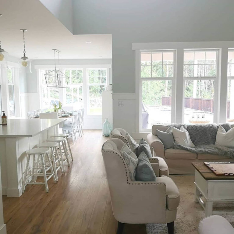
Use of Sea Salt in interior
If looking at Sherwin-Williams’ Sea Salt gray-green makes you use it anywhere in your house, we can assure you that approximately eighty percent of those finding themselves in the same situation have experienced something similar. We agree that this stunning shade is so pleasing to the eye that you want to enjoy it for as long as possible. And we are ready to offer you several options for using SW 6402 to reveal its best properties.
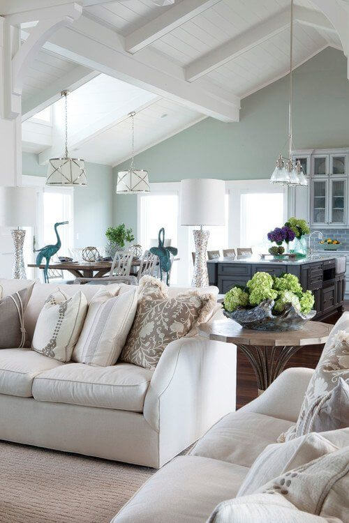
A little more about Coastal
It’s safe to say that Sea Salt is universal and organic in any interior, whether it’s cozy Provence, discreetly harmonious Scandi, or elegant Neoclassical. However, designers still consider the style of exquisite houses on the American coast to be the most natural habitat. Using gray-green as the base color, you can create a perfect symphony with the azure and blue sea hues against it, generously seasoned with soft white and beige tones, light wood textures, and black metal accents.
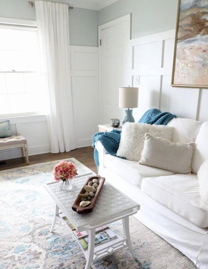
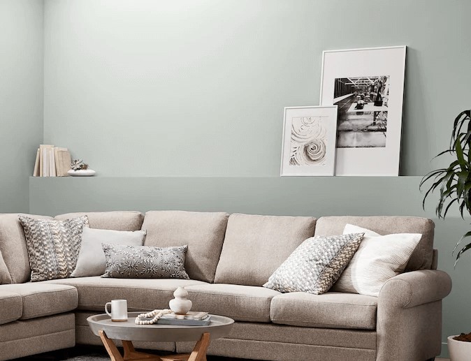
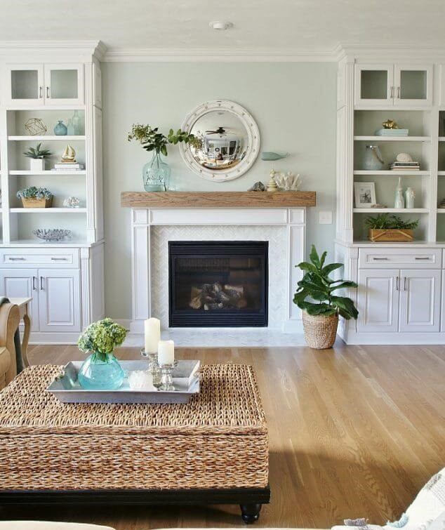
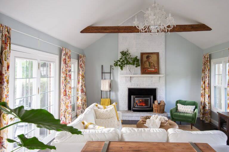
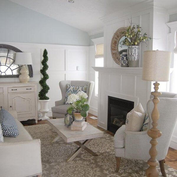
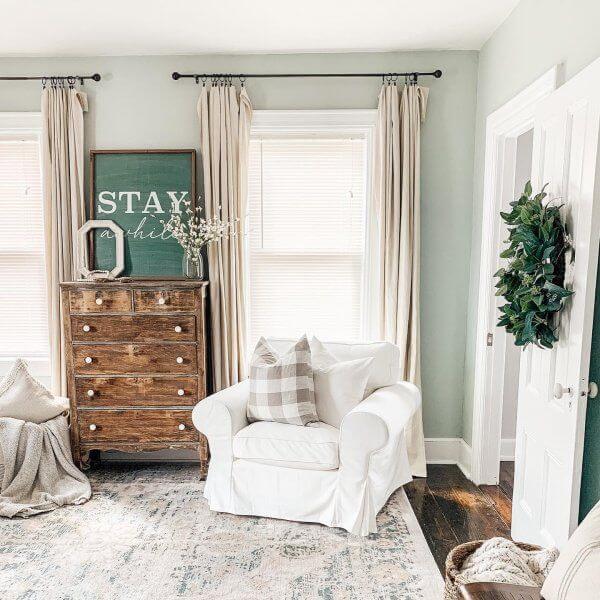
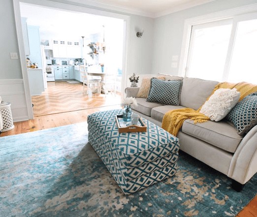
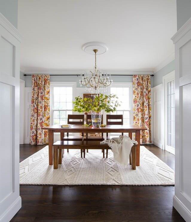
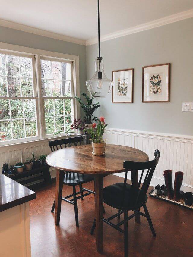
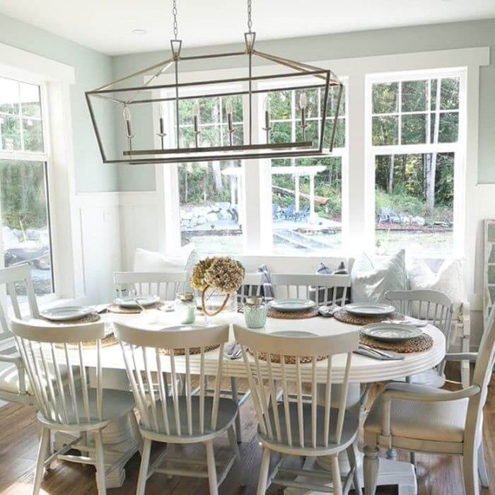
Living room
If you see your ideal living room as spacious, peaceful, and filled with light and air, feel free to order SW 6204 – it will meet your wildest expectations! With this, you can go either way – make it warm and sophisticated or refreshingly elegant.
In the second case, use white and blue tones, wood in coldish gray shades, and metallic decor elements. In the first, wooden floors and furniture in honey and caramel shades and a yellowish pistachio palette will work well. Another option is to add soft cream or delicate pink tones with gold accents for a sophisticated and romantic vibe.
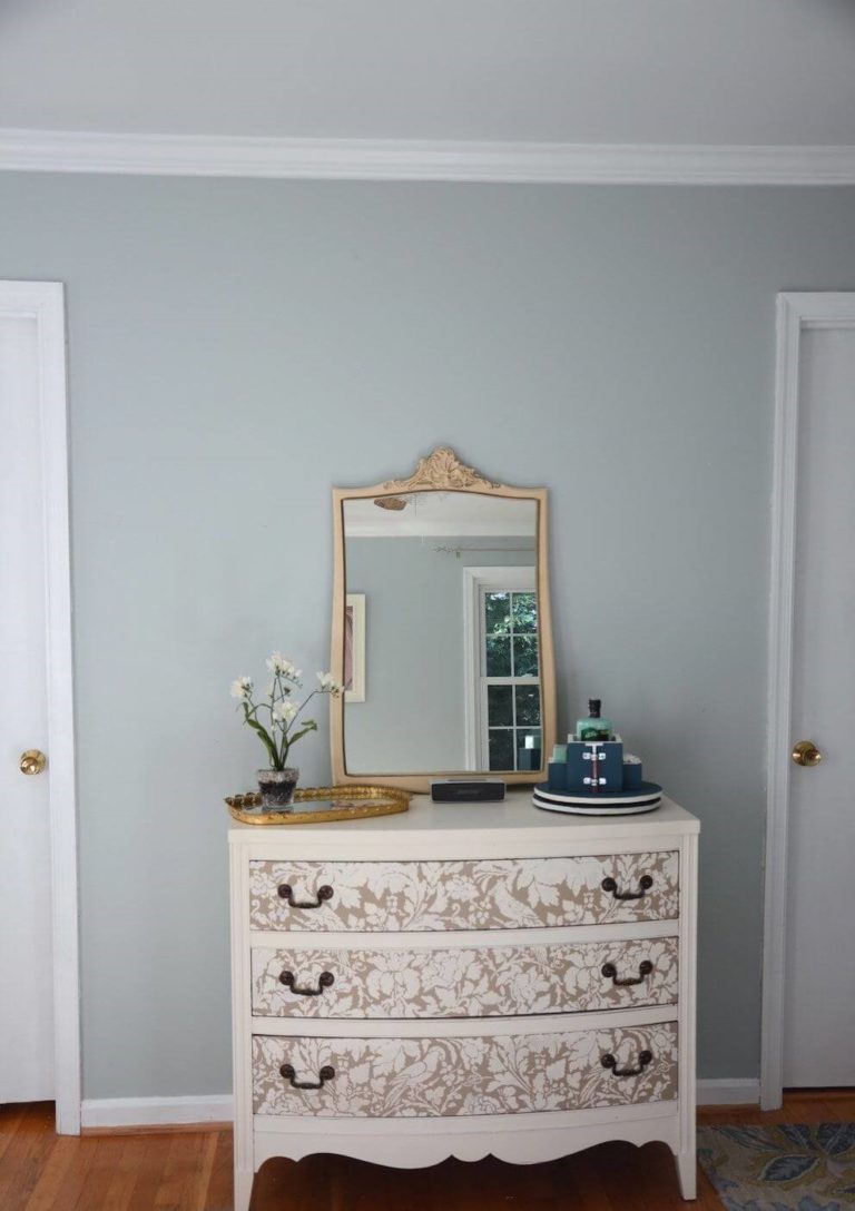
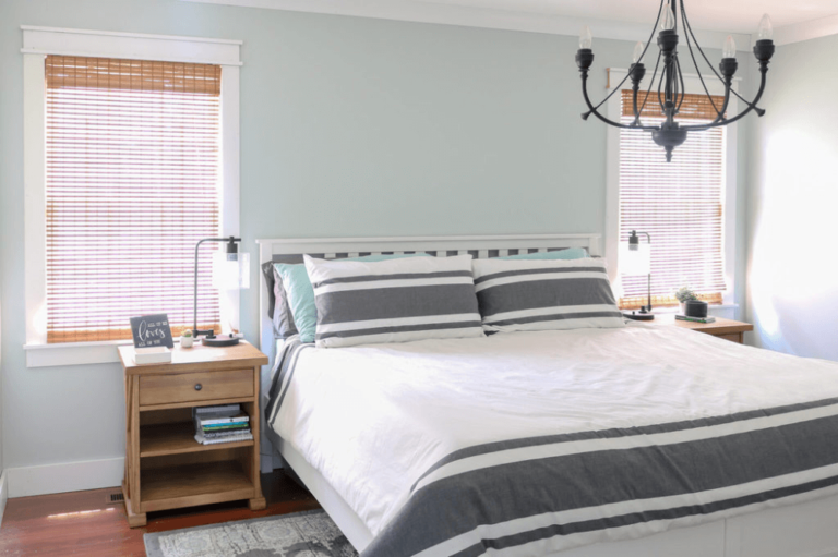
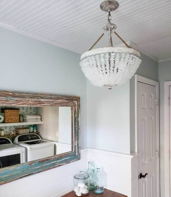
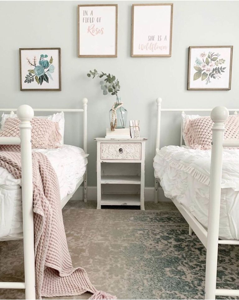
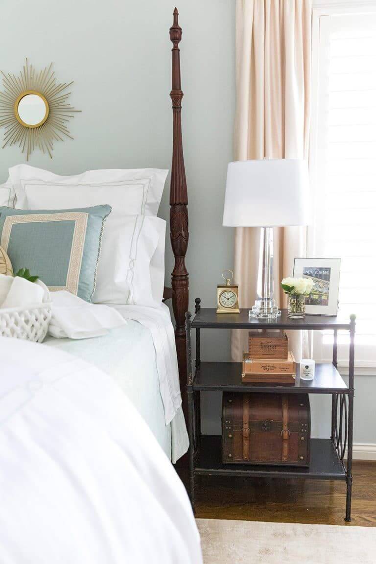
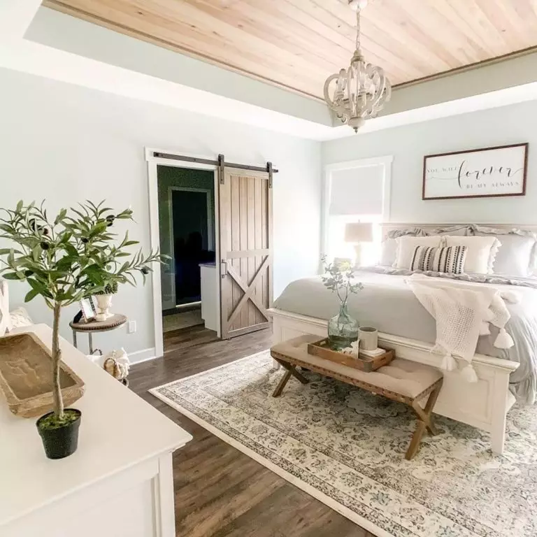
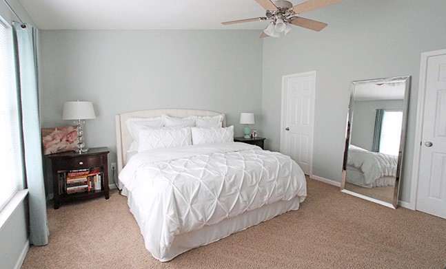
Bedroom
All in all, Sea Salt is considered the perfect color for bedrooms. A light gray-green tone visually expands the room boundaries, making the atmosphere airy and offering a crystal feeling, especially at dusk and in the early morning hours. It is devoid of draining and dark notes, and therefore waking up in such a bedroom promises to be very, very pleasant.
In addition, if you want, you can complement the interior of the bedroom with bright accents – coral and orange details against the background of such walls will look especially elegant. However, if you do not want contrasting color splashes, try turquoise, white, navy blue, sky blue in combination with elements of wood and bamboo, copper, and painted metal.
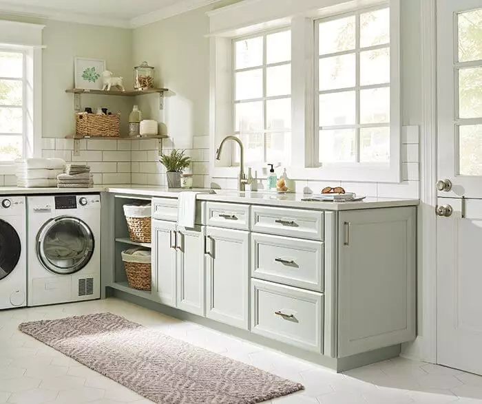
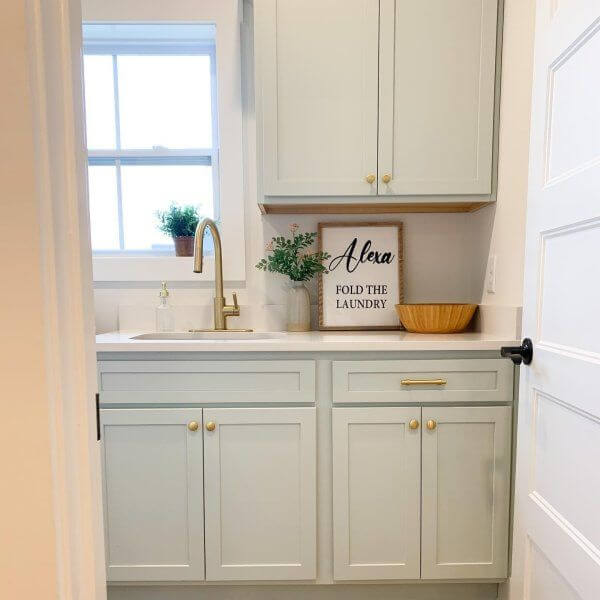
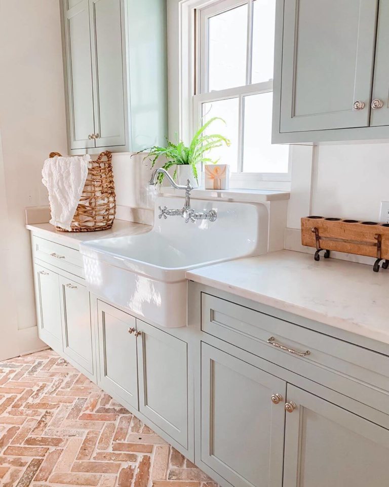
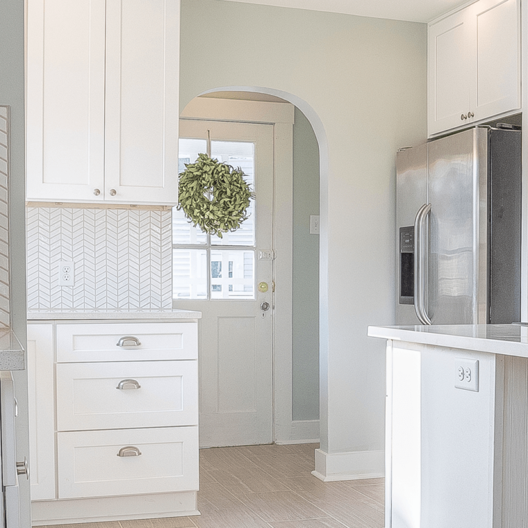
Kitchen
Are you considering the Sherwin-Williams gray-green for your kitchen? Do not hesitate – you have lots of possibilities! If painting cabinets is a priority for you, then Sea Salt will delight you with its versatility, as it is suitable for both luxurious classic sets and very simple farm cabinets. At the same time, it accepts any fittings – from wooden to gold, chrome, and black metal.
Sea Salt demonstrates no fewer advantages when painting the walls of the kitchen. It seems to us that this is the perfect way to make it spotlessly clean, bright, and spacious at any time of the day and with any content. However, we still advise you not to forget about fresh flowers and green plants – this way your kitchen will make a fantastic impression!
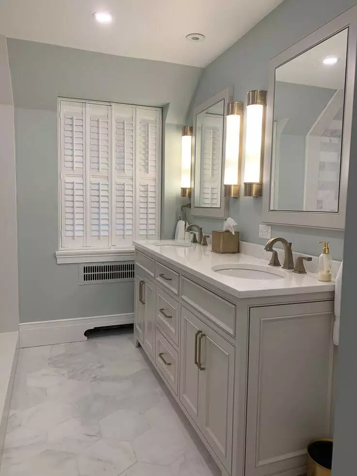
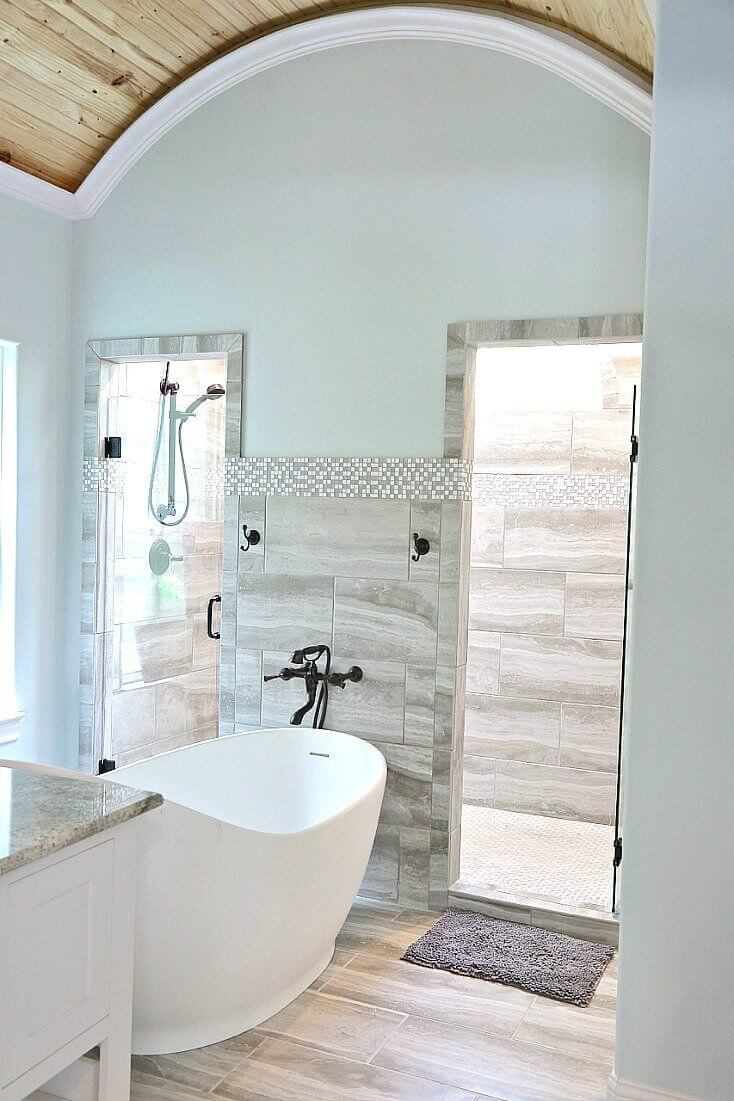
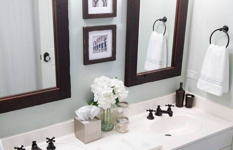
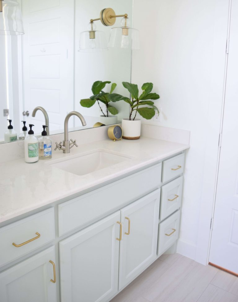
Bathroom
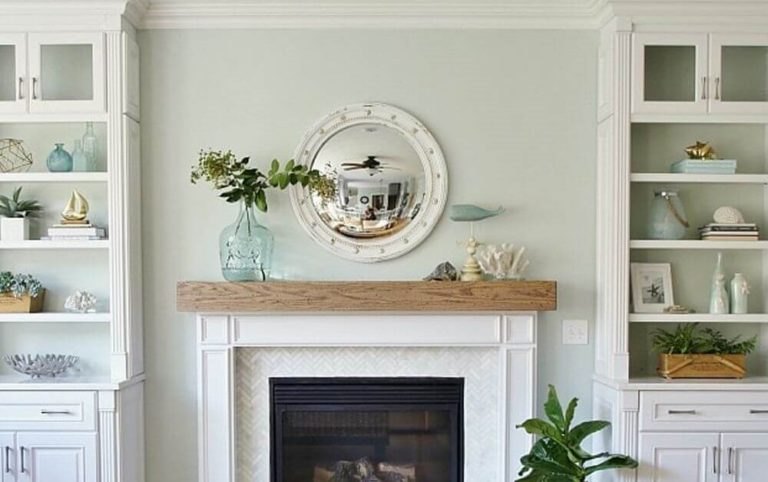
Sea Salt seems to be the most obvious choice for a bathroom, as it creates an amazing feeling of cleanliness, freshness, and proximity to the ocean – it is not without reason that such gray-green shades are increasingly used to decorate rooms in spas. It’s also a good thing that contrasts are completely optional here: you can fit SW 6204 into a pastel bathroom palette, and it will look complete and flawless.
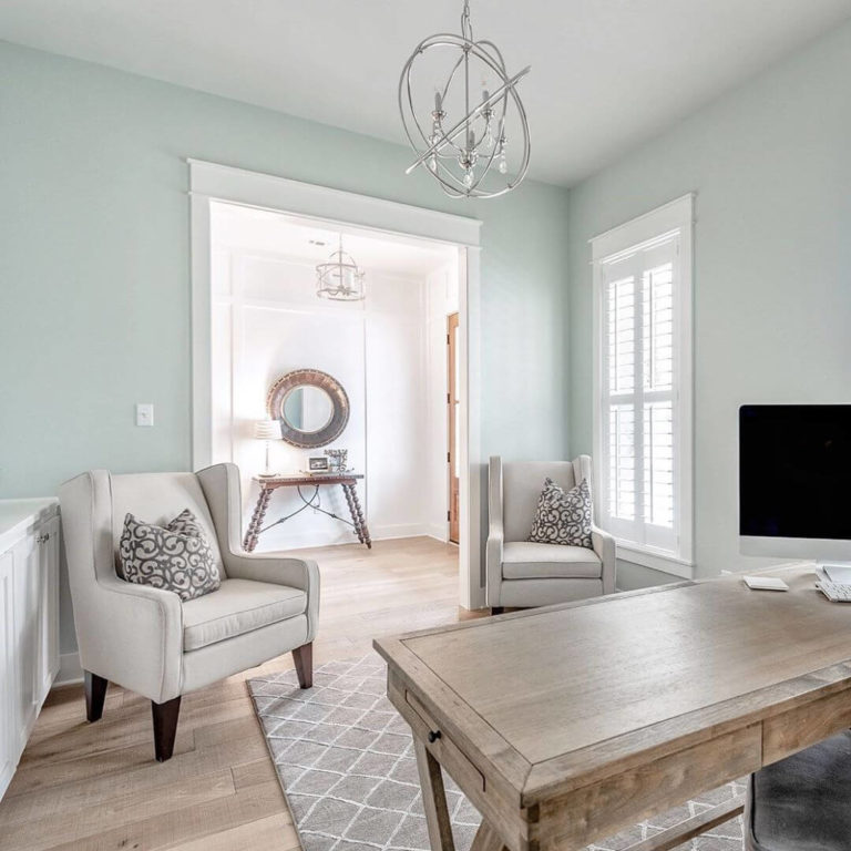
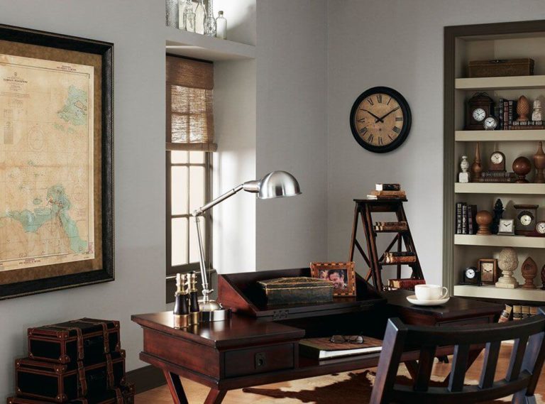
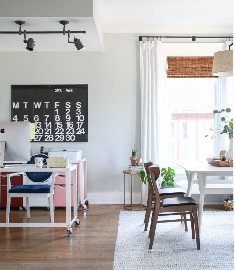
Home Office
Color matching for the home office is a special case because the shade should help you focus while inspiring and giving you the energy you need to work. Sea Salt is able to cope with such a task. Thanks to its lightness and balanced color mix, it blends perfectly with any furniture and window design. Every time you enter your home office, you will feel a surge of energy.
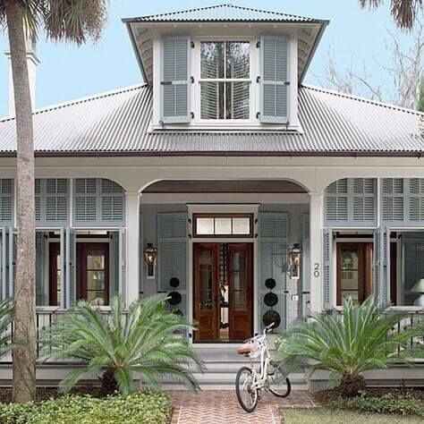
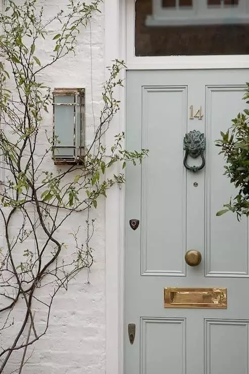
Using Sea Salt for house exterior
If you are going to paint your beach house, grab Sea Salt without hesitation – it is extremely difficult to find a more organic color for this. However, the scope of this amazing gray-green shade is not limited to such buildings, and therefore you can choose it in any case. Black details and snow-white finishes, board, and siding – each of these solutions will give the exterior of the house an unconditional individuality.
In addition, designers consider doors and shutters in Sea Salt to be a separate form of art. If you only need to freshen up the facade a little, this solution can be successful in all respects.

Sherwin-Williams Sea Salt gray-green is able to bring you back to a serene world where everything is light, easy, and calm. If you often feel insecure or anxious or simply want to uplift your interior, SW 6204 can make your life much more enjoyable.
