This pearly off-white shade features a well-balanced white base diluted with warm beige notes and a few particles of neutralizing gray. The paint color as a whole feels exceptionally soft and refined.
Seapearl OC-19 (Benjamin Moore): what color is, review and use
One of the most prominent representatives of the off-white category is definitely Seapearl OC-19 from Benjamin Moore. The beloved shade has won the respect of designers and conquered the homeowners’ hearts, confidently entering the trends for the current season and promising to stay the same.
The timeless hue that colorists from Benjamin Moore came up with is a soft shade of white with impeccable greige notes that stand behind the warm and inviting appearance. It is not the usual light greige you come across, but rather an elegant mix of gray and beige that slightly penetrates the white base for a paint color meant for you to fall in love with. We wondered what stands behind such finesse when the composition is clear as day. Is there something we don’t know? Let’s find out!
Seapearl paint color features
The OC-19 paint color from BM is this off-white variation you see once and return to every time you have the occasion. Is it the irreplaceable base of well-balanced white, the welcoming beige scents, or the neutralizing gray notes? What if we said that all at once? A bit from everything, yet not too much from each, and our already beloved shade is ready. As the name implies, the mix of the mentioned notes replicates the elegant sea pearl color that feels soft, refined, mesmerizing, and impressively unique.
Seapearl: is it warm or cold?
After mentioning the words “warm” and “soft” a few times, it is impossible to draw any other conclusion than that Seapearl is a warm paint color. Still, warm would be too strong for such a smooth shade. Soft seems like the right word in this sense. Where does it come from? Do you remember the pairing between beige and gray? Well, they balance each other and enrich this shade with the right amount of softness.
How does lighting affect Seapearl?
Despite its rather neutral surface, Seapearl has quite intense undertones, which affects how it reads in particular conditions, and lighting is one of the main factors to consider. To make it easier for you, let’s take a look at both sides of the coin! Can you believe that this lovely shade can read slightly crispy? All due to the cool light that penetrates the north-facing spaces. The same shade can make an entirely different turn in rooms with south-facing windows, where it leans light beige. At the same time, in rooms with eastern and western exposure, this shade gravitates between the two extremities, depending on how the sun rays penetrate the space. Lighting always plays the last violin, although you could slightly affect the situation by choosing particular undertones in artificial lighting.
Seapearl LRV
A quick reminder for connoisseurs and a small intro for the new guests: Light Reflectance Value tells us how dark or light a color is on a scale from 0 to 100. What if we told you that 100 stands for pure white and Seapearl has an LRV of about 76, which are facts, by the way? It seems OC-19 is quite close to true shades of white, still not reaching them. To be short, Seapearl gravitates between the medium and light color groups.
This fabulous paint color impresses us again in terms of light reflection abilities. Despite the relatively low LRV for an off-white shade, this color variation behaves like a pro at reflecting the light throughout the room. We can safely state that it even makes the room seem more spacious.
Seapearl undertones
The irreplaceable undertones of this paint color are beige and gray, which offer this off-white a slight creamy effect. Still, particular conditions reveal one appearance or another. You can quickly switch from a balanced off-white to a cool gray shade or a warm beige variation. One thing stays the same – the pearly elegance that this paint color never gives up on.
Similar colors
It would be a shame to state that there is not a single paint color similar to Seapearl when the combination of beige with gray on a white background is so popular among manufacturers. We will take you on an adventure by going through alternatives that would perfectly work in the place of Seapearl. Consider one of the following options:
Coordinating colors
The off-white shade that prevails over the latest trends is simply in love with darker variations of gray with various undertones, behaving no less friendly towards lighter white paint colors. Designers suggest that its warm undertones are enough to enrich the space with an appropriate amount of softness, and neutral matching colors are just what it requires. You can always display any accents that will surely stand out on this background, while the perfect matching neutrals are not that easy to find. Take a look at the following exact paint colors you can consider!
Use of Seapearl in interior
The first thing we should mention is that Seapearl will take any style direction. You can safely use it for any design solution of yours. Still, there is something unusual about the refined pearly notes that seem to suit some styles in particular. Speaking generally and specifically, we will try to give you an insight into how this beautiful shade can be integrated into the interior.
Low-key shade for a Minimalist statement
The minimalist interiors with a monochromatic palette based on off-white shades and light wood texture, accompanied by a functional layout, seem to lack this particular splash of neutrality that brings a slight elegant effect. Don’t allow such a thing, and go with Seapearl for the walls in the company of the mentioned elements. You will simply be impressed by what a look your minimalist interior will acquire – seemingly low-key yet full of individuality.
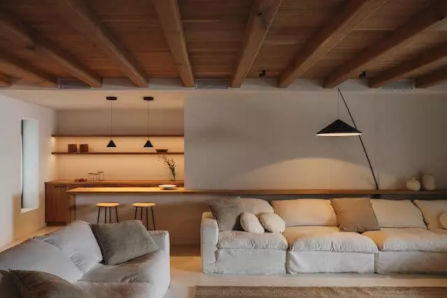
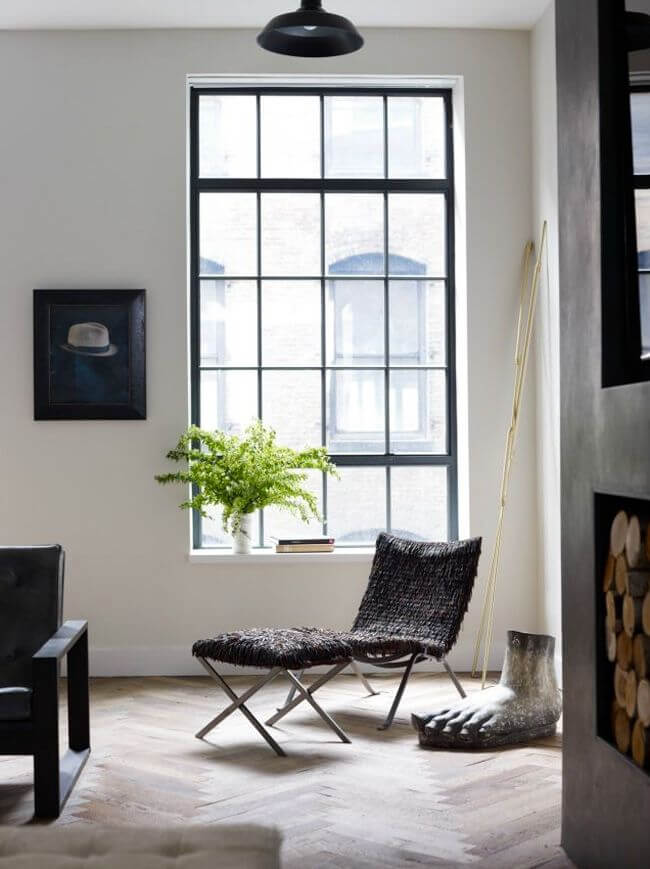
Soft on Loft
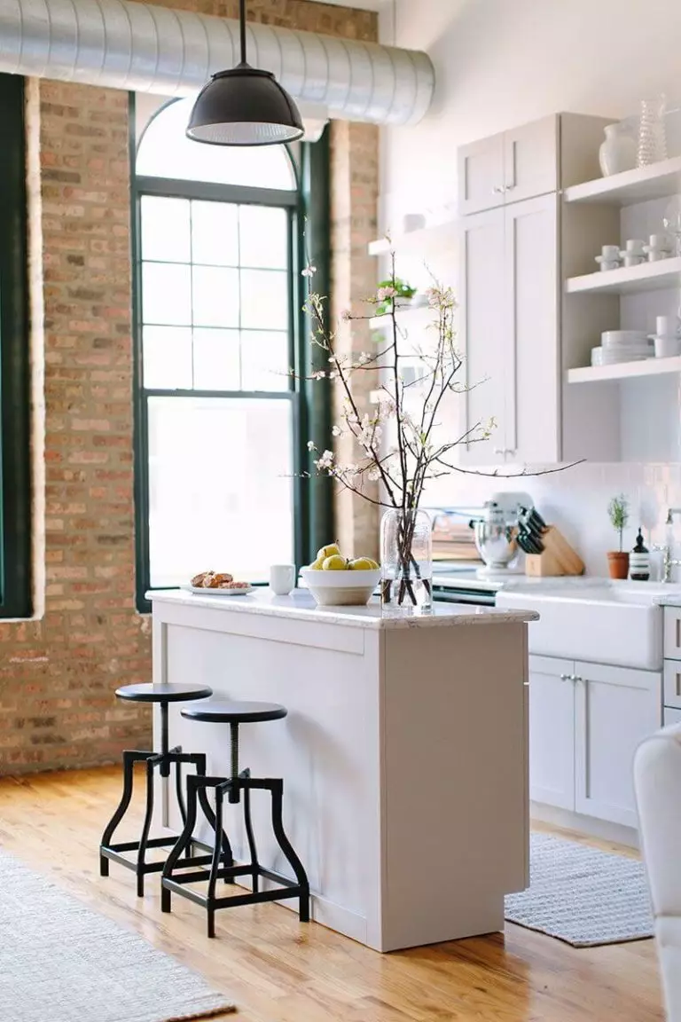
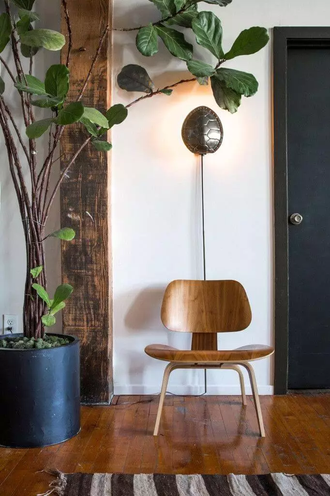
Despite how raw a style looks, current trends imply an extra sense of comfort. The soft shade that BM can firmly show off is a perfect paint color to combine with Loft interiors’ raw wood, brick, and steel surfaces. The slightly warm off-white variation will smoothly soften the rather formal environment while keeping pace with the free-of-rules layout. This way, you will bring comfort in a smart way that does not spoil the style yet softens it in an exquisite way.
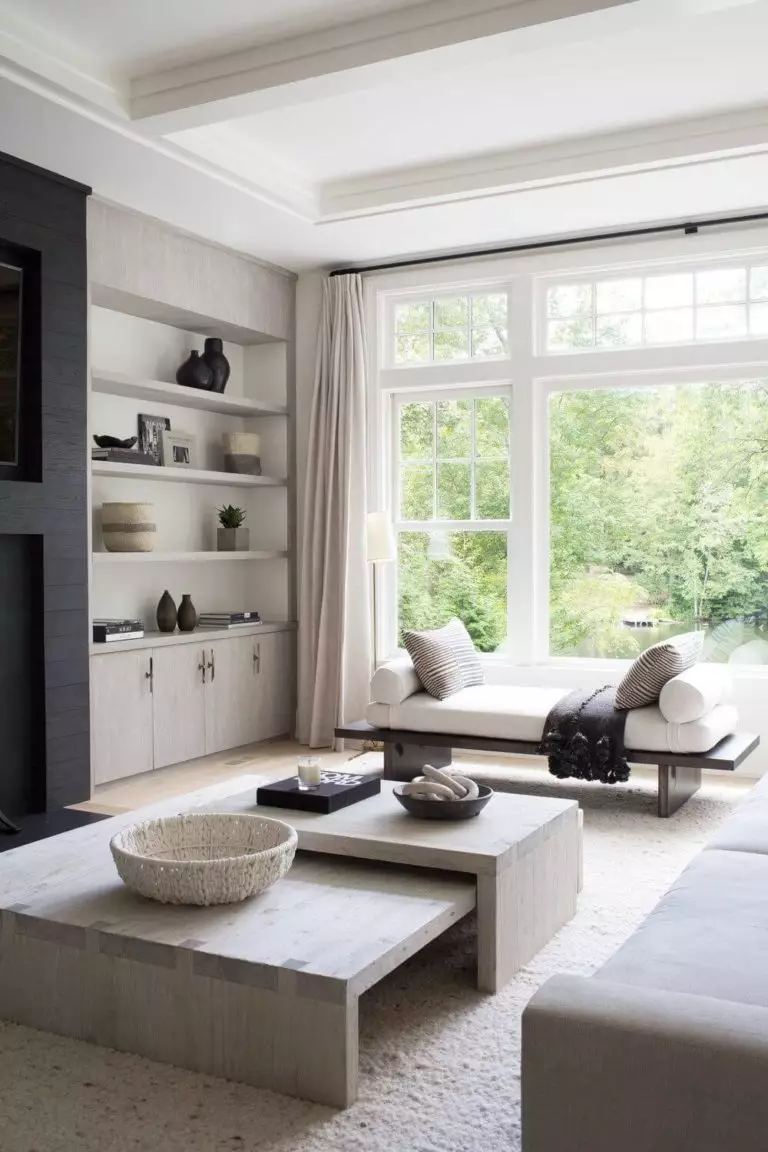
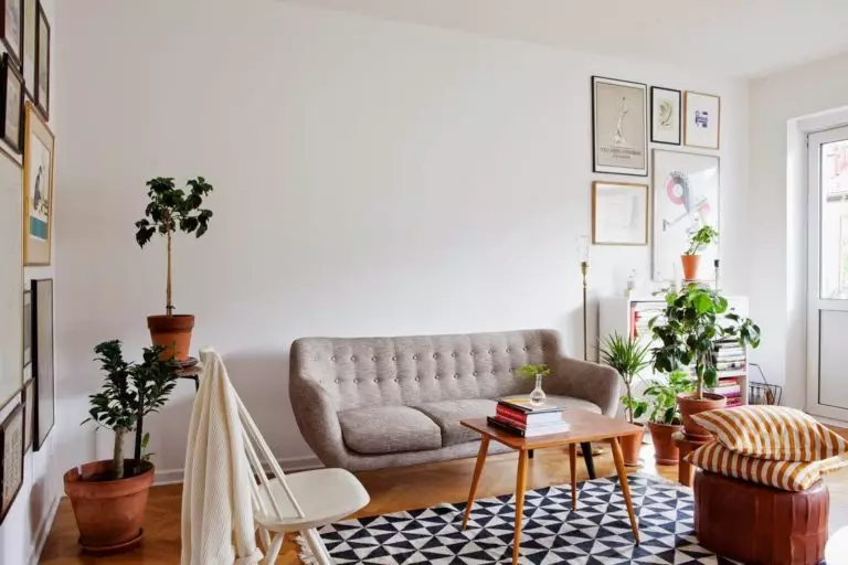
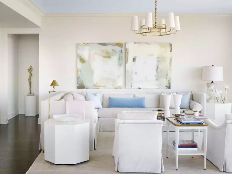
Living room
Either way, if you use this paint color, be it the walls or trim, your living room will be instantly filled with a balanced sense of comfort you cannot help but enjoy to the fullest. Do you fancy a serene environment fully penetrated by the soft notes? Keep it monochromatic. A bit of vibrance feels close to you? Expose a few accents on the beloved slightly neutral background.
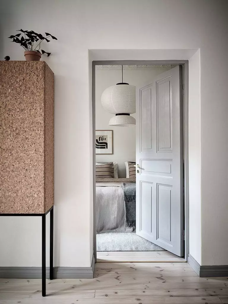
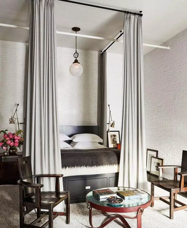
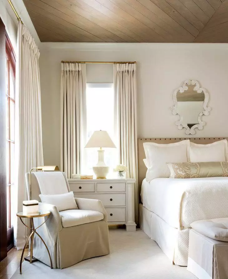
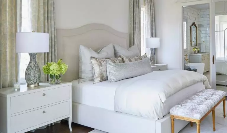
Bedroom
Are you looking for an ideal shade of white that perfectly refreshes the environment in the morning and impressively softens it during the night? Stop searching and take a look at Seapearl. Besides meeting the mentioned standards, this paint color is a real find for monochromatic approaches based on beige, serving as a no less impressive background for accents if you want to add individuality. The most important thing is that you will surely have a safe and sound sleep surrounded by walls, or at least trim, painted this way.
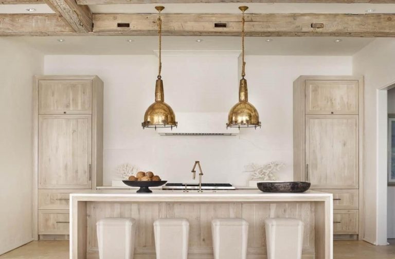
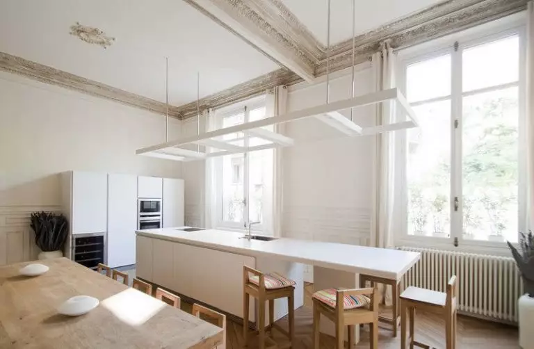
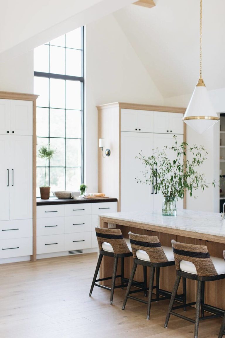
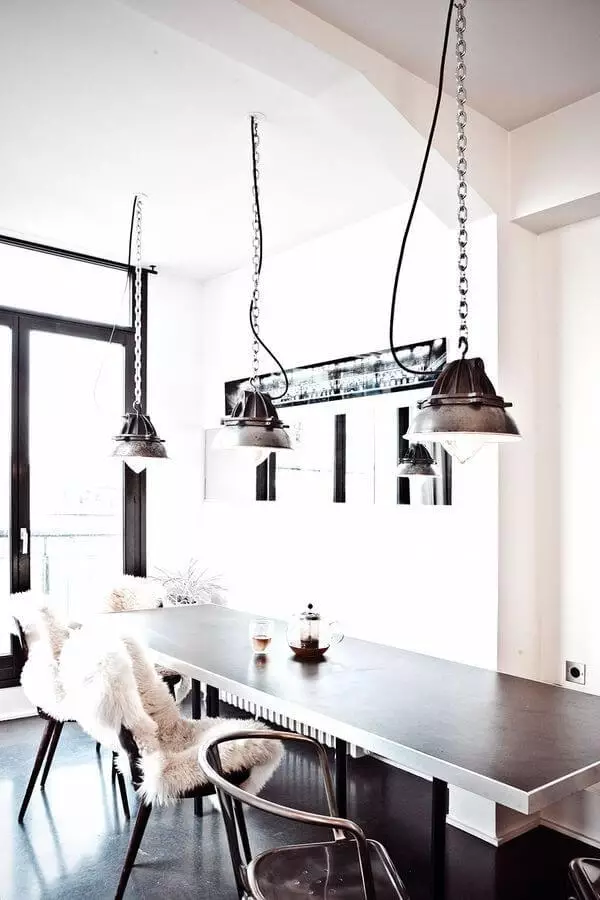
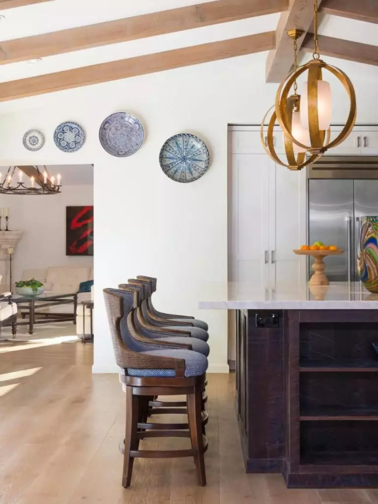
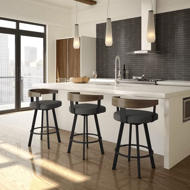
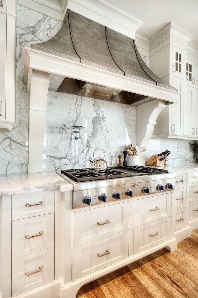
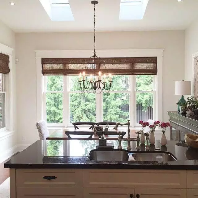
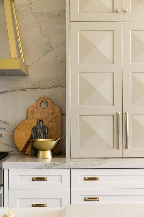
Kitchen and dining room
Luckily, you can use Seapearl both for the walls and kitchen cabinets. Of course, any style is welcome. Still, nothing impresses as much as a traditional kitchen with soft off-white splashes of color decorated with a marble backsplash and enriched with brass sparkles; as they say – if we start with elegance, we keep it this way further on.
The range of design solutions is endless in the dining area, with Seapearl as a background. Maybe a little wood texture to emphasize the warm effect or a few splashes of gold elements to add even more refinement?
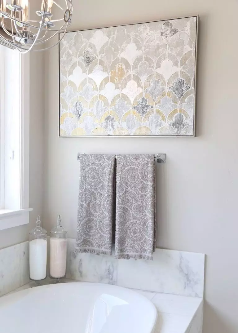
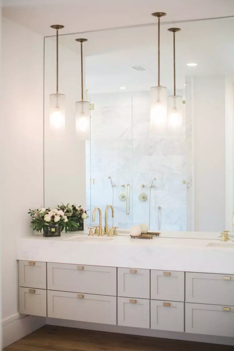
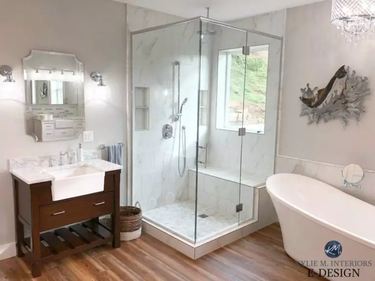
Bathroom
It is simpler than you thought. Choose the gorgeous off-white for the walls and go with one of the following partners: wood, marble, or brass. Consider them separately or all at once. Depending on the lighting, Seapearl may appear lighter or darker. Therefore, choose wisely the artificial light undertones to achieve the desired result.
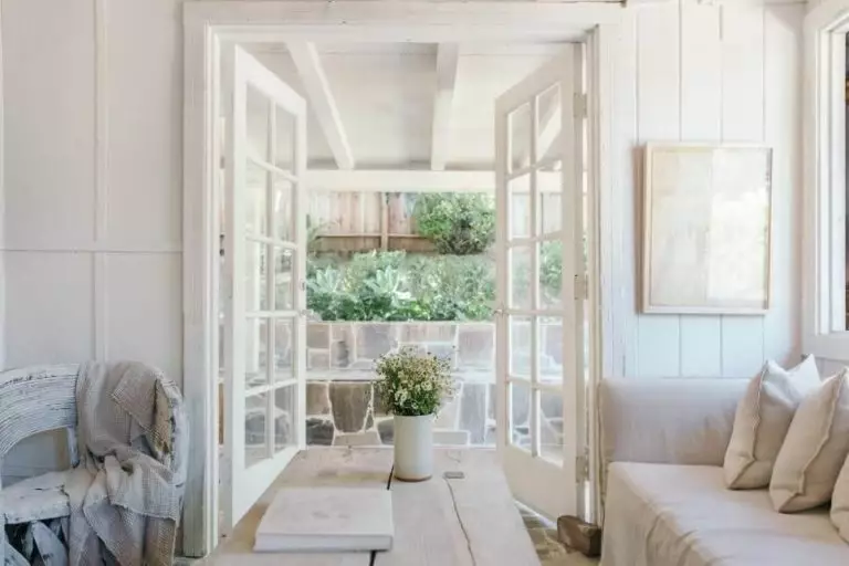
Use of Seapearl for house exterior
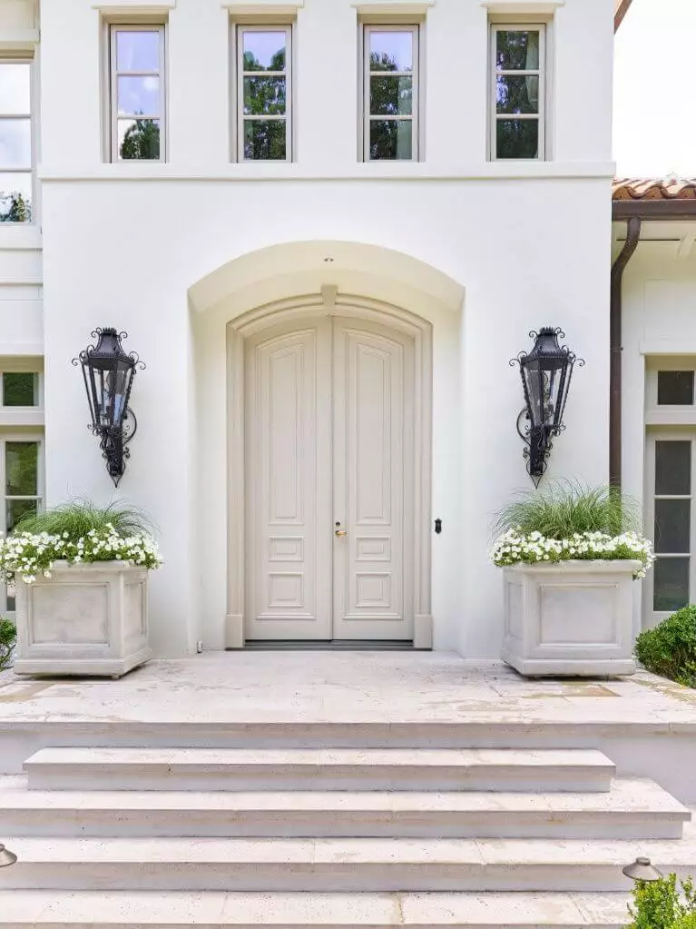
A bit lighter than on the sample, yet not losing its exceptional softness, Seapearl is a real find for contemporary exteriors. Whether you opt for a darker greige for the trim and front door or consider a slightly contrasting variation for the same elements, the flamboyant off-white shade will not cease to impress you with its welcoming effect. As already stated, it is more of a background paint color, and applying it to the front door, although it is appropriate, would seem like not enough since once you opt for this paint color, you should go with it till the end.

The Seapearl OC-19 paint color from Benjamin Moore is right what you need if the true whites seem too stark to you while the off-whites with striking undertones seem too eye-catching. That’s right! Seapearl is a perfect mix of the two worlds that brings an irreplaceable sense of elegance.
