Silver Satin OC-26
Benjamin MooreThis off-white variation features a light gray base penetrated by a slight lavender scent that perefctly resonates with the silverish satin texture.
Silver Satin OC-26 (Benjamin Moore): what color is, review, and use
Do you know what makes a paint color stand out? Its secrets! This is when a shade seems so intriguing, opening such a wide range of feelings that you cannot help but wonder what a color variation it actually is. To your attention – a true representative of the mentioned features: Silver Satin OC-26 from Benjamin Moore.
Let’s start with the name: imagine the soft and airy satin texture replicating a light and appealing shade of gray with silverish notes. This is what Silver Satin is about. One of the best-selling paint colors and a prominent representative of the Off-White collection, the OC-26 shade is the perfect choice if you want to contrast darker color variations with an exquisite neutral or dilute an all-white palette. This is the tiniest part about this paint color. Wait and see what other secrets it has to reveal!
Silver Satin paint color features
Is it an off-white shade? Actually, Silver Satin is more of a light variation of gray with an almost unnoticed hint of warmth and exceptional hidden undertone that shall be revealed later. What words would we associate with this shade? Undoubtedly, we would say sleek, fresh, sophisticated, soft, neutral, enchanting, versatile; the list can go on and on. Most of its features go against each other, all due to the complex composition that only a gray shade like Silver Satin has.
Silver Satin: is it warm or cold?
There are two defining aspects that can decide which way this color will take. On the one hand, the silverish notes keep it cool. On the other, the slightly noticeable warm scents keep it soft. It all depends on the room exposure, amount of light, and neighboring colors. Still, on the sample, Silver Satin is a very soft shade of grayish off-white.
How does lighting affect Silver Satin?
Luckily, Silver Satin works within rooms of any exposure. You can safely go with it in spaces with northern, southern, eastern, or western exposure. Under a substantial amount of daylight, this paint color reveals its brightest face yet is not devoid of its silverish feature, showing a shiny appearance during the day with a slightly cooler hint in north-facing spaces and a warmer effect in south-facing rooms.
Silver Satin LRV
On a scale from 0 to 100, the delicate paint color the colorists from BM came up with reaches a Light Reflectance Value of 74.9. This shade is close to entering the white category since 100 stands for true white. Still, the crisp gray notes and soft satin sense keep it the way it is – a silverish off-white shade. However, a paint color with such a high LRV cannot help but reflect the light throughout the room at an impressive level, going beyond borders.
Silver Satin undertones
This is the biggest secret Silver Satin hides. Although not showing them that often, this paint color harbors a few lavender notes. Can it get any more intriguing? Sure it can, with such a fabulous shade! The tricky undertone reveals itself particularly in south-facing spaces, although it depends on many factors. Therefore, we suggest playing with a sample within your interior and paying attention to how this shade behaves.
Similar colors
If we speak about a paint color that has the slightest hint of gray, there is surely a wide range of shades that can serve as an alternative. It cannot simply be any other way when gray variations are some of the most developed paint colors. Let’s take another look at Benjamin Moore and go beyond its limits in the search for new options that resonate with the essence of the already beloved-by-many-designers silverish off-white.
Coordinating colors
You will be on the safe side either way: a monochromatic or contrasting palette with Silver Satin as the main character. Even if you are free to opt for any matching colors since the silverish white canvass will perfectly accompany them, we still suggest paying attention to a few paint colors that experts from BM recommend.
Use of Silver Satin in interior
Silver Satin is widely used within the interior as one of the best-selling paint colors, mostly as a base color. Off-whites are applied as an alternative to classic white, and the silverish variation offers an updated perspective. Although it looks rather gray on the sample, when put into practice, the refined shade takes on the satin texture and fills the space with a sense of softness that does not go beyond the borders set by the particular style. We would like to reveal how Silver Satin behaves in real settings with a few specific approaches and general integration into the interior.
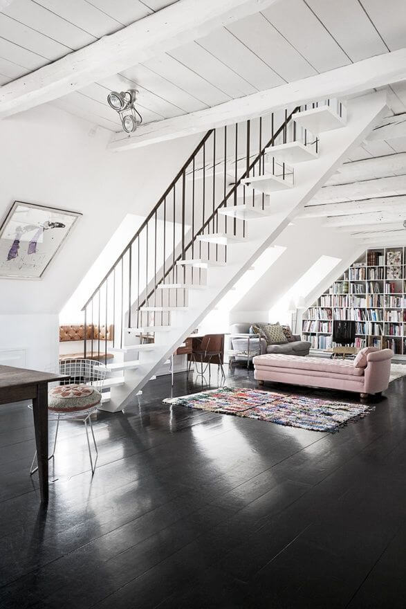
The beloved Minimalist approach
Great news for lovers of minimalist interiors! There is a new paint color on the horizon that sticks to the functional approach yet brings something unique that makes you wonder where it starts and ends. Considering this paint color for the walls, you instantly fill the space with peace and serenity, offering the defining elements of the minimalist layout the opportunity to reveal their essence. Contrast the background with accent colors or natural texture. By the way, a pot with indoor greenery would not spoil the result. Still, opting for other shades of light gray that seem to flow from the backdrop color draws attention to the uniqueness of Silver Satin; why hide it?
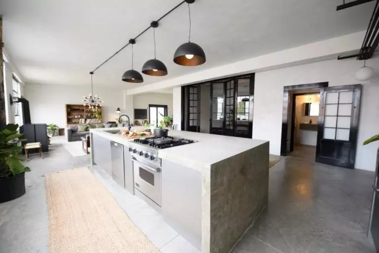
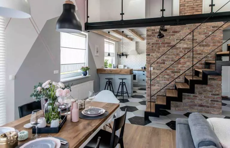
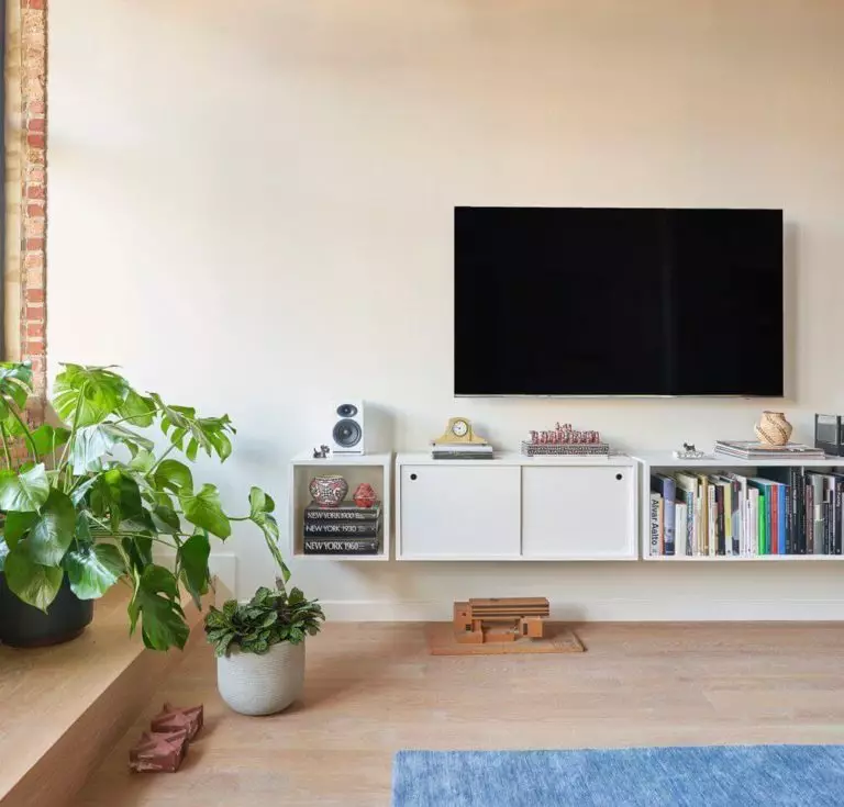
A new perspective on Loft
Replace the usual concrete walls with a light gray variation that softens the raw elements of this style. Consider Silver Satin as a canvas and draw on it your wildest design ideas that fall within the borders of a loft interior. This shade will be more than happy to underline the variety of textures that this style welcomes, although a monochromatic palette fits it no less impressively. Particularly well, it works when paired with brick – a sleek contemporary combination of contrasts. Don’t overdo the decor. Let the space breathe in the scented air of the satin-inspired background.
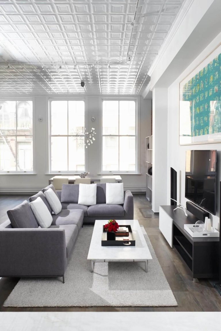
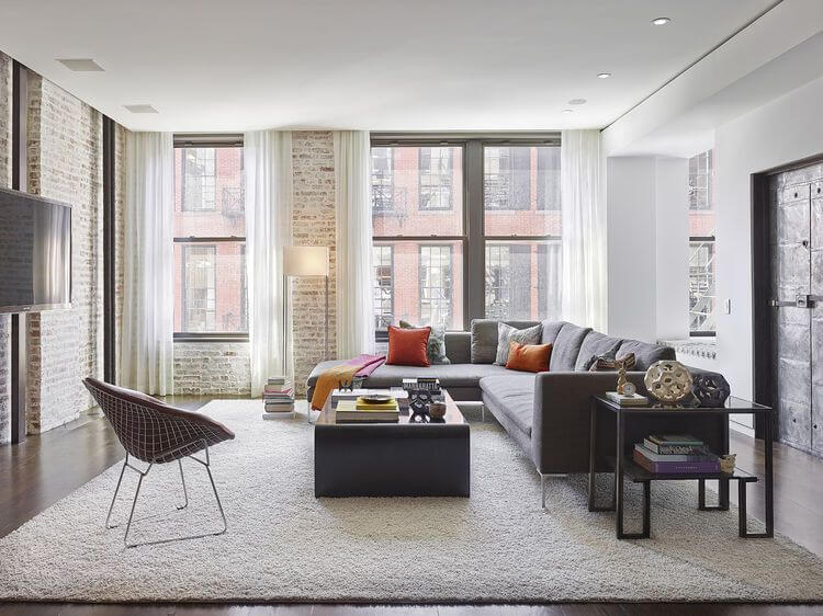
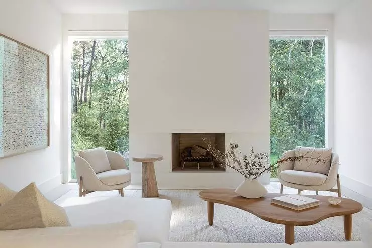
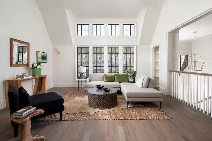
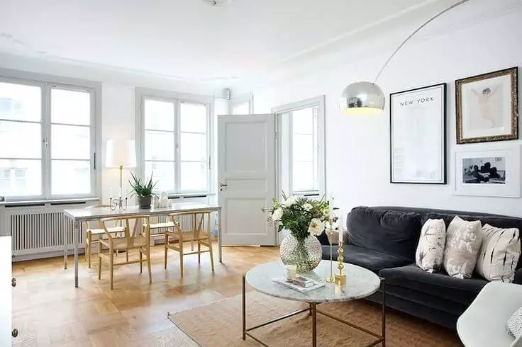
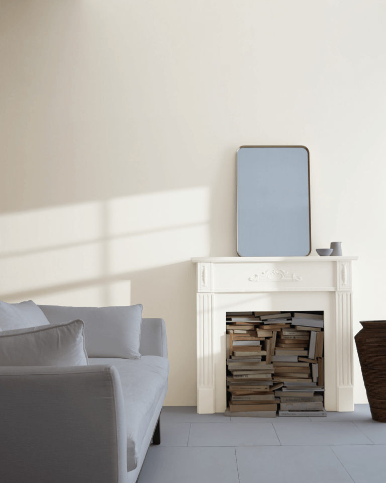
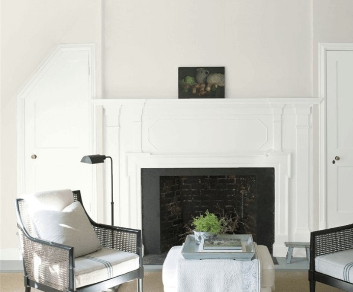
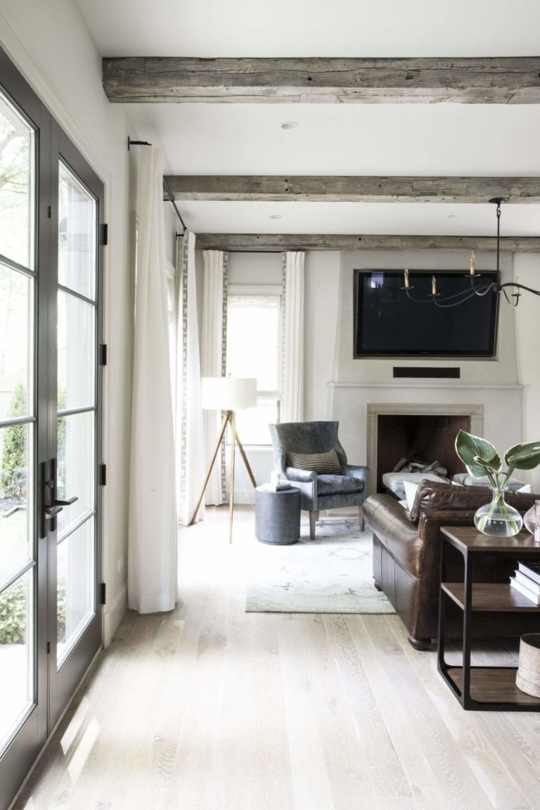
Living room
Silver Satin proves to be impressively versatile. You can either pair it with other white variations for an interior that defines serenity to the fullest or consider contrasting colors or textures. Once combined with light wood, it reveals its richness of soft notes, while its collaboration with dark wood sets a fresh and confident sense. The thing is that the grayish replication of satin shows an impressive personality, revealing the appropriate amount of it, leaving space for other shades and textures, which makes it an adjustable paint color and a perfect choice for any style.
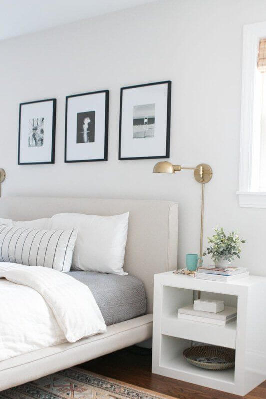
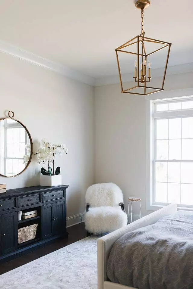
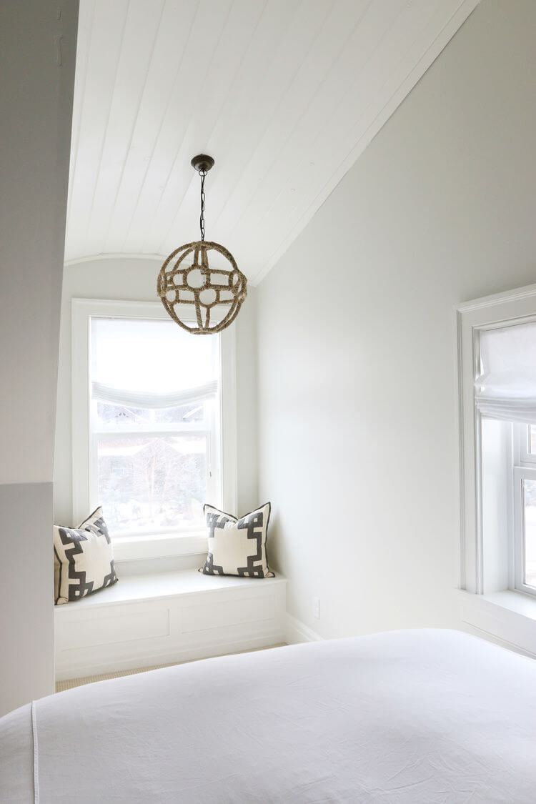
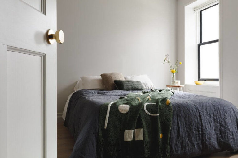
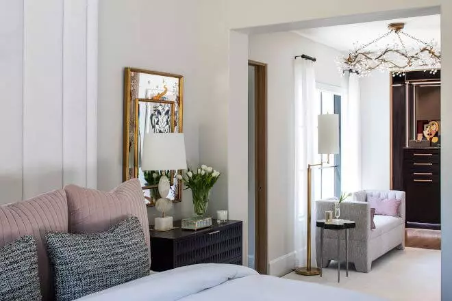
Bedroom
A color whose name is inspired by the soft satin texture seems developed for this space particularly. It literally feels like satin when applied to a surface. As usual, we start by suggesting a monochromatic color combination with Silver Satin for the walls, which is enough to set the desired serene environment. Still, this paint color loves pairing with accents. Be it bright paint colors, rich textured pieces of furniture, or sparkling decorative details. The most important thing is that this shade will ensure nights of safe and sound sleep. Isn’t it what we want from a bedroom most?
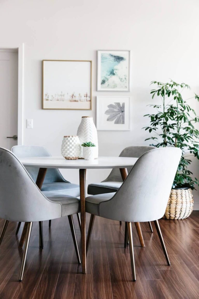
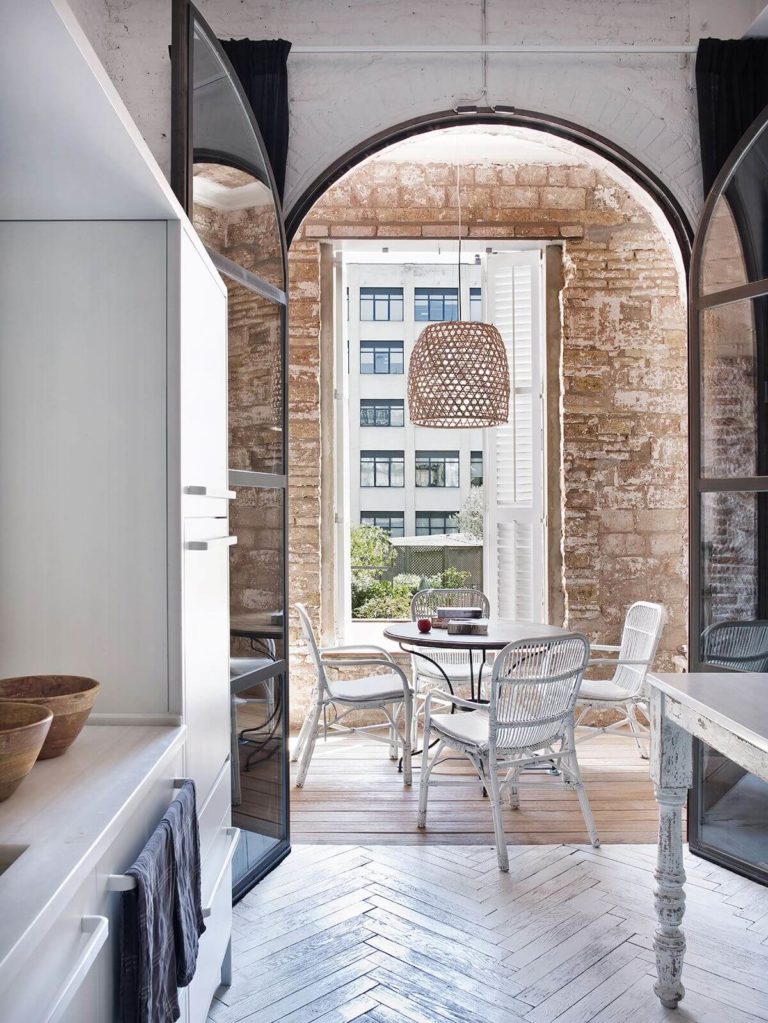
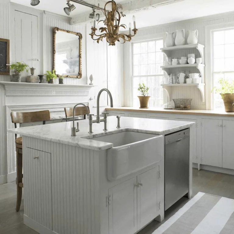
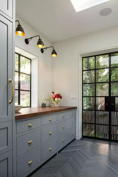
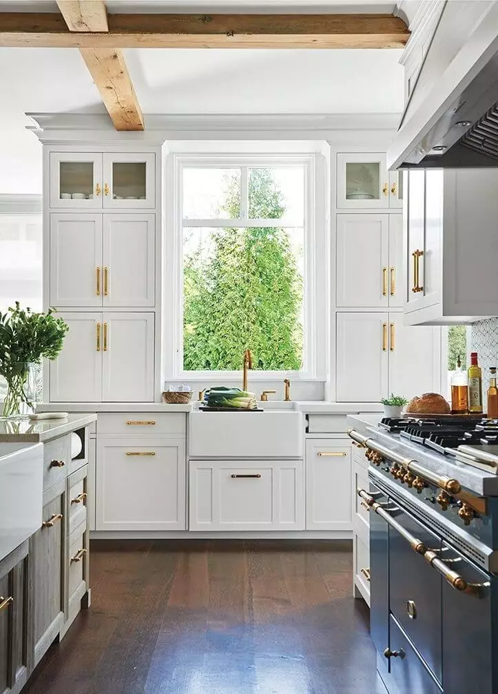
Kitchen and dining room
Both the kitchen and dining room welcome Silver Satin. Whether monochromatic or contrasting, you will not regret choosing this paint color. Go with a full off-white kitchen or enrich it with accents. A bit of brass will harmonize with the silverish softness and gracefully embody a refined sense of vintage. On the other hand, such bold accents as black will perfectly contrast the light gray background to set the most contemporary look you could dream about. As for the dining area, we suggest sticking to the good old approach with natural wood that would reveal its texture at its finest on such a backdrop.
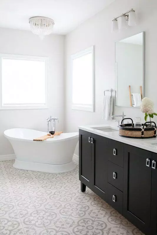
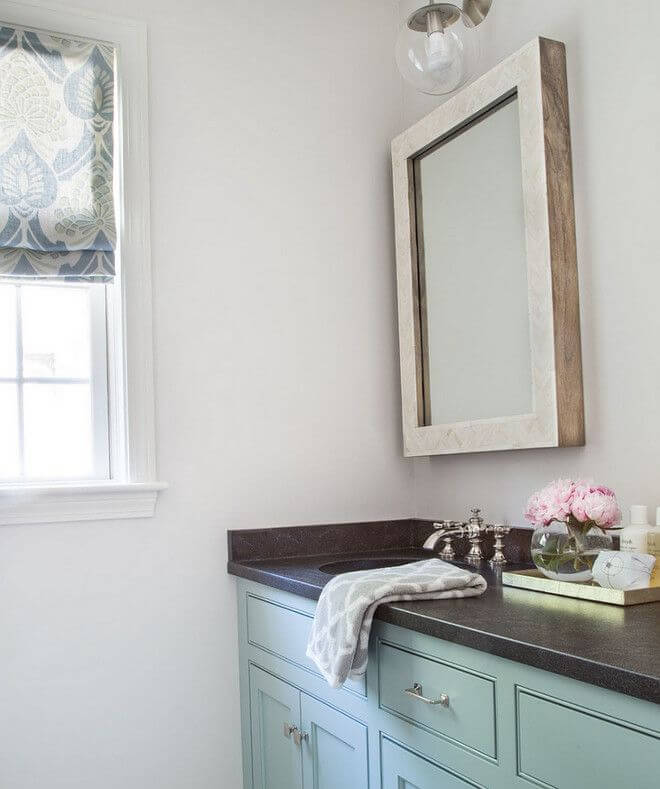
Bathroom
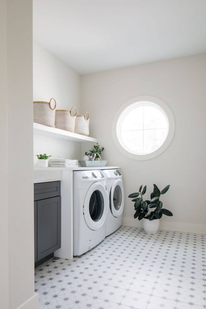
There is something special about this paint color that you cannot help but continuously admire, even in the bathroom. Again, keep it sleek with Silver Satin for the walls and an all-white interior, or add colorful or textured accents. Usually, a single pot with greenery is enough. Still, make sure that you choose the appropriate lighting color temperature so that this shade looks the way you want since it can quickly switch from a coolish gray to a pinkish one. In the same range of ideas, we would like to mention the relevance of this paint color in the laundry room, which has a similar effect on the interior.
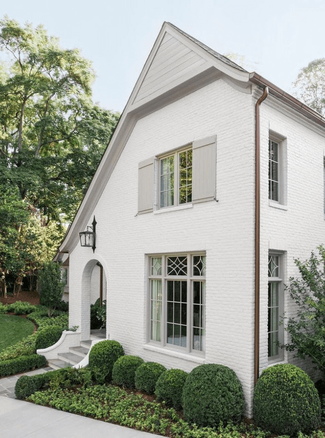
Use of Silver Satin for house exterior
The popularity of this shade extends to the house exterior. You can safely apply it to the walls. Although it is exceptionally light on the sample and seems even lighter under direct natural light, it does not lose its magic. It works particularly well on brick walls, revealing their texture in a new way, mostly applied to ultra-modern house exteriors. Still, the traditional approach feels no less appropriate.
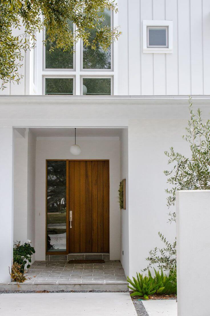
As for the front door, Silver Satin would work if combined with darker walls. If we speak about a light house exterior, this shade simply fades when applied in small amounts.
The Silver Satin OC-26 paint color from Benjamin Moore is a new find in interior and exterior design, bringing something new, unique, and fresh that adapts to each style and preference in part.
