Silvermist SW 7621
Sherwin-WilliamsA morning-fresh green-blue with foggy gray undertones that replaces the light neutrals with a deeper color meant to balance, calm, and connect.
Silvermist (SW 7621): What Color Is, Review, and Use
Welcome to another color review! This time we speak about Silvermist, a gorgeous cool blue with gray and green undertones that colorists from Sherwin-Williams definitely succeeded with. The name sounds pretty popular, yet the paint color is not that often used, or it hasn’t been till this moment, now that SW 7621 is part of the 2023 Colormix collection. Either way, there are plenty of reasons why Silvermist has great design potential. Discover them with us!
Silvermist Paint Color Features
There are colors, and there are blends of colors. Silvermist is surely a blend – blue, green, and gray. If gray was leading in the past, now the bright side of colors comes to designers’ attention. At Silvermist, gray patiently steps back and leaves the stage for green-blue. All in all, this paint color that has been at Sherwin-Williams for a long steals the show this season. All due to its nurturing, recharging, and calm features that connect with the pure nature of the mysterious mist above an undisturbed morning lake. People are looking for neutrals with more body that hide meaning and authenticity. Luckily, Silvermist is all this.
Not to mistake it with Silver Mist 1619 by Benjamin Moore, a pale blue, much lighter, and injected with a larger amount of gray undertones that hide behind the resulting mist effect.
Silvermist: Is It Warm or Cold?
This is the kind of mist you can witness on an early summer morning – the enigmatic and cool one. Have you noticed? Not cold. Speaking facts, Silvermist is truly a cool gray-green-blue. There. We said it. You probably can make it gravitate somewhat to the warm side with appropriate lighting, but this is a whole new story (discover it as follows).
How Does Lighting Affect Silvermist?
Under the effect of cool light in rooms with northern exposure, Silvermist may seem too cool, even cold. Therefore, designers don’t recommend using the cool neutral in a north-facing room. On the other side, the cool color gets balanced by the warm light in spaces with south-facing windows where Silvermist seems pleasantly soft, leaning pure green-blue. The same can be noticed in rooms with western exposure in the afternoon and rooms with eastern exposure in the morning.
As for artificial lighting, warmer light temperatures are suggested to preserve the balance and beauty of the refreshing green-blue during the night.
Silvermist LRV
If you are new here, the Light Reflectance Value determines how light or dark a color is based on its ability to reflect light, all this on a scale from 0 to 100, which is from true black to true white. Silvermist has an LRV of 47, distinguishing it as a middle-tone color, neither too light nor too dark.
Unlike other neutrals that bounce back a great amount of light, which makes them perfect as background colors, Silvermist requires more natural or artificial light to ensure a slightly similar effect indoors. Simultaneously, it isn’t intense enough to be used easily as an accent color. In a few words, it gravitates in between. Still, this is the new type of neutral, and it reads to the current trends.
Silvermist Undertones
We’ve already revealed them, yet for the record – Silvermist is part of the blue color family, prevailed by green undertones and balanced by a foggy gray trace.
Similar Colors
Neutral shades of blue are very popular with color brands, and the list of available shades goes beyond expectations, speaking about other manufacturers as well. Let’s discover the alternatives to the lovely gray-green-blue.
Coordinating Colors
When it comes to the paint colors to pair with Silvermist, you can opt for shades close to the green-blue with gray undertones for monochromatic design ideas or consider contrasts. Colorists say the cool blue works well with whites and off-whites, dark blues and grays, and our favorite – warm yellows and reds. Let’s see what the professionals from Sherwin-Williams have in store.
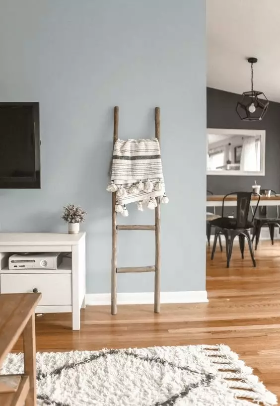
Use of Silvermist in the Interior
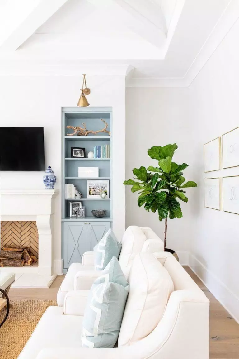
A crisp and invigorating blue like Silvermist is the best color for the Coastal style. Still, there are other fascinating design ideas that the new neutral would beautify. You should consider the calm and peaceful value of the green-blue that brings back harmony into our houses. Restore a balanced environment in your bedroom or breathe new air into your newly designed living room, all this with the delicate blue from Sherwin-Williams. What other design solutions are there?
Modern Farmhouse in Blue
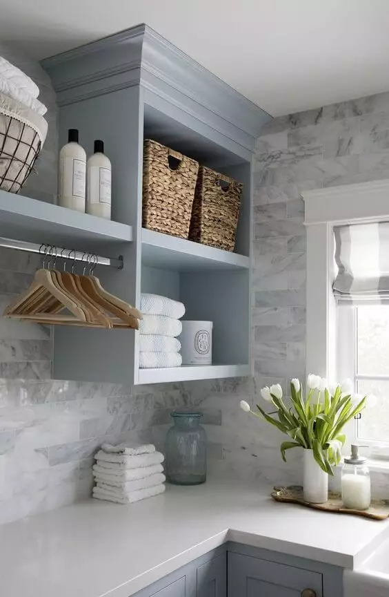
Give a refresh to your favorite Modern Farmhouse style with a blue background, replacing the usual white. Besides, Silvermist has its way with color when it comes to the natural shade of untreated wood surfaces and woven wicker baskets – the absolute must of Modern Farmhouse. Additionally, think of blending Farmhouse with Coastal, where the green-blue shade will come in handy.
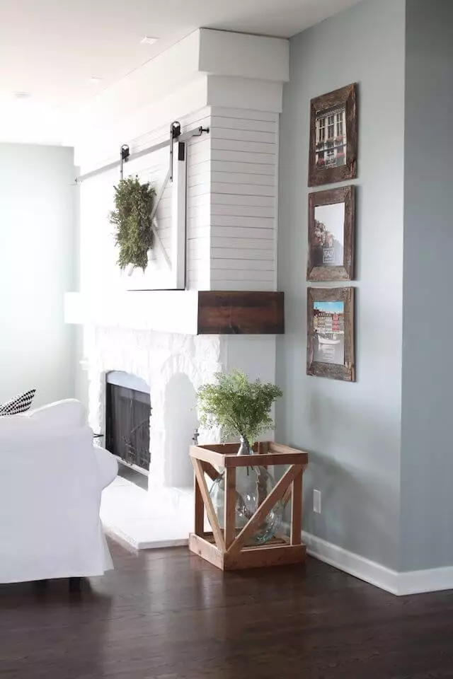
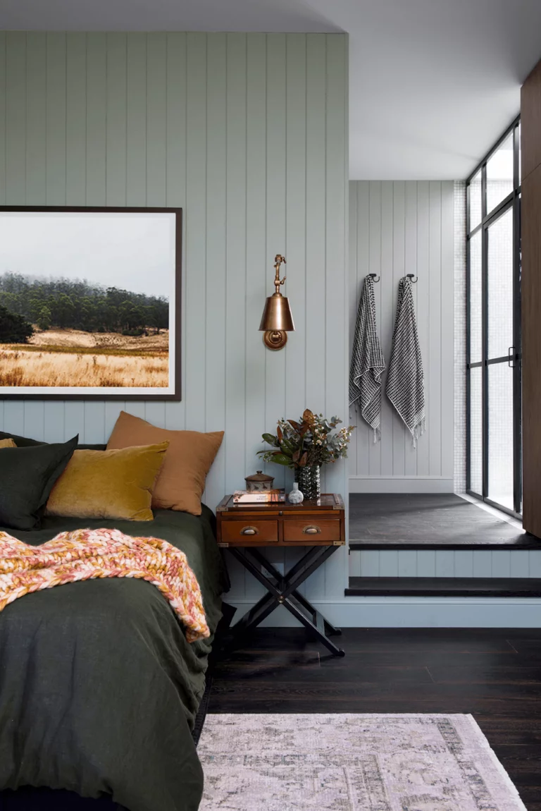
Rustic in Blue Mist
Referring to the serene forest landscapes invaded by mist, designers combined Silvermist and the Rustic style with raw textured flooring, furnishing, and accents. The soft blue shade calms down the imposing and rich-grained wood surfaces, rough metal details, and the overall unfinished-like effect. If you fancy a trendy spruce up, get the look and apply it even to a bedroom.
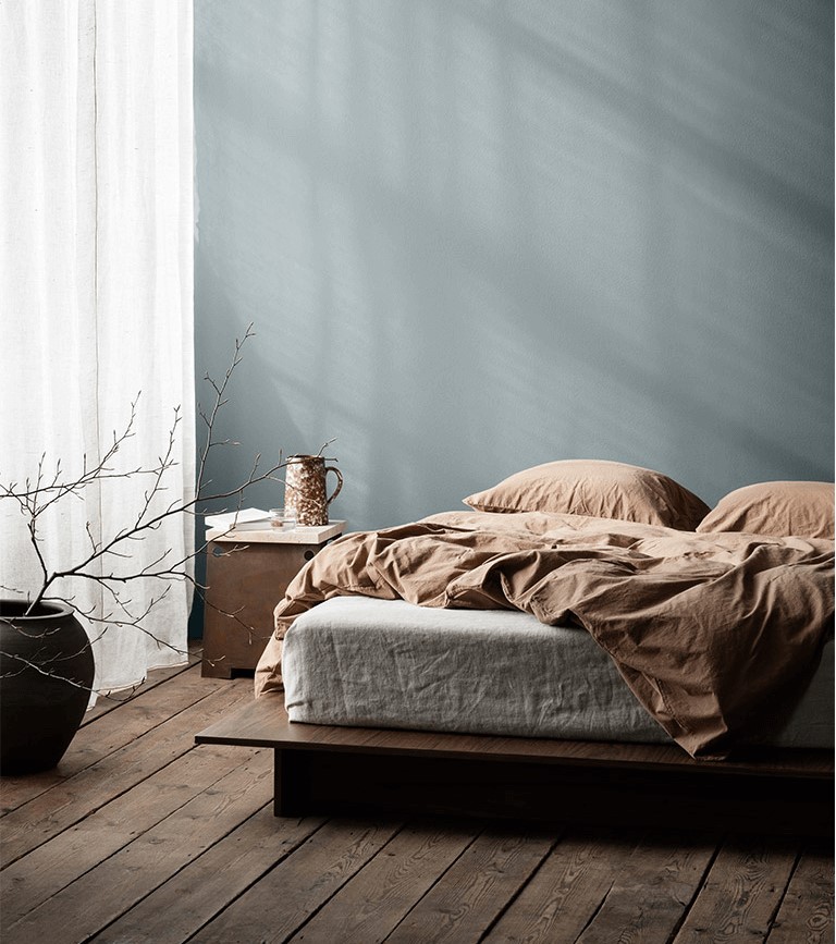
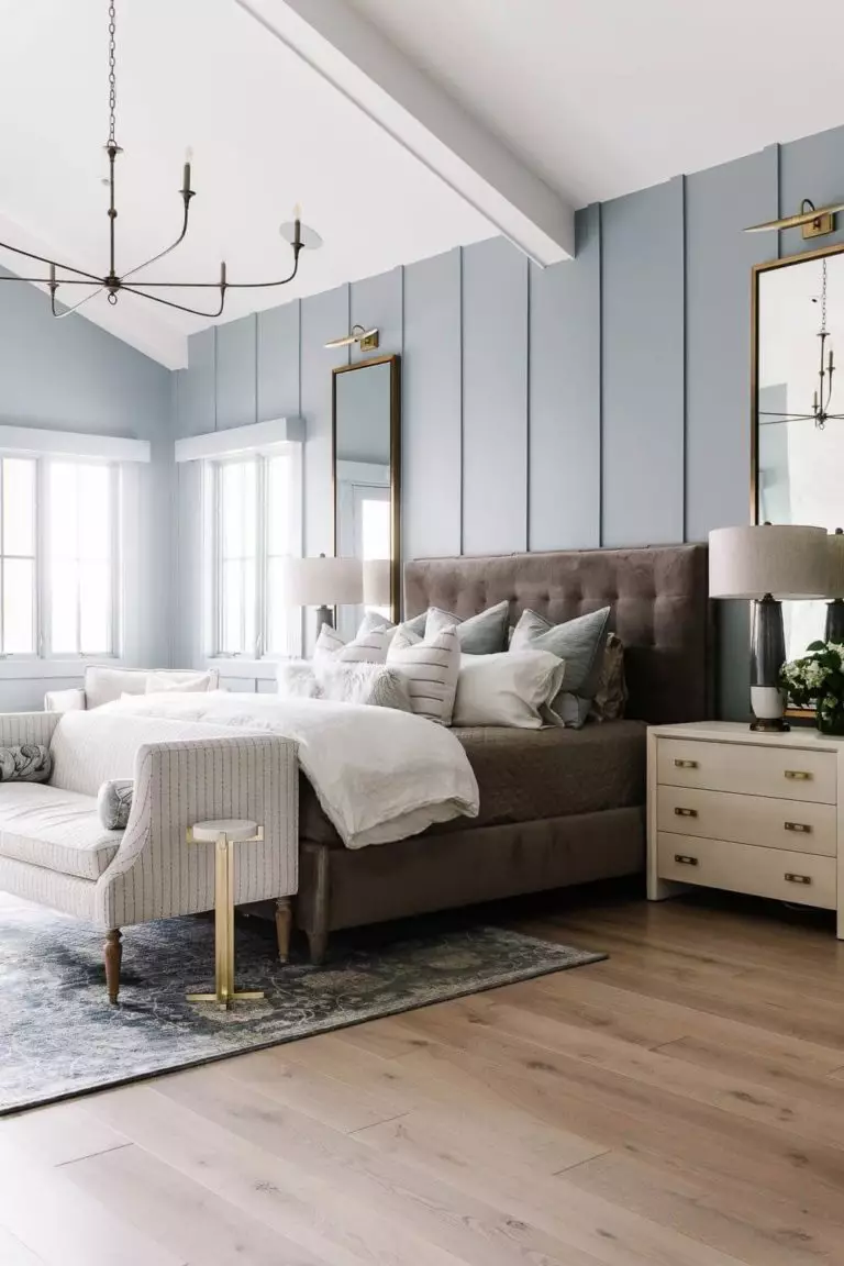
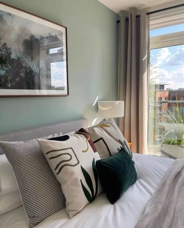
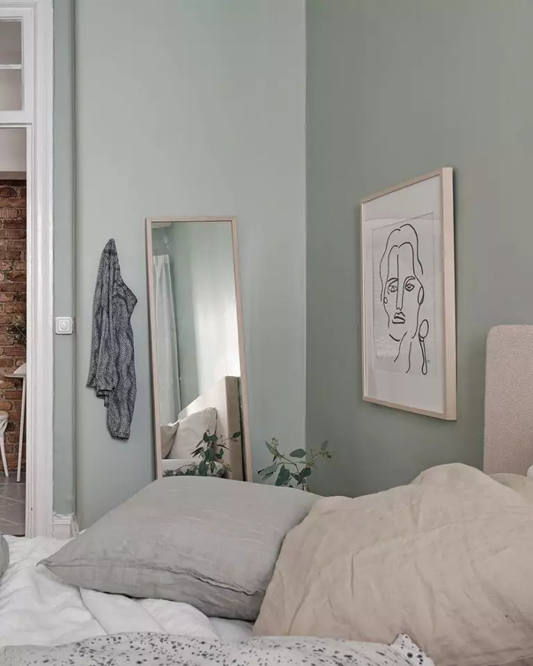
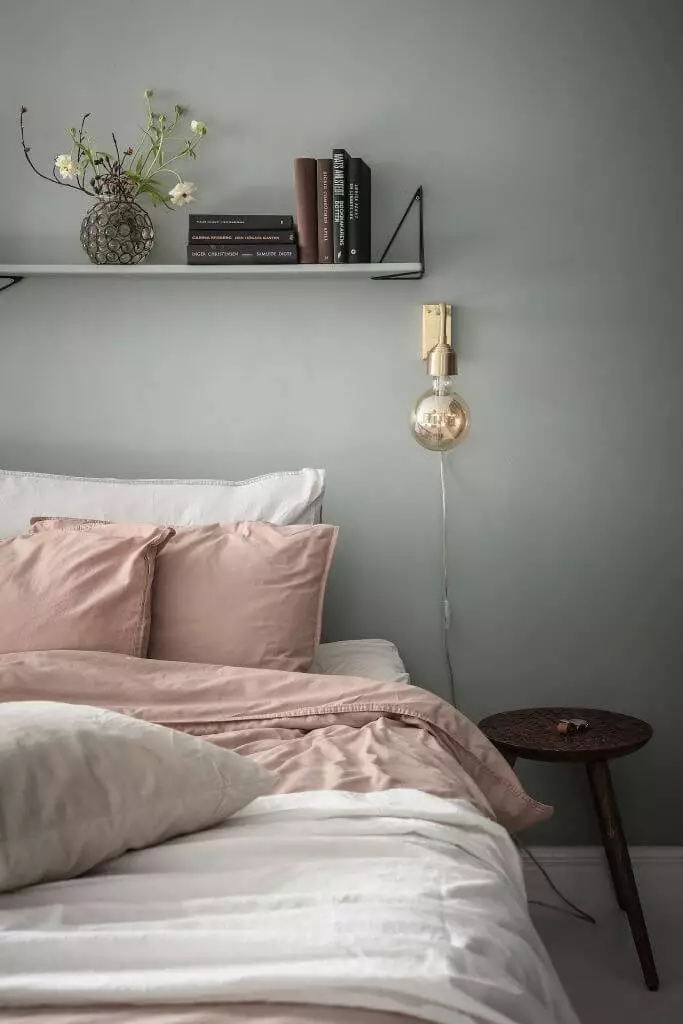
A Bedroom to Drift Away In
Unlike lighter neutrals, there is more depth to Silvermist, making it one of the best choices for ensuring an intimate ambiance, and no other room in the house works as perfectly for this purpose as the bedroom does. Avoid disturbing accent colors. Stick to light wood for the bed frame, bookcases, nightstands, and closets. Choose light shades for the bedding and other textiles. If you don’t mind an accent, consider earthy orange, yellow, or red shades for the throw blankets and cushions on the bed.
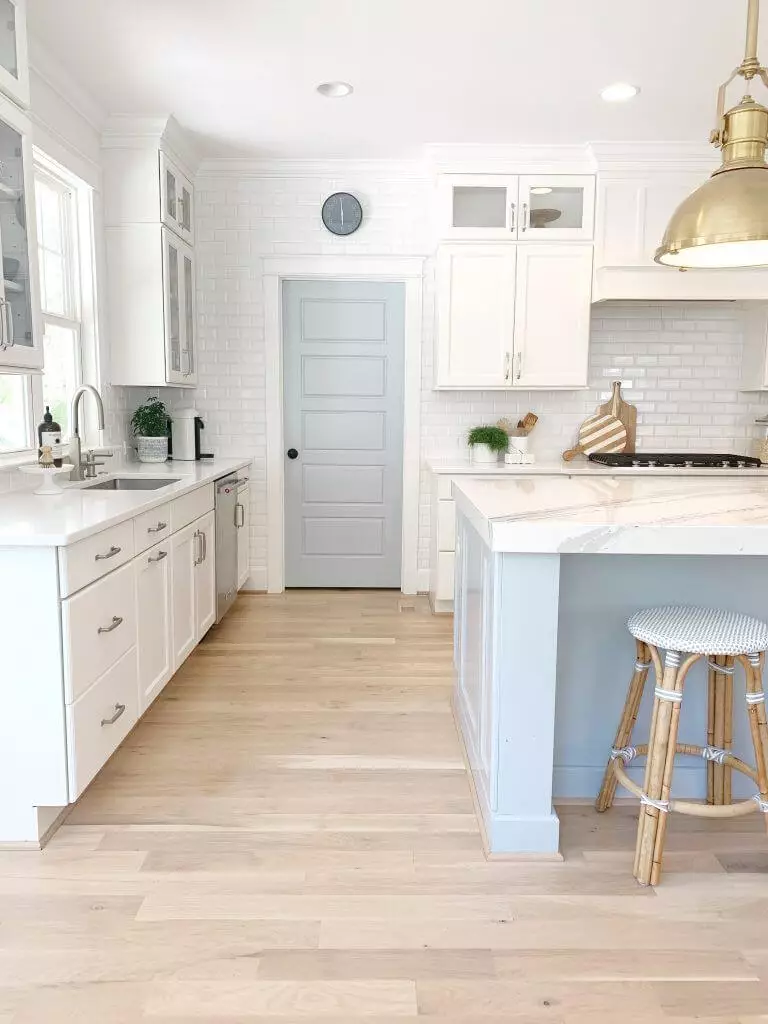
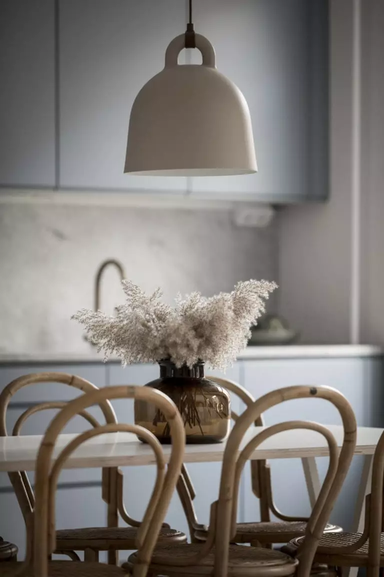
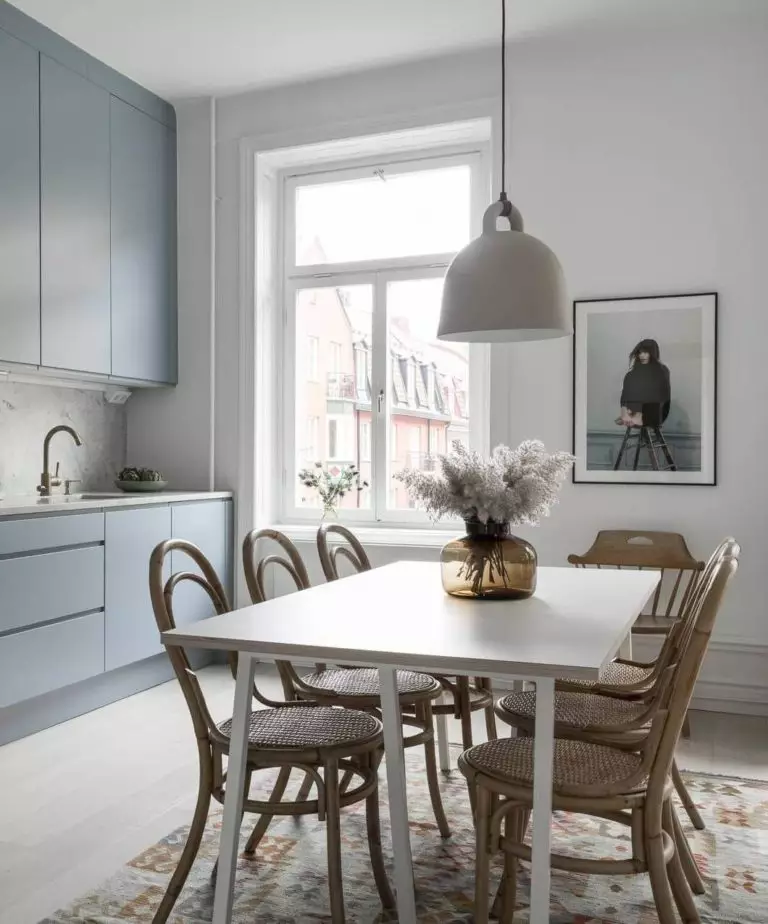
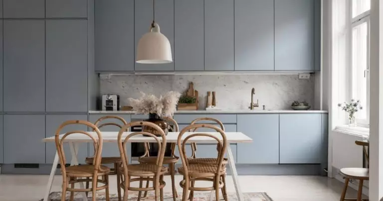
Foggy Blue in the Kitchen
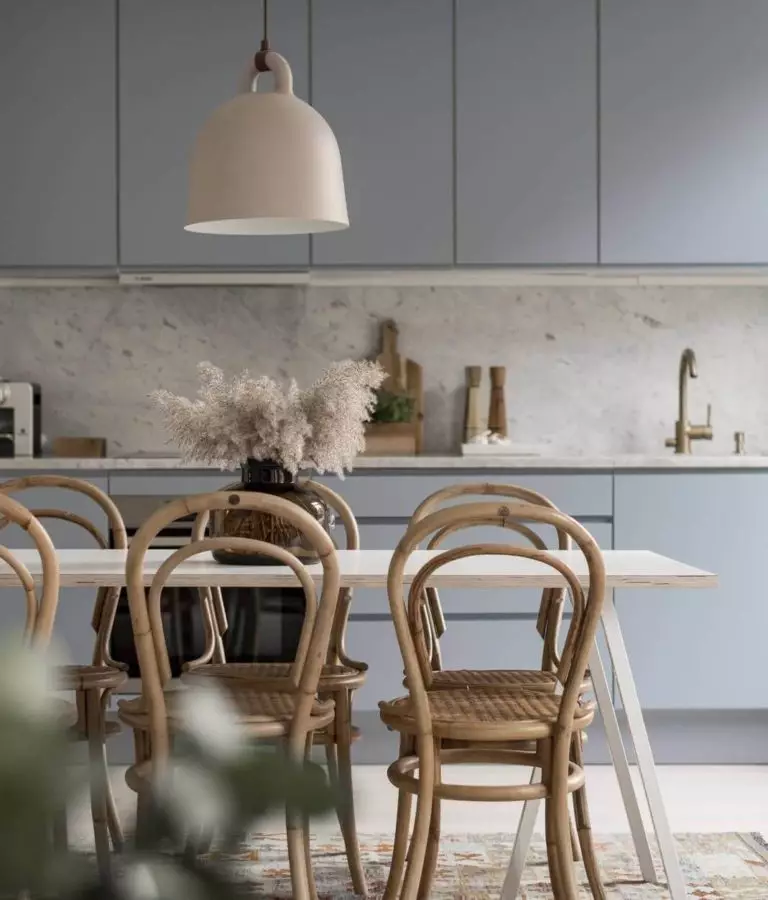
The silver green-blue is a great choice for the kitchen, particularly when combined with a white backsplash and countertop alongside naturally textured wood dining tables and chairs. Opt for a touch-to-open cabinet system to preserve the cooking space within contemporary limits. Overall, the white and green-blue combination results in an aesthetically appealing kitchen, where preparing the meals or having a late-night dinner feels like art.
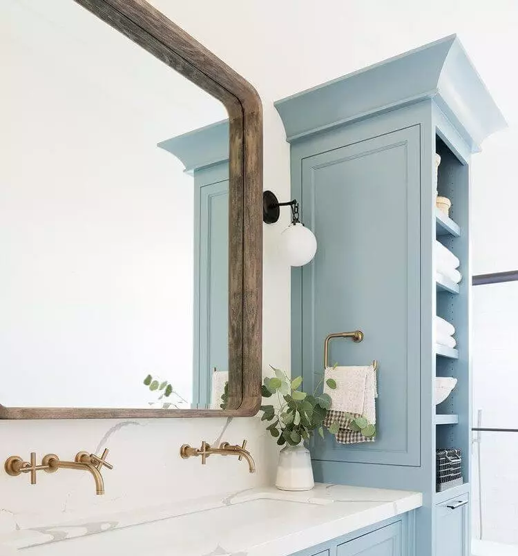
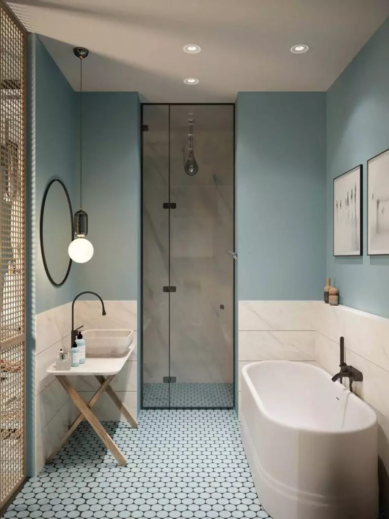
A New Neutral for the Bathroom
A paint color that has everything to resonate with water is the top choice for the bathroom. We like seeing green-blue on vanity cabinets and walls. As for the rest, stick to crisp white. Let the morning-fresh blue take over the color palette. Particularly trendy are now hanging light fixtures above the vanity area. Preference is given to bubble design and warm light, both acting as a balance for the formal and cool Silvermist.
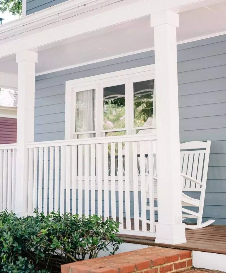
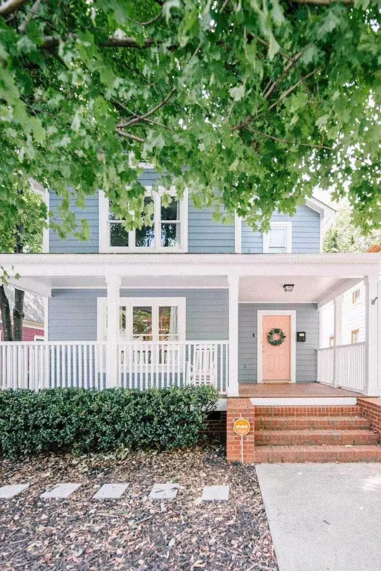
Use of Silvermist for the Exterior
This is the part when the intensity of the blue neutral pays off. If you want a neutral paint color for your house exterior that doesn’t fade in direct daylight, Silvermist is your no-fail solution. Designers love the combination of green-blue exterior walls and a bright-colored front door. The green undertones of the gentle blue shade connect with the outdoors and make the exterior design integrate better into the natural landscape.
The Silvermist SW 7621 paint color by Sherin-Williams is an emerging neutral blue that will soon replace the usual whites, grays, and beiges due to its unmatchable blend of deep blue, green, and gray.
