Smoky Blue SW 7604
Sherwin-WilliamsAlmost entering the category of dark colors, yet held back by the slight smoky effect, SW 7604 is unique of its kind, implying soothing and vibrating notes at the same time.
Smoky Blue (SW 7604): what color is, review, and use
Not far from the popular navy blue, consisting of trendy blue and gray shades and a real find for connoisseurs of intriguing colors, Smoky Blue SW 7604 from Sherwin-Williams is the new favorite among designers. The medium-to-dark shade of blue with a noticeable gray hint responsible for the foggy effect is an updated variation of navy for more of a soothing accent shade.
Regardless of its rather soft surface, we cannot call it calm, while the hidden bright notes are a source of dramatic scents. Still, this paint color is neutral – a single shade that looks in so many directions. What does its essence consist of, then? Keep on reading, and the answer will reveal itself!
Smoky Blue paint color features
Almost entering the category of dark colors, yet held back by the slight smoky effect, SW 7604 is unique of its kind, implying soothing and vibrating notes at the same time. It is all about balance, and the gray scents seem to manage it well. Experts suggest that Smoky Blue is perfect for those looking for a paint color to make a large space feel proportionate if used for the walls. Still, this fabulous blue is no less an accent that would impressively fit any space. The hidden bright blue notes bring a bit of drama, while the subtle gray tone keeps it balanced yet not devoid of intrigue.
Smoky Blue: is it warm or cold?
Usually, colors of this kind are regarded as cold. Still, the astonishing pairing between blue and gray serves as a base for a cool paint color that does not radiate any warm notes but cannot be called entirely cold either. This shade feels particularly refreshing, balanced, and inspiring in full daylight.
How does lighting affect Smoky Blue?
Not to our surprise, lighting always plays the last violin. As usual, we refer to the compass direction of the space. Therefore, Smoky Blue feels exceptionally crispy when the north exposure interacts with its blue surface, which is partially true about east-facing spaces when the sun finds itself on the other side. SW 7604 acquires a slightly warmer appearance when bathed in the sun rays in rooms with south and west exposure. As for artificial lighting, you can always reach the result you want by playing with its undertones.
Smoky Blue LRV
If you are acquainted with this term, you probably know that the lower the Light Reflectance Value, the darker the color is. In this case, we have an LRV of 15, which makes Smoky Blue almost part of the dark group. In plain words, SW 7604 is a relatively dark paint color that reflects little to no light at all. It requires large amounts of light to reveal its inner beauty in the way it appears on the sample unless a very dark blue shade would not risk the overall look of your interior.
Smoky Blue undertones
The name itself points to the gray undertones that penetrate the surface of this color, which not only balance the bright blue base but also offer it a foggy effect. At some point, one may think that this is an equal combination of blue and gray. Still, it is the blue base that is diluted with a few gray particles for a redefined blue-gray variation.
Similar colors
A bit darker or lighter, there are quite a few paint colors that resonate with the hidden essence of Smoky Blue. The difference consists of the combination between blue and gray that may show a particular prevalence of one or another. Let’s go beyond the limits, and discover the alternatives from other color brands as well!
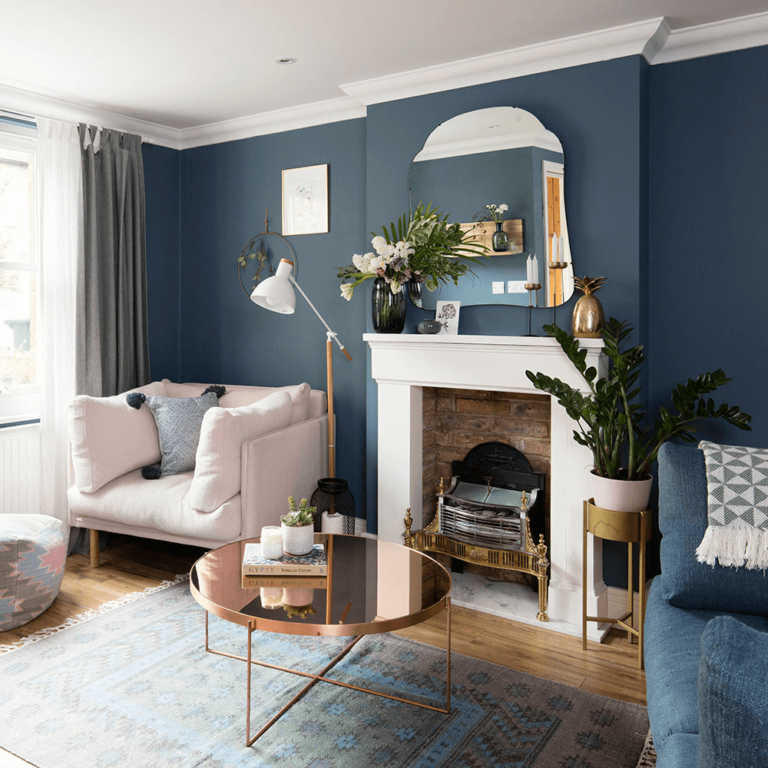
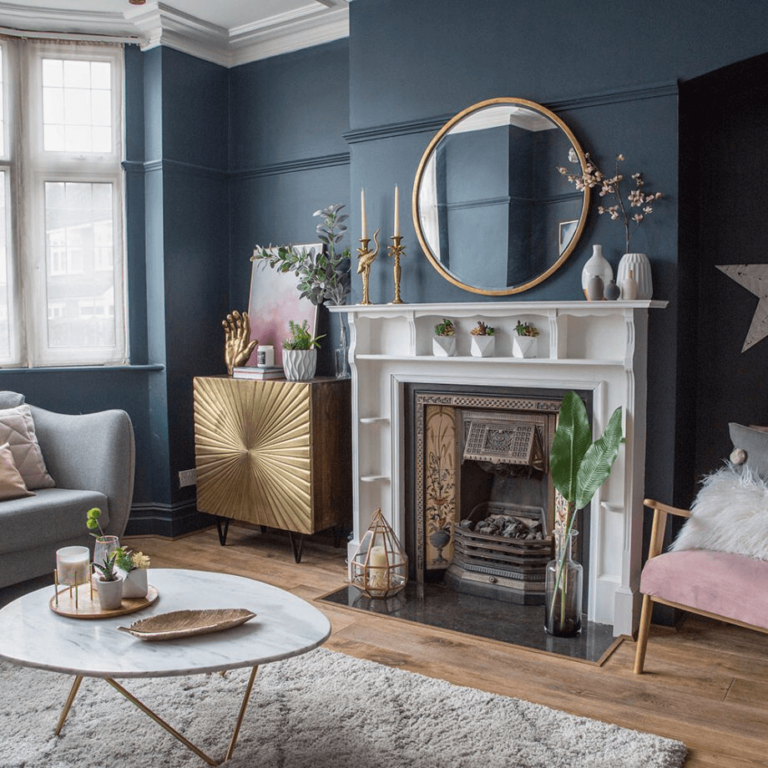
Coordinating colors
Generally speaking, this paint color works perfectly with light blues, cool shades of gray and white, and vibrant variations of mustard, pink, or bronze. It all depends on what vibe you are looking for within your interior or exterior. You can go for a monochromatic palette to suit contemporary minimalist or coastal settings or choose a contrastive pairing for Smoky Blue for a bold statement. Let’s go through a few representatives!
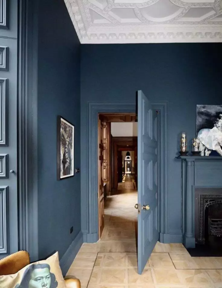
Use of Smoky Blue in interior
Smoky Blue serves as a perfect alternative for the popular navy shades, bringing more of an airy feel due to its soothing base. You can safely use this paint color to paint all walls in a large space for an intriguing environment or go with accents for a contrastive pairing not devoid of balance. The soothing blue from SW works for any room. As regards the rest, it depends on what mood you want to set. Let’s go through a few prominent design solutions involving this color and see how it works within the interior!
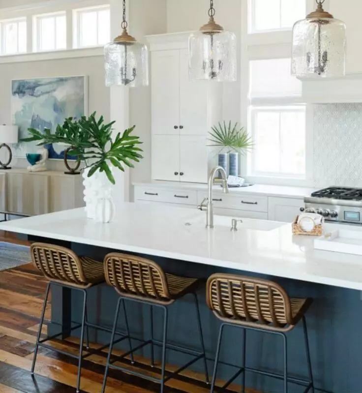
Coastal fairytale
Update your Coastal interior with a new approach to navy blue. SW’s rather foggy shade of navy will take any space to the next level. Consider it for an accent wall, the kitchen island, or cabinets in the bathroom. Combine this beautiful shade with crispy white, light blue, gray, and natural texture, such as light wood or rattan, decorative baskets, or any other unit of the kind to remind you of the pleasant coastal life. Keep it simple, rely on a relatively monochromatic pallet, and enjoy the magic Smoky Blue is playing on the interior.
A new color for a new Scandi
We are used to neutral walls within Scandi interiors. What if we opted for a new Scandi with rather neutral yet slightly vibrant walls? Smoky Blue feels like the go-to paint color – relatively neutral for a perfect background and slightly bold for a unique effect that you would have never expected to see within a Scandinavian interior. Go on with natural wood, comfy textiles, and a contrastive pairing with white to balance the environment. Don’t forget the functional arrangement and fewer decor units to embrace the essence of this style.
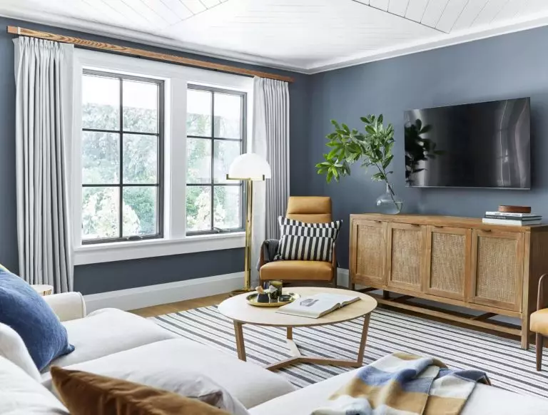
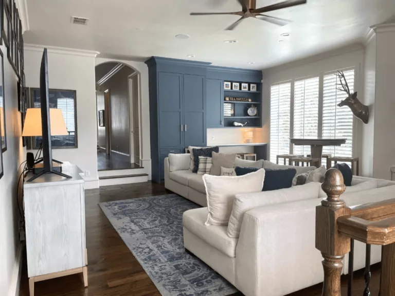
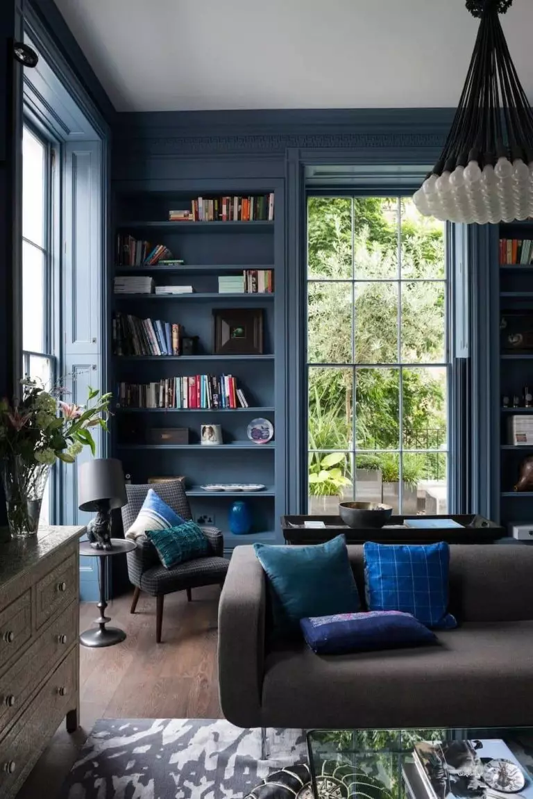
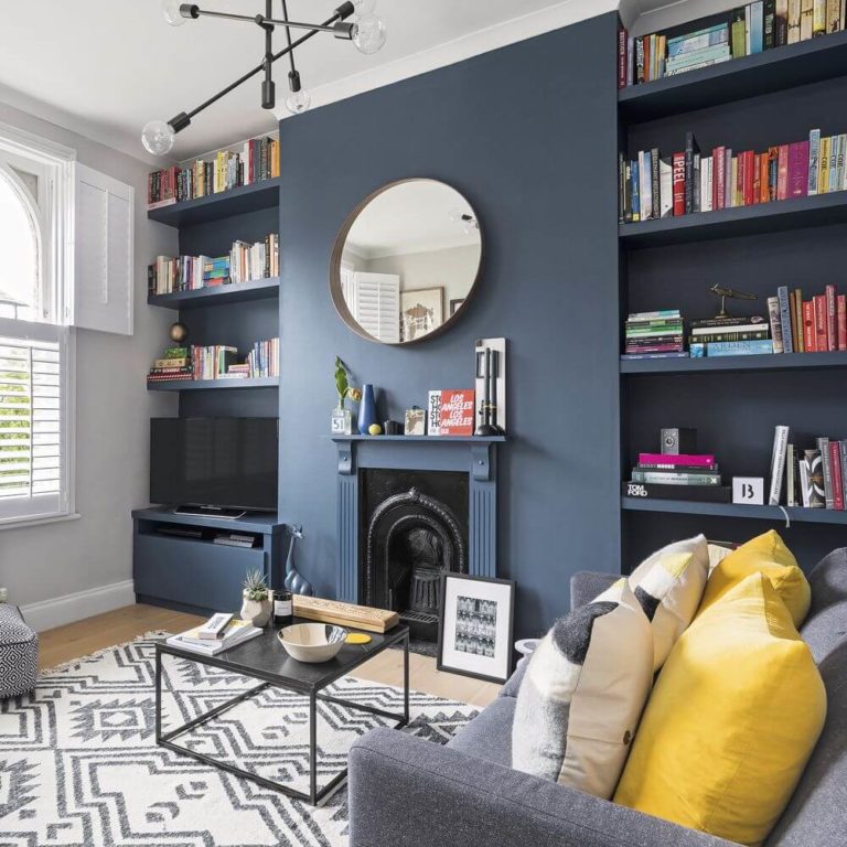
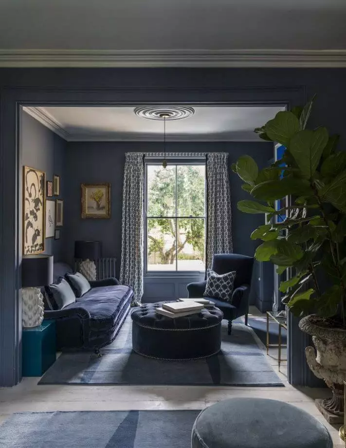
Living room
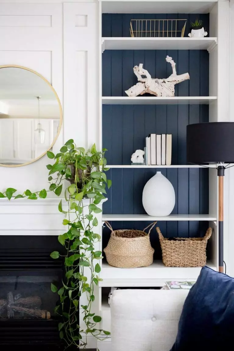
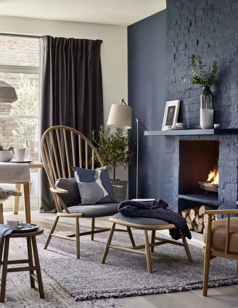
SW 7604 is a no-fail paint color for all walls for a serene environment that you will not get tired of admiring. Particularly if we speak about northern exposure, which will make this color show its crispy surface and fill the space with intrigue. One can also consider it for a built-in bookshelf, an accent wall, or go entirely with this paint color, covering the interior door as well. The favorite companions are white and brown for a stately environment, which perfectly works for Traditional, Modern, and Transitional.
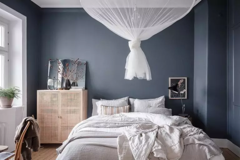
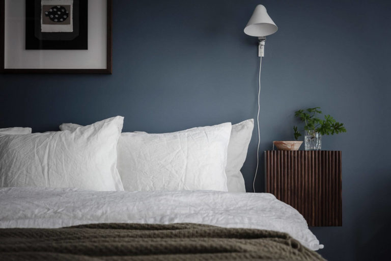
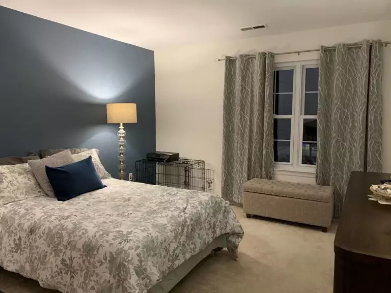
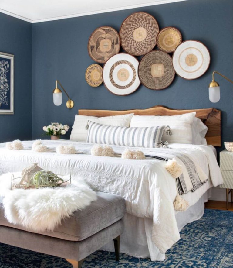
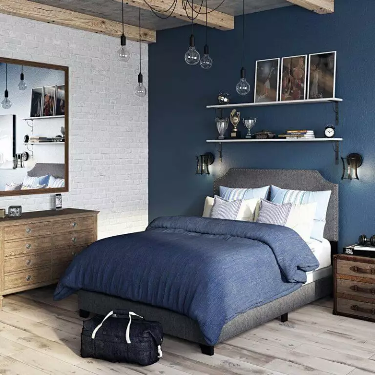
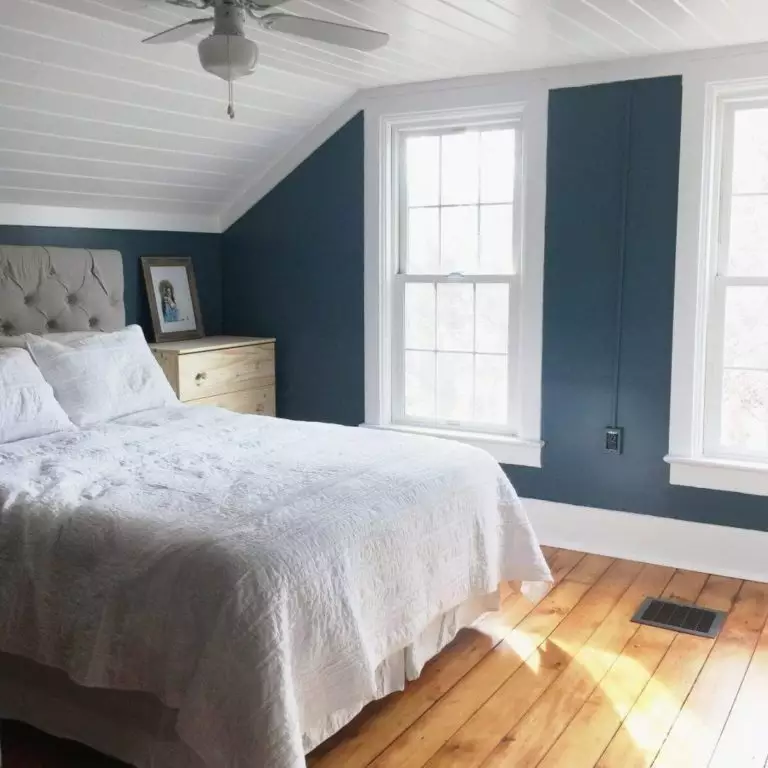
Bedroom
Smoky Blue is quite imposing, particularly for a space like this. Still, the amateurs of serene and dramatic interiors will find an escape in this paint color. To fully embrace these features, paint the walls entirely in this shade or opt for an accent for a less emphasized effect. Combine this soothing blue with light colors to balance the contrast, such as white or beige for the bedding and curtains. Regardless of how draining it appears to be, Smoky Blue reveals its entire range of soothing notes when applied to spaces that require calmness and peace.
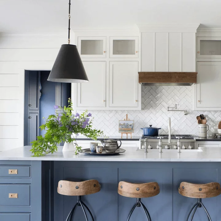
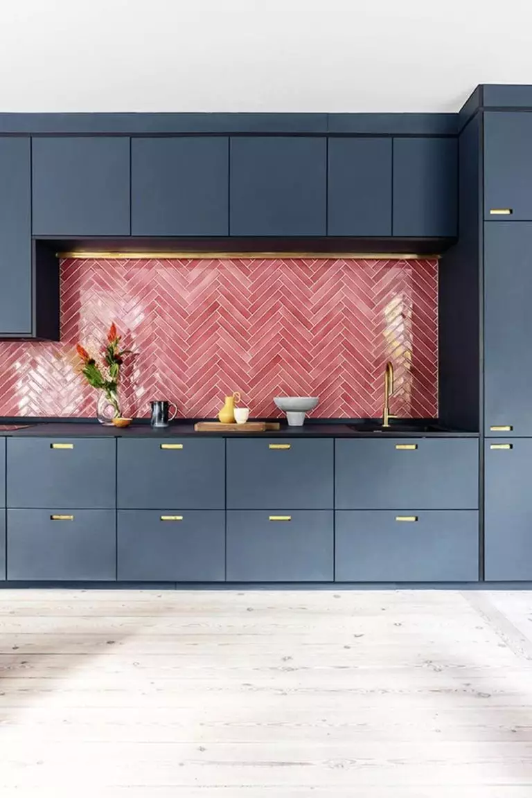
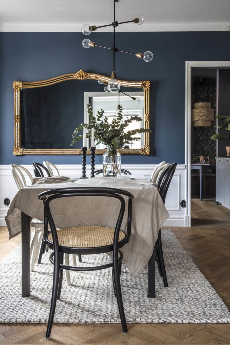
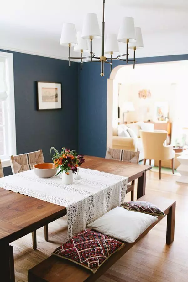
Kitchen and dining room
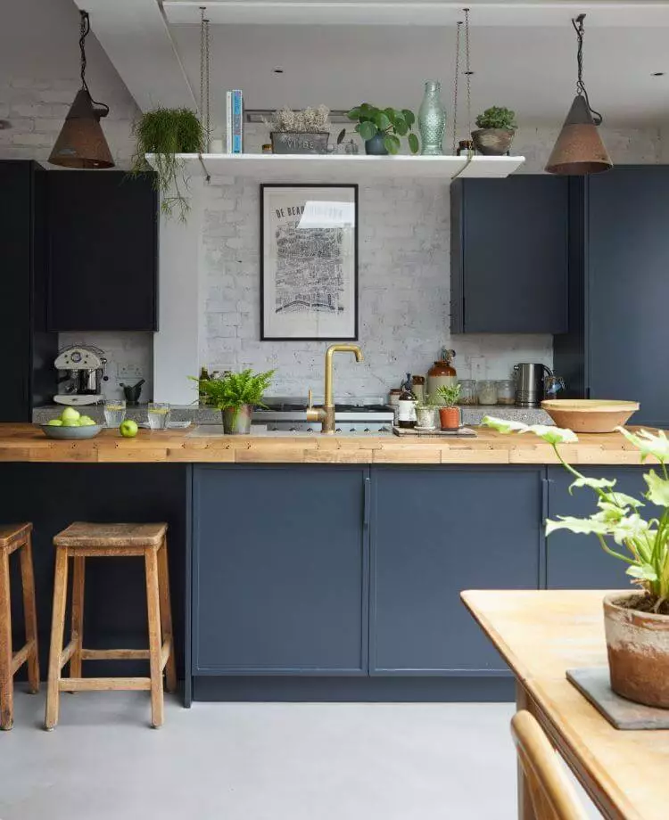
Smoky Blue is a real find for kitchen cabinets. Consider this fantastic blue for lower and upper cabinets combined with a standout backsplash, such as sparkling silver or vibrant pink. No less impressively, SW 7604 works with white upper cabinets. Opt for wood or brass details to add uniqueness. Either way, all the mentioned approaches are perfect for redefining a vintage or traditional kitchen.
As for the dining space, go with Smoky Blue for the walls. Pair it with elements of any style that feels close to you. Pay attention to wood, one of the all-time favorites of dark blue.
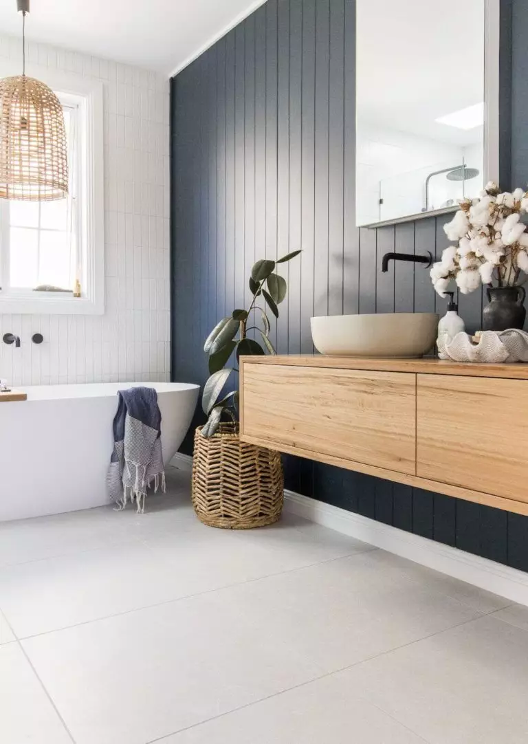
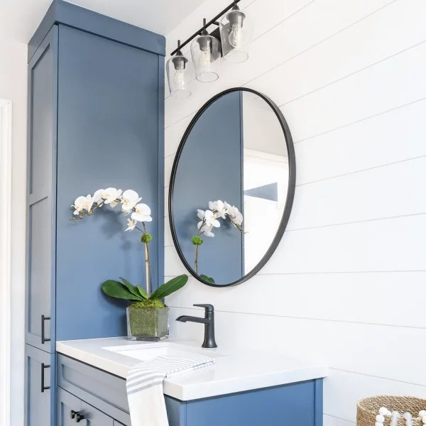
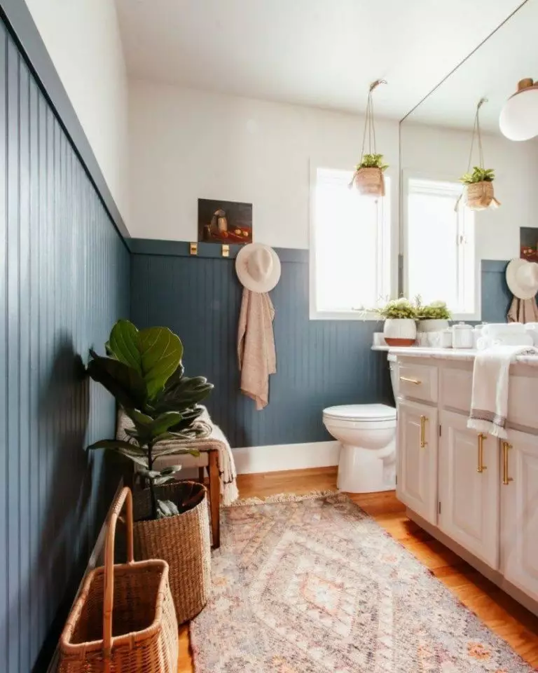
Bathroom
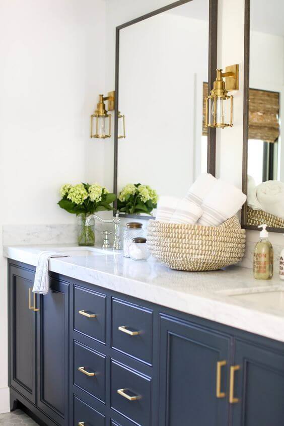
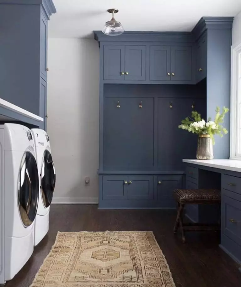
Blue has always been a go-to color in the bathroom. It gets better when we speak about a dark shade of soothing blue. You cannot go wrong with SW 7604 in this space. Furthermore, you can paint the cabinets or the wall paneling in this shade combined with white and a few black or brass elements to complete the style. In the same context, we want to draw your attention to the laundry room that would benefit from cabinets painted in dark blue, although an appropriate amount of light is required.
Use of Smoky Blue for house exterior
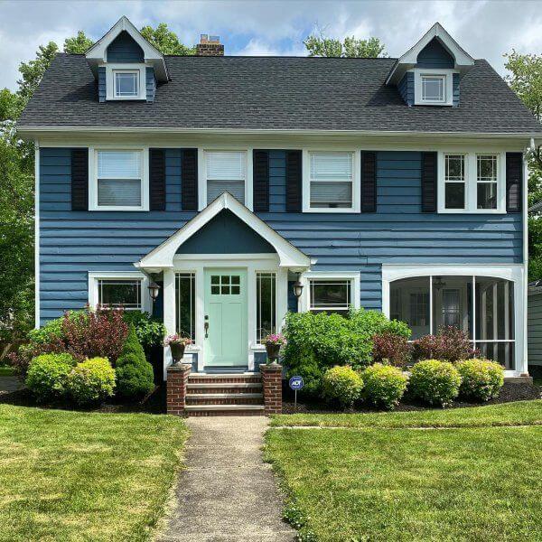
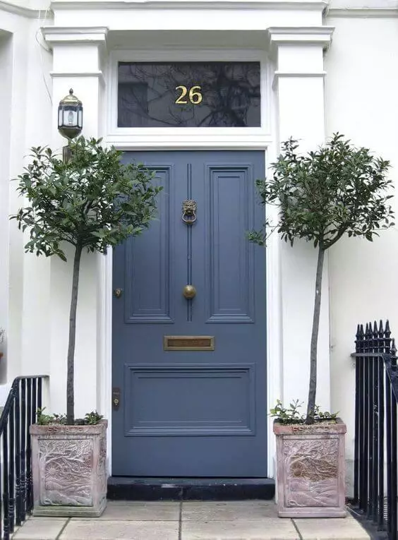
Although it appears much lighter in full daylight, Smoky Blue is the definition of a stately house when applied to the exterior. Add white for the trim, black for the shutters, gray for the roof, and your house exterior will sparkle in a way you have never seen before. It is all about the confidence this color bears and reflects when paired with appropriate shades. You can safely opt for a front door painted this way on a light background. It all depends on the weather – on a sunny day, Smoky Blue acquires a pleasant light blue appearance, while a cloudy sky will reveal its true gray-blue nature.
The Smoky Blue SW 7604 paint color from Sherwin-Williams is the perfect alternative for navy blue lovers who fancy a more neutral shade. There is no need to tackle its relevance within contemporary interiors, which is self-explanatory. At the same time, its wide range of possible color matches is just another reason to use this paint color for your interior or exterior confidently.
