Snowbound SW 7004
Sherwin-WilliamsA neutral shade of white, definitely crisp yet not cold, and not devoid of a warm note as well. It seems that it has a bit from each group but not too much from everything.
Snowbound (SW 7004): what color is, review, and use
White shades proved to be perfect options for contemporary settings due to their neutral appearance and light notes that refresh the environment yet serve as a no less perfect background for accents. We have spoken about warm shades, cold variations, and the ones that find themselves between the two extremities. The star of this article belongs to neither of these categories, all due to the complex science behind its appearance. The Snowbound SW 7004 paint color from Sherwin-Williams is a neutral shade of white, definitely crisp yet not cold, and not devoid of a warm note as well. It seems that it has a bit from each group but not too much from everything. As sophisticated as it is, Snowbound is a popular white applied intensely within interiors and exteriors.
As the name implies, SW 7004 looks like freshly fallen snow – crispy, refreshing yet soft, and mesmerizing. This snowy shade is part of the following collections: Minimalist, Living Well – Reflect, Timeless White, Finest Whites, Pottery Barn – Fall/Winter 2021, and Top 50 Colors, which are a reliable reason to believe that Snowbound is indeed a special paint color. Let’s discover what stands behind its uniqueness!
Snowbound paint color features
This crispy white from Sherwin-Williams may seem a true white on the sample, but as soon as you apply it on the walls, you can notice its belonging to off-whites. There is a strongly perceived note of gray responsible for the rather coolish effect. This shade is also not devoid of a beige undertone, visible in particular conditions, although responsible for the soft appearance of this color that is always noticeable. That’s not all! Some regard this shade as a light pastel gray or a mix of gray and beige, and all considered when Snowbound is not that far from true whites. Let’s make it clear! It may seem devoid of undertones on the sample, but once compared with actual true whites, one can notice the gray and beige undertones that penetrate the surface. As regards its appearance as a gray or greige, which is gray merged with beige, it depends on the space and lighting conditions. This is why you should consider all factors that could possibly influence this color before integrating it into your interior or exterior. It is quite a description for a neutral shade. Just imagine the mix of invigoration, softness, ease, restoration, calmness this color interprets, and the list can go on and on since this shade can take on different looks.
Snowbound: is it warm or cold?
As regards this aspect, Snowbound is impartial as well. The gray scents ensure the crispy effect, while the beige notes offer a pleasant soft effect. Therefore, this shade is neither warm nor cold. Furthermore, it is not even a balance between the extremities. In different conditions, it feels one way or another. However, we have to make a statement in this sense. Well, in ideal conditions, Snowbound seems like a neutral shade, which certainly has a crispy base, although not cool enough to call it cold, with a slight hint of softness.
How does lighting affect Snowbound?
You have probably noticed that lighting is an important factor to consider, particularly for such shades as Snowbound. Let’s discover its effect on this color! In full daylight, this hue reveals its entire range of undertones. Still, it may seem a rather cool gray in the north-facing rooms, slightly muted but not devoid of its neutral base. The scenario changes entirely in rooms with south, west, and east-facing windows penetrated by a larger amount of light. In this case, this shade appears rather warm, with beige particles revealing themselves, particularly in south-facing rooms. Generally, it feels crispy yet not devoid of a slightly warm scent. All this points to what undertones you should choose for artificial lighting to achieve a particular result.
Snowbound LRV
Snowbound has an LRV (Light Reflectance Value) of 83. The higher the LRV, the larger the amount of light reflected by a particular shade, which determines how light or dark a color is. It is clear that SW 7004 is a very light shade, slightly muted by the greige notes, still not devoid of its ability to impressively brighten up the room and make it look spacious. One should also note that Snowbound tends to reflect the neighboring colors, which means it is unpredictable and can take on different looks.
Snowbound undertones
It is clear this far that Snowbound has a clearly perceived gray hint and subtle beige notes responsible for the general appearance. Still, this color reveals other undertones under the influence of particular factors. In south-facing rooms, where a large amount of light with warm undertones penetrates the space, this shade brings rather purple or pink notes to the surface, but, again, it also depends on the neighboring colors.
Similar colors
The list of white shades that comprise a large range of undertones, among which gray and beige, is wide enough to find at least a few colors similar to Snowbound. As usual, they are all unique, although some of them seem so identical that you can hardly notice any difference. This is why we compiled a list of the most prominent shades in this sense that includes colors both from Sherwin-Williams and other manufacturers. Let’s discover them little by little!
Coordinating colors
Considering that Snowbound can be used as an accent and backdrop, the range of coordinating colors is quite wide, including shades from various categories. If you want to emphasize the soft feature of SW 7004, you should pair it with a clearer shade of white. At the same time, it goes harmoniously with other gray variations and serves as a perfect background for accents, where you have greater freedom of choice. Experts suggest pairing this crispy white with darker blue, green, and even black shades. Let’s get more specific!
Use of Snowbound in interior
Such a neutral color is surely the perfect match for bold accents, serving as an outstanding background. Still, one cannot help but admire how stylish the trim, cabinetry, or interior door looks painted in this shade on a cooler backdrop. Snowbound is versatile, which stands behind its impressive ability to adapt to any situation, although always staying true to its nature. It is a crisp white that adds a slight hint of softness to the overly simplified contemporary settings and a breath of fresh air to the most elegant styles. We would like to offer you a clear perspective on how this shade works within the interior with a range of design solutions.
Scandinavian aesthetics
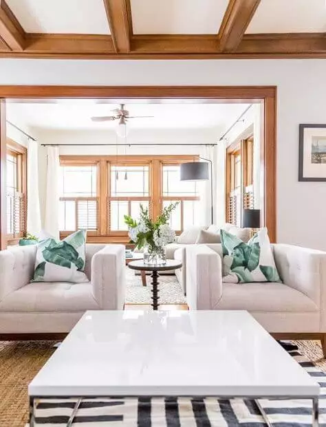
We have written in our articles that the latest trends tend to soften the rather cool Scandi style by opting for warmer alternatives to the cold gray walls, which reduces a bit from the true northern environment. This is not the case with Snowbound, which offers a slight hint of softness, although staying true to its cool nature, which is more than welcome within Scandinavian settings. Accompany it with the elements peculiar to this style, such as a rather neutral palette, functional arrangement, and cozy textiles to fully embrace the Scandinavian tradition, without forgetting the natural wood texture for an aesthetic result.
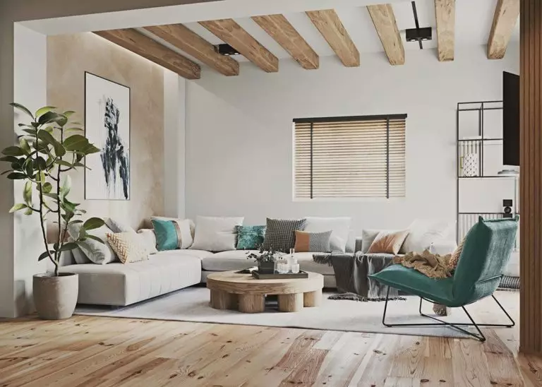
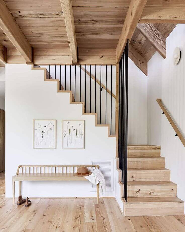
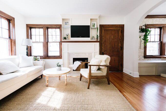
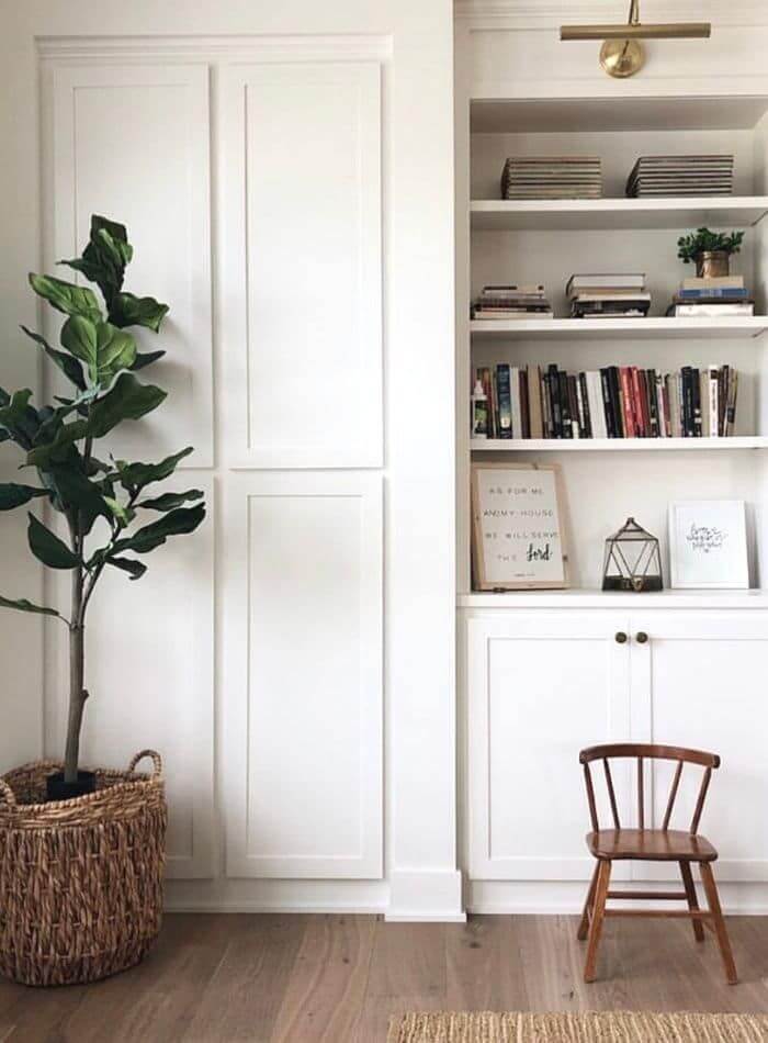
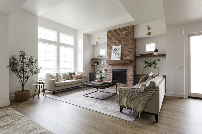
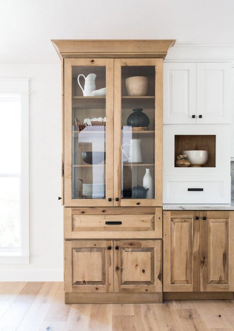
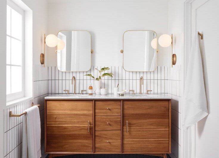
White crisp and wood texture
The pairing between white and wood is timeless, and so can be your interior with an appropriate approach to this combination. Consider Snowbound for the walls and set clear boundaries with wooden trim, cabinetry, interior door, floor, or any piece of furniture. Such a mix of cool notes and cozy texture would perfectly harmonize within a Farmhouse, Rustic, and the same Scandi interior. It is all about the balance – notes of warmth from the wood and crispy scents from the walls painted in this fabulous shade of white. Furthermore, you can change the mood entirely and adapt it to your style by opting for either light or dark wood.
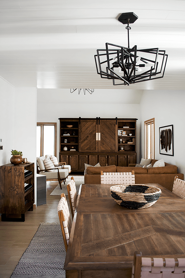
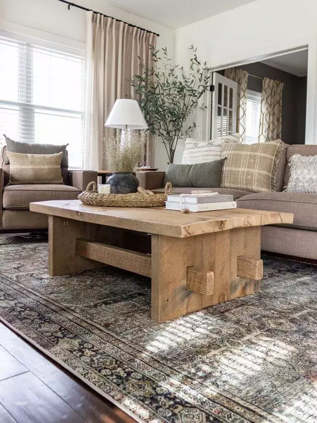
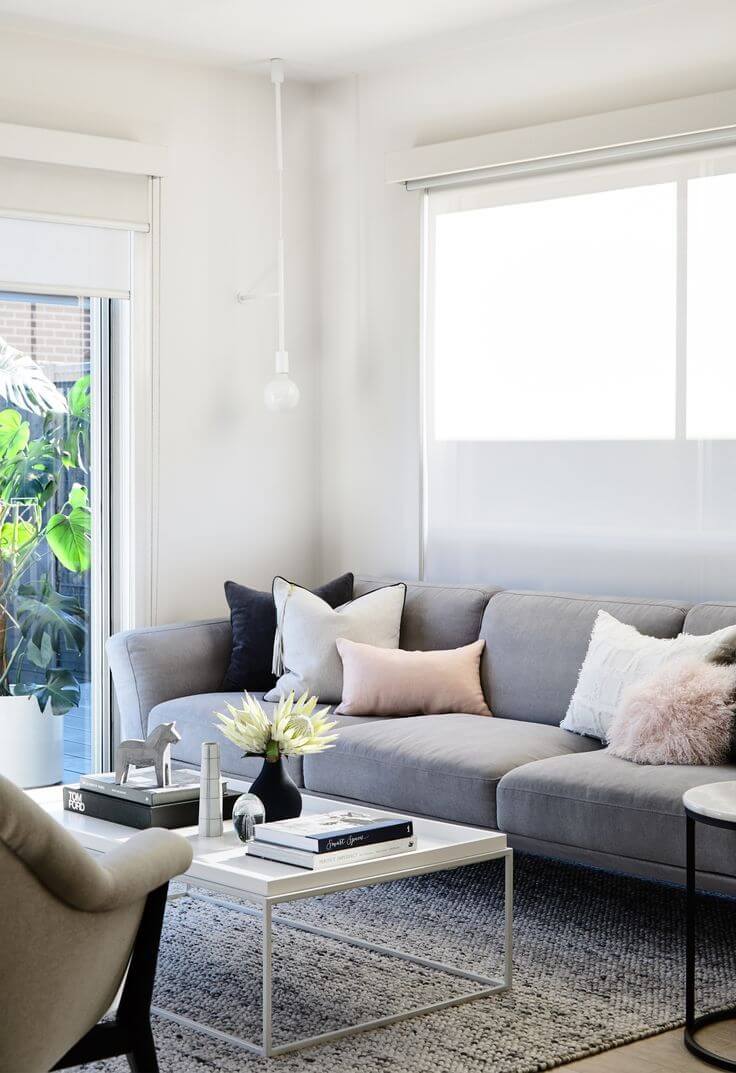
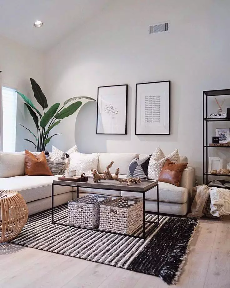
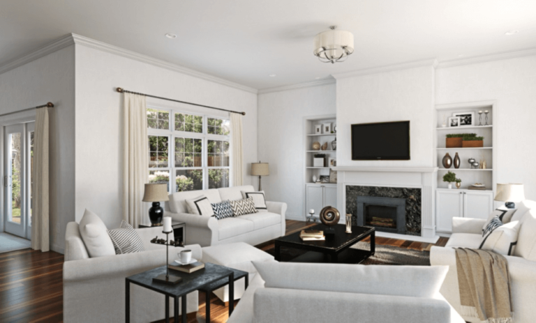
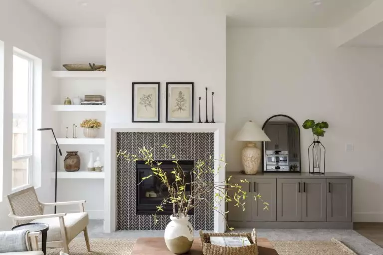
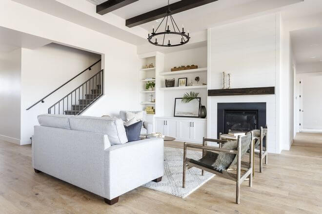
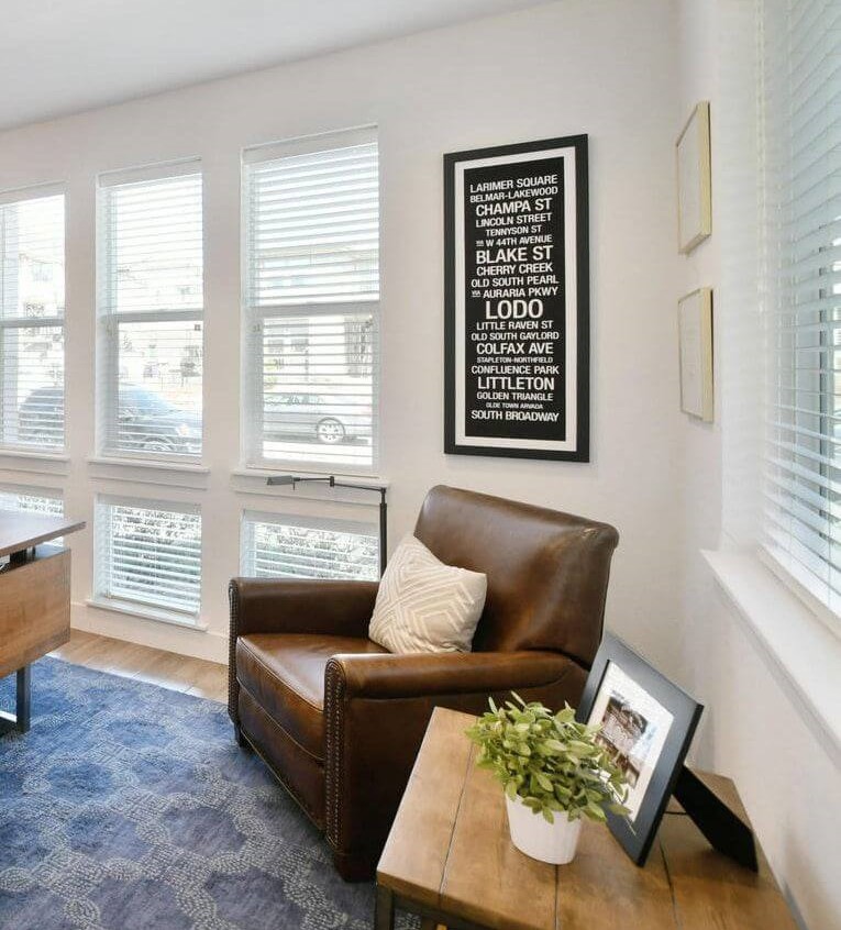
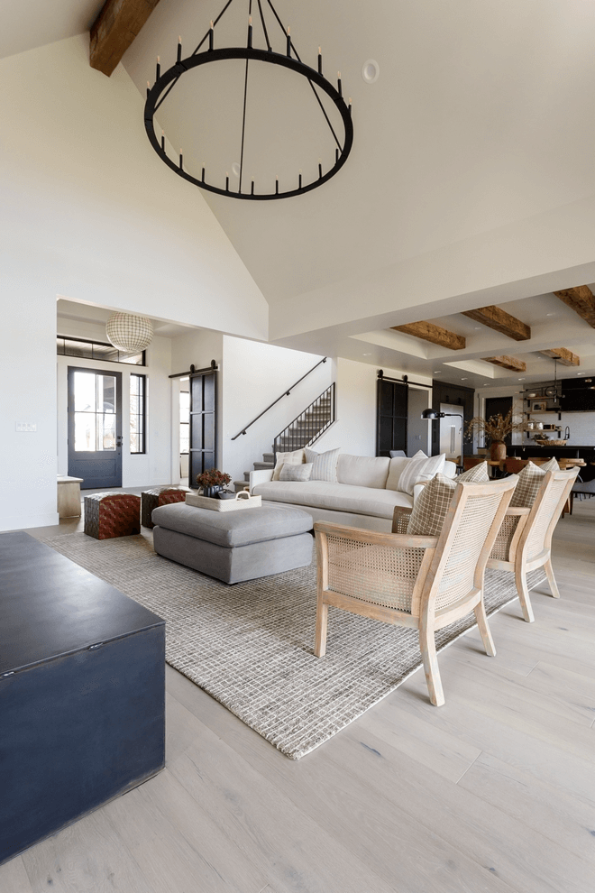
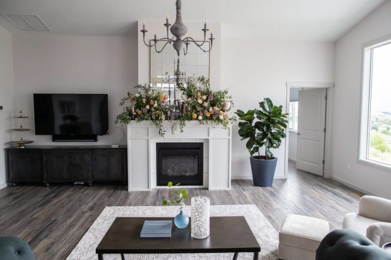
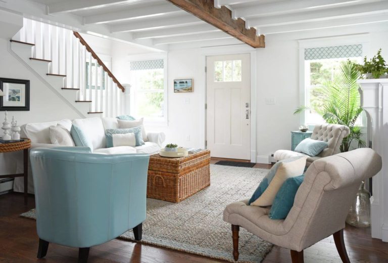
Living room
This versatile shade will adapt to any style and enrich your living with a soft touch of freshness. Do you think about the Modern Farmhouse with an abundance of wood, a minimalist setting with a monochromatic palette, or an eclectic mix of accents? Snowbound will go in harmony with any option due to its ability to reflect the neighboring colors and provide a contrastive background for accents. Additionally, any of these design solutions would benefit from a splash of greenery with a few indoor plants to complete the minimalist settings especially.
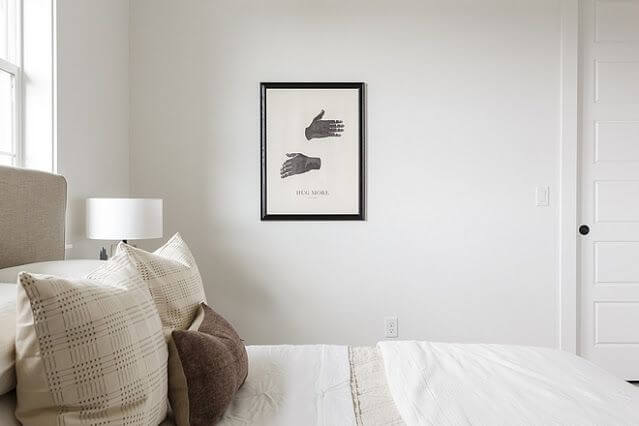
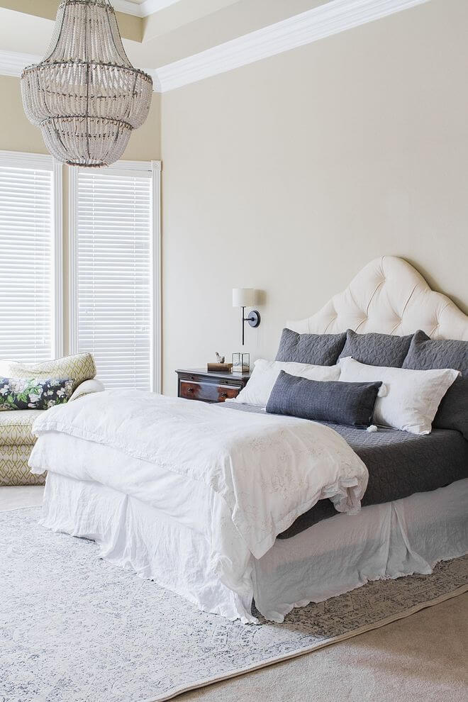
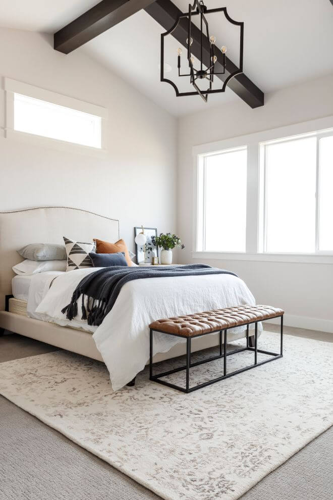
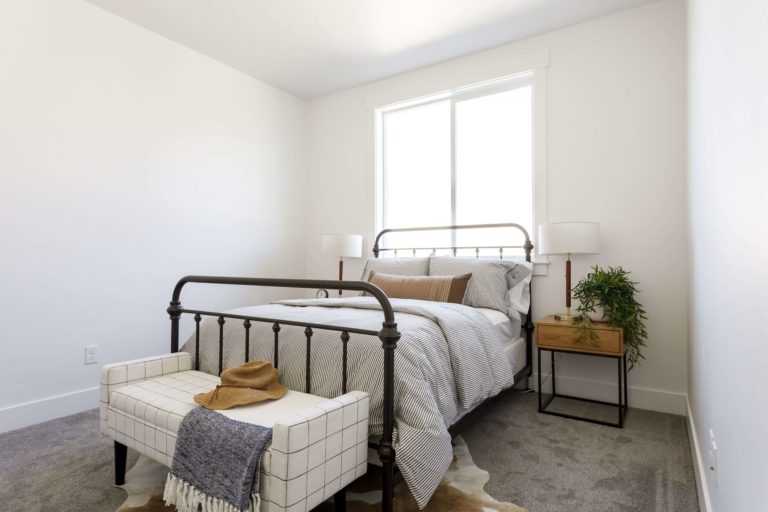
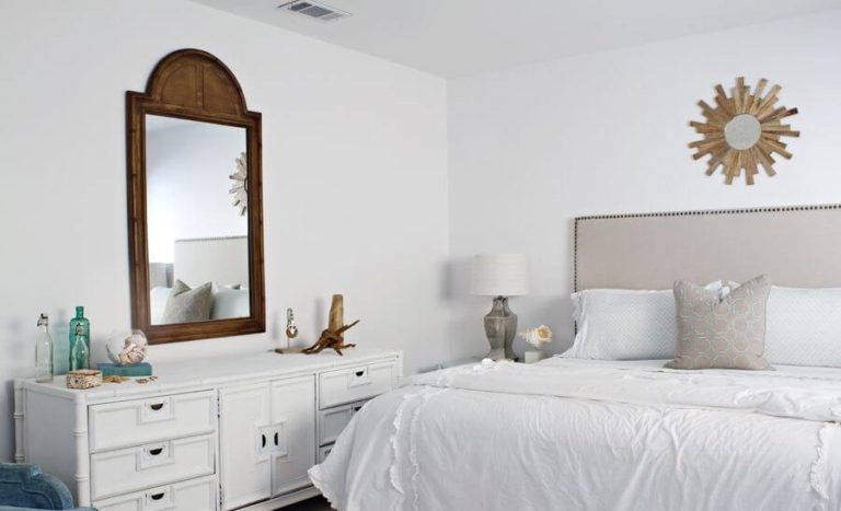
Bedroom
A perfect shade that stimulates a new start in the morning and induces calmness for a safe and sound sleep sounds perfect for the bedroom. Designers suggest opting for a rather monochromatic palette with Snowbound as a background. This way, the soft notes of this shade will be able to penetrate the space and ensure the effect mentioned above fully. The furthest you could go is to consider a few splashes of texture, be it wood or pots with plants, to dilute the neutrality a bit.
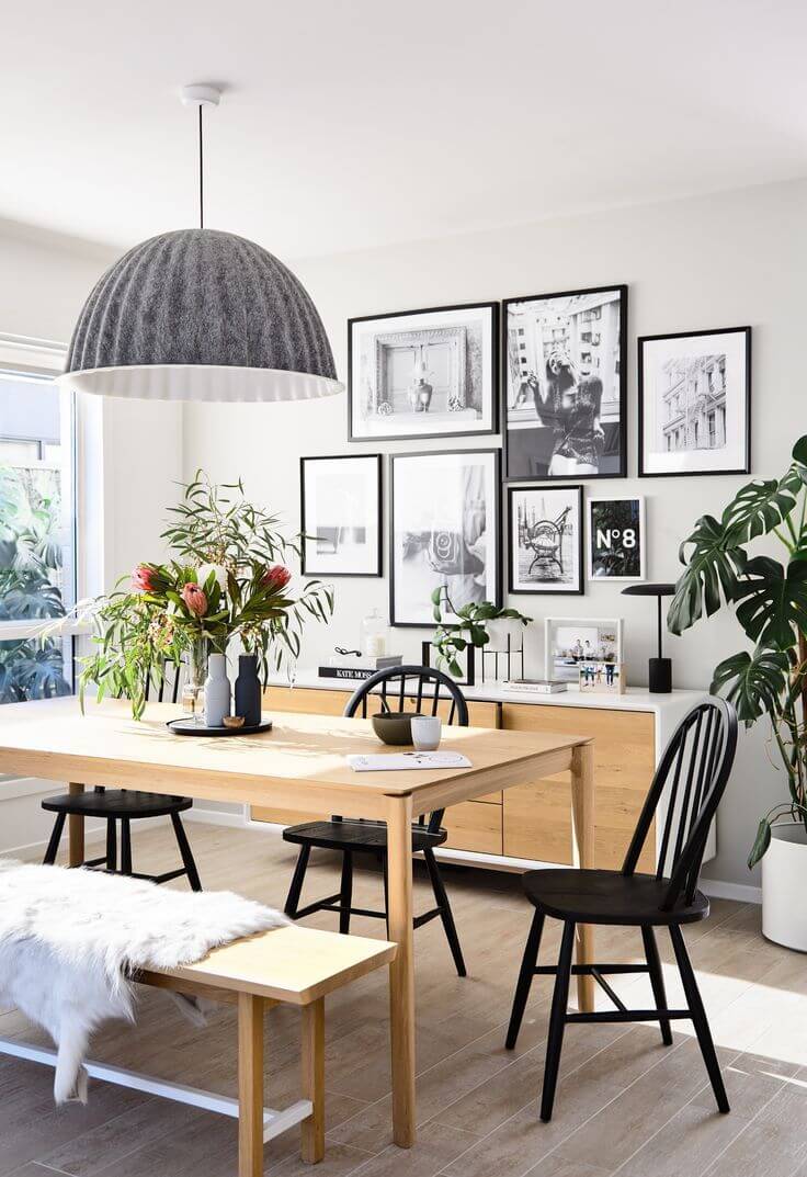
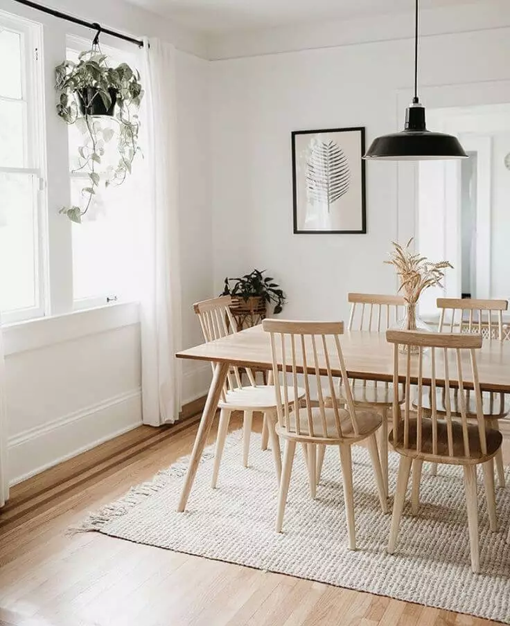
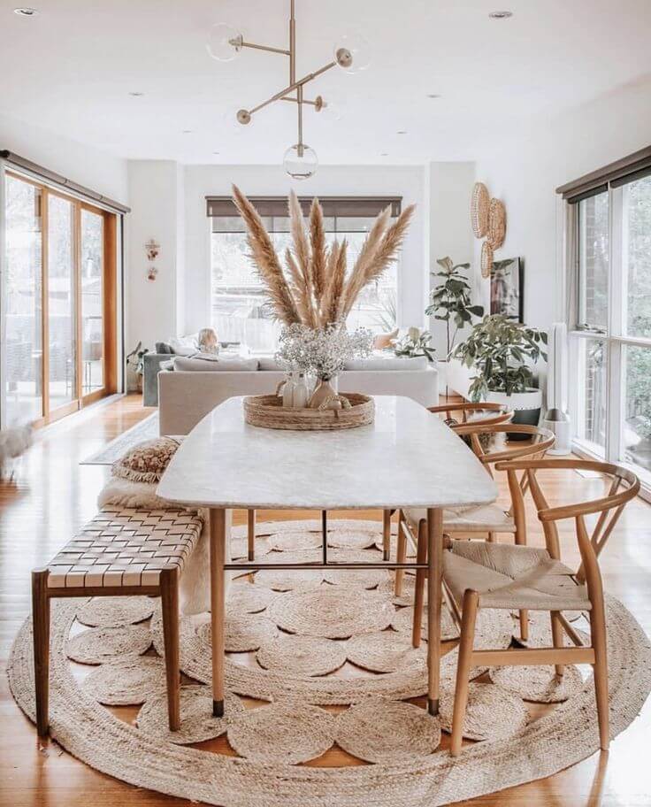
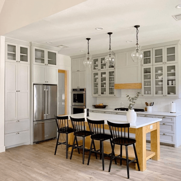
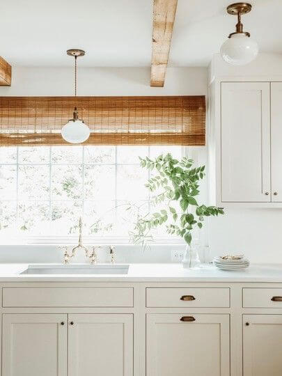
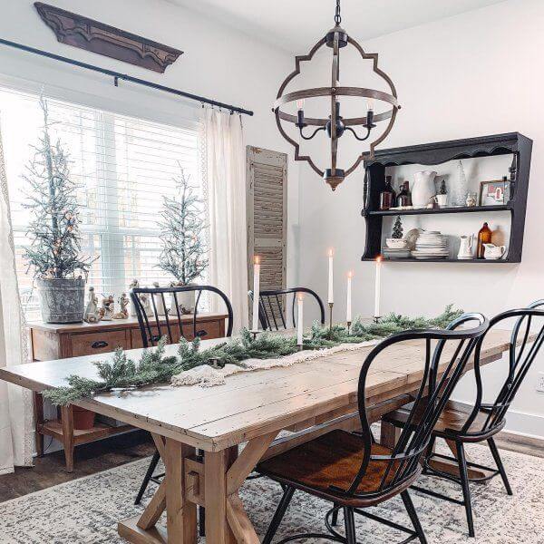
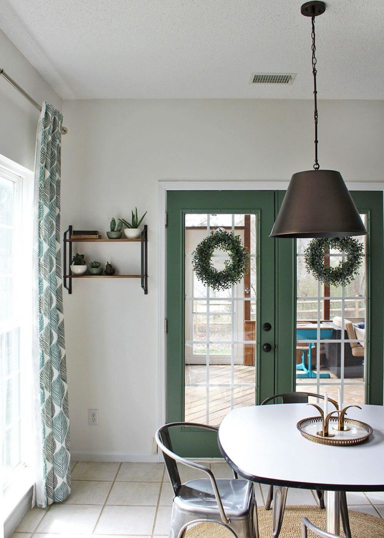
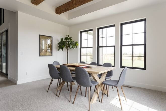
Kitchen and dining room
The same classic combination between white paint and wood texture goes here. Consider Snowbound for the cabinets while pairing it with wood for particular parts of the cabinetry, countertop, or decorative elements. A perfect alternative to wood that looks no less impressive is black paint, which will add visual interest to a crispy white kitchen.
Not far from the design approach considered for the kitchen is the one that should be applied in the dining room. Of course, SW 7004 goes for the walls that will perfectly harmonize with a large wood table in its natural beauty. The space will be enriched with raw surfaces that add individuality, while the soft background will set a pleasant environment.
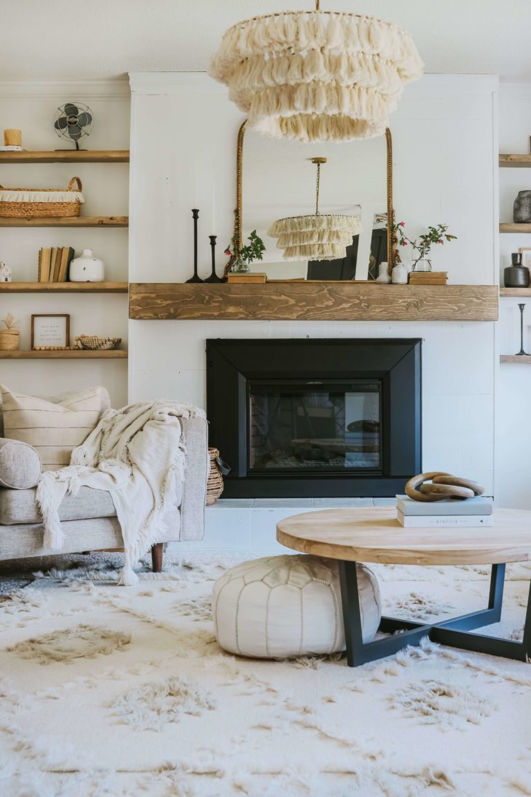
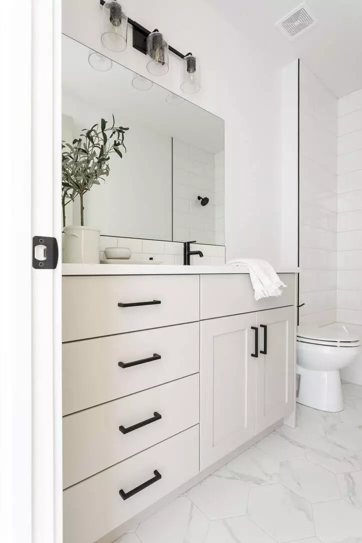
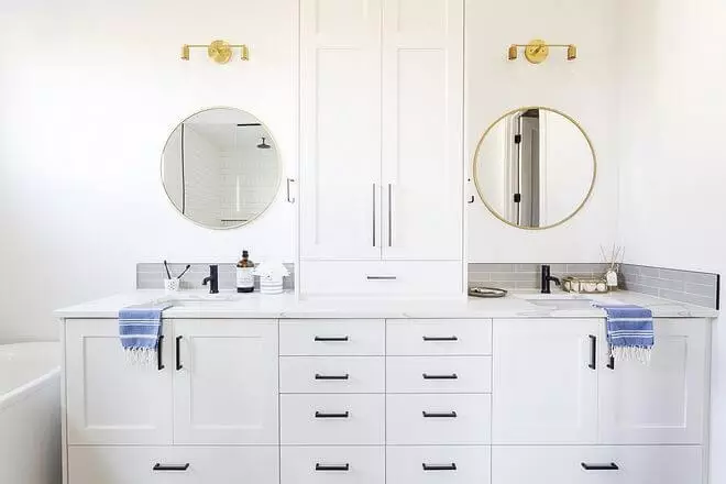
Bathroom
There is no other design solution implying Snowbound that would work better than the following one: consider this fantastic white from Sherwin-Williams for the cabinetry, walls, or all together in combination with a true white shade, adding black hardware. Clear, fresh, contemporary, and functional – these will be the defining features of this space if you go this way. Additionally, you can add a few units of wood, although tiny ones, to dilute the overly perfect cleanliness of such an approach.
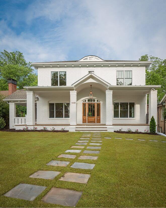
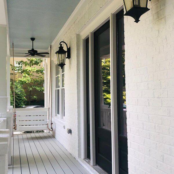
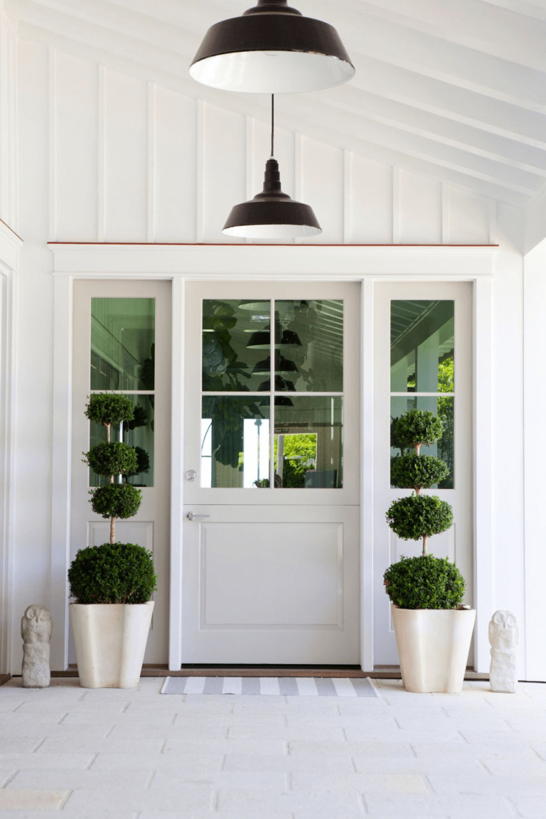
Use of Snowbound for house exterior
Snowbound is a go-to paint color for lovers of whites who would like to add a bit of individuality to their house exterior. Designers suggest painting the house walls in this shade, particularly if they are of brick. This way, the wide range of undertones found at Snowbound will authentically reveal themselves. The irreplaceable wood for the trim and front door will complete the picture.
As already stated, Snowbound works no less astonishing as an accent, which makes it a perfect shade for the front door on a cooler white background. The colors will go hand in hand while not being devoid of originality.
The Snowbound SW 7004 paint color from Sherwin-Williams is a perfect alternative to the true shades of white. Outstanding as an accent, exceptionally clear as a backdrop, and impressively versatile, this crispy shade works for any room and style, embracing both traditional and modern values as required.
