Soft Apricot SW 6352
Sherwin-WilliamsA summertime apricot shade of orange with a Mediterranean fragrance that will bring all-year-long warmth and energy to your home.
Soft Apricot (SW 6352): What Color Is, Review, and Use
We are delighted to see homeowners finally ready to embrace the new trend with bright and cheerful paint colors. Our today’s guest is Soft Apricot, a delicate peachy orange. It’s no secret colors affect our moods and lifestyles. If you need a mood boost in your home, surround yourself with this joyful and full-of-energy apricot color from one of the designers’ favorite brands, Sherwin-Williams.
Soft Apricot Paint Color Features
As the name implies, Soft Apricot is a pale apricot shade resonating with the lazy summertime afternoons on the Mediterranean coast. No wonder this peachy orange is also part of the Living Well Collection. Being in the company of such a cheerful color cannot help but inspire us to act, live in the moment, and pay more attention to what really matters. Here and now is what you should focus on. Soft Apricot will help you with that. By the way, we feel the urge to tell you that this fruit orange slightly nods to the feminine energy – soft, lovely, and unconditionally chick.
Soft Apricot: Is It Warm or Cold?
Without seeing the color, you can suppose it is a warm shade of orange, and it is true. Soft Apricot is a warm paint color, and figures won’t let us lie. In the RGB value of this color – the mix of red, green, and blue – we can distinguish the prevalence of red responsible for the warm temperature. Therefore, we know for sure Soft Apricot will warm up your home all year round.
How Does Lighting Affect Soft Apricot?
Enjoy the warmest side of Soft Apricot, with resurfacing glowing yellow undertones, in rooms with southern exposure where the direct sun rays will say it all. Still, it will also preserve its colorful charm in north-facing spaces, where the cool bluish natural light will cast an additional gray trace on Soft Apricot.
Expect a golden-hour apricot orange at sunrise in rooms with eastern exposure and at sunset in west-facing spaces. As soon as the artificial light is on, Soft Apricot turns into a deep, more standout peach, revealing a subtle earthy hint where the shadow hits.
Soft Apricot LRV
Soft Apricot perfectly fits the name of a mid-tone orange shade. And we meant it when we said: “perfect”. This naturally engaging apricot is one of the few paint colors with a 100% Light Reflectance Value of 50. Between 0 (black) and 100 (white), the golden mean of 50 stands behind colors that bounce back as much light as they receive. You can safely use Soft Apricot on all the walls, even in small rooms, and you won’t risk making the space feel dull and poorly lit.
Soft Apricot Undertones
This trendy orange hue has shadowy yellow undertones that are responsible for the overly warm and joyful features. A hidden gray undertone also takes part, although it resurfaces under poorer lighting conditions.
Similar Colors
Check out this expert-approved list of the best peachy alternatives to Soft Apricot. By the way, we borrowed some inspiration from other brands as well.
Coordinating Colors
Such pastel orange tones look fabulous near light neutrals, other pastel shades, or brighter derivatives of orange, such as coral or pink. Think of blues and greens paired with Soft Apricot. They simply complement each other. Here are the expert recommendations:
Use of Soft Apricot in Interior Design
Although Soft Apricot is highly associated with the Boho design style, you can safely integrate it into other styles as well. At the end of the day, it’s the warmth and summertime breeze in this apricot shade that counts. So, Rustic, Modern, Mediterranean, and why not, Traditional all work. Discover the trendiest ways to use Soft Apricot in your home.
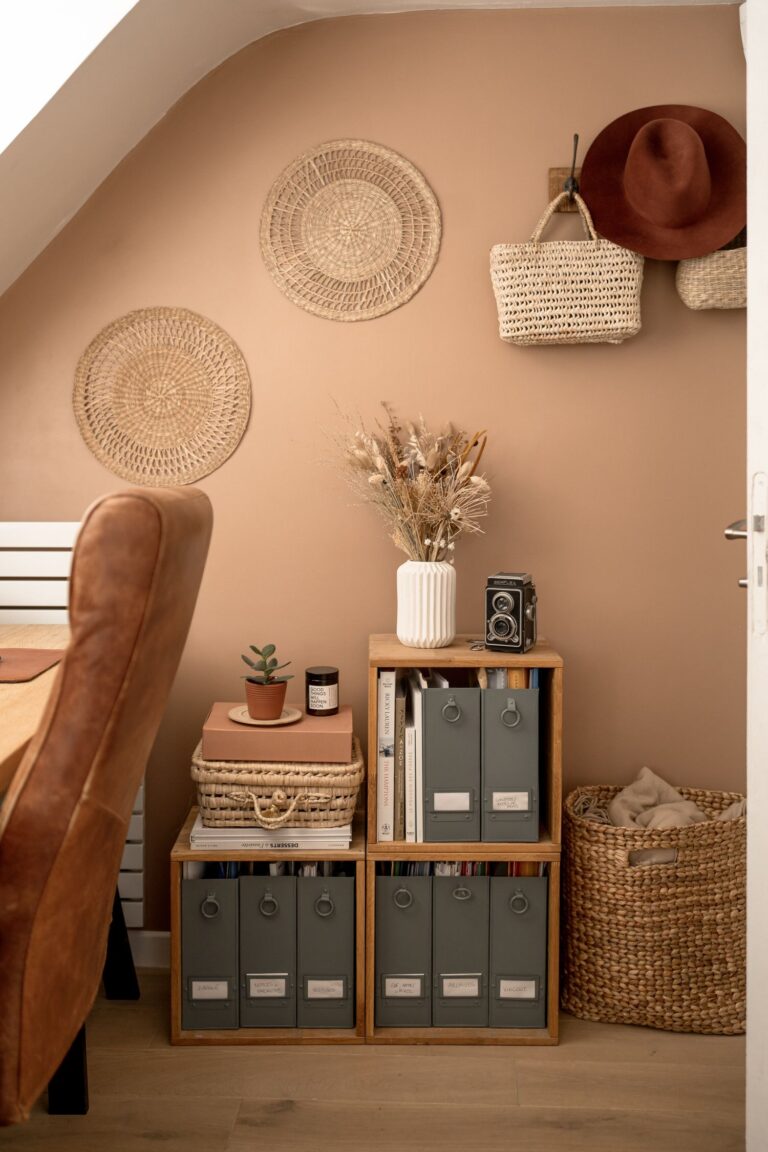
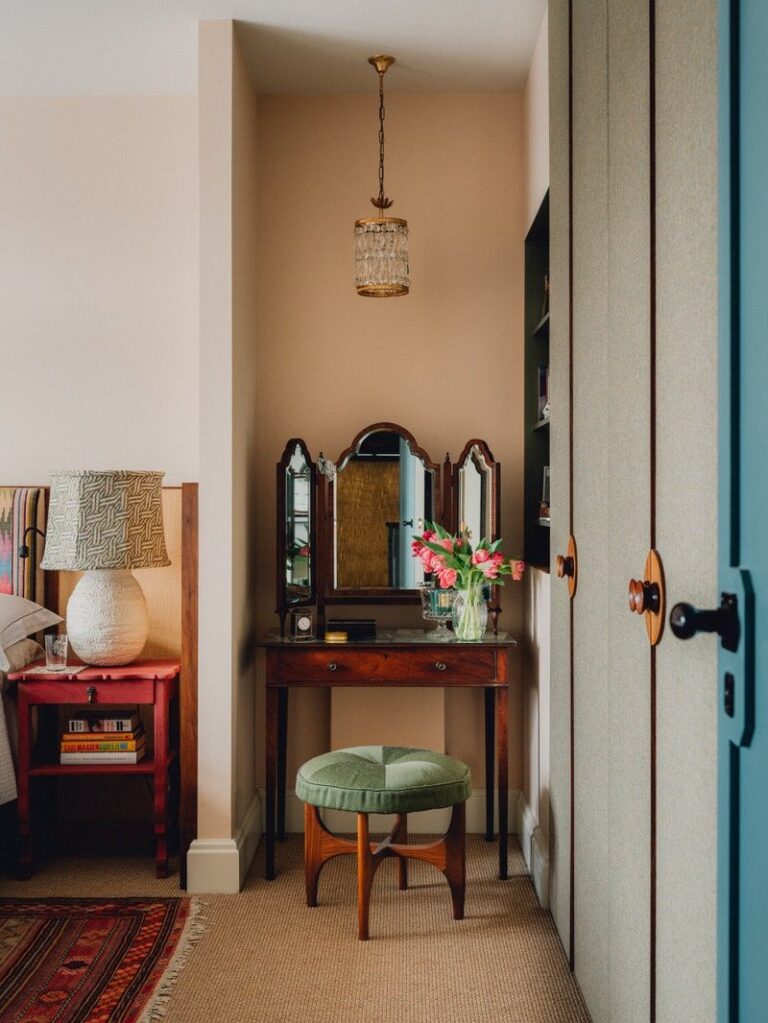
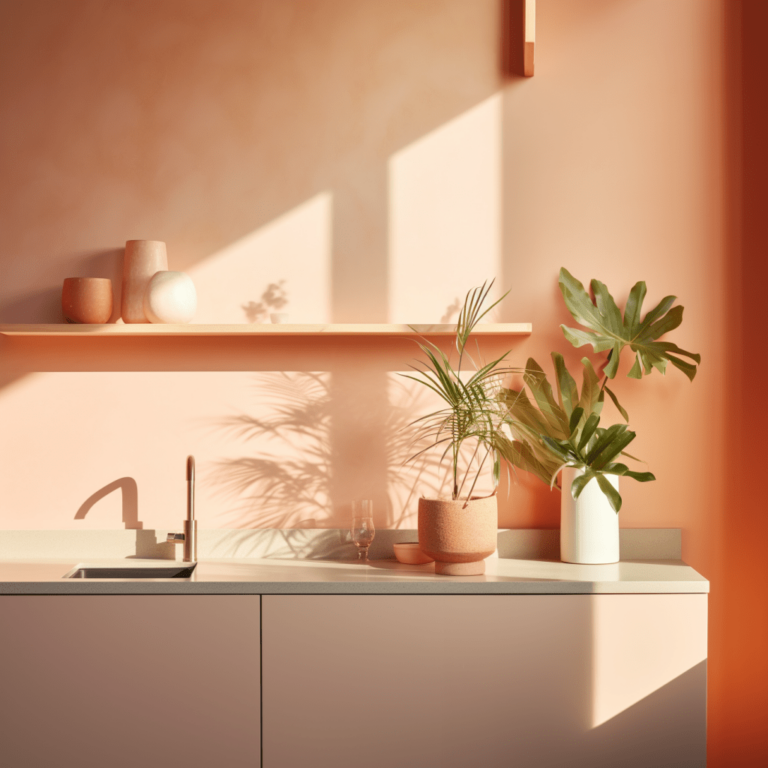
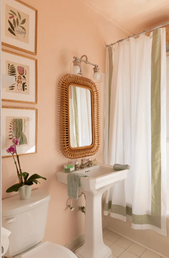
Apricot and Natural Texture
In the spirit of environmental awareness and the beauty of sustainable and naturally textured surfaces, we bring to your attention one of the trendiest ways to style this peachy tone – pairing it with wood, rattan, bamboo, sisal, jute, and organic fabrics. Enjoy the trendy earthy palette and fill your home with warmth. Don’t forget about a few pots with indoor plants for the utmost natural effect.
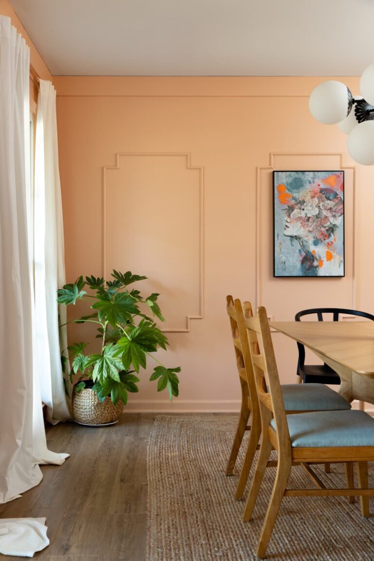

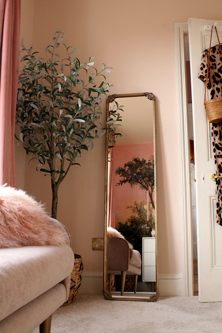
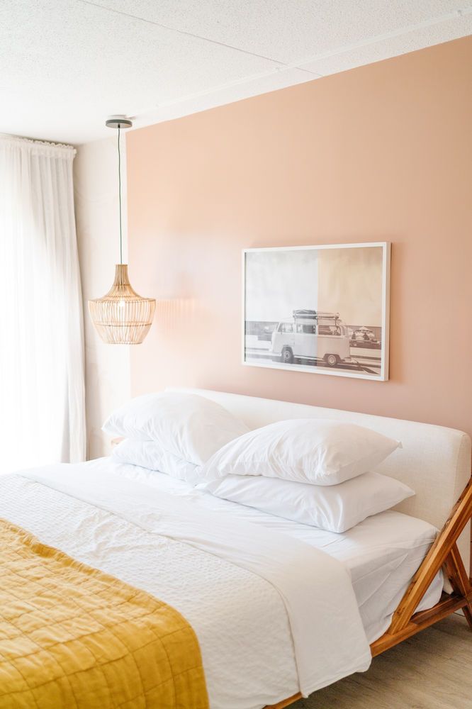
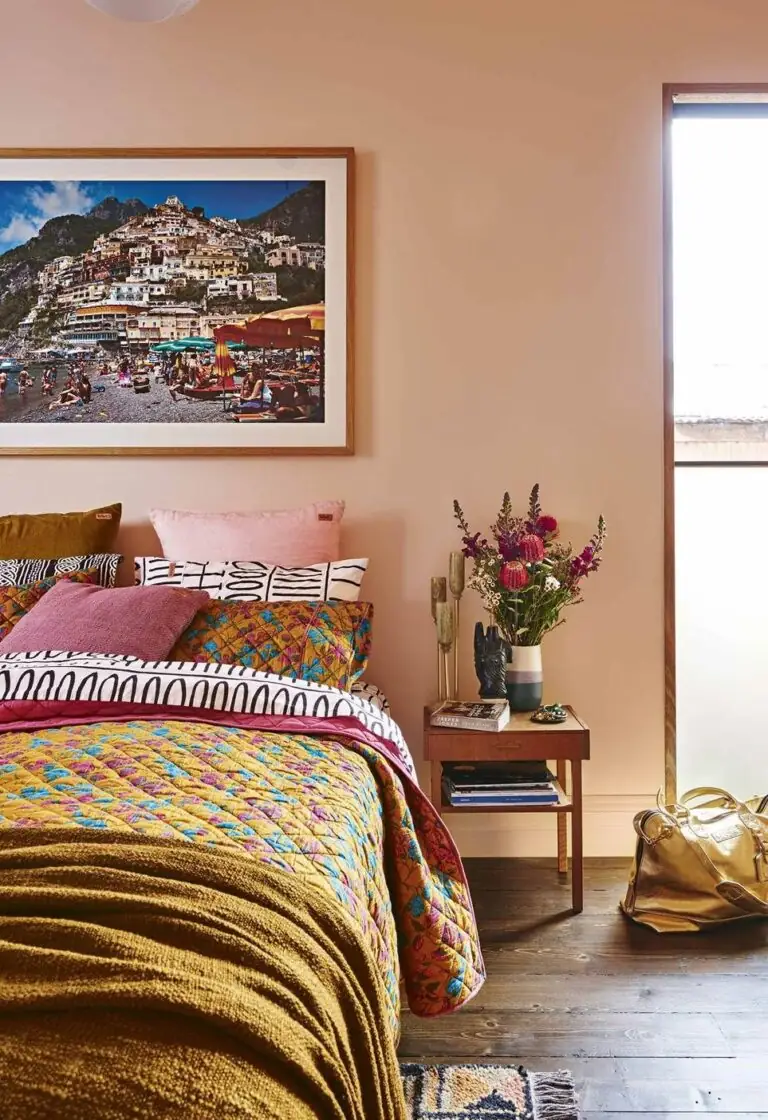
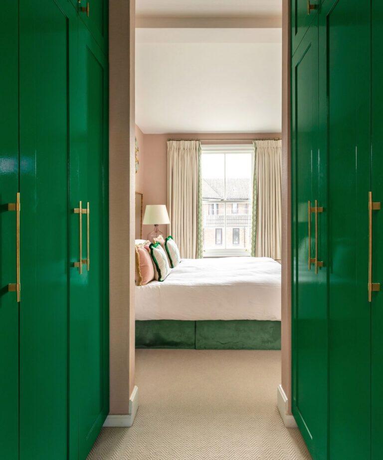
Bedroom
Soft Apricot is an impeccably approachable paint color. You just want to stay and admire it for hours. Unsurprisingly, designers love using peach tones like this in the bedroom, where everything should read comfortably. The best news is you can use Soft Apricot on bedroom walls for any design style. The expert advice is to decorate it with accents, be it vivid colored bedding or rich-textured furniture, to avoid a dull color palette.
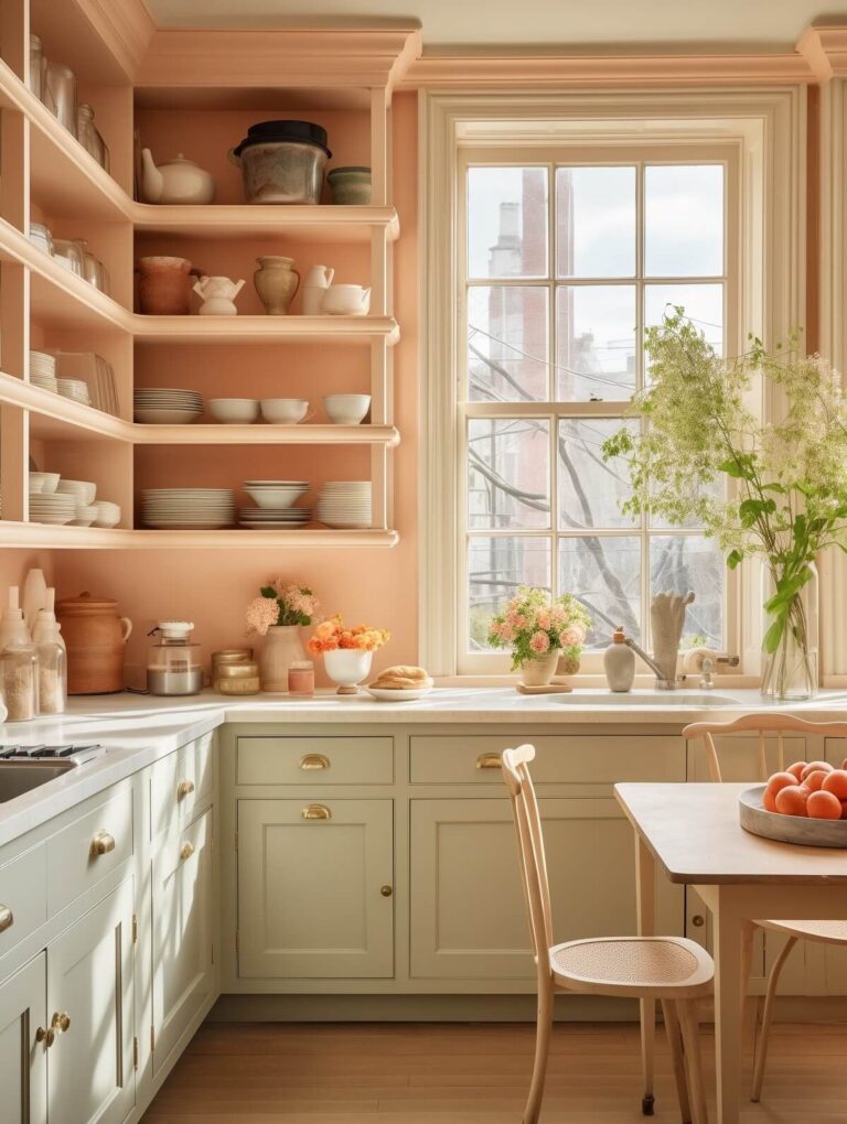
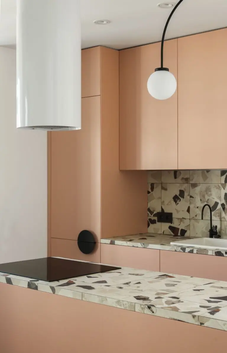
Kitchen
Soft Apricot will ensure an all-year-long summertime feeling in your kitchen when applied to walls and constantly bathed in sun rays. Light wood is recommended for cabinets. Conversely, peach-painted cabinets paired with white walls follow a whole new story. Enjoy the charm and comfort of this apricot tone in a modern or traditional cooking space.
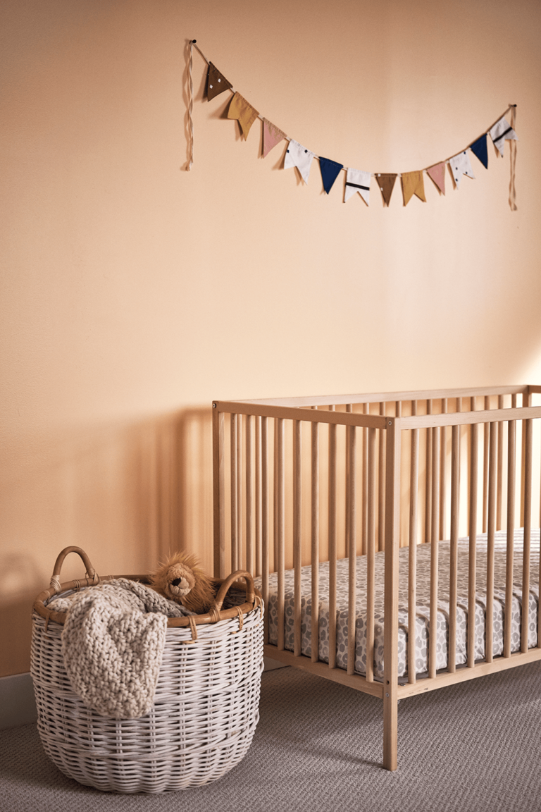
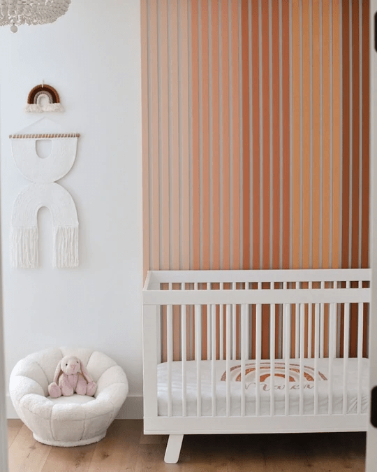
Nursery
Apricot is the new favorite nursery paint color. This gender-neutral shade will deliver the coziest and most adorable mood in the kids’ room. Unlike traditional peaches, this particular tone has a more balanced and calm color base, benefiting the nursery.
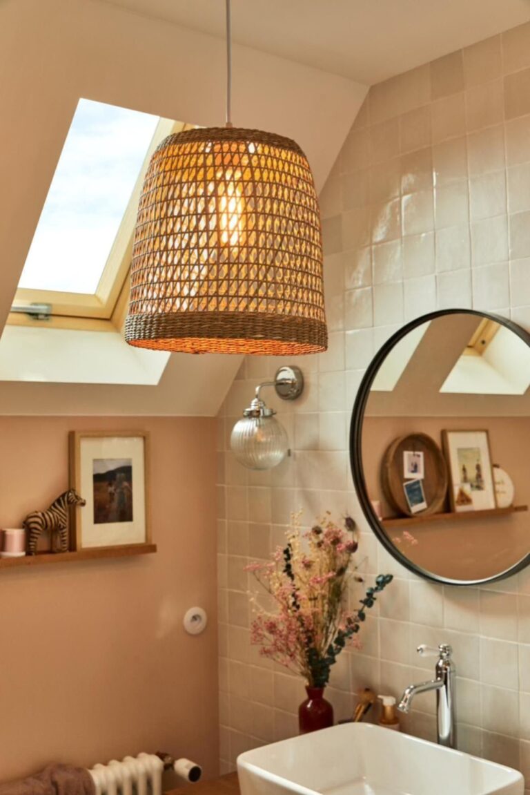
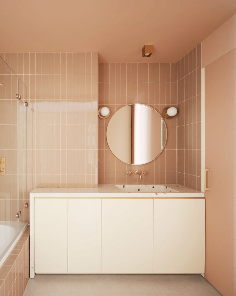
Bathroom
Peach has always been a great color option for the bathroom. Experts see it as a perfect choice for Mediterranean bathrooms decorated with terracotta tiles. However, any traditional or modern bathroom would benefit from a pop of apricot sweetness.
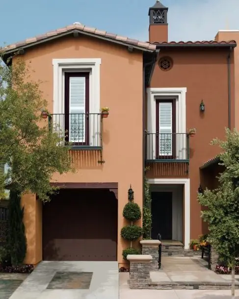
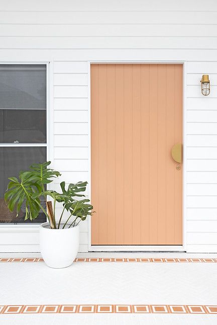
Use of Soft Apricot for the House Exterior
A catchy yet stately confident color like this new peach is a perfect attention-stealer paint color for the exterior house walls or front door. While catching all the attention in the neighborhood, it manages to stay calm, inviting, and true to its balanced character. Revive the curb appeal of your house with the right peach tone.
The Soft Apricot SW 6352 paint color by Sherwin-Williams is a new neutral in the world of emerging paint colors. It emanates such positive, optimistic energy that will not only update your home’s design but also bring color to your lifestyle.
