Stardew SW 9138
Sherwin-WilliamsA magical gray-blue with the slightest trace of green that will add an appealingly nostalgic effect to your home, together with its sleek and fresh side.
Stardew (SW 9138): What Color Is, Review, and Use
2024 is 100% the year of greens and blues. The pandemic and the uncertain times we live in have made us look for peace, even when it comes to the paint color choice. The most peaceful and serene blue shade under the gorgeous name Stardew has become popular among interior designers and homeowners. Primarily associated with the good old days and the undisturbed countryside lifestyle, that is the color of the month of August 2017 and part of plenty of color collections at Sherwin-Williams, including Living Well, Colormix Forecast 2020, Rejuvenation, of course – Colormix Forecast 2024, and many other. Today, we invite you to rediscover blue from the perspective of one of the trendiest gray-blue shades.
Stardew Paint Color Features
The emerging paint color from Sherwin-Williams beautifully blends blue and gray in the company of the softest green trace. “This dreamy slate blue has a hint of magic,” as colorists claim. It is undoubtedly a middle tone of gray-blue, which means it stands out and doesn’t risk fading out. Stardew is your go-to paint color if you’ve always wanted a perfect gray-blue that doesn’t seem too pastel or too saturated and knows how to install calmness into a space and make it feel airy and refreshing. Nonetheless, there is a strong connection between this gorgeous blue and the peaceful countryside life, alongside traditional design styles and plenty of natural materials, all due to the green drop of hidden color.
Stardew: Is It Warm or Cold?
Analyzing the RGB (Red, Green, and Blue) value of Stardew, we can claim that the green and especially blue amounts prevail over red, which usually means we deal with a cool paint color. This fact is partially true about Stardew. The thing is that Sherwin-Williams’ colorists describe this paint color as a perfect balance of warm and cool undertones. Therefore, Stardew is a well-balanced slate blue that may lean toward the warm or cool side, depending on lighting. Read on!
How Does Lighting Affect Stardew?
It may be a mid-tone blue, but the lighting still has much to say. If you decide to paint a north-facing room with Stardew, expect a considerably cooler stone blue up to the level of crisp. It’s an entirely new story in rooms with south-facing windows, where Stardew turns into a slightly warmer green-blue. The more light it receives, the paler it looks.
Note that you won’t have any problems with this paint color in rooms devoid of natural light. If you ensure enough artificial light sources, Stardew will stay as lovely. Still, experts advise us to opt for warm-temperature lighting to make sure Stardew doesn’t turn too cold.
Stardew LRV
That’s how we know for sure that Stardew is a middle tone. On a scale from 0 to 100, it has a Light Reflectance Value of 43. It shows how much light the paint color bounces back, determining simultaneously how light or dark this color is. Considering that 0 stands for true blacks and 100 for pure whites, Stardew is a solid mid-tone blue with enough color yet knows how to make a room feel spacious and well-lit. However, homeowners who have already used it recommend experimenting with a color sample before committing. If Stardew looks perfect in one home, it doesn’t mean it will be the same in other interiors.
Stardew Undertones
More or less, we’ve already mentioned the prevailing color tones. The base color is blue. Next comes the prevailing note of gray. Last but not least, we can notice a subtle trace of green, which makes Stardew stand out of hundreds of gray-blue shades.
Similar Colors
We’ve already mentioned paint brands have plenty of gray-blue shades you should know about. At least, be aware of Sherwin-Williams Stardew’s similar colors at this manufacturer and other giant brands.
Coordinating Colors
Pair Stardew walls with a bright white shade or a darker gray tone on the trim. If you’re looking for general color matches for this gray-blue, decide on the color palette: is it a monochromatic or contrastive one? Choose other pale grays, blues, or greens for a discreet all-blue-gray color code. Conversely, try warmer off-whites, accent greens, pinkish pastels, and clay tones to make a contrast. Here are the expert choices:
Use of Stardew in Interior Design
A pale blue shade like this is perfect for modern coastal interiors, farmhouse homes, and traditional styles. It flawlessly pairs with wood, bamboo, sustainable fabrics, metallic accessories, and weathered surfaces. So, the range of design possibilities is vast. Let’s go through the trendiest!
Soft Coastal
Ensure a year-long summer breeze in your home by stylishly combining the coastal gray-blue from Sherwin-Williams with crisp white, wicker accessories, wooden furniture, and an overall bright color palette. Don’t overdo the decor. The traditional coastal accents on open shelves depicting the marine world and beach wall art will only spoil the effect. Speak Coastal through color and keep it contemporary.
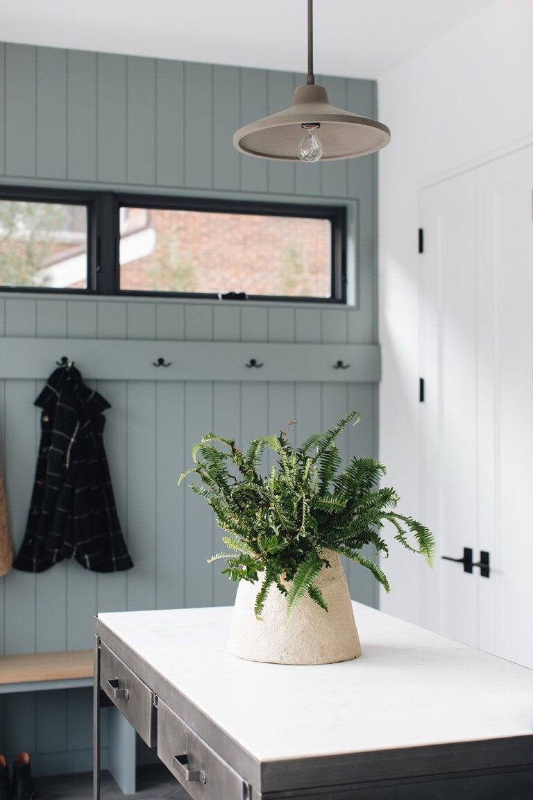
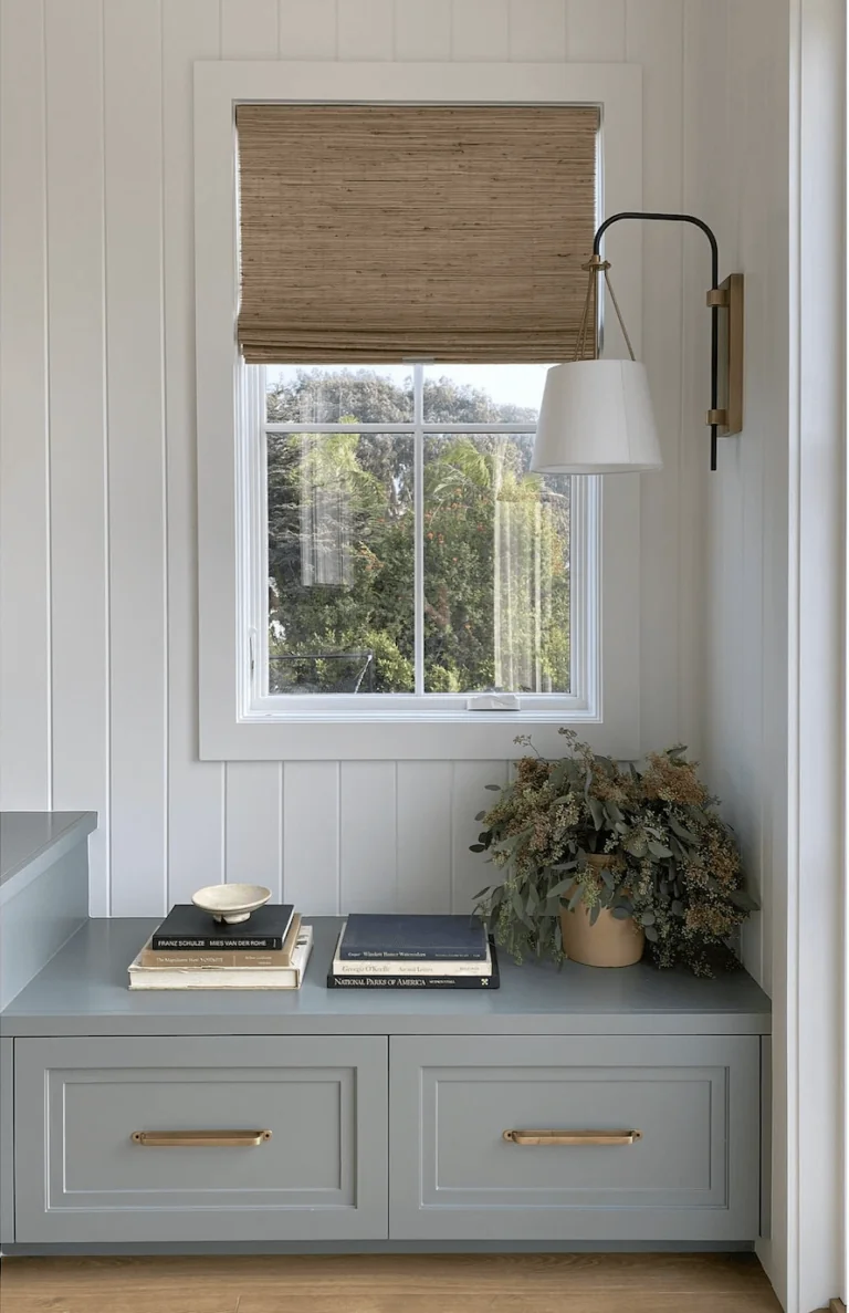
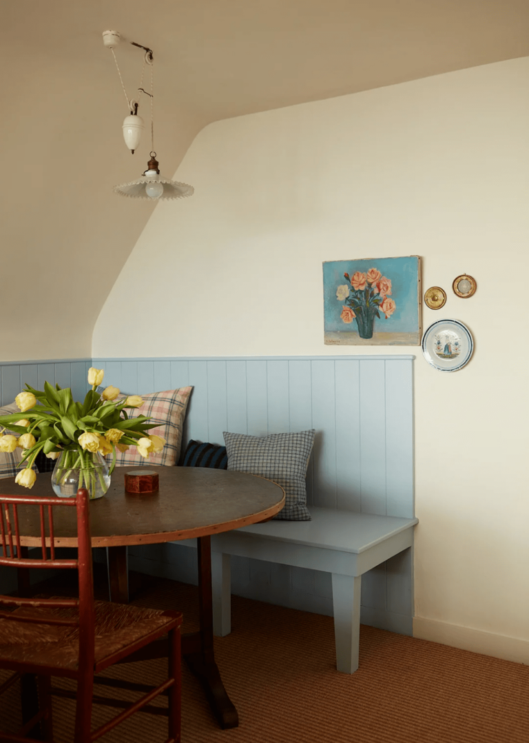
Quiet Countryside
Stardew resonates with all countryside styles, from raw Rustic to comfy Farmhouse and charming Cottage style. This paint color perfectly lies on wood wall paneling and complements natural textures. Recreate the beloved and trendy Countryside style with a gray-blue color that perfectly renders the same careless and peaceful ambiance.
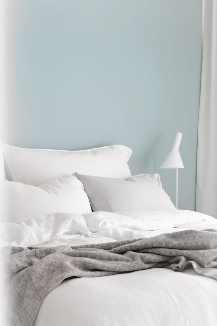
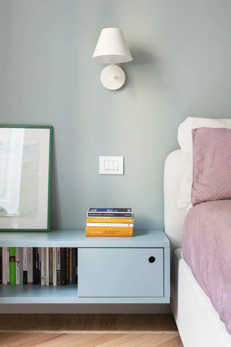
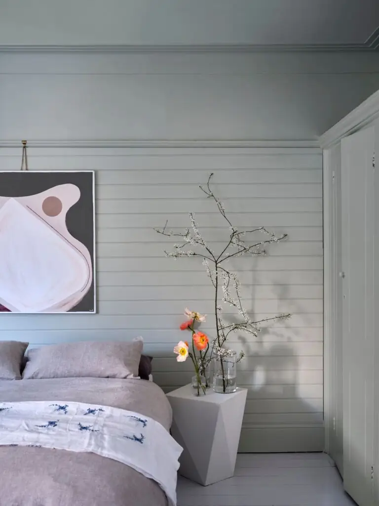
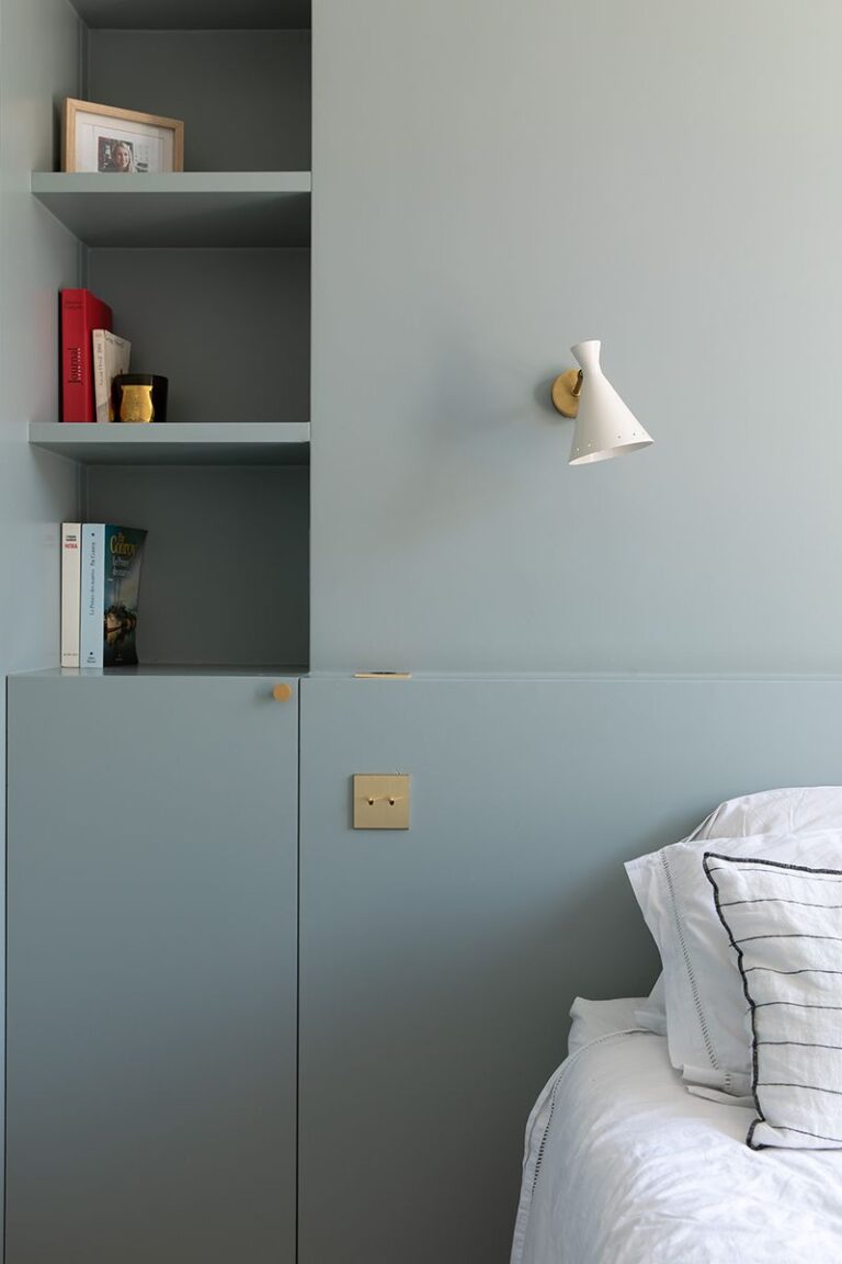
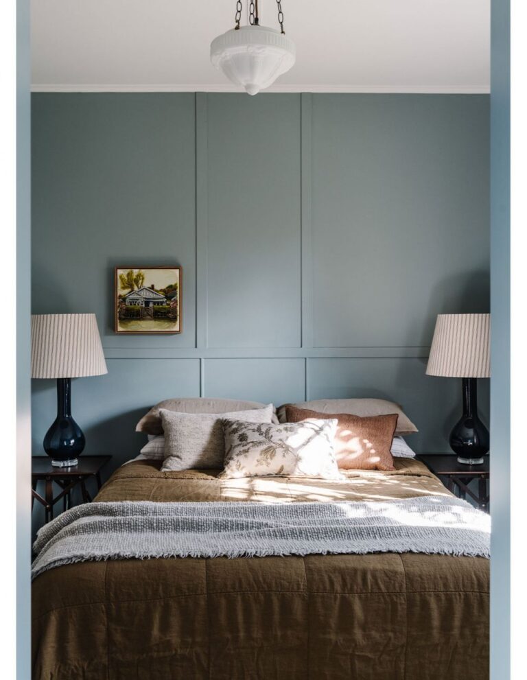
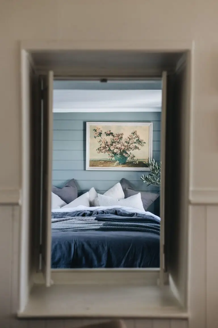
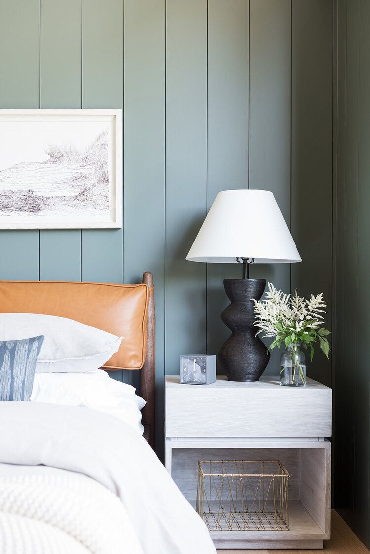
Bedroom
Dive into the serene and unconditional world of gray-blue with a bedroom painted all in Stardew. Enjoy the tranquil color on its own, or contrast it with bold colors for furniture and textiles. You won’t find a more peaceful and suitable paint color for the sleeping space. Soft like a whisper, Stardew installs a tranquil and secure mood for you to unwind.
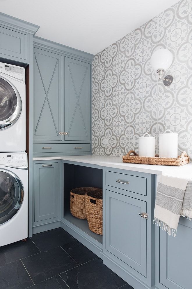
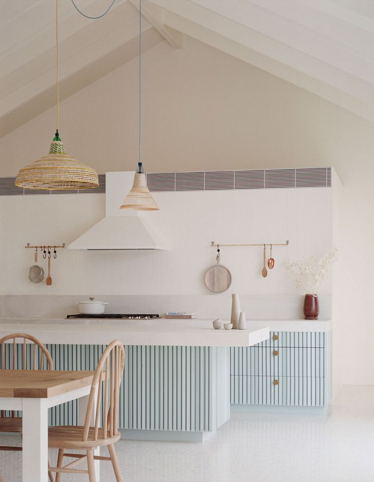
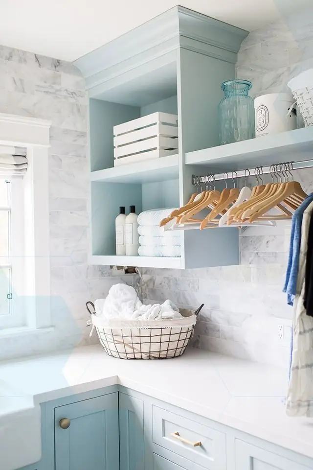
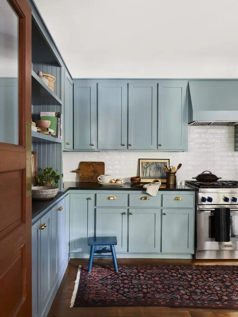
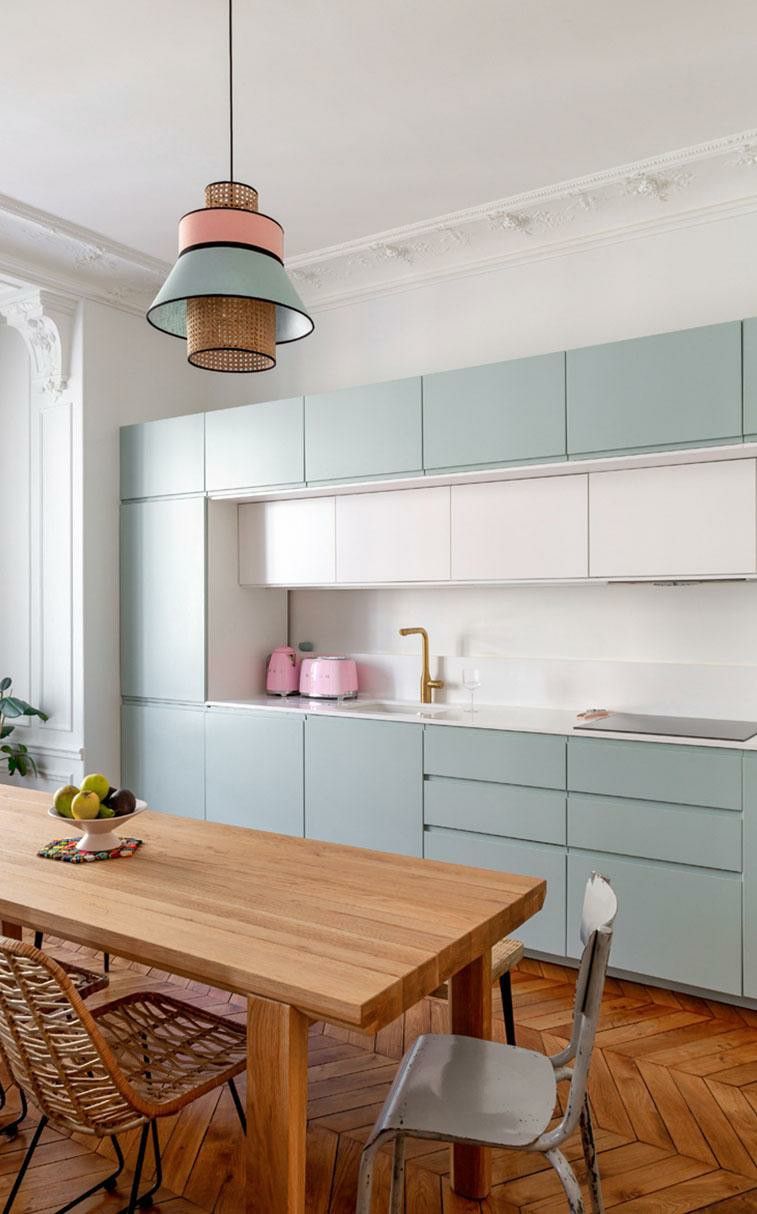
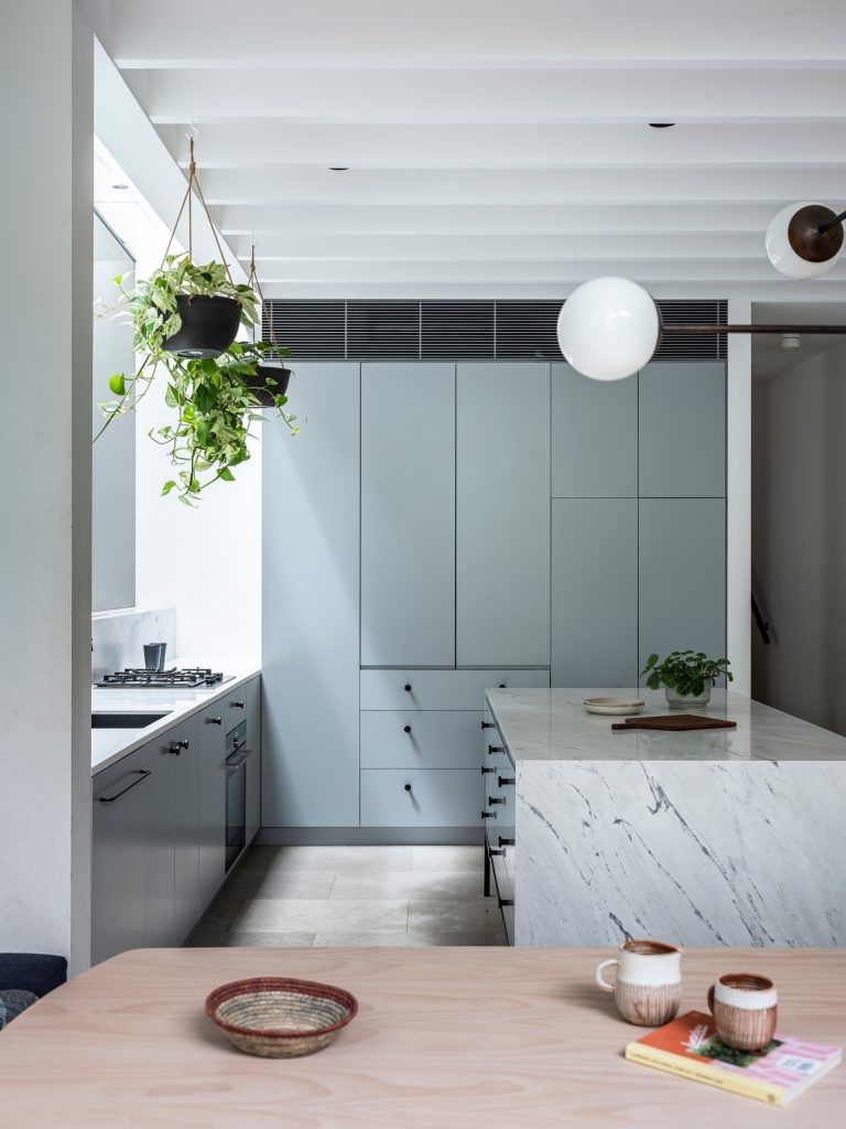
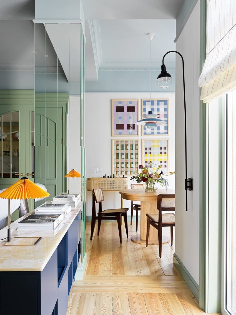
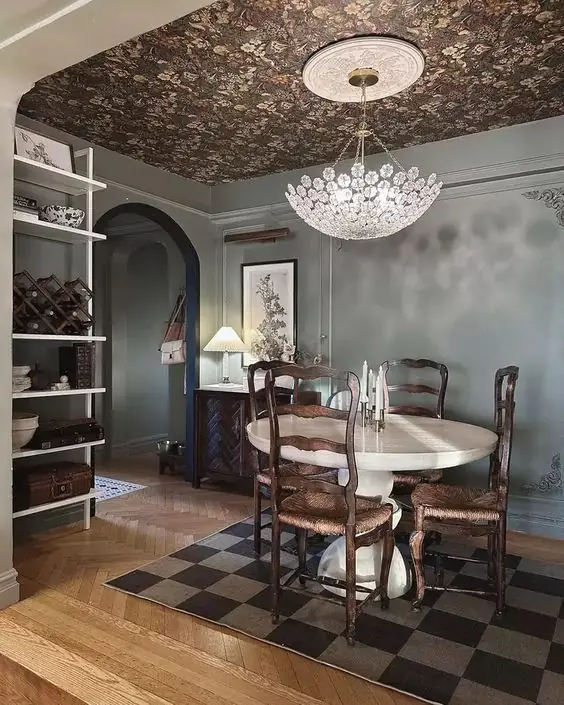
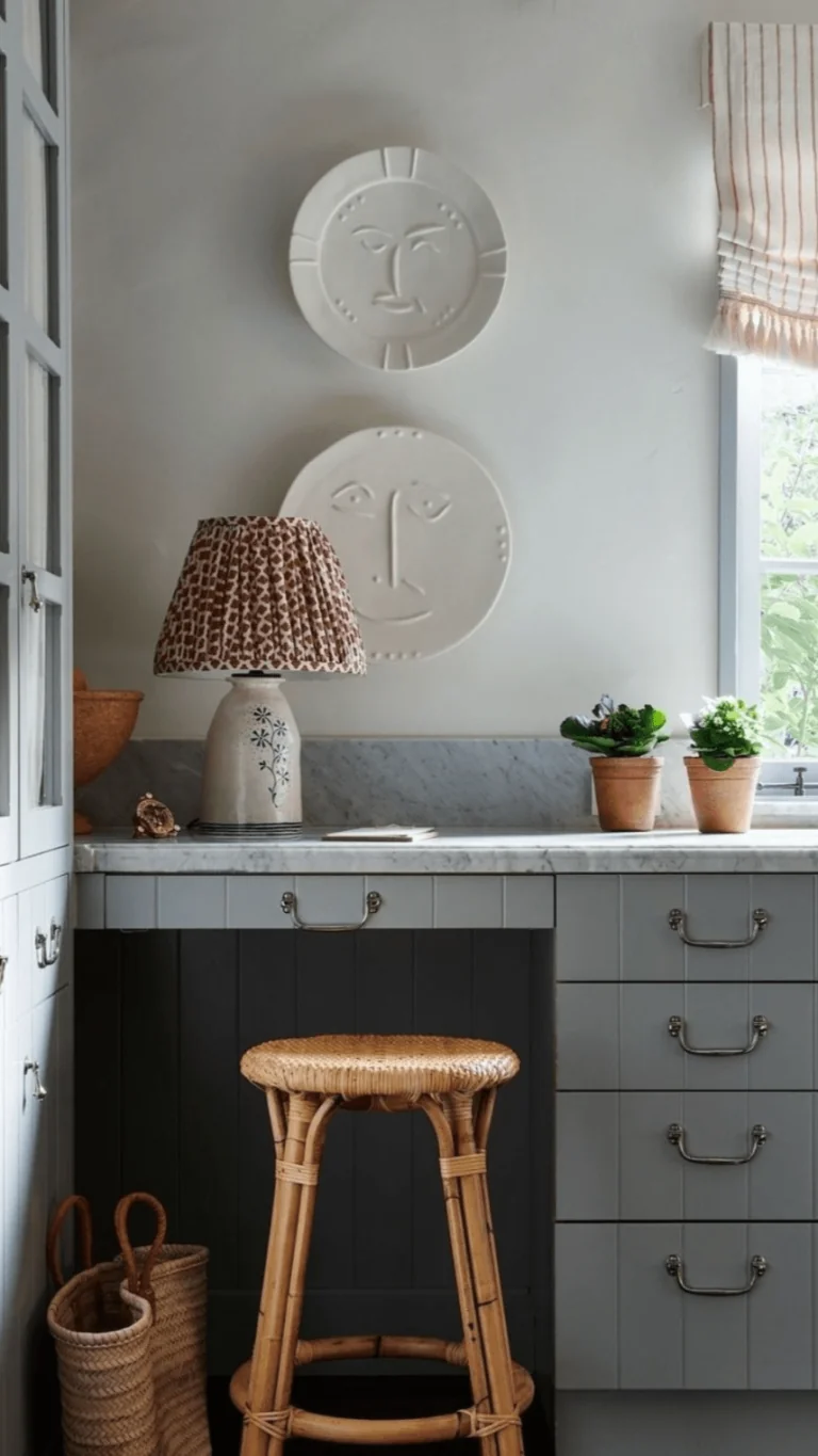
Kitchen and Dining Room
Blues have become a trendy option in kitchens, especially on cabinets. Designers firmly recommend using Stardew for your kitchen design. Both modern and traditional or transitional design styles work. Stardew pairs well with wood, brass, and stone. You can either keep it sleek with a calm color palette or make a colorful statement by pairing this gray-blue with complementary shades.
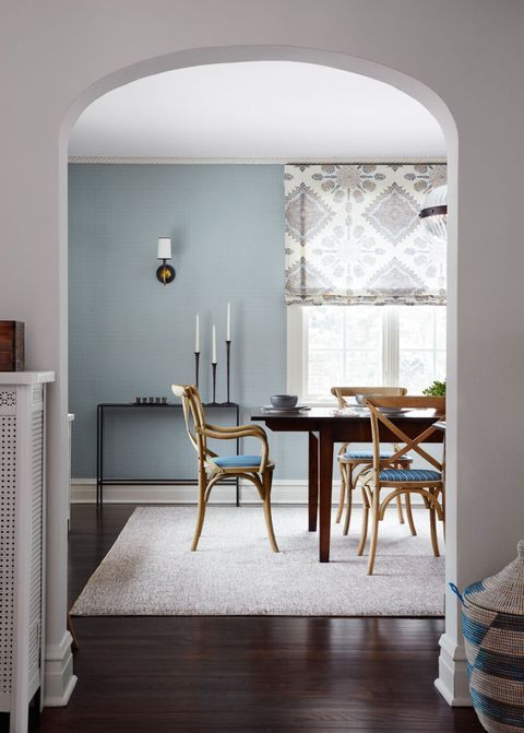
In the dining room, we cannot help but see this slate blue shade in classic interiors primarily, with sophisticated furniture, rich textiles, and accent chandeliers. By the way, choosing Stardew as a ceiling paint color with white walls is a trendy option.
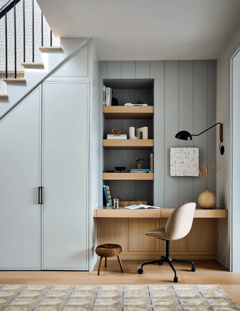
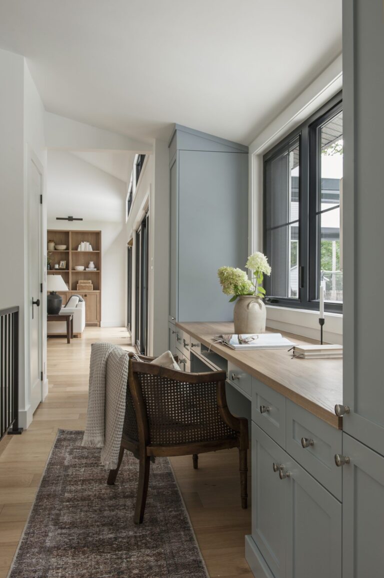
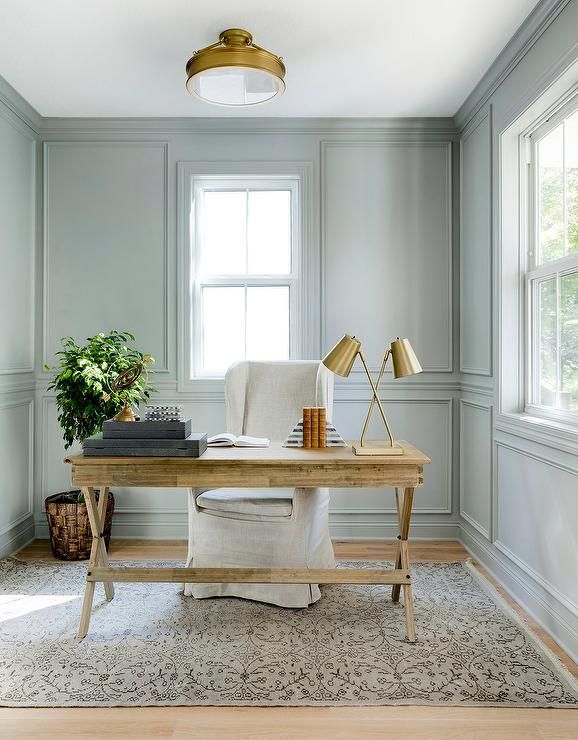
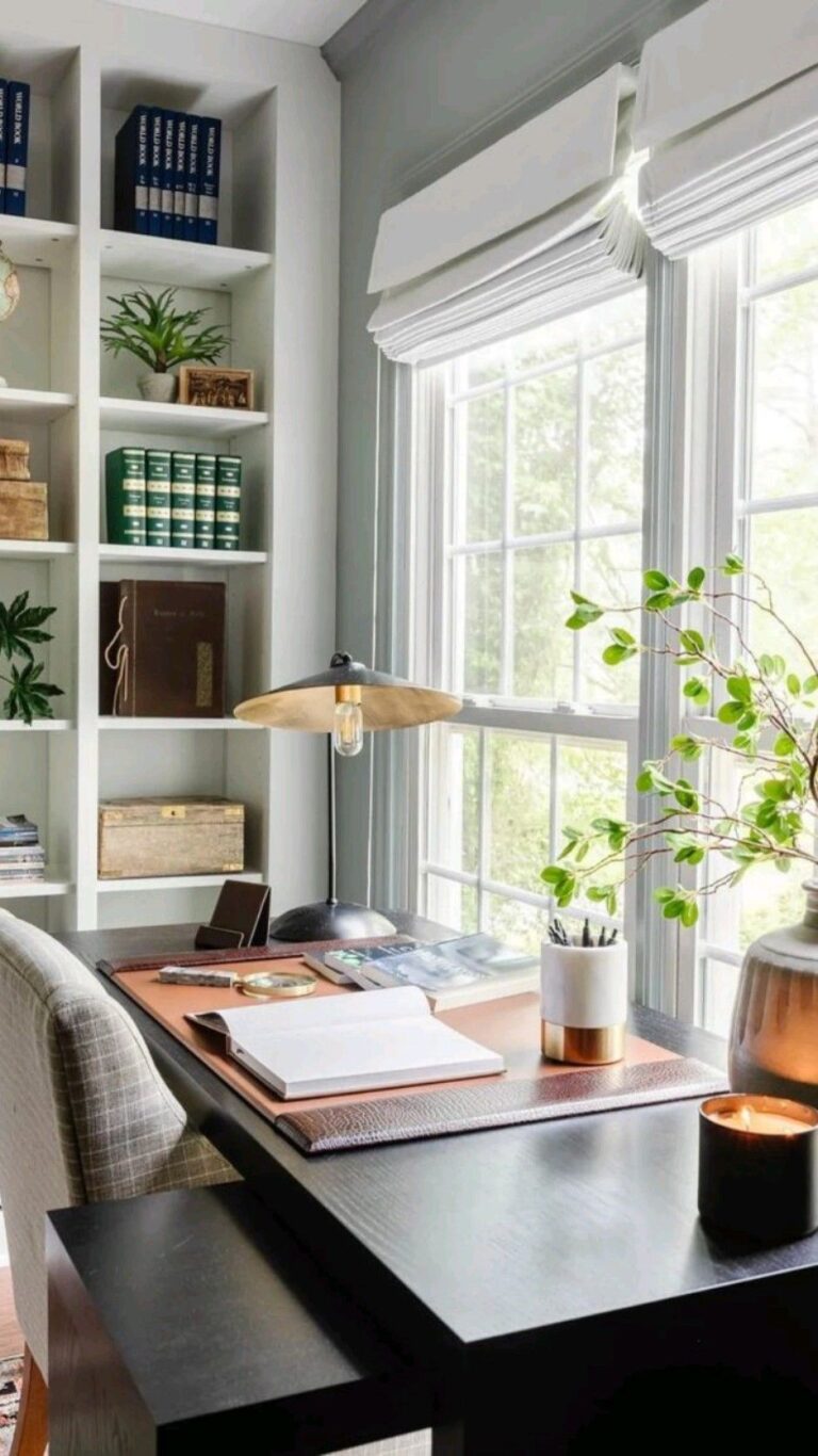
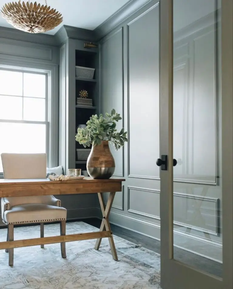
Home Office
It is not without reason that Stardew is considered a great primary color for workspaces. There is something so calm and undisturbing about this stone blue shade. It will help you concentrate on your task while working and unwind while taking a rest. Use it on walls or cabinets as long as it matches your taste and keeps your mind fresh.
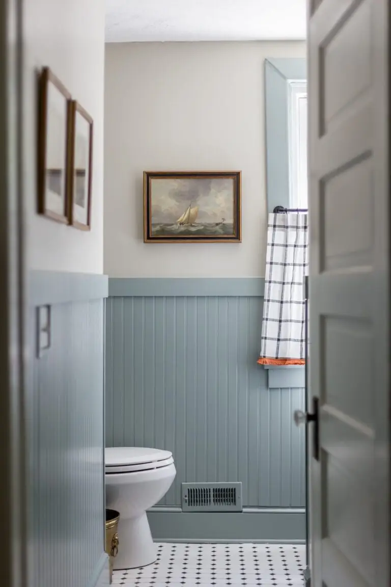
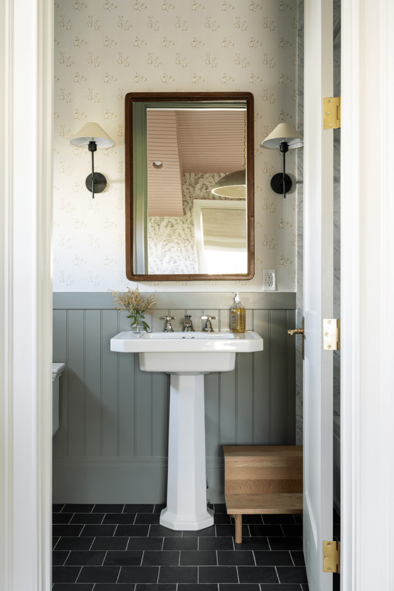
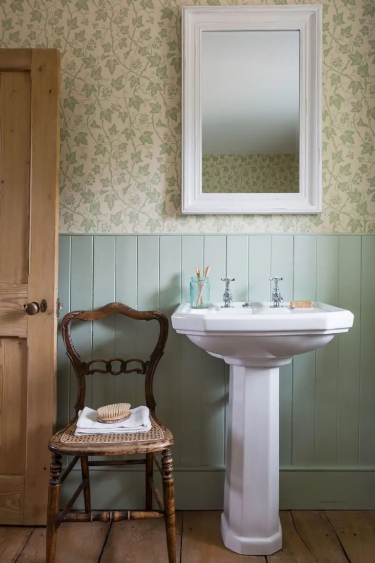
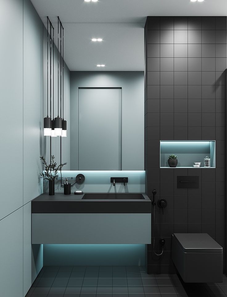
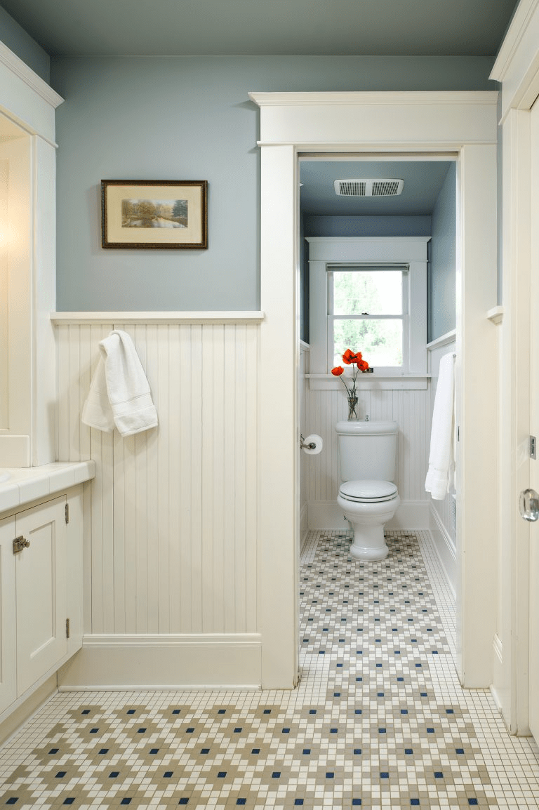
Bathroom
Stardew looks impeccably well in modern bathrooms. It almost fades into green, which benefits a contemporary space. Still, nothing compares to its use in cottage-like interiors, where this fresh gray-blue perfectly combines with Vintage accents and offers the bathroom a comfy nostalgic charm.
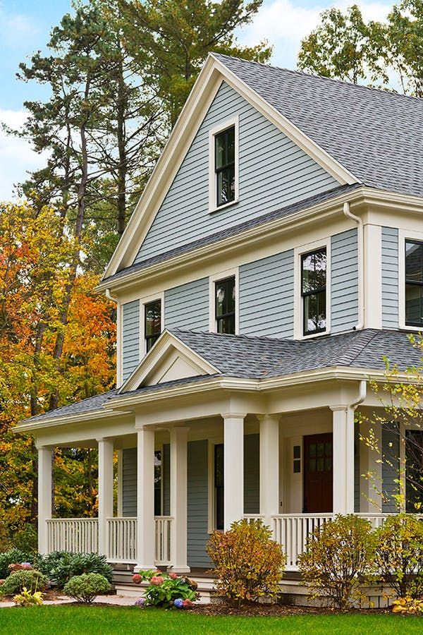
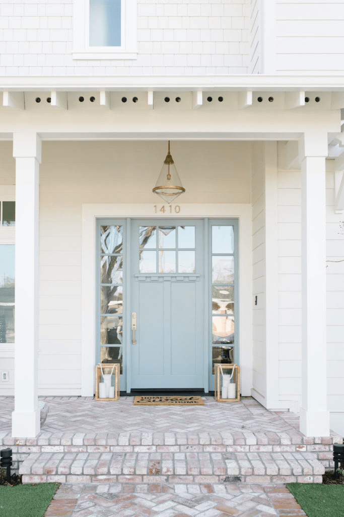
Use of Stardew for the House Exterior
Stardew has a lot of confidence due to its fully saturated yet balanced color base. It won’t fade out under direct natural light. If you’ve long searched for the right gray-blue exterior paint color, Stardew is a no-fail solution. Ensure a solid and fresh look and add value to your property by painting the exterior house walls or choosing this fabulous blue for the front door. Initially a perfect color for coastal exteriors, Stardew now easily adapts to any other style.
The Stardew SW 9138 paint color by Sherwin-Williams reminds us of the good old days. Install this pleasantly nostalgic vibe into your home by choosing this trendy green-pigmented slate blue that looks flawless as a primary or accent color.
