Swiss Coffee OC-45
Benjamin MooreAn almost white shade, charming in its softness and calmness, refinement, and welcoming warmth.
Swiss Coffee OC-45 (Benjamin Moore): what color is, review, and use
Light and almost white shades are a huge field for experiments both in the interior and exterior of the house. Without the dazzling brilliance of true whites, they still make rooms light and airy, make home furnishings sophisticated and modern and serve as a perfect backdrop for accents in a wide variety of styles.
If you think choosing an almost white shade for the home is very simple, and you can even not bother with a long study of the palette, but simply poke your finger at the first color that comes across, then we are in a hurry to dispel your misconceptions. Despite the seeming simplicity, such tones can have a difficult character and present many surprises that you will discover only when all the walls in your house are already painted. A striking example of a stunningly beautiful yet very ambiguous shade is Swiss Coffee OC-45 from Benjamin Moore, based on which it is very easy to understand how rich the potential of almost white tones is and how you can use it to your advantage.
Swiss Coffee paint color features
When you hear the name of this color, you can assume that we are speaking about some kind of brown tint. However, this is absolutely not the case: in fact, Swiss Coffee is an almost white shade, charming in its softness and calmness, refinement, and welcoming warmth. Why is it called this way? Let’s reveal a small but funny secret: they say that when colorists and designers worked on this color, they used the same coffee in unlimited quantities, and someone had a playful idea to name the resulting shade that way.
Swiss Coffee is included in the Off-White collection. According to BM experts, it includes particularly sophisticated and light colors that create a calm and serene environment. So let’s find out how it works using the OC-45 as an example.
Swiss Coffee: is it warm or cold?
The shade of Swiss Coffee is distinguished by a very noticeable presence of creamy tones that peacefully coexist with grayish and subtle greenish scents. However, there are still more of the former, and therefore we can say confidently that this is indeed a warm shade. However, this is clear as day without any explanations: just look at the surface painted in Swiss Coffee to feel that very refined, even aristocratic warmth.
How does lighting affect Swiss Coffee?
It is here that the most interesting story about this almost white shade begins. Depending on what neighboring colors you use, it fully shows its versatility. So, next to warm beige and cream tones, in conditions of sufficient lighting, it almost completely goes into white. If the room is dominated by cool tones, and there is still enough light, then it will seem even warmer and more yellow.
However, the real magic begins when the lighting is dim or insufficient. So, in the north-facing rooms, it can delicately show gray undertones during the daytime and seems a little formal and colder than it really is. In some cases, under subdued light, it can also reveal a green undertone. In addition, surfaces of this color absorb the reflection of the bright colors present in the room. That is why designers work extremely carefully with Swiss Coffee: as practice shows, it can behave completely unpredictably, although it usually meets one’s expectations.
LRV
The LRV (light reflectance value) for Swiss Coffee is almost equal to 82 (81.91, to be precise, according to the data from the official BM website). This indicator makes it clear that this shade holds a borderline position between almost white and true white tones. However, the abundance of cream undertones, which we talked about earlier, still prompts us to rank it in the first group.
At the same time, this high LRV gives OC-45 an excellent ability to play with space. It perfectly reflects light and visually expands the boundaries of the room, but at the same time does not look too dazzling and flat, which makes it the favorite of many, if not all, designers without exception.
Swiss Coffee undertones
We have already talked enough about the undertones of Swiss Coffee above, and now we will just summarize the information. Yes, the key to this almost white hue is the yellowish creamy undertones complemented by subtle gray notes. However, due to the slight presence of a green undertone, it is quite difficult to find matching colors and since this shade behaves unpredictably depending on the lighting; you need to think carefully about its use.
Similar colors
An important feature of Swiss Coffee is that, despite the presence of a huge number of similar colors both in the BM palette and in the catalogs of other manufacturers, it differs from all of them. Next to the snow-white tones, it seems grayish and slightly beige; next to the cold, almost white tones – enriched with cream tones, and when compared with warm whites, it shows a gray undertone. Yet, some colors manage to get close to this ambiguous white:
Coordinating colors
Before speaking about colors that go with Swiss Coffee, it’s worth mentioning the ones you should avoid when it comes to this shade. It is not at all skeptical: given the complex nature of Benjamin Moore’s almost white, there is a risk that tones that do not suit it will show it from the most disadvantageous side – faded, dirty, or unevenly aged.
So, designers strongly recommend avoiding gray shades with pink and purple undertones, pure and cold white colors. Some are wary of gray-beige and too dark gray. However, everyone recommends looking at beige or brown-beige with greenish undertones, and BM colorists suggest the following matching colors:
Use of Swiss Coffee in interior
The almost white hue from Benjamin Moore has remarkable potential for putting into practice both classic and contemporary interior solutions. Designers are happy to use it in different rooms and different directions in the interior of houses and apartments. Let’s find out together where else Swiss Coffee looks perfect.
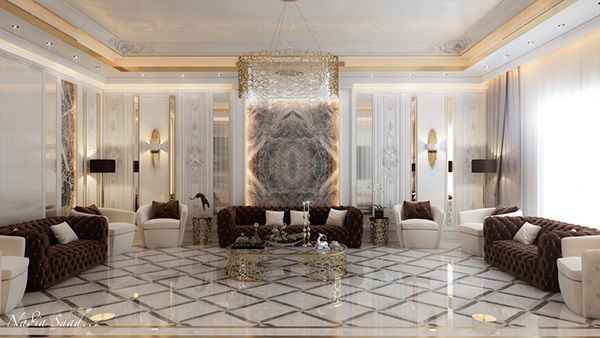
A contemporary perspective on the classic
Today, many still gravitate toward the elegant and sophisticated solutions typical of neoclassical interiors. Slightly creamy, soft, and light Swiss Coffee becomes an impeccable base in all respects for a palette peculiar to this style and helps to create a feeling of comfort, aristocracy, emphasizing the inviolability of traditions.
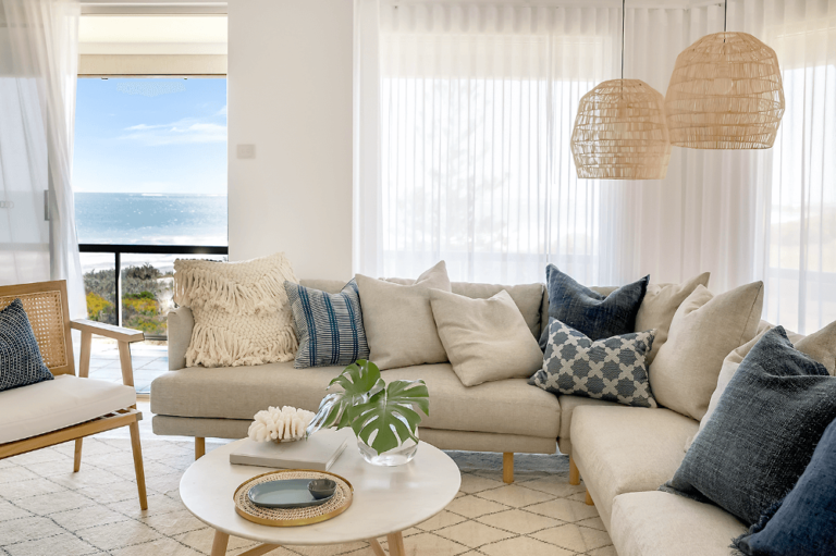
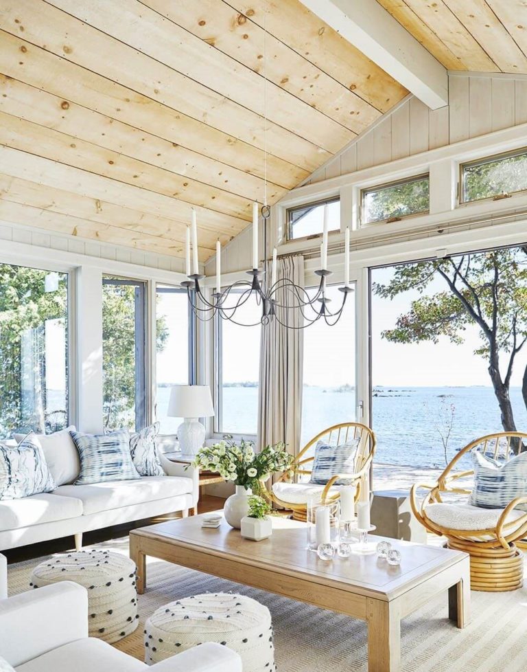
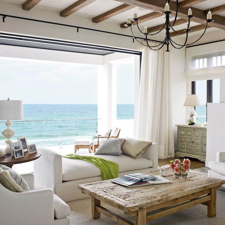
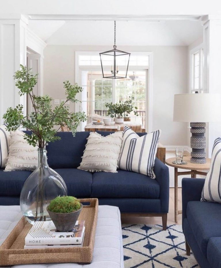
Welcoming Coastal
Coastal style does not suppose the use of such pure colors and sharp contrasts as the naval ones, making Swiss Coffee ideal for a background designed in this way. This off-white looks natural and welcoming, warm and muted, and lends itself well to such coastal hues as light and dusty blues, beiges, soft grays, sage, and wood.
Charming gold
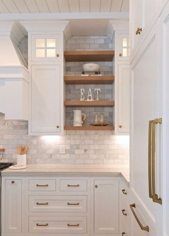
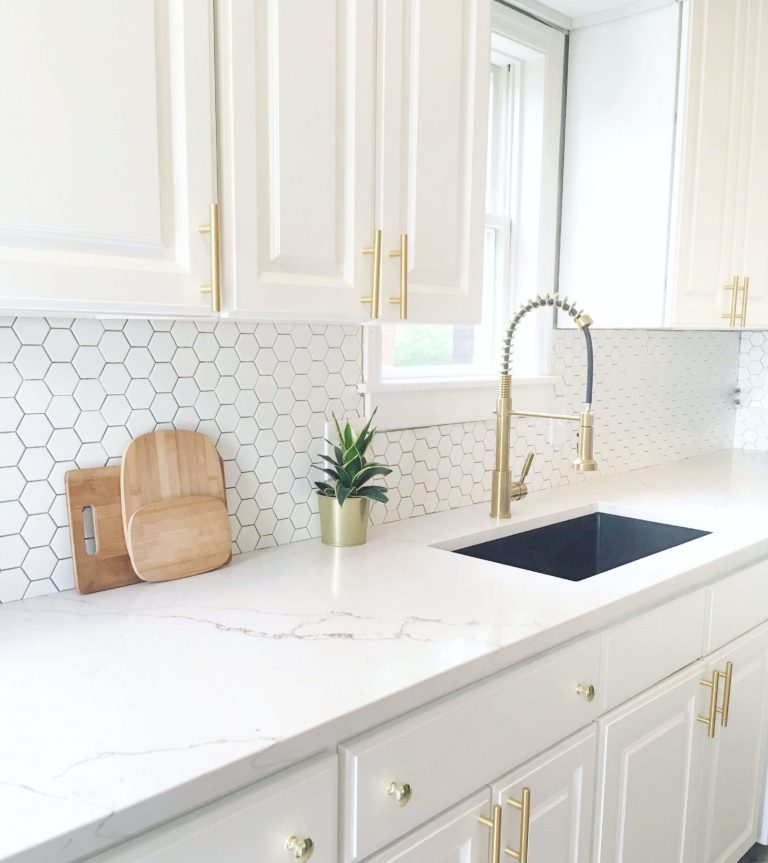
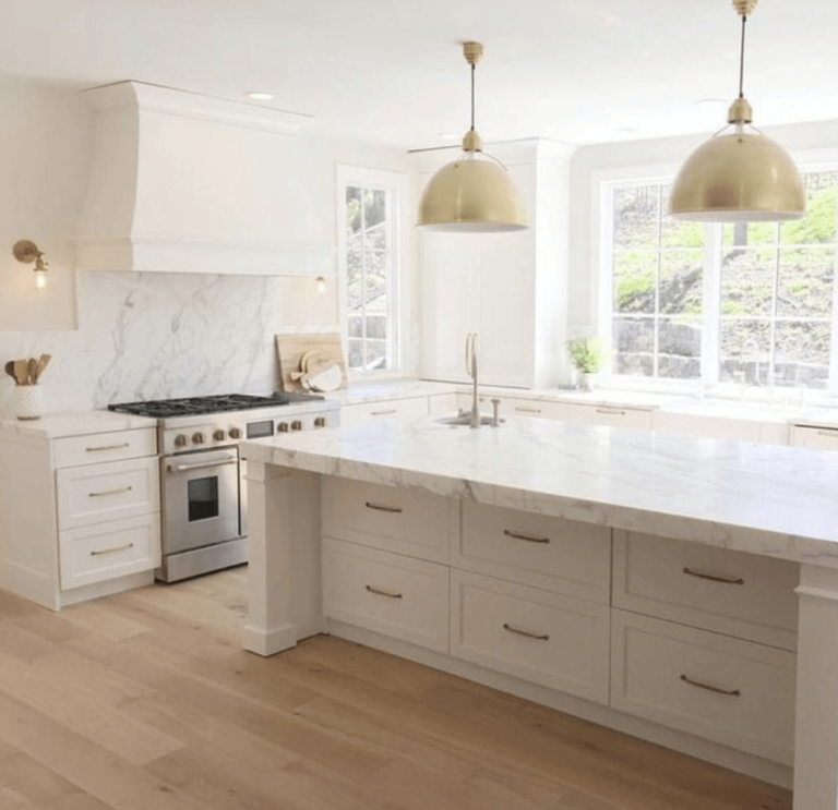
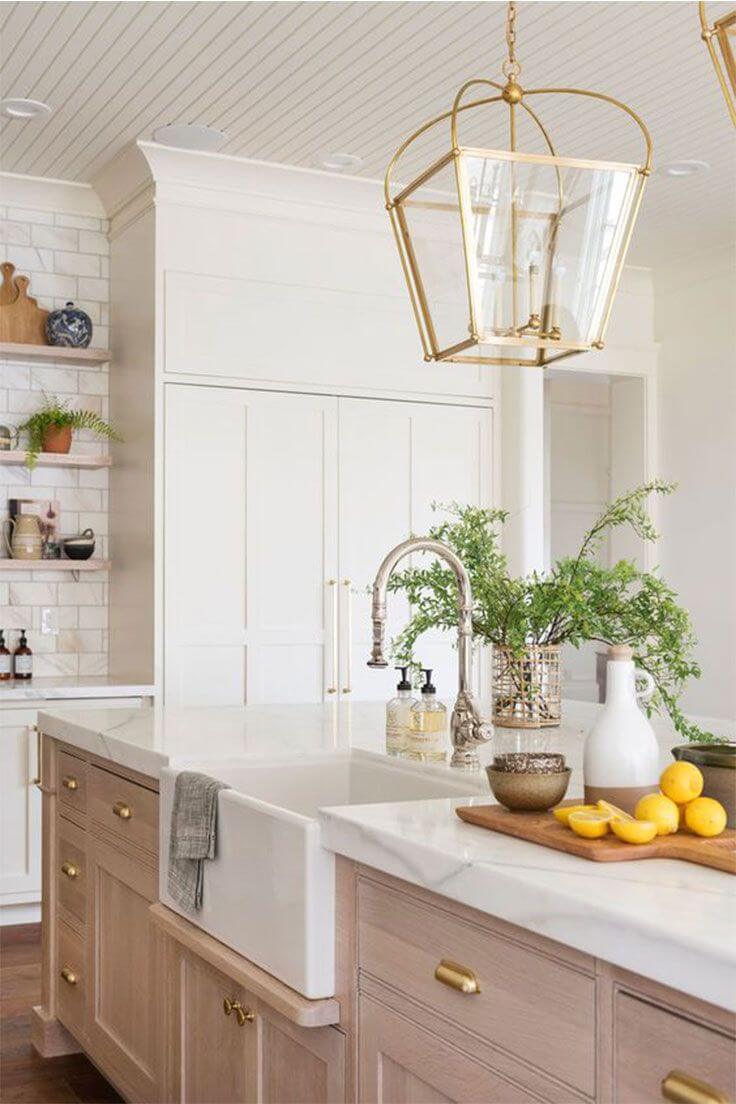
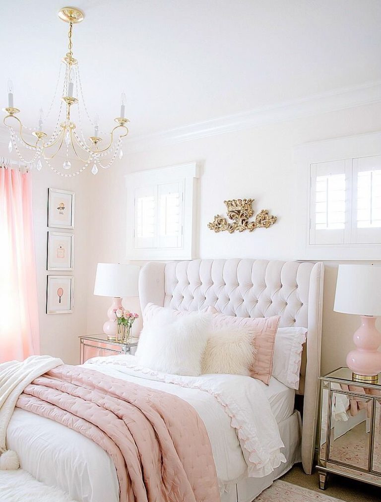
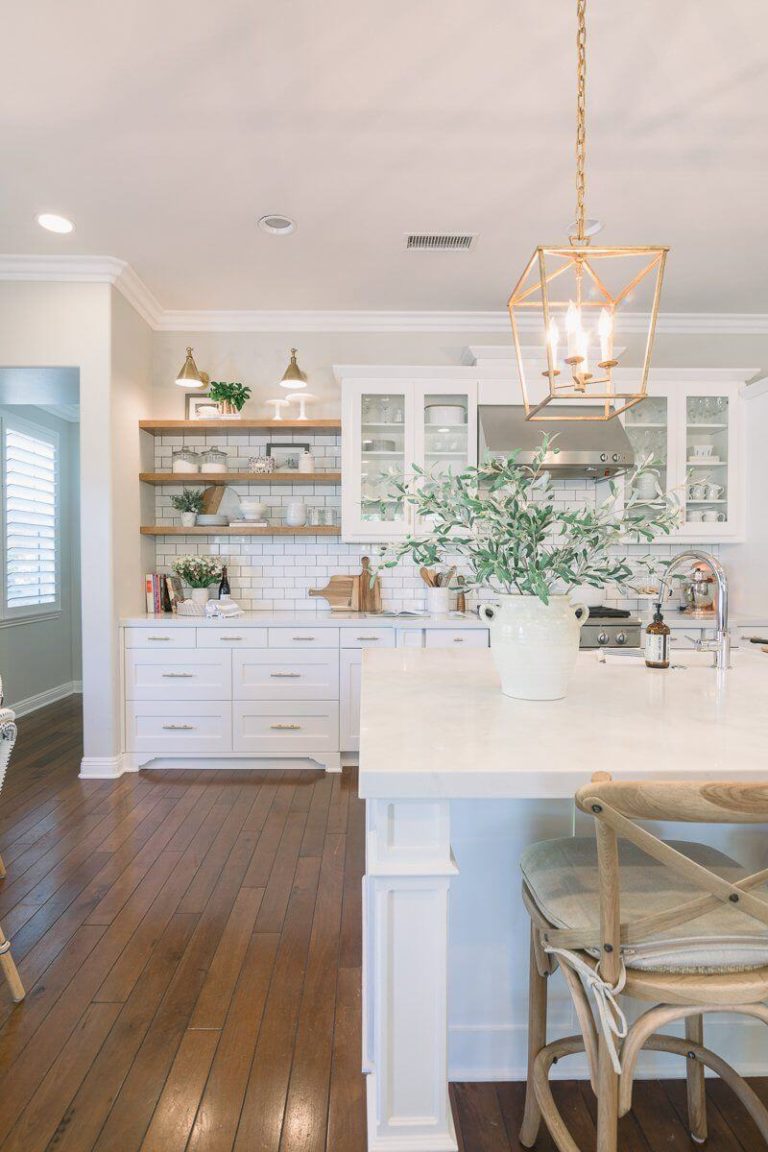
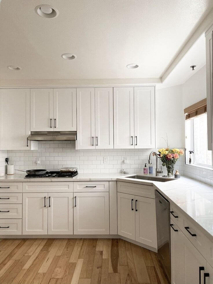
When it comes to metallic elements in a room dominated by Swiss Coffee, designers recommend choosing only units of this kind with yellow undertones. Brass, copper, bronze, and the same gold bring the golden undertones to the surface of this almost white shade, and therefore it not just becomes warm but acquires an impressive sense of sophistication on the verge of glamour.
To a greater extent, this is true for kitchen cabinets painted in this color. But silver, steel, and chrome are by no means a priority since they can make Swiss Coffee look faded and dirty. Even if the golden metal is not part of your plans, try to avoid silver options – better give preference to black forging.
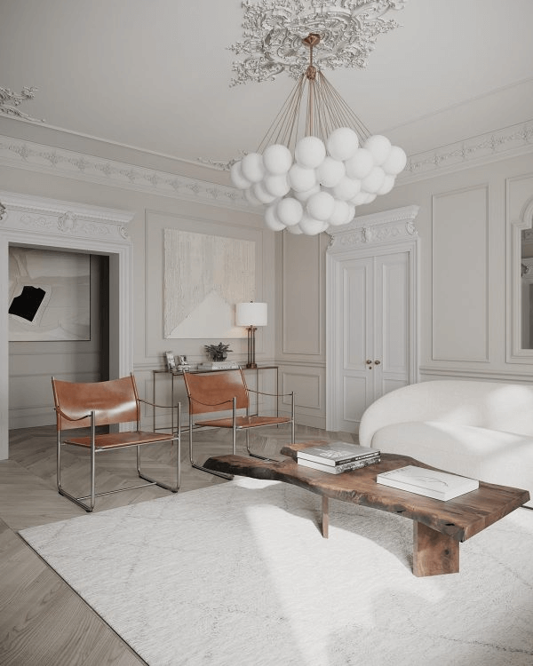
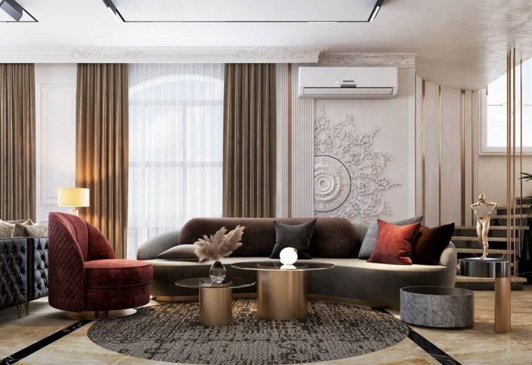
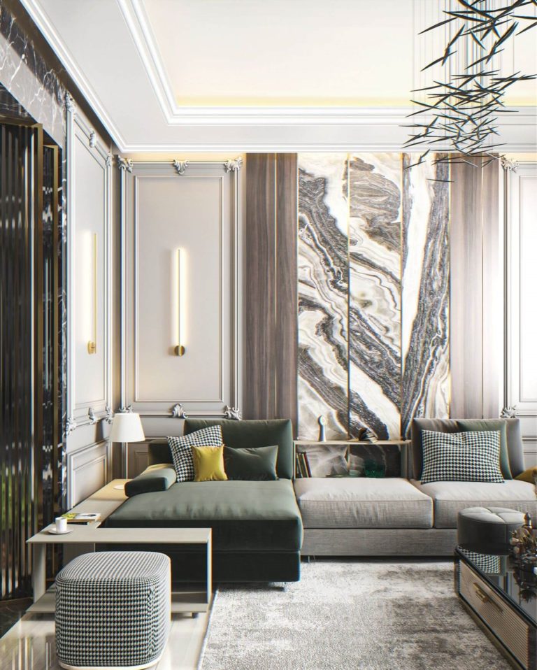
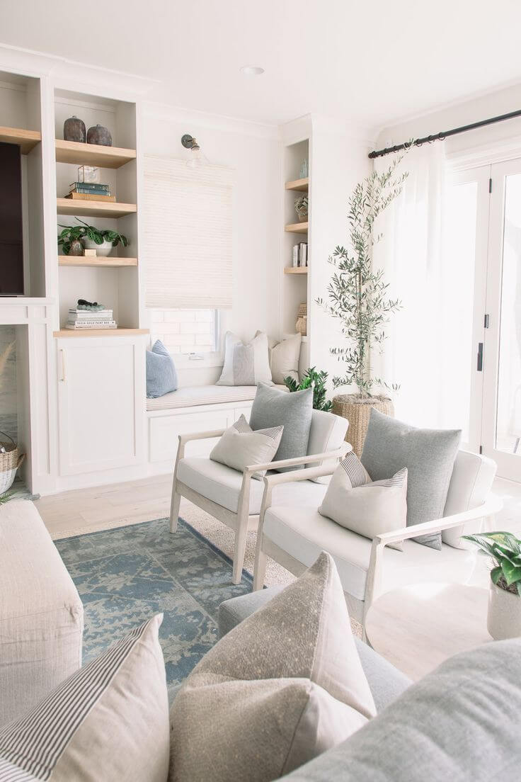
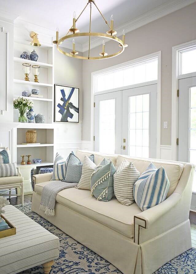
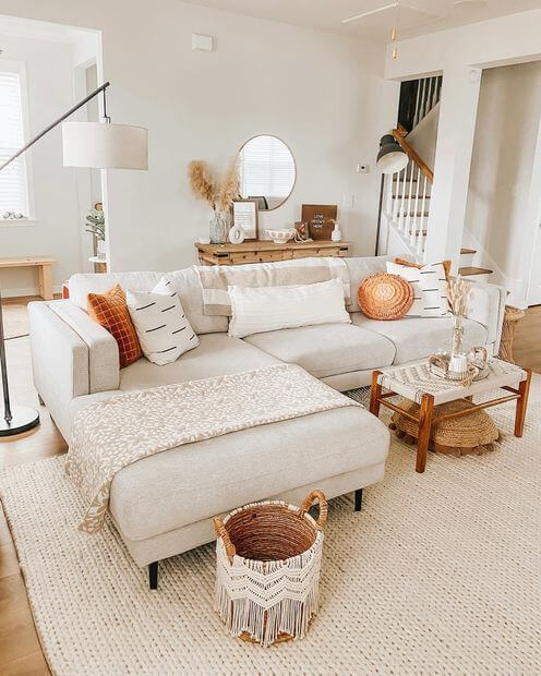
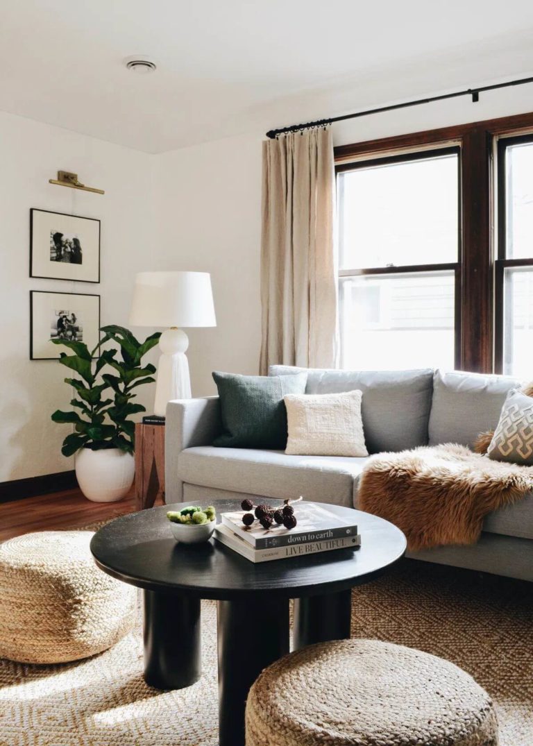
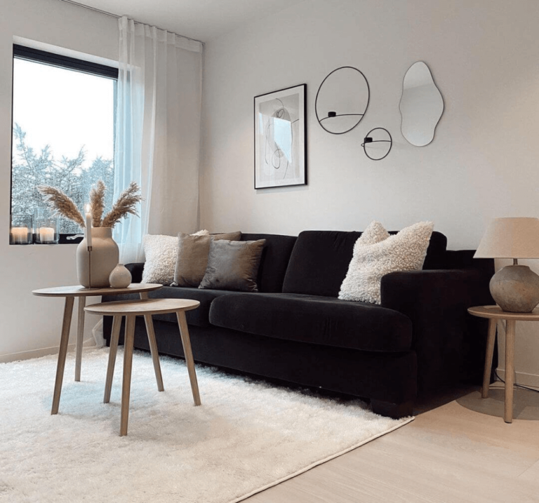
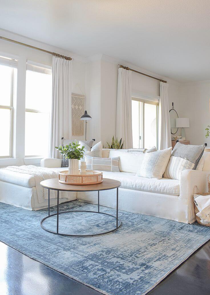
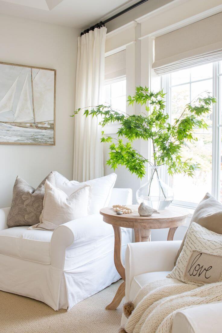
Living room
Swiss Coffee is a great find for living rooms because, with enough light, it manifests itself as a soft, airy, and very light color, providing a welcoming atmosphere. It creates beautiful harmonies with both dark wood elements and bright accents, as well as with a neutral palette and natural textures.
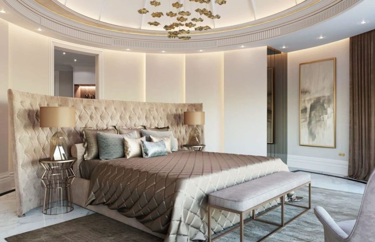
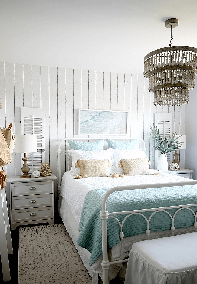
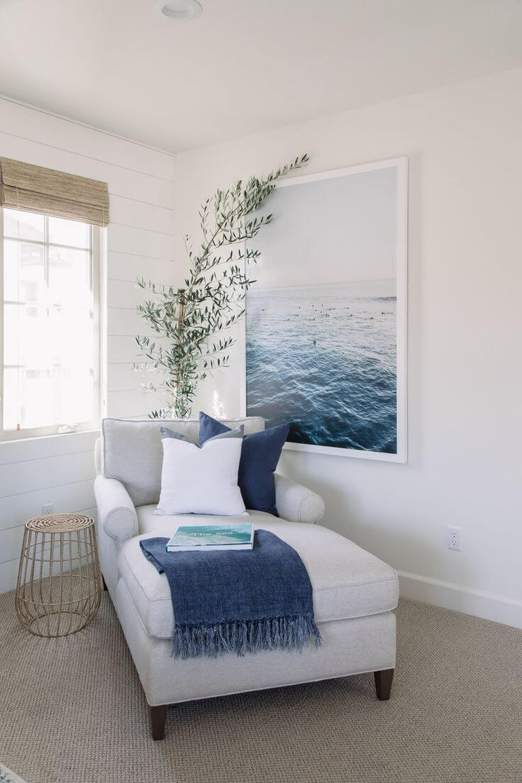
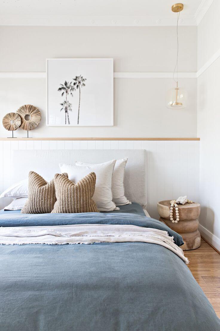
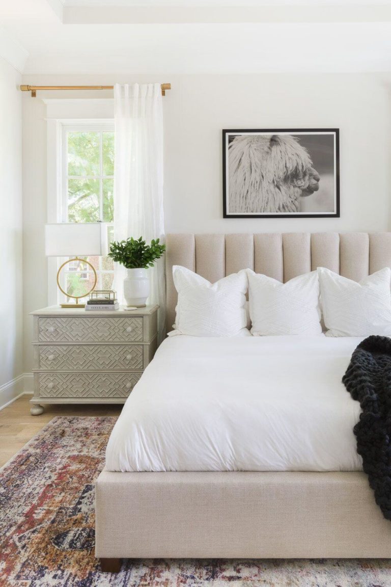
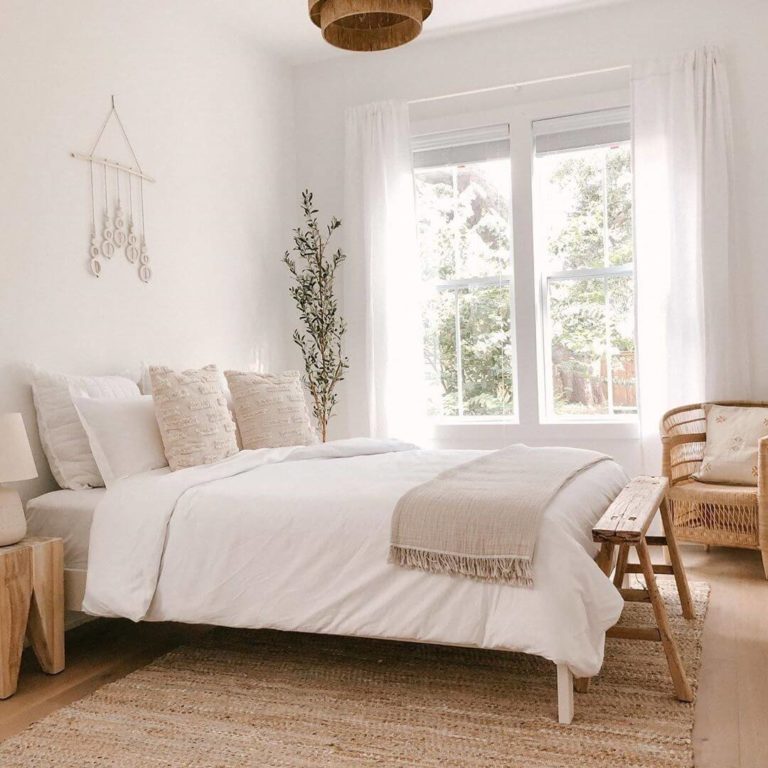
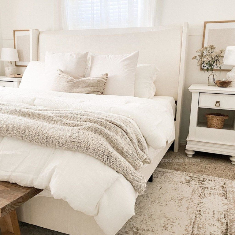
Bedroom
Whether your bedroom is designed in a Classical, Scandi, Provence, or Farmhouse style, Swiss Coffee can make a big difference. Its warmth and softness provide an enveloping and friendly atmosphere and create the basis for a harmonious combination of various types of textiles, natural wood elements in honey shades, and wall decor – primarily mirrors, paintings, posters, and macrame panels.
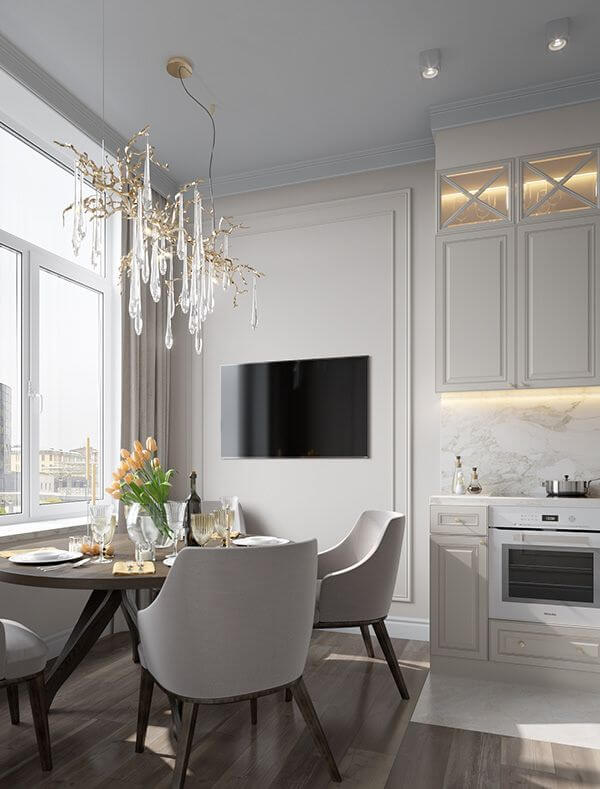
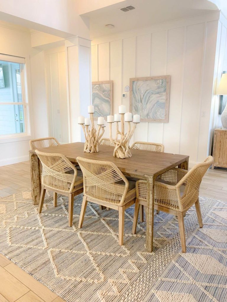
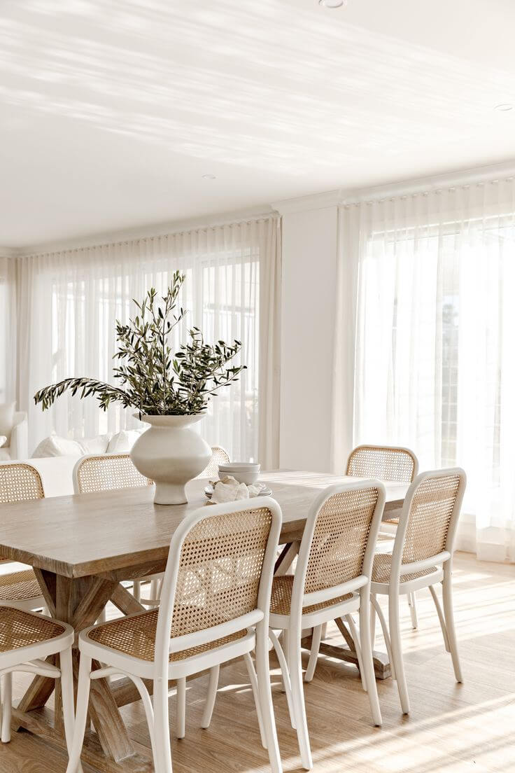
Kitchen and dining room
We have already mentioned above the suitability of metal elements for kitchen cabinets painted in Swiss Coffee. However, this is far from the only approach to be considered within this space. Feel free to use it for walls, the base of the kitchen island, and even chairs – thanks to this shade, your kitchen or dining room will always be light, cozy, and, let’s not be afraid of this word, appetizing. You can pair it with dark wood floors, light gray stone countertops, and copper fixtures for a delightful farmhouse or traditional look.
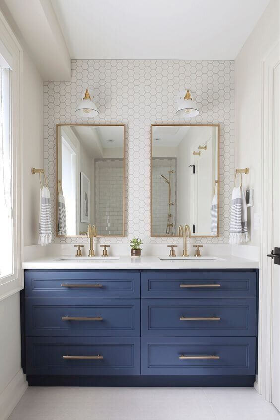
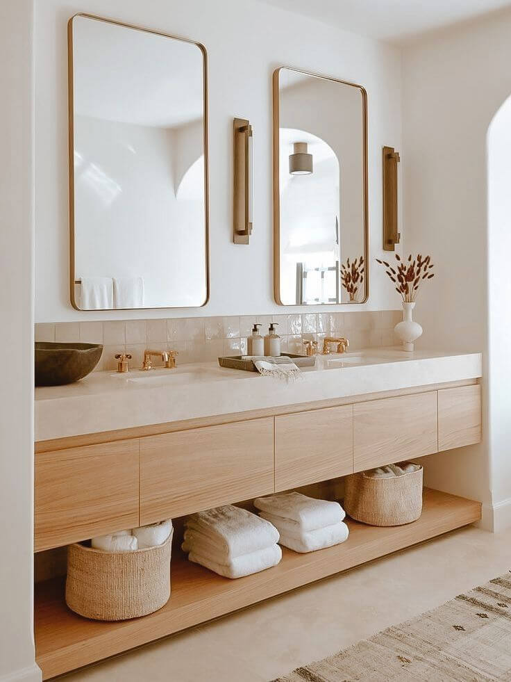
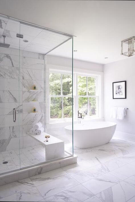
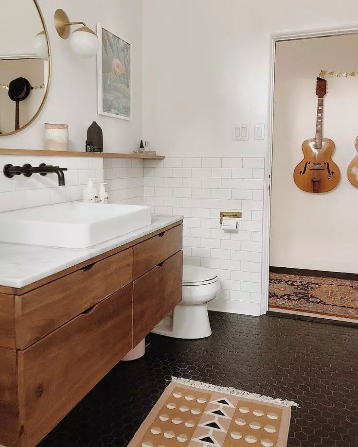
Bathroom
We don’t have words to describe how wonderful and appropriate Swiss Coffee is for bathrooms in most styles, from Classical to Scandinavian – we are sure that this is obvious. Nevertheless, we would like to draw your attention to this almost white shade as a perfect solution for small spaces.
On the one hand, true whites are quite capable of making a small bathroom brighter and more spacious, but there is a risk that they will look dazzling to the point of discomfort. Swiss Coffee is completely devoid of such risk because it looks warm, calm, and without excessive brightness in any case.
Use of Swiss Coffee for house exterior
Unfortunately, we do not have good news for those who like Swiss Coffee so much that they want to use it to paint the exterior walls of the house. The overly complex combination of undertones that makes it charming in an interior can be so unpredictable in an open space that the result risks discouraging or, frankly, disappointing you. At the same time, it cannot be balanced by either a dark or bright white finish since you will not even know what undertones it will reveal. That’s why designers insist on keeping OC-45 for interiors where it excels – and for exteriors, opt for other, more predictable off-whites.
The almost white Swiss Coffee from Benjamin Moore is impressive and, at the same time, quite complex. However, if you adapt it, you will get a sophisticated and modern interior, in which the feeling of warmth and comfort is firmly intertwined with an atmosphere of elegance. Would you like to try it yourself? Don’t hesitate! We believe in you!
