Teacup Rose 2170-50
Benjamin MooreA pastel coral pink that evokes comfort, love, and optimism. Dilute your lifestyle with a gorgeous pink paint color in your home.
Teacup Rose 2170-50 (Benjamin Moore): What Color Is, Review, and Use
Color speaks, tells stories, and expresses emotions. The pastel coral pink from Benjamin Moore with the romantic name Teacup Rose fluently speaks the language of love, comfort, and compassion. This weathered pastel shade borrows color from the outdoors and invites us to celebrate the beauty of vibrant natural tones. It’s time for a colorful update, and we think you’ll like Teacup Rose as much as we do. Read on!
Teacup Rose Paint Color Features
This mid-tone pastel pink with a drop of coral is one of the trendiest paint colors of 2024. We are impressed by how this vibrant pink shade feels radiant and calm simultaneously. With a nod to traditions and full of contemporary air, Teacup Rose knows its way around various design styles. Discover a new sense of comfort and peace at home with a paint color that successfully combines serenity and personality.
Teacup Rose: Is It Warm or Cold?
No doubt, Teacup Rose is a warm paint color. Still, let’s check the facts. We analyzed the RGB (Red, Green, Blue) value and found out that the Red amount considerably prevails over the other two colors. So, undeniably, we deal with a warm shade of pink.
How Does Lighting Affect Teacup Rose?
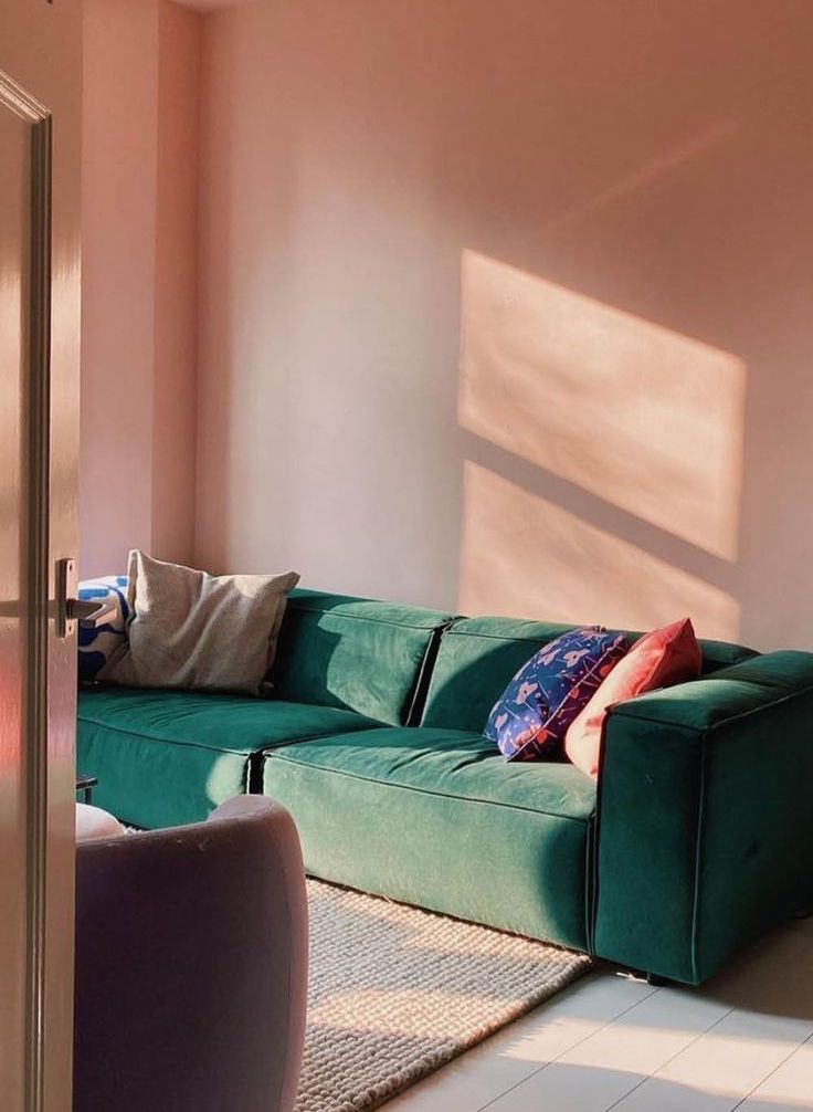
Exposure is the key. For instance, in a north-facing room, Teacup Rose will confidently show a note of gray in this most appealing pink. Therefore, a more muted gray-pink, still soft, will resurface. Conversely, expect a much warmer coral pink in spaces with south-facing windows bathed in sunlight. You can also witness a profound sepia effect when this color directly interacts with sun rays. The same goes for rooms with eastern exposure in the morning and west-facing spaces in the evening.
Artificial lighting will give Teacup Rose a less radiant, muted effect at night. Yet, the color will preserve its original charm.
Teacup Rose LRV
Usually, designers and architects use the Light Reflectance Value to determine how much light a color reflects on a scale from 0 to 100. It also shows how dark or light a color is. On Benjamin Moore’s official website, we can find Teacup Rose’s LRV, which is 60.42. That’s why we called it a mid-tone earlier. Slightly leaning toward the light side, this rose shade has all the right to be named a middle tone.
In translation, it means our new favorite shade is pretty good at reflecting the light throughout a space, keeping it well-lit and relatively spacious. Don’t hesitate to use Teacup Rose as a primary paint color and an accent.
Teacup Rose Undertones
At first sight, it’s a gorgeous and catchy pink tone. The more you look, the better you see the unforgettable tinge of coral. Some may even say there is a subtle gray to it, and they won’t be wrong. The hidden gray undertones come to the surface under cold natural light.
Similar Colors
Since pink has been a must for over a decade so far, we can safely claim there are plenty of pink shades of any personality and undertone combination. Let’s see how true it is about Teacup Rose. These are the main alternatives:
Coordinating Colors
Colorists from Benjamin Moore claim that neutral, light, and dark are the best paint colors to pair with this vibrant and unconditional shade of pink. On their website, we found a selection of expert-pick colors to contrast the boldness of Teacup Rose.
Use of Teacup Rose in Interior Design
Such colors like this optimistic coral pink encourages us to look beyond standards. Embrace a new color this year and allow it to transform how you see the world. Take on the challenge and decorate any room with this inspiringly beautiful pink from Benjamin Moore. We’ll show you how to do it the best!
Teacup Rose Background
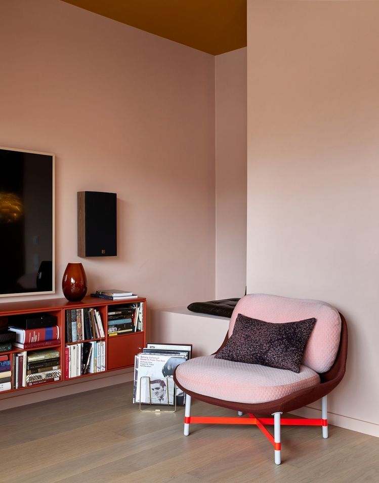
Regardless of how bright this new-generation pink seems, the current painting trends dictate its use as a backdrop color as well. Cover all walls in coral pink in your living room, bedroom, or any other room, and allow rich textured or bold-colored accents to take center stage.
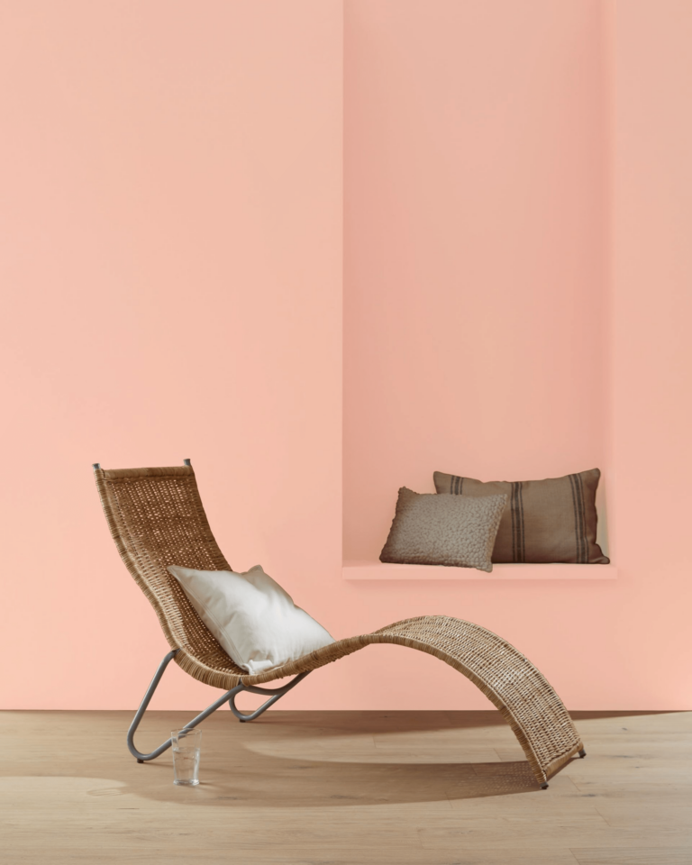
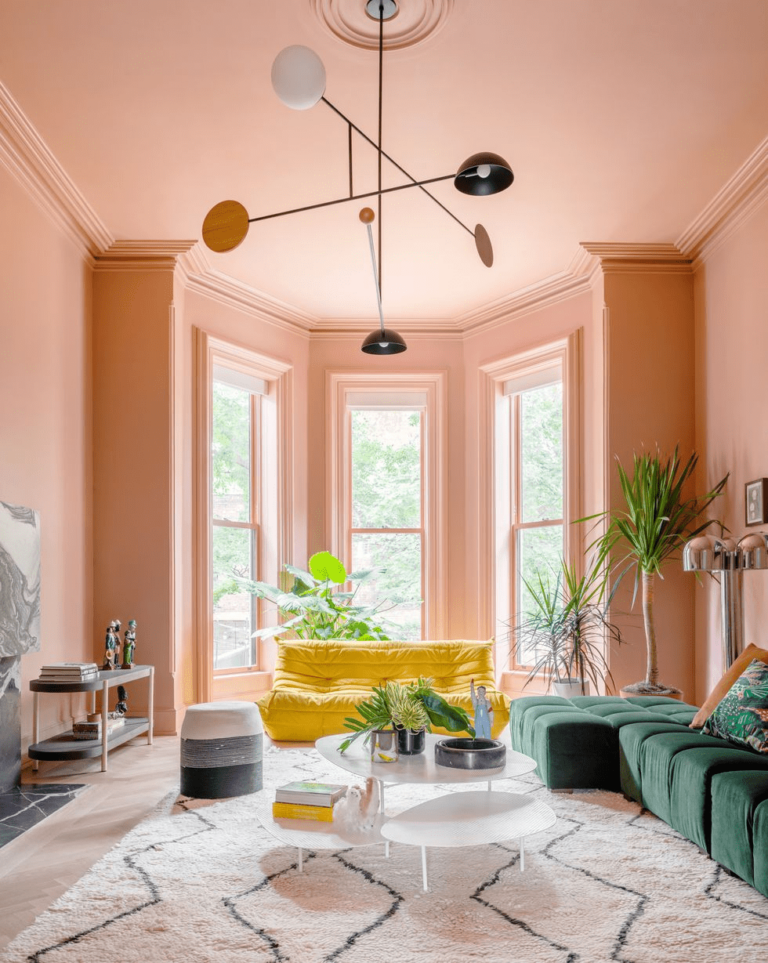
Eclectic Living Room
Undoubtedly, this pastel pink with vibrant undertones is perfect for eclectic design projects involving an array of bold colors and different design styles. Get creative this season and install an energetic mood. You’ll indeed feel different in your home when surrounded by a daring color palette that roars inspiration and freedom.
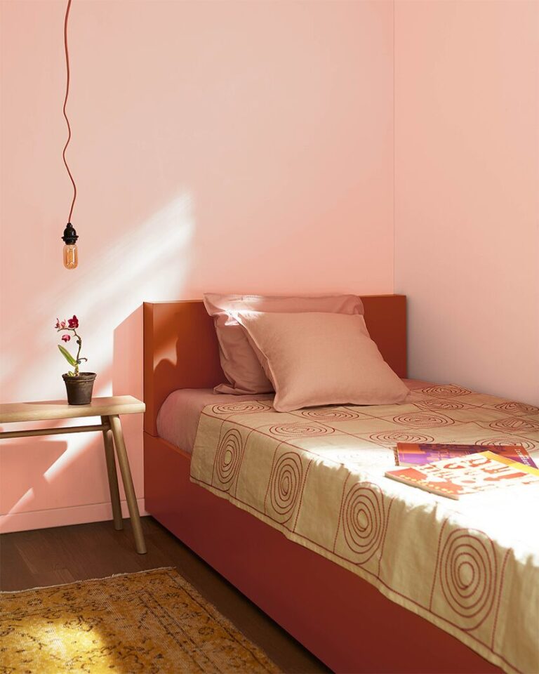
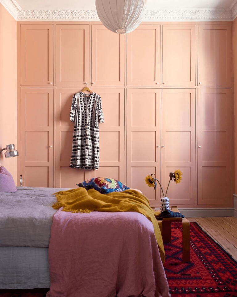
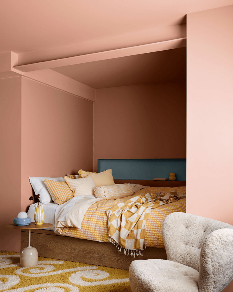
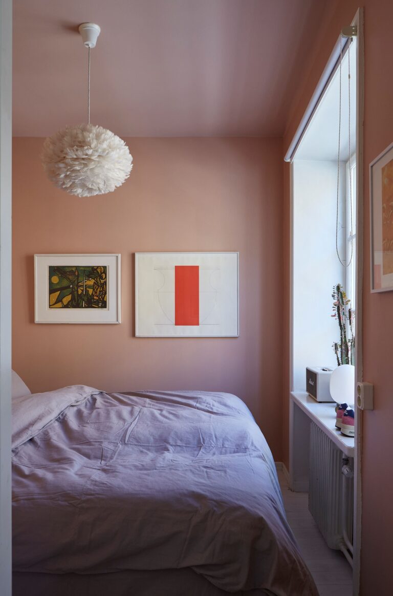
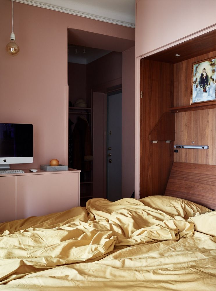
Coral Pink Bedroom
Pink has always been a favorite in bedrooms. It’s calming, comfy, and serene. The good news is this trendy pink from one of the top paint brands feels absolutely different from neutral pinks. You’ll fall in love with pink again. Keep the color palette simple, or dare contrast pink with a new color, such as bright yellow bedding paired with coral pink walls. Experiment with new colors.
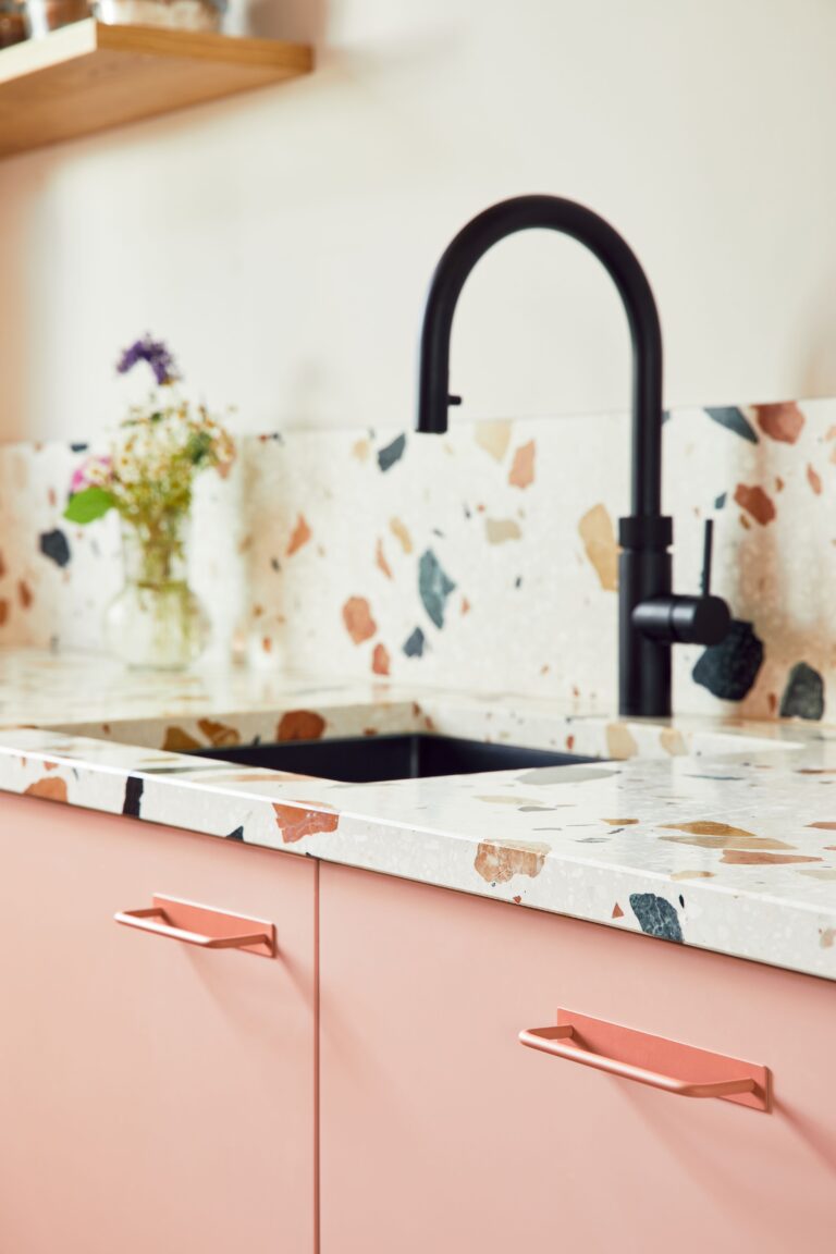
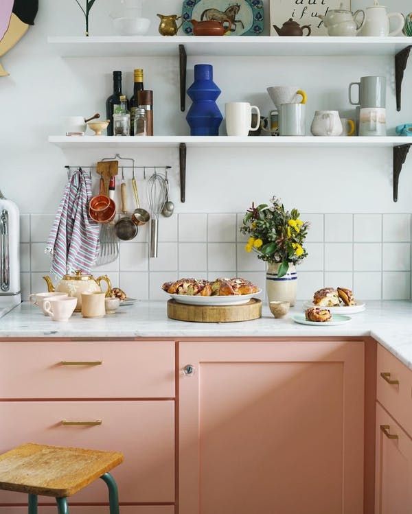
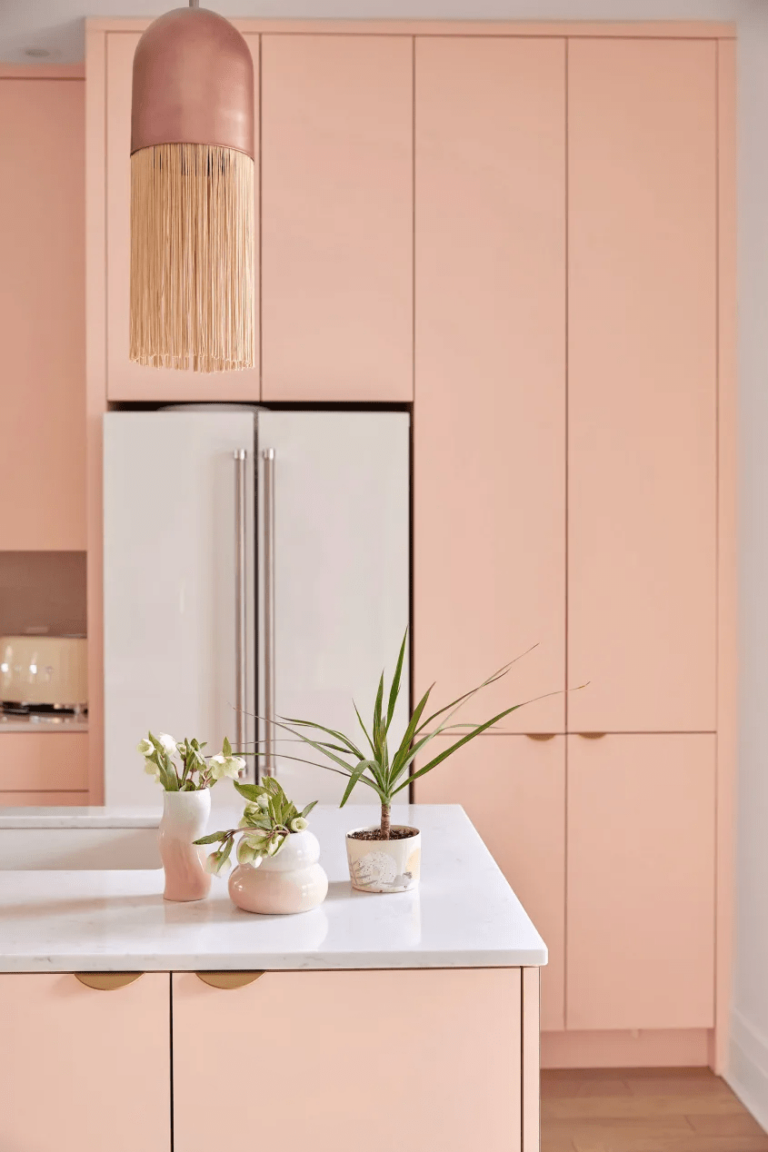
Modernize the Kitchen
Give your kitchen an impetus of freshness with a new pink that looks similarly voguish on modern and traditional-style cabinets. The dazzling coral note in Teacup Rose resonates with contemporary color palettes in sleek and decluttered kitchens. Simultaneously, the retro sepia effect in the same paint color perfectly accompanies a traditional cooking space with vintage-designed cabinets.
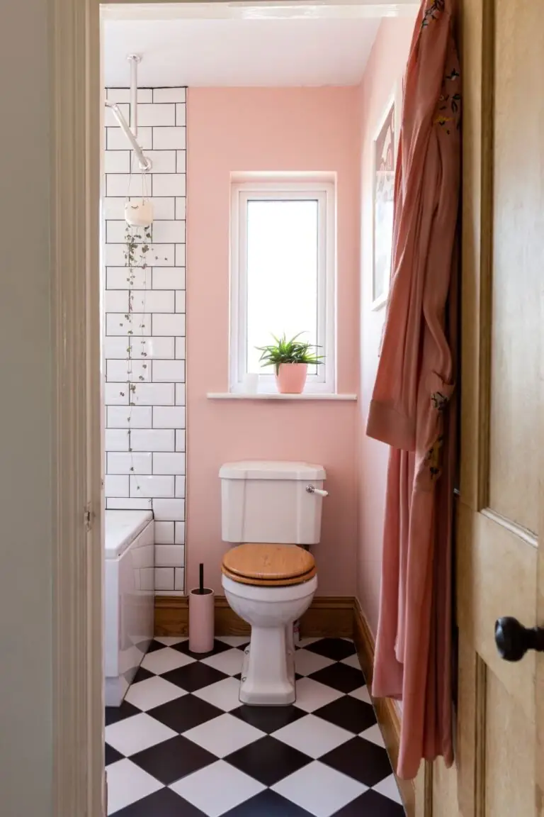
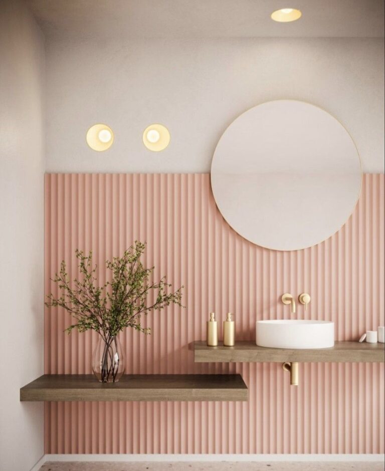
Bathroom
It’s time to replace neutral color palettes in bathrooms with more colorful ones. Bathrooms are more than utilitarian spaces. Fill it with positive energy and dilute your routine with pink. What a remarkable coincidence that Teacup Rose looks beautiful in traditional bathrooms – experts suggest pairing coral pink walls with trendy checkerboard flooring tiles. Still, a modern pink bathroom sounds equally stylish. For instance, apply Teacup Rose to ribbed wall panels.
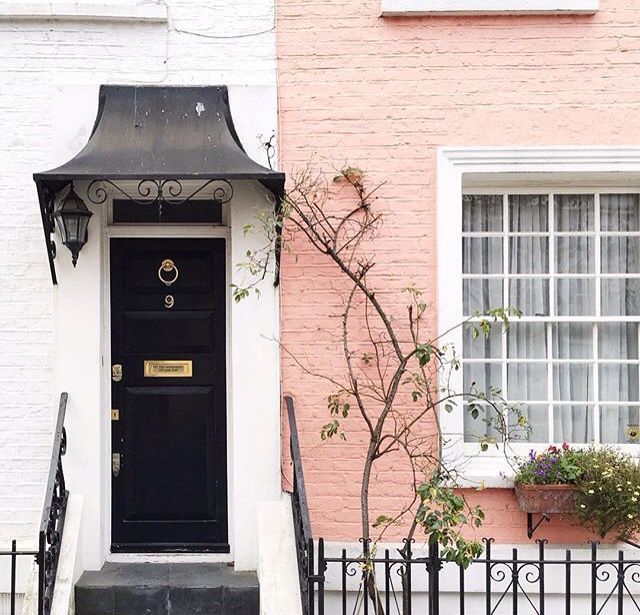
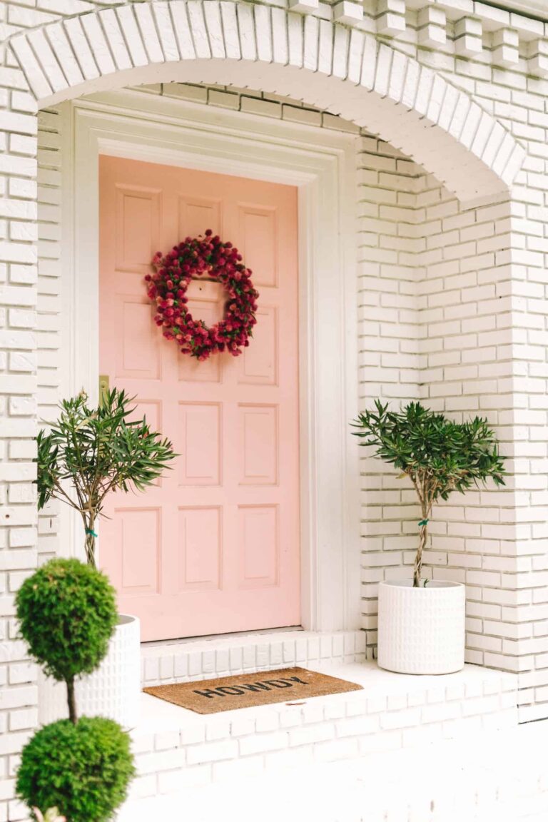
Use of Teacup Rose for the House Exterior
Usually, homeowners and designers don’t use bright colors for house exteriors since they tend to lose their charm when bathed in direct natural light. It’s definitely not the case with Teacup Rose. The solid coral undertone will keep it as bold as ever. For instance, you can use this pastel pink on brick walls or the front door paired with white walls.
The Teacup Rose 2170-50 paint color by Benjamin Moore evokes feelings of coziness, optimism, and compassion. With one side – retro and another – ultra-modern, this versatile tone of pink will adapt to any design style. Celebrate every moment by charging your energy with color.
