A breezy neutral with a subtle beige-gray undertone that may read green-blue; it teaches us the essence of a well-balanced interior that boosts our well-being.
Terrace White (Dulux): What Color Is, Review, and Use
This year, the beloved and trusted color brand Dulux puts a wide range of paint colors at our disposal that connects with the outdoor world, helps us find balance and teaches us to enjoy the little things. If you are still looking for a way to reconnect with your inner self and find harmony at home in these uncertain times, you will most likely approve of the Terrace White paint color.
A lot of questions arise around Terrace White. Is it really white? Why “terrace”? And, most importantly, how can you make the most of one of the expert choice paint colors? All answers are as follows.
Terrace White Paint Color Features
TW is a complex neutral paint color. While some still regard it as the white you would probably notice on a terrace at a particular time of the day, others say it is a very light gray shade. The peak of intrigue is that many people see it as a soothing green-blue. How come? It is all about the undertones. To clarify this, the creators of this paint color state that Terrace White is a neutral tone with a subtle beige-gray undertone.
As an impressively light shade of gray, TW is calm, respects boundaries, and infuses an unmatchable feeling of tranquility. The sophisticated gray from Dulux is a genuine pearl among thousands of gray shades, yet it stays humble, highly functional, and flexible. Colorists suggest that such a light gray, unlike darker shades, skilfully works with anxiety and overthinking by keeping them at bay. It undoubtedly makes the room feel more spacious, and while it doesn’t much like changes, it will happily support your creativity and serve as a canvas.
Terrace White: Is It Warm or Cold?
The updated gray shade from Dulux is relatively neutral. But, there is a “but”. If we were to analyze its RGB value, the concentration of Red, Green, and Blue, we would come across such values as 215 – Red, 218 – Green, and 216 – Blue. The cool pigments, green and blue, slightly prevail over red, offering TW a subtle cool cast.
How Does Lighting Affect Terrace White?
Since TW is a very light paint color and gets various interpretations, lighting undoubtedly affects it. If you would enjoy a bright gray shade with beige bursts of energy that almost fade into white, consider TW in a room fully penetrated by sun rays, a space with southern exposure.
If your room has north-facing windows, the lack of sunlight will bring an emphasized blue tinge to this light gray shade, leaving behind a well-defined cold cast. Don’t forget that such light paint colors also tend to absorb the surrounding colors, such as a bright-painted furniture piece or the outdoor greenery.
Expect a somewhat muted beige-gray effect during the night when artificial lighting replaces natural light.
Terrace White LRV
If you still think TW is purely white, consider the following fact: colors with a Light Reflectance Value higher than 82 are white, referring to white shades only. Everything that comes lower is off-white. TW has an LRV of 72. Close to white, yet not white. Reflecting 72% of light out of 100 shows that a room painted with TW feels bright and large.
Terrace White Undertones
Finally, we got to the part that explains everything. The neutral paint color starring in this article has a subtle beige-gray hint, very soft and relaxing. Additionally, the green-blue fragrance allows this shade the liberty to seem slightly green or blue, and you can easily mistake TW for a very light blue shade if the right light hits.
Similar Colors
We don’t promise all the following alternative shades will give you a 100% similar effect, but they are worth trying since some are considerably close to White Terrace. To your attention – the best substitute paint colors to use instead of Terrace White if it is the case:
Coordinating Colors
Terrace White is neutral, right? It means it works with pretty much any other color. If you still want to pair it with another shade of white, colorists advise choosing cooler whites. For contrast, go with muted color variations. Here are a few precise color matchings from Dulux:
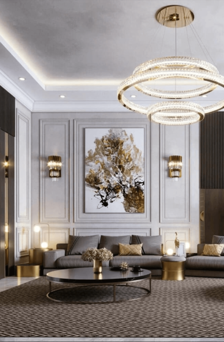
Use of Terrace White in Interior Design
The idea of Terrace White looking gray should not give you any worries. While grays are fast going out of trend, such gray shades with rich pigments as Terrace White will always be welcome. Moreover, you can use this neutral paint color to paint the walls in any room of your house. We will show you how you do that.
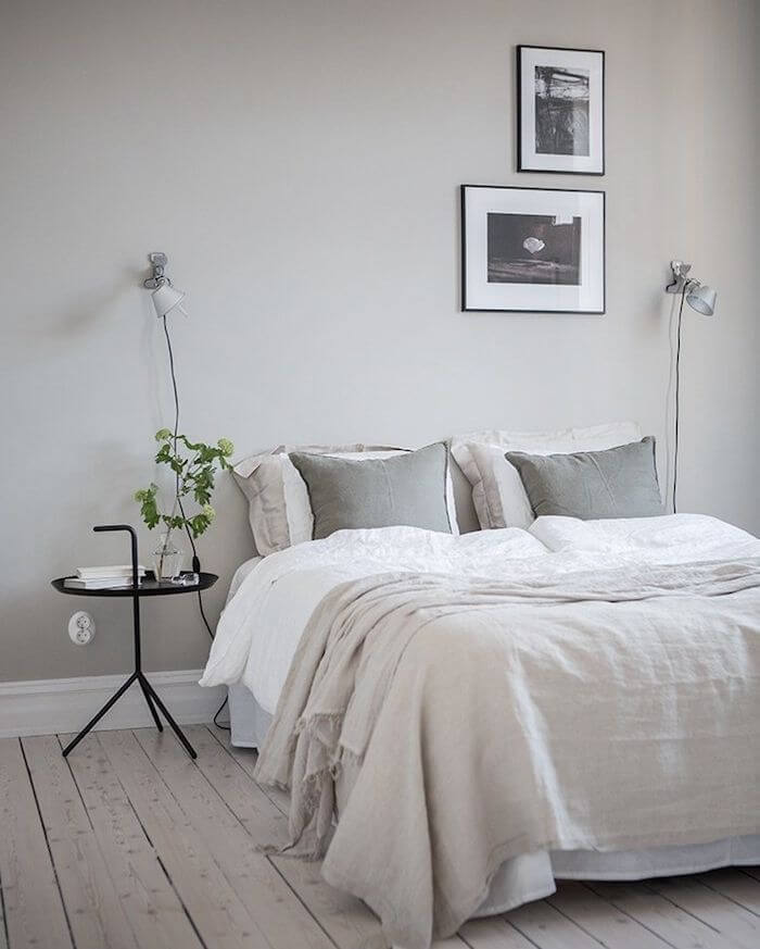
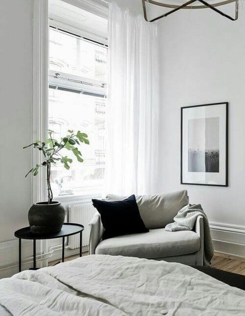
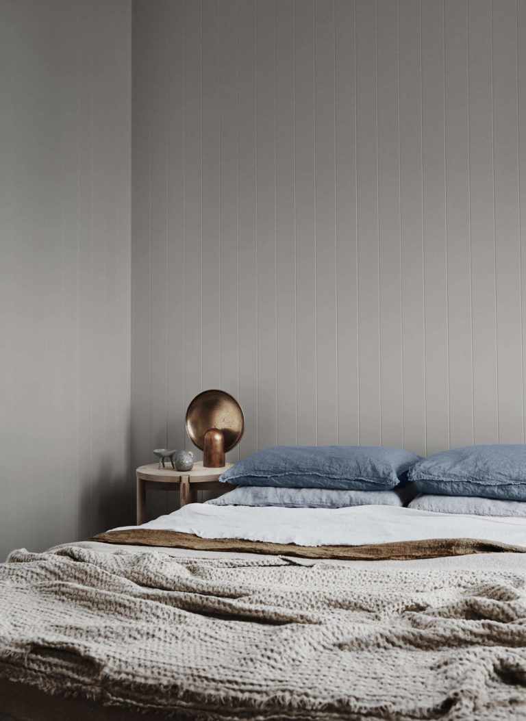
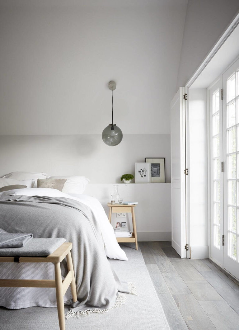
Modern Bedroom with a Mountain Air
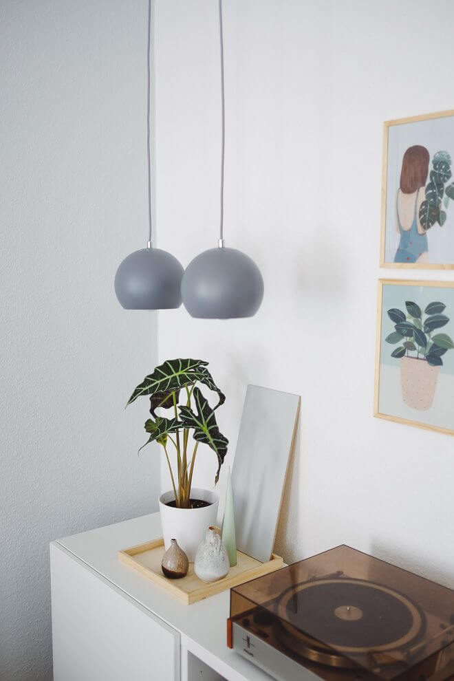
We usually want our personal spaces to look and feel pleasant, calming, and easy, like an escape from the daily routine and worries. In this sense, avoid contrasts and opt for an airy color palette. Choose TW for walls and light wood flooring. Avoid cluttered surfaces and unnecessary accessories. Let the room breathe and refresh your mind.
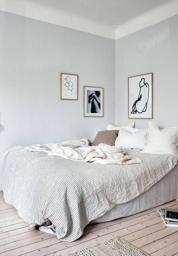
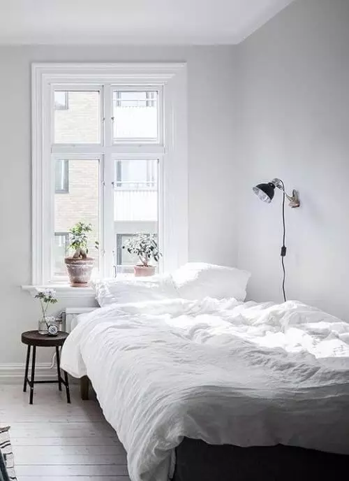
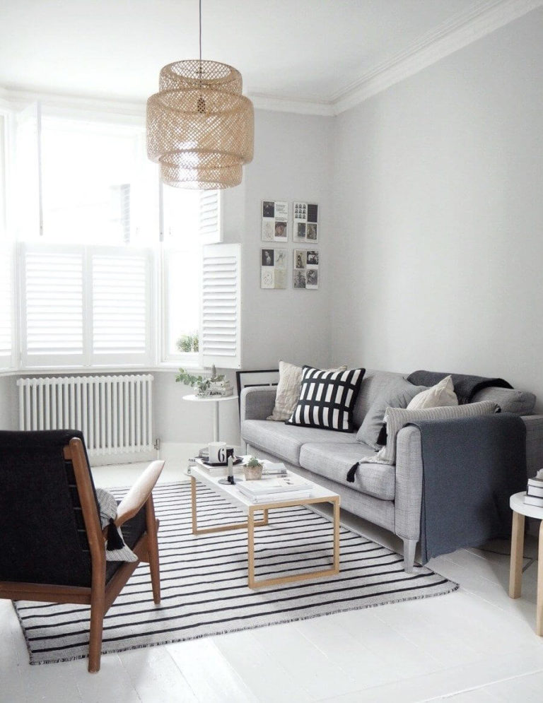
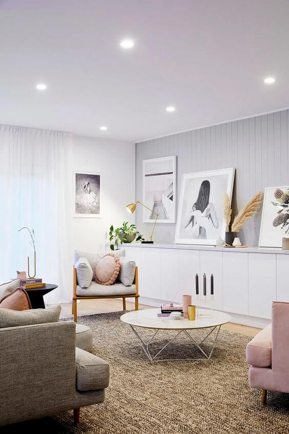
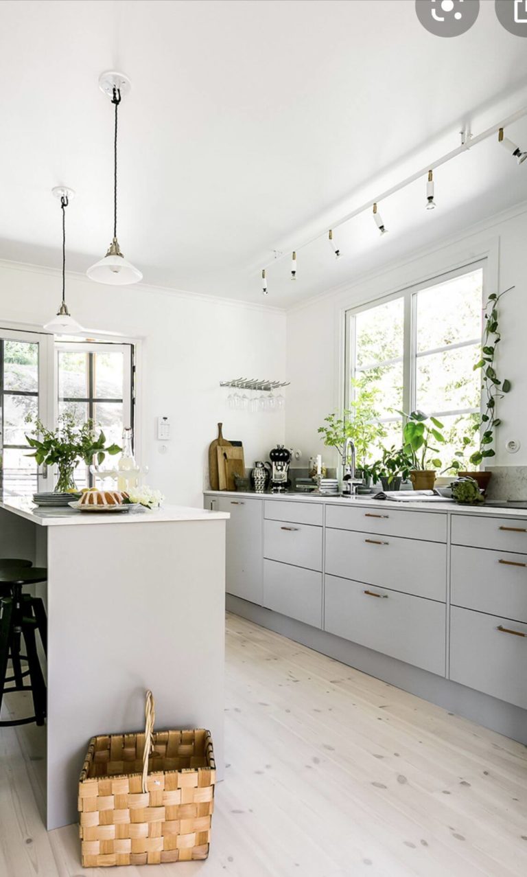
New Scandinavian
We all know that the Scandi color codes include cool grays that reflect the Nordic countries’ weather. If you are still fond of the timeless design style that uses wood and aesthetic decor, update the look with a new neutral paint color for walls. Ensure natural light fully penetrates the space and avoid any unnecessary units of furniture or decor that may risk the room’s aesthetics.
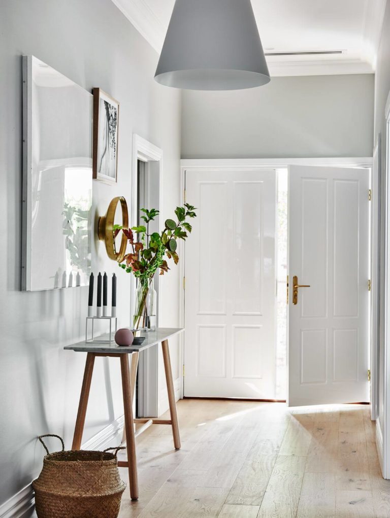
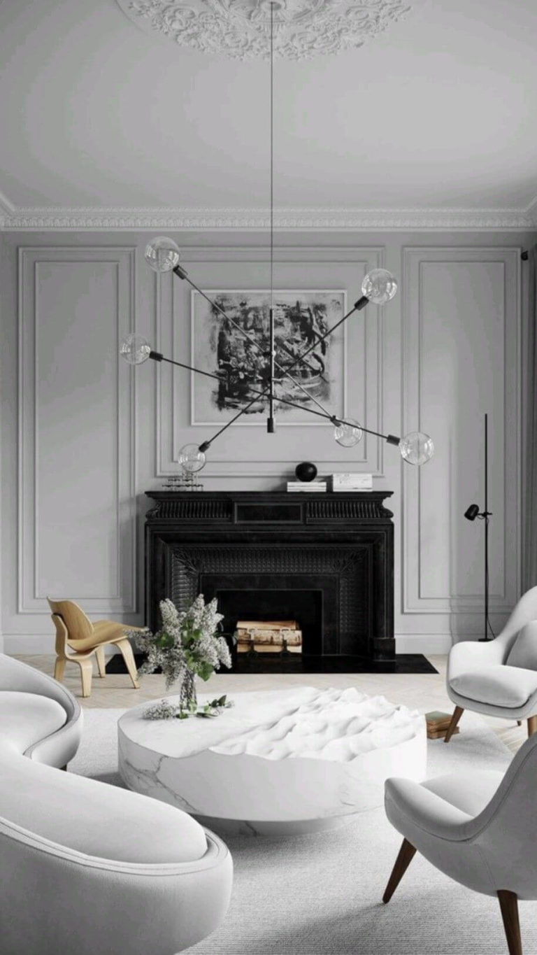
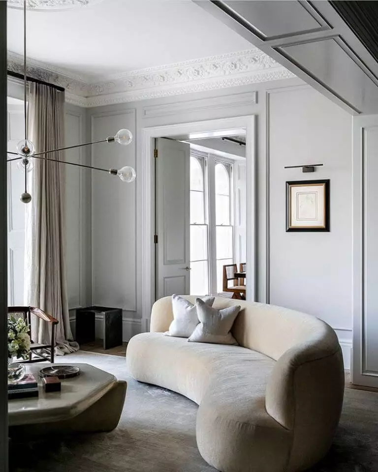
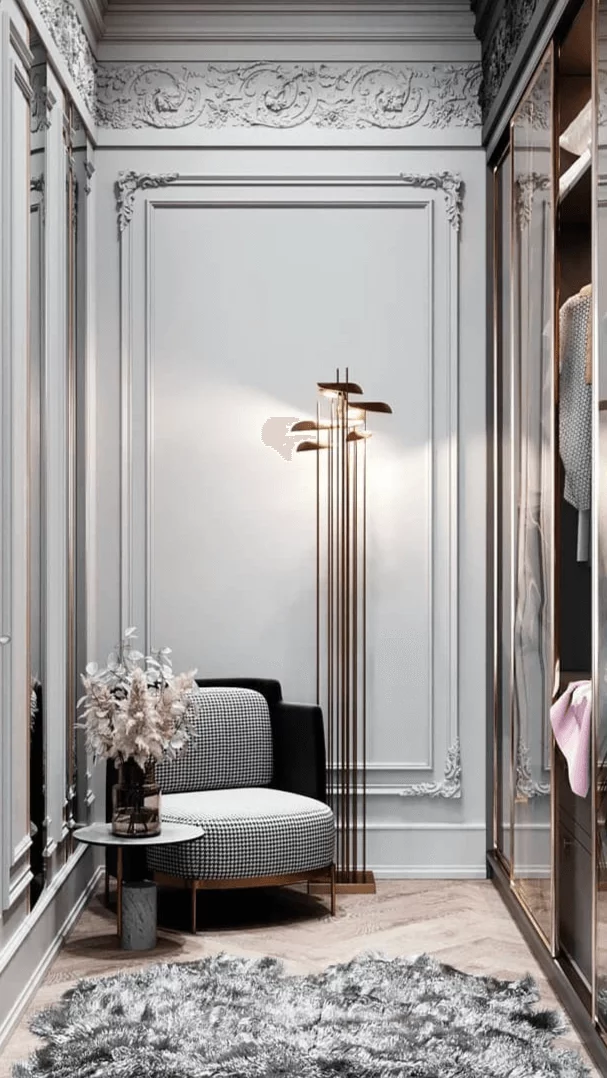
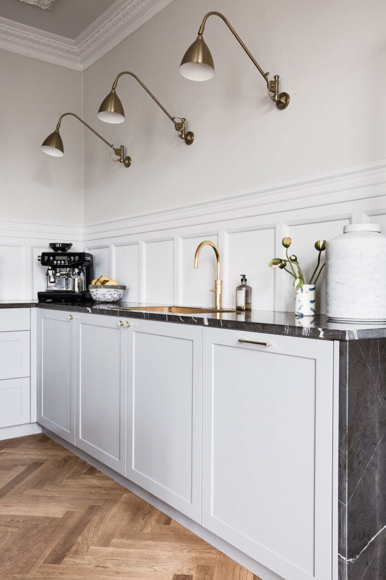
Underlining Architectural Features
When light and shadows play with the dusty gray Terrace White, it tends to add a magical feel of sophistication and style. Therefore, painting gray walls decorated with Classic molding, be it in a Classic, Neoclassical, or Parisian design, is a great chance to uplift the mood in your room. It also works for beautifully decorated kitchen cabinet facades.
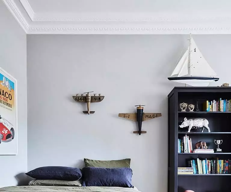
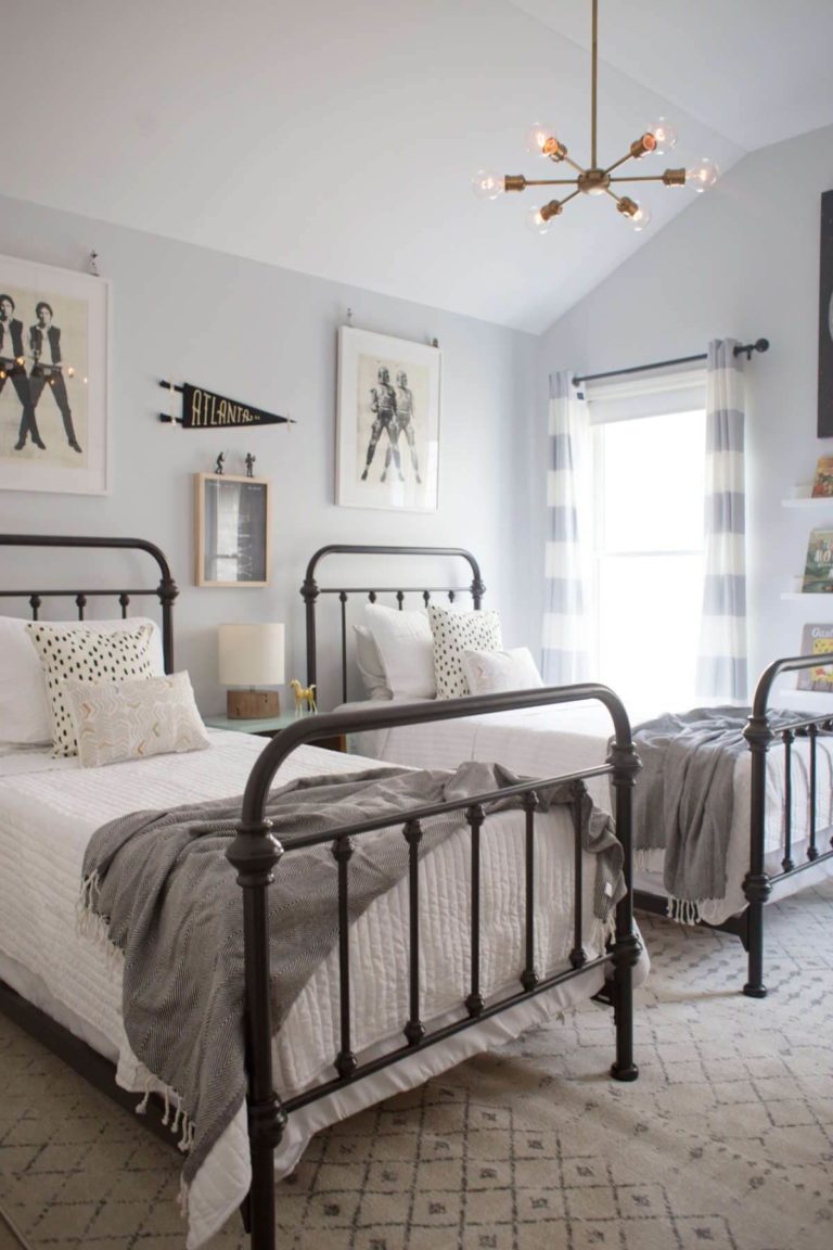
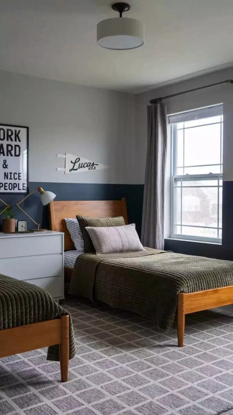
Boys Room
There is a tinge of masculine energy in Terrace White. While this paint color would look great in every kid’s room, regardless of gender, there are ready-made projects with boys’ rooms painted light gray since this neutral accepts any accessories in terms of furniture, decor, and personal belongings. Moreover, the base color adapts to the current decor as your child grows up.
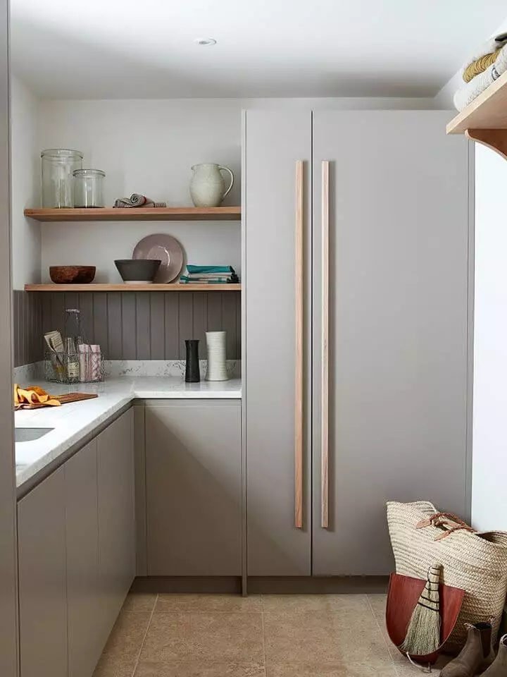
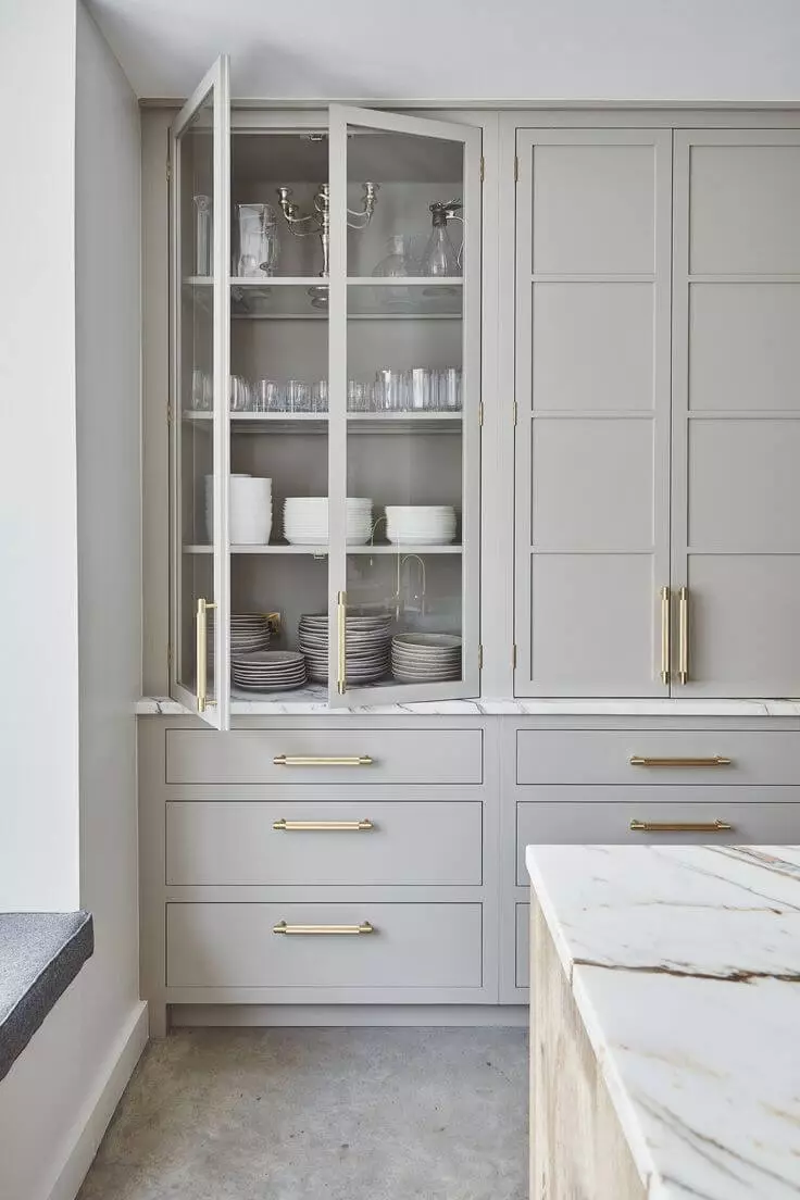
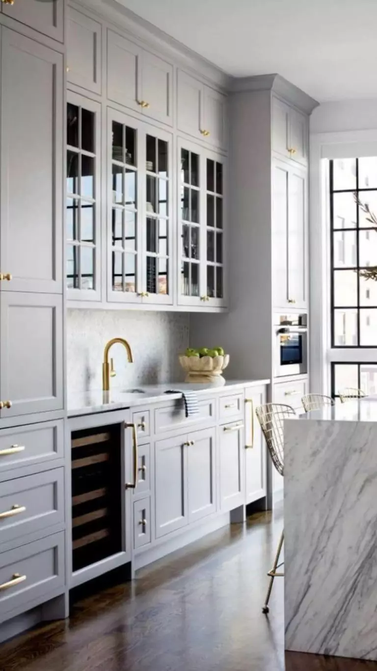
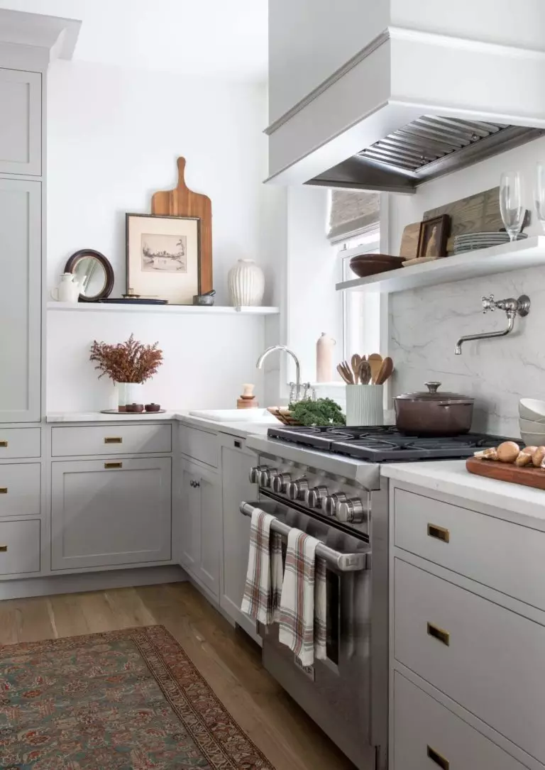
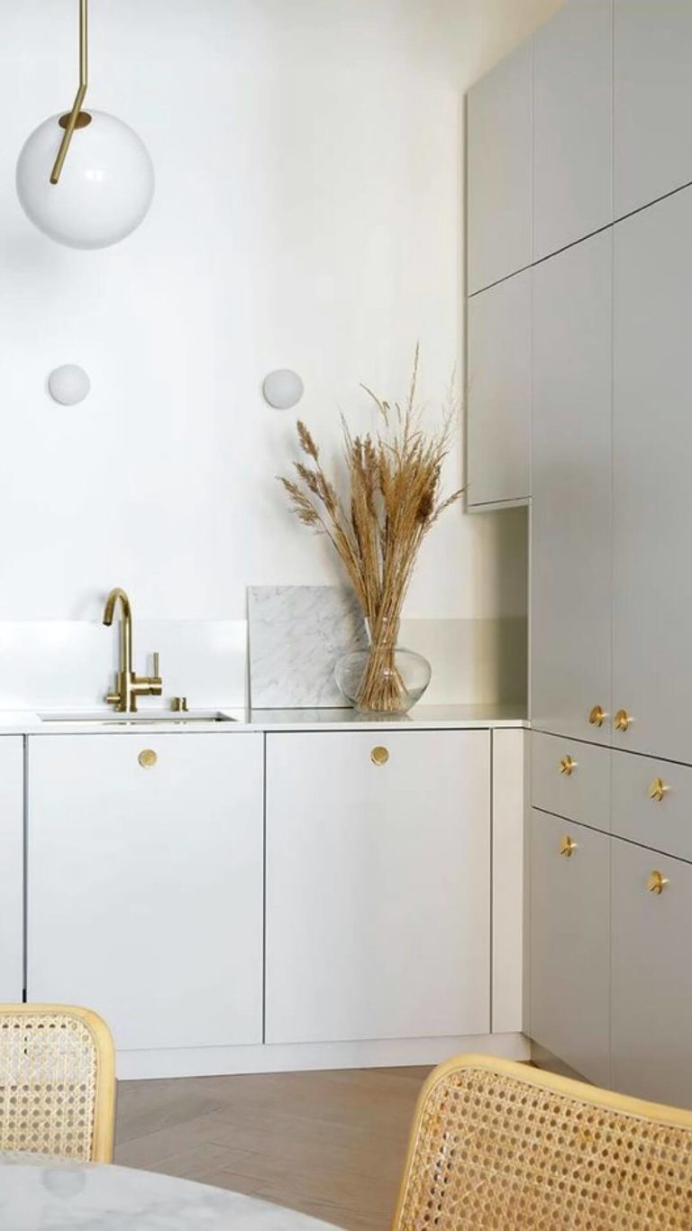
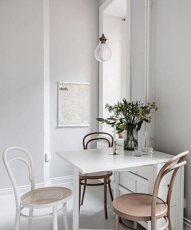
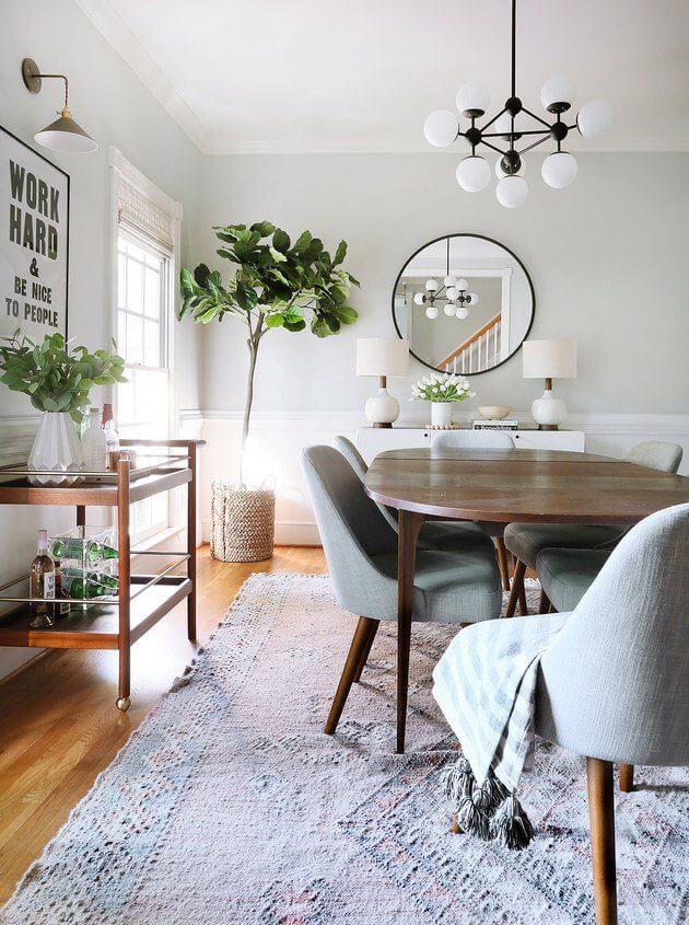
Kitchen and Dining Room
Calm like the summer morning fog over a lake; this is how your kitchen can feel like. Paint the cabinets light gray paired with white-washed walls, and allow yourself the only liberty to add your mark with gold hardware.
In the dining room, Terrace White has a whole new story. It likes to work here with white only or wood. You may as well invite a few colorful accents if the ambiance feels too peaceful to you. Terrace White is the definition of undisturbed calmness.
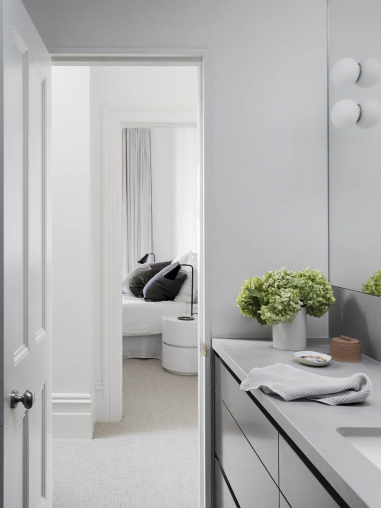
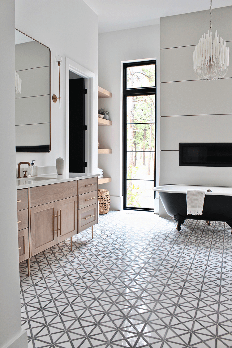
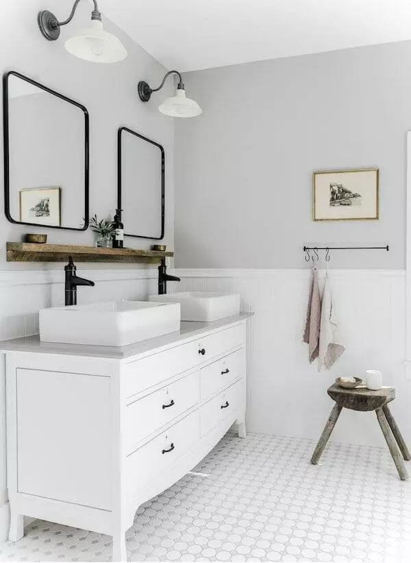
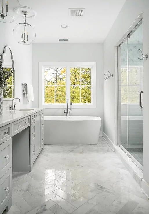
Bathroom
Designers usually recommend such refreshing grays for southern locations constantly bathed in sunlight. And, here you have two options: pair Terrace White, be it on walls or vanity cabinets, with gold or silver hardware. Silver leads to a pronounced cool effect, while gold makes the light gray shade seem softer.
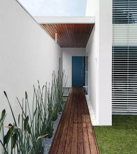
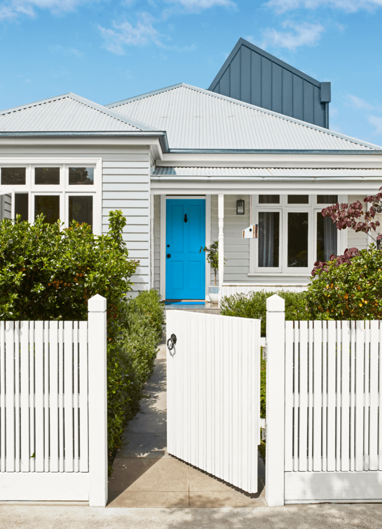
Use of Terrace White for House Exterior
Terrace White looks much brighter when used outdoors. We can safely call it now a white paint color. Since TW is a contemporary paint color, it acts flexibly towards various design styles. You can see this cloudy gray on an ultra-modern cubical house or a traditional coastal exterior; the list of possibilities doesn’t end here.
Dulux’s Terrace White paint color teaches us to be patient and prioritize our well-being. It’s time you took care of your inner state. Therefore, start the new design season with a new empowering paint color – a gorgeous sky-clean gray.
