Threshold Taupe SW 7501
Sherwin-WilliamsA deep taupe shade with intense brown and gray color drops perfectly balanced by the trendy and versatile color base; a new-era neutral paint color.
Threshold Taupe (SW 7501): What Color Is, Review, and Use
Taupe shades are some of the trendiest neutrals on the market, keeping homeowners and designers down to earth. Colorists describe taupe as timeless, organic, and at times, conservative. All these features evoke the essence of one of the best neutrals ever at Sherwin-Williams – Threshold Taupe. The brown-gray paint color strives for harmony and balance as part of the Biome collection in the Colormix forecast 2023. What brings it to such features? Let’s find out!
Threshold Taupe Paint Colors Features
The middle-tone shade of brown and gray that gravitates firmly to the dark group of colors is a very pleasant and earthy paint color. No wonder it is part of the Terra collection – the 2023 Sherwin-Williams selection of trendy paint colors. It literally reflects the interaction between us and nature in the search for balance. Similarly to this concept, Threshold Taupe radiates a perfect dance of notes between brown and gray. It is also regarded as a calm mushroom that creates the illusionary purple effect.
Threshold Taupe: Is It Warm or Cold?
Regardless of the light exposure, SW 7501 tends to always stay warm. It is to be noted that this is not the kind of overwhelming warmth. On the contrary, a comfortable and inviting sense of security creates the feeling of being at home. Colorists like to refer to this feature the following way: a drop of sunlight decided to take over the brown-gray balance.
How Does Lighting Affect Threshold Taupe?
Lighting always says the last word, yet it is a bit different with the new taupe color. The thing is that its strong sense of warmth doesn’t allow for much interference. Still, there is a difference between Threshold Taupe in a north-facing room and the same color in a space with southern exposure.
The brown-gray shade doesn’t appear cooler in a room with north-facing windows, yet it is still less warm, gravitating more towards gray. On the other side, in rooms with southern exposure, Threshold Taupe feels as brown as possible, particularly if direct sunlight hits the surface painted taupe. The less natural light and more artificial light, the more intense the color appears, revealing a rather pastel brown shade.
Threshold Taupe LRV
The Light Reflectance Value shows how much light a color reflects on a scale from 0 to 100, with 0 standing for true blacks and 100 for true shades of white. Therefore, this also determines how light or dark a color is. Despite the mid-tone appearance of Threshold Taupe, it has an LRV of 34, which is closer to the dark side. Consequently, with appropriate natural lighting, SW 7501 seems lighter on a surface than on the sample. Yet as soon as night comes and artificial lighting takes the leading role, the taupe variation of color feels pretty deep and dark.
Threshold Taupe Undertones
At some level, Threshold Taupe gives the vibe of a creamy mushroom shade. Either way, it is settled. Brown and gray notes are the base for this paint color. We mentioned earlier a subtle purple effect. Are those tricky violet undertones or the simple illusion resulting from the play between brown and gray? What is known for sure is that there is more to this taupe shade than brown and gray, which makes this neutral color special.
Similar Colors
If you want an alternative to Threshold Taupe, we got your back. Colorists offer similar paint colors to the taupe shade from Sherwin-Williams, considering this and other brands. To your attention – the most prominent representatives of the group:
Coordinating Colors
One should combine taupe with colors that allow it to express its individuality and prevent it from feeling boring or faded. Colorists suggest considering soft whites for the trim in all-taupe rooms, lighter greiges or tans for monochromatic palettes, and darker browns or our favorite – navy blue or pale blue for contrastive color schemes. You cannot go wrong with one of the following paint colors offered by the professionals from Sherwin-Williams:
Use of Threshold Taupe in the Interior
Threshold Taupe is a very competitive base and accent shade. It suits almost any room in the house. It manages to preserve its ability to ensure stability and security in personal spaces, which is the sense of comfort we all strive for in our houses. If you decide to replace the already fading neutral shades with this up-to-date taupe paint, consider one of the following integration options into the interior.
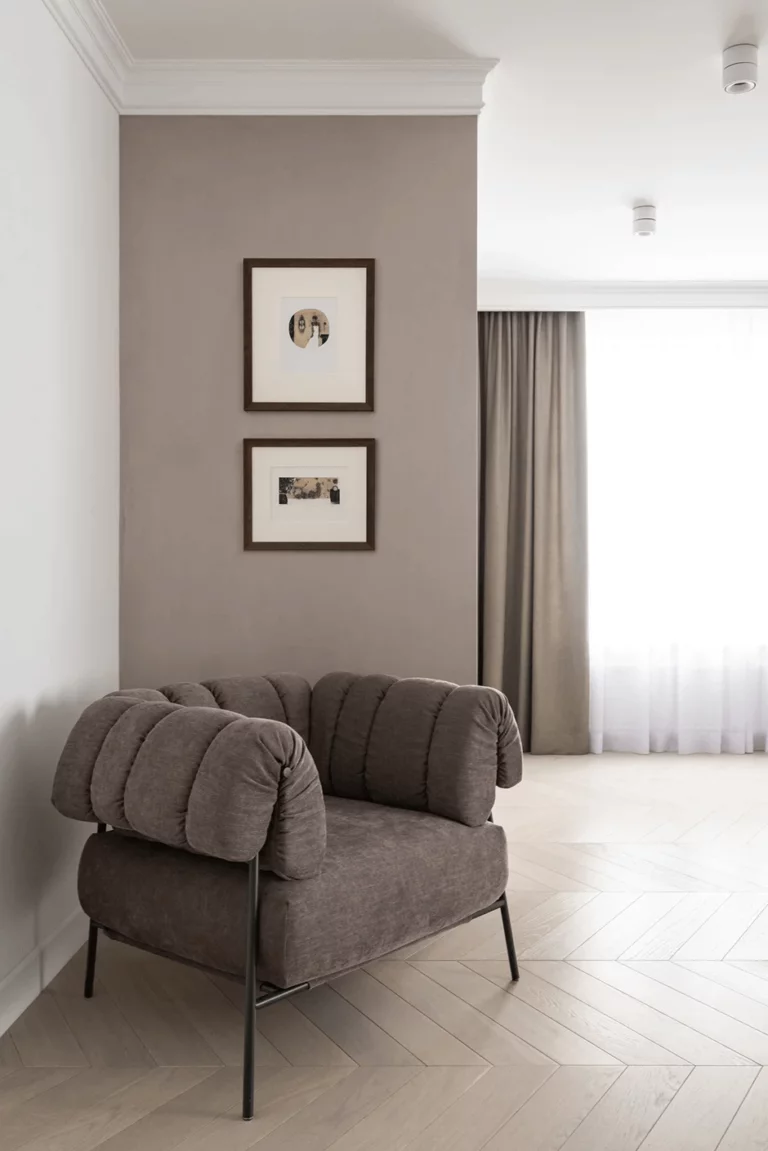
Updated Japandi
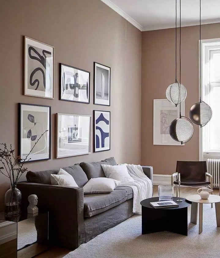
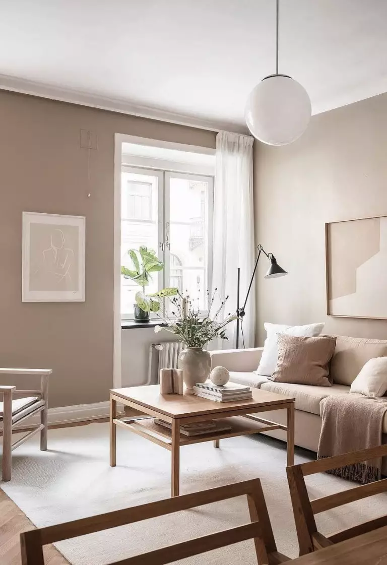
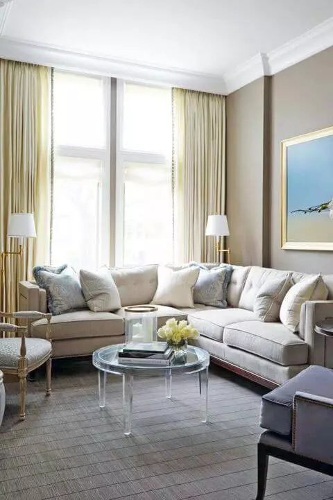
The fusion between the Scandinavian and Japanese styles is nothing else but a balance of thoughtful design solutions with practical layouts, ergonomic options, open spaces, and aesthetically pleasing decor. The defining color palette for the style is a minimalist and relatively warm one, where Threshold Taupe fits best. Pair the paint color with white, ensure a free layout, opt for simple forms and distinctive furniture shapes, and consider a complete absence of disturbing colors and patterns. This approach can be applied to a living room, bedroom, and dining room.
Reinvented Classic Style
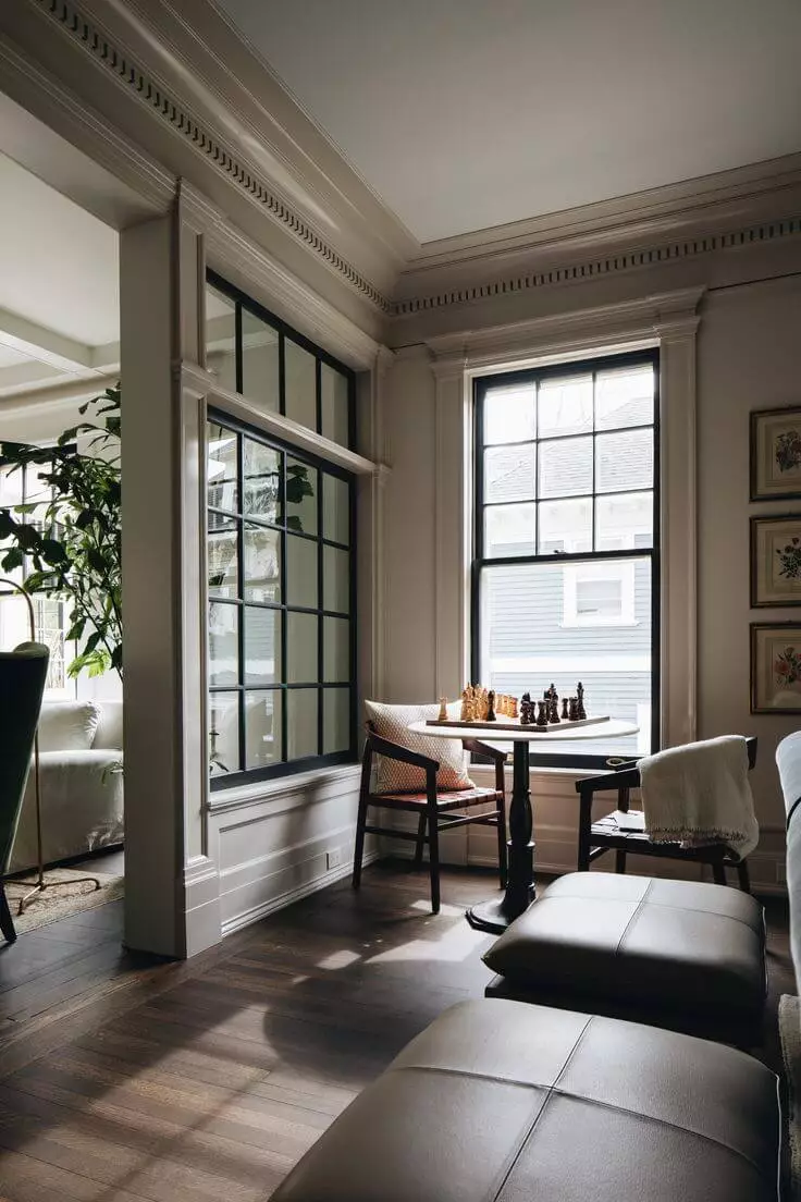
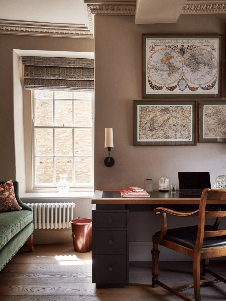
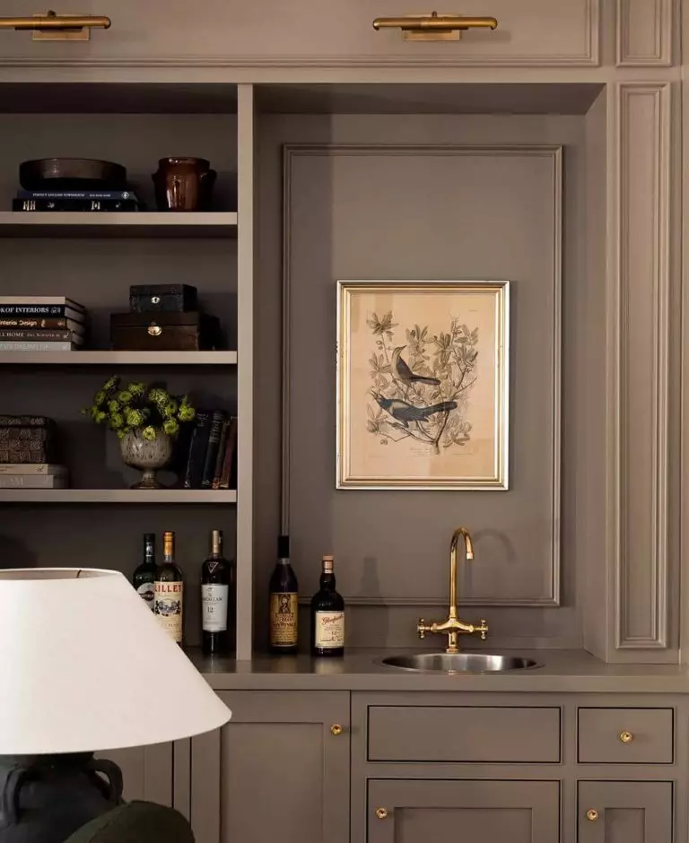
We would like to bring to your attention the redefinition of the Classic design style that stands out with timeless furniture with carved features, subtle shapes, rich textures, wood prevalence, and overall old-time aesthetics. In this case, SW 7501 is great for painting the walls or the trim. Gold accents, such as wall light fixtures or furnishing hardware, complete the style. The suggested style partnered with this paint color suits living rooms, dining rooms, bedrooms, and kitchens.
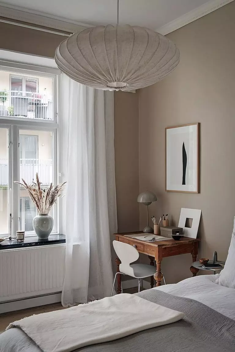
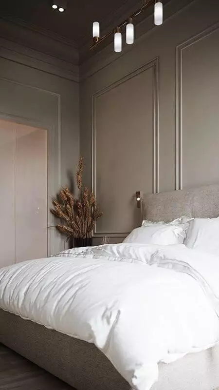
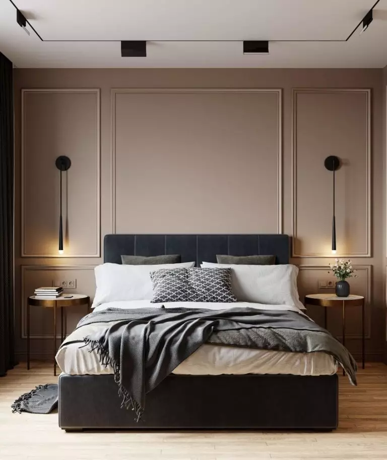
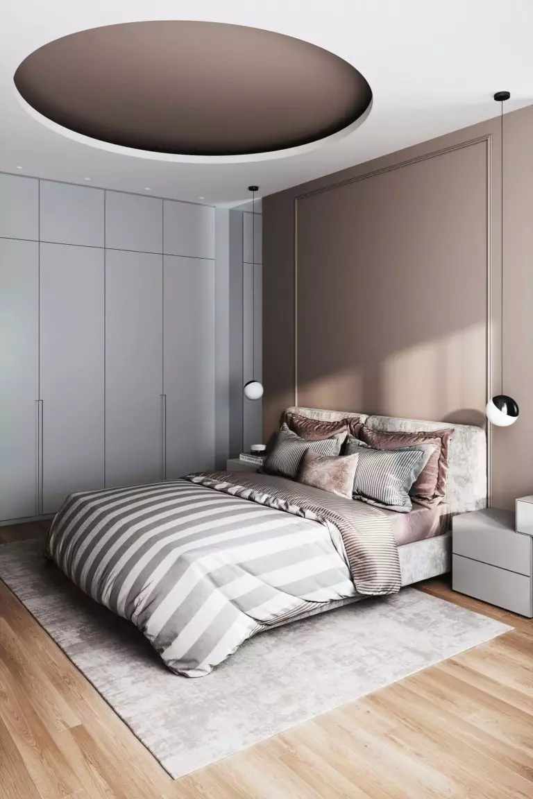
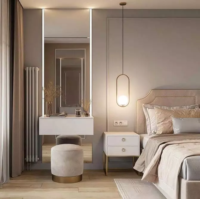
Modern Bedroom
Replace whites and grays with taupe for the bedroom walls to increase comfort and set the aesthetics of a modern space. Threshold taupe has unique calming properties that help you fall asleep faster, surrounded by an enhanced feeling of being home. Keep the color code monochromatic with SW 7501 as a background color. LED strips on the ceiling or hanging downlight fixtures above the nightstands are preferred. Designers emphasize the compatibility between taupe and gold accents that customize the design.
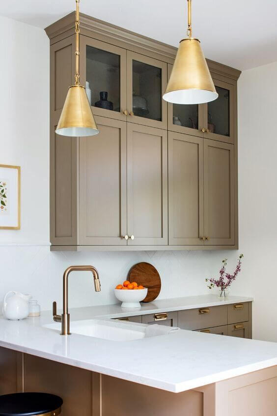
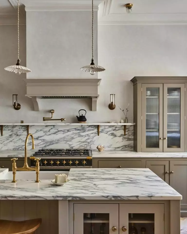
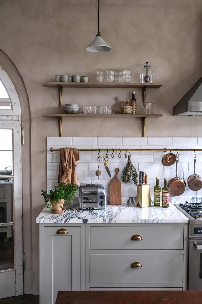
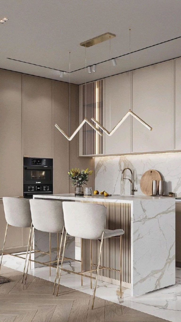
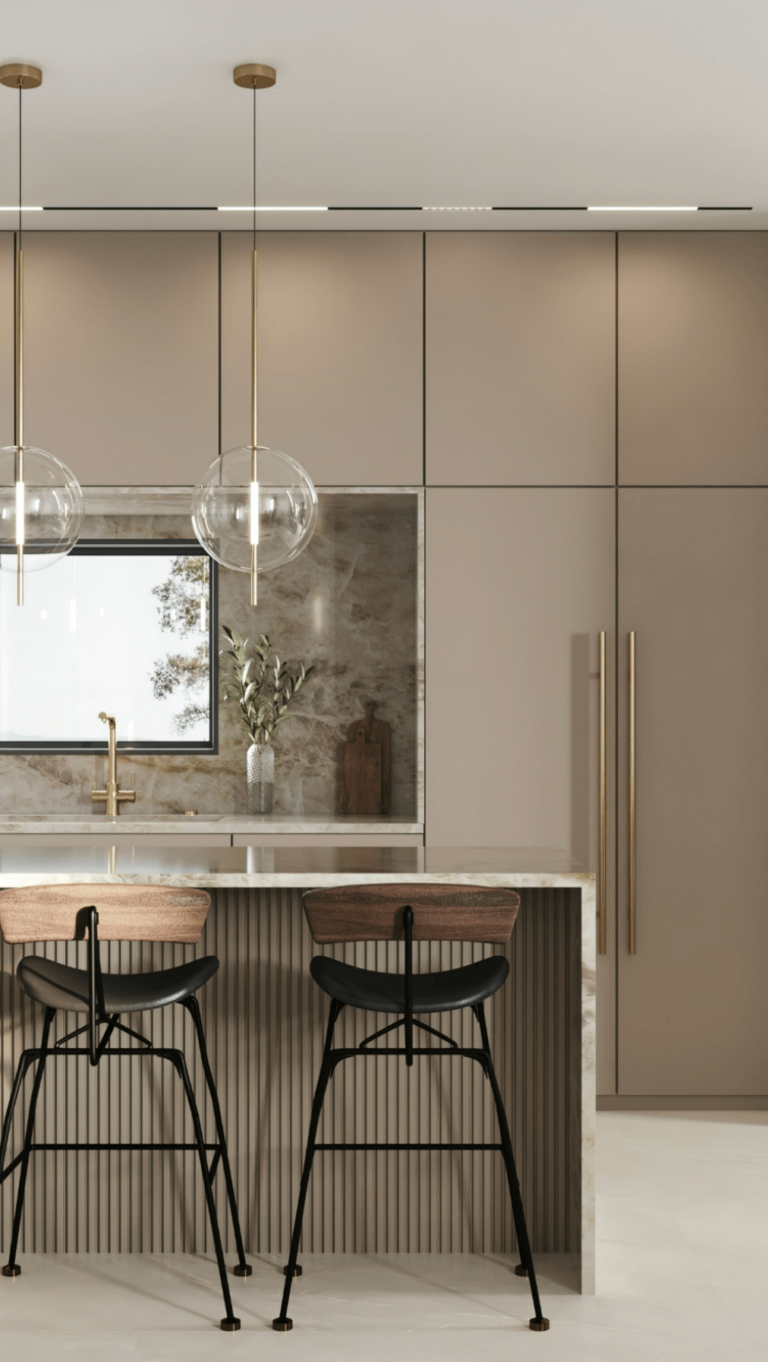
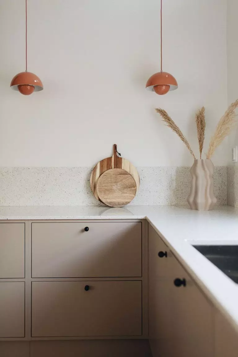
Aesthetical Kitchen
Taupe is a pretty conservative color if applied to particular styles and color palettes. In combination with white and traditional kitchen cabinets, Threshold Taupe, or simply TT, is great for Classic cooking areas, particularly on cabinets. Another super solution is applying this paint color to the walls in a kitchen with open storage space instead of upper cabinets.
On the other side of the colorful coin, SW 7501 is a favorite in ultra-modern kitchens with touch-to-open systems, minimalist design, and sparkling accents.
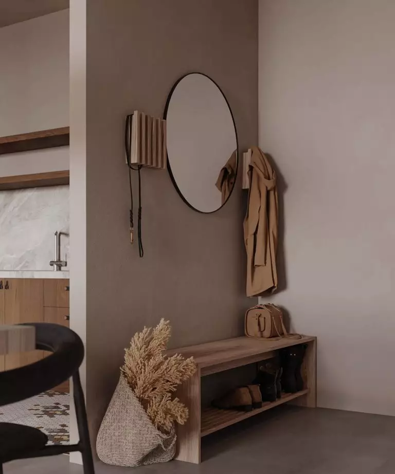
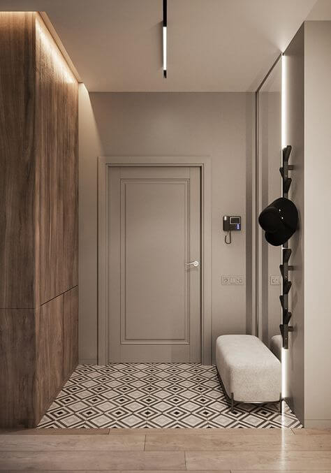
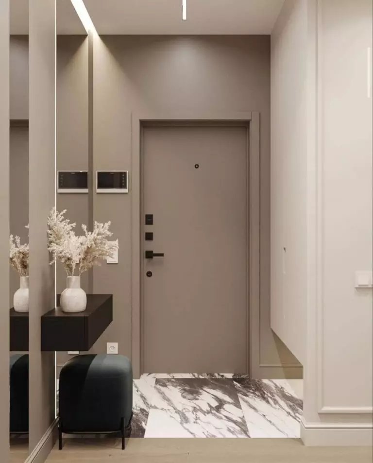
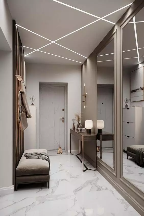
Welcoming Hallway
Out of all available paint colors for the entry space, taupe is one of the most beloved neutral shades, and this is not our opinion; designers have had their say. It is impartial, inviting, and a perfect backdrop for accents, such as marble flooring, gold details, or centerpiece lighting pendants. Additionally, the new trendy taupe – Threshold Taupe from SW is traced to earthy tones, known for their stylish and comfort-inducing effect on the interior.
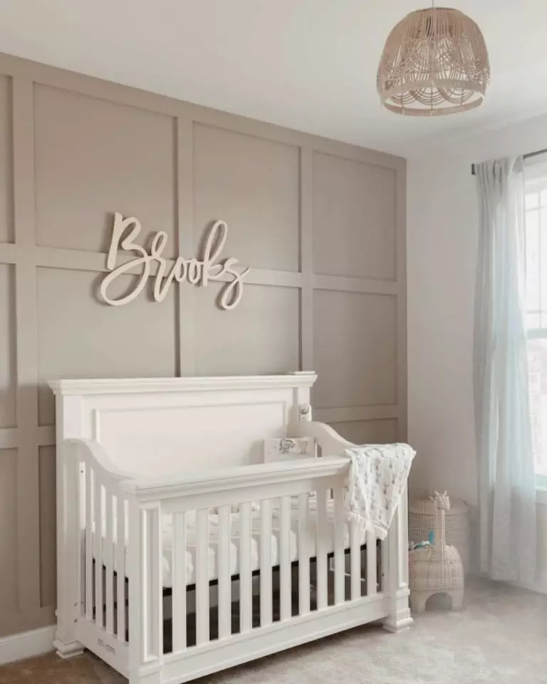
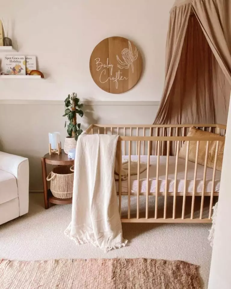
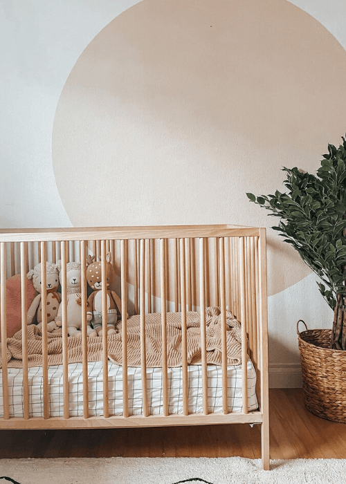
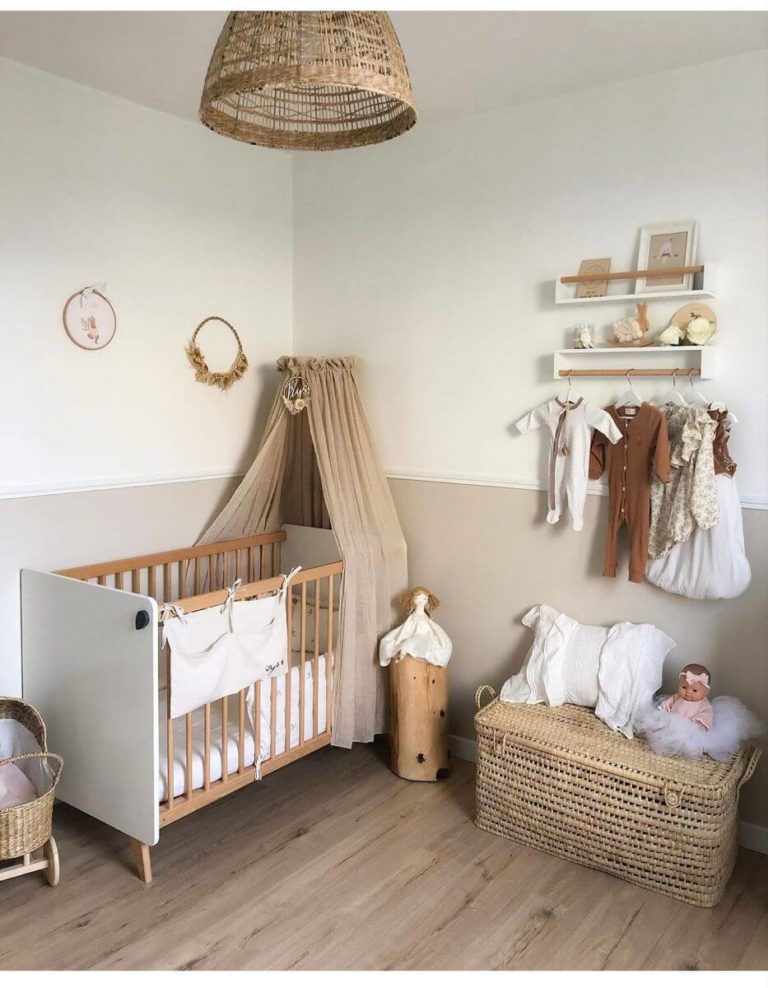
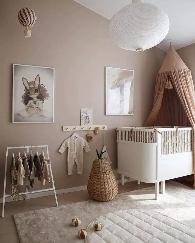
Taupe Nursery
Although designers encourage using pastel variations of bright and natural colors, some still want to stick to their favorite neutral palette. If you cannot give up on minimalist design solutions, consider a monochromatic color palette in the nursery and take TT as a base color. It bears calming and peaceful notes so your children can get the rest they need at this young age. By the way, as the kids grow up, the balanced brown-gray keeps pace and serves as a perfect background color for future redecorations.
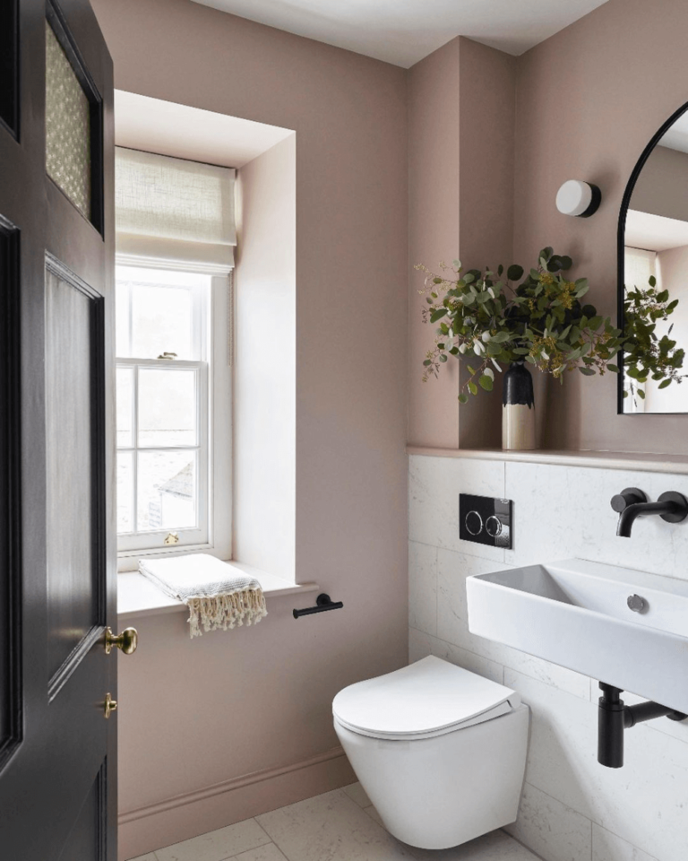
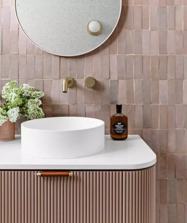
Versatility in the Bathroom
If you haven’t noticed so far, taupe is a very versatile color, and the fabulous brown-gray from SW, with its sunshine warmth, has lots of solutions for the bathroom. A strictly traditional bathroom, a brand-new modern space, or an eclectic interior works for SW 7501 if the latter covers the walls or the vanity cabinet. Here, you can as well play with gold accents for the hardware or lighting fixtures.
Use of Threshold Taupe for the Exterior
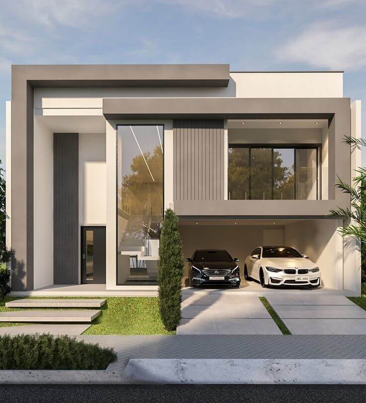
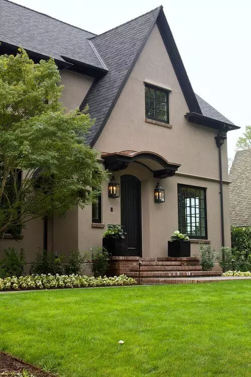
Usually, when dealing with neutral colors other than white, one risks getting an exterior paint color that easily fades when bathed in direct natural light. Luckily, the taupe shade experts from SW came up with a true brown-gray with a deep color base that allows for preserving the original color under different lighting conditions. With increased popularity among brand-new contemporary exteriors and as successful use on traditional houses, paired with light or dark trim, taupe is a winning exterior paint color among designers and homeowners, while Threshold Taupe is a great representative.
The Threshold Taupe SW 7501 paint color by Sherwin-Williams is the neutral brown-gray designers have dreamt of for so long. It is intense enough not to lose its authenticity under any light exposure, warm enough to fill our houses with a sought-after sense of irresistible comfort, and neutral enough to work with most design styles and existing color palettes.
