Timeless (Dulux): what color is, review, and use
We have been discovering more and more fabulous off-white shades lately, which are extremely popular within contemporary interiors. Actually, the star of this article is a cream shade, but its impressive neutrality replicates nothing else but a creamy variation of white. The newly discovered Timeless from Dulux is a unique creamy shade with a spectacularly neutral base. It is a go-to color for those who are into off-whites with slightly soft notes. The name itself points out the limitless range of fascinating features peculiar to this shade, its up-to-date appearance that seems to stay this way for a long time, and its unprecedented versatility. Quite impressive for a beginning, but wait and see what this shade reveals as a result of our thorough analysis.
Timeless paint color features
Timeless is an impartial shade of cream that can be easily mistaken with a very soft shade of white due to its neutrality. Still, it is a cream, and the slightly visible notes of softness add even more individuality to this shade. Unlike other shades of cream, which are usually directed towards an emphasized warm effect, this one works simultaneously with two features: balanced softness and exquisite freshness. It is a win-win option for those who want to enrich their space with a bit of neutrality, comfort, and stimulation, all together.
Timeless: is it warm or cold?
One may say it is a rather cool shade, which is the trick the subtle gray hint is playing on one’s imagination. Actually, when being applied to a particular space, Timeless embraces its values to the fullest, showing off its nearly visible yet present warm undertones that prevail over the general appearance. Therefore, we can safely state that Timeless is a warm shade.
How does lighting affect Timeless?
When lighting enters the play, the scenario changes entirely. Timeless, known as a rather neutral shade, instantly reveals a whole new range of undertones. When the space is bathed by daylight, the sun rays bring the seemingly non-existent yellowish notes to the surface, adding an unusual sparkling feature. You no longer feel surrounded by a neutral veil but rather a soft cover full of light and ease.
Once a slight shadowy touch penetrates the space, the light creamy shade from Dulux becomes a neutral beige color. That’s not all! Add a bit of artificial light, and this new beige shade will acquire a pleasant warm effect. How far can this paint color reach? No wonder it is considered one of the most unusual creamy shades.
Timeless LRV
A shade so similar to white cannot go other than having a relatively high reflectance value. On a scale from 0 to 100, Timeless reaches a value of 87, which means that this cream is a very light shade. Responsible for the brightening and expanding effect, this shade manages to fulfill its duties in a unique way. We would rather say its light reflectance abilities are accompanied by a splash of irreplaceable softness. Therefore, it reflects large amounts of light and makes the room seem spacious at the same level it enriches the space with a sense of refreshing comfort. What does it seem like? Well, imagine a fluffy blanket that feels so soft at touch yet whose light color and barely felt weight are a source of invigorating ease.
Timeless undertones
It is clear this far that Timeless is diluted with a few particles of light gray that keep this color within the limits and subtle yellow that can be fully perceived only under a large amount of light. One should note that Timeless can also be considered part of the chameleon category. It tends to reflect particular amounts of the neighboring colors, resonating with their inner beauty and leading to a harmonious result.
Similar colors
As mentioned, Timeless is a unique shade of cream, and its features are hard to be noticed at any other shade, although there are exceptions. Still, light creams are many, and some of them even resonate with the undertones perceived at Timeless, which can be used as alternatives if you are looking for a slightly different effect. Let’s find out what Dulux has to offer and also look outside its borders!
Coordinating colors
Although a very special color, Timeless is not that specific about its matching partners. The range of shades that would work with this unique cream is wide and rich in various colors. From a splash of neutrality, through soothing variations, to quite bold alternatives, Timeless can adapt to them all while staying true to itself. Luckily, experts from Dulux have already compiled a list of such shades long enough to meet any expectations. Let’s take a look!
Use of Timeless in interior
As with any other off-white variation, which Timeless perfectly resembles, this shade of neutral cream is a standout alternative for the commonly used neutrals in interiors. Of course, its primary role is to serve as a background, and as any other newly developed shade of this kind, it brings a particular flair to the space. Due to its versatility, it suits almost any style, offering it a renewed look. Therefore, you can safely apply this color to your interior if you want to redefine it and embrace contemporary values without a whole makeover. Let’s take a look at how this shade works when put into practice!
A contemporary sense of style
Are you the lucky owner of a rustic interior, or are you happy to show off your minimalist design with a touch of Art Deco elegance? Well, you don’t have to give up on such amazing designs or any other style that defines your interior if you feel that they miss a slight contemporary touch. Consider the neutral cream shade from Dulux for the walls, and your interior will instantly sparkle in a new way. For those who are currently working on their interior design plan, experts suggest considering Timeless as a background, and any future changes will surely not risk the contemporary look of your interior.
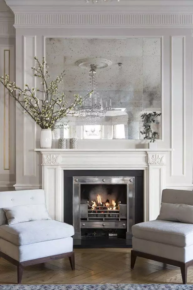
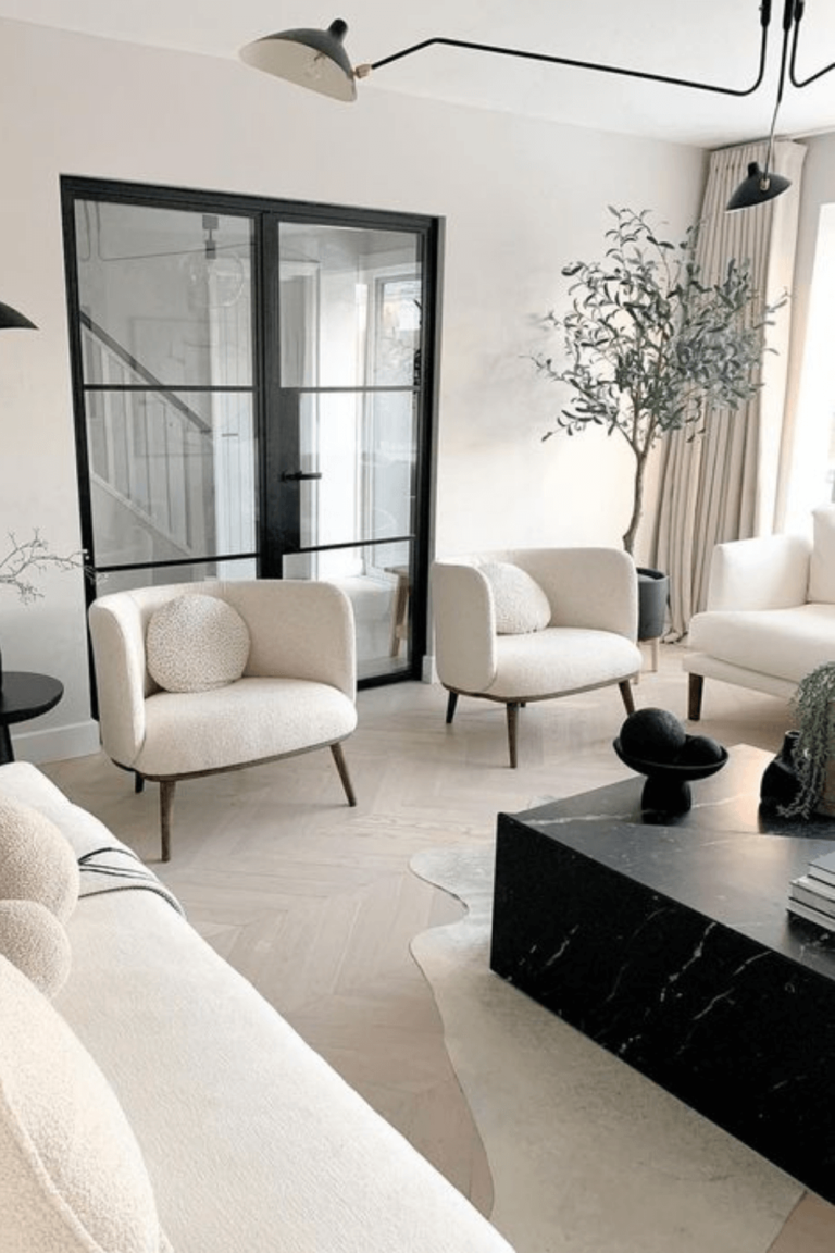
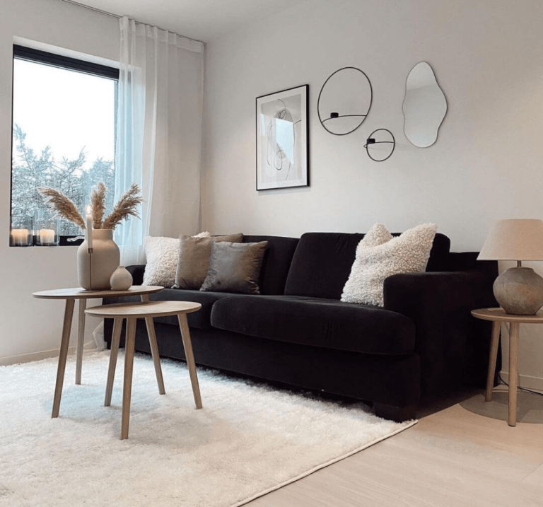
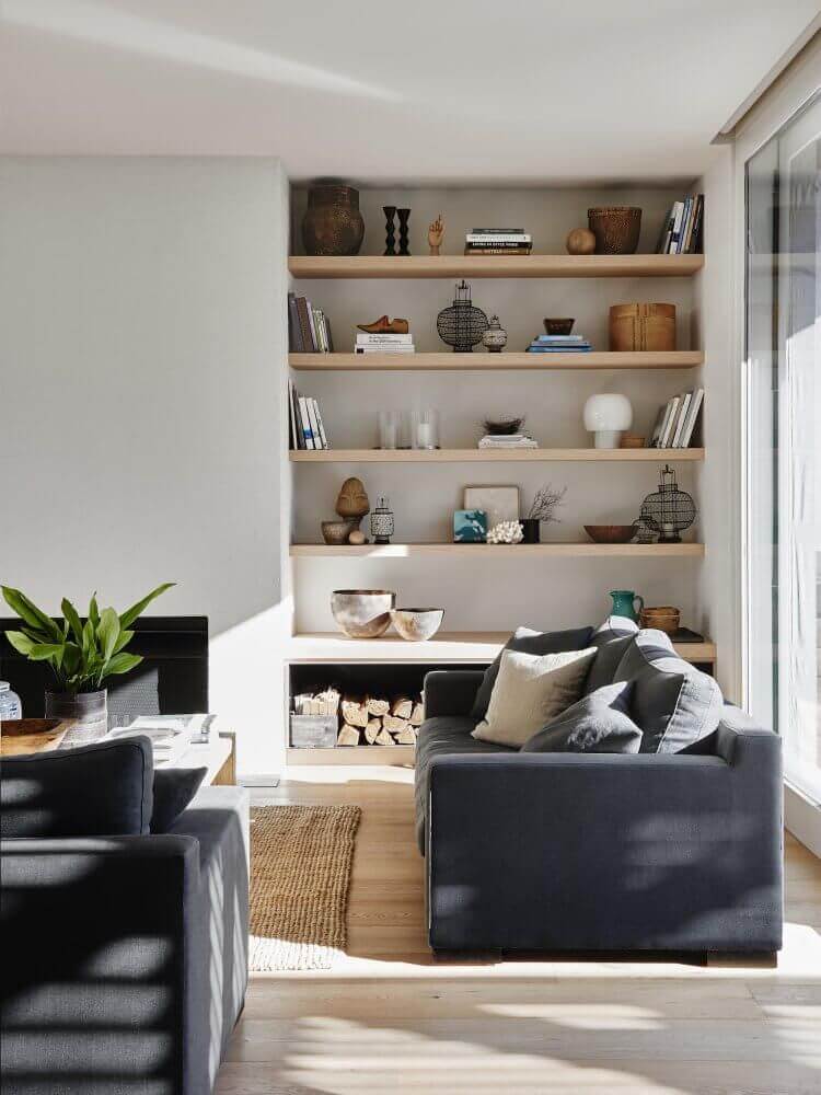
Living room
The approach is quite simple, although the result will leave you without words. Consider Timeless for the walls, and decorate the space with natural materials and rich textiles, considering a pastel palette. Additionally, add a bold accent, such as a black sofa, to dilute the overall monochromatic look. While the light background will perfectly emphasize the constituent elements of the room, it will also harmonize with the warm undertones that are to be found within this space for a balanced yet comfy environment.
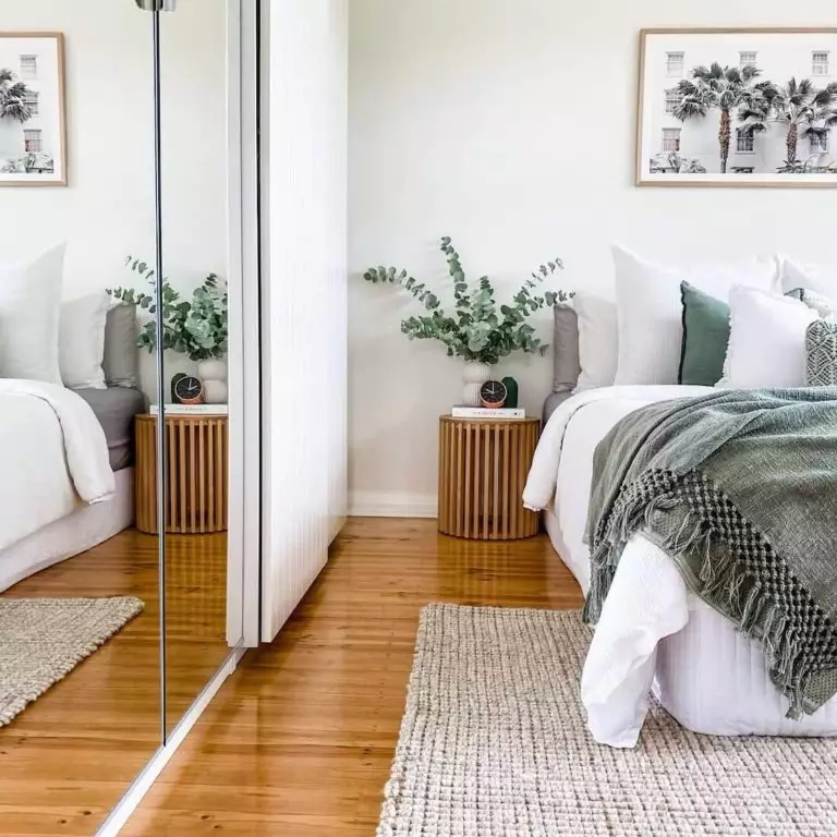
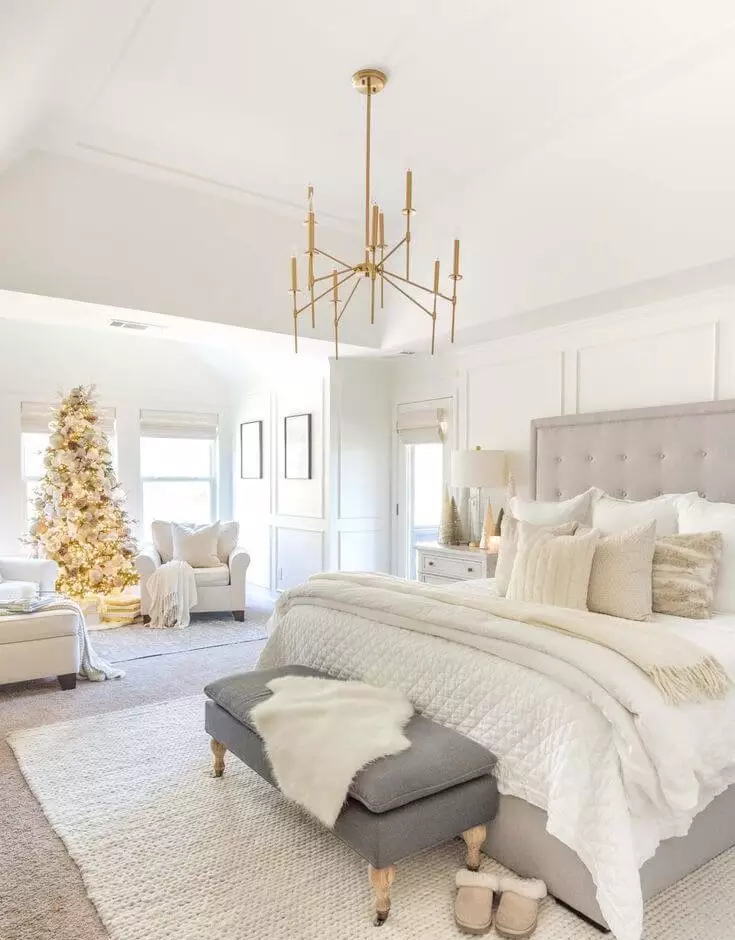
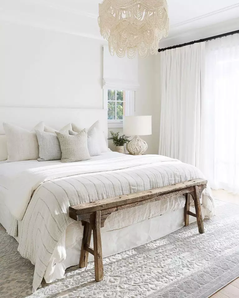
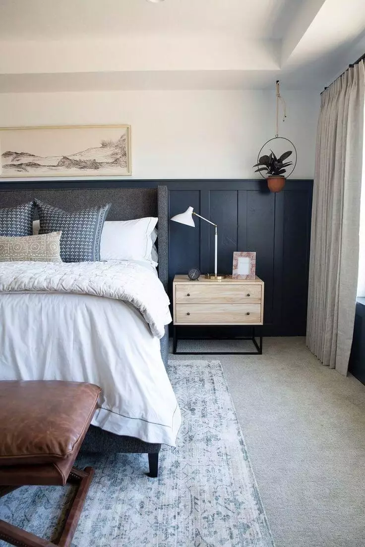
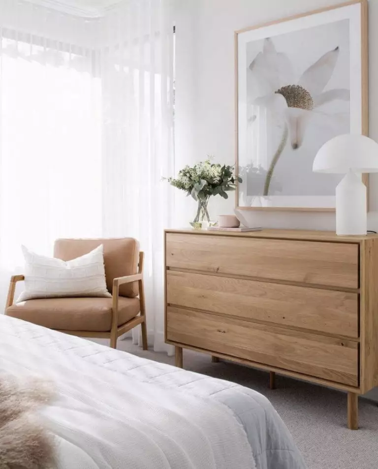
Bedroom
Considering that Timeless is quite a neutral shade, resembling an off-white color, it would work perfectly as a background, accompanied by an all-white environment for a sleek contemporary look. Opt for a combination of white shades for the bedding, rug, curtains, even furniture and dilute the result with a few slightly noticeable patterns. You will always feel refreshed and in harmony with your thoughts when surrounded by such a pairing of shades. If an all-white bedroom is not about your personality, consider a bit of individuality by opting for an accent, such as a bold-colored headboard or natural wood, which will dilute the monochromatic palette.
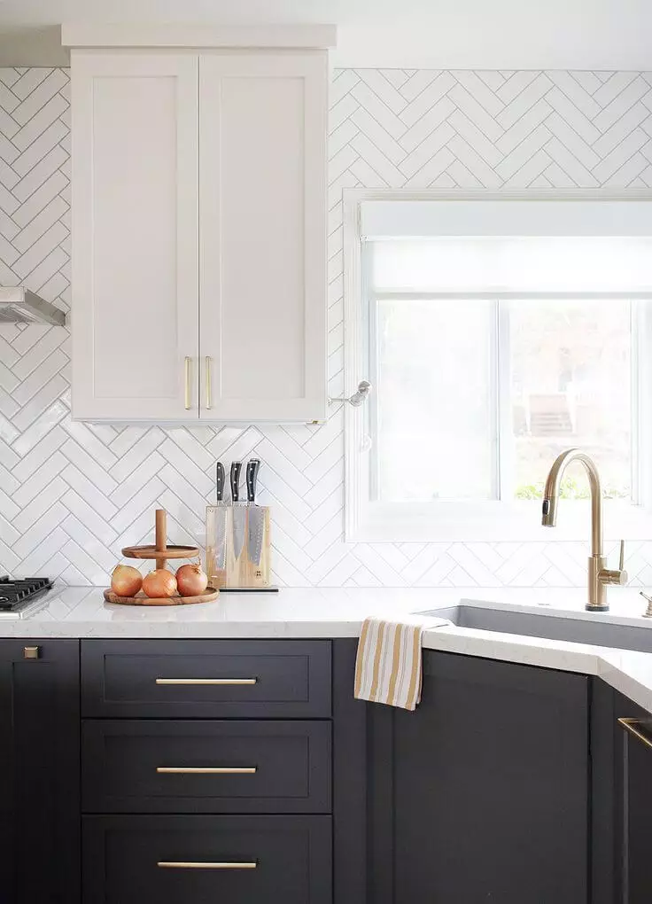
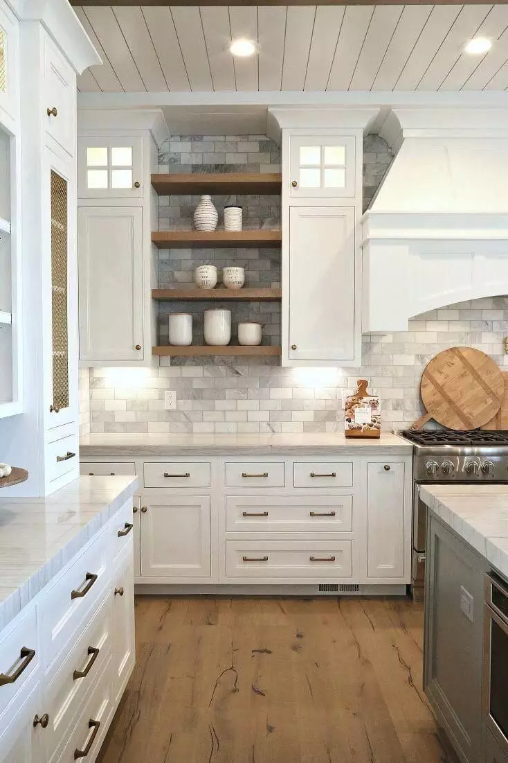
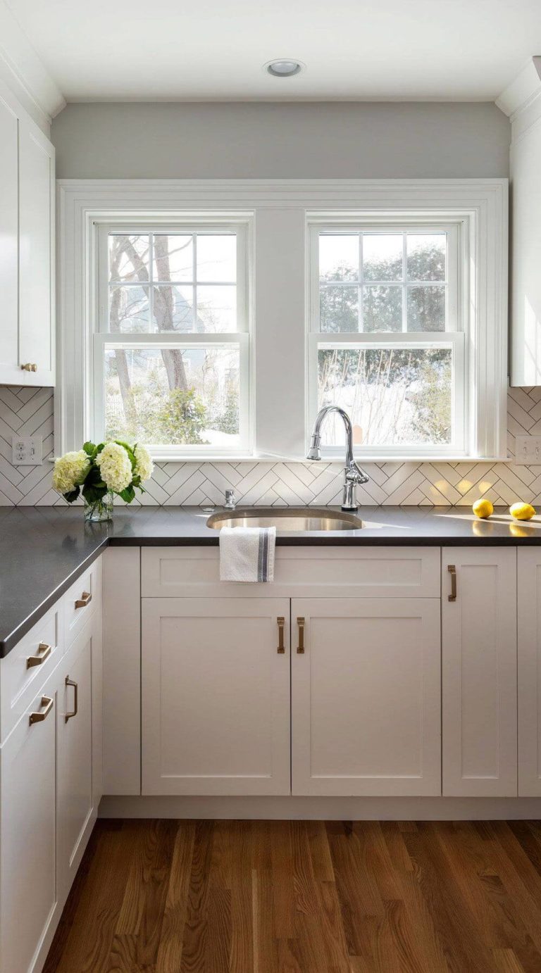
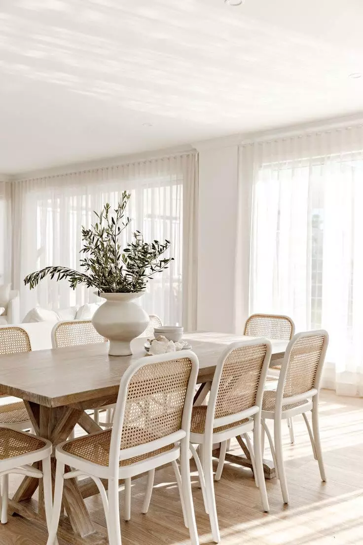
Kitchen and dining room
If Timeless works perfectly as a background for other rooms, in the kitchen, it can be used at its finest by applying it to the cabinets. Be it only for the upper cabinets and combined with a bolder accent or for all the cabinets. It is quite neutral, but the hidden yellow undertones and creamy surface add a bit of uniqueness to these pieces of furniture even in a quite monochromatic setting. Additionally, you can opt for an accent, such as a bold countertop or natural wood floor, although the look as a whole has to be kept rather neutral to let the beautiful cream shade bloom to the fullest.
Things change a bit in the dining room. You can safely paint the walls in this shade from Dulux and set a rather monochromatic design, considering wooden pieces of furniture that would resonate with the warm undertones of Timeless. It sounds like the perfect recipe for a harmonious environment, which would perfectly suit the space where you take your meal.
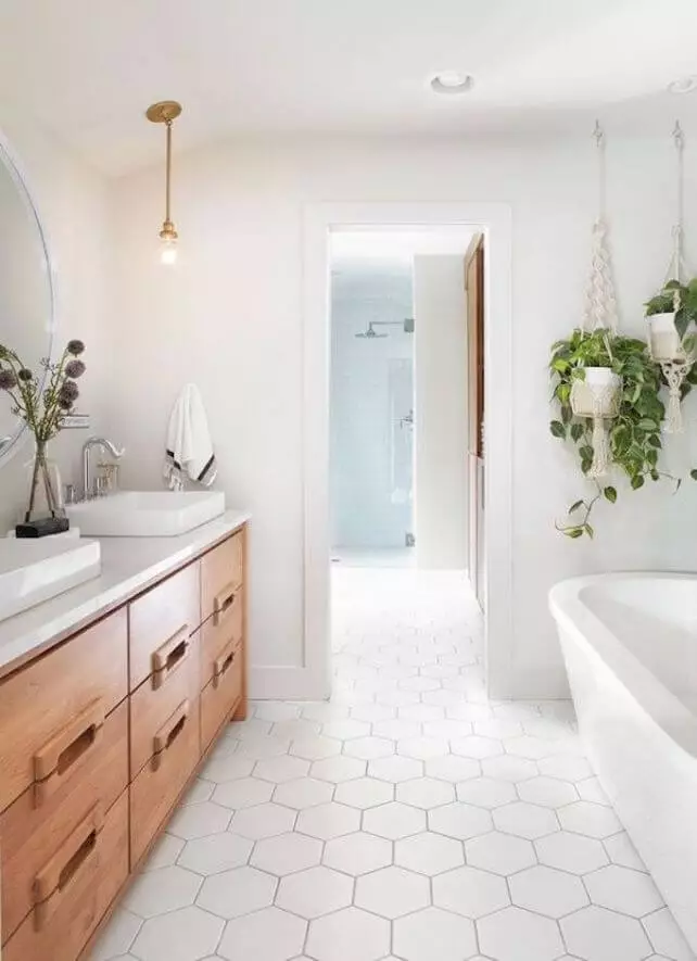
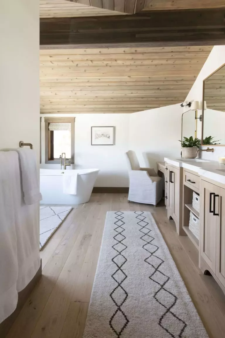
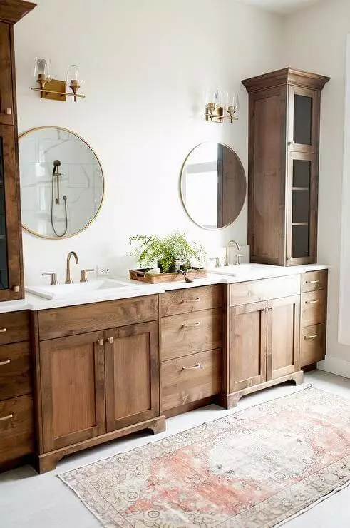
Bathroom
The same approach goes here: Timeless for the walls, an overall monochromatic palette with an all-white setting, or a touch of texture with wooden furniture. One should note that particularly natural wood should be considered that would impressively pair with the warm undertones of the creamy shade used to paint the walls. Nevertheless, an all-white bathroom diluted by a splash of Timeless is no less impressive but rather a perfect integration of contemporary values.
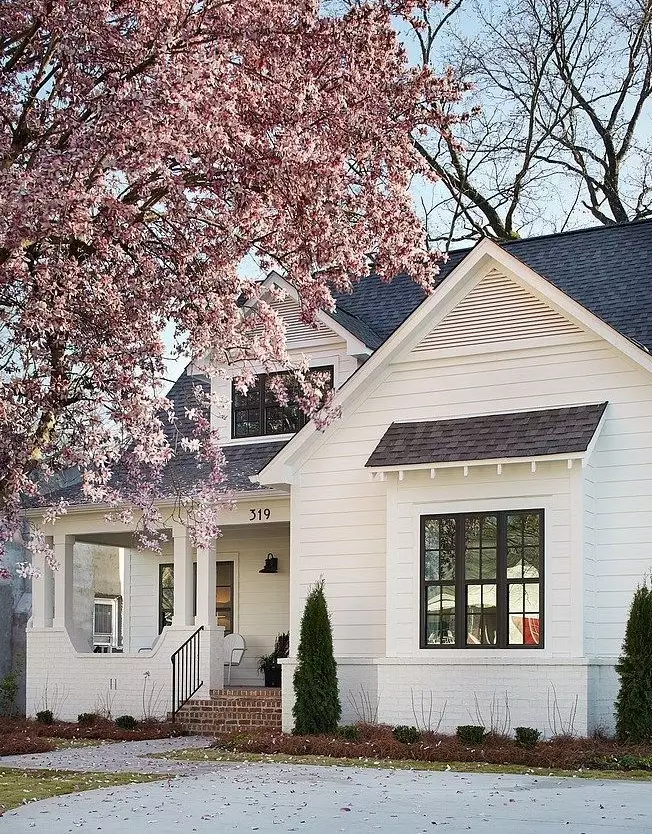
Use of Timeless for house exterior
While Timeless is a real find within the interior, it loses a bit from its unique combination of neutrality, creamy base, and hidden yellow notes when applied to the house exterior. The result is a quite faded look, which does not benefit the homeowner. It depends mostly on the weather, and a cloudy day will surely leave this shade without sparkle. Nevertheless, you can still apply it to the house walls if considering brick or wood. This way, the rich texture will compensate for the lost undertones and ensure a stately appearance, not devoid of originality as well. As regards the front door, experts don’t advise using this shade, considering the same reason.
The Timeless paint color from Dulux is a unique shade of its kind that surely stands out among other colors from the same category. A perfect alternative for neutrals, extremely versatile, enriched with a contemporary feel, and definitely bearing a sense of original beauty, this cream shade is a number-one option for any style.
