Toile Red SW 0006
Sherwin-WilliamsA deep and rich brownish-red with purple undertones with an impressively meaningful collection of notes and fragrances, radiating comfort, confidence, and individuality.
Toile Red (SW 0006): What Color Is, Review, and Use
Combining new and old resurfaces distinctive colors that bring the utmost sense of originality to our living spaces. And, we don’t speak about the past few years, but the “past” like decades and centuries ago. When you don’t have color inspiration, taking a look back may open a new perspective. At least, that’s what the historic and inspirational color collection Lore from Sherwin-Williams does with a selection of dignified paint colors that bear the glory of the past and adjusts it to contemporary trends, all for your inspiration.
Take a few minutes to discover a tremendously magical and stately paint color with French origins, Toile Red, from the 2023 Colormix Forecast. The ancestor of most contemporary red tones is deeply rooted in the past and has a history to share. The more meaning hides behind a color, the more authentic its effect on your design.
Toile Red Paint Color Features
From now on, TR, to keep it short. TR is a dark crimson tone, a mix of red and purple with a vintage rose effect. This charismatic paint color gets its name from the French word “toile de Jouy”, meaning linen cloth. Toile was a particular fabric with one-color romantic prints in blue, black, or red, such as in our case. You won’t be wrong to recognize this tone as a lovely shade of brown-red or burgundy, taking after the renowned wine from the Burgundy region, which is also in France. Coincidence? We don’t think so.
TR is a magnificent and meaningful paint color as part of the Historic and Victorian color collections. The “crème de la crème” hue (from French, best of the best) doesn’t put a reddish shade only at our disposal, but also a whole range of values inspired by the past and meant for the future. If you need a burst of warmth, energy, courage, affection, or royalness, you know where to find them. TR is a safe bet for traditional and romantic designs, alongside its suitability for modern projects that would benefit from its inspiring sparkle and vivid passion.
Toile Red: Is It Warm or Cold?
TR reads slightly dark terracotta or brick. It has “red” in its name. What else do we need to understand that it is a warm paint color? Actually, there is something else. Our constant readers know that we always refer to the RGB value in this section of the review. The combination of Red, Green, and Blue in this paint color shows an impressive prevalence of red over the other two. What does it mean? TD is a 100% warm paint color.
How Does Lighting Affect Toile Red?
Such a deep and vibrant red tone is not that easily affected by lighting exposure. Still, the last word always belongs to lighting. If you decide to paint a room with northern exposure, the lack of the warm sun rays will reveal the dusty side of this color. A slightly less bright and foggier crimson, showing a purple-biased tone, will take the lead.
TR regains its name of a red shade in rooms with constant access to sunlight, mainly those with southern exposure. You’ll witness a standout burgundy tone with warm purplish undertones that outrun the dusty effect. Regardless of how you decide to use this paint color in your house, remember that TR is an exceptionally dark shade of red that doesn’t like enclosed spaces with little natural light. Still, using it as an accent changes the course of action.
Toile Red LRV
Any newbies out there? You should know that the Light Reflectance Value determines how light or dark a color is. There are three main groups: light, dark, and medium shades. One more thing: 0 stands for black, and 100 for white. Now, TR has an LRV of 12. Do you get what we mean? Relatively close to 0, TR enters the dark category. In plain words, this purplish-brownish-red doesn’t reflect much light. That always means such a color requires the best lighting conditions.
Toile Red Undertones
Our favorite part! What makes TR the way it is? First, we have a well-defined red base color. Next are brownish and purplish undertones that make this shade lean burgundy or crimson (depending on the light). And last but not least, why does this color seem dusty? Of course, these are the subtle gray undertones.
Similar Colors
Here, you can find the best substitute paint colors for one of the designers’ favorites, Toile Red. Get a quick glimpse of each:
Coordinating Colors
Following the image of a dusty rose, try pairing TR with greens. A no less successful match would be blue. Still, colorists are high on light pairings for this deep and enthusiastic red shade. Consider warm whites and other neutrals. The designers’ favorites are:
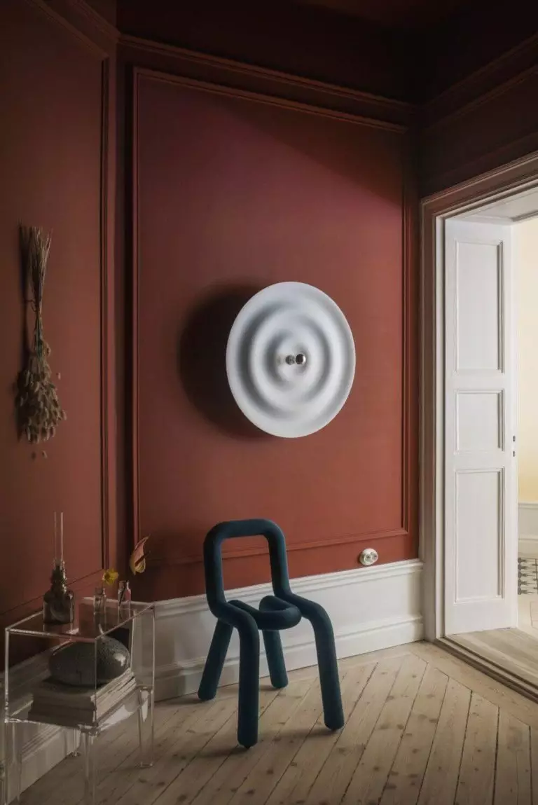
Use of Toile Red in Interior Design
As sophisticated as Toile Red seems, it is versatile. It is a perfect color solution for traditional and modern-inspired design ideas. Regardless of the design style, this color invites a royal sense of elegance and autumnal comfort to join when used in any room of the house. That’s one of the rare confident, bright colors that easily adapt to your taste. Enjoy the following design concepts suggested by professionals!
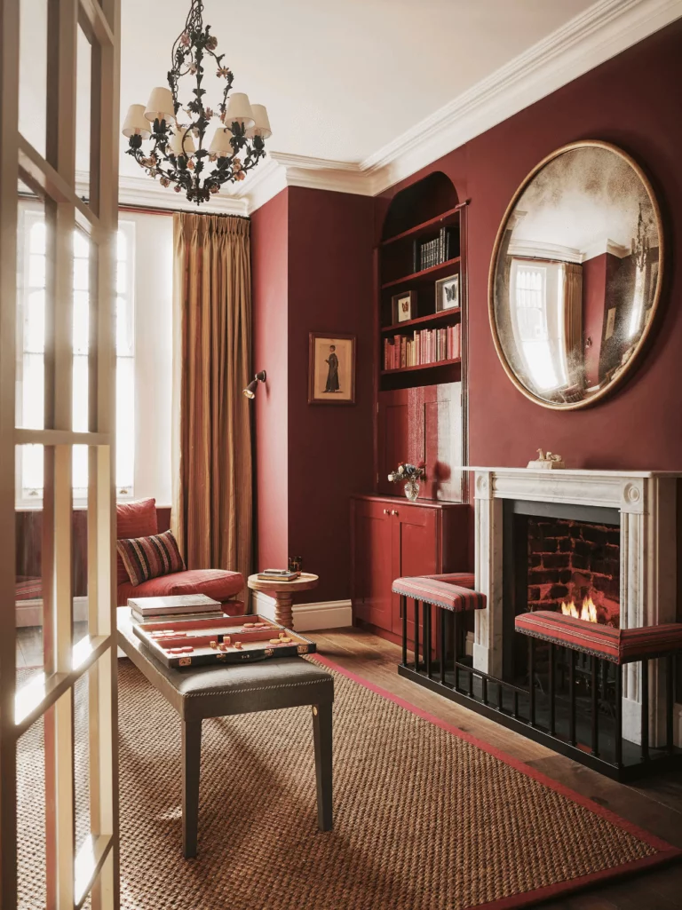
Victorian Rose
We couldn’t pass by the fashion and design era this paint color is inspired by. Victorian homes are known for their rich ornamentation, precious stone colors, and eye-catching patterns. Beautifully decorated furniture, romantic prints, and sparkling metallic accents integrate into such interiors effortlessly.
Consider the dusty rose Toile Red as a background color in purely Victorian interiors or Modern Victorian adaptations to the style. For the latter, consider fewer accessories and more modern details, say modern art paired with wall molding or traditional furniture paired with a contemporary eco pendant.
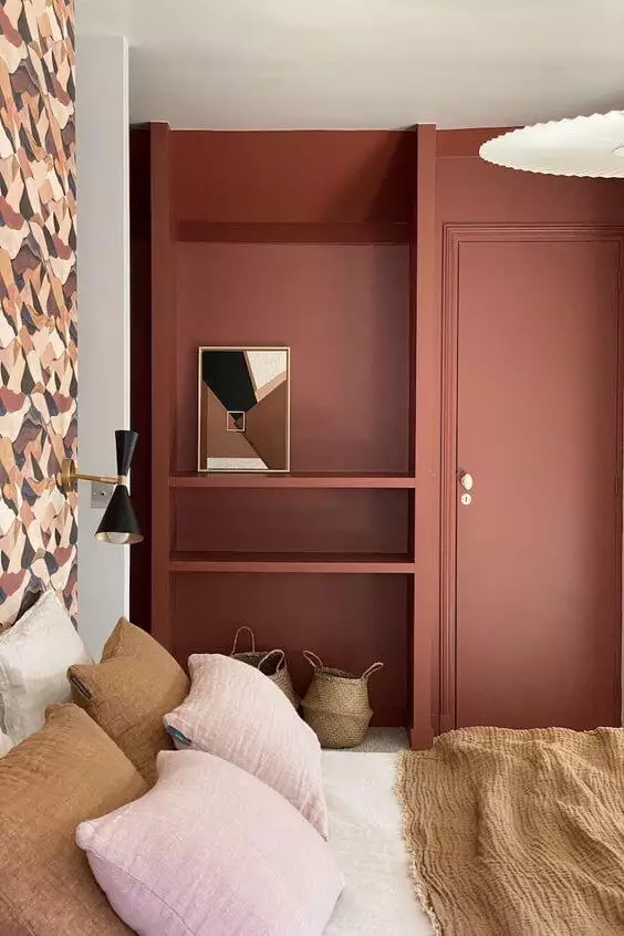
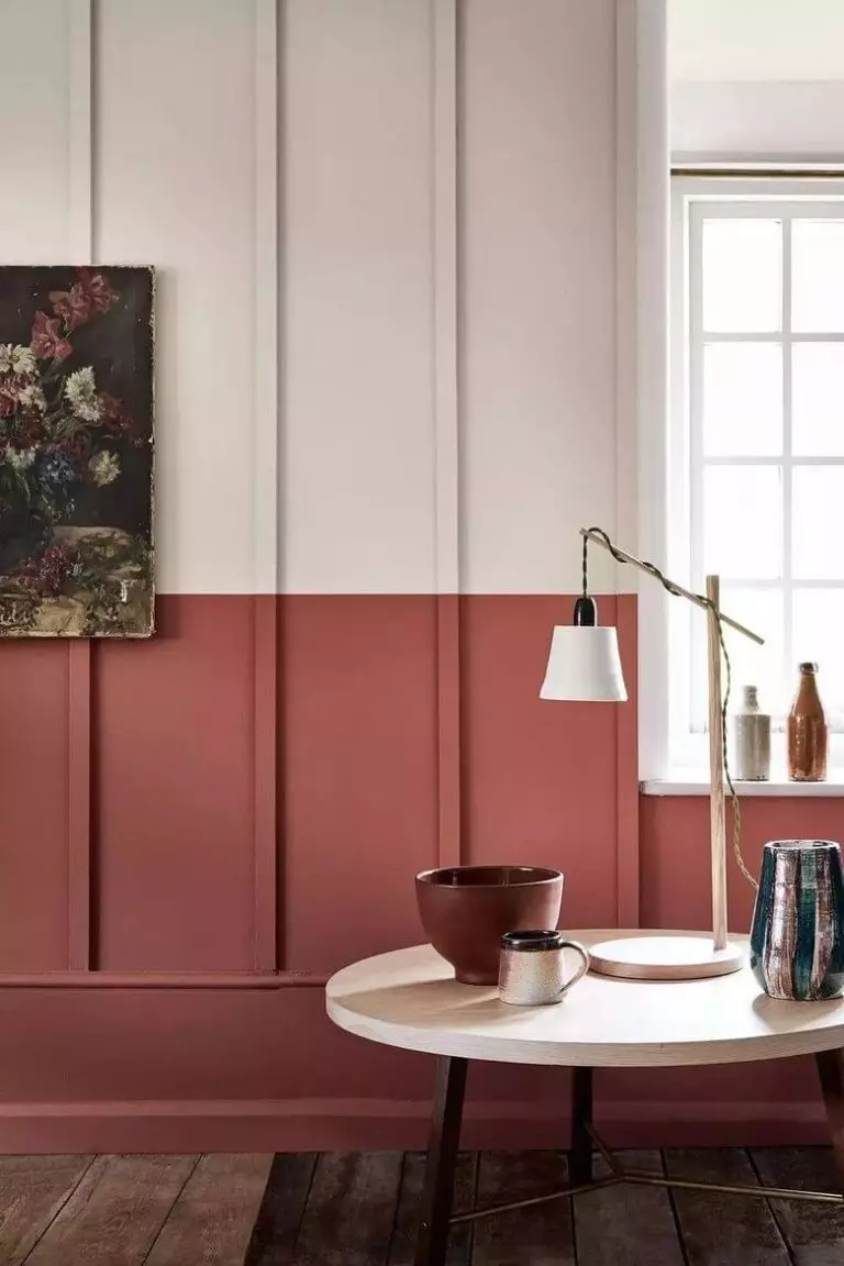
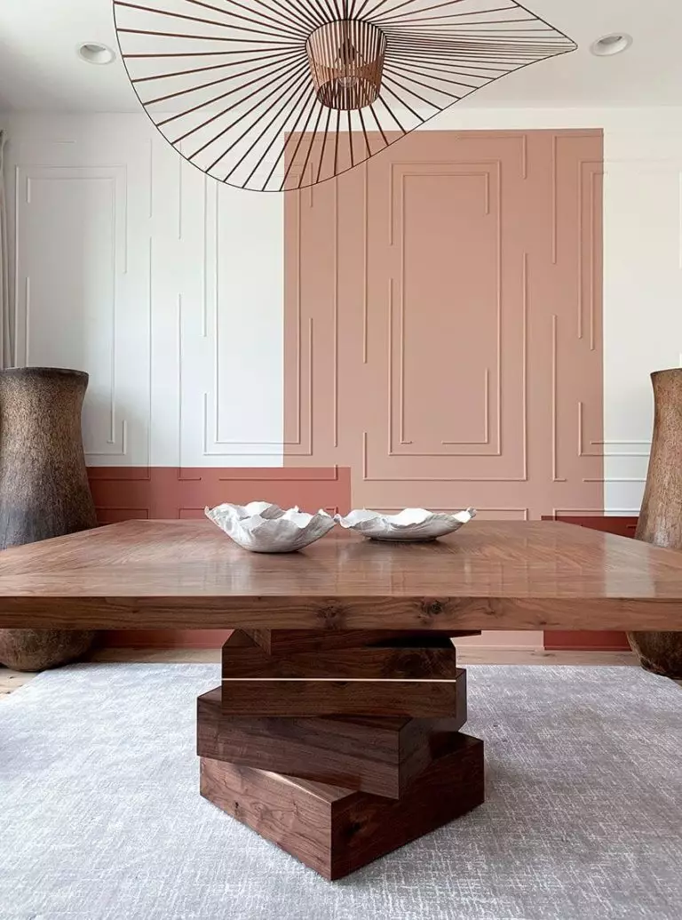
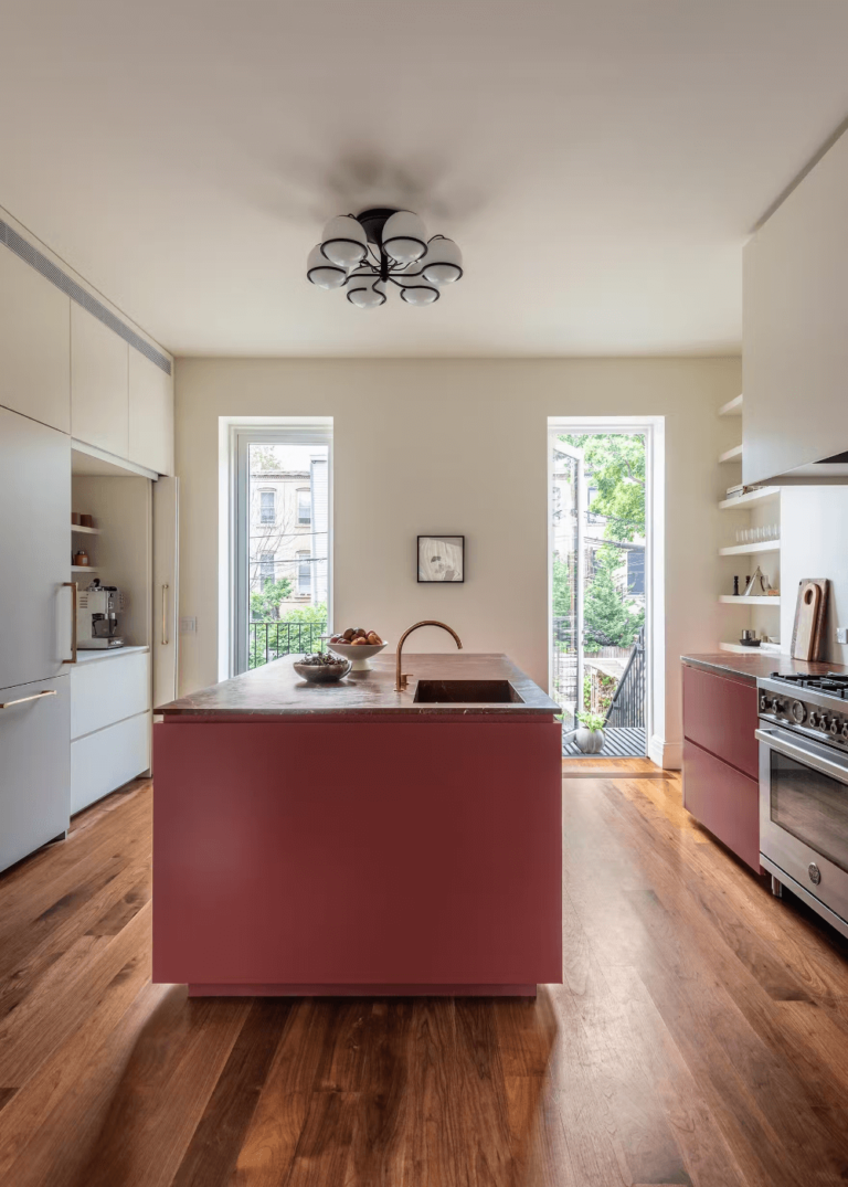
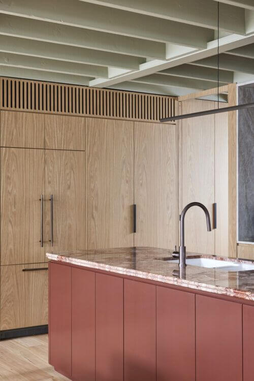
Modern Rose
Try TR as an accent in modern interiors, and it quickly transforms into a contemporary brown-red ready to conquer your attention. It pairs well with wood, white, blue, green, and neutral shades. By the way, a crimson accent doesn’t feel as overpowering as an all-crimson makeover. Try TR in your living room, bedroom, or kitchen without changing any other element. The result always speaks for itself.
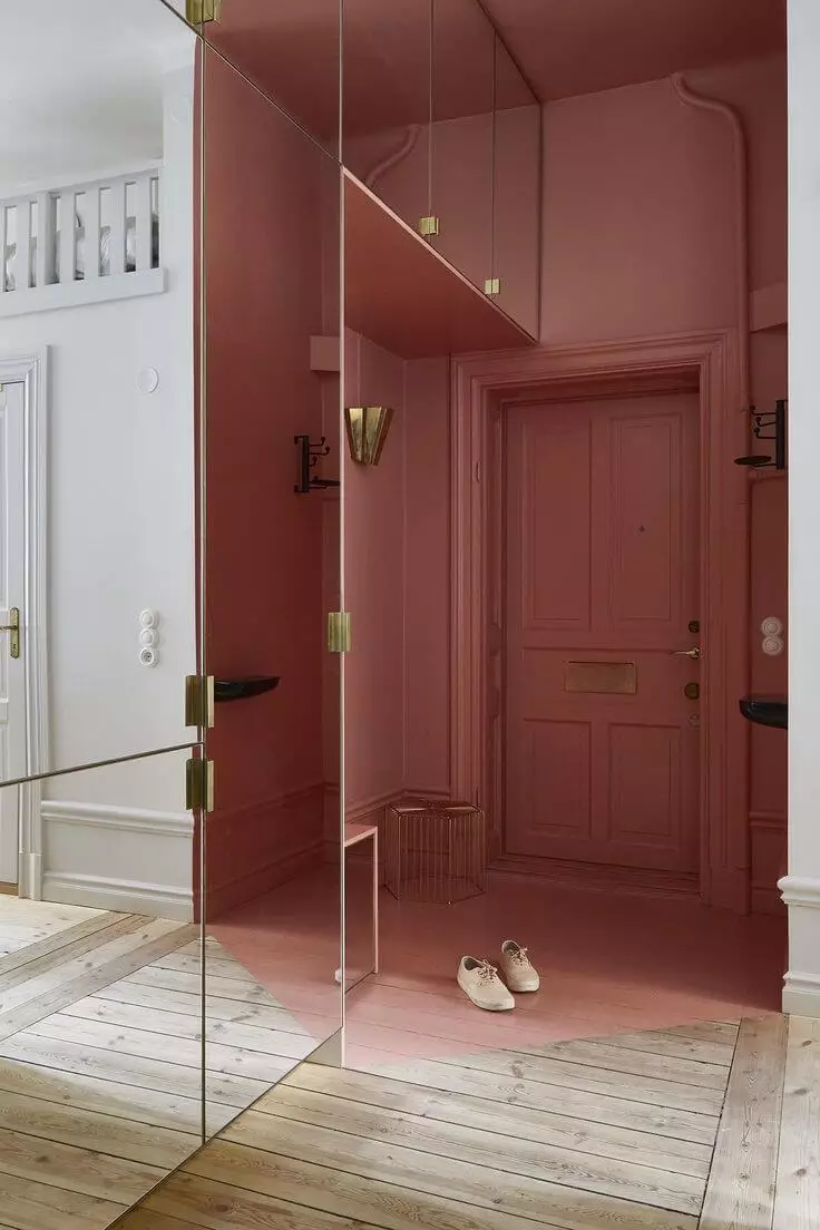
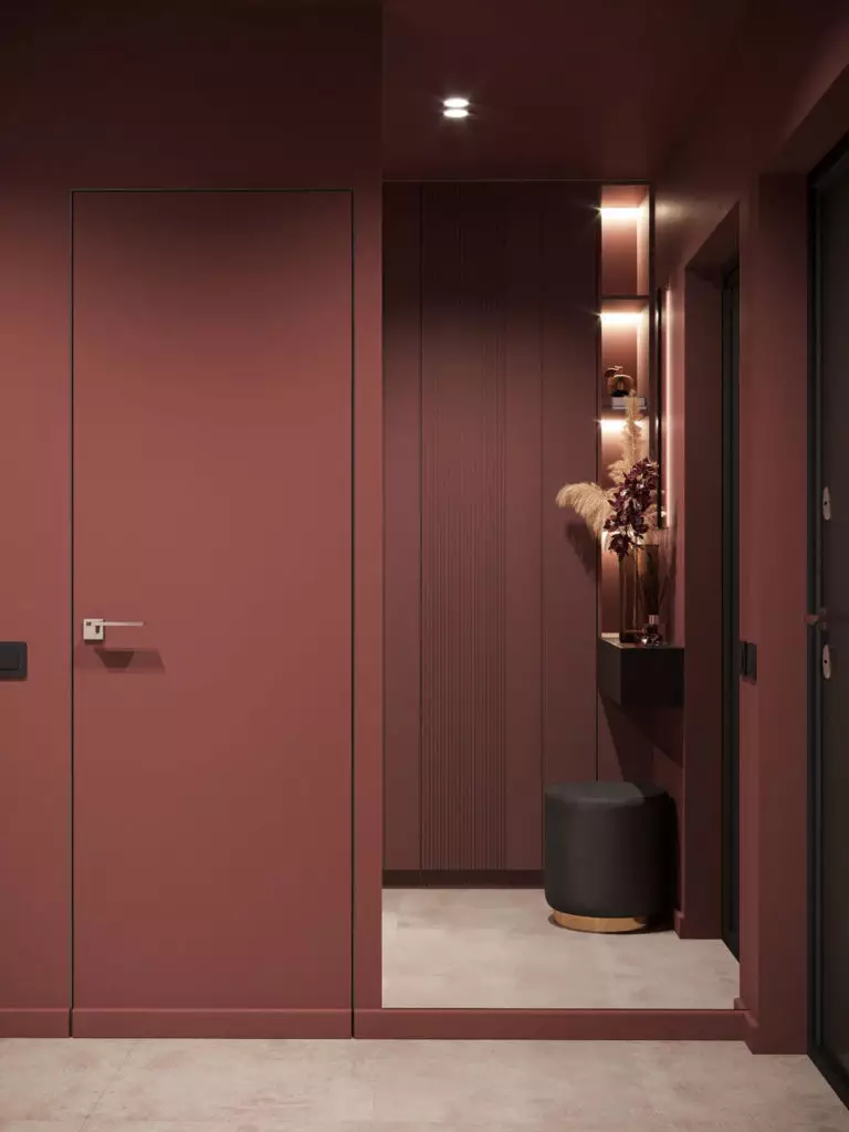
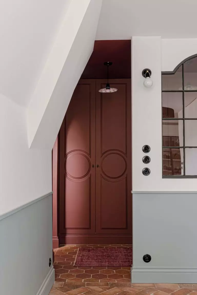
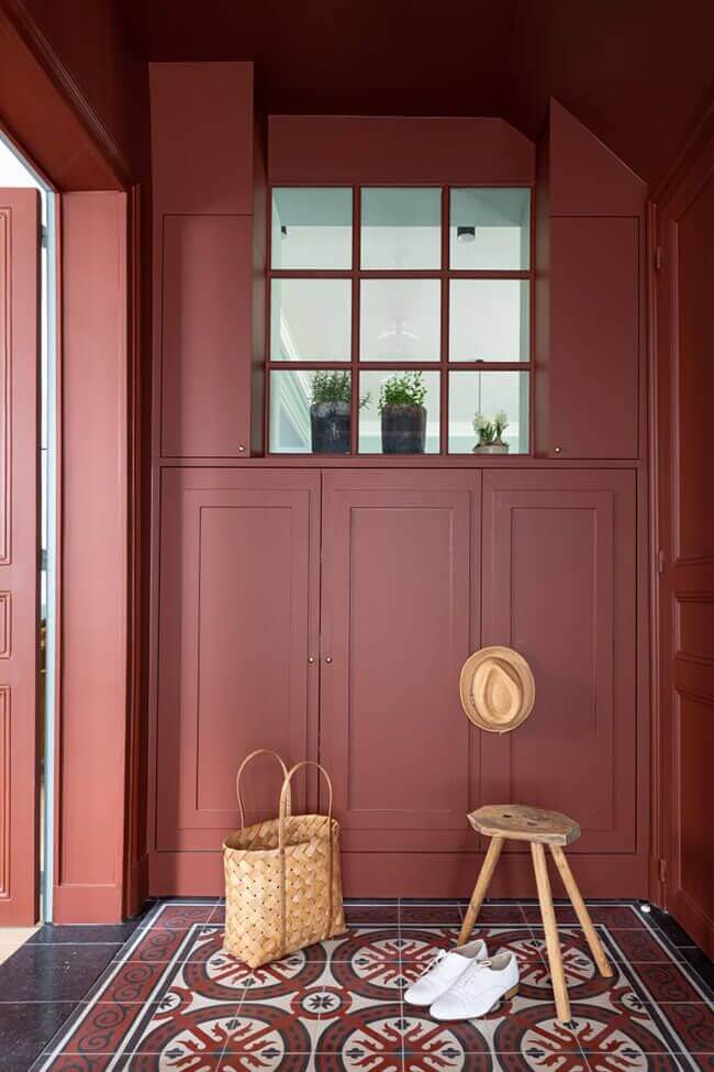
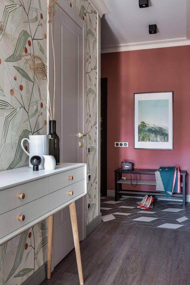
Hallway
Most designers agree that crimson is a great color option for hallways and entryways. Take Toile Red, for instance. It has everything an attractive and introductory color should have. TR is welcoming, makes for a great first impression, effortlessly partners with many colors and textures, and, most of all, knows how to stand for itself. Try TR and wooden or tiles flooring, modern or traditional furniture, and neutral or similarly vivid additional colors.
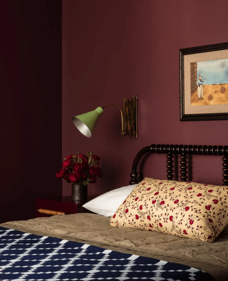
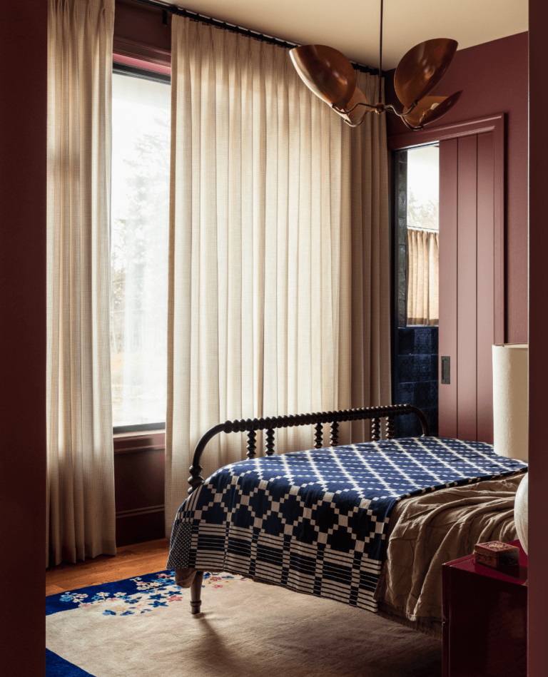
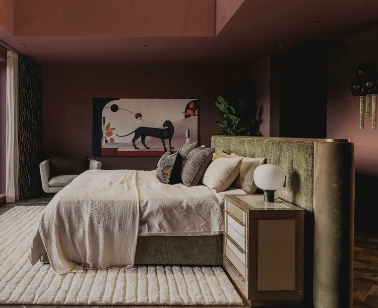
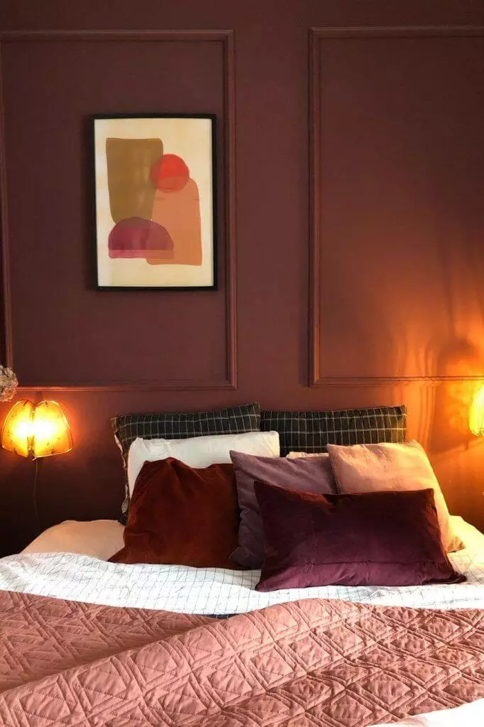
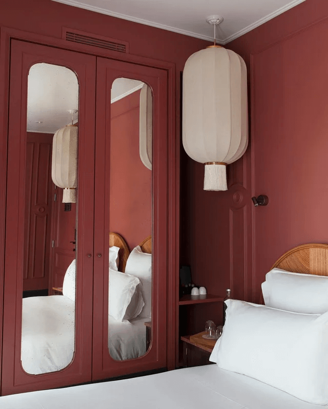
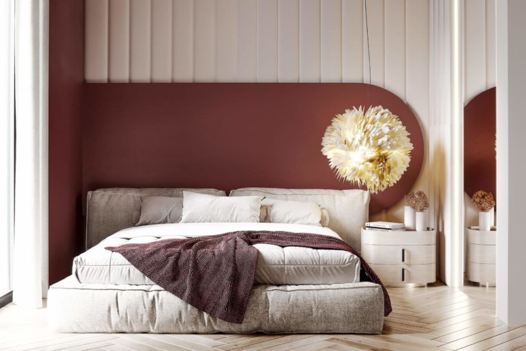
Romantic Bedroom
Frankly, TR is one of the most romantic paint colors. Undoubtedly, it will find its way to your bedroom. Due to its dark base, an all-crimson repainting will ensure a moody ambiance, perfect for relaxation and escape. You’ll feel surrounded by a cocoon and separated, at least for the night, from the contemporary world bustle.
The great news is that TR is ready to pair with any design style you like, especially if it is an accent painted brown-red, which successfully integrates into any color palette.
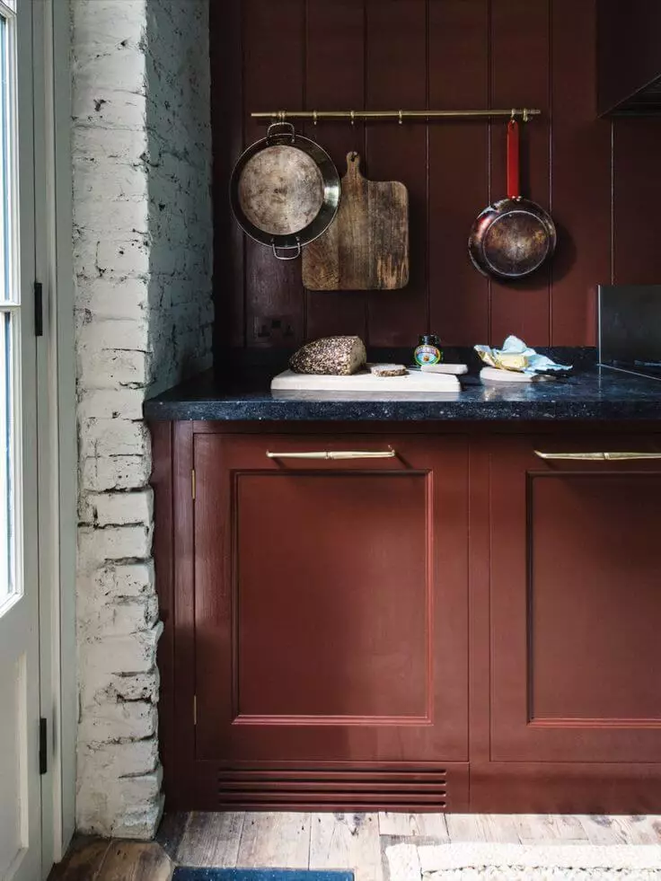
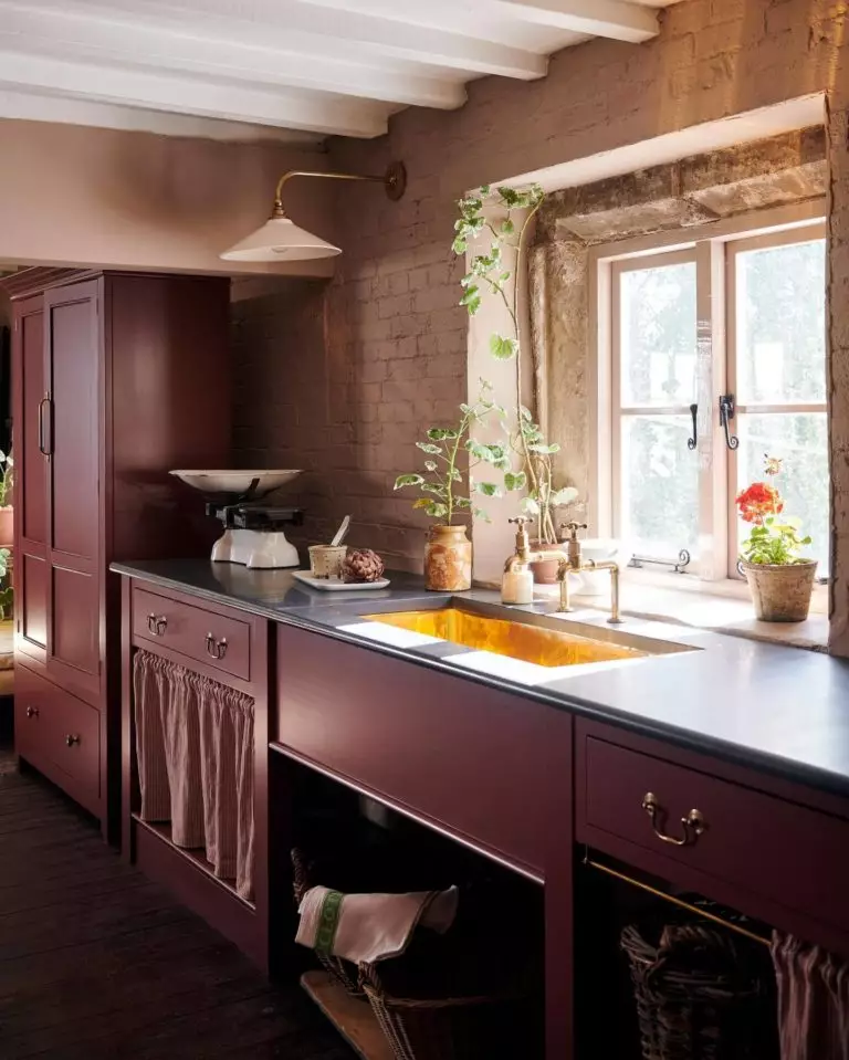
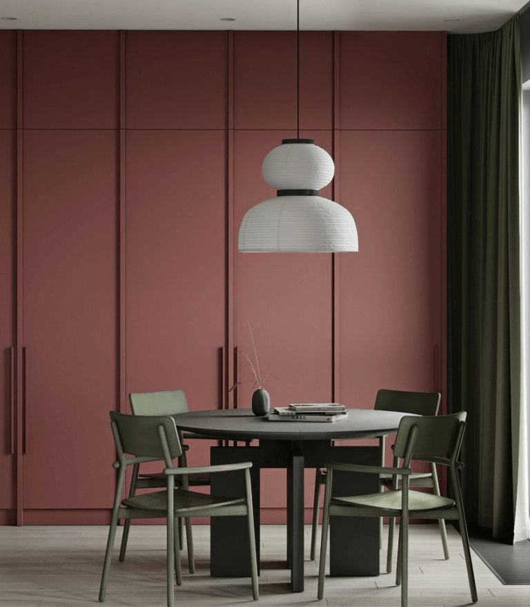
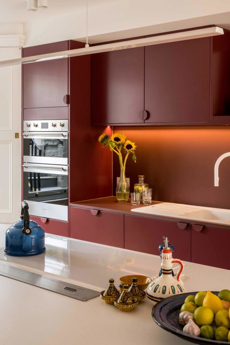
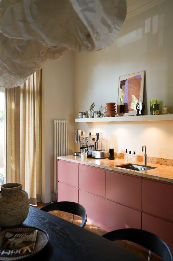
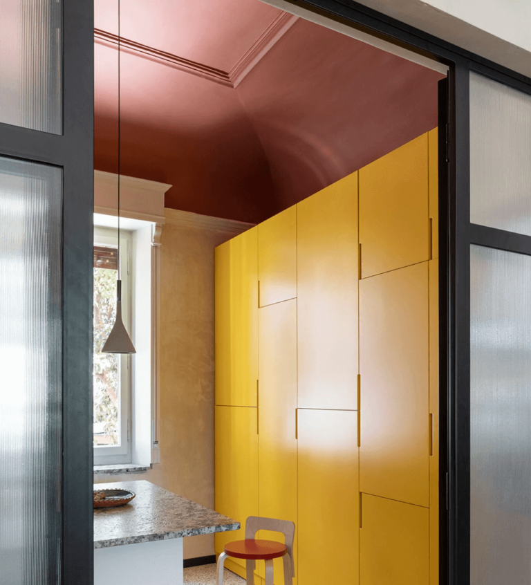
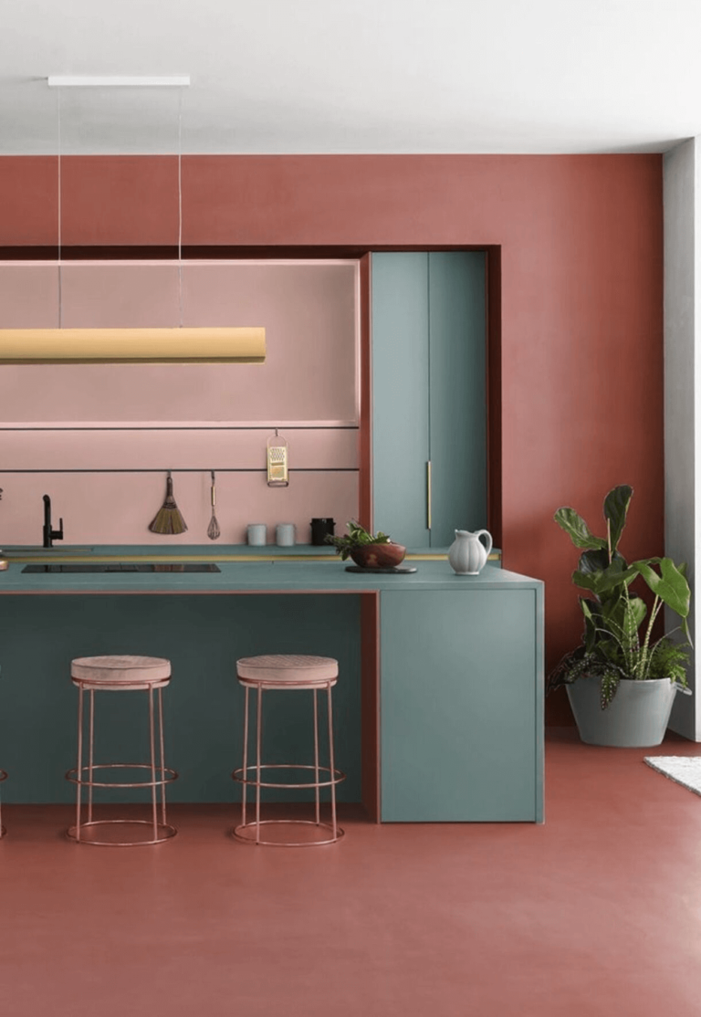
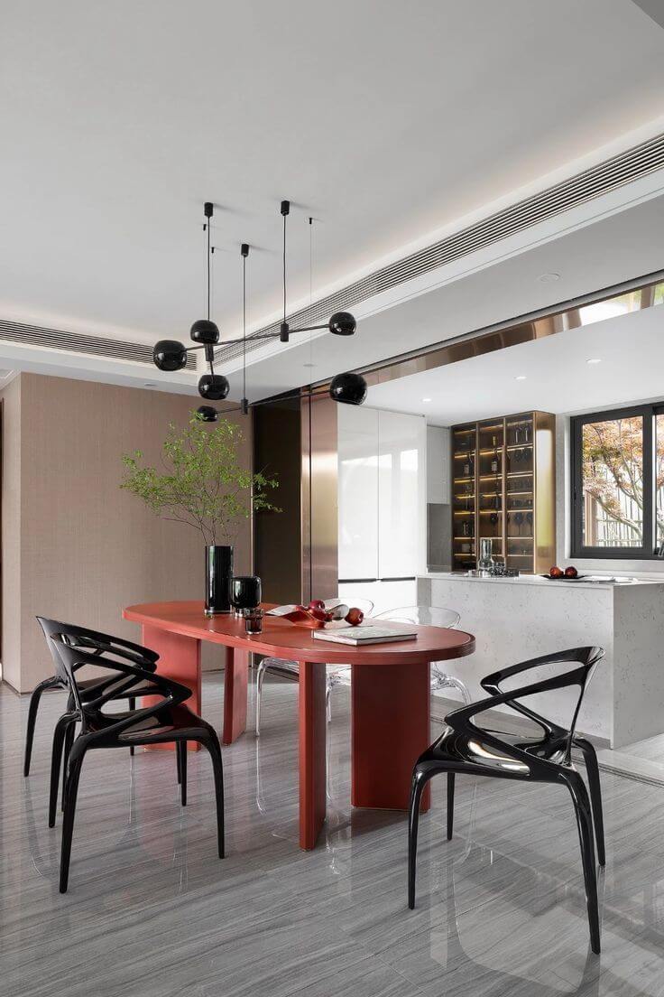
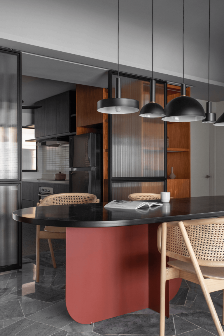
Kitchen and Dining Room
The terracotta-resembling brown-red from SW is a real find for kitchen cabinets. Paired with white and traditionally designed cabinets, TR lends the ultimate sense of exceptional flair to the cooking area. Don’t hesitate to paint crimson your modern kitchen cabinets. As easy as that, Toile Red switches from old to new.
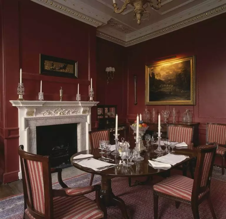
Experts don’t advise you to paint a dining room fully crimson, especially if we speak about a small room without access to natural light. The space will feel overly dark and sleepy. Instead, try TR on accents like the dining table combined with black, white, or naturally textured furniture.
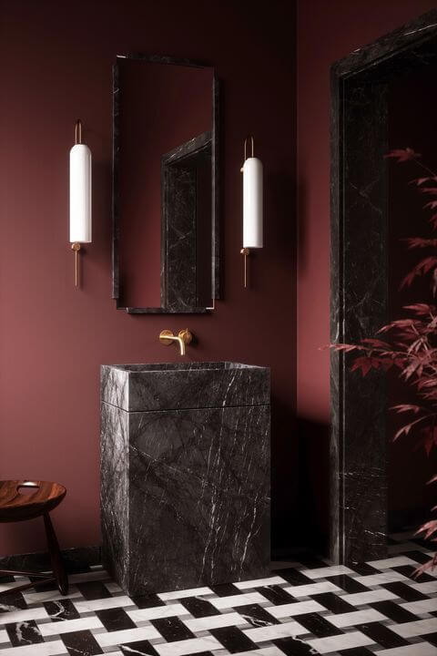
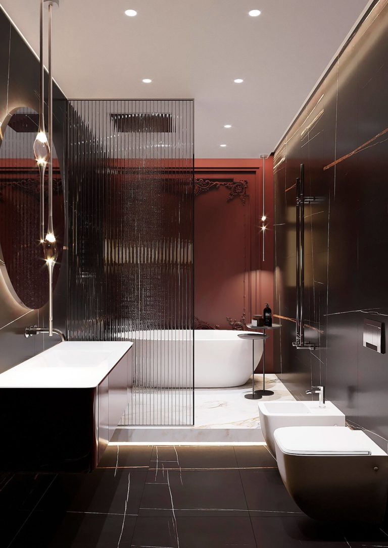
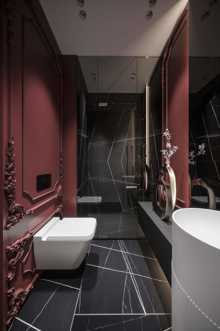
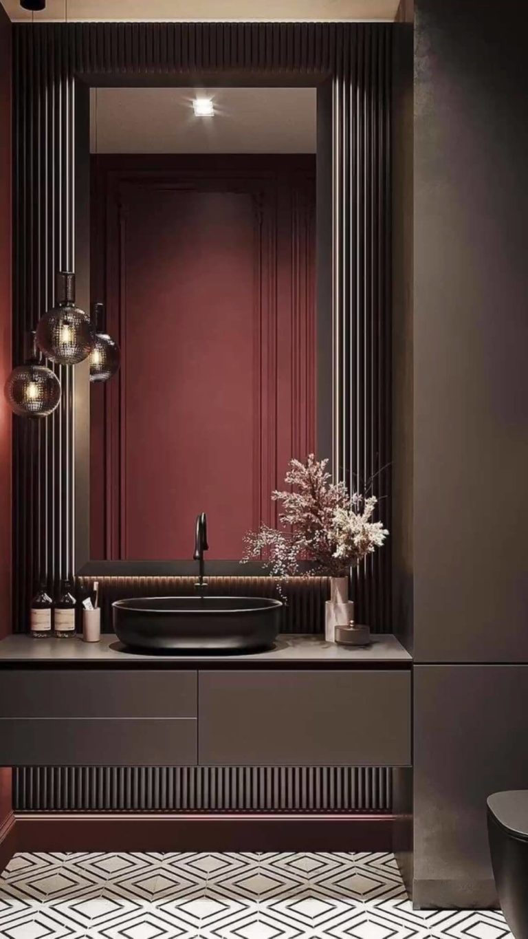
Bathroom
It’s time to use TR’s royal effect, which reveals best in the bathroom. Under the thorough supervision of black bathroom fixtures and walls, subtle white accessories, and modish wall molding, the ruby crimson tone spreads throughout the bathroom and delights your eyes and taste with its pomegranate fragrance.
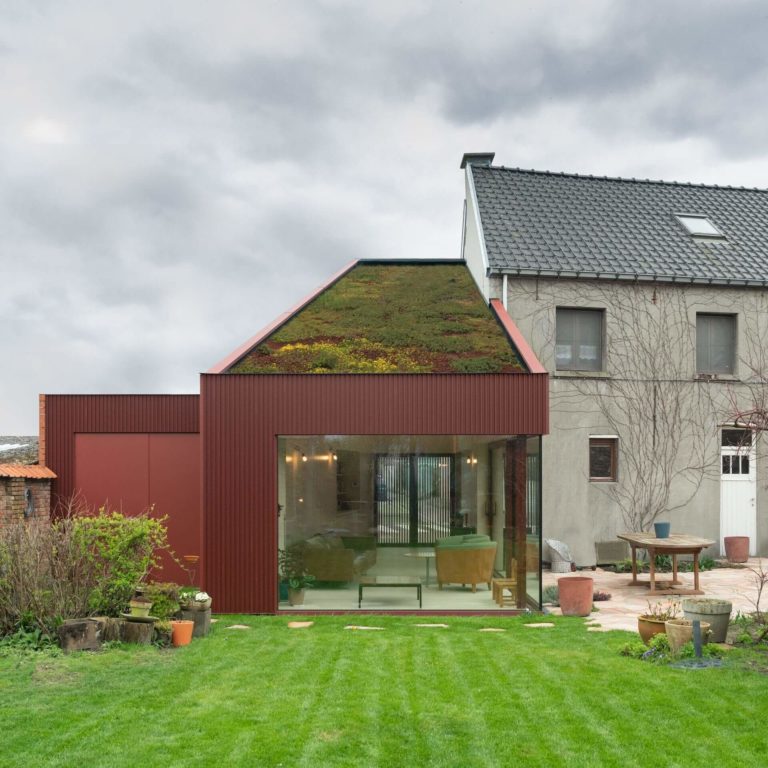
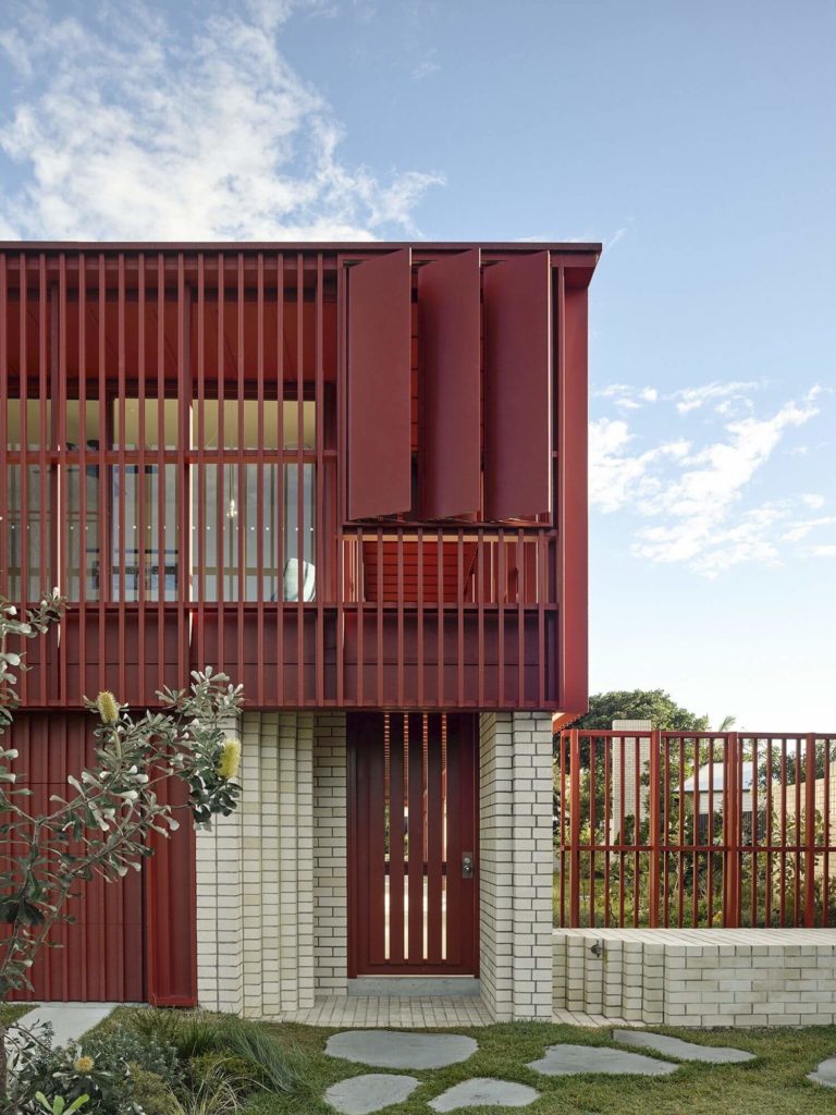
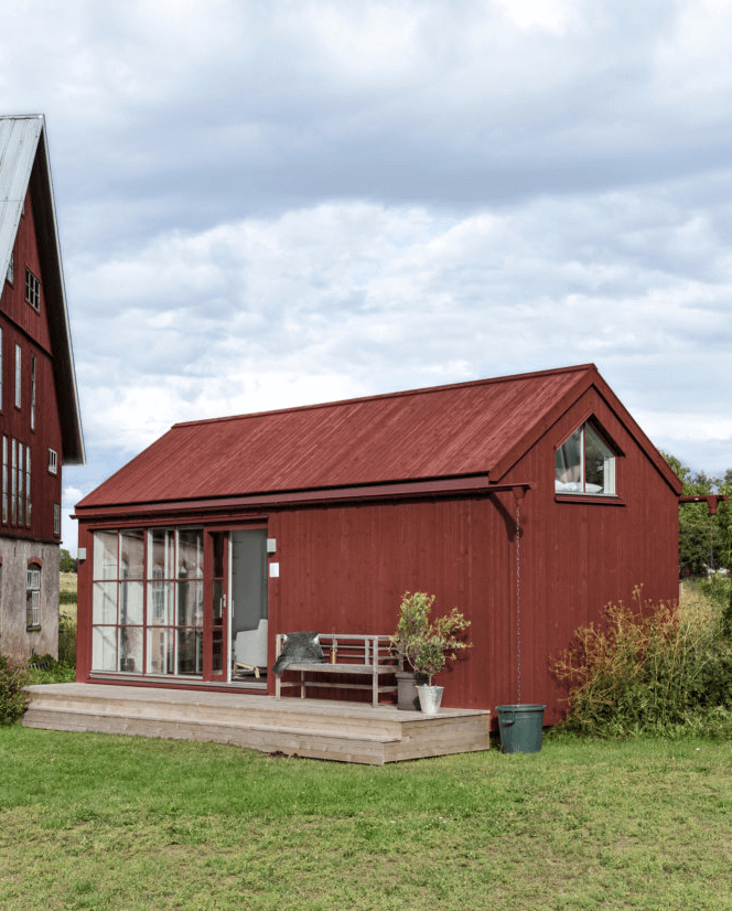
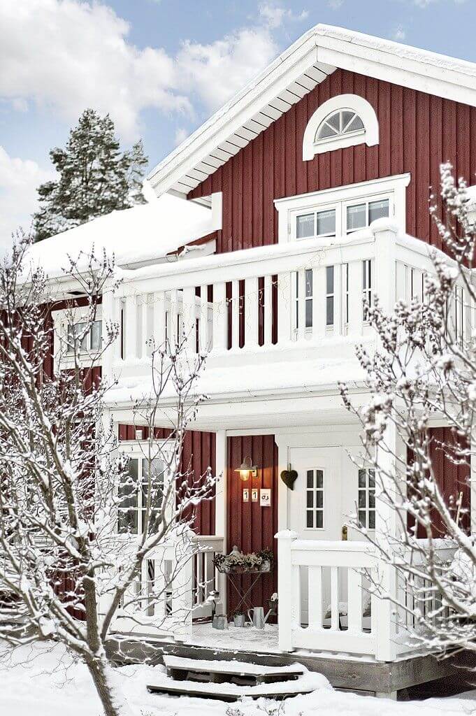
Use of Toile Red for House Exterior
Toile Red is one of the favorite crimson paint colors among designers and homeowners. A standout shade that draws the eye yet stays within limits, stately and confident. It looks great on ultra-modern exteriors with contemporary architectural features. Still, traditional houses are also a perfect suit for this color, both in summer and winter.
The Toile Red SW 0006 paint color by Sherwin-Williams is a historic and, at the same time, modern purplish-brownish-red deeply rooted in the past. It induces comfort and brings an impetus of confidence and royal style. Make a personalized accent in your interior or exterior design with this beloved reddish shade.
