Topaz 070
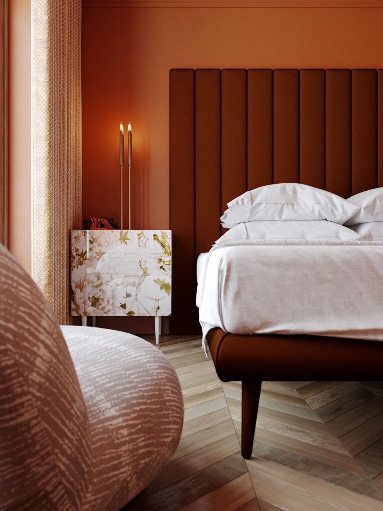
Benjamin MooreA terracotta orange shade with radiant reddish-brown undertones that will catch your attention at the very first glance.
Topaz 070 (Benjamin Moore): What Color Is, Review, and Use
2024 is undeniably the year of radiant paint colors, and the category of vibrant oranges, earthy variations, and terracotta shades is one of the most popular among colorists and designers. No wonder the giant brand Benjamin Moore chose Topaz, a sparkling reddish orange, as a prominent representative of its 2024 trendy color palette. We’ll help you rediscover bold colors from a new perspective by analyzing Topaz’s properties and design abilities. Read on!
Topaz Paint Color Features
Like its namesake, this dashing shade of orange reveals the color of one of the rarest Topaz variations – the orange one, used as a gemstone and known for peculiar features like optimism, creativity, and abundance. Like the mineral, the paint color under code 070 unfolds a vivid combination of brown and red that looks fantastic as an accent yet adds the right amount of confidence when used as a background color.
Topaz: Is It Warm or Cold?
Topaz is probably one of the warmest paint colors at this manufacturer. The cozy, earthy notes, together with the reddish tinge of boldness, make for a perfect color that radiates warmth and comfort. You’ll never feel unwelcome in a space painted with such a warm orange shade.
How Does Lighting Affect Topaz?
Although we can see a pretty dark orange tone on the color sample, its vivid features compensate to the fullest. This richly saturated orange undoubtedly feels brighter when used in a space. Still, exposure has a lot to say in this sense. Expect a much more saturated orange in rooms bathed in sun rays, such as those with southern exposure. Simultaneously, a more muted, earthy orange will thrive in a space with north-facing windows.
Pay attention to the amount of natural or artificial light your room receives. Topaz is a pretty daring paint color that needs much light to avoid making a space feel too enclosed.
Topaz LRV
The Light Reflectance Value explains why we cannot use Topaz in large amounts in a poorly lit room. On a scale from 0 (black) to 100 (white), this vivid orange paint color stands out with an LRV of 22.37, close to the group of dark colors. Although Topaz seems brighter when put into practice, it bounces back the tiniest dash of light, risking making the space feel small and devoid of a comfortable amount of light. Try experimenting with a color sample in your room in advance.
Topaz Undertones
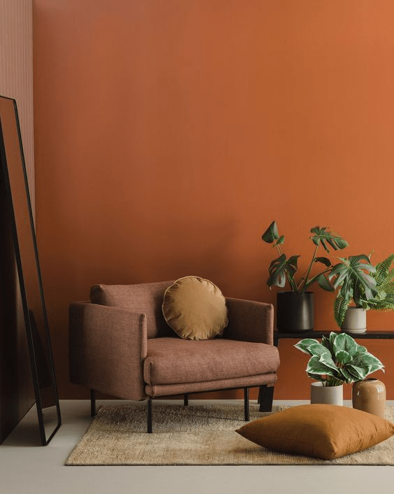
As mentioned, Topaz is a catchy orange shade whose warm and vibrant brown and red undertones make it stand out in the category of bright colors. Not least, those reddish-brown notes keep this paint color close to terracotta, one of the trendiest colors this season.
Similar Colors
We’ve been used to neutral paint colors prevailing over trends for more seasons, and seeing now such bold shades like Topaz makes us wonder whether such colors have always been there. Apparently, top paint manufacturers are full of radiant shades as well, especially oranges. Let’s explore the top alternatives for Topaz by Benjamin Moore.
Coordinating Colors
On interior designers’ favorite list, we can find stark whites, softer off-whites, greiges (gray with beige), tans, and the top choice – gray-blue for a perfect contrast. Let’s see what Benjamin Moore colorists recommend!
Use of Topaz in Interior
Despite being a relatively bright paint color, it knows its way around neutral and similarly bold colors. You can use this warm orange shade as an accent if your space lacks visual appeal. Or, let it steal the show by becoming the primary color in the room. The appropriate combination of colors, perfect lighting, and suitable accessories can help this radiant orange seem stately and high-class. Let’s explore the trendiest design ideas with Topaz by Benjamin Moore.
Orange and Neutrals
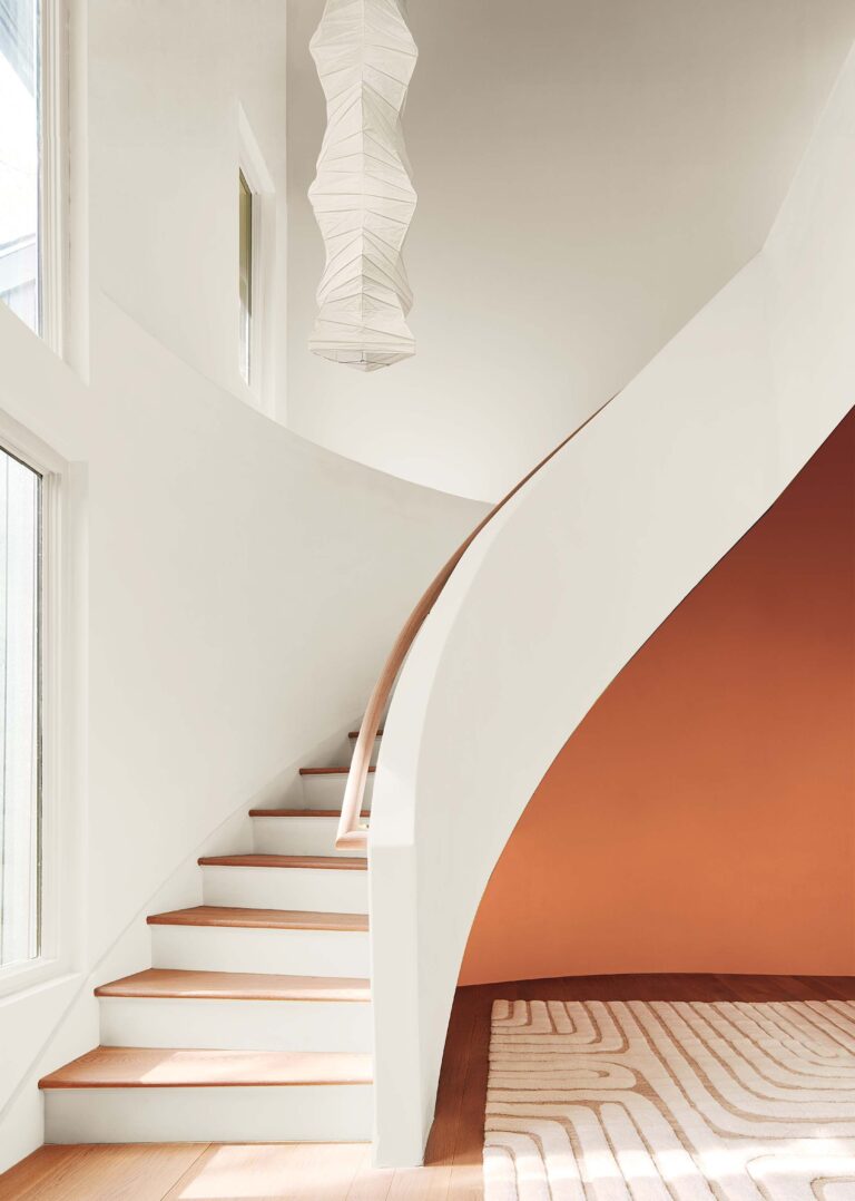
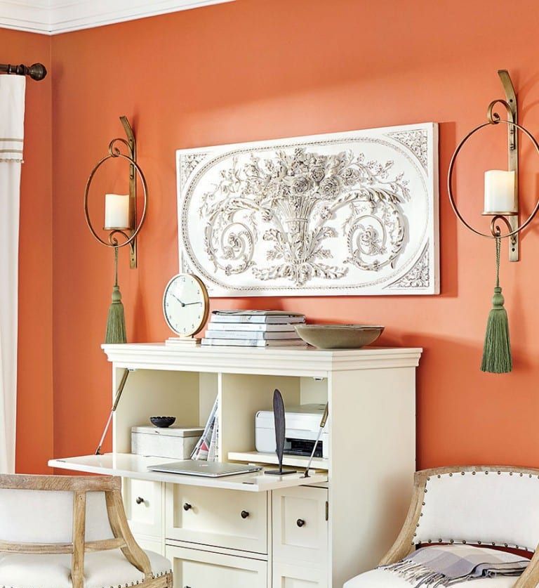
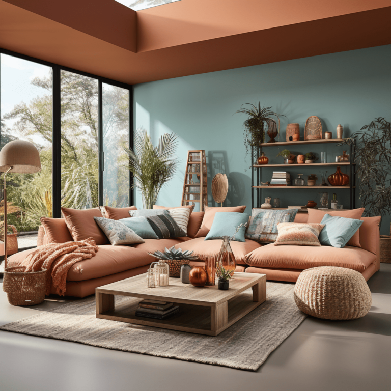
The standout orange shade from Benjamin Moore is a good friend for almost all neutrals, from white to gray. If you like the color yet are unsure how to use it in interior design, know that you’ll be safe with a neutral matching color. Whether it is a Topaz-painted accent on a white background or off-white trim paired with warm orange-colored walls.
Bedroom
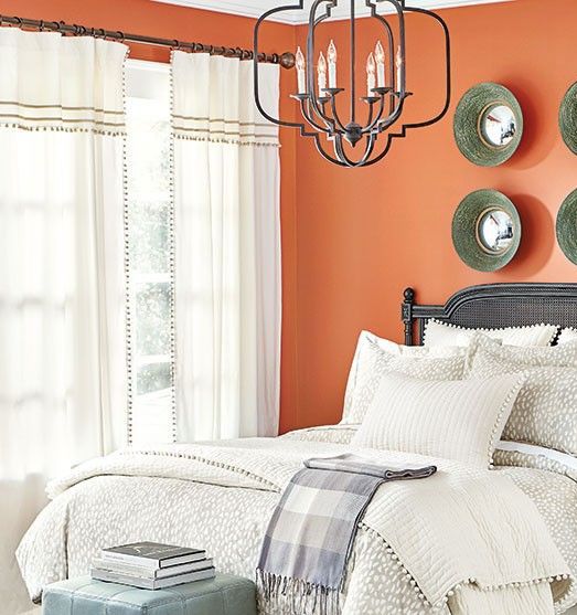
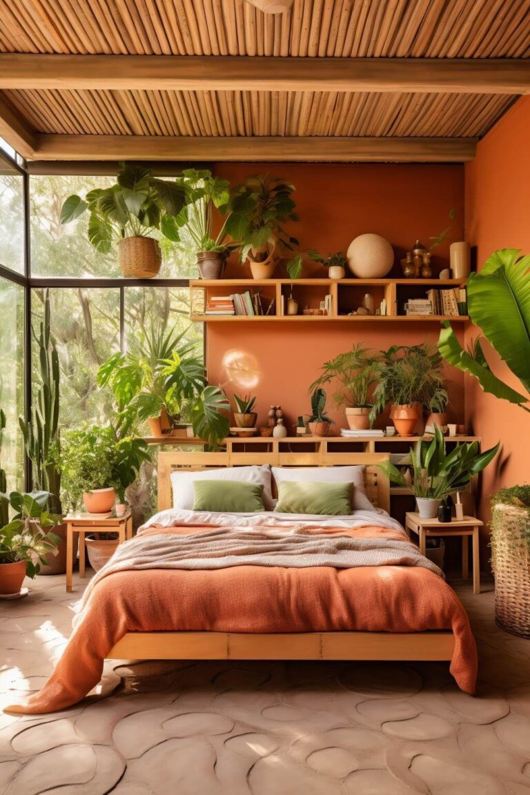
That’s when the enclosing property of Topaz comes in handy. If you’ve always found comfort in saturated and warm colors surrounding you like a cocoon, don’t lose this trendy option to paint your bedroom walls all orange. Try Topaz on walls for a darker effect, or use it with lots of greenery and natural materials to increase the terracotta effect.
Eco-Style Living Room
Embrace one of the trendiest interior design styles, together with a gorgeous paint color, to boost your mood. Topaz looks great beside sustainable and rich-textured surfaces, especially indoor plants whose green leaves harmoniously stand out on the earthy-colored background.
Sun-Bathed Kitchen
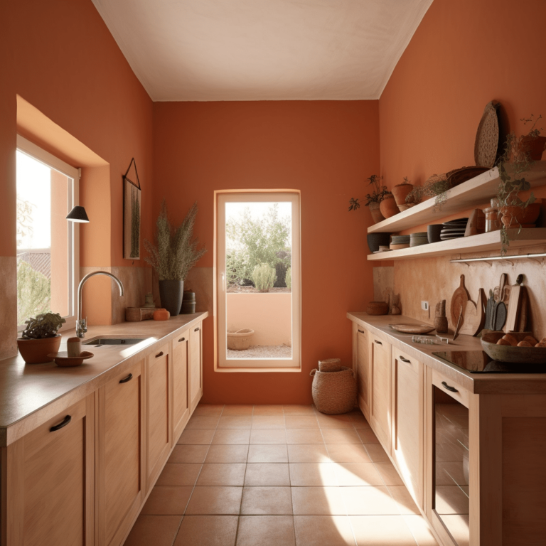
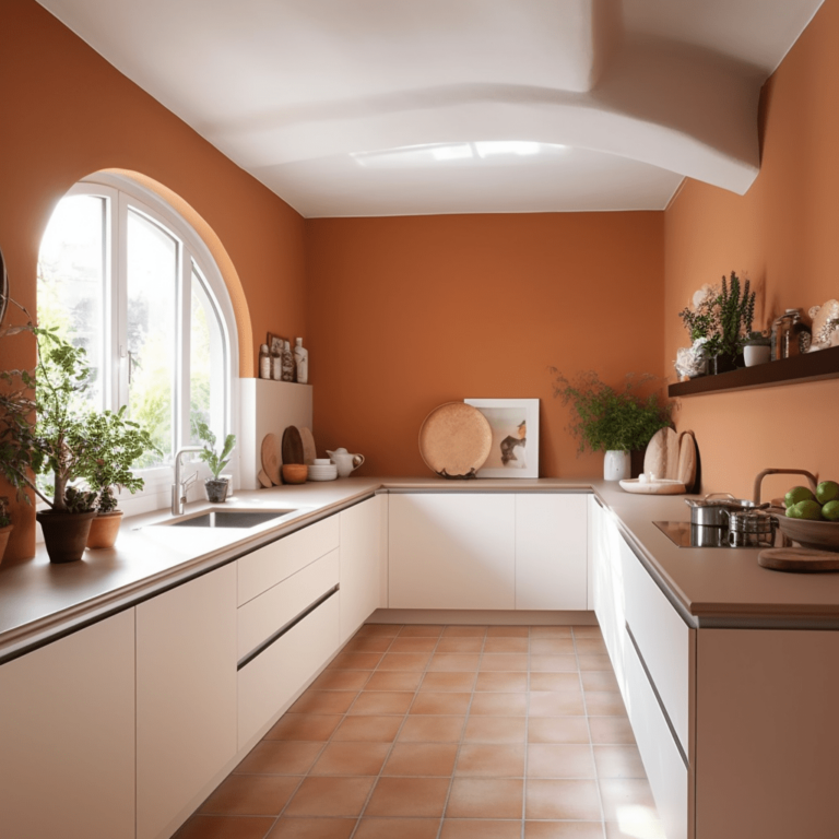
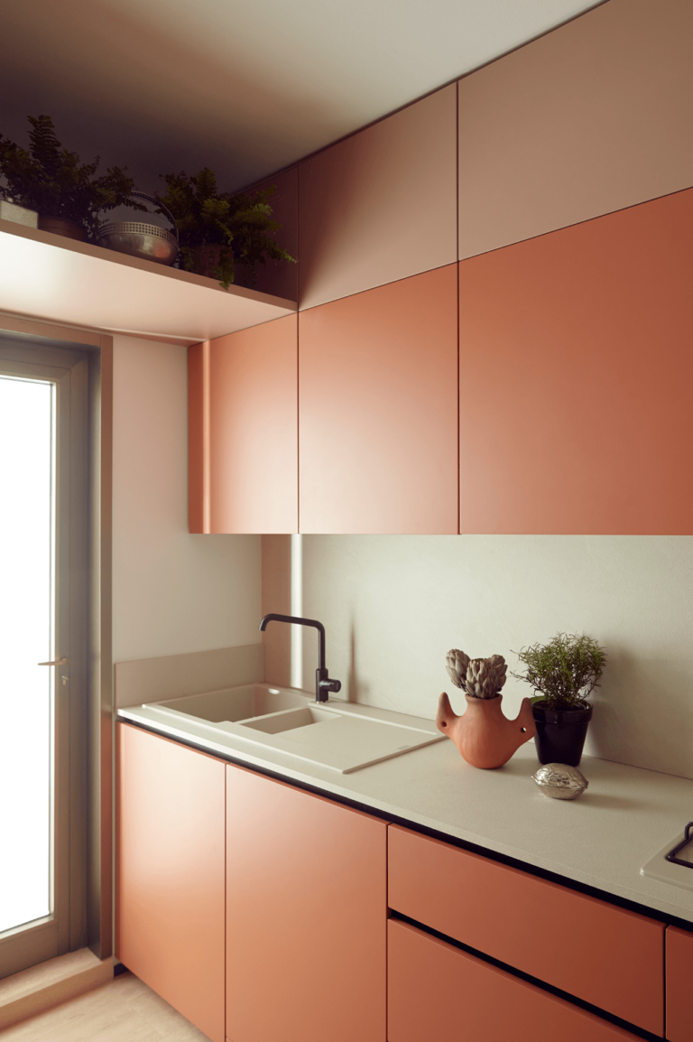
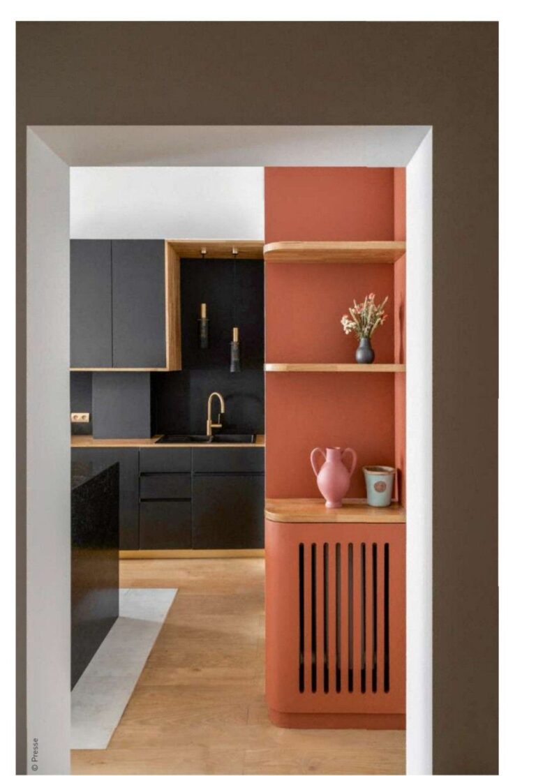
Feel the Mediterranean effect all year long in the cooking space by painting the walls or kitchen cabinets in the terracotta orange Topaz. Surprisingly, this roaring paint color looks equally perfect around light and dark neutrals, especially white and black. Give it a try regardless of the design style.
Bathroom
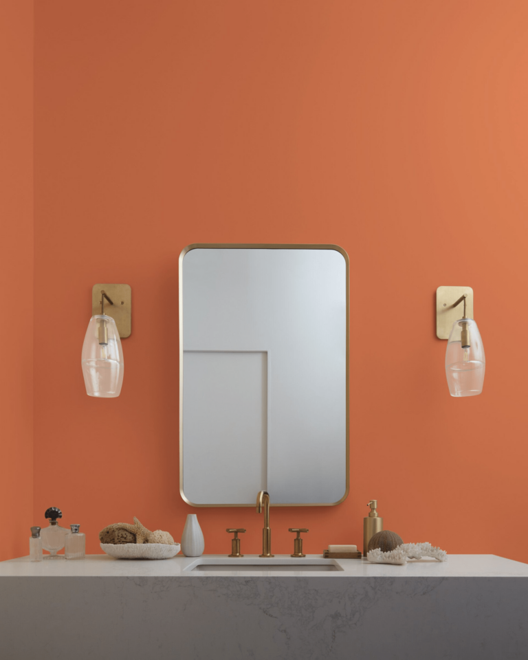
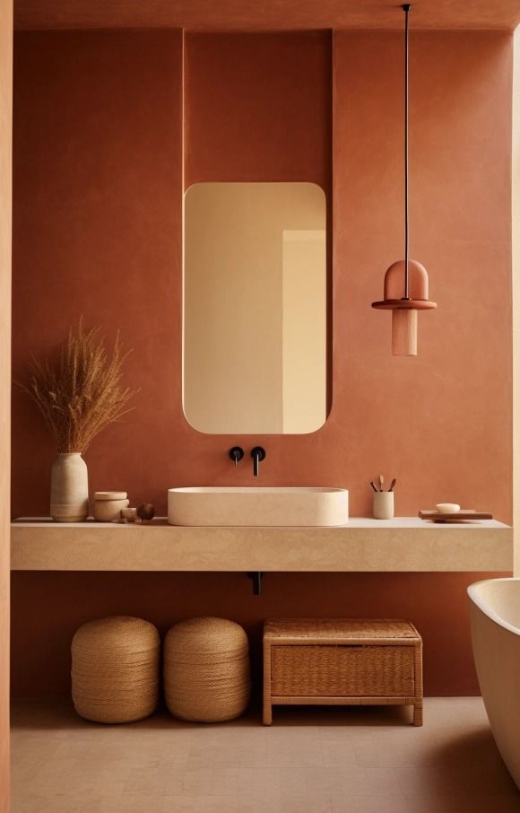
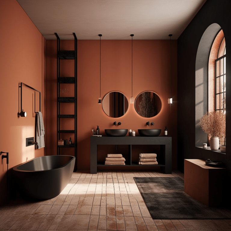
Topaz is a favorite paint color when it comes to spa-concept bathroom design ideas. Cover all walls in this inviting and relaxing orange shade, especially if those are unevenly finished, for an increased natural effect. Here, again, we mention the unmatchable pairing between this orange shade and black accents.
Use of Topaz for House Exterior
Although this trendy orange shade is fully saturated and isn’t prone to losing its charm when bathed in direct natural light, colorists don’t recommend it as an exterior paint. There is more boldness to this shade than anyone would have expected. Thus, you better limit yourself to interior design.
The Topaz 070 paint color by Benjamin Moore is one of the most vivid shades on the trendy paint color palette. If you need a mood boost or an accent color in your interior design, don’t hesitate to try this shade of orange, which seems like an updated version of the popular terracotta.

