Veri Berri SW 9069
Sherwin-WilliamsA standout violet, fully saturated and impeccably radiant. Dive into the world of the trending purple paint colors with one of the most original tones.
Veri Berri (SW 9069): What Color Is, Review, and Use
It’s no secret purples have become quite a trend when it comes to paint colors. The renowned paint brand Sherwin-Williams has a whole color palette dedicated to reds and purples, the brightest in the 2024 Colormix Forecast. Since maximalist design concepts are impeccably popular, choosing a bold violet tone in a world of overly neutral color palettes is a perfect way to stand out while keeping pace with trends. Add more vibrancy to your home and boost your mood with the voguish Veri Berri violet. First things first, let’s check some facts before committing!
Veri Berri Paint Color Features
To visualize Veri Berri clearly, think of a freshly prepared berry smoothie. Looking at this paint color almost feels like tasting such a delicious mix. Actually, this trending tone is a deep and sweet violet shade. It is definitely saturated, yet there is something so balanced about Veri Berri. In the past, violets were indicative of luxe and royalty. Today, it is a more approachable color. Designers encourage us to be more creative and bold. Vivid hues will boost your mood and enhance your home’s color palette.
Veri Berri: Is It Warm or Cold?
This delicious violet tone is a delightful pairing between blue and red. In the RGB value – the mix of red, green, and blue in this paint color, we distinguish the prevalence of blue over red and especially green. Although blue represents the cool temperature, Veri Berri is a warm paint color.
How Does Lighting Affect Veri Berri?
Expect the blue note in Veri Berri to prevail considerably in a room with north-facing windows. Conversely, if you use this paint color in a space with southern exposure, this charming purple will turn into the warmest pastel plum shade. Additionally, consider that the yellow-orange natural light, witnessed in east-facing rooms at sunrise and in west-exposed spaces at sunset, will add even more warmth to this summertime color.
At night, artificial light ensures a more saturated violet that may overwhelm a small room with poor lighting conditions. Yet, a purple accent sounds perfect.
Veri Berri LRV
You should know about the Light Reflectance Value if you’re new to paint color reviews. This figure shows how light or dark Veri Berri is, based on the amount of light it bounces around. With an LRV of 21 out of 100, this fruity violet ranks as one of the most saturated mid-tone shades. Frankly, Veri Berri is pretty bright for such a low LRV, yet quite capable of reflecting light and ensuring the space doesn’t feel too enclosed. Still, before using this paint color on walls, make sure to experiment with a color sample.
Veri Berri Undertones
It’s no surprise we can witness the dance of red and blue undertones in this radiant violet. Of course, lighting is key. The cooler the lighting is, the more bluish Veri Berri feels, and the opposite with warm light.
Similar Colors
If you need more color inspiration, check out this expert-pick selection of shades similar to the beautiful violet from Sherwin-Williams.
Coordinating Colors
Veri Berri-painted walls would look great paired with a soft white shade for trim. Generally, this bright paint color best works with lighter neutrals. Think of an off-white tone. For more contrast, look at the other side of the color wheel, where you can find a complementary color – green. And not just any green, but a bold one that matches the vibe of Veri Berri. Let’s see what Sherwin-Williams’ colorists suggest.
Use of Veri Berri in Interior Design
We agree such a violet tone seems overly bold. Yet, it is time to embrace new colors besides the overused neutrals. We’ll reveal some pretty design ideas on how to style Veri Berri.
Veri Berri Design
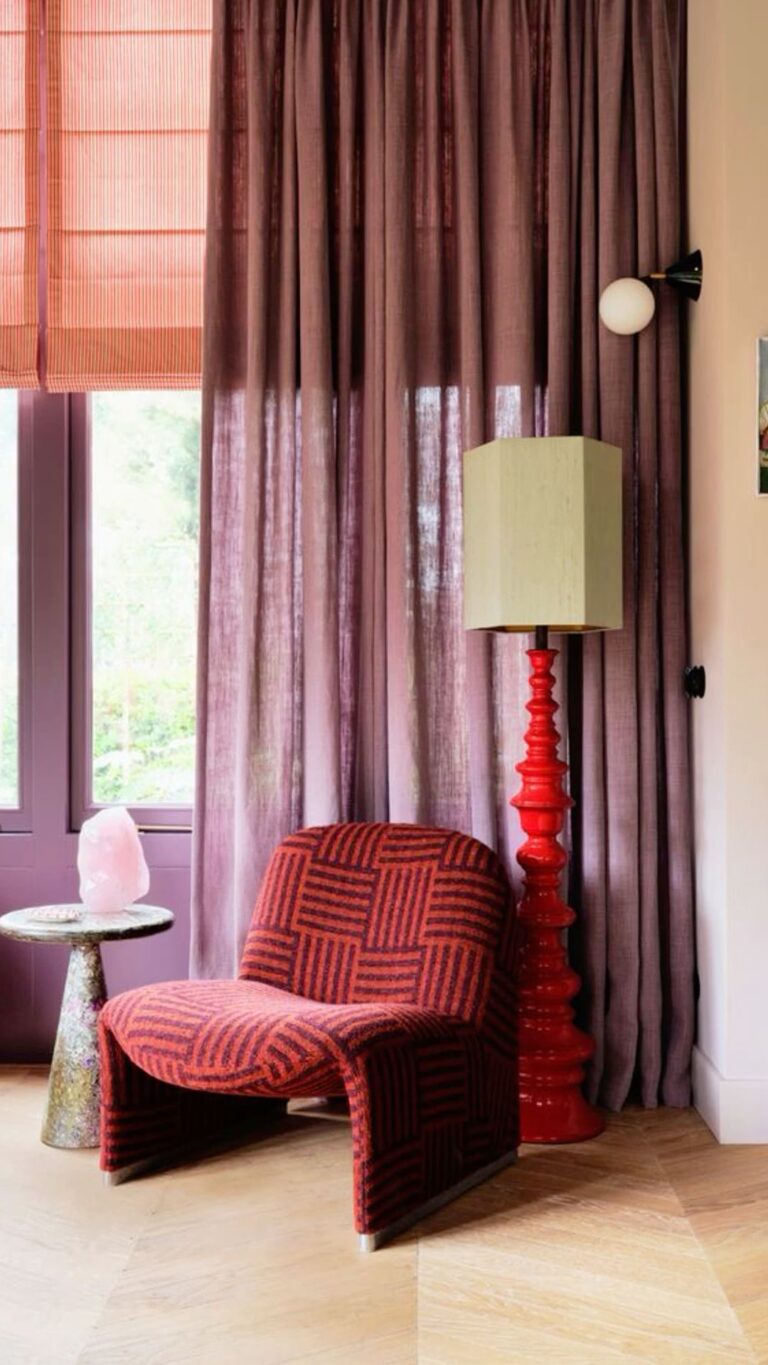
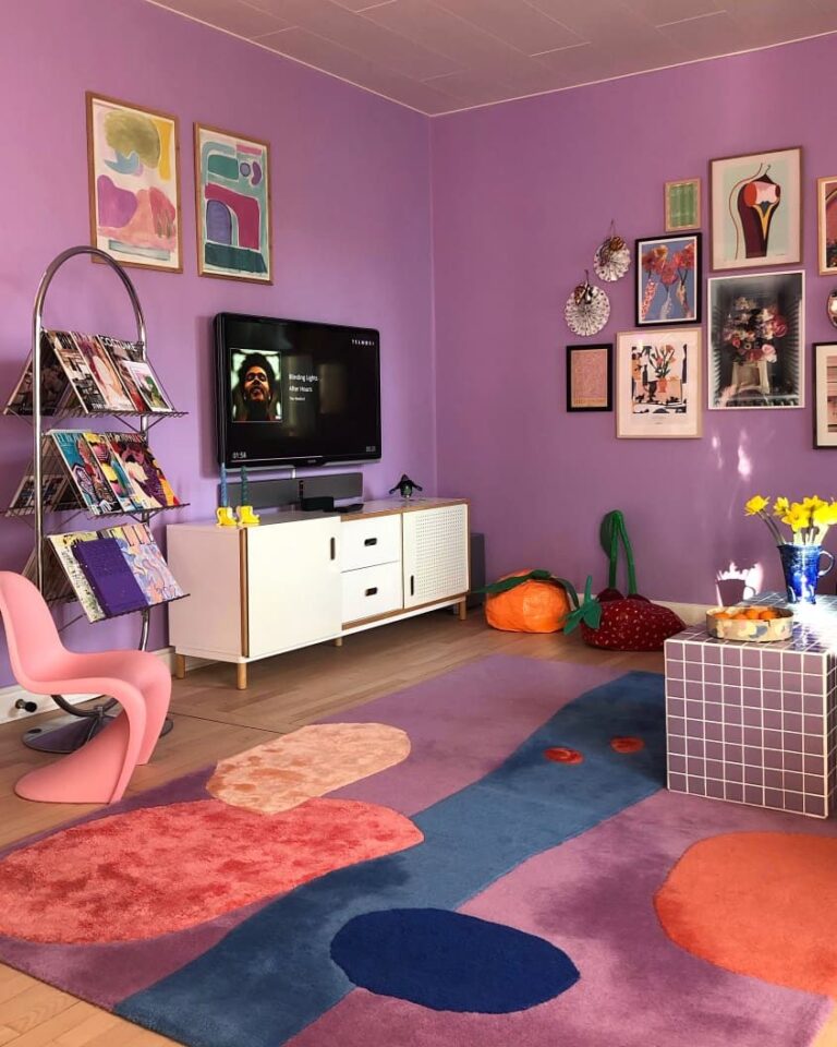
It would be inappropriate to speak about such a contemporarily vivid paint color and skip the trending-now maximalist design. Express more emotions by decorating any room with a fruity combination of bright colors. Enjoy the boost of energy daily. So, the designers recommend using Veri Berri on walls as a primary or accent color and furniture to share your colorful inner world with the external world.
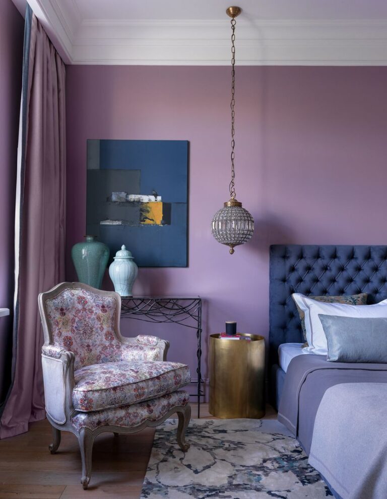
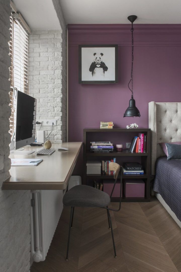
Bedroom
Unlike deeper lilacs, this violet is quite vibrant, and choosing it for all walls may result in an overwhelming environment. Still, considering it as an accent sounds perfect. Those who like purple will much more easily adapt to this vivid tone. However, if you don’t think it is a perfect option for the master bedroom, you can always choose it for your kid’s bedroom unless they don’t like purple.
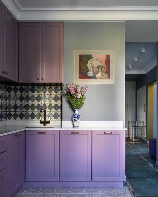
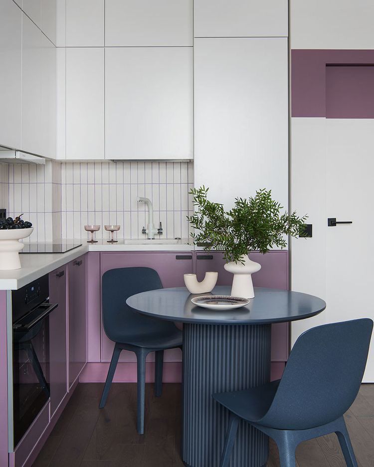
Kitchen
It may seem that you cannot choose such a bold lilac for a modern kitchen. However, Veri Berri is a very adjustable paint color. Whether you go bold with all cabinets painted violet or pair Veri Berri with neutrals, your kitchen will undeniably stand out with a stylish design and one of the trendiest violet shades. Experiment with color this season!
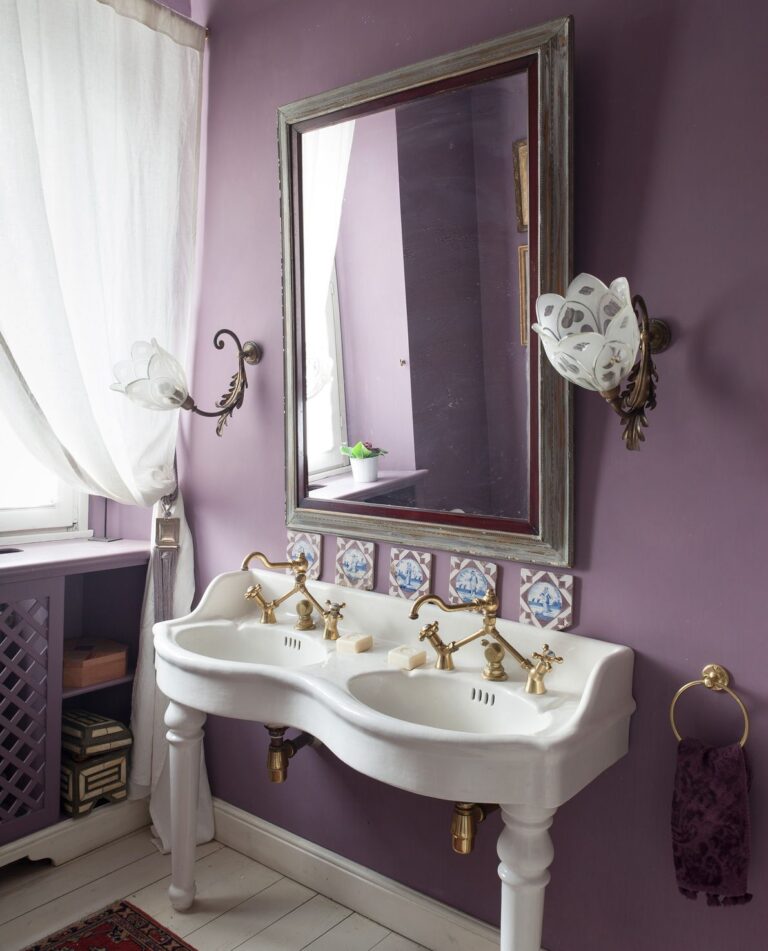
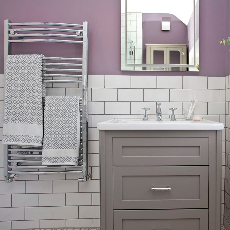
Bathroom
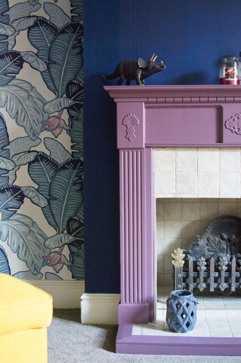
No surprise, Veri Berri looks great in Traditional bathrooms with vintage accessories. Violet was the color of royalty in the past. Get a taste of the old-time class with a beautiful combination of radiant violet and golden fixtures. By the way, don’t limit yourself to one design style. You can also use Veri Berri in a modern bathroom.
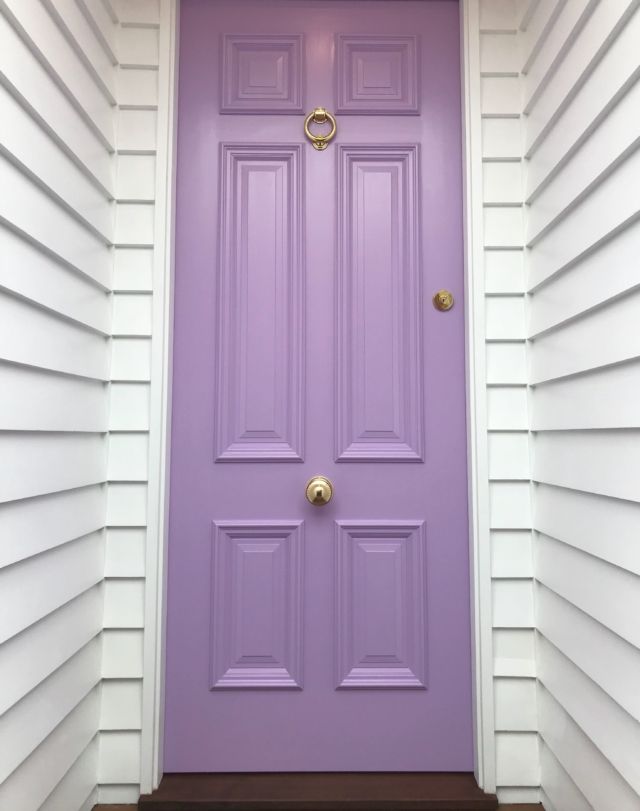
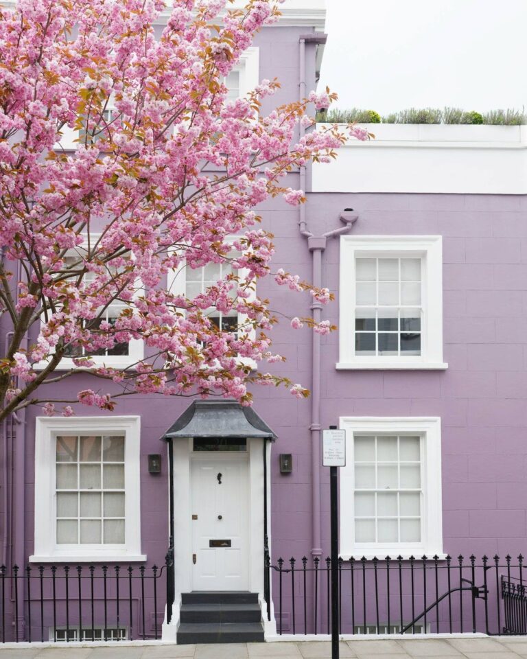
Use of Veri Berri for the House Exterior
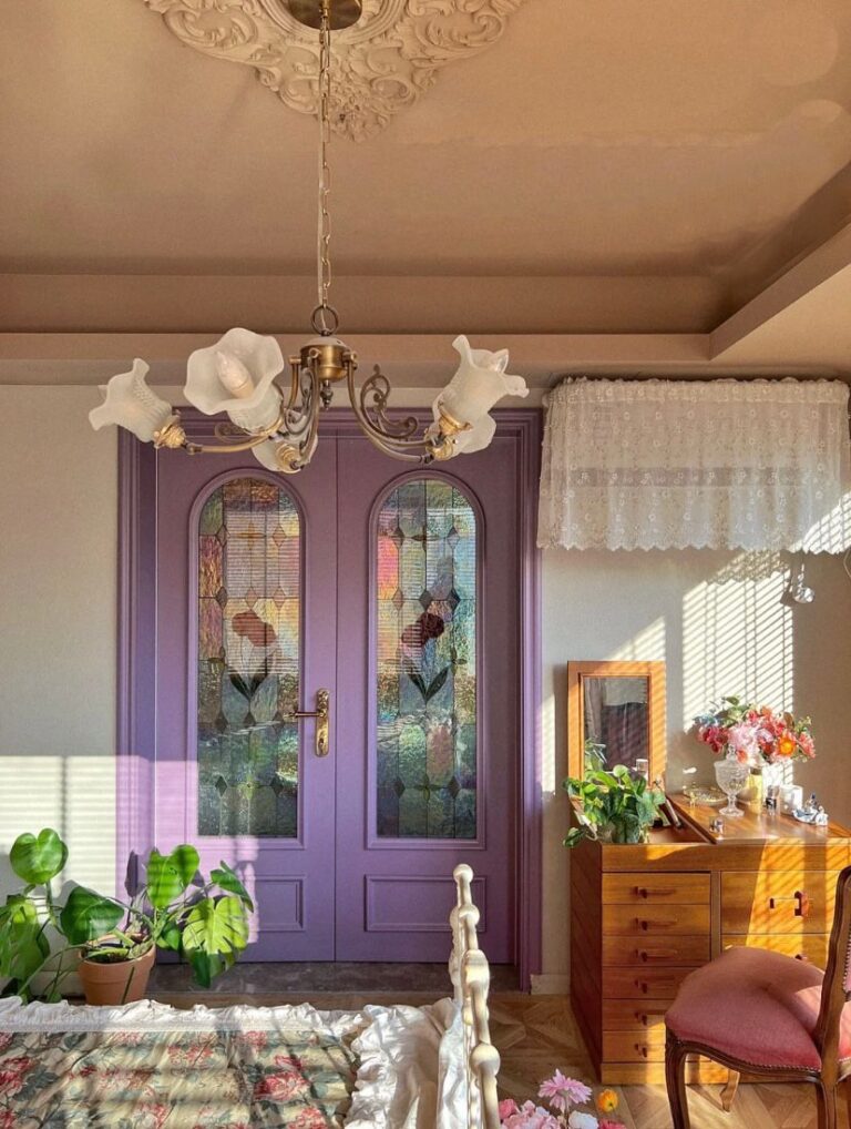
If it were a bright orange or vibrant pink shade, no doubt it would catch too much attention. Since Veri Berri is associated with royal and luxe colors, regardless of its impressively bold character, it is a stately exterior house paint color. Add charm to your home by painting walls or the front door in this one-of-a-kind violet tone. Plus, draw the eye through a stylish color choice.
The Veri Berri SW 9069 paint color by Sherwin-Williams is the dream violet shade for those who adore purple. It goes hand in hand with the latest color trends while bringing something original to the table.
