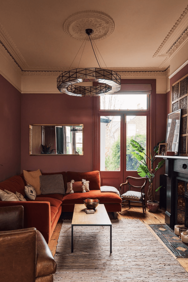
A passionate shade of dark purple-red that develops into a gorgeous dusty rose that romanticizes luxury and adds that accent to design you've always dreamt of.
Vermilion (Behr S150-5): What Color Is, Review, and Use
While reviewing Behr’s 2023 Forecast paint colors with timeless potential, we have seen a lot. Yet, nothing compares with the brilliant red Vermilion paint color. It is no coincidence colorists from the giant color brand chose red since it is among the most popular colors currently. Vermilion may become your new favorite if you are fond of eye-catching and strongly-felt colors. Discover why!
Vermilion Paint Color Features
Vermilion means a rich red shade. This brilliant color has an impressive history, from Ancient Rome to today’s Chinese culture. This color is mainly described as a vivid orange-red, whereas Vermilion from Behr is a rather crimson shade or purple-oriented red. Some also call it a very dark, dusty rose.
Vermilion is full of emotions, energy, passion, and ambition. It will undoubtedly be your go-to paint color if you are an extroverted person who doesn’t mind the attention, a true go-getter, a person of action, and like company. Moreover, in Chinese culture, colors from the Red family are associated with courage, good luck, and success, and Vermilion from Behr is no exception.
Vermilion: Is It Warm or Cold?
The RGB value of Vermilion shows a concentration of 162 for Red in contrast with 107 for Green and 102 for Blue. Therefore, this dark red shade is a particularly warm paint color that will not likely lose this feature even when affected by cold light conditions.
How Does Lighting Affect Vermilion?
Vermilion will take the side of a bright shade of dark crimson or rich foggy rose when ensured with plenty of natural light. The summertime rose blooms even stronger if direct sun rays bounce on a surface painted in this crimson tone. The slightest shadow can cast a substantially more muted effect on the dark purple-red color.
Experts recommend this paint color in north-facing rooms since its romantic warmth would enliven a space penetrated by cold natural light. However, you should note that Vermilion will appear even foggier and more neutral.
Once the sun sets and it gets darker, Vermilion turns on its magic and becomes a very profound violet-inclined red shade, which requires lots of artificial lighting since too much red may feel intimidating.
Vermilion LRV
The vivid red shade from Behr reflects 19% of light out of 100. With such a low Light Reflectance Value, Vermilion firmly enters the dark category of colors. Although pretty bright and attention-seeking, this purple-red bounces back little to no light, and you better use it as an accent paint color or in a spacious room with enough natural light.
Vermilion Undertones
Vermilion is clearly a rose shade, yet given the red color base, it is paired with purple undertones that get a boost under warm lighting and blue-scented gray drops of color that you can witness in rooms with northern exposure only.
Similar Colors
The freshly brewed wine color from Behr is confidently one of a kind. If, for one reason or another, you need an alternative to Vermilion, feel free to use one of the following substitutes:
Coordinating Colors
To say we were impressed by the selection of colors suggested by Behr’s colorists is to say nothing. First, we start with a bright white shade and go on with a rich collection of natural and organic greens, purples, blues, teals, pinks, and grays. The resulting color palettes would look as if inspired by modern art. Get a splash of inspiration from the following color options:
Use of Vermilion in Interior
Professionals cannot get enough of this unforgettable purple-red from Behr. Even if playing with a red shade in your interior may be tricky, you can make the most of it with the designers’ thoughtful help. We compiled a list of go-to design concepts with Vermilion to help you land on the safe side.
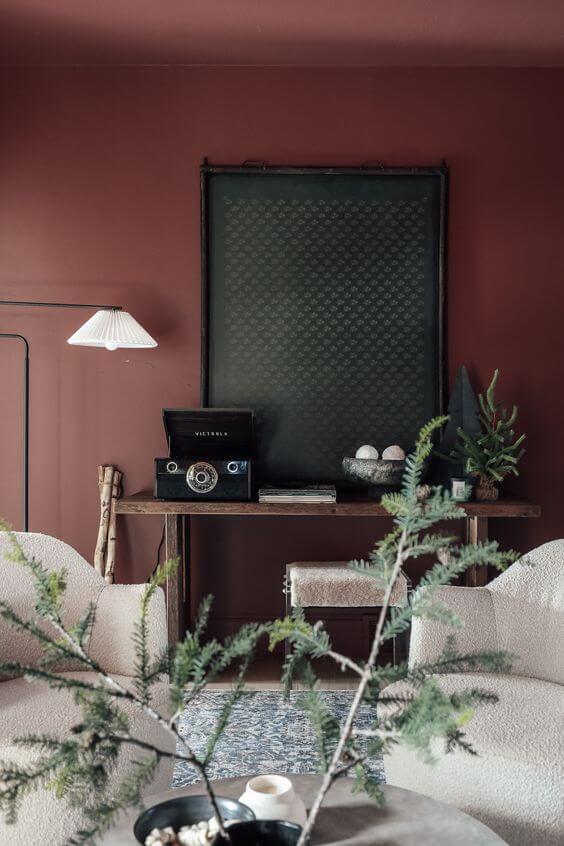
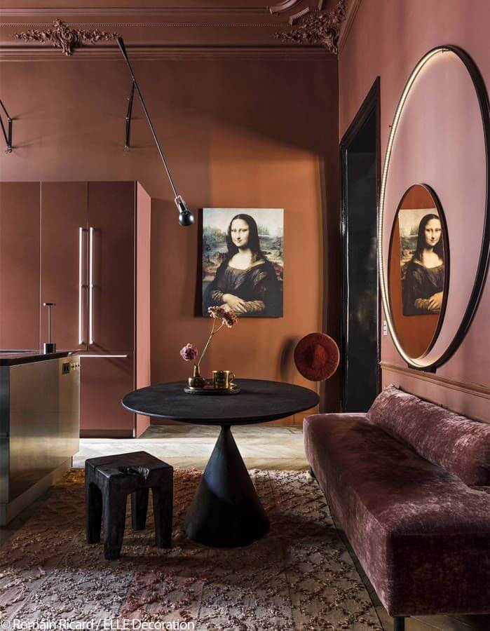
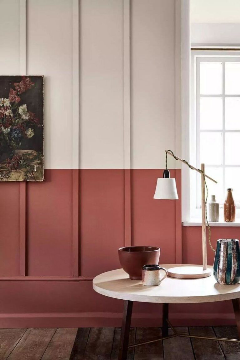
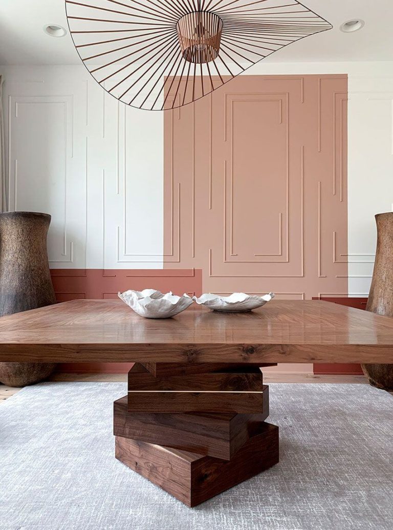
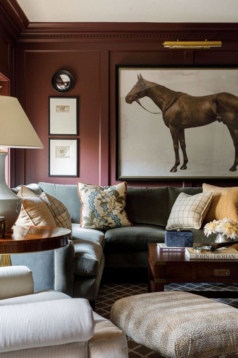
Luxury Design
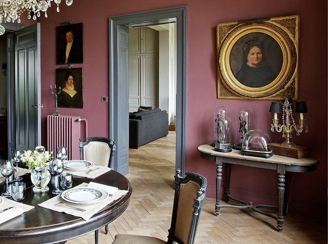
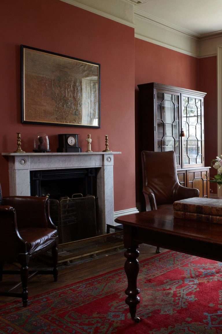
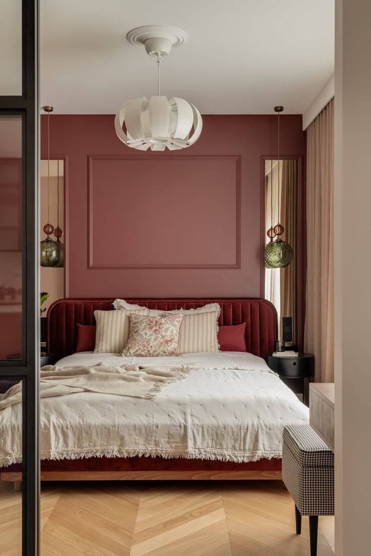
Besides being an energetic and passionate color, Vermilion is one of the best shades of red for exclusive design projects with luxury details. Designers use this paint in all rooms of the house by applying it to timelessly decorated wall paneling, half-red half-white walls, combined with black or gold and completed with bright-colored velvet textiles.
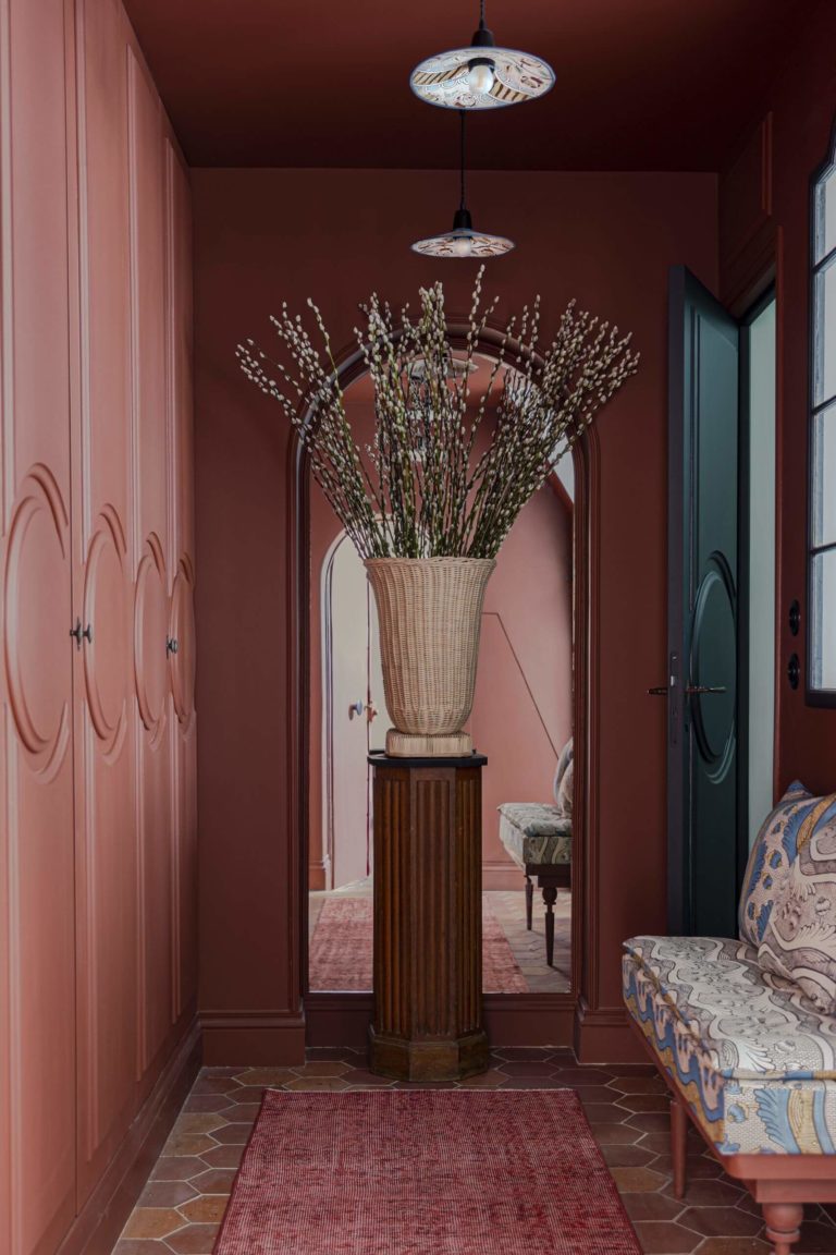
Romantic Cherry
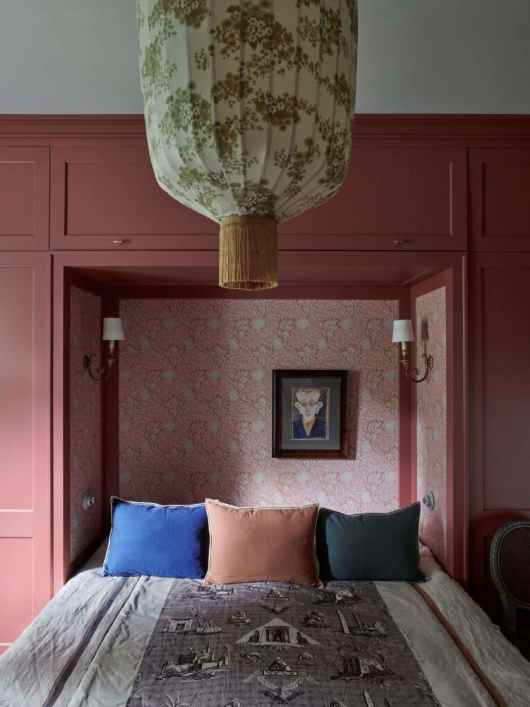
It’s impressive how many interpretations this trendy paint color has. Vermilion seems like a delicious burgundy color that allures and romanticizes the old-time royal beauty in design. This paint color is among the most popular accent dark red shades to use in Classic-polished interiors with beautifully decorated wood furniture, subdued lighting, and expensive materials.
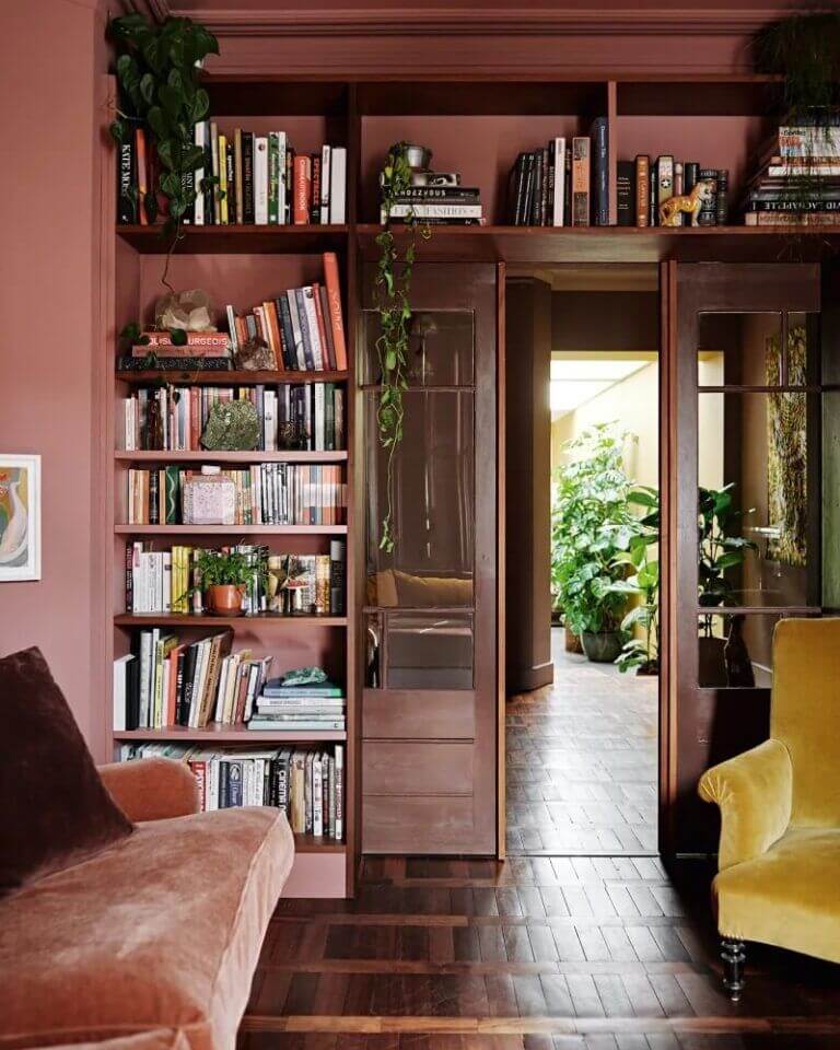
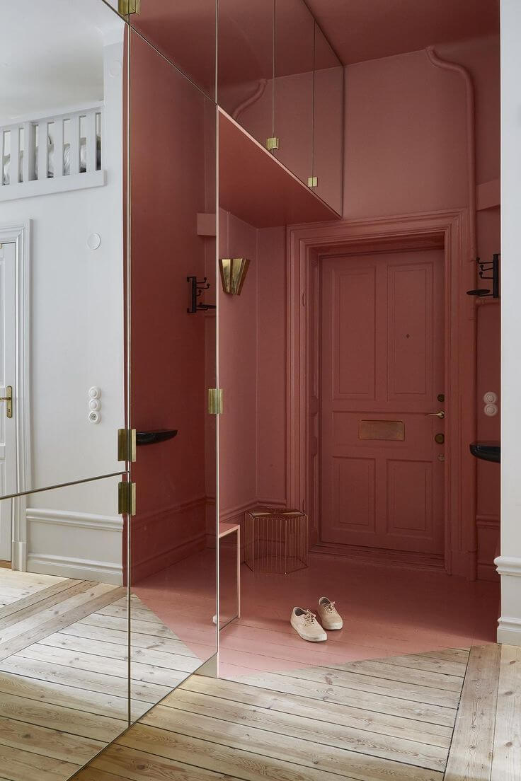
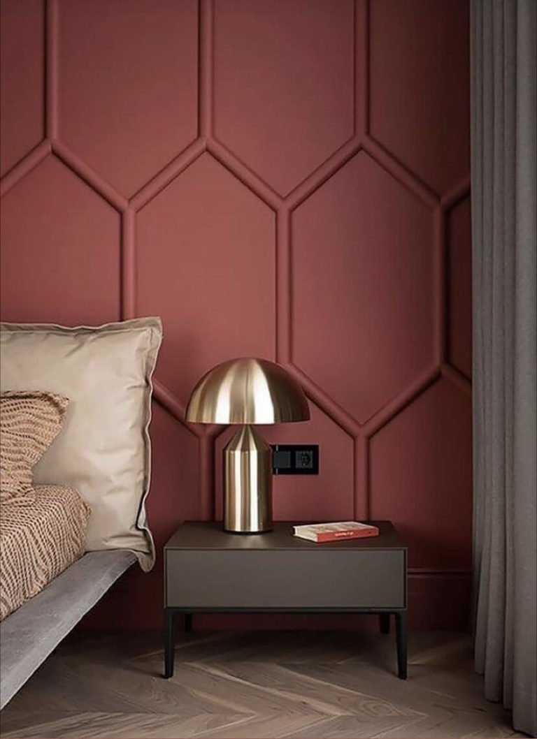
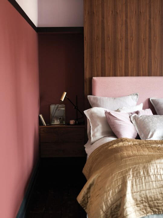
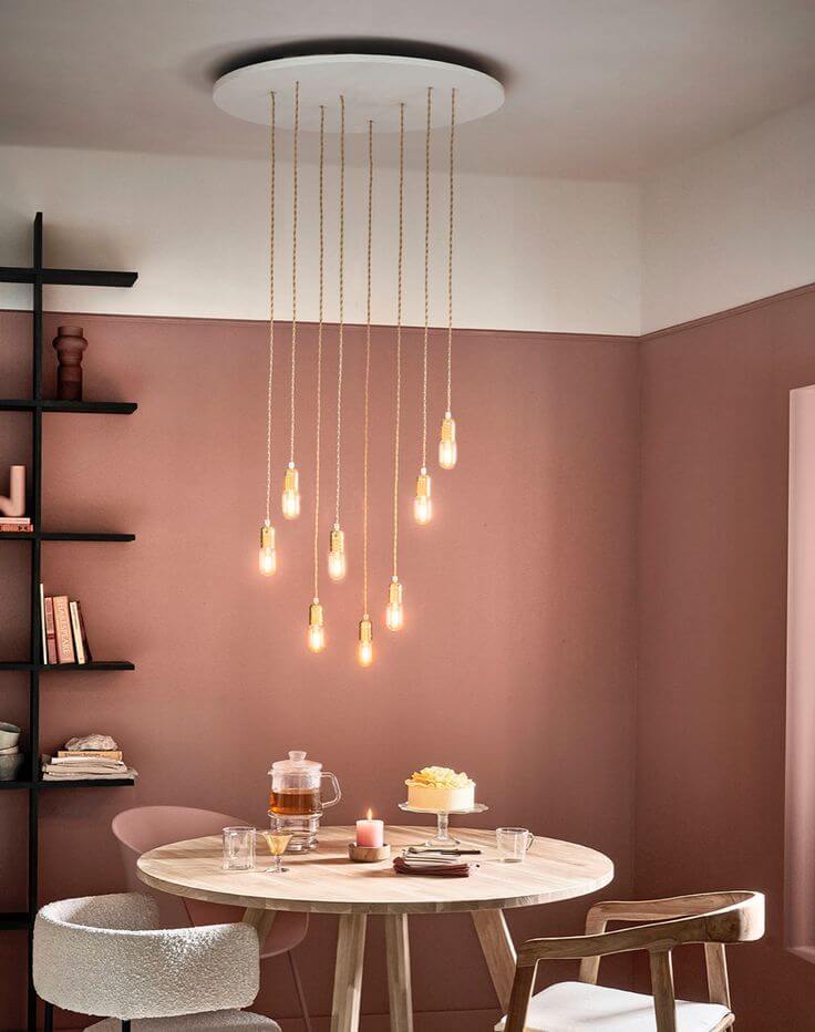
Rose Bedroom
If one room in the house stands out when it’s time to choose which space will be painted dusty rose, it is undoubtedly the bedroom. This romantic paint color thrives in sleeping areas, ensuring a comfortable and delicate ambiance. You can choose any design style with the violet-red paint color for the walls. Note that the Classic wall trim looks astonishing when painted rose.
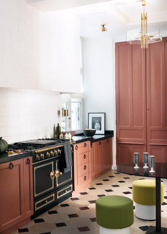
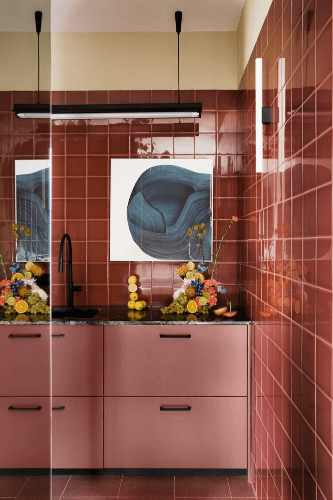
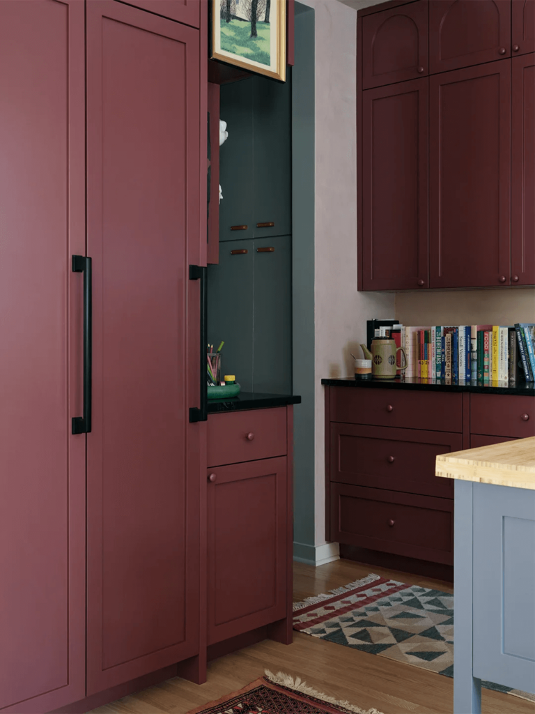
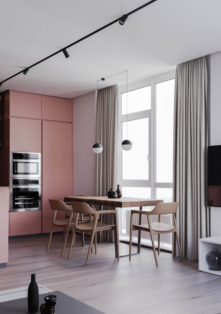
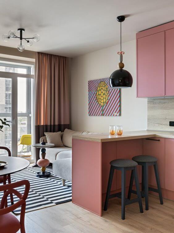
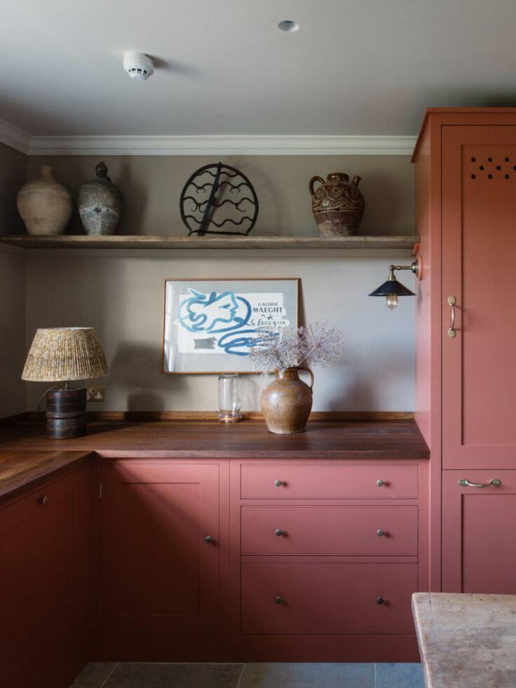
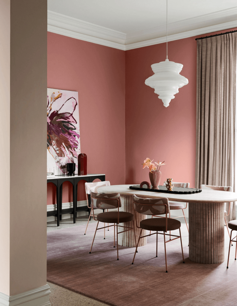
Kitchen and Dining Room
On the one hand, Vermilion pairs well with modern kitchens, accepting even a few splashes of additional bold colors, such as blues, greens, and purples. On the other hand, the romanticized hazy red delights the eye when combined with a Country Rustic style. Just imagine the saturated purple-pink in the neighborhood of richly grained wood.
Now, let’s give you an insight into a contemporary dining room with a royal twist. Vermilion-painted walls cannot help but underline a specific ambiance around the dining table. At some level, romantic. At the other, cheerful, engaging, and hospitable.
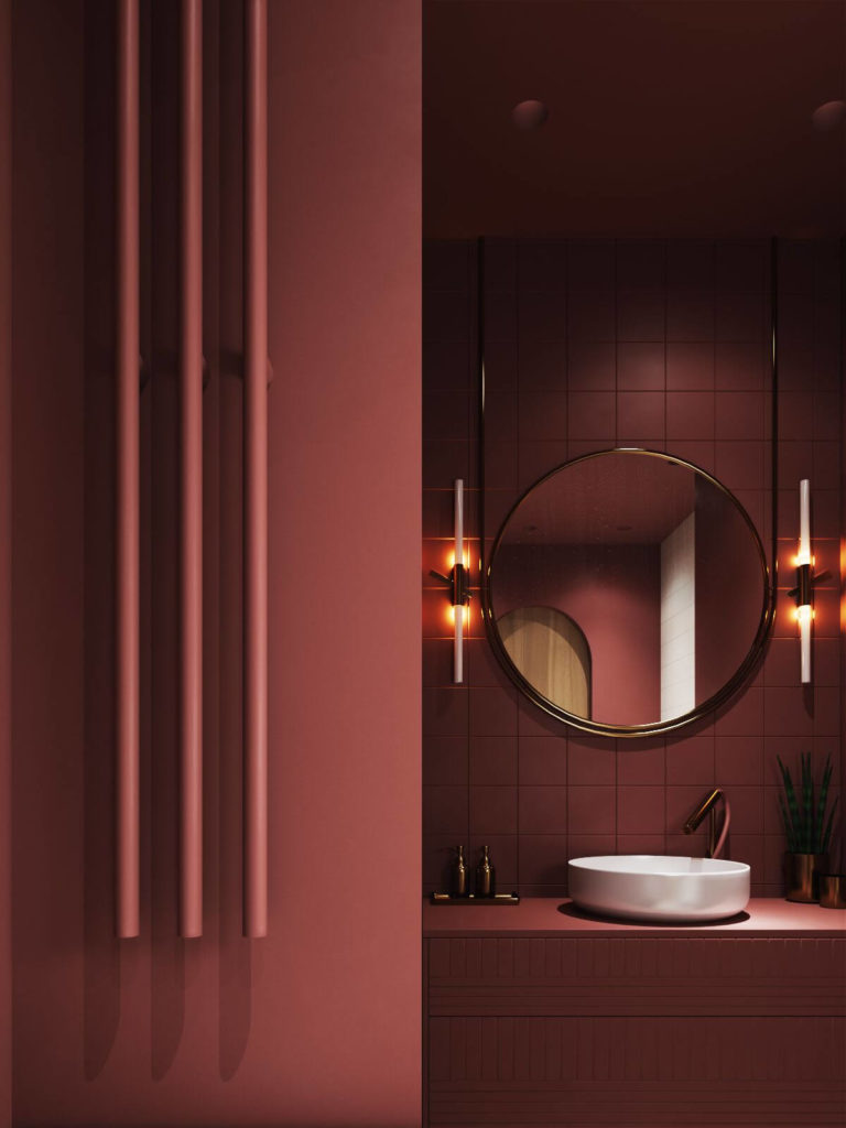
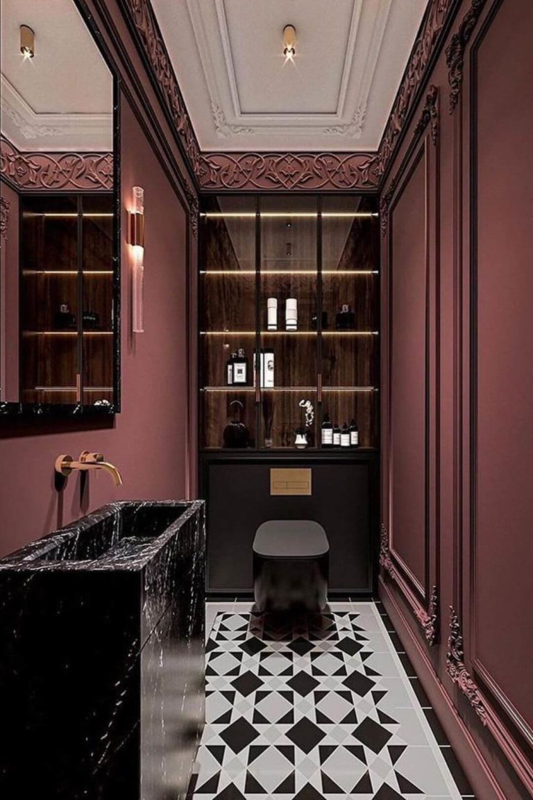
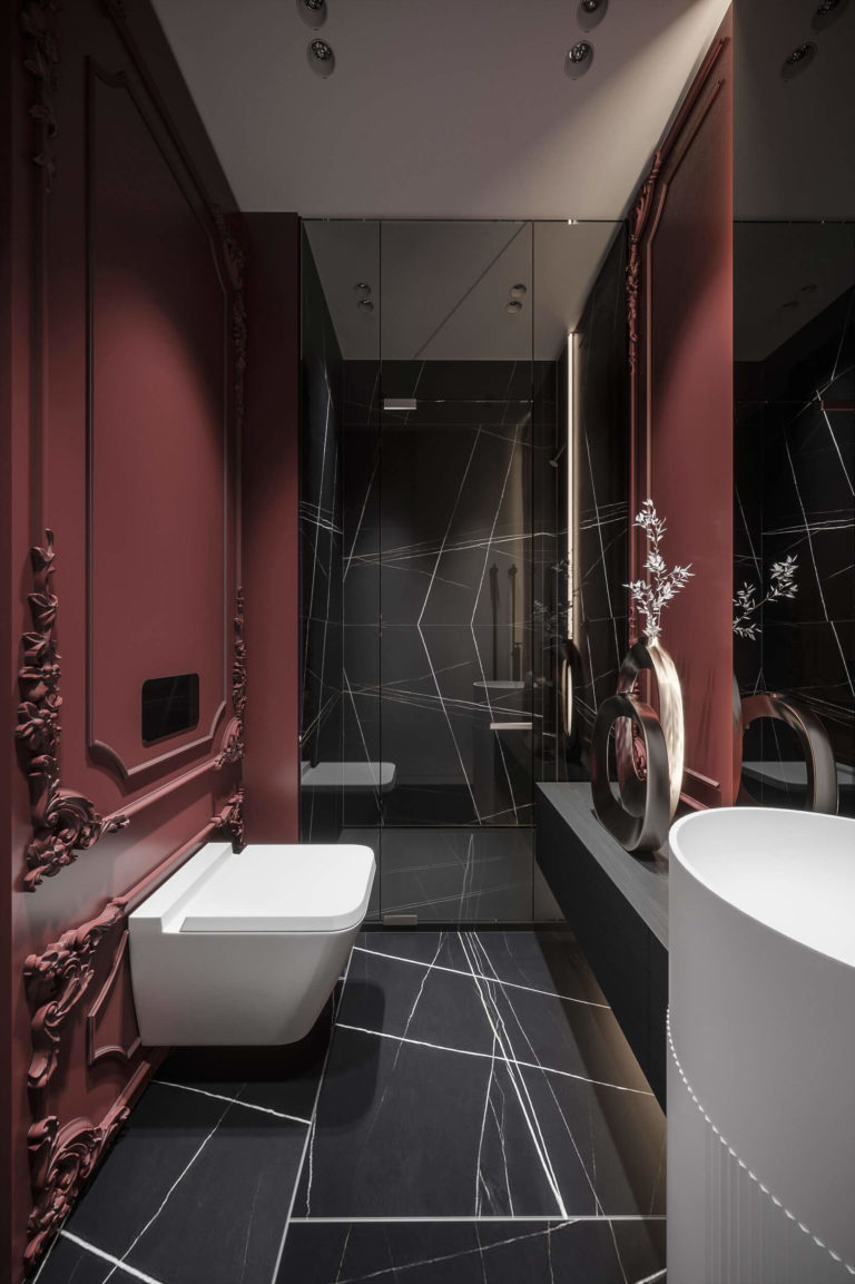
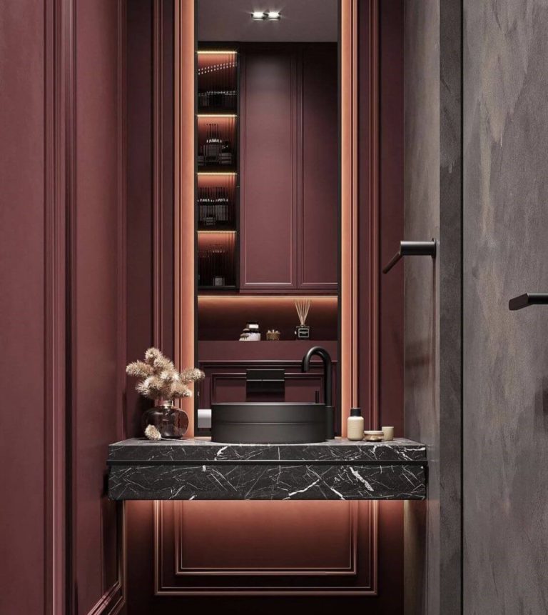
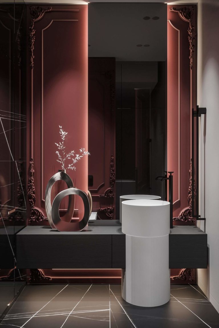
Bathroom
Designers recommend pairing Vermilion-painted walls decorated with intricate trim together with black marble tiles and white bathroom fixtures. There is definitely something special about Classic wall molding painted rose. To ensure the ambiance isn’t overwhelming, add sizable mirrors and many light fixtures to brighten every corner.
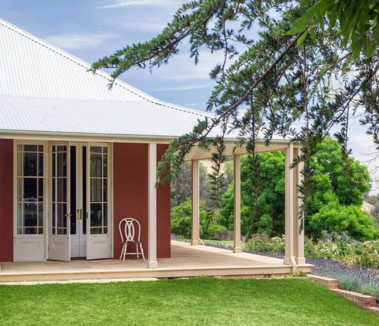
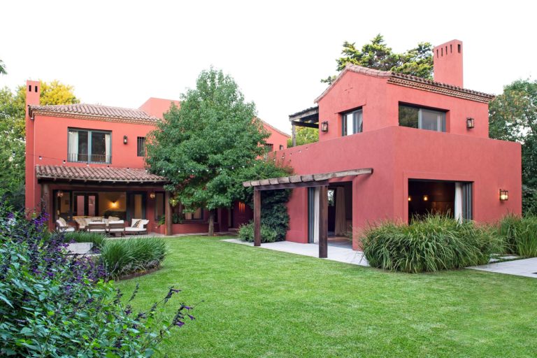
Use of Vermilion for House Exterior
Vermilion is a truly bold paint color to use for your exterior house walls, yet not too aggressive for courageous minds that step out of their comfort zone more and more. If you are fond of bright colors, try Vermilion this season. Besides, the dusty rose shade looks effortlessly well on both traditional and modern exteriors.
The Vermilion S150-5 paint color by Behr is an excellent example of how a vivid color can seem delicate, calming, and relaxing. If you haven’t decided so far which color should become your next accent in interior or exterior design, choose the thrilling and fanciful rose paint color.
