Viva Magenta (Pantone): What Color Is, Review, and Use
Today, we won’t refer to paint color manufacturers as usual. Instead, we will share with you an unusual color review you can use as inspiration for your future painting plans. You have probably heard about Viva Magenta. Pantone’s Color of the Year 2023 is everywhere. The Pantone Color Institute serves as a global source of color inspiration, especially for the fashion and design world.
As Pantone calls it, “an unconventional shade for an unconventional time,” Viva Magenta reflects our courage to go through life despite the current surroundings; the pandemic, economic and social crisis, interstate conflicts, and the ongoing climate changes. Viva Magenta, the color that literally translates as “vibrant shade of energetic pinkish-purple,” is one of the boldest colors ever. It teaches us to feel free about our true inner colors and reveal them to the world. It is “a new signal of strength.” Be brave and fearless like this Red-family descendant color, and don’t be afraid to take on new challenges with an optimistic attitude.
We prepared a truly amazing color review, ready to reveal how Viva Magenta transformed the fashion and design world and how you can authentically underline your interior and exterior design by adding an exuberantly joyous and brave mauvish crimson accent. Enjoy!
Viva Magenta Color Features
Despite the age of technology we live in, we still find the ultimate dose of happiness and inspiration in nature. Leatrice Eiseman, the executive director at the Pantone Color Institute, states that Viva Magenta reconnects us to the original matter. Indeed, this gorgeous color is inspired by one of the brightest natural dyes traced to the cochineal beetle, a tiny and fearless insect revealing a beautiful red-purple-blue crust. Viva Magenta is a hybrid color, behaving the same way the courageous crimson tone gets displayed by this brave insect that has passed the test of time.
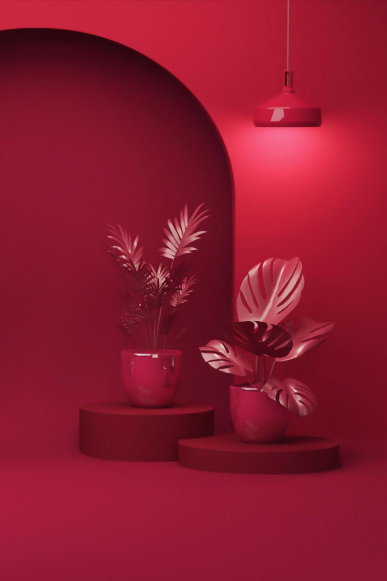
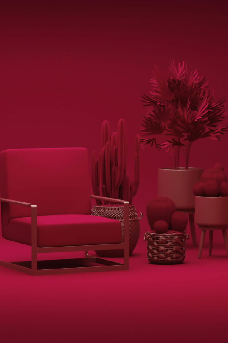
This eye-catching raspberry crimson is a feature color with impressively bright features, celebrating life. At the psychological level, it makes us try new things, be open to new people, and have an optimistic perspective on the future. Viva Magenta is a lifestyle that pays tribute to natural beauty and gives an impetus to bravery and self-expression. Open your horizons, add more organic color, and make an original statement with this year’s favorite color in your house.
Viva Magenta: Is It Warm or Cold?
On Pantone’s website, experts describe it as a balance between warm and cool, all because Viva Magenta gives off a bluish fragrance. Overall, the prominent representative of the Red color family is a warm color. Let’s speak facts. The RGB value (Red, Green, Blue) of this amazing crimson tone shows an astonishing prevalence of red over the other two. However, the next in line is blue, which doesn’t come as a surprise since the color of the year is a dignified hybrid hue.
How Does Lighting Affect Viva Magenta?
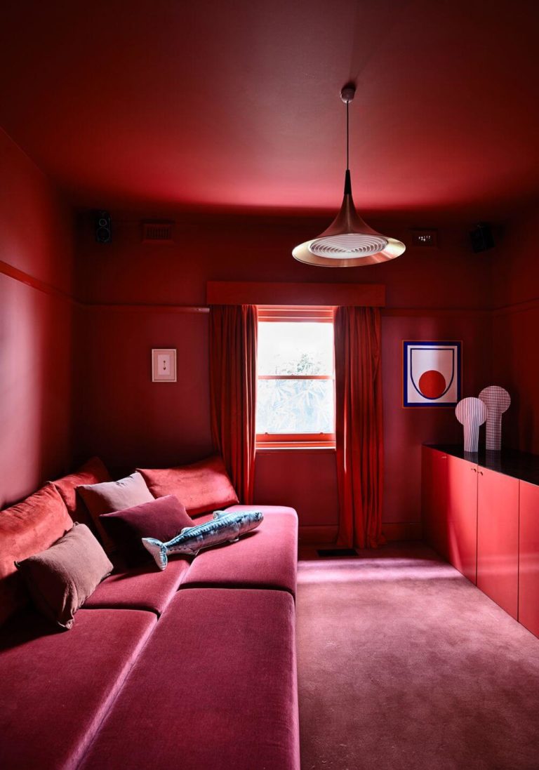
Viva Magenta is a very deep and richly pigmented color. It won’t allow the lighting conditions to change its imposing appearance much. The leading color trend of the year stays true to itself. However, expect a few modified details.
If you decide to use this magnifying color in a room constantly bathed in sun rays, Viva Magenta will look as radiant as you see it on Pantone’s palette. You can even notice a subtle orange sparkle and a delicious ripe raspberry scent where the sunlight hits. Under cold lighting, say in a north-facing room, expect a slightly washed-out purple-red with a subtle foggy effect, not very noticeable. The most fabulous transition you can experience is the resurfacing of that tricky blue undertone as if it resulted from the play of lighting on the ripe berry red.
Avoid painting a small room purple-red since Viva Magenta is an exceptionally overpowering color if used in an extra dose. Even at night, it looks similarly vibrant and proudly steals the show in the smallest amounts. All this leads to the idea that using Viva Magenta in your house supposes perfect lighting conditions, natural or artificial.
Viva Magenta LRV
If you often deal with paint colors, you know that the Light Reflectance Value shows which category of colors a particular shade belongs to. Is it the dark, light, medium, or somewhere between on a scale from 0 (black) to 100 (white)? Viva Magenta reveals an LRV of about 14. Since it stands close to the dark side, everything that keeps it bright is its vivid raspberry base color. As for the rest, such a low LRV means that this color bounces back tiny amounts of the light it receives, which proves once again that Viva Magenta prefers well-lit spaces that help it prevent any overwhelming result.
Viva Magenta Undertones
It’s time we did a round-up. Viva Magenta is a richly grained purplish-red with a raspberry effect, showing the lightest blue undertones responsible for the hybrid and reflective magic this color plays under particular lighting.
Similar Colors
Now, our favorite part. If you decide to integrate this color into your interior or exterior design, here are a few suggestions of similar colors from our beloved paint color brands that you can safely use:
Coordinating Colors
If you focus on crimson accents mainly, consider a suitable neutral tone to use as a canvas for the feature color Viva Magenta. Colorists draw our attention to the use of this color besides other crimson shades; we suggest more neutral ones for monochromatic palettes.
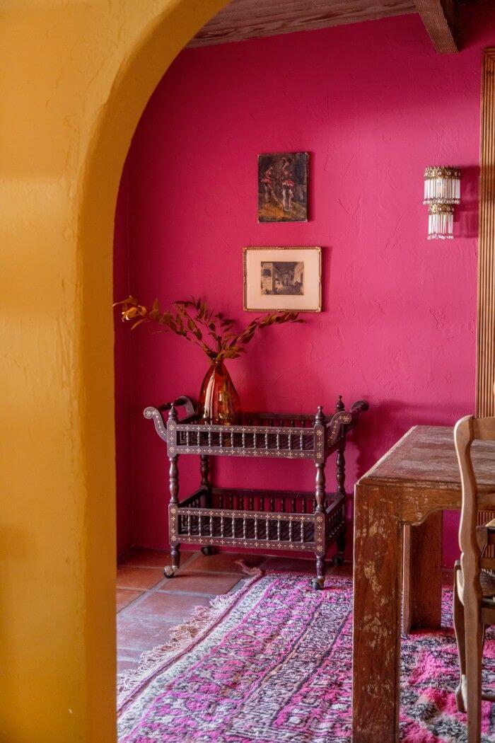
The interesting part starts when Viva Magenta gets to be paired with other natural and vibrant colors: green, blue, yellow, earthy tones, purple, and pink. In this sense, we would like to recommend you representatives from each group, referring to the trendy color collections from trustworthy brands.
Use of Viva Magenta in Interior Design
Experts state that homeowners and designers are finally ready to embrace such a bold color to the fullest. Viva Magenta can be used in any room of the house. Besides textiles and decor, it can be applied as a paint color to surfaces, which interests us mainly.
Viva Magenta feels modern and nostalgic simultaneously, which makes it an excellent color for various design styles. You can make it the main narrator in a room or a figure speech in terms of accent walls or furniture pieces. You can safely use this magical fruity shade to add interest to a modern minimalist design or opt for a fully purple-red-colored space. The choice is up to you. Either way, you won’t be the tiniest step back from trends with such a stylish color in your house. Some of the following designer-choice ideas may draw your attention.
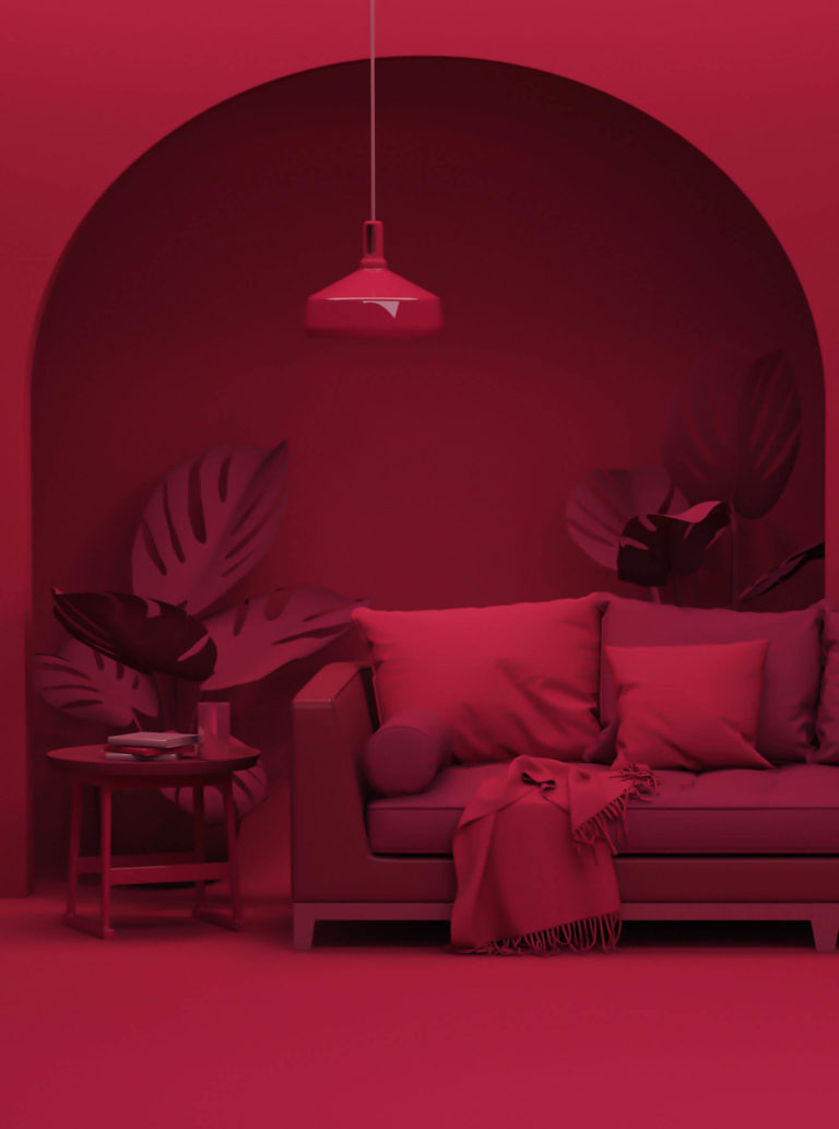
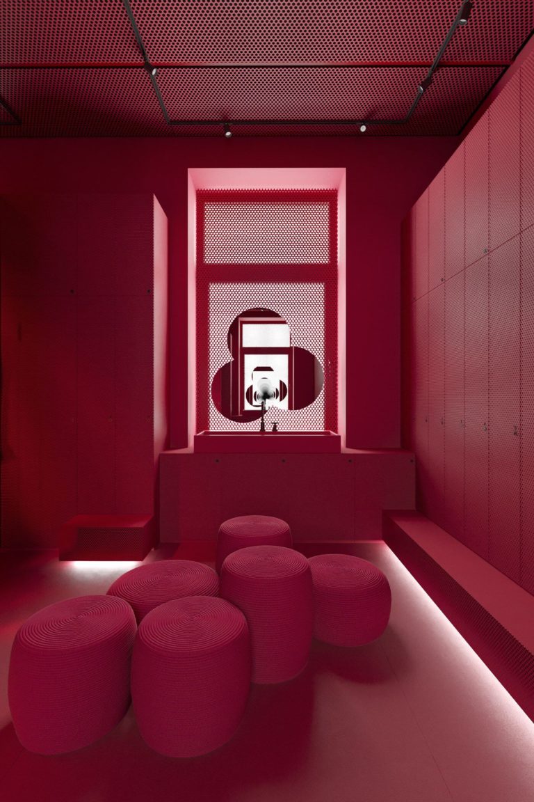
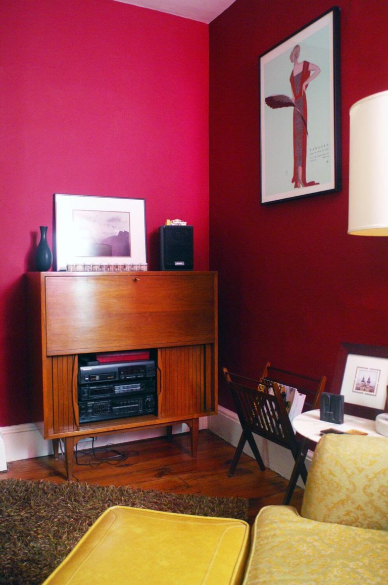
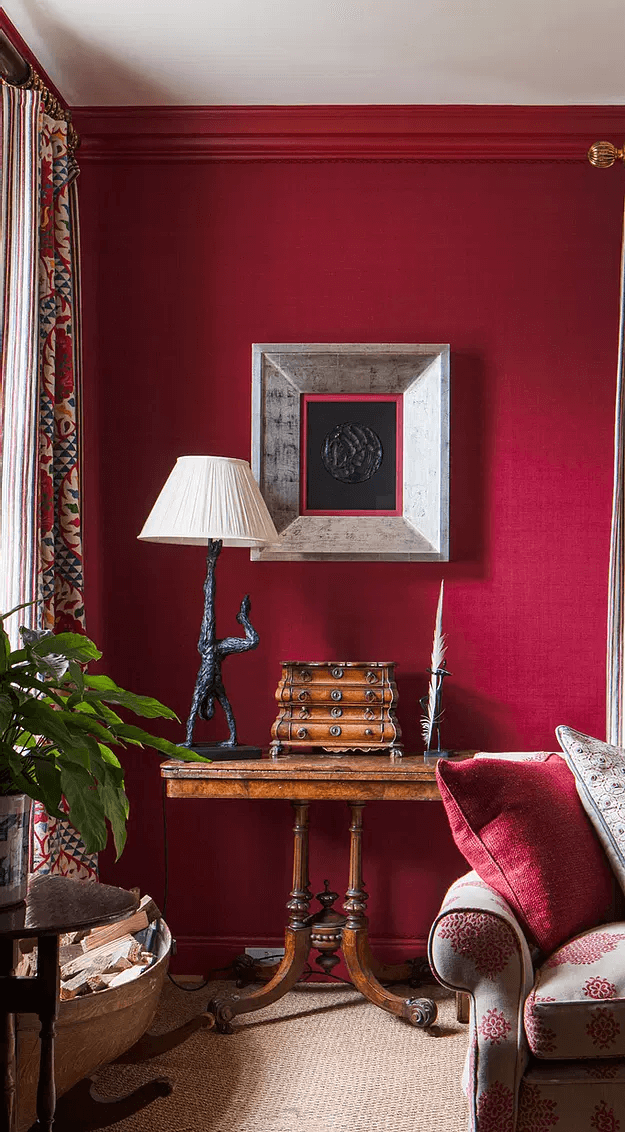
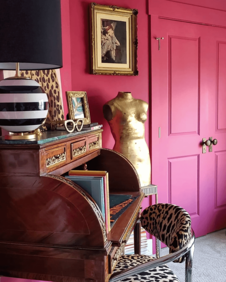
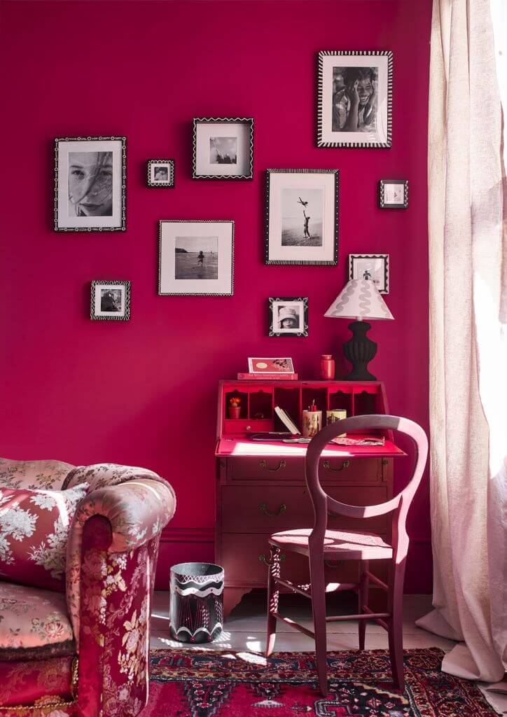
When Viva Magenta Speaks Monochromatic
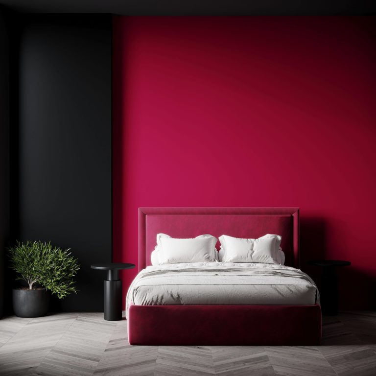
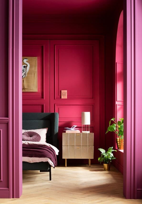
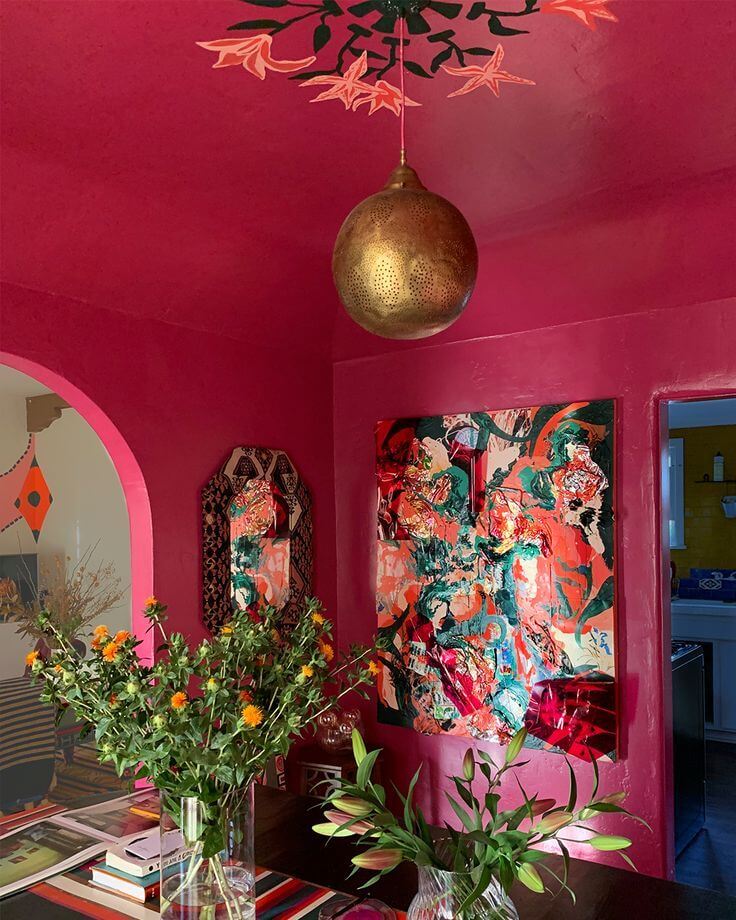
If we had been told just a few years ago that layers of bright purplish red in interior design are the ultimate trend of the season, we would have thought somebody was playing a joke on us. Yet, here we are today fully content with an all-red palette. If Viva Magenta won your heart up to the level that you are ready to consider an all-raspberry makeover in your house, then you have the green light for your intention.
Undoubtedly, we speak about personalized design concepts meant to make a statement when considering crimson-painted walls with layers of purple-red, such as textiles, furniture, decor, and the most petite accents possible.
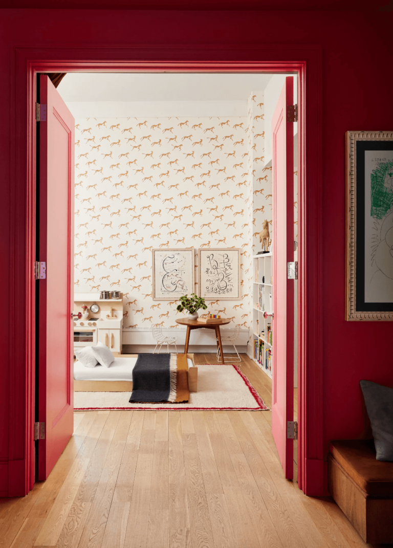
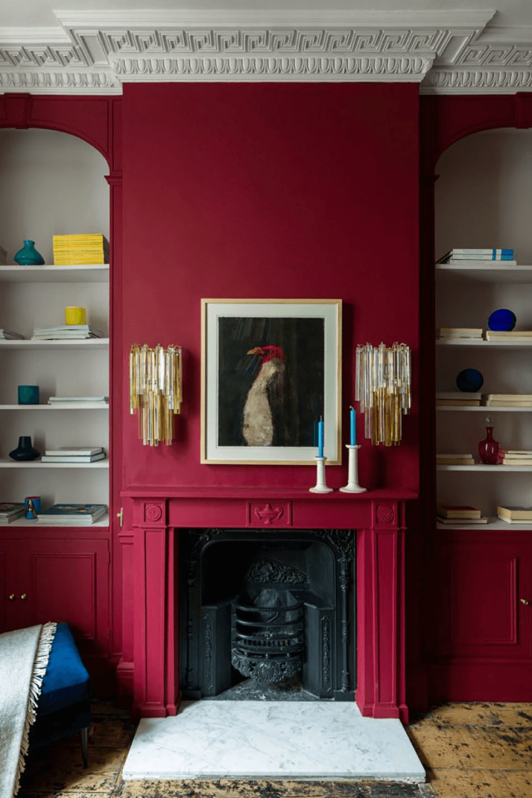
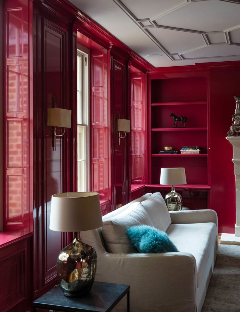
Viva Magenta in a Classic Suit
Update your favorite Classic style with a color that will keep it up to date. Use Viva Magenta to paint the walls in your bedroom, living room, kitchen, dining room, study, or hallway, accompanied by tufted furniture, built-in bookcases, wall and ceiling trim, wood texture, and parquet on flooring. Add Vintage accessories to customize the design. Viva Magenta will celebrate the marriage between old and new as never seen before, while you will enjoy this beauty every day.
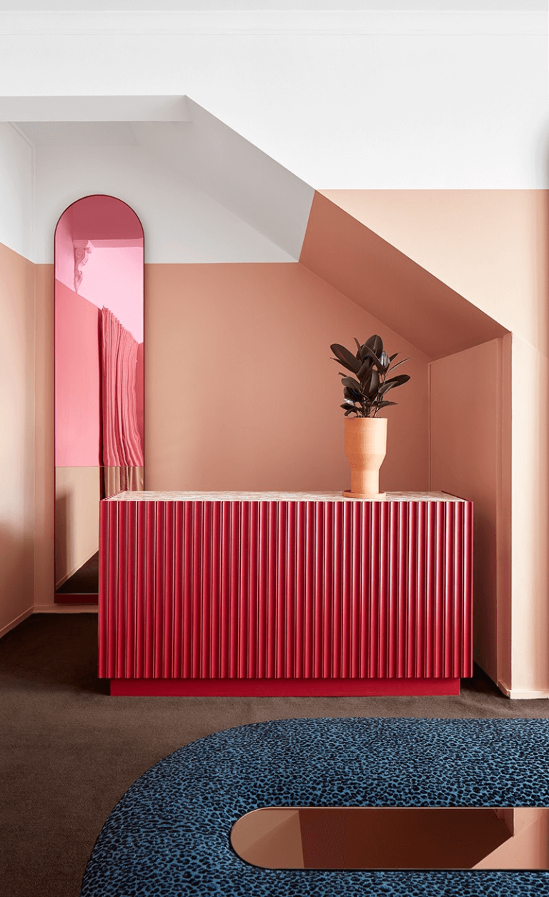
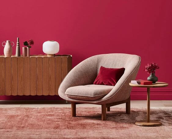
A Modern Perspective on Viva Magenta
Modern is not necessarily a minimalist-colored interior with simple shapes that focus utmost on functionality. The contemporary meaning of a Modern design implies a broader range of colors, such as new feature shades, intricate forms, and personalized details. Show your approach to Modern with the season’s trendiest color – Viva Magenta. Pair it with neutrals or bright shades, richly-grained or smooth textures, curved shapes, or sharp edges. Let this raspberry juice color become the protagonist of your story, or use it as a canvas to display your favorite modern accessories.
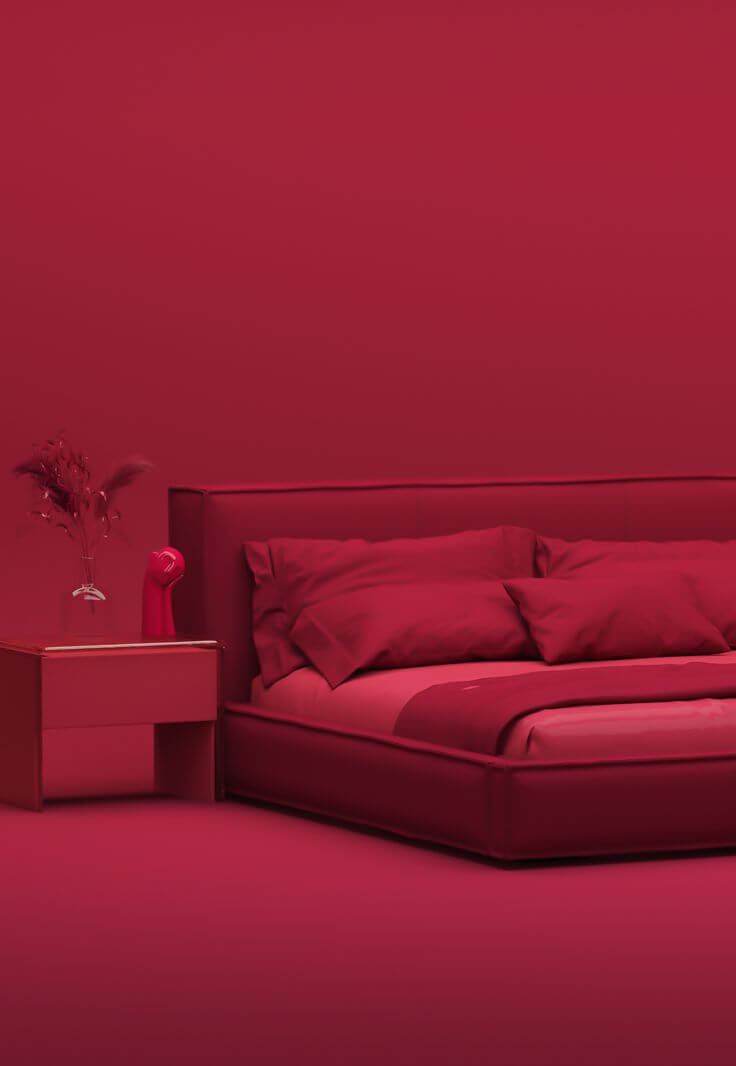
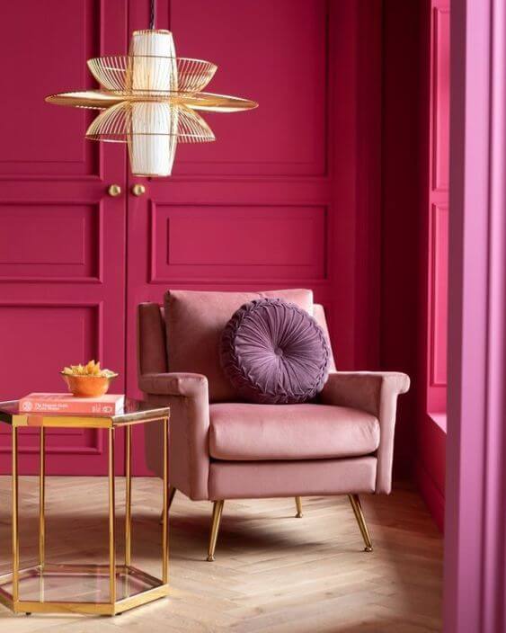
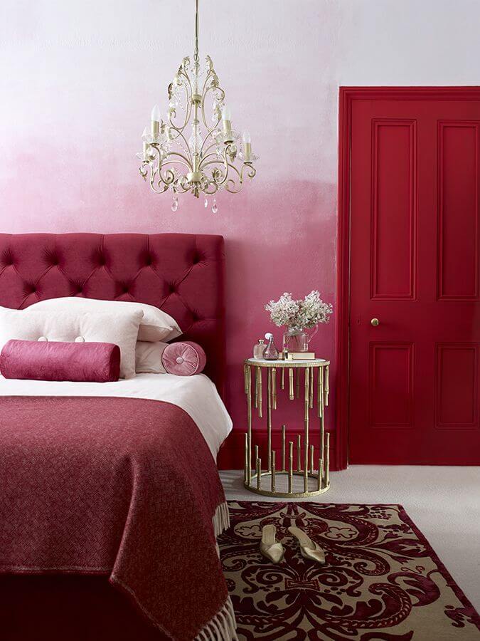
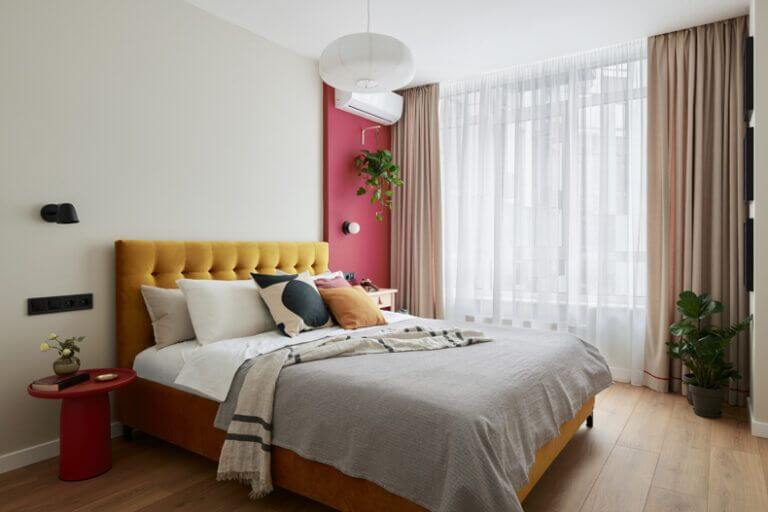
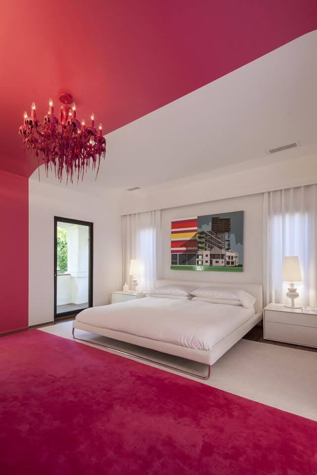
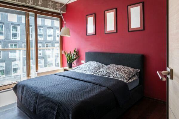
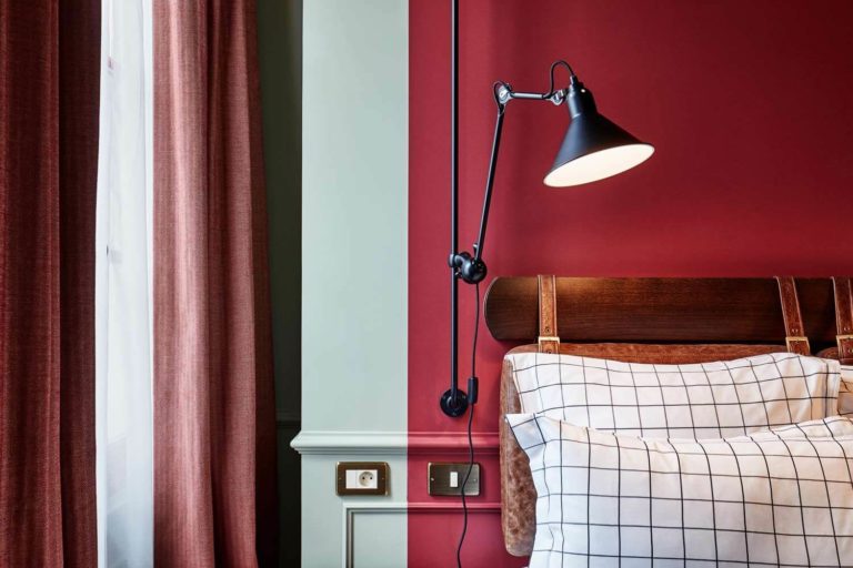
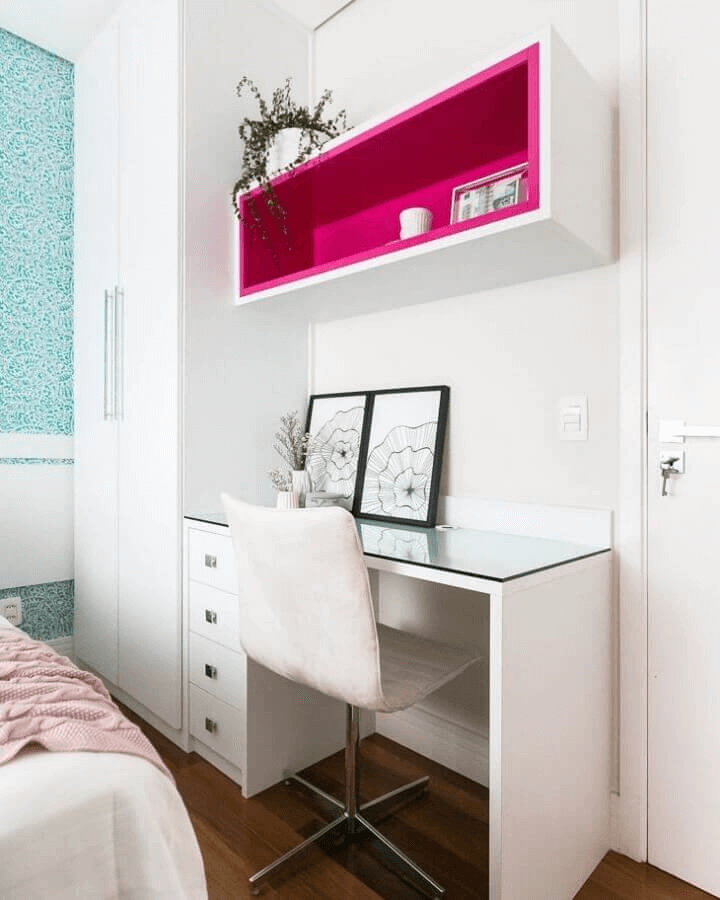
A Pop of Magenta in the Bedroom
Experts firmly advise us to primarily use Viva Magenta in the bedroom as an accent. It seems like a waste to have such a juicy color at your disposal and limit its use. Still, a bedroom is mainly a space for sleeping. You most likely won’t fall asleep fast, fully surrounded by bold mauvish-red, while a gorgeous raspberry accent adds just the right amount of sophistication and visual interest. Think of an accent wall, ceiling, fireplace, or furniture piece. Pair this color with any design style, yet stick to a neutral palette for Viva Magenta.
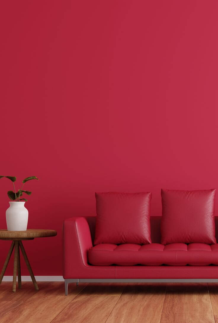
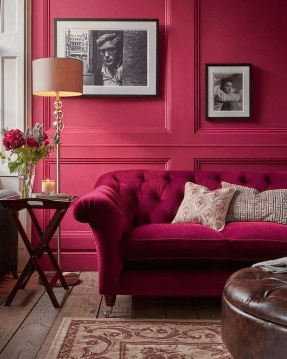
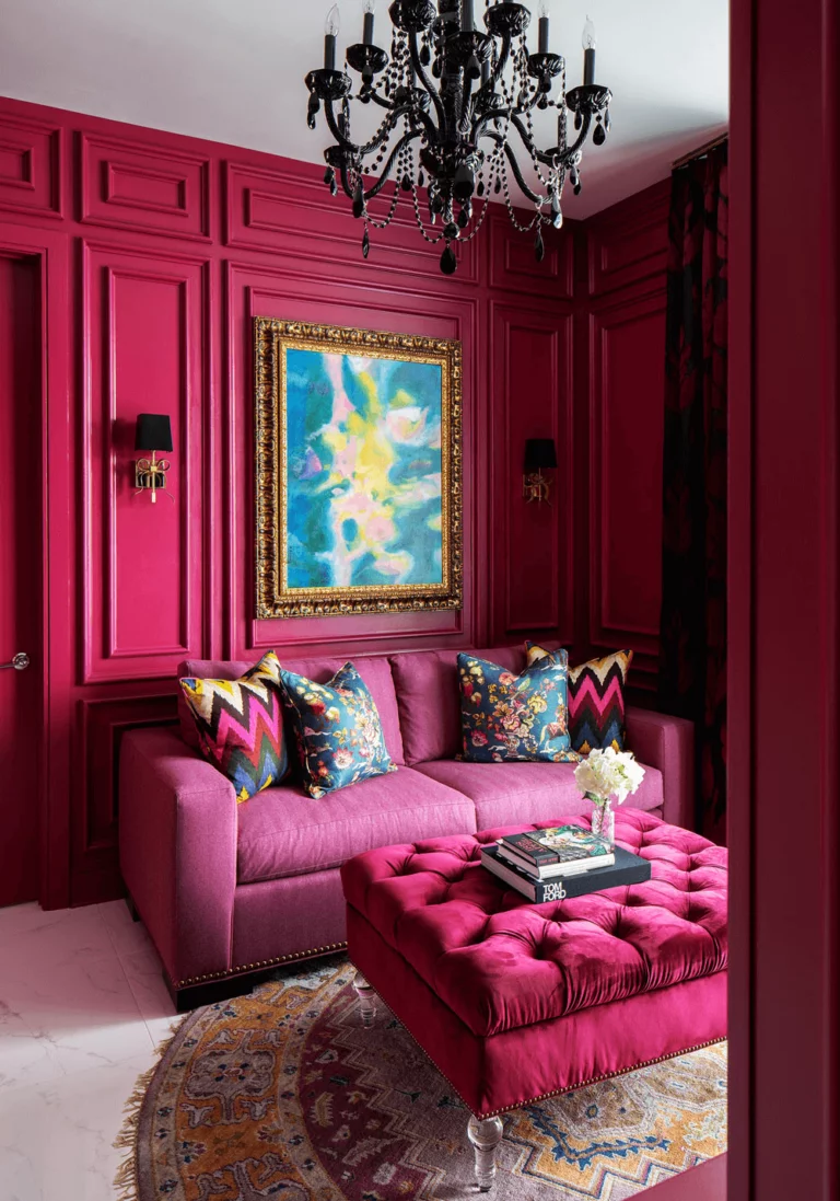
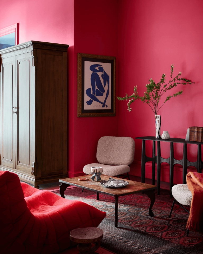
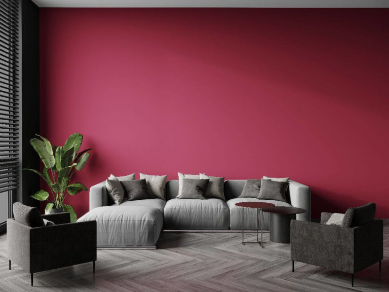
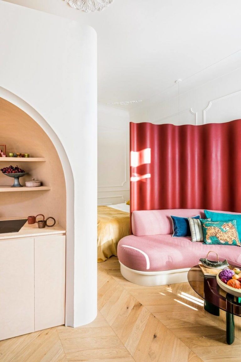
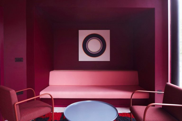
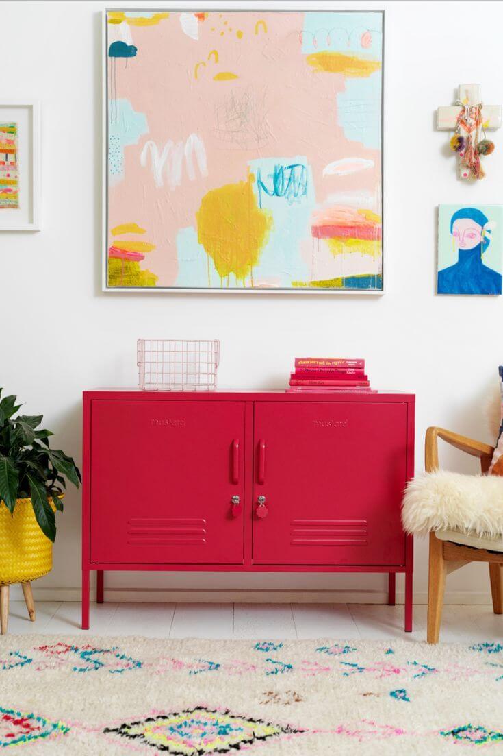
Raspberry-Scented Lounge Area
Viva Magenta is one of the most positive colors you’ll ever find. Professionals usually apply fruity tones to family rooms, lounge areas, or living rooms, call them as you wish, to provide a delightful and entertaining ambiance that encourages interpersonal connection. Moreover, the vibrant color from Pantone is one of the rare bright colors that work with any design plan.
You can use it as the main color in the room and paint the walls and ceiling purple-red or apply it to an accent wall, accessory, or piece of furniture. It looks great as a feature color besides neutral shades, such as in a minimalist interior or as part of a Mid-Century Modern decor surrounded by wood texture. Consider the same berryful color partnered with other joyful bursts of color in Eclectic layouts, or accessorize the pink crimson canvas with vintage accents.
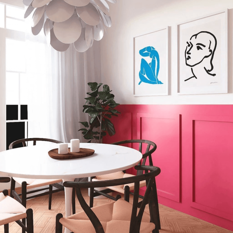
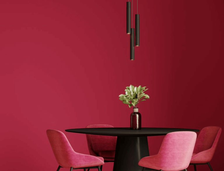
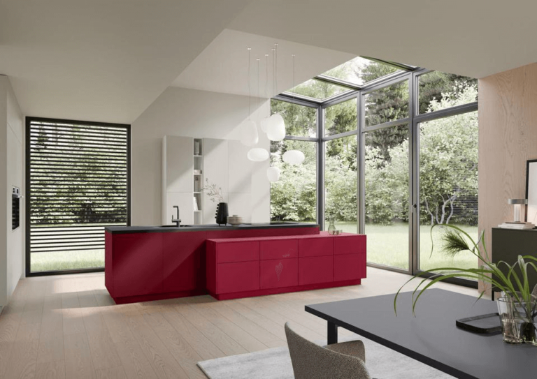
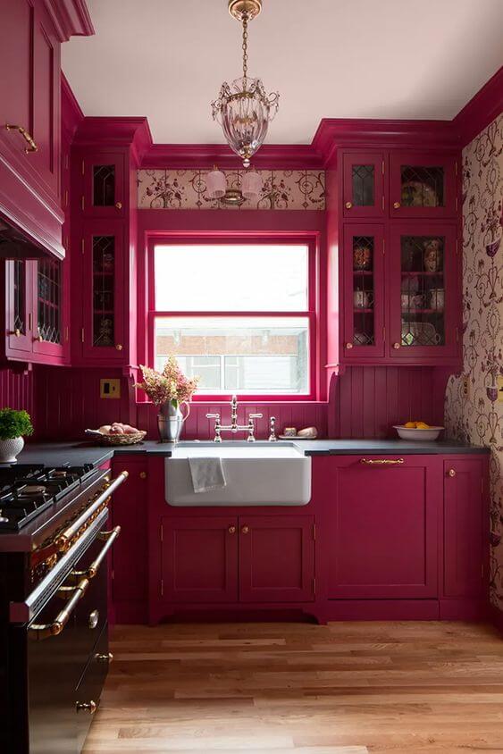
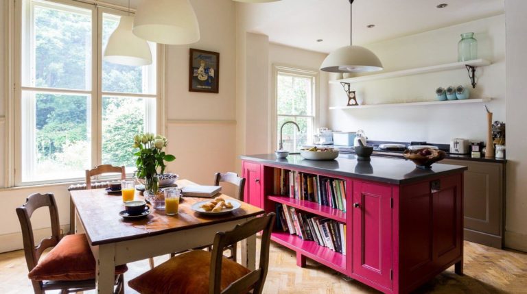
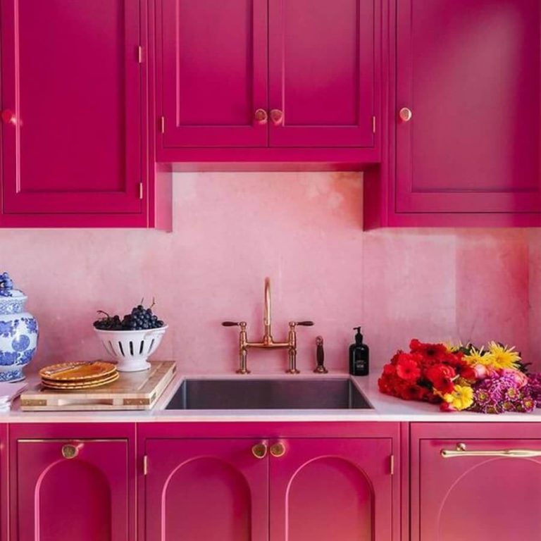
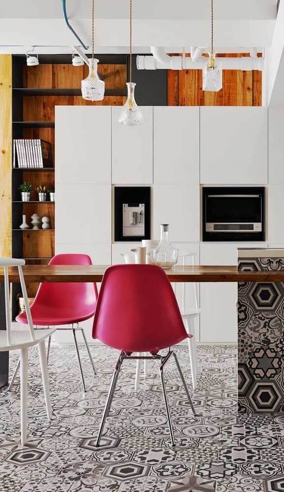
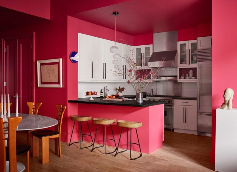
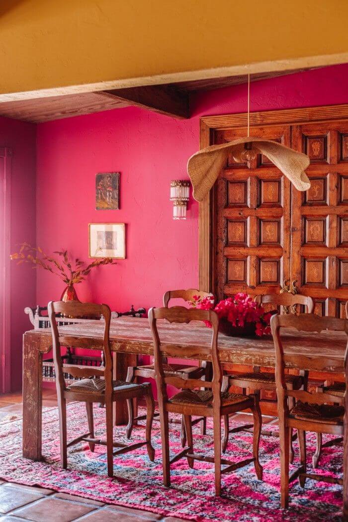
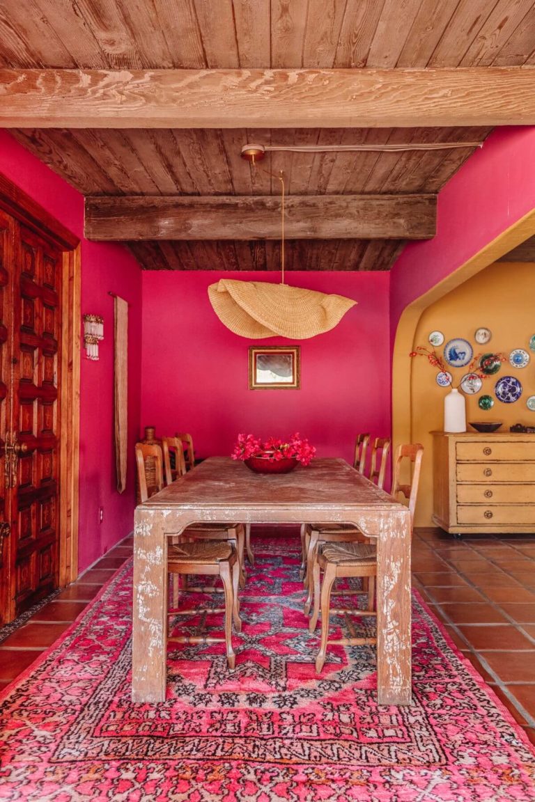
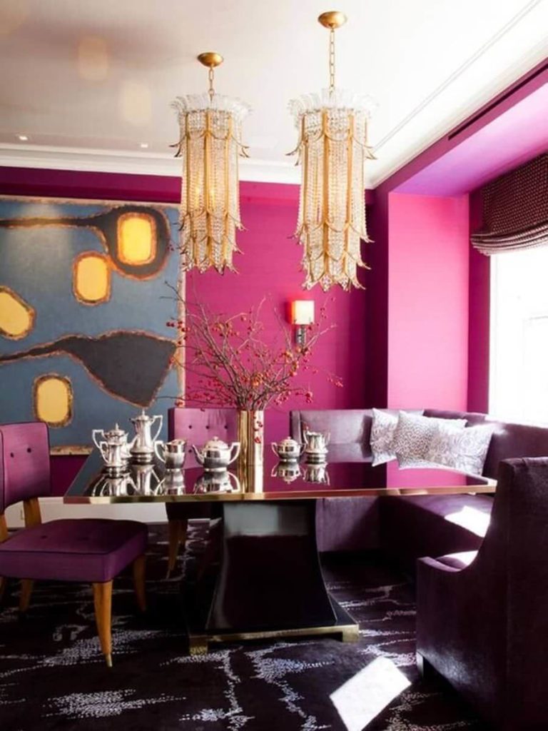
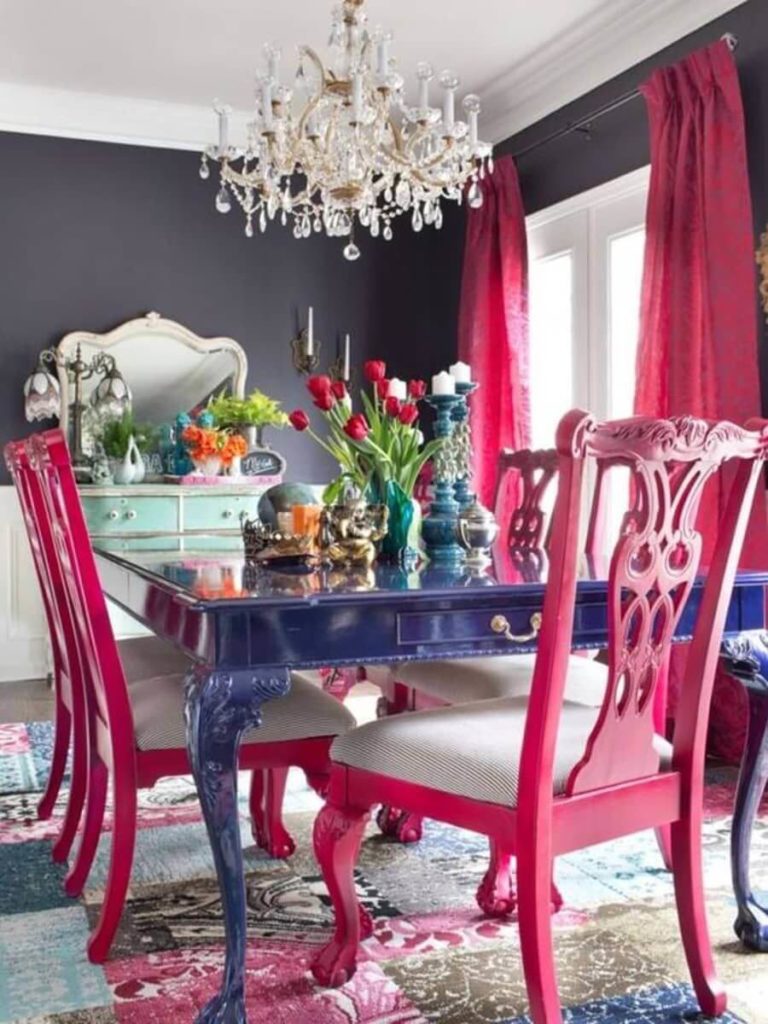
Kitchen and Dining Room
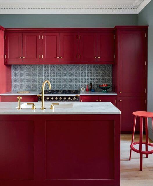
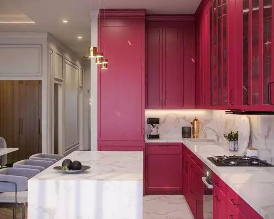
Do you fancy a one-of-a-kind kitchen design to steal your attention every time you enter this room? It is time you decide on a new color. Don’t be afraid to choose from the boldest. You may doubt the relevance of other bright shades, yet you’ll never be wrong with Viva Magenta. This color is the mainstream of the season. Stand out with an authentically colored kitchen by choosing this appetite-awakening tone for the cabinets or walls. Pair it with gold hardware, a marble countertop, and a mandatorily neutral color in the neighborhood. Both traditional and modern kitchens work.
Viva Magenta is a unique and irresistible color choice in the dining room. First, ensure enough natural light and apply this color to large spaces. It works for the walls, ceiling, and even the chairs. Interestingly, this color effortlessly adapts to various design styles, acquiring a new personality for each, from entirely vintage or countryside to ultra-modern.
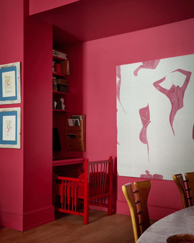
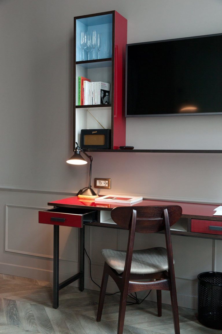
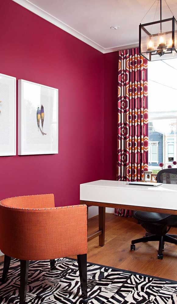
Inspiring Home Office
Nothing adds more inspiration to a space than an appropriately chosen bright shade of color, especially a trendy one. Viva Magenta seems to be created for creative minds who find the courage to speak out through naturally vivid tones or those who need the slightest touch of raspberry sparkle to reveal their true self.
Create a motivational workspace in your house with the best natural hue we’ve seen so far. Viva Magenta is great for personal studies and working nooks, particularly if you work remotely or are busy with your favorite hobby on weekends. You’ll instantly notice a rise in your productivity and creativity.
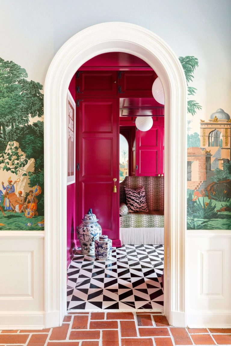
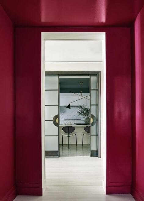
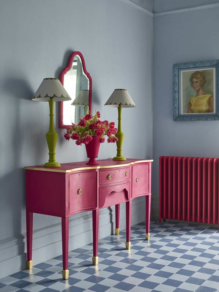
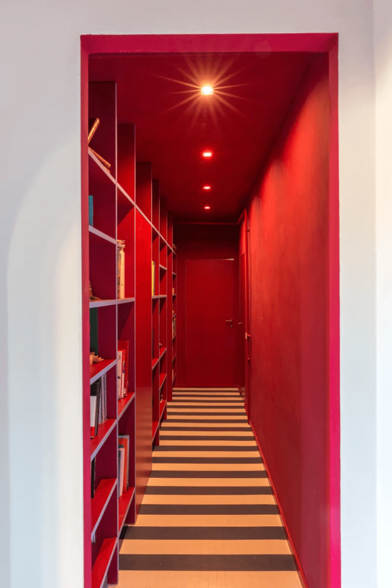
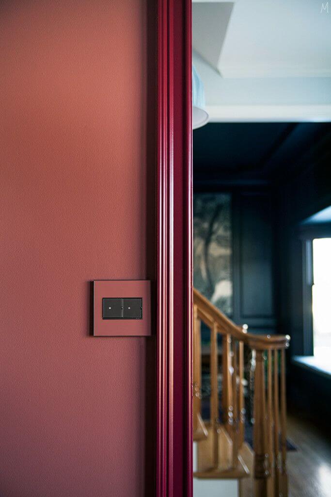
Hallway
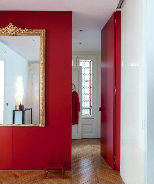
They say how you design the entryway or hallway makes the first impression. This season, experts suggest making a bold introduction to your interior design with the designers’ favorite Viva Magenta. Use it to entirely paint the walls or add it in small doses, such as on the vanity or trim.
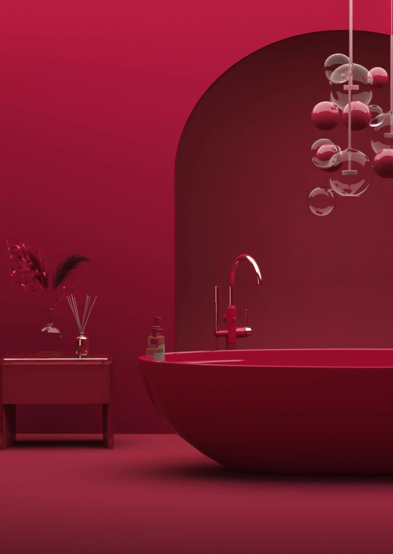
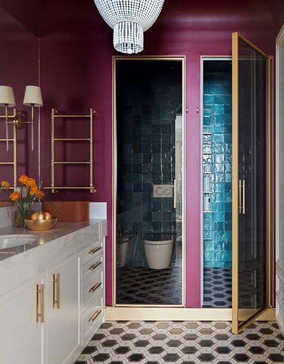
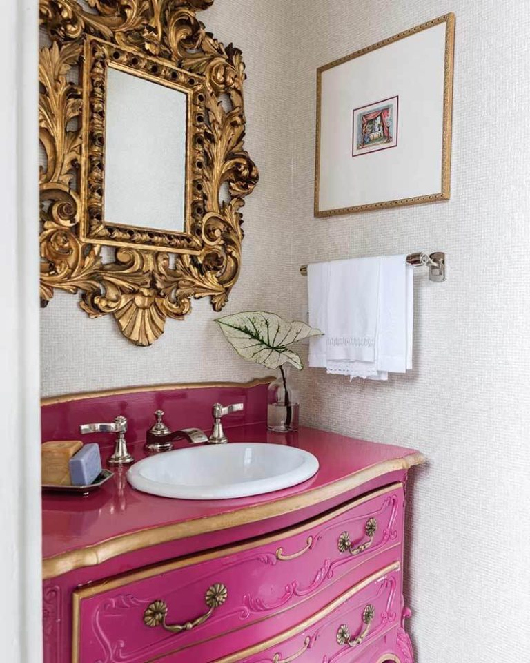
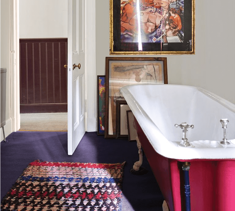
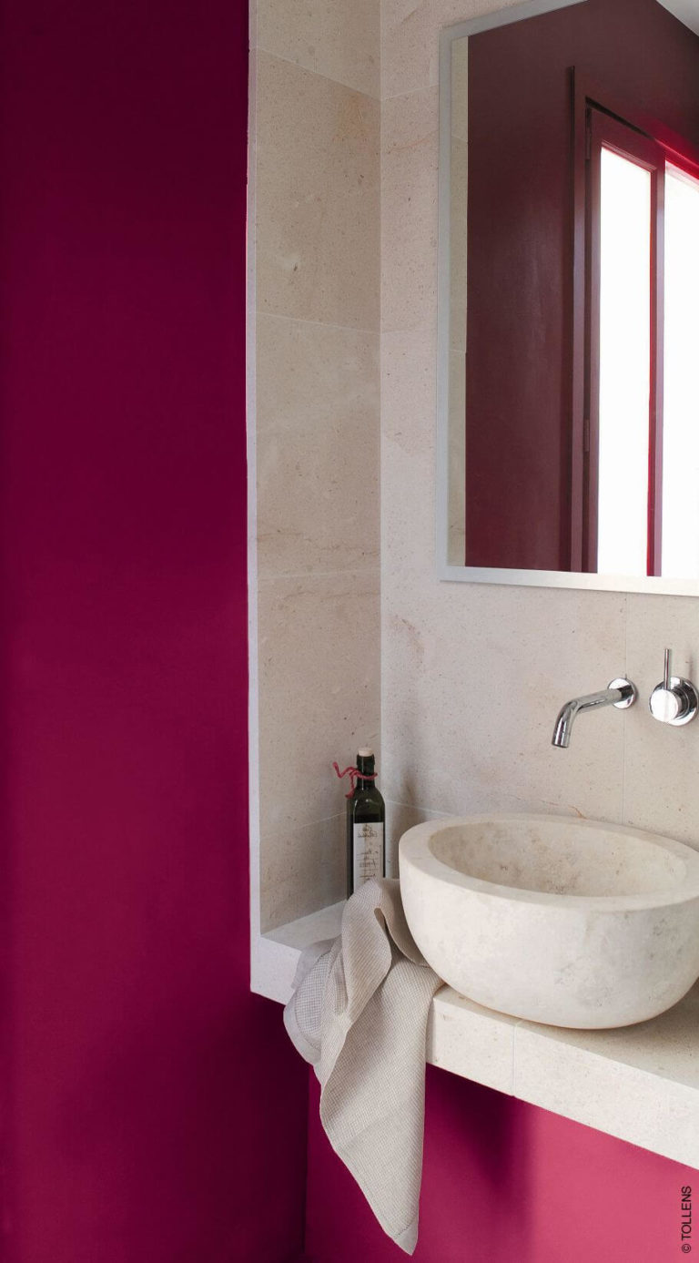
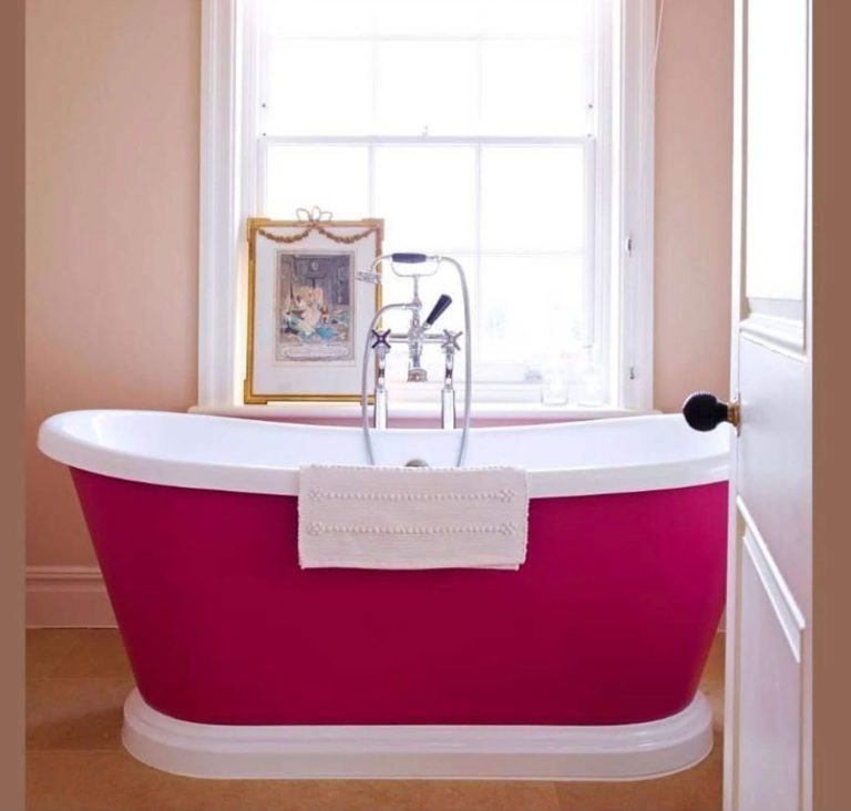
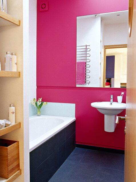
Bathroom
Experts advise integrating Viva Magenta in the bathroom if it is large enough to host an overpowering color. That’s why designers mainly apply it to accents, such as vanity cabinets or a freestanding clawfoot bathtub. The summertime berry scent may appear colder and blue-biased here due to the usually cool natural lighting reflected in the room by neutral colors, which should be mandatorily chosen to balance the limitless magenta beauty.
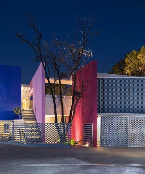
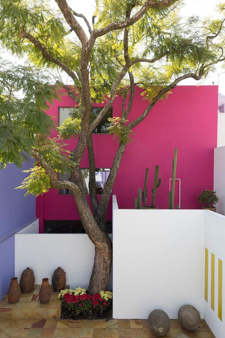
Use of Viva Magenta for House Exterior
As friendly as Viva Magenta may be towards any design style and color scheme in interior design, it shows its unconventional features mainly when applied to exterior design. Maybe we are not yet ready to use such a bright color for the house exterior, or it simply doesn’t work with all exterior design styles.
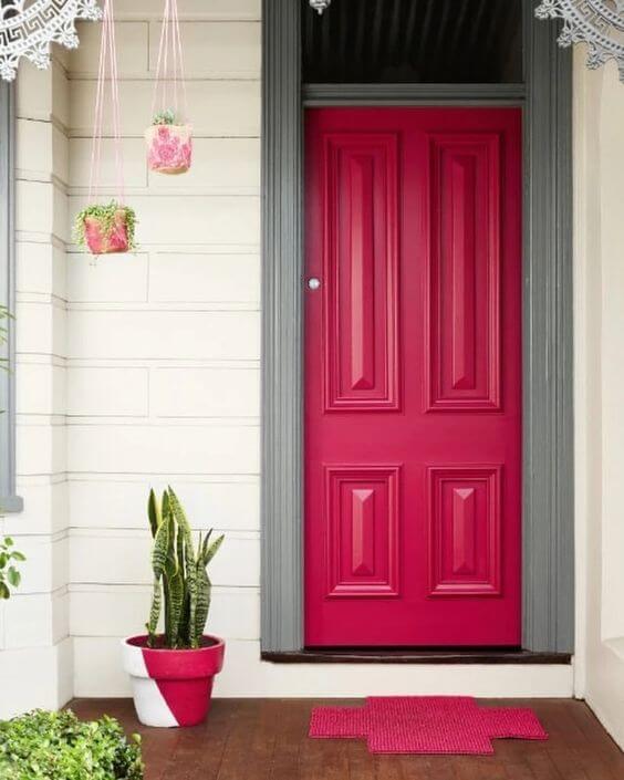
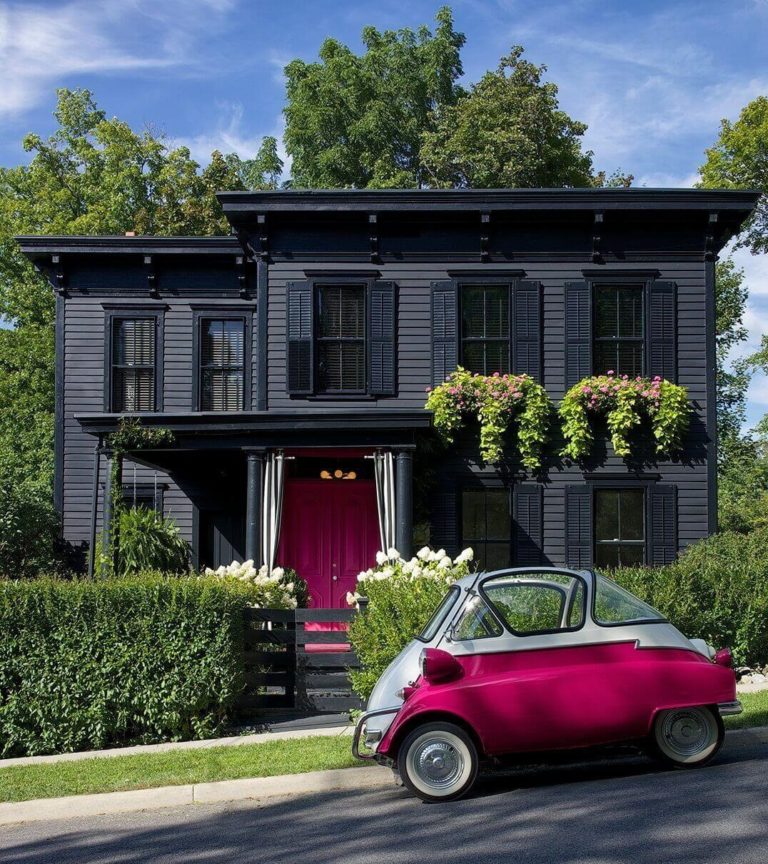
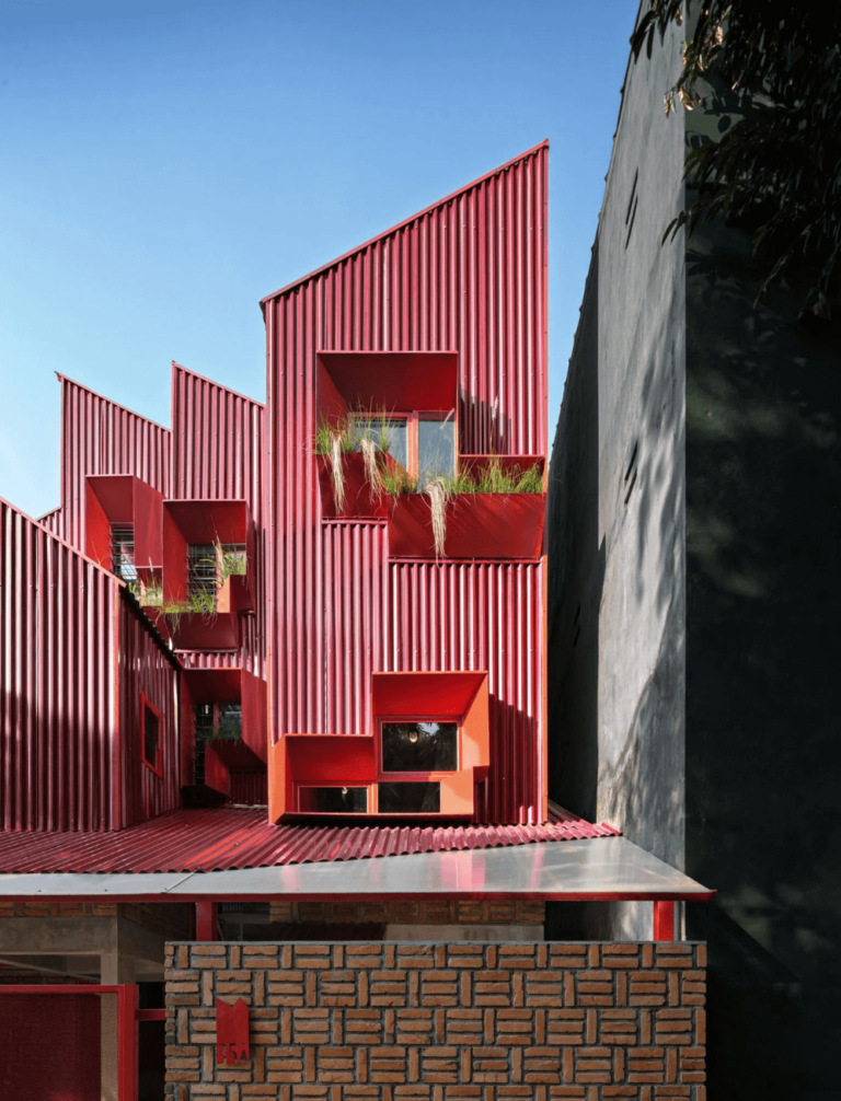
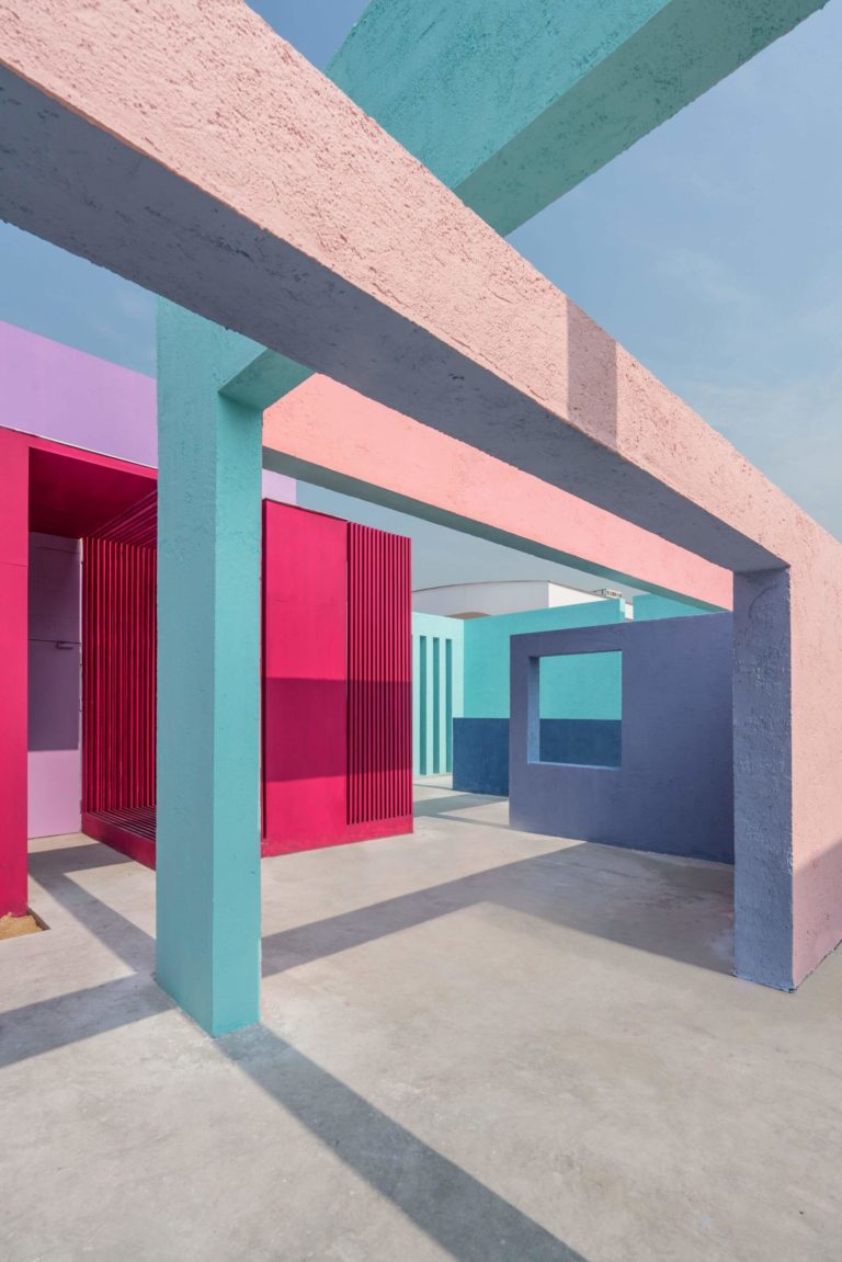
Nothing beats the show this mauvish-crimson prepares for ultra-modern houses with intricate architectural features. The wide range of geometrical shapes and additional bright colors paired with Viva Magenta leads to unmatchable masterpieces. That’s when the fruitful color reveals its futuristic character. Still, you can always use it on the front door of a traditional house, especially if paired with gray walls. If you make a statement, do it the right way with the right color. Start with the exterior of your house.
Pantone’s Viva Magenta is the mainstream color of the year. Despite its vividly bold character, it works with pretty much any design style in any room of the house. Although this is the most used color by designers today, you’ll never look like the others with this berry purple-pink in your home. It looks authentically special for each design concept in part.
Are you ready to be trendy? Try the new color trend that will define both your design and you as brave, open-minded, and creative.
