A bright creamy white that brings together serenity, balance, elegance, and calmness under the same neutral color base that works indoors and outdoors.
Whipped Cream (Behr DC-001): What Color Is, Review, and Use
Interior designers and decorators have recently noticed the rising popularity of cream paint colors. Experts state cream is not a trend. It has always been a timeless choice. However, today, it effortlessly replaces grays, a huge trend in the last decade. For a perfect cream shade that doesn’t read overly yellow, colorists suggest Whipped Cream from Behr’s 2024 trendy color palette. This elegant cream is your go-to neutral if you want a calmer yet similarly light alternative to exceedingly bright whites. Let’s take a closer look!
Whipped Cream Paint Color Features
Elegant, luxurious, calm, sophisticated, delicate, and soft – that’s how versatile and universal Whipped Cream is. We would even say it is one of the lightest cream variations. This creamy white paint color looks enchanting and cheerful, like the freshly whipped cake cream. It has coloration to it, yet the balanced cream effect doesn’t fade into a yellow shade, which is great. Flexibility is its second name, and you can safely use Whipped Cream in a Classic, Traditional, Neoclassical, Modern, Rustic, Countryside, or Mid-Century Modern interior. The list goes on – that’s how multi-purpose Whipped Cream is.
Whipped Cream: Is It Warm or Cold?
The most interesting secret comes to the surface. Despite the name, Whipped Cream is not a warm paint color. It is a well-balanced neutral, so designers love it so much. Let’s bring some clarity! The RGB value shows the mix of red, green, and blue in a paint color. At Whipped Cream, it is the following way: red – 246, green – 245, blue – 239. As you can notice, the two extremes – red (warmth) and blue (coldness) just slightly differ, making Whipped Cream lean towards the warm side.
How Does Lighting Affect Whipped Cream?
Regardless of how neutral, warm, or balanced Whipped Cream may seem, lighting is essential. Take, for instance, Whipped Cream in a north-facing room. It will seem cooler – like a muted shade of light gray, especially where the shadow hits. However, the same cream tone turns into a soft and glowing white, considerably warm. The direct sun rays may even resurface a few notes of peach-yellow exceptionally. Such light paint colors transform into deeper, muted shades at night under artificial lighting. Since it is a pretty bright paint color, it may as easily reflect the surrounding colors, especially the indoor plants or outdoor lawns.
Whipped Cream LRV
Colorists will tell you that paint colors with a Light Reflectance Value higher than 80 are white. All that falls in the lower group is off-white. Since Whipped Cream has an LRV of 91, we know exactly which category it belongs to. No wonder experts call it one of the lightest cream shades. To be clear, the higher the LRV, the more light a paint color reflects. Being so close to 100, Whipped Cream is a truly bright shade that bounces around light, making a room spacious and airy. You’ll love it in small spaces especially. Still, its subtle coloration will add interest to overly large rooms.
Whipped Cream Undertones
No doubt, this delightful cream is a white tone diluted with the slightest amount of gray and cream. The proportion is well thought-out. It may even read green-blue under specific conditions. Use a paint sample before committing to this paint color to avoid unwanted results.
Similar Colors
White is definitely one of the trendiest paint colors, with many alternatives from the same brand or other prominent manufacturers. Whipped Cream is a pleasure to work with. Check out our finds!
Coordinating Colors
On Behr’s official website, we can find a few professionally organized color palettes with Whipped Cream. Among its best matching colors are light pastel and deep green shades, followed by brighter yet pale blue, violet, and lemon tones. Light peaches look great next to this creamy white, as well as bolder variations like bright grape violet, teal, or sepia rose. Here are the exact matches:
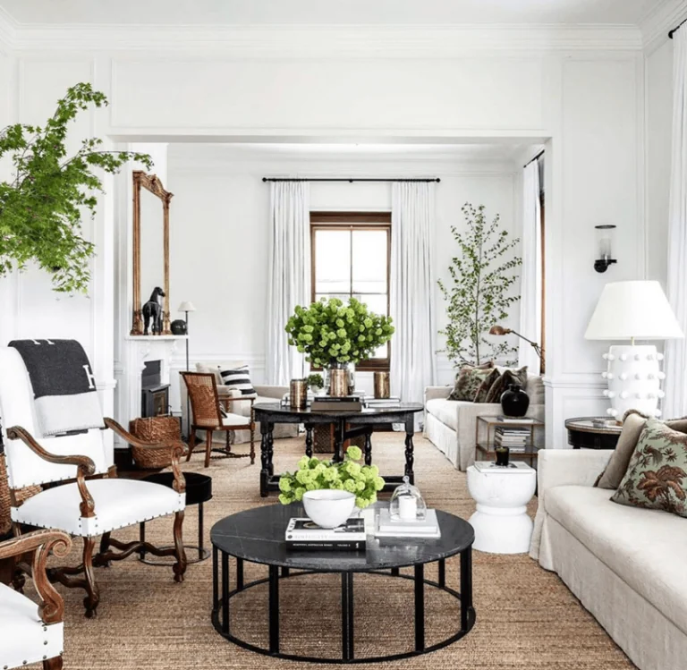
Use of Whipped Cream in Interior Design
Despite the name, Whipped Cream is very close to pure white. The secret is its subtle cream coloration that will instantly update the color palette of any design style. Moreover, you can use this paint in any room. Metallic accents, natural textures, printed upholstery, neutral colors, and bold splashes of color all look great next to Whipped Cream. Explore some of the best reasons to use Whipped Cream in the interior!
Brighten the Room
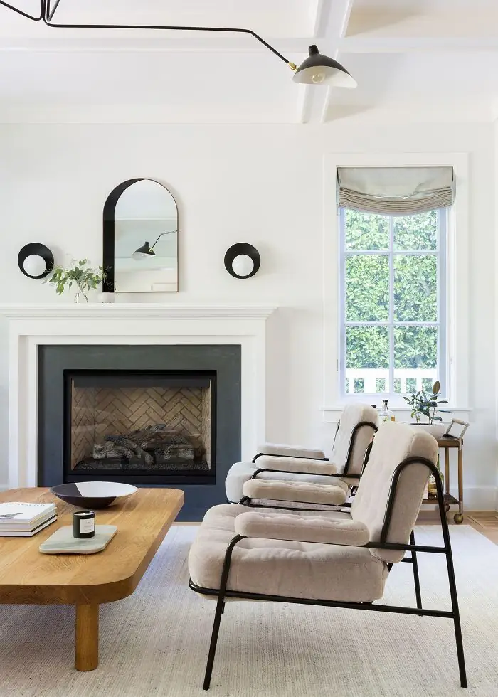
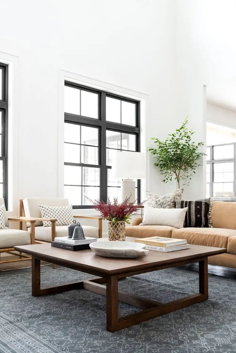
In a world of trending bold and dark-colored interior designs, be one of a kind and choose in favor of a bright white shade in any room you like. Brighten the palette and allow the furnishing and decor to take center stage on the neutral canvas. Whipped Cream stands among the brightest whites that can make the smallest room feel spacious, light, and airy. Breathe freshness into every corner.
Quiet Luxury
Although the fashion world already deviates from the Old Money style in favor of other trends, the interior design trends move at a slower pace, making Quiet Luxury relevant for this and the following seasons. Enjoy the magnificent and refined luxe of classic interiors with moderate elegant decor that roars expensive. The crisp white from Behr will fit in just right. Its endless opulence will emphasize the generously polished and tasteful furnishing and decor.
Creamy White and Texture
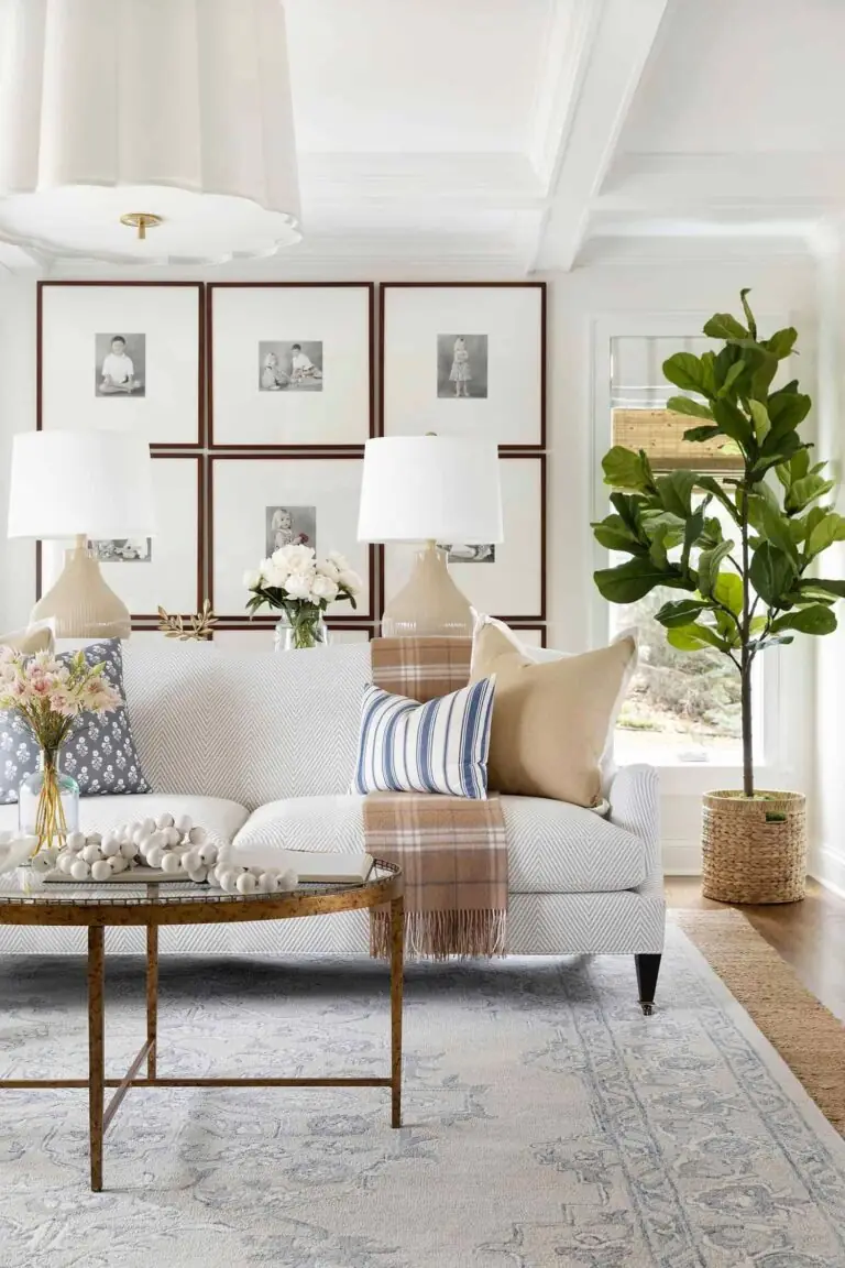
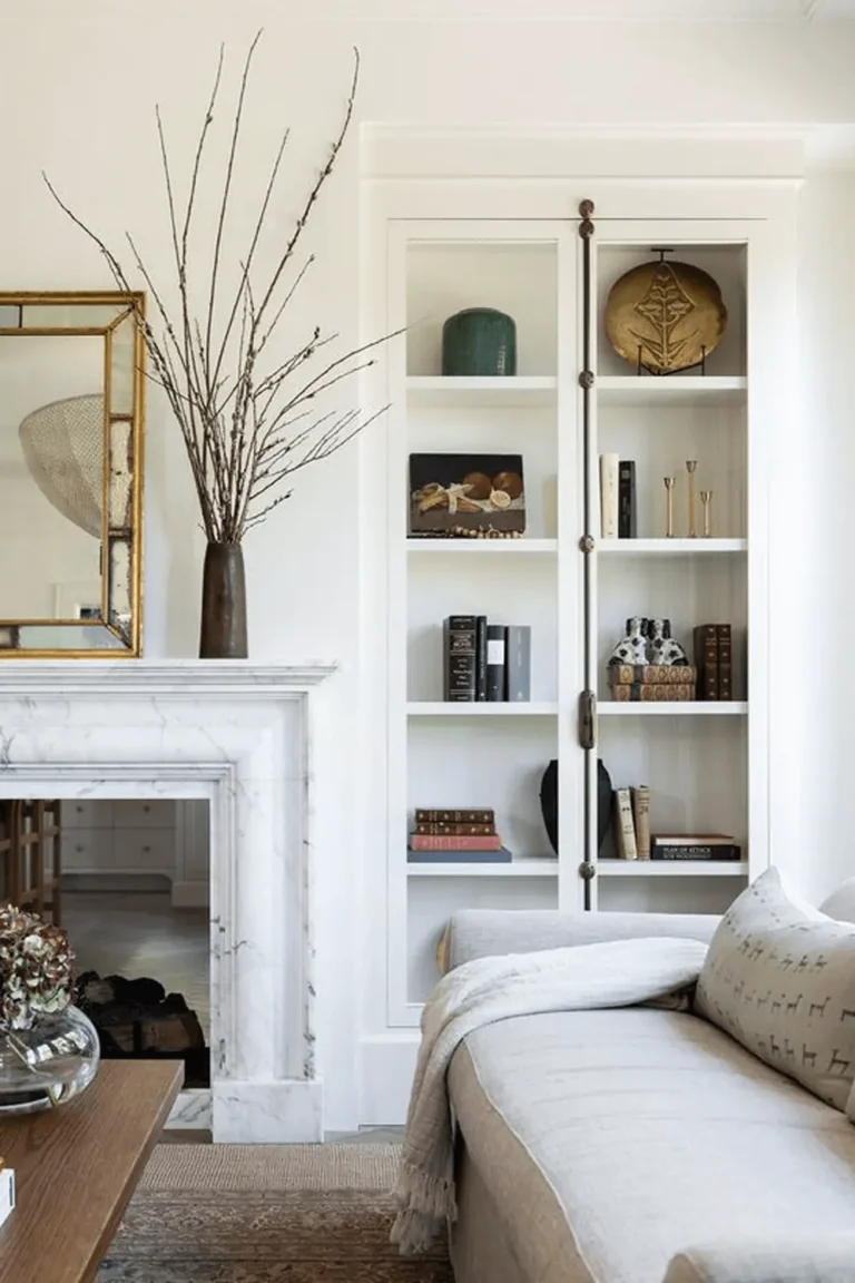
It would be a shame to have such a canvas-clean paint color at our disposal and not accessorize it with accent colors, statement textures, and rich-printed textiles. That’s why Whipped Cream is an excellent choice for traditional styles full of patterns, textures, and colors. The contrast will add charm to your home, underlining an individual personality.
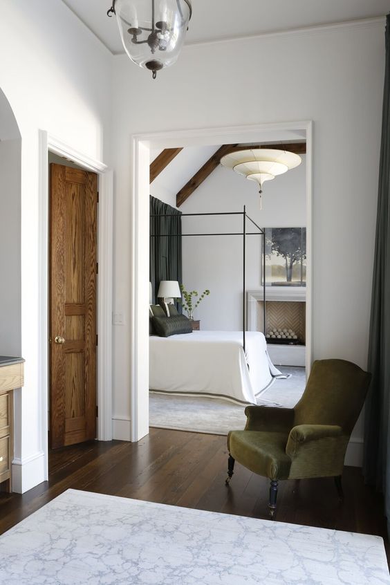
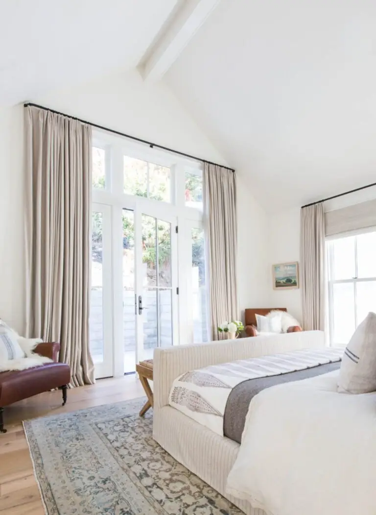
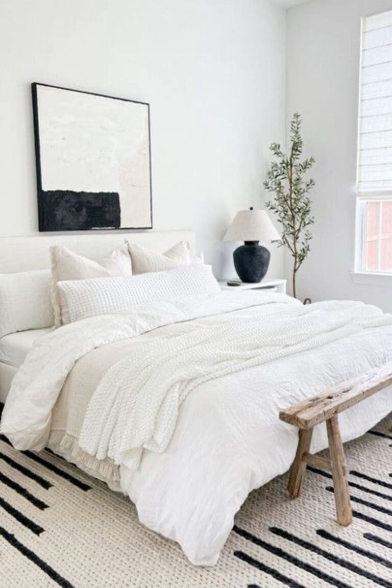
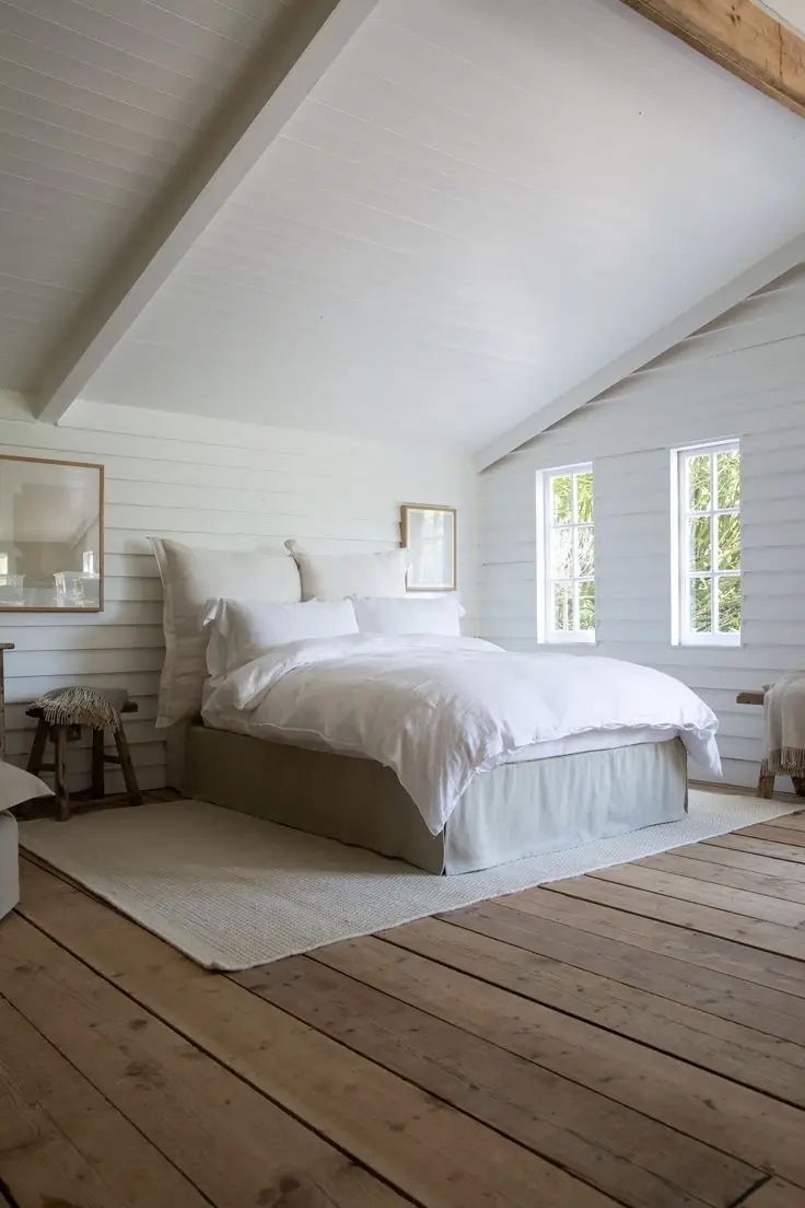
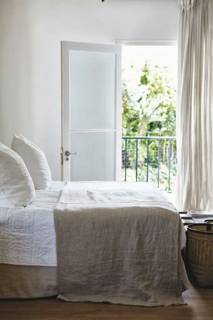
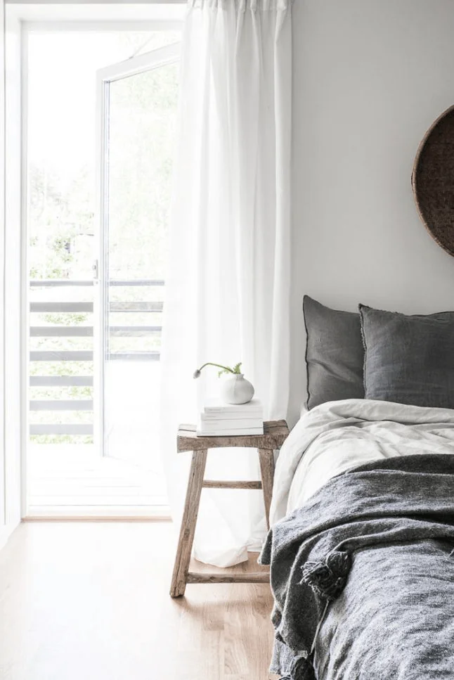
Airy Bedroom
Surround your sleeping space with a limitlessly fresh ambiance you can easily ensure by painting all the walls in Whipped Cream. Mandatorily, experiment with color and texture on this neutral background. Wooden furniture, indoor plants, printed textiles, handmade accessories, and wall art. Unlike pure white shades, this cream white has a dash of softness and won’t make your bedroom seem overly bright.
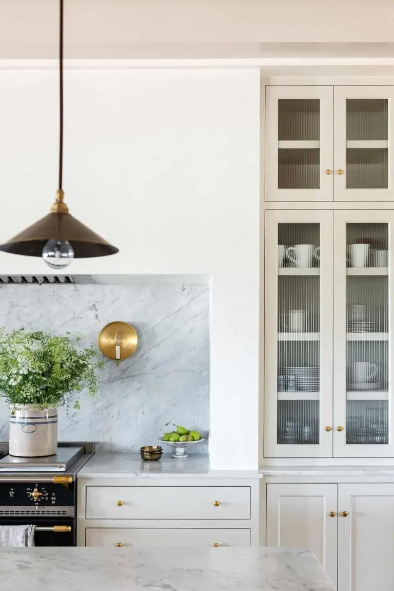
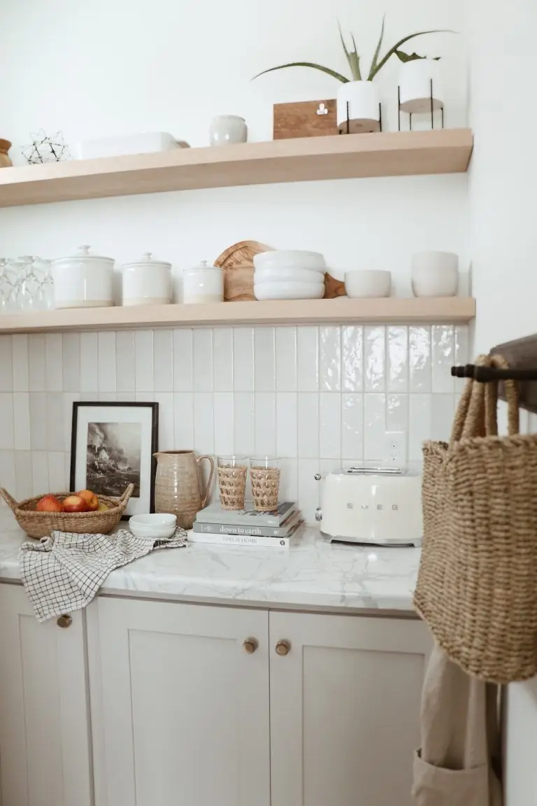
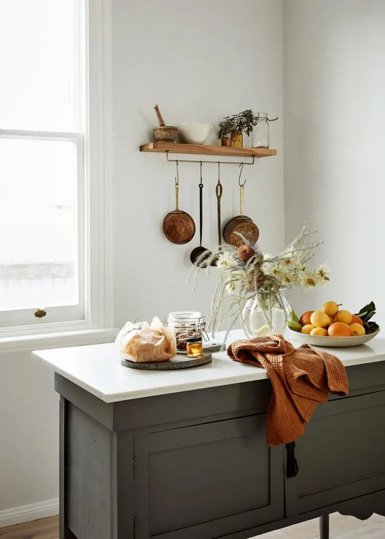
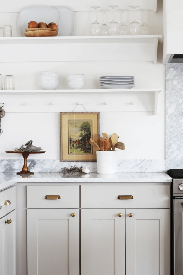
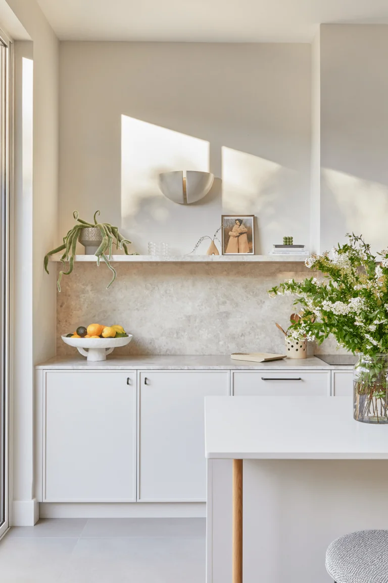
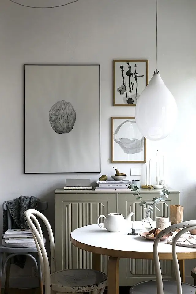
Kitchen and Dining Room
White is a timeless option for the kitchen, whether you decide to paint the walls or cabinets. However, experts advise us to be careful with decor. You shouldn’t leave it all white. Balance the palette and underline boundaries with the right accents. Golden, silver, and black hardware look good. Additionally, think of wooden or stone countertops or backsplashes. You may also want to add a few drops of catchy colors, such as eye-catching wall tiles. Last resort – decorate the open shelves with rich-textured items.
In the dining room, Whipped Cream pairs well with round wooden tables in the company of traditional wooden chairs. Don’t hesitate to uplift the mood with indoor greenery or wall art. Although this creamy white looks great solely, it doesn’t mind a few pops of energetic color.
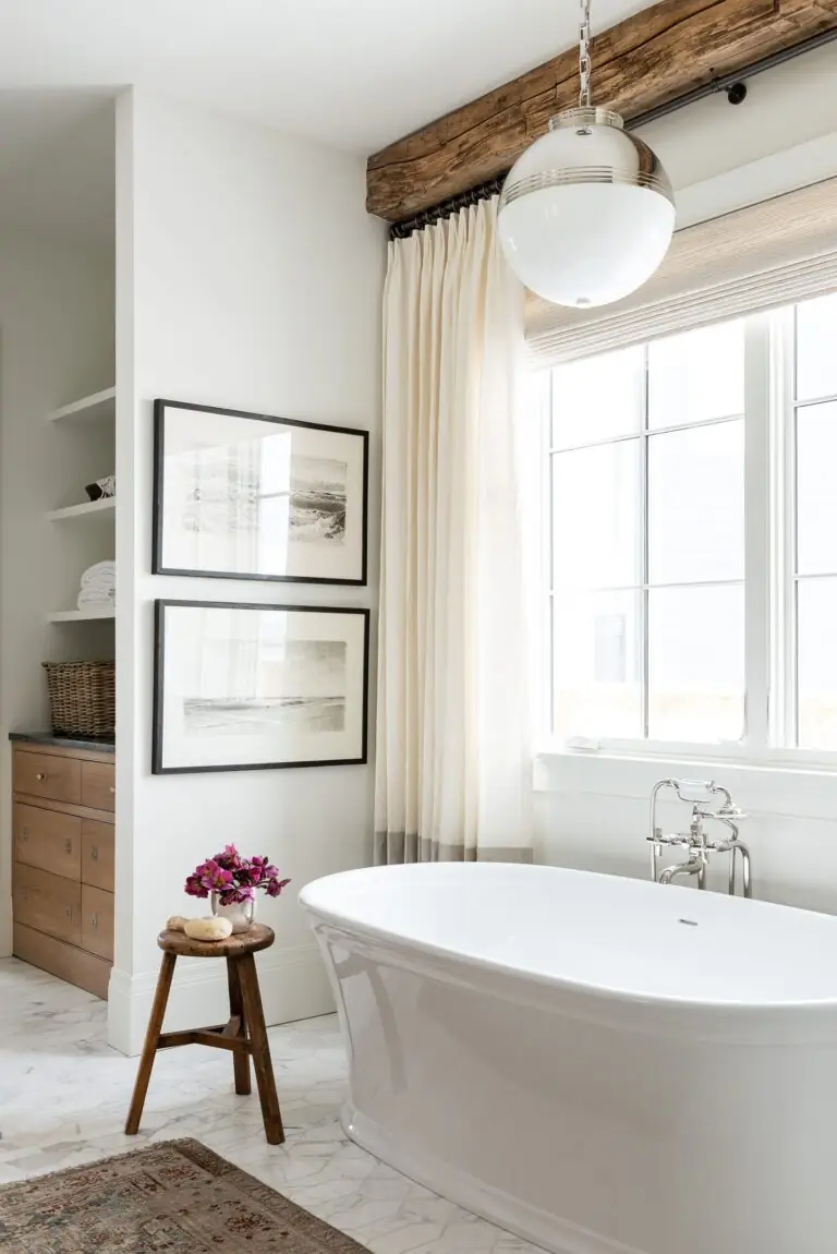
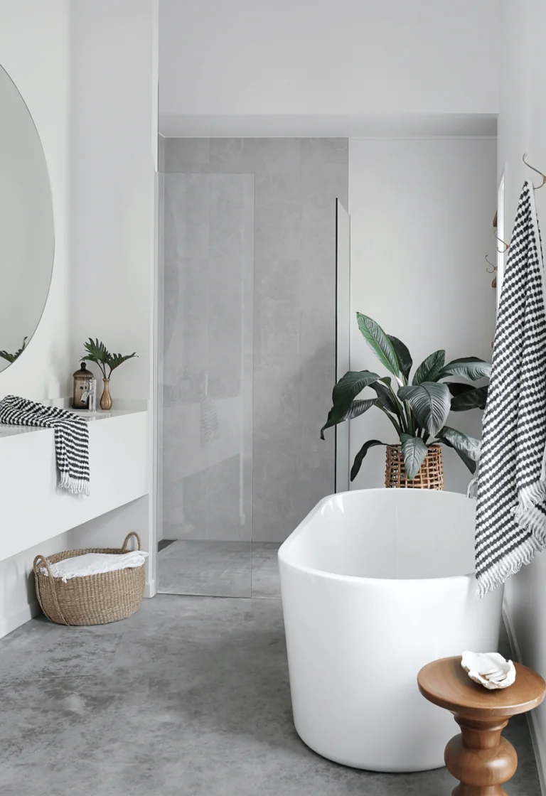
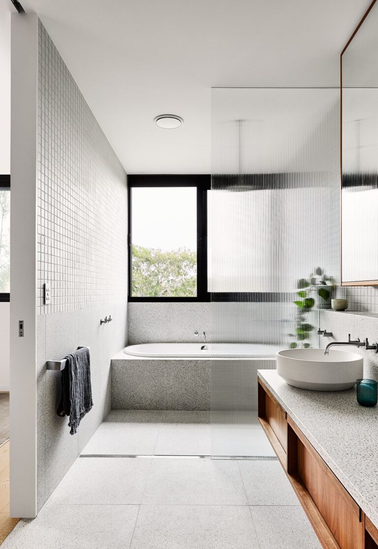
Bathroom
This versatile white paint color feels at home in modern bathrooms with a neutral color palette enriched with statements. Use it on walls or the ceiling. Next, paint with texture and color over this clean canvas. Wood, stone, metallic hardware, and wall tiles all work for this flexible white tone. Consider a few occasional pots with houseplants as well.
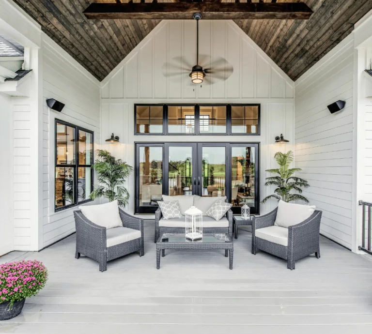
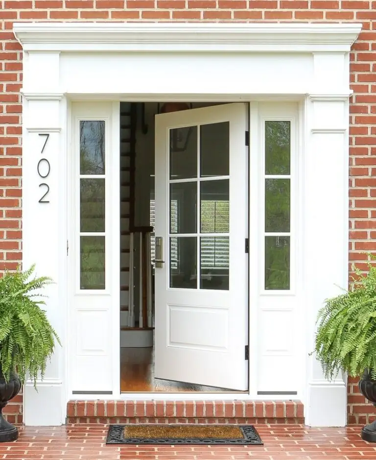
Use of Whipped Cream for the House Exterior
Whipped Cream may seem much brighter when used on exteriors due to direct interaction with natural light. However, it will still preserve its authenticity. Like other neutral shades, this soft white is a great option for the exterior walls as it is for the front door. For the second case, consider a contrastive color for walls, such as wood or natural brick.
Behr’s Whipped Cream DC-001 paint color is as bright as it is creamy. The lighting is essential. Nonetheless, out of tens of bright white shades, this creamy white brings softness, appeal, and interest to the most usual color palettes.
