White Mocha (Behr OR-W11): what color is, review, and use
Today, we dive deep into the essence of delicious paint colors. No, they cannot be tasted! Yet, you can feel their taste. A prominent representative of the appetizing color category and simply a lovely shade that you cannot help but admire is White Mocha OR-W11 from Behr. The fabulous mix of light beige, a bit played down by the tiniest gray particles and penetrated by the slightest purple hint, is the new neutral that cannot help but make you fall in love with its beauty.
The name itself implies a soft and appealing shade that surrounds you with love, peace, ease of mind, and motivation to enjoy every moment, just like enjoying a cup of white mocha. You cannot simply come up with a paint color that tastes and smells delicious. There is an entire process of combining various tones. Although we will not get deep into the scientific work that stands behind it, we will rely only on facts. Let’s find out the secret of receiving such an enchanting paint color!
White Mocha paint color features
Despite its belonging to the light category, White Mocha has intense beige notes that feel exceptionally soft and warm. The base is penetrated by a muted, slightly perceived gray hint that cools down the color a bit to balance its appearance. When the gray scents interact with the beige base, a beautiful shade of pale purple, one may even say – soft pink, reveals itself. This complex mix of notes offers this paint color the unforgettable look that can instantly warm up the space, keeping it light and adding individuality.
White Mocha: is it warm or cold?
The tiny gray notes that slightly cool down the paint color are in place to balance the overly appealing appearance. There should always be a limit, and gray is there to neutralize this shade. Still, White Mocha cannot help but reveal its exquisitely warm beige scents that have the softest effect on any surface you apply it to. It is impressive how the same paint color feels so balanced yet so mesmerizing with its irreplaceable sense of warmth.
How does lighting affect White Mocha?
It depends on the room exposure. White Mocha is quite muted in rooms with north-facing windows, where gray reveals itself in a new light. This is when this paint color appears more like a very light shade of purple with a cool look yet not devoid of softness due to the warm beige roots. On the other side of the coin, this paint color reveals its warmest variation in south-facing spaces, particularly when bathed in sun rays. If you cannot do anything about the exposure, which is one way or another, you can always play with artificial lighting and receive the desired effect.
White Mocha LRV
Quick reminder for our constant guests and relevant information for our new guests: LRV stands for the Light Reflectance Value that determines how dark or light a shade is on a scale from 0 to 100 (0 for true variations of black and 100 for the purest shades of white). White Mocha reaches an LRV of 73. If we were to speak in plain words, we would say that this paint color gravitates between the medium and light color groups. Still, it impresses with its ability to reflect the light throughout the room and make it feel exceptionally spacious regardless of its relatively intense beige notes.
White Mocha undertones
It is probably clear by now that White Mocha is penetrated by neutral gray scents and no less balanced purple notes that enrich the warm beige base with effects that make this paint color look exceptionally light, feel exquisitely warm, and taste impressively sweet. Well, the latter is just an addition to the way this color feels. It is definitely one of a kind that you give once a glance and cannot help but keep this paint color in your heart forever.
Similar colors
Not as sweet; still, a few paint colors replicate the beauty of White Mocha with an astonishing similarity. Whether you are looking for alternatives or slightly darker or lighter variations that suit your style, we would like to draw your attention to a range of shades that are no less unique and fit the earlier mentioned feature. Let’s start with Behr and go beyond its borders!
Coordinating colors
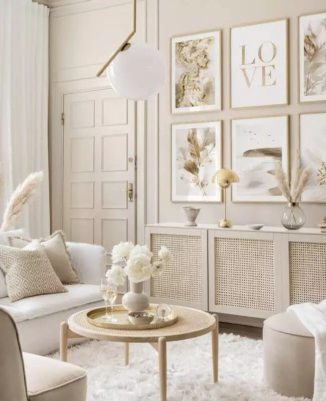
Although neutral, this paint color has intense beige notes, which affects how it interacts with other shades. Among its favorites are warm shades of white for monochromatic approaches, medium shades of warm brown for harmonious pairings, pastel variations to enhance the soft effect, and bolder paint colors for contrast. You don’t have to look for these colors when experts from Behr offer a wide range of exact color matchings.
Use of White Mocha in interior
We cannot deny the relevance of a warm neutral shade within contemporary interiors that require more softness and comfort. You can safely go with White Mocha for any style and be sure that its relatively neutral base will suit almost any preference. Of course, we cannot skip the styles that would especially benefit from the splash of coziness this shade replicates. Still, we would also like to show you its integration into the interior from a general perspective.
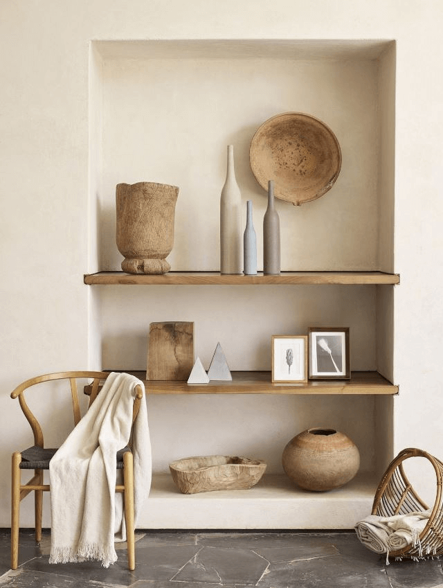
Farmhouse again and again
It seems White Mocha was created particularly for this style since it integrates into such interiors to the fullest. Apply it to the walls or pieces of furniture and go on with the usual elements of this approach. Whether it is a traditional or modern Farmhouse, nothing can stop this paint color from enriching the space with the right amount of comfort. Consider wood, in particular, to resonate with the warm undertones of White Mocha and shades of white to balance the environment for a more contemporary design.
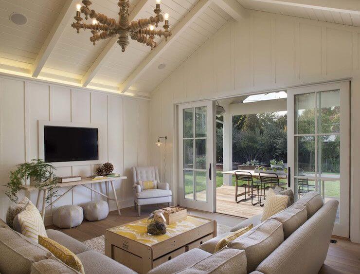
Modern Rustic
There is a special connection between the warmth of White Mocha and raw surfaces of light wood accompanied by no less raw stone flooring. You can even skip the finishing part when it comes to the walls and paint the raw surfaces in this soft shade of beige. Since we speak about a modern approach, avoid any additional units than the room’s main elements, keep it functional, and let the prevailing warm notes spread all over the space. The result will be an interior close to nature, full of comfort, and exceptionally modern.
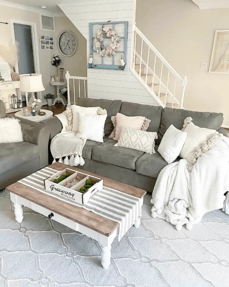
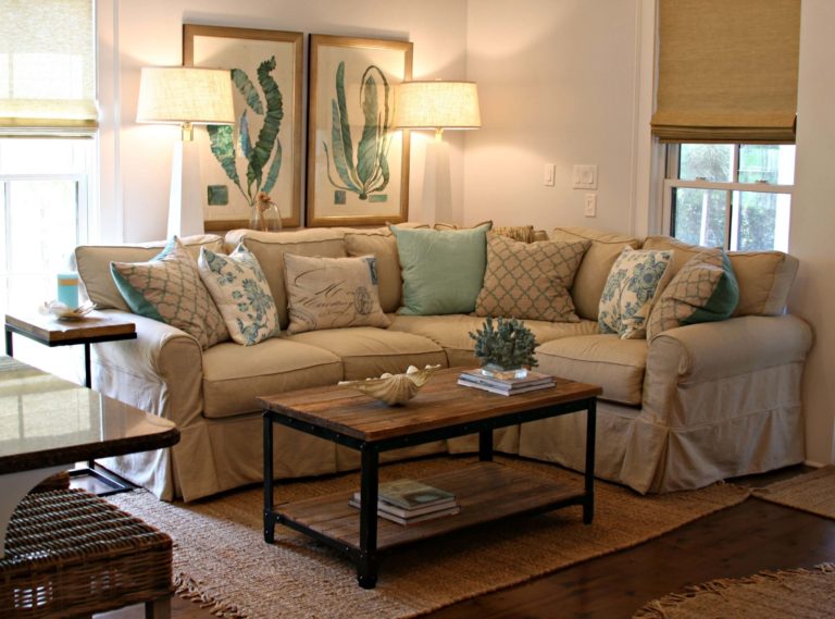
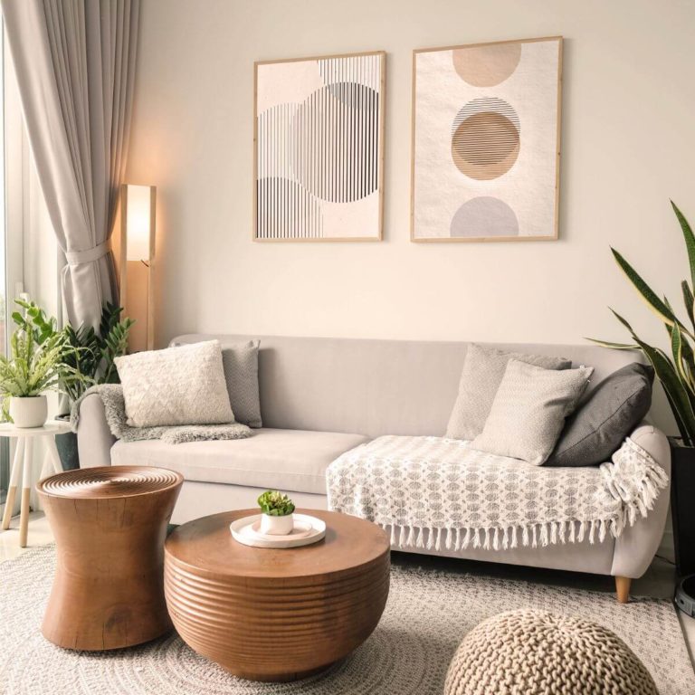
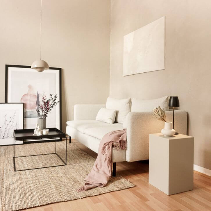
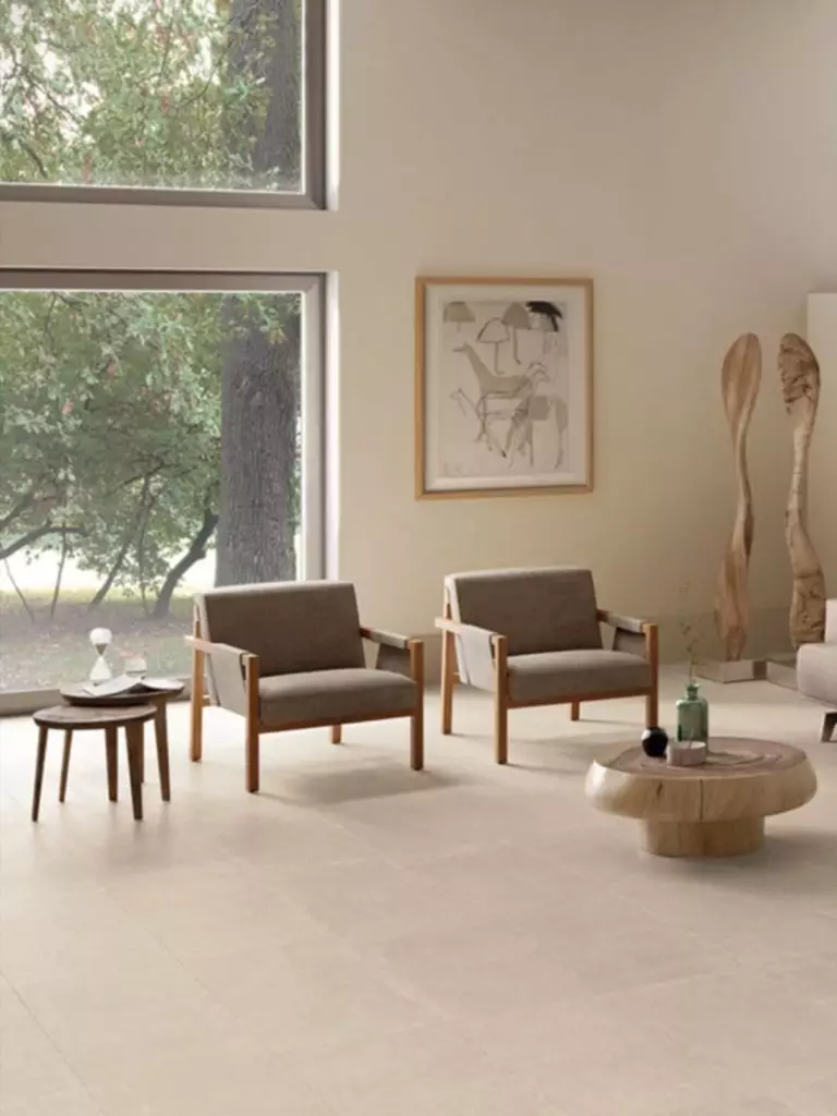
Living room
Whether you consider a traditional or modern approach, White Mocha will add a special sense of comfort to each case in part. Opt for a monochromatic or contrasting palette depending on what result you want. Don’t forget that the northern exposure brings a cooler effect, while the southern exposure makes this paint color radiate the softest notes. You can increase the warm effect with additional wood texture for the former, while the latter would benefit from a bit of contrast to balance the overly warm shade.
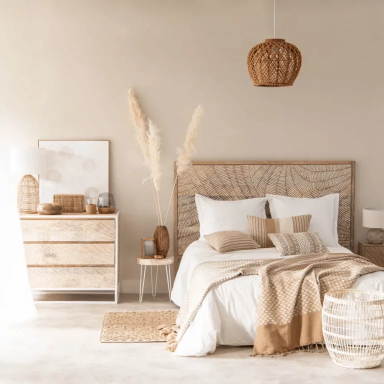
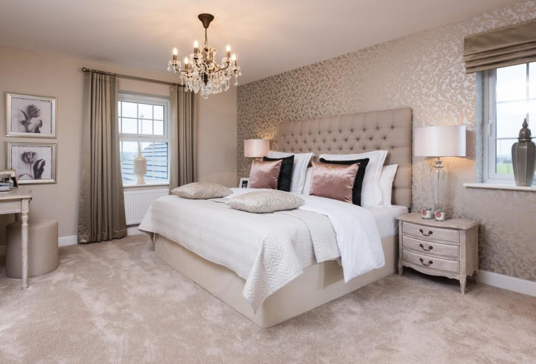
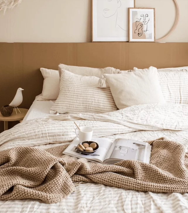
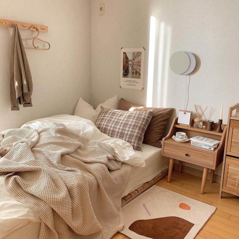
Bedroom
If keeping comfort to the fullest within your bedroom is a priority, don’t hesitate to paint the walls in this shade. The go-to approach is to consider Boho, whose beige prevalence perfectly fits the light beige walls. Still, a contrasting palette would be no less perfect if you appropriately choose the matching partners. Even the same vintage units will shine in a new way on such a background. Nevertheless, you can opt for any style, while White Mocha will keep your sleep safe and sound.
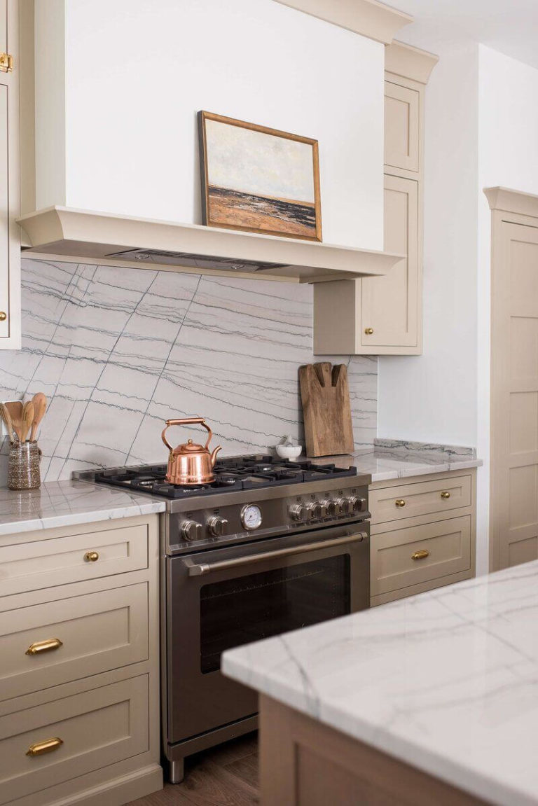
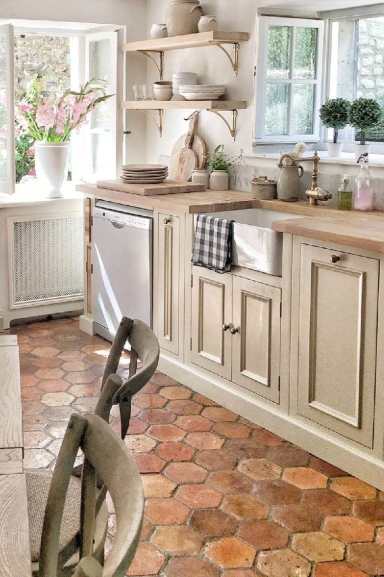
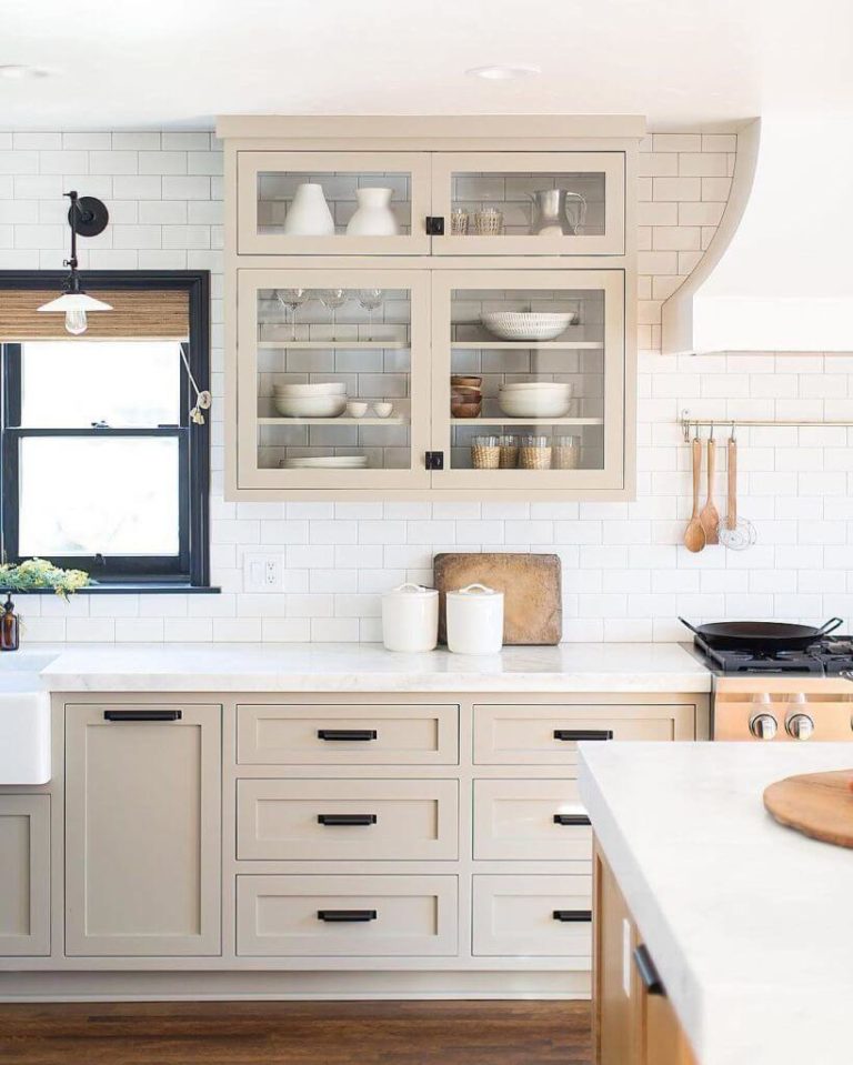
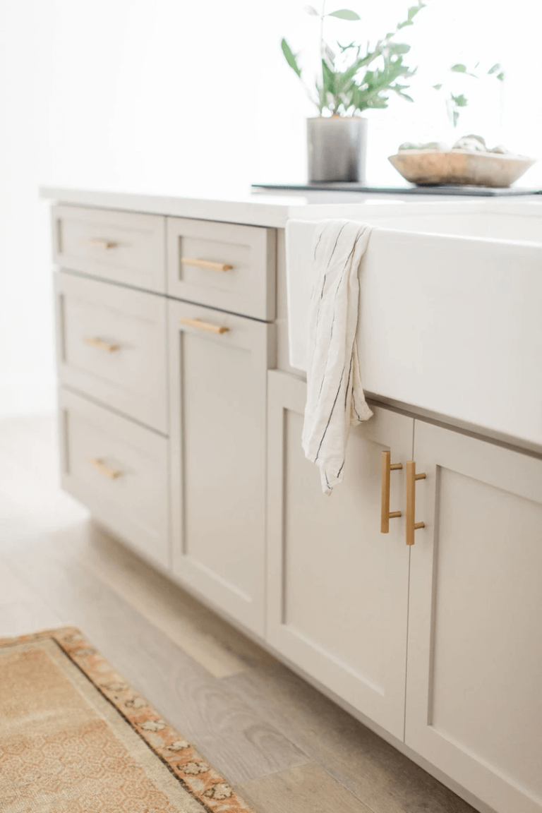
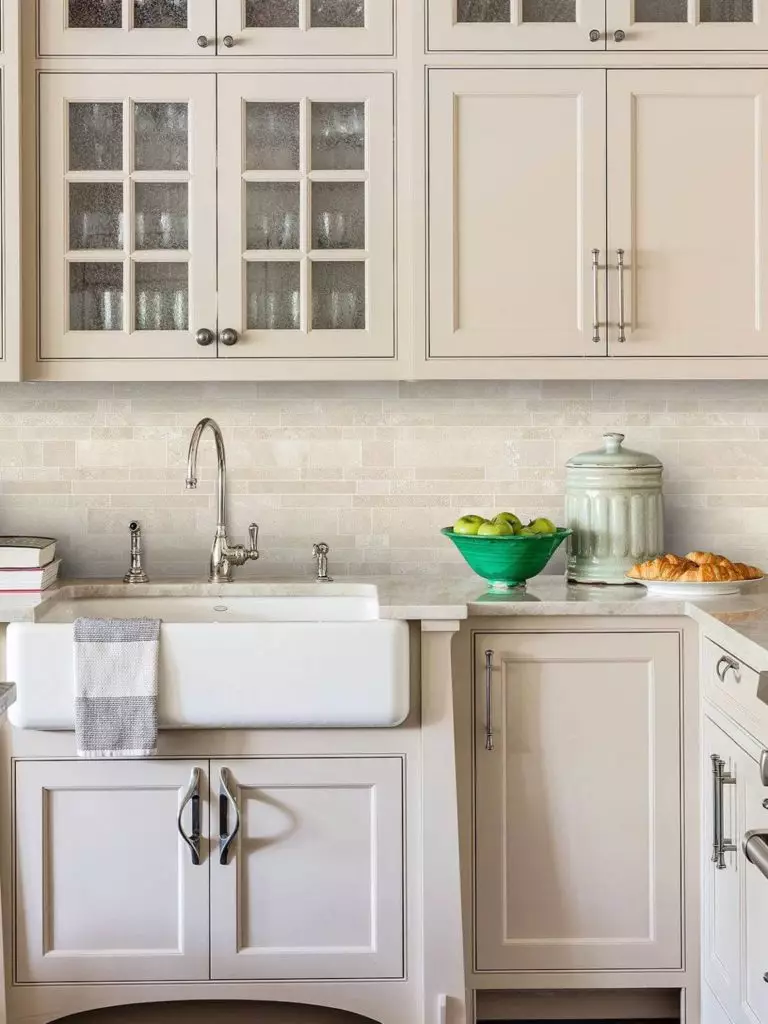
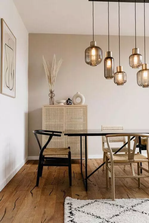
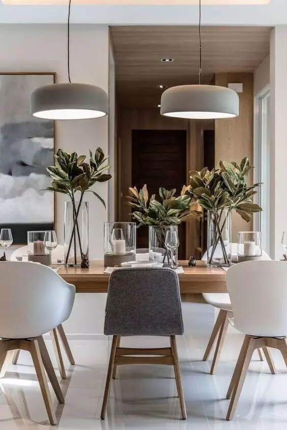
Kitchen and dining room
White Mocha perfectly fits modern and traditional interiors. Still, this paint color is a real find for traditional kitchens, particularly for the cabinets, considering black, silver, or gold hardware. This is not the usual beige shade but a charming mix of beige with gray and purple notes that offer this space an impressive look. As for the dining area, White Mocha serves its purpose the best it can by enhancing the appetizing effect and keeping pace with the design approach.
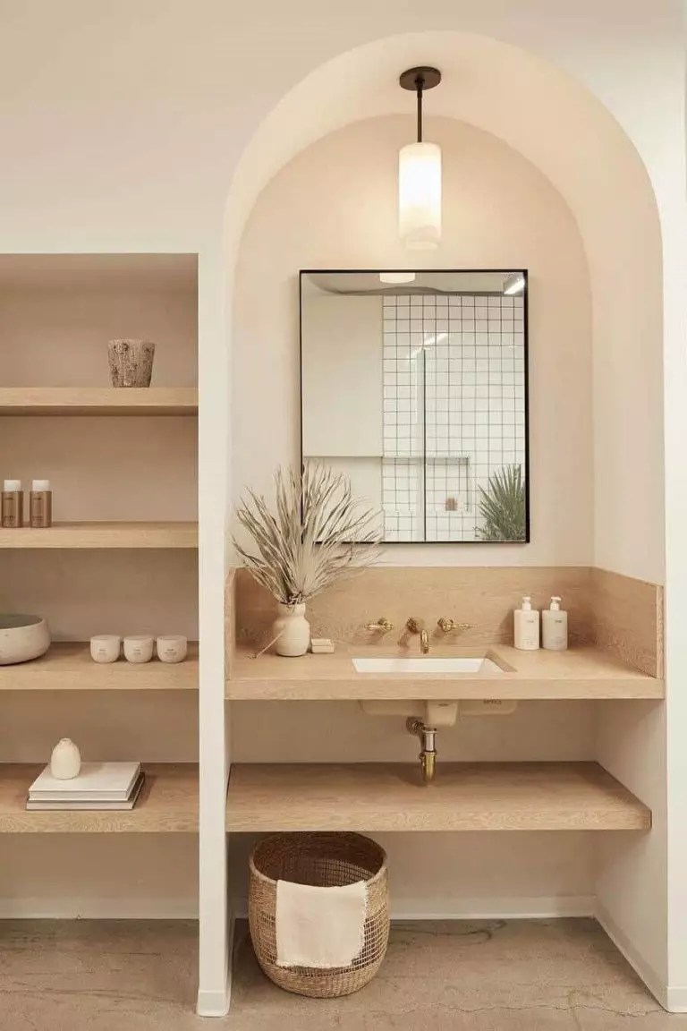
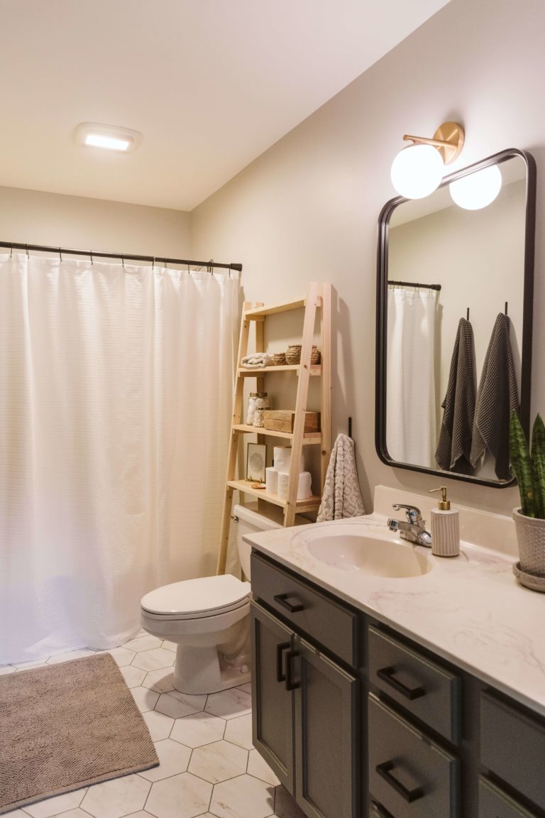
Bathroom
Bathrooms usually feel cold, and a splash of beige would perfectly balance and warm up the interior. Consider White Mocha for the walls and go with any approach. Maybe a bit of contrast with gold hardware or keep it low-key by not diluting the palette with additional shades. It is up to you. Still, White Mocha is enough to set a comfortable environment even within the bathroom.
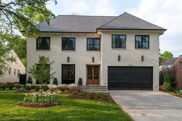
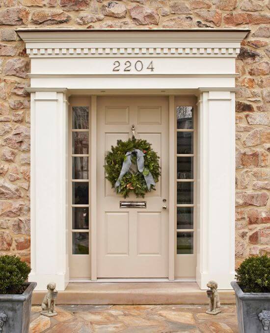
Use of White Mocha for house exterior
When applied to the house exterior, White Mocha loves a bit of contrast. Consider it for the walls and add black for the trim and front door. The once traditional paint color acquires a modern look and offers the exterior a stately appearance. White Mocha reveals a more intense variation and perfectly stands out even on light backgrounds for an inviting feel when it comes to the front door.
The White Mocha OR-W11 paint color from Behr is the new neutral that quickly enters the trends and promises to stay up-to-date for a long time. Don’t hesitate to be among the first ones to experience the love this shade radiates.
