Wild Wonder (Dulux): What Color Is, Review, and Use
The trusted paint manufacturer Dulux revealed its 2023 Color Forecast by bringing to our attention three conceptual palettes: Balance, Connect, and Revive. This kingdom of balance restoration, harmony with nature, and cheerful inspiration is led by nobody else but the show-stealing Color of the Year 2023 – Wild Wonder, which combines all mentioned characteristics.
When choosing the leading color this season, the creative team from Dulux considered the perspectives of the prominent voices in fashion, design, and science. Most agreed that the highest-in-demand color is one inspired by nature that helps us connect with ourselves and spread more positive energy, and this is how the light green-yellow began its journey to designers’ hearts. Its popularity spread worldwide, and experts cannot stop talking about it. Let’s see what professionals say about the new favorite paint color’s interior and exterior design potential!
Wild Wonder Paint Color Features
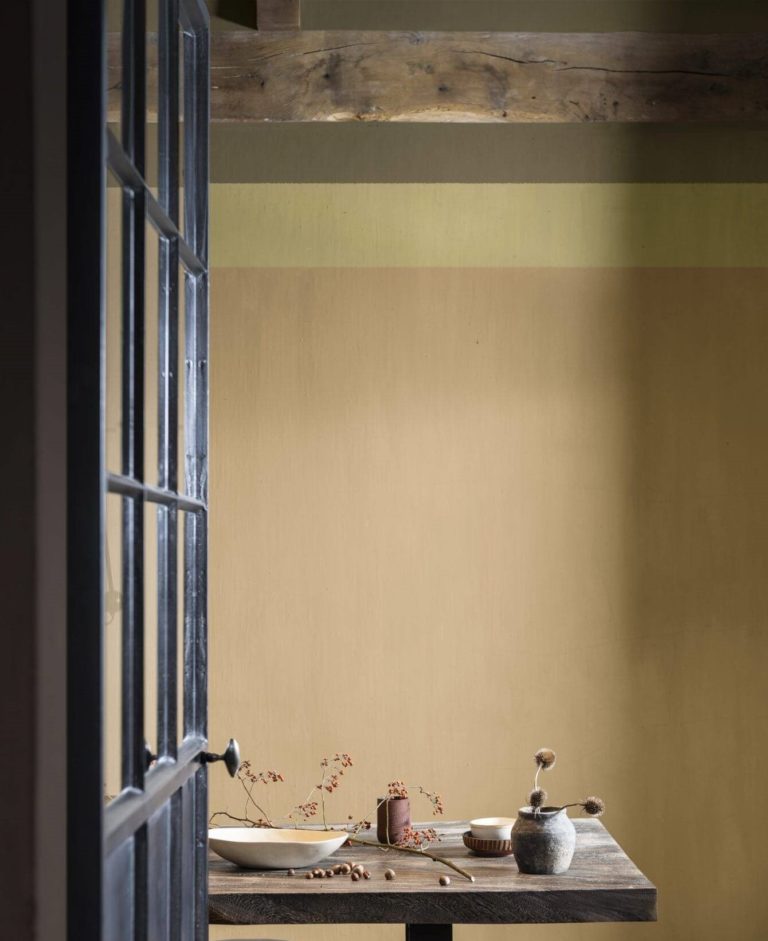
“It’s a really beautiful, premium color,” says Marianne Shillingford, the Creative Director at Dulux, and we cannot help but agree. Wild Wonder is a medium sun-kissed yellow-green that earned the colorists’ respect through its chameleon personality. You may see it as a light neutral yellow on the color sample, yet this paint color reads entirely differently under various lighting conditions (later on this). Experts firmly claim that it might have been a problem in the past but not now, when people are eager to experiment with unusual colors.
Let’s take it in small steps! Naturally speaking, Wild Wonder impersonates the prior-to-harvest wheat color, a bit ripe yellow, a bit young green, or, as the general color theme sounds – seeds of wonder. The name brings us to the central concept behind the summer-autumn shade of yellow, with “wild” for freedom and “wonder” for the endless opportunities to discover the world. Consequently, the golden green color resonates with a worry-free wander through a summertime field with unharvested wheat.
As for interior and exterior design, Wild Wonder perfectly adds a natural touch all by itself, ecologically inserts organic color, inspires sustainable products, and creates a feeling of warmth that lasts all year. Still, the primary feature that attracts homeowners is this paint color’s ability to meet their demand for a complete state of calmness and ensured well-being.
Wild Wonder: Is It Warm or Cold?
The concentration of blue in this yellow shade doesn’t compare with the amount of green and red that make this paint color an actual warm shade of sunny green. Even the formula of this color implies a few summertime ripe seeds that infuse endless comfort and a genuine sense of warmth.
How Does Lighting Affect Wild Wonder?
This is why designers fell in love with Wild Wonder so fast. It switches organically from one color to another simultaneously with the sun across the sky. Therefore, you don’t get one paint color but a collection of interconnected green-yellow shades that buy a new look for your room once in a few hours.
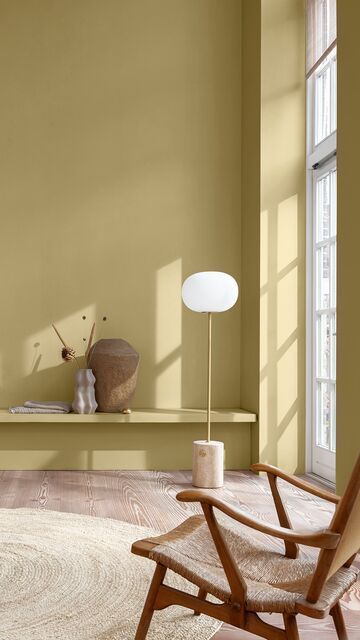
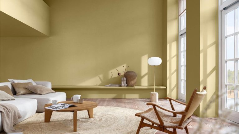
In the morning, when the first sun rays dare disturb the dawn-infused ambiance in your room, Wild Wonder will take on the golden green color of a ripe wheat field. The shy green hints will take the lead during lunchtime when the sun is high in the sky (the outdoor greenery plays quite a role here). Right after that, in the afternoon, a gorgeous shade of muted and soft green-yellow will delight your eyes.
Wild Wonder LRV
Note for newbies: the Light Reflectance Value has been long used to precisely determine how light or dark a color is. It relies on the percentage of reflected light. Wild Wonder has an LRV of almost 47 out of 100. It is undoubtedly a mid-tone paint color that acts very professional when it comes to light reflectance in a room, yet it better be used in well-lit spaces to reveal its entire potential in design.
Wild Wonder Undertones
Since colorists regard it as yellow rather than green, we will stick to this information. Therefore, Wild Wonder is a medium yellow tone with glowing green undertones. At times, you may notice a few hints of gray when the paint color appears muted, and even a few drops of gold sparkle when the color of the year gets sunbathed.
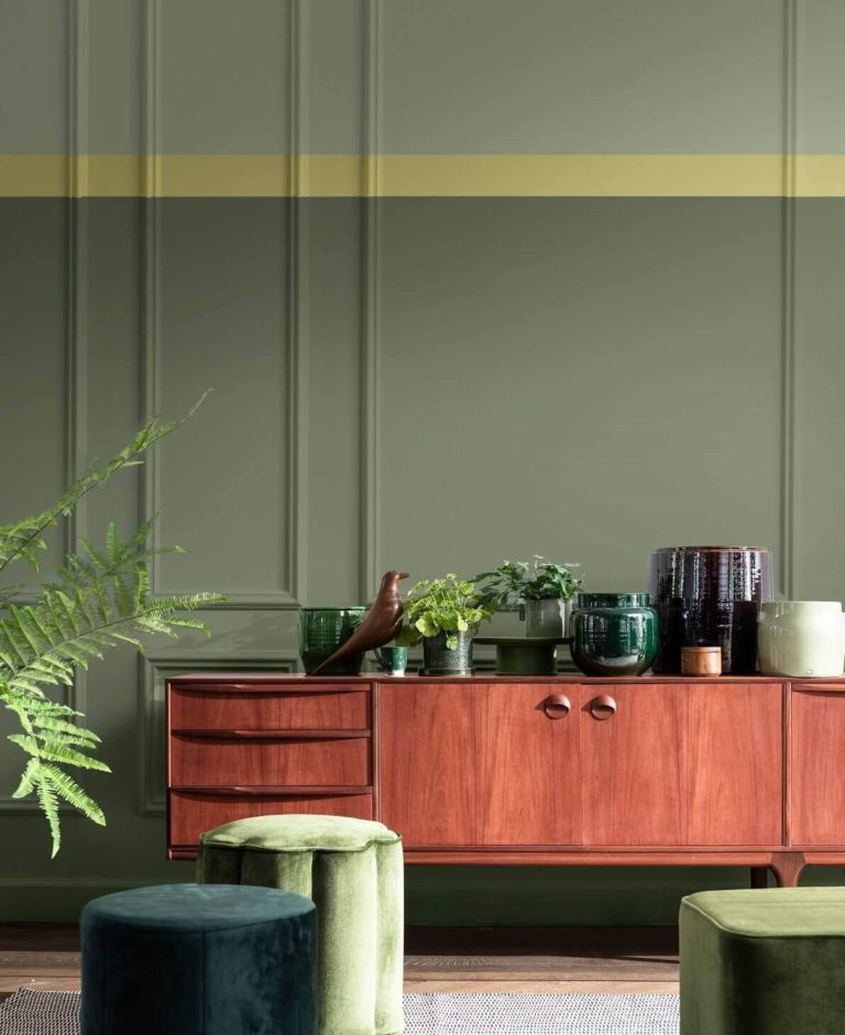
Similar Colors
Nothing can replace the authentic combination of green and yellow in Wild Wonder. Still, we managed to find a few close substitutes from other professional manufacturers. We warn you that their color sample resemblance doesn’t equal a perfectly identical result when put into practice.
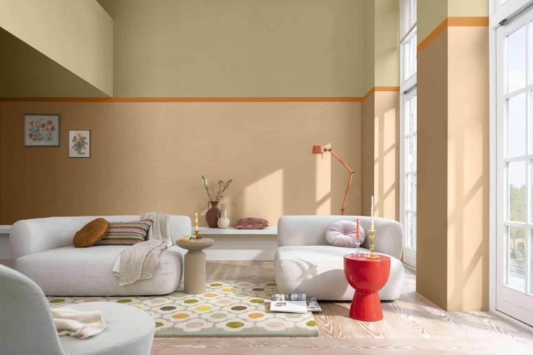
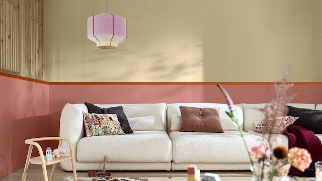
Coordinating Colors
Dulux’s color experts put at our disposal four color schemes that Wild Wonder can be part of. It shows how versatile and friendly this paint color is. Additionally, you have a wider choice of coordinating colors.
The palettes are as follows: Lush (healing and uplifting gray greens, soft blues, powdery lavenders, and stately mauves), Buzz (cheerful and energetic oranges, pinks, terracottas, and beiges), Raw (organic and warm browns, violets, grays, and beiges), and Flow (subtle and harmonious blues and grays). Check out Dulux’s official website for a deeper insight into these color palettes.
Generally, Wild Wonder pairs excellently with the following expert color choices from the same brand:
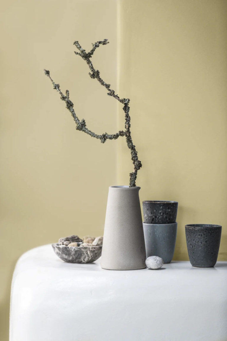
Use of Wild Wonder in Interior Design
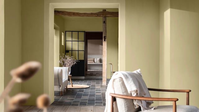
Most designers agree that the natural green-yellow color looks great on the living room or bedroom walls, bringing an effortless state of safety and connection with the outdoor world. Some see it as a perfect kitchen cabinet paint color due to its pure yet not clinical-clean appearance that adds freshness and update.
Like the wheat seeds, Wild Wonder represents the color of renewal and hope in today’s uncertain times. Therefore, it will undoubtedly find its way to any room in your house that requires the slightest feeling of a new beginning. Let’s see what designers have prepared for us this time!
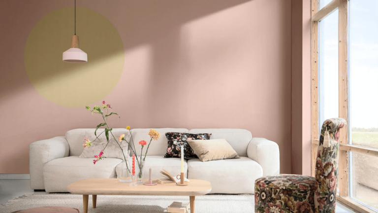
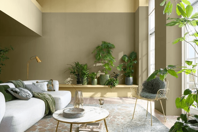
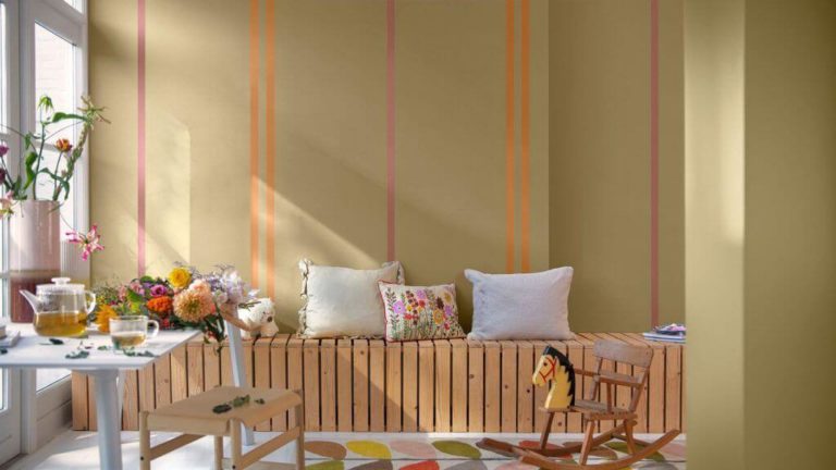
Bring the Magic into Your Lounge Area
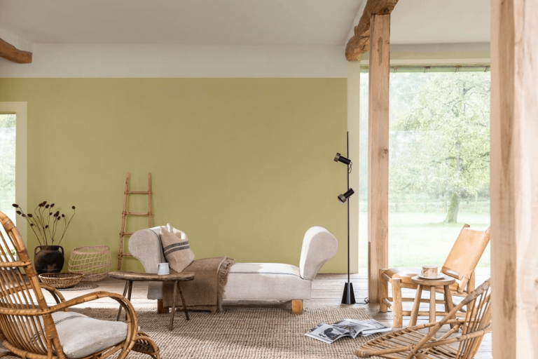
Enjoy your weekend sole relaxation or family gatherings in a sunkissed living room, even when the sky is cloudy. Use Wild Wonder to fully or partially paint the walls or ceiling in the company of natural and organic textures or brighter pops of color.
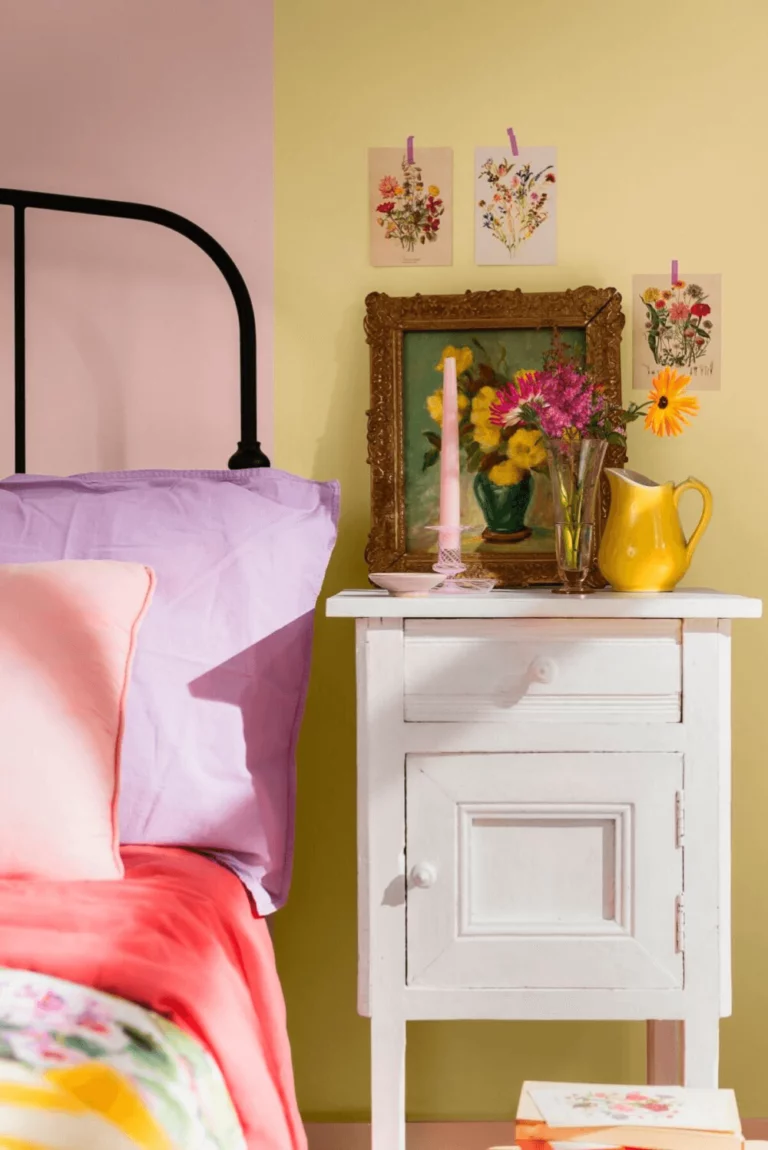
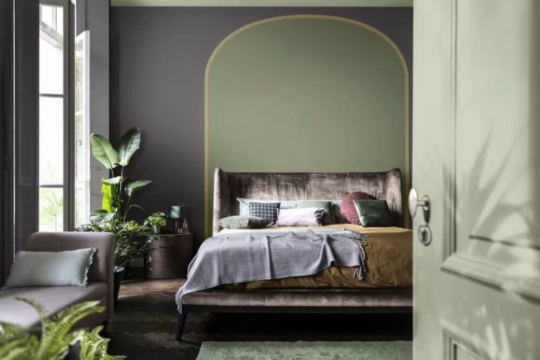
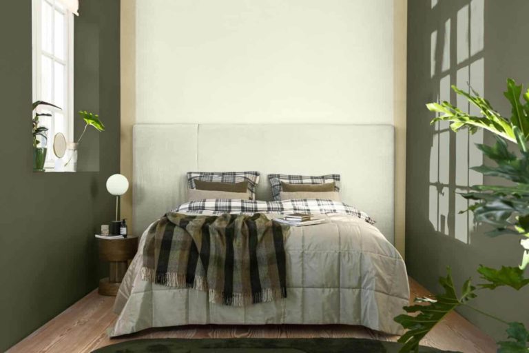
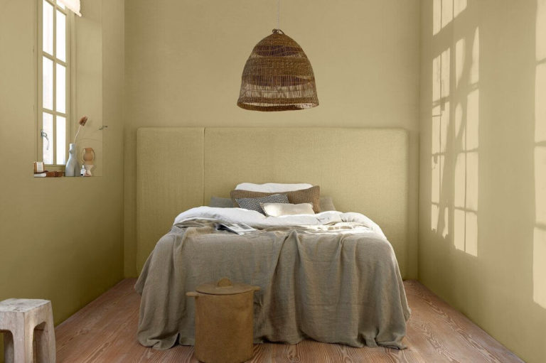
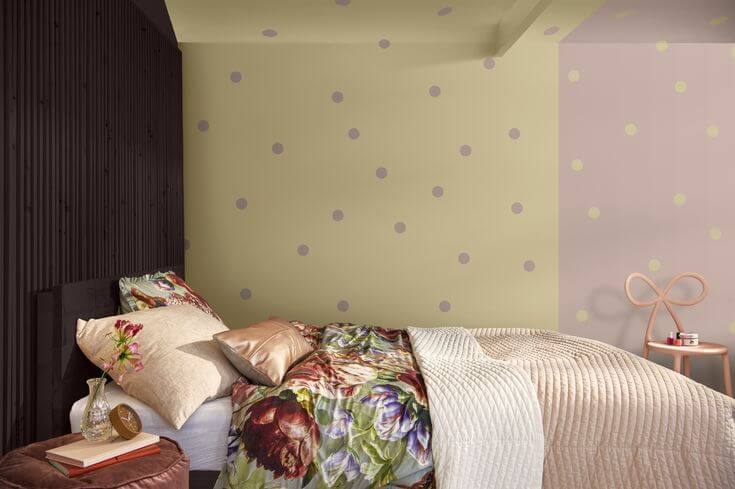
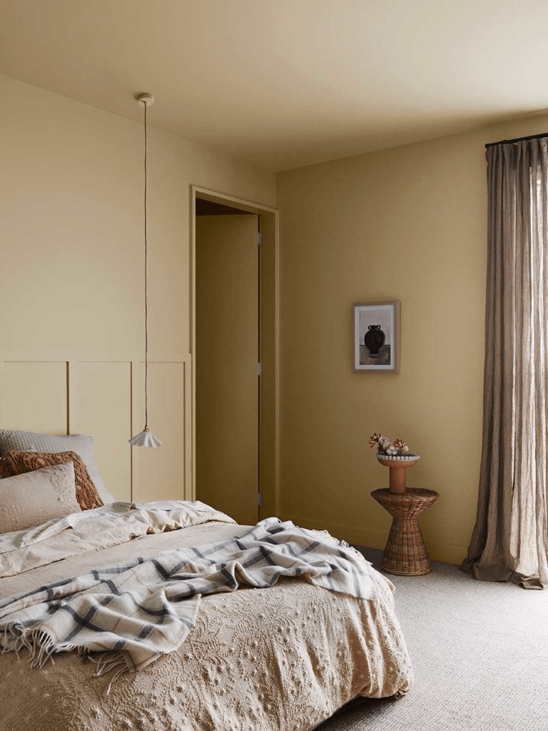
Personalize Your Bedroom
Feel free to explore your true colors by rediscovering your personality with a versatile and inspiring paint color. Paint all walls golden green or choose customized accents paired with neutral or juicy shades with the same origin – nature.
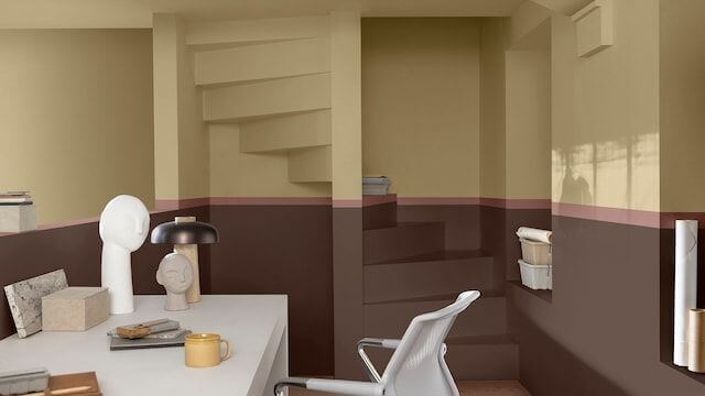
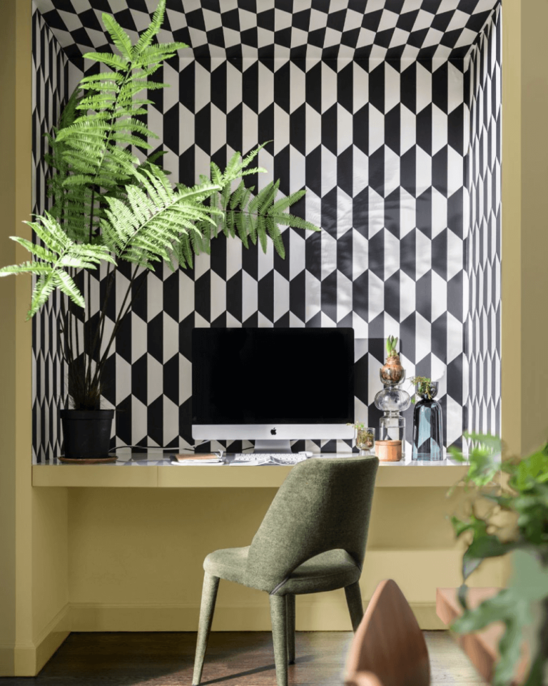
A Healthy Home Office
Create a home office to develop your personality, get the work done, and let yourself be driven by inspiration for a healthy relationship with your inner self. Use Wild Wonder paired with natural materials, monochromatic palettes, or contrastive color schemes.
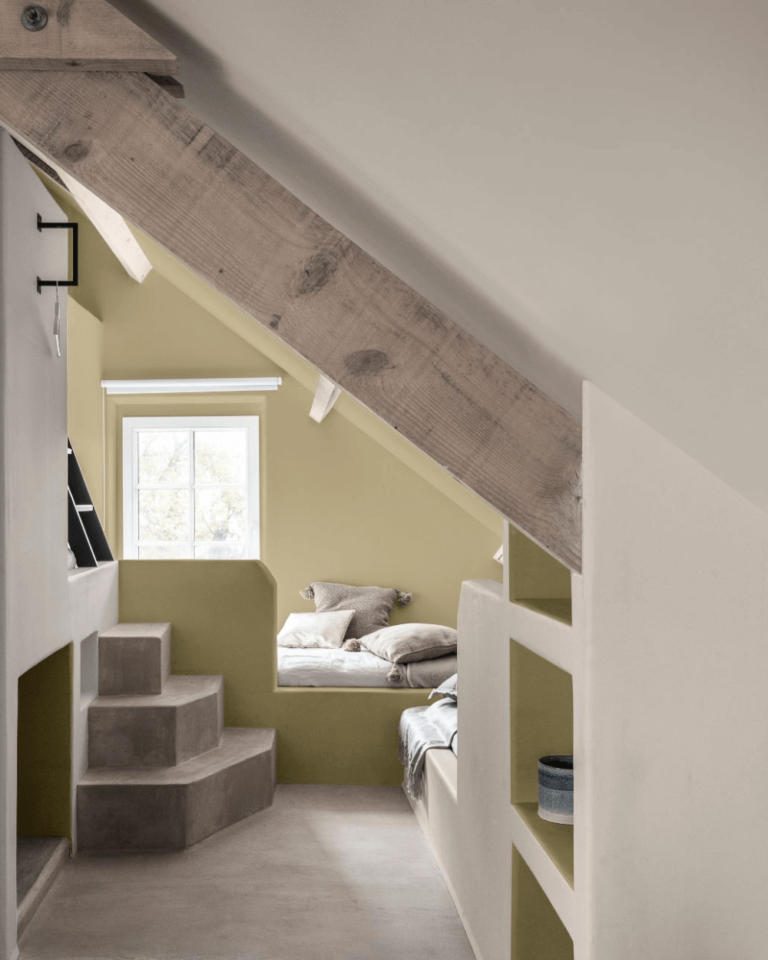
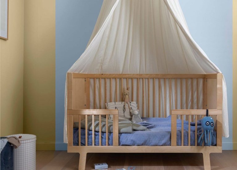
Kids Room
Offer your children the possibility to explore the world from a young age. Induce the love for nature through the magical Wild Wonder. This color thrives in a nursery and acts timelessly in a grown-up child’s room.
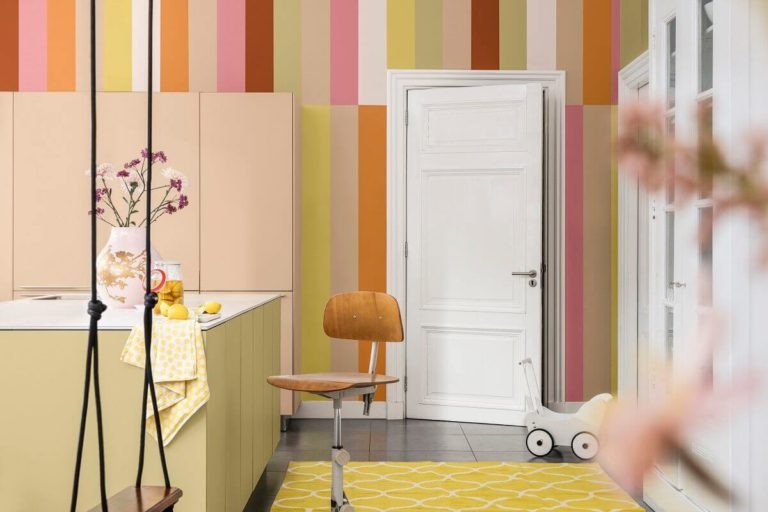
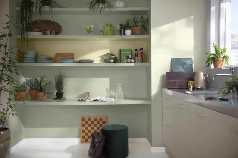
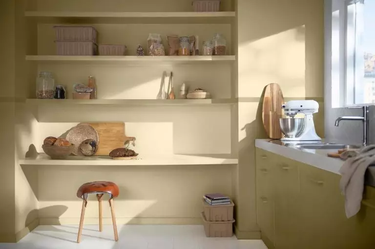
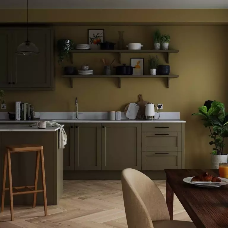
Kitchen and Dining Room
Combine Wild Wonder with green or wood textures to create a warm and welcoming cooking space year-round. Stick to the same pairing with wood furniture in the dining room and be ready for lots of impressive comments from your guests.
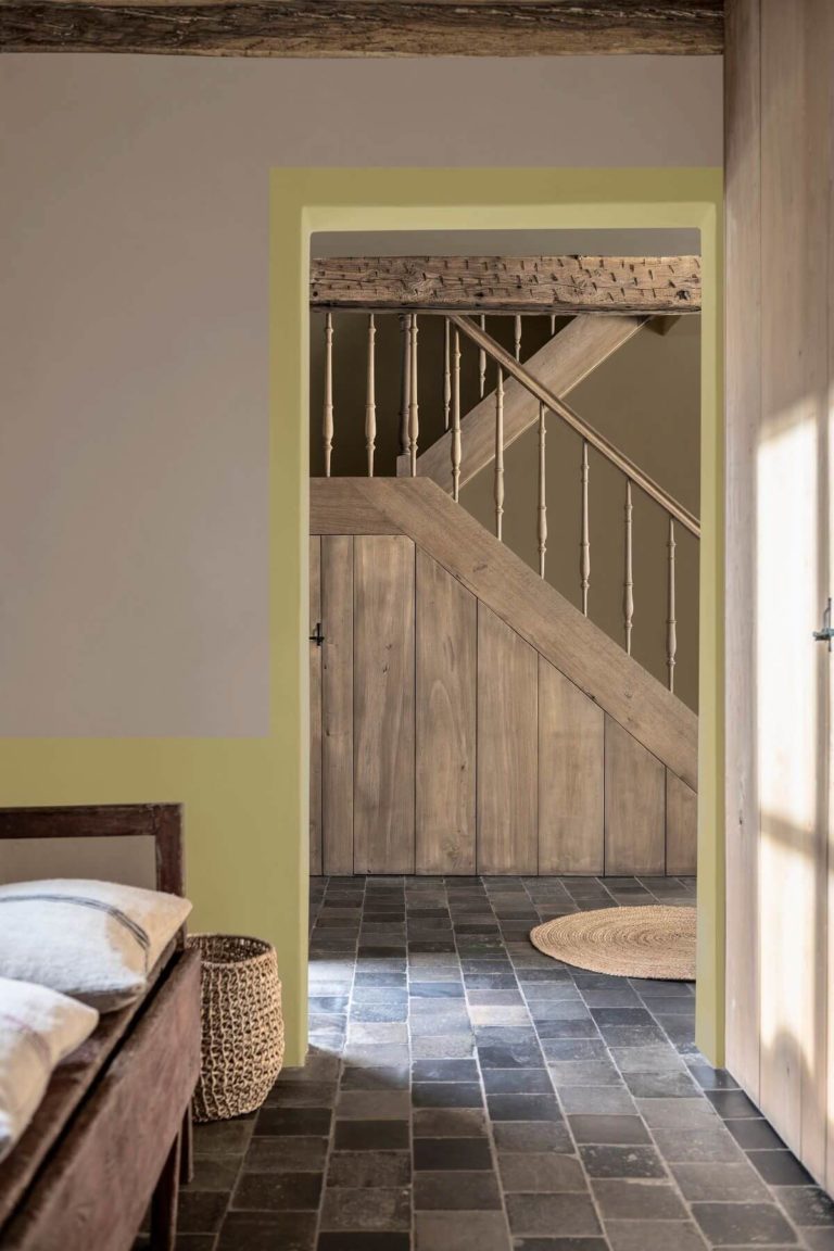
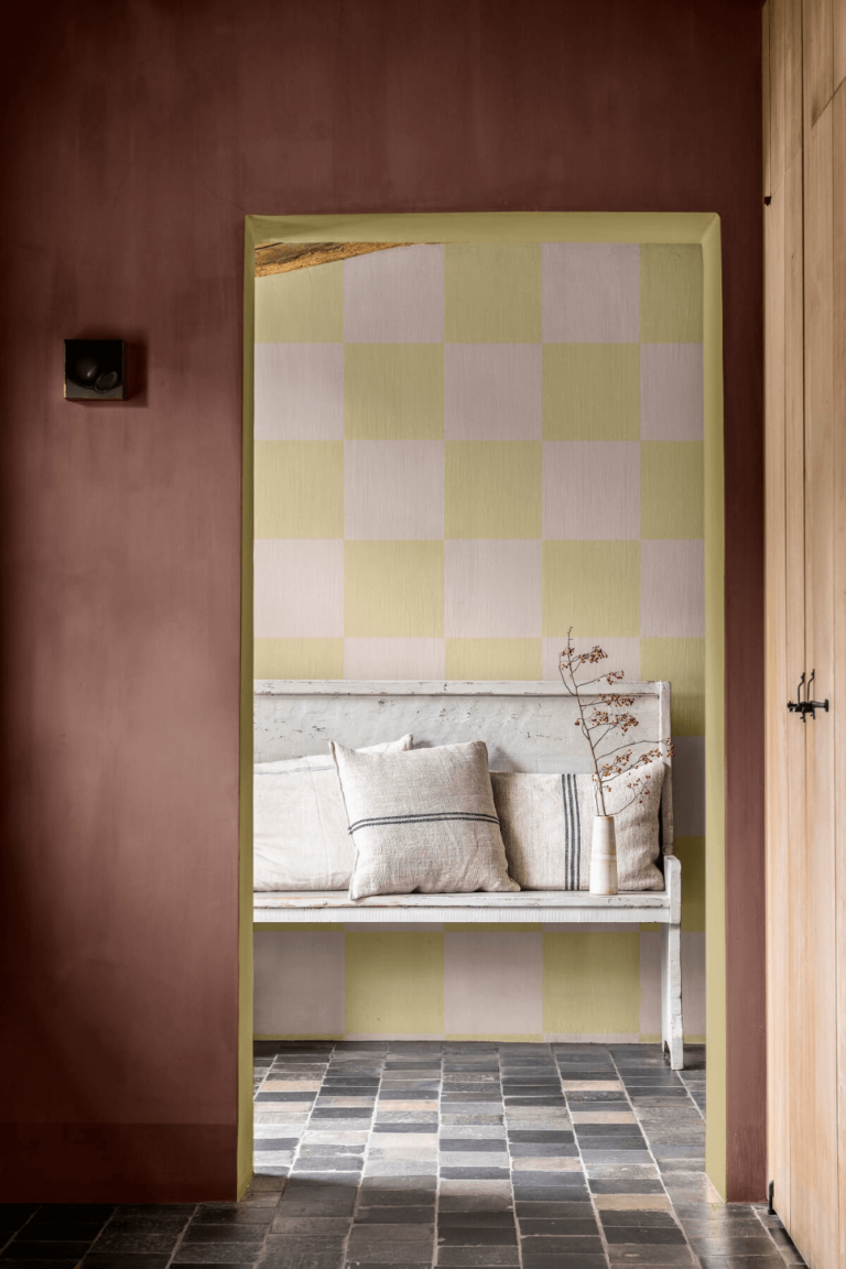
Hallway
Set the right mood right from the entryway. Decorate the hallway walls with this bright paint color and witness the redefinition of your interior design. Every coming home will be associated with a feeling of familiar comfort.
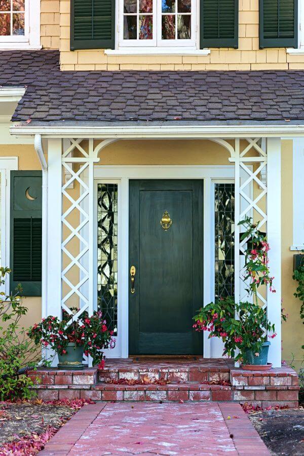
Use of Wild Wonder for House Exterior
Dulux’s professionals emphasize the use of Wild Wonder in interior design mainly because you can predict its variation that changes during the day. When outdoors, Wild Wonder depends entirely on natural lighting. Since the weather is not always predictable, you may end up with an unwanted color for your exterior.
Still, don’t hesitate to try it if you live in a constantly warm location. The warm sun rays will make the most of this unique paint color. Note that Wild Wonder pairs harmoniously with green.

The Wild Wonder paint color by Dulux is a positive and organic greenish yellow that evokes natural beauty untouched by people as if the colorists carefully borrowed it from the raw outdoor world and turned it into one of the greatest paint colors that will not leave the stage soon.
