Worldly Gray SW 7043
Sherwin-WilliamsSW 7043 is a unique middle tone greige shade. Worldly Gray features a prevalence of gray notes diluted with a few splashes of beige.
Worldly Gray (SW 7043): what color is, review, and use
Greige has become a popular term among designers lately. This color variation is nothing else but a mix of gray and beige, although the complex base of this neutral that pairs softness with coolness is fascinating. One of the top 50 colors at Sherwin-Williams is a prominent representative of the kind: Worldly Gray SW 7043. Although regarded as part of the gray category, one cannot simply skip the welcoming beige notes.
The fabulous gray paint color stands among the all-time favorites Repose Gray and Agreeable Gray from the same brand. Although you have probably not heard of Worldly Gray as often, it is surely a go-to paint color that keeps pace with its counterparts. Furthermore, it has lots of features to impress you with, which go far beyond the limits of a simple neutral shade. What would these be? Let’s find out!
Worldly Gray paint color features
SW 7043 is a unique middle tone greige shade. You have probably read this a lot of times in our articles, and every time it was right. Regardless of how many greige shades, each comes with something new. Worldly Gray features a prevalence of gray notes diluted with a few splashes of beige. Although part of the mid-tone group of colors, it looks light, while the perfect mix of gray and beige serves as a perfect backdrop. This paint color feels exceptionally soft and calm despite the intense gray base.
Worldly Gray: is it warm or cold?
There is no doubt that Worldly Gray is a warm shade. Let’s put it this way: it radiates a soft sense of warmth that instantly feels familiar. Even the same gray notes, which bring a slight coolish feel, seem soft. We wonder how a paint color prevailed by gray feels rather soft than cool. Well, this is the magic the beige notes are playing on the overall appearance.
How does lighting affect Worldly Gray?
We are all familiar with the fact that lighting is the one defining the entire fairytale. In this case, this aspect is particularly perceived. As usual, we look at both sides of the coin. Worldly Gray appears cooler in rooms with north-facing windows, showing why it is part of the gray category. At the same time, in south-facing spaces, this paint color reaches the softest level possible. Furthermore, it looks much lighter, refreshing the room yet not skipping the exceptionally warm feel. Somewhere between the mentioned variations hides a balance that reveals itself in spaces with eastern and western exposure.
Worldly Gray LRV
A bit of clarity: Light Reflectance Value determines how light or dark a color is on a scale from 0 to 100. In this case, we have a value of 57. Considering that 100 stands for true shades of white, we can safely state that Worldly Gray is a medium shade gravitating towards the light side. It has a slightly muted base, although an appropriate amount of light can bring out the best in this paint color in terms of light reflection. Furthermore, one can even notice a slight expansion of the space borders, all due to the reflection abilities of Worldly Gray.
This is when we should mention that SW 7043 is a skilled representative of the chameleon category, taking on slight notes of the neighboring colors and changing its appearance according to lighting conditions.
Worldly Gray undertones
In the same light of ideas that we finished the previous section with, we want to mention that Worldly Gray has hidden green and purple undertones that show themselves only under particular conditions, considering the lighting, neighboring colors, room elements, and decor. This is when we realize that SW 7043 has many faces and reveals each of them differently, which is why you should experiment with a sample in your interior and make sure the result fits your preference. Still, we would like to say that such a wide range of variations is rather a source for various design possibilities.
Similar colors
Not to our surprise, the new greige variation is not one of a kind. A vast range of shades perfectly resonate with its nature and even show identical features. We usually go beyond the given manufacturer’s borders for a larger perspective on the variation, and this is what we will do now. Let’s see what alternatives there are!
Coordinating colors
Undoubtedly, you can be the author of unique color combinations with Worldly Gray and fill your space with originality since this neutral works with almost any shade. Still, there are a few paint colors recommended by designers as best to pair with SW 7043. If you want to go with a no-fail option, you should definitely consider one of the following variations:
Use of Worldly Gray in interior
The versatility of Worldly Gray explains why it is a go-to paint color for any space and style. Would you like to stick to the traditional approaches or embrace the contemporary flair? SW 7043 is there for you. Are you looking for a perfect background to display your wildest design solutions or neutral paint color to preserve the monochromatic palette? Here we go again with Worldly Gray. The list can go on and on. Let’s get specific with real design solutions that imply using this paint color!
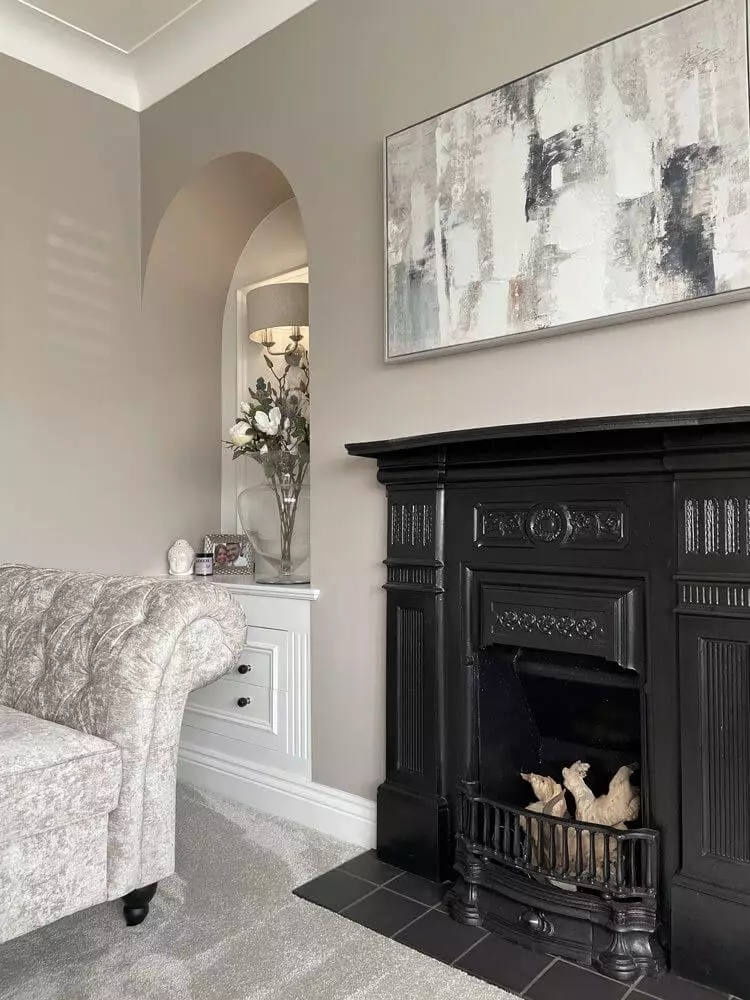
Traditional finesse
Don’t you dare skip Worldly Gray if you plan a makeover for your traditional interior! Whether true traditional variations or a modern approach to the classic features, SW 7043 is perfect for emphasizing the welcoming feel of traditional interiors, adding a bit of sophistication to them. Whether you paint the walls in the living, the kitchen cabinets, or the trim in the hall, the beautiful gray variation from SW is ready to help you and offer your interior an effect you have never dreamt of. The classic pieces of furniture, irreplaceable fireplace, lots of wood splashes, and rich texture are your true companions.
Modern approach
Do contemporary features feel closer to you? Go with a modern approach to design by integrating Worldly Gray as a background. For a start, consider a monochromatic palette, functional layout, and natural texture if possible for a sleek yet comfy arrangement. The greige paint color is enough to set the right environment and make the space feel both welcoming and modern. Don’t hesitate to enrich your interior with bold splashes of decor if you want to make a retro throwback or an Art Deco statement for an extra splash of energy. In this case, Worldly Gray will expose its most neutral appearance and happily emphasize the accents.
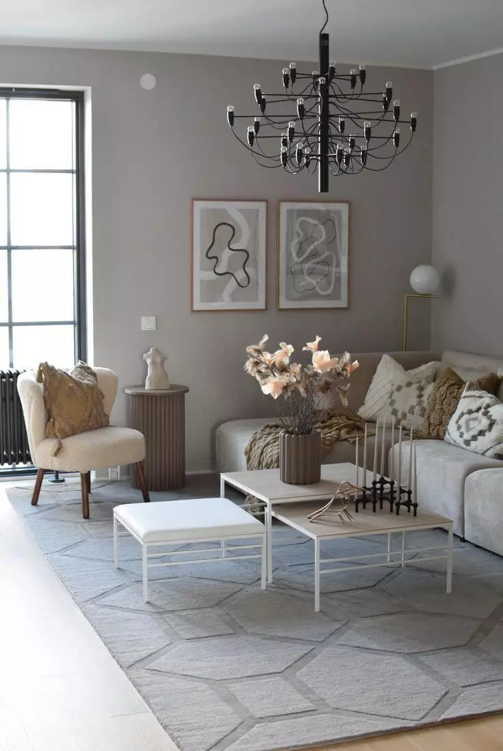
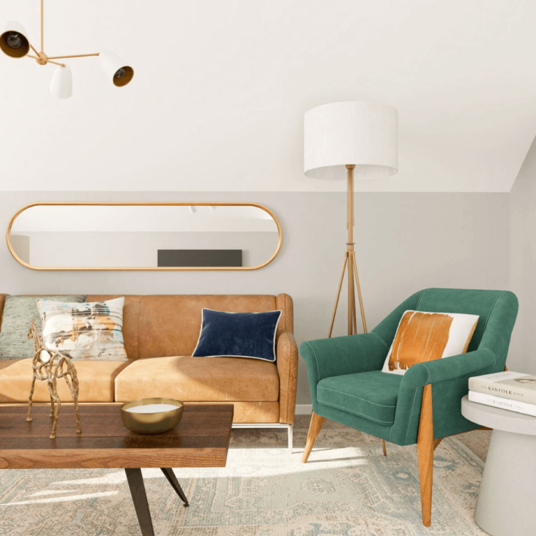
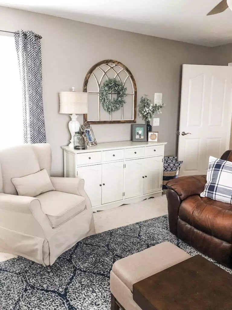
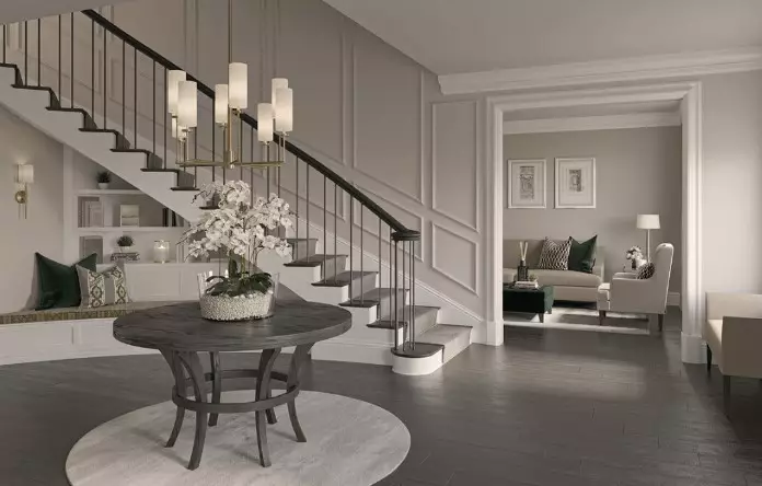
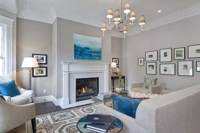
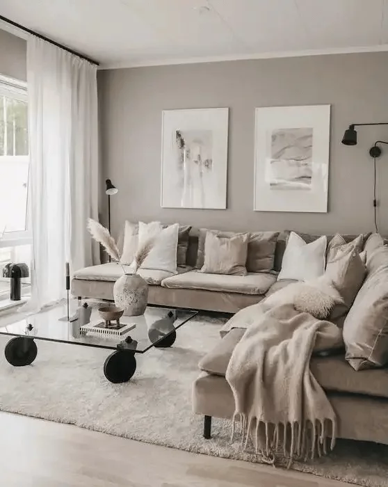
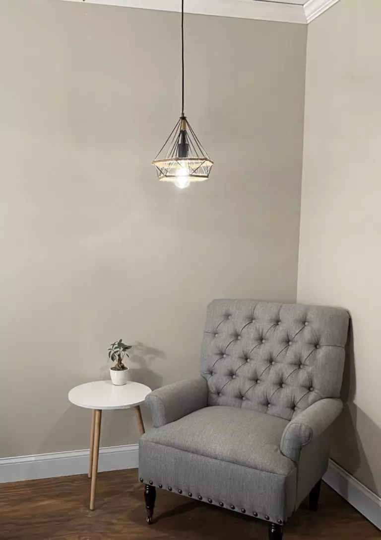
Living room
The best way you could benefit from the soft touch of Worldly Gray is by considering it within a monochromatic interior, letting the warm notes spread all over the space while the neutral background keeps pace with the other shades for a sleek contemporary feel. Enhance the soft effect with curved furniture and take your living room to the next level. Still, a few bolder accents here and there would not spoil the picture, such as soothing blue textiles or pots with greeneries.
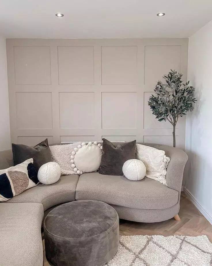
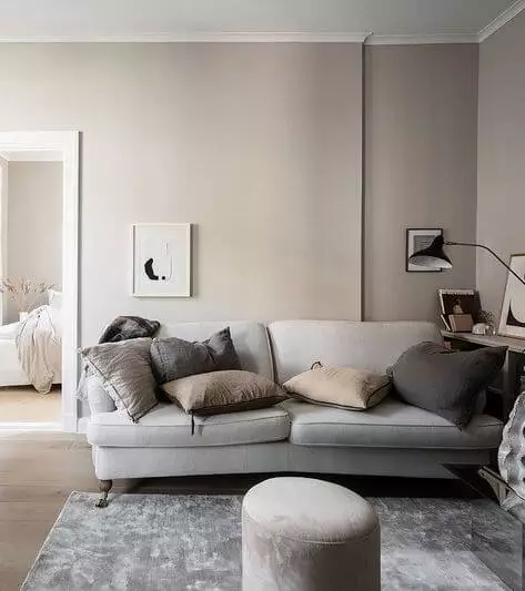
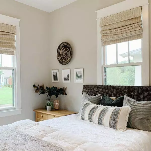
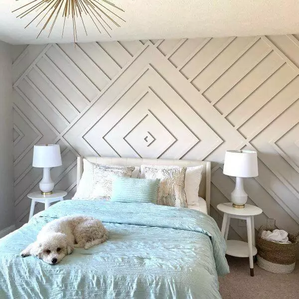
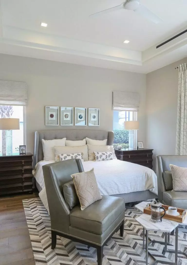
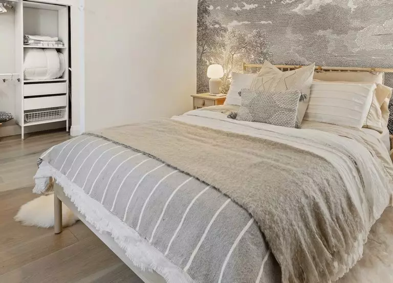
Bedroom
The balanced shade of greige goes for the walls, particularly if we speak about wall paneling so that the color can reveal its full potential. Next comes texture with light wood for a modern approach and dark for a rather classic interior. The background color is soft itself, although additional splashes of comfort would not spoil the result, considering particularly fluffy textiles. Keep it smooth or add contrast, depending on your comfort level. Either way, the inviting sense this space will radiate will make you feel at ease.
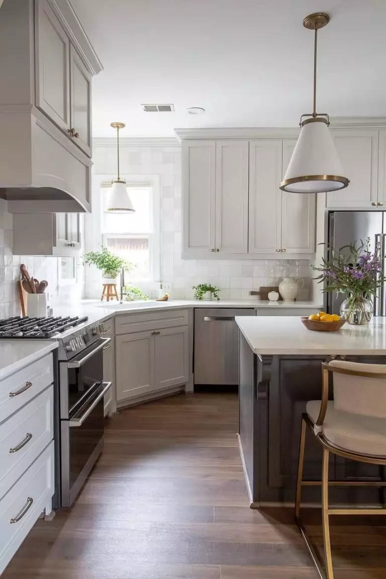
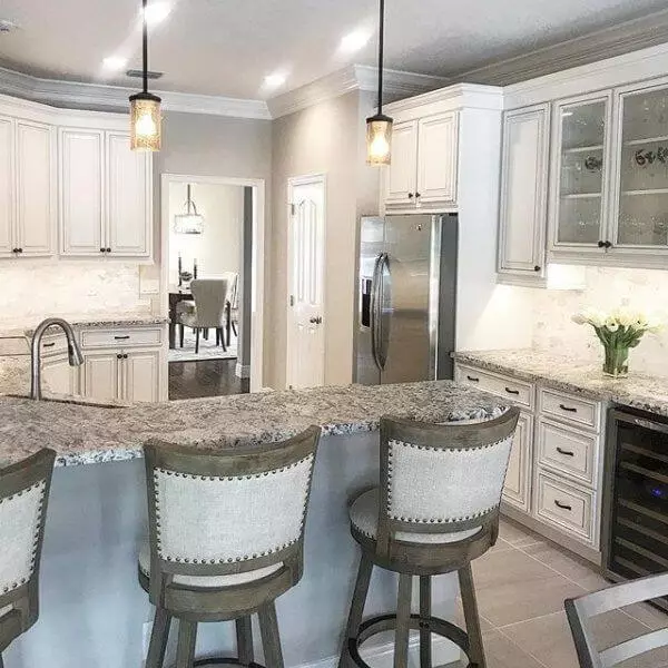
Kitchen and dining room
Worldly Gray under artificial lighting and the same paint color under natural light feel like two different shades. Add a few pots with greeneries, and the scenario will change even more. This makes the greige shade from SW versatile and adaptable to various design solutions. Consider it for the walls paired with white kitchen cabinets for a traditional interior, or paint the kitchen cabinets themselves in this greige variation, combining them with navy blue lower cabinets, a marble countertop, and a light background for a modern approach to elegance.
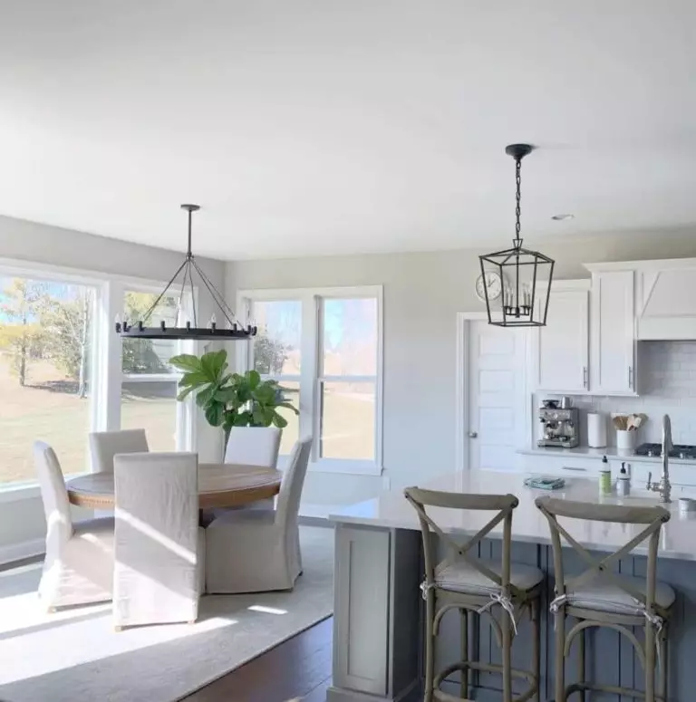
As for the dining space, go safely with Worldly Gray for the walls and complement them with wood variations that fit your style for a comfy, stylish, contemporary, and no less authentic interior that you enjoy taking your meal in.
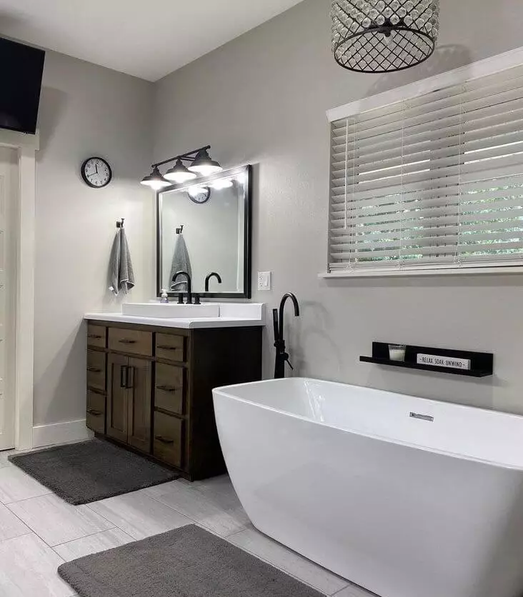
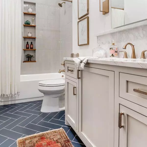
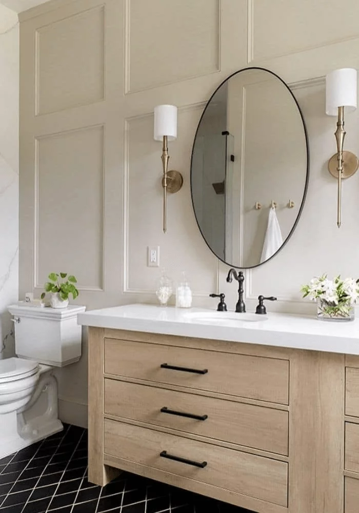
Bathroom
Worldly Gray for the walls and black accents for a contrastive pairing, additional splashes of navy blue and brass for an elegant approach, or light wood to enhance the soft effect – consider one of these options and go on with lighting undertones that suit your mood. Opt for cool lighting for a contemporary feel or warm lighting to add comfort. Either way, try to ensure an appropriate amount of light so that the space does not feel draining.
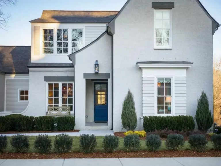
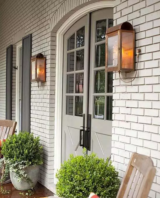
Use of Worldly Gray for house exterior
Just take a look at the following picture with a house exterior painted in Worldly Gray, and you will instantly notice how light this paint color appears under natural lighting. Such an appearance can be witnessed at sunrise or sunset that brings a slightly bluish effect, warming up the color where the sun touches it. A true chameleon! SW 7043 works with wood, brick, and stone surfaces, which offer you a wide range of possibilities. Don’t hesitate to paint your front door in this shade on a light background, which can also be of any texture.
The Worldly Gray SW 7043 paint color from Sherwin-Williams is the less known greige shade designers only keep for themselves, which is not without reason. Who would reveal a secret tool that can take your interior and exterior to the next level?
