Yarmouth Blue HC-150
Benjamin MooreUndoubtedly bright, impressively full of depth, and relaxing; it sounds like the recipe for a perfect pastel color.
Yarmouth Blue HC-150 (Benjamin Moore): what color is, review, and use
Clear as the sky when the morning stars already miss the moon, refreshing as the cool ocean breeze, enchanting as the crispy surface of a frozen lake, the list can go on and on. Quite intriguing properties are hidden behind the fantastic pastel shade Yarmouth Blue from Benjamin Moore. Is it inspired by the seaport on the eastern coast of England that bears the same name? We would not doubt it since this shade perfectly fits the vibe of a port environment.
One thing we can tell for sure: Yarmouth Blue, together with other shades, among which the unforgettable Heritage Red that we analyzed in our previous article, is part of a wide collection of 191 colors, whose beauty was revealed in 1976 at the celebration of the US bicentennial. Inspired by historical landmarks, penetrated by national values and traditions, this astonishing shade of blue, which impresses with its beauty and calming features, has a lot in store for us. Suitable both for traditional and contemporary spaces, the range of possibilities is wide. Let’s discover this color little by little!
Yarmouth Blue paint color features
We cannot step further without mentioning that Yarmouth Blue, together with other colors from this Historical Collection, is softer and muted in contrast with other shades from the same company. Undoubtedly bright, impressively full of depth, and relaxing; it sounds like the recipe for a perfect pastel color. This fabulous hue from Benjamin Moore does not look washed out nor extremely bright. One would say it is pure coincidence. We say it is all about balance.
This shade of blue is cool enough to refresh the space and fill it with an airy effect. Nevertheless, its bluish and grayish notes add a slight touch of color. It is a surprisingly balanced combination that manages to expand the space while staying within limits.
Yarmouth Blue: is it warm or cold?
A single glance at this color, and you will instantly understand that it belongs to cold shades. Nevertheless, its calming blue basis cannot allow calling Yarmouth Blue cold at all but rather cool. This is why such shade is welcome in regions with hot climates. At the same time, a coastal view on the other side of the window is as much suitable for a space painted in this pastel shade of blue.
How does lighting affect Yarmouth Blue?
At times astonishingly bright, at others more neutral than ever, Yarmouth Blue will trick you into believing what it wants you to. Nevertheless, the answer behind this mystery is lighting. Let’s start with the fact that this shade has a brightness of 74.9%, which means that it is light enough to brighten the space even under the influence of a small amount of light. However, the more natural or artificial light there is, the brighter and larger the space will appear. Once it gets darker, this versatile shade will acquire a whole new appearance. The blue and gray notes will seem more emphasized, although the color will not lose its muted effect.
Yarmouth Blue LRV
The LRV light reflectance for Yarmouth Blue from Benjamin Moore is high, reaching a value of 56.2. It proves our earlier statement as regards the influence of light on this color and the belonging of the latter to the middle tones group. That’s right! It can substantially expand the space and even brighten it at an acceptable level, although all this is possible with enough light.
Yarmouth Blue undertones
As mentioned earlier, this extremely interesting shade comprises gray undertones that balance the bright blue effect and ensure the muted cover. A grayish-blue for some and a bluish-gray for others, although the name points out clearly the right answer. Blue is responsible for the richness of color, while gray keeps it muted, neutral, and calming. The result is a refined and elegant color that can adapt to particular settings and make the most of the simplest designs.
Similar colors
The variety of shades with a similar effect is hardly surprising for lovers of neutrals, including blue and gray scents in particular. Both Benjamin Moore and other paint manufacturers are ready to impress us with their palettes in this sense. We cannot doubt their uniqueness, although it is better to be informed about other possibilities as well. Let’s discover them!
Coordinating colors
It seems that we can include Yarmouth Blue without any doubt into the category of neutrals. Nevertheless, its bright blue notes have something else to say when it comes to finding perfect pairings. From such a perspective, this shade of blue is perceived as a muted hue that still brings rich bluish notes to the surface. This is why other neutral colors should be considered for combination. The only variation you can opt for is to choose between a warmer and a cooler environment. Furthermore, the palette offered in this sense by Benjamin Moore is right on point that you don’t even need to go further. Let’s find out the best available options!
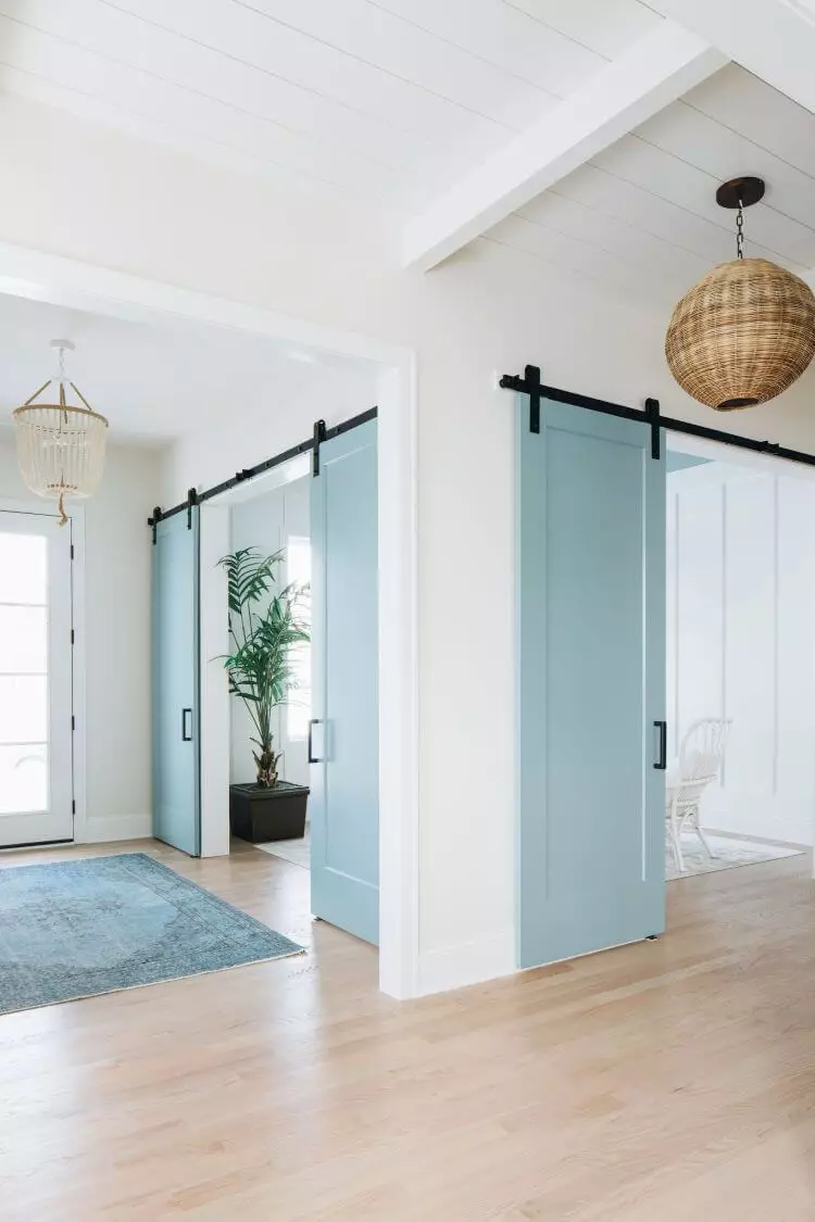
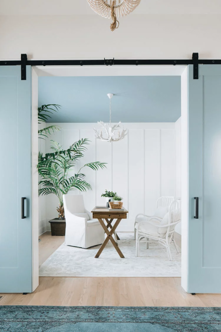
The use of Yarmouth Blue in interior
Although we have already mentioned the best coordinating colors that perfectly suit this shade, the range of possibilities is wide enough to cover all your preferences. The most important thing is finding a balance and ensuring the appropriate amount of light. An amazing crisp effect can be achieved by pairing Yarmouth Blue with white woodwork or simply opting for an off-white companion, such as Cloud White from the same manufacturer. The further we go, the softer it gets. Beige and all its variations are ready to accompany our beloved shade of blue at their fullest. Even a few sparkles of brass or copper in combination with Yarmouth Blue will make a space feel like a fairytale. We encourage you to discover with us how you can successfully work with this shade in interior design.
Throw a new light on coastal style
The refreshing coastal style amazes with its irreplaceable ability to fill the space with the breeziness of the beach. Soft tones, natural light, and a slick aesthetic look are all standards to be met for an environment alike. What would you say about summer all year round? One of our favorite shades of blue is ready to help you with that. Furthermore, you can opt for large quantities of this color only, and your room will instantly acquire the wanted look. You will be impressed to find out the large range of possibilities we have prepared for you. Consider Yarmouth Blue for:
Consider one or some of these approaches, don’t forget about a neutral background, add a few accents, and you will be able to enjoy an original coastal interior all year round.
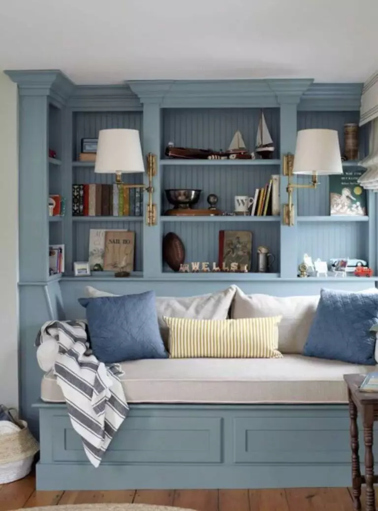
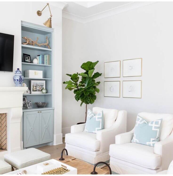
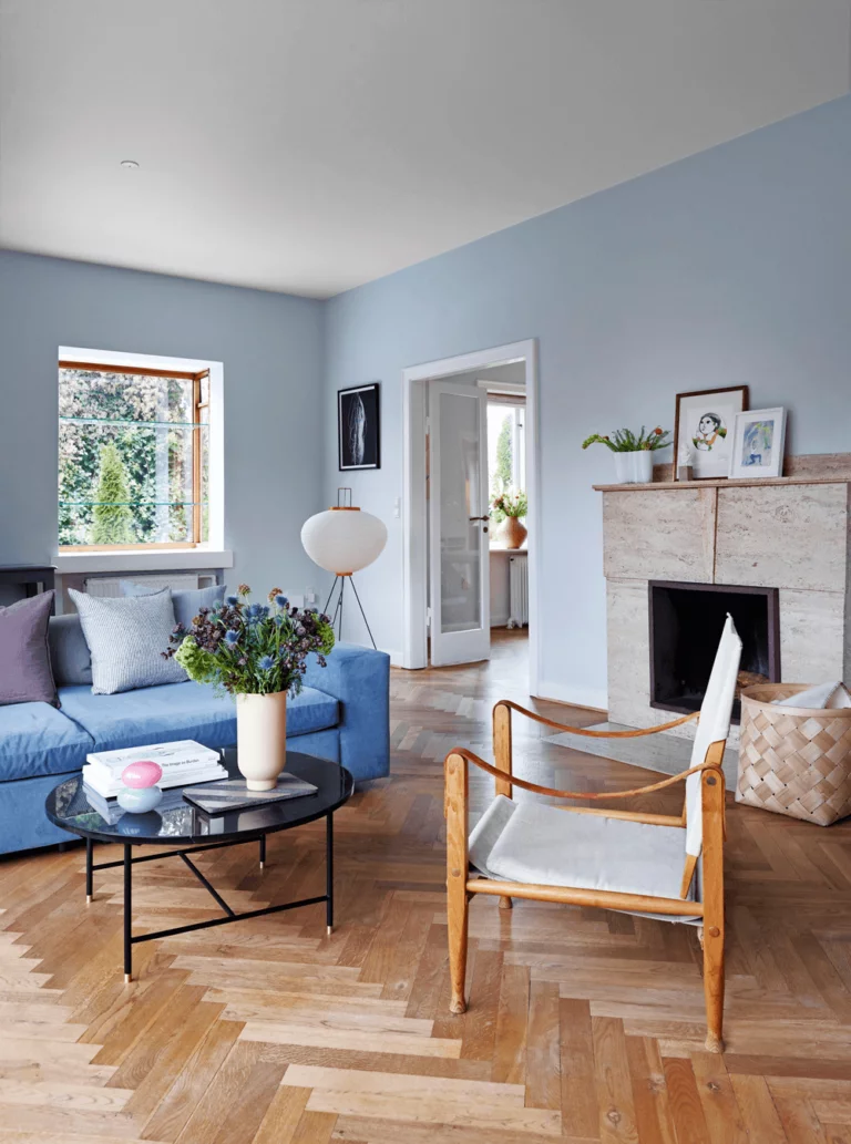
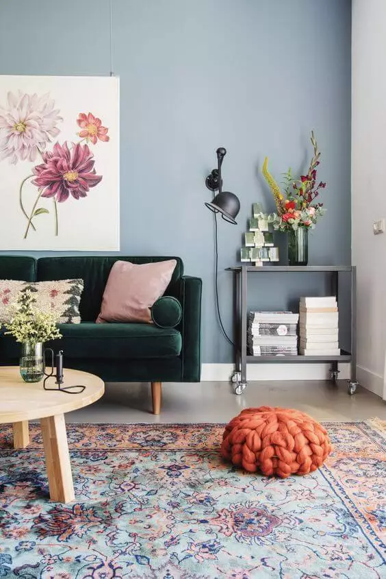
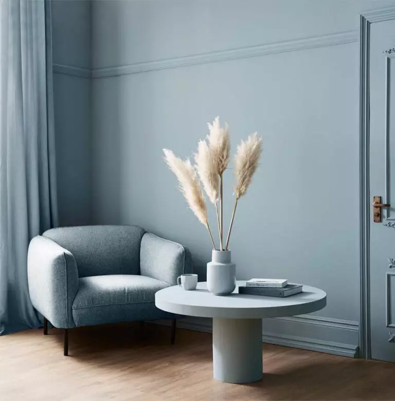
Living room
The best integration of this color in the living is considering Yarmouth Blue for walls. It is muted enough to be used for all walls, although an accent one is also suitable. Such a cool shade requires a little bit of warmth, and wood flooring is here to solve the problem, particularly lighter shades of wood. A sofa in a darker blue shade or soothing green, a few pots with plants, and original photo frames on the wall are all you need to complete the picture of a comfy yet perfectly splendid living. Do you know what style would also benefit from walls painted in this color? The seemingly conservative yet surprisingly contemporary Neoclassical style. Enrich the space with a fabulous chandelier and spread the sparkles of elegance all around the place. That’s not it! A Yarmouth Blue background and a few elements of brass will interpret the vintage values at their finest.
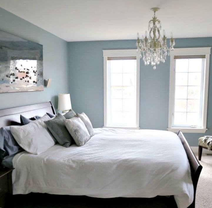
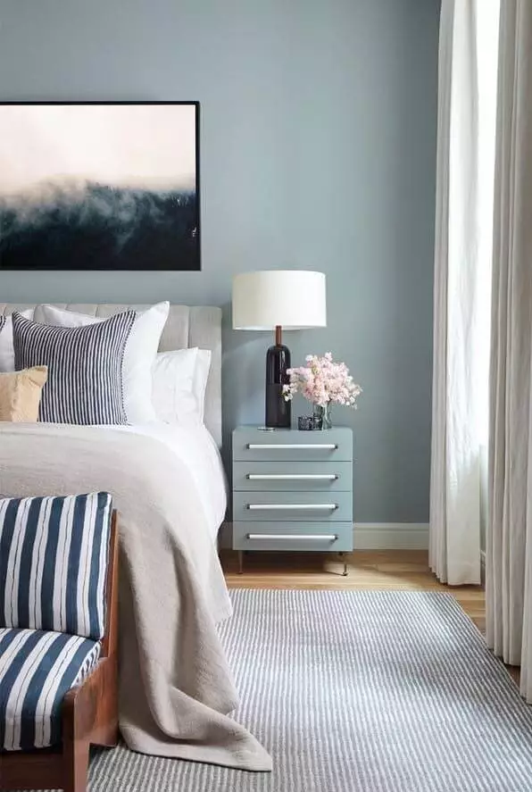
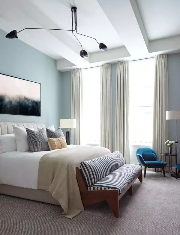
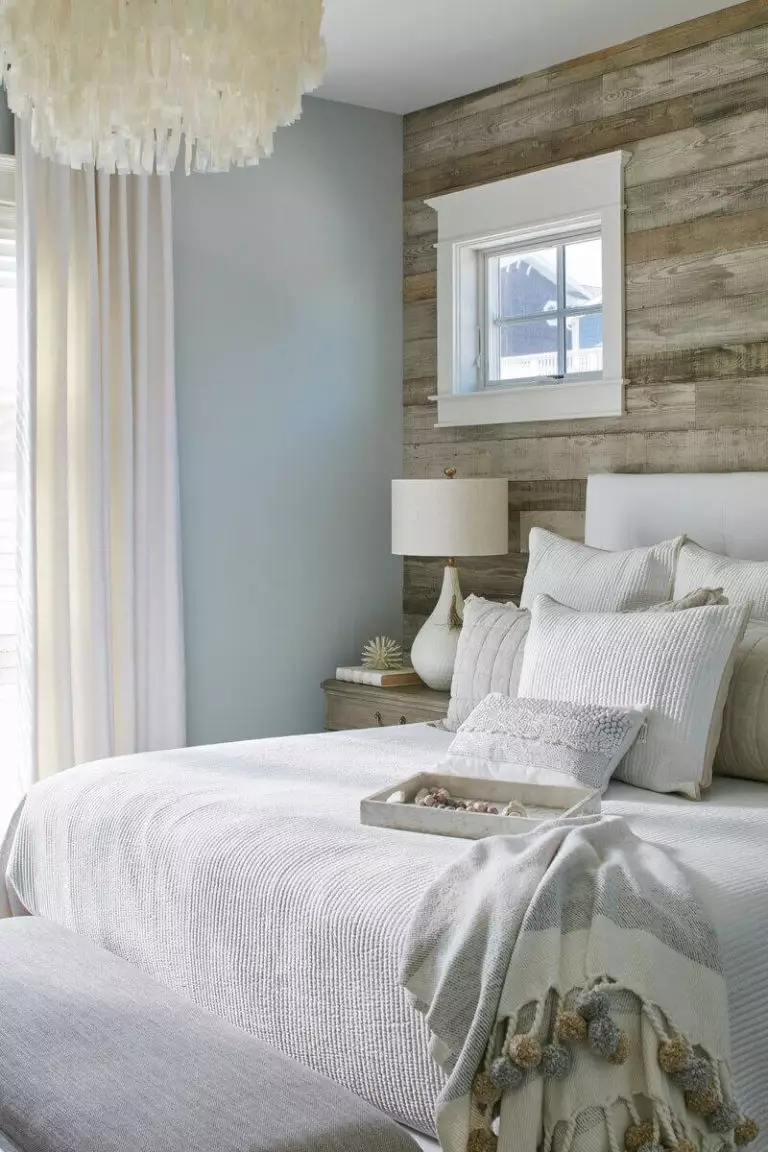
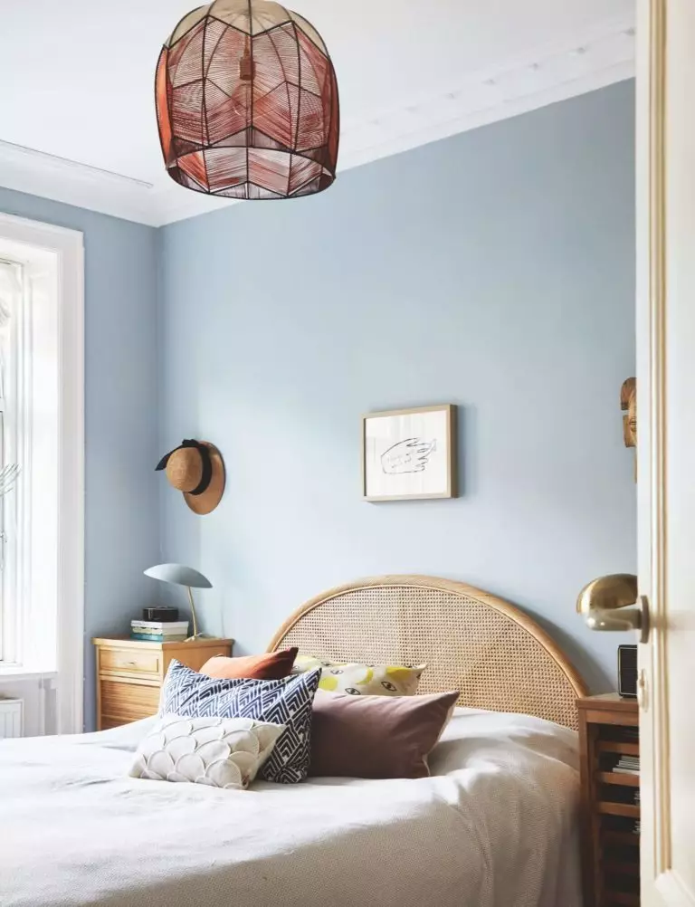
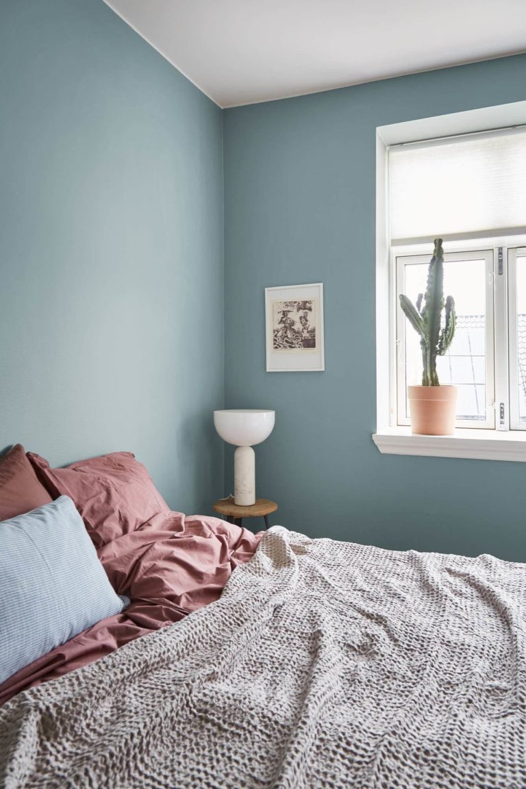
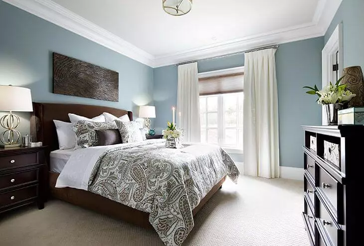
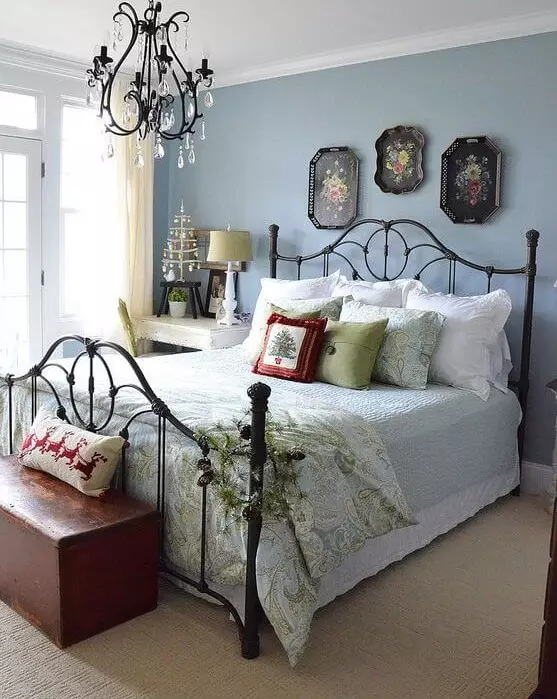
Bedroom
Here is our recipe for a perfect bedroom: walls covered in our already favorite shade of blue, wood or rattan headboard, white or soft beige bedding, and a simple decor; invigorating yet calming, textured yet soft, and astonishingly comfy. That is one way to put this color in practice. Let’s look at this from another perspective! The same blue walls, dark wood for the bed and other pieces of furniture, and an impressively elegant chandelier: Vintage style in its full beauty at your disposal.
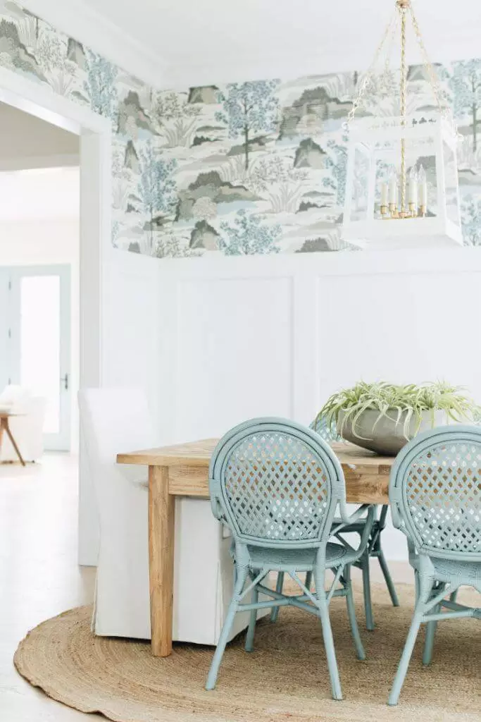
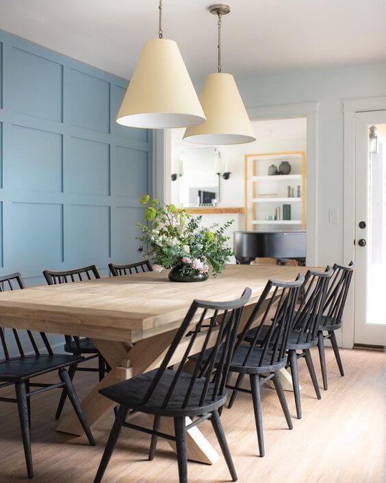
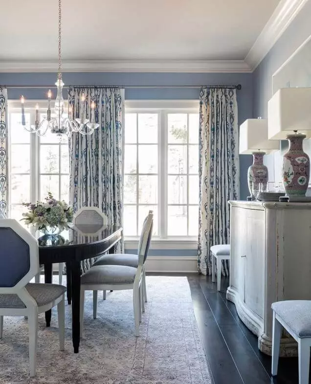
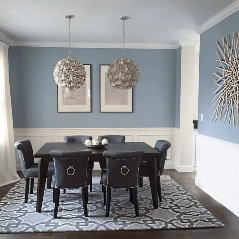
Dining room
This pastel shade of blue goes undoubtedly with the walls, accompanied by wood furniture and lighting sources suitable for the style. Blue walls, extravagant chairs, and impressive pendants work for a formal setting. Add a few elements of decor with flamboyant accents, and your dining will be filled with a scent of Art Deco elegance. For lovers of simple designs, we suggest stopping at wood furniture and letting the blue play the rest. The more space it will be offered, the more it will reveal its rich undertones.
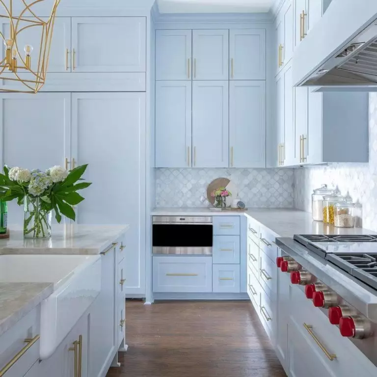
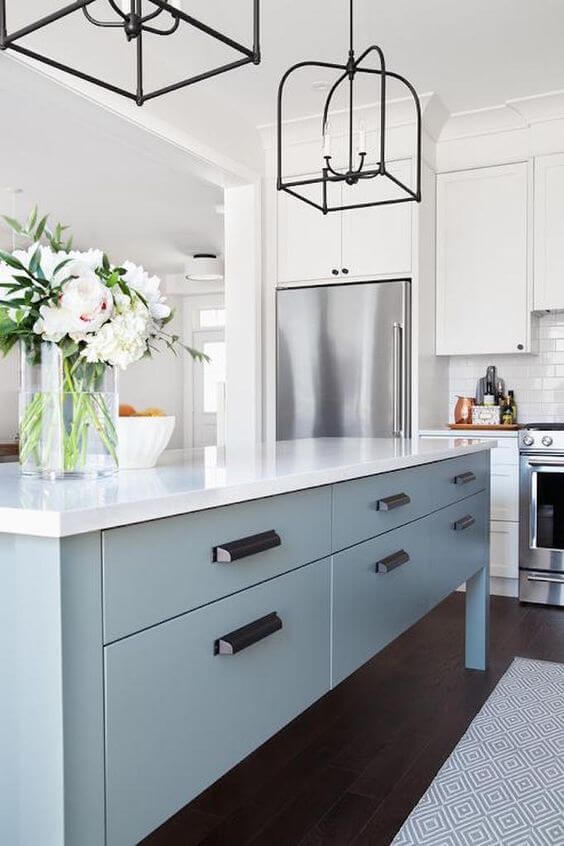
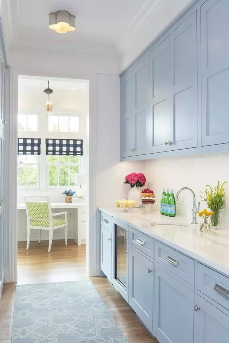
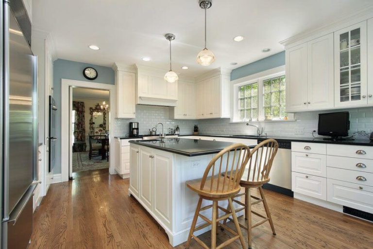
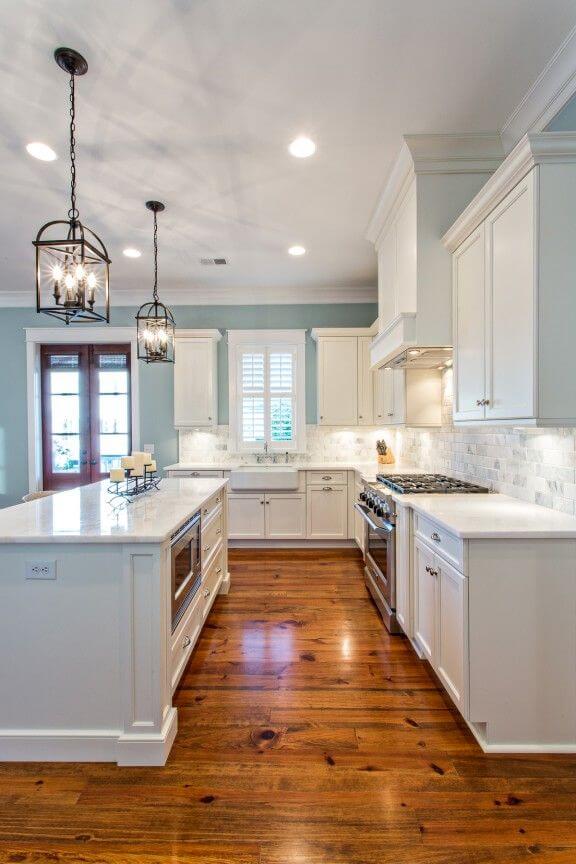
Kitchen
If you fell in love with this beautiful shade from Benjamin Moore the way we did, you would probably want to think about painting the cabinets in Yarmouth Blue. Great decision! It will be particularly welcome in east-facing rooms, allowing the natural light to spread the bright blue notes all over the space. Still not sure if blue cabinets are to meet your expectations? There are always alternatives; consider this shade for the walls, accompanied by white cabinets. Not as eye-catching but definitely stimulating.
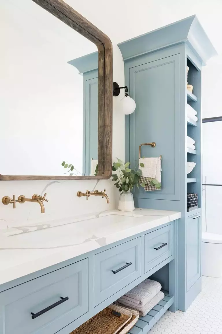
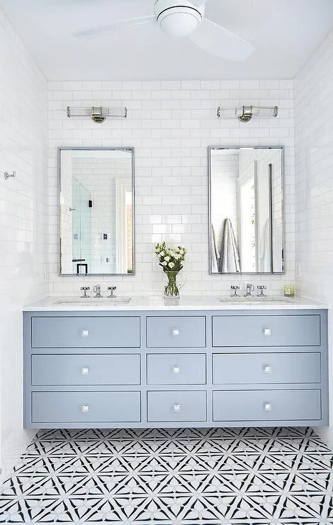
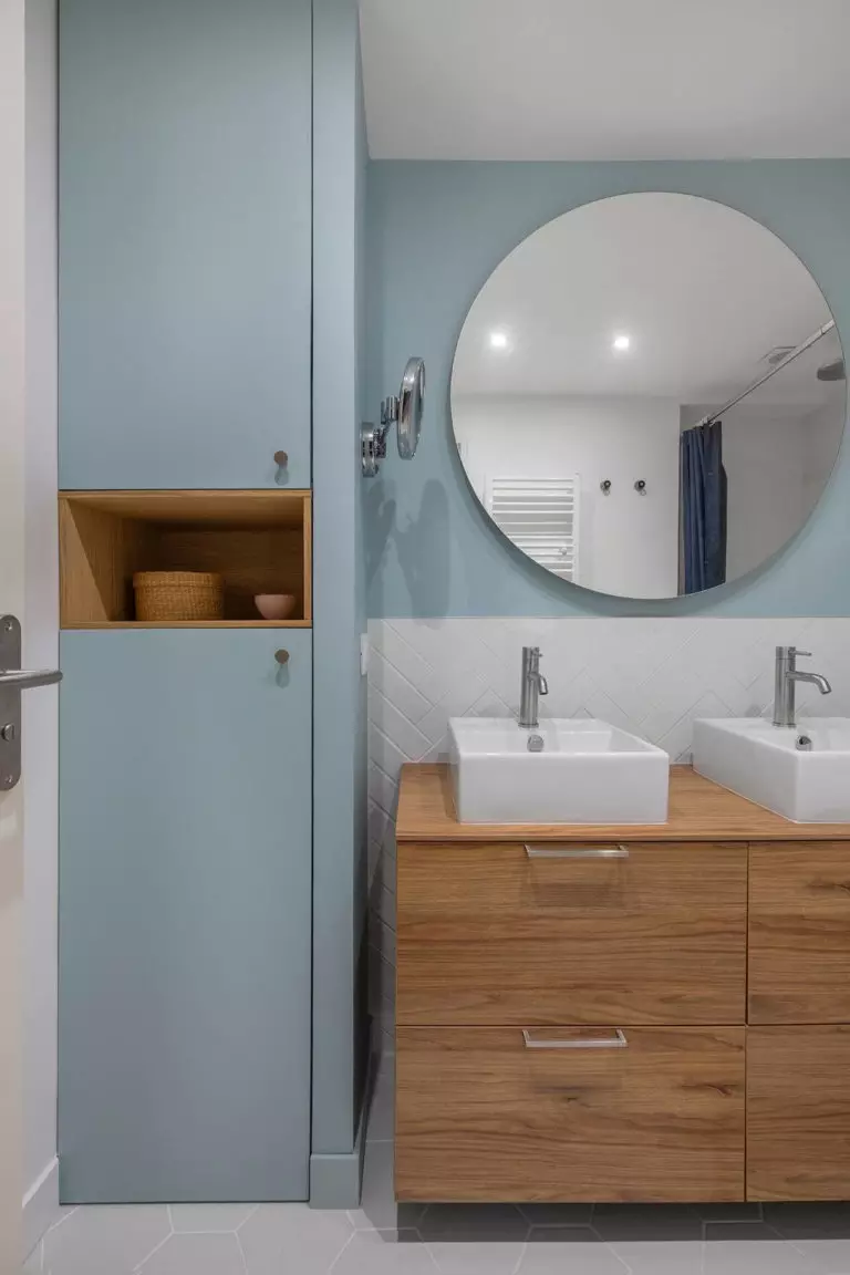
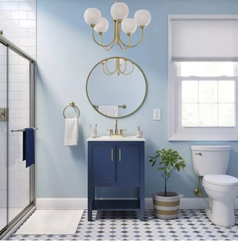
Bathroom
The blue shade from Benjamin Moore surprises us more and more. From one room to another, we reach the bathroom, and guess what! We find Yarmouth Blue walls, white cabinets, a white bathtub if there is the case, and we are simply amazed by the versatility of this shade. Do you still think something is missing? A few brass accessories for the pendant or cabinet hardware will fill the space. There is probably no place more suitable for the ocean breeze than the bathroom.
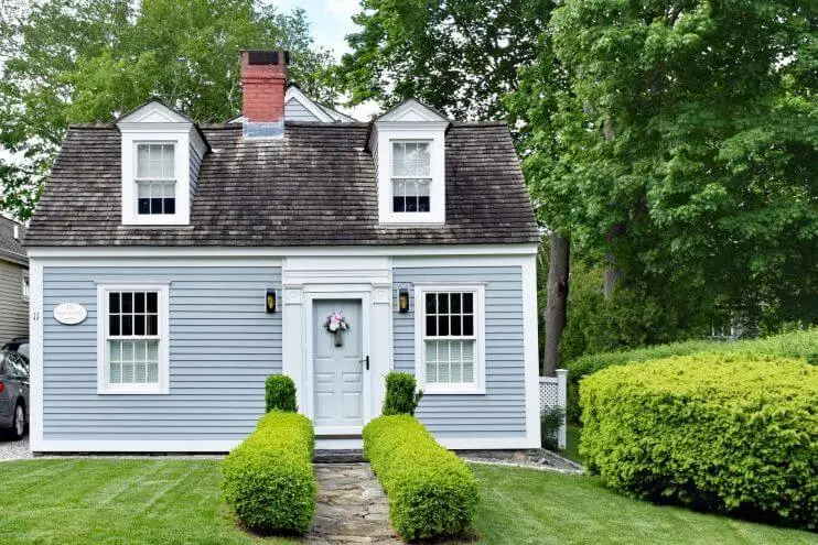
The use of Yarmouth Blue for exterior
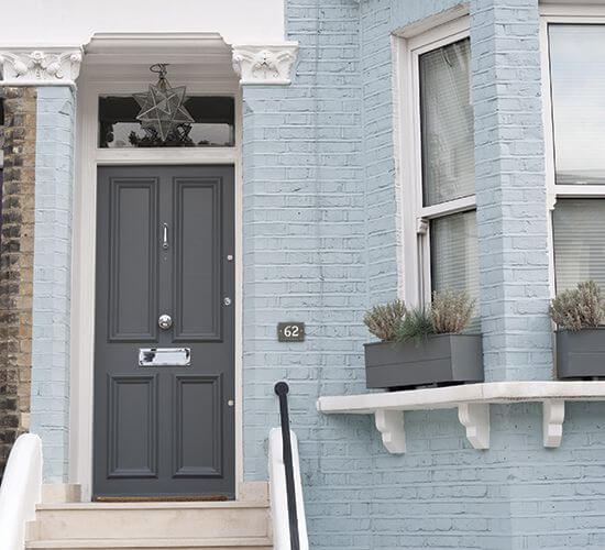
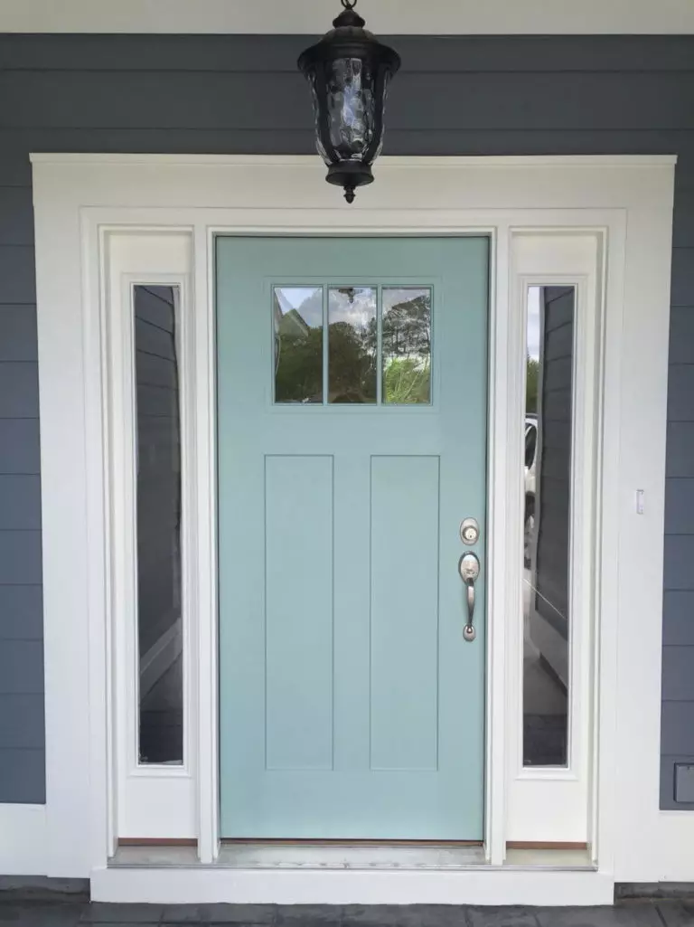
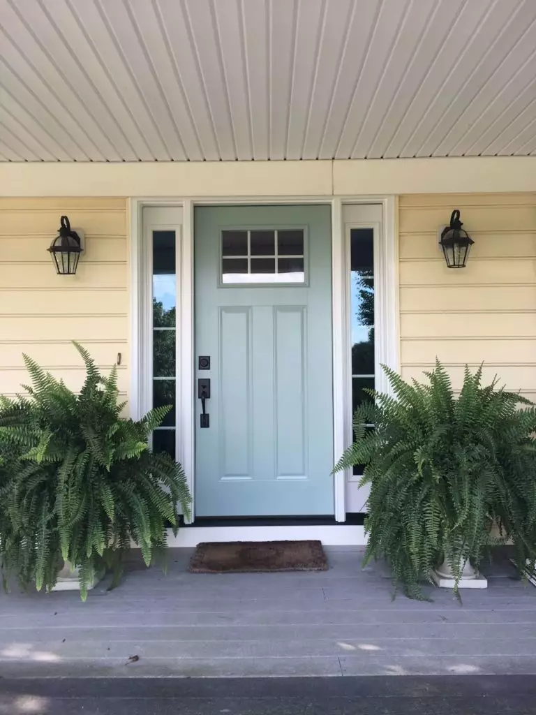
If it were another brighter shade of blue, we would not suggest using it to paint the house exterior. Luckily, this is not the case, and you can opt for this color for the facade. A contrastive front door will be a perfect partner, particularly a white or muted red one. Since brick design has been popular lately, we suggest you opt for a brick cover for the walls and paint them with this shade of blue. The stately look of an aristocratic mansion is ensured. On the other hand, if your house exterior is white, beige, or gray (with soft undertones in all cases), a front door in this breezy blue will add freshness and visual interest.
Yarmouth Blue paint color from Benjamin Moore is about everything the owner of a contemporary interior, as well as exterior, can dream of: a splash of color from the blue notes, a scent of calmness from the balancing gray undertones, and unlimited freshness from the airy effect of the achieved combination.
