Almond Wisp (Behr PPU5-12): what color is, review, and use
Today, the whole world is fascinated by gray-beige shades, and we also succumbed to the general mood. In fact, they’ve taken one of the leading positions in fashion palettes as neutral tones relatively recently, when designers needed something new in their search for the perfect balance. The fact is that a couple of decades ago, beige was already starting to get boring, and gray began to seem unnecessarily strict and cool. It was then that it was decided to try a combination of both for the first time, and the idea was crowned with success.
Today, gray-beige shades are recognized as the perfect option for creating a neutral yet cozy and stylish base. However, one cannot fail to note the fact that their palette has dozens, even hundreds of tones, so the choice of a suitable color can be a little complicated. At the same time, paint manufacturers make this choice easier by annually presenting their favorites in the gray-beige family. And this time, we decided to talk about one of them – the PPU5-12 shade from Behr with the poetic name Almond Wisp. Well, let’s get acquainted.
Almond Wisp paint color features
This glorious gray-beige shade got its name for a reason. Its amazingly even mood with a touch of coolness indeed resembles the natural color of an almond. There are many similar tones, but it was Almond Wisp that was included in the 2021 trending shades palette.
According to Erika Woelfel, vice president of color at Behr, 2021 was one of the revolutions in interior design because, after the problematic events associated with the pandemic, we began to look at our home differently. Now from a transit point where you can take a breath between work, hobbies, and travel, it has turned into a refuge where we feel safe and can create exactly the environment we want.
As the need for positivity and comfort in terms of interior solutions has grown significantly, the Behr team opted for rather sophisticated but at the same time pleasant and natural shades that can create a light, cozy and productive atmosphere. In total, several palettes were presented, and Almond Wisp ended up in the Casual Comfort color palette along with light and warm neutral tones.
Almond Wisp: is it warm or cold?
You don’t need to be a true color expert to determine that Behr’s PPU5-12 is more warm than cool – just look at it. And this is true even from a technical point of view: a hue value of 33 degrees, a lightness of 79%, and a predominance of red in the RGB model again confirm that Almond Wisp is primarily a warm color. However, at the same time, it should be noted that there are cooler notes that are created due to the lightest silver undertone.
How does lighting affect Almond Wisp?
Depending on the lighting, Almond Wisp will behave in much the same way as most taupe tones. The fact is that, depending on the intensity of light, it can be perceived in different ways, and this point must be taken into account when choosing surfaces that will be painted with such paint.
So, in clear sunlight, Almond Wisp will look very light, almost white. If there is enough light without the sun, or if you use lamps with warm light, this color will turn into a cozy and soft beige with slightly noticeable gray notes. It’s another matter if the light is not enough (up to dusk) or you prefer the cold light of the lamps: in this case, gray tones will come to the fore, and Almond Wisp will seem a little cooler and more strict.
Almond Wisp LRV
The LRV coefficient of light reflection for Almond Wisp is relatively high at 60, which allows it to be classified in the group of light – and in some cases, very light colors. This figure speaks of superior light reflectance, which means that when you use this shade from Behr for the base finish, you get a bright room that can even look spacious, at least visually.
However, Almond Wisp is not immune to lighting-influenced changes. So, if there is enough light, the color can appear very light, so much so that it can even be perceived as white. Under natural and moderately intense light, this color will acquire its original balance of gray and beige. If the light is not enough, it will look much darker, as the gray will begin to dominate.
Almond Wisp undertones
As we said earlier, delightful in its simplicity and ease, Almond Wisp belongs to the representatives of the trendy family of taupe tones today. That is why you might have guessed that gray and beige remain the key to creating this color. At the same time, one cannot overlook in it the obvious, albeit the hidden, presence of a creamy undertone, and relatively light, like a ghostly silver, which allows this color to transform depending on the intensity and warmth of the lighting.
Similar colors
In addition to a considerable number of advantages, the Almond Wisp shade is also attractive because it has a huge number of similar – but still different tones, both in the Behr palette and from other paint manufacturers. If you want to create a modern, inviting, and fun space, then you can combine this fabulous taupe with any of the shades below, focusing on both the lighting and the surrounding textures and materials:
Coordinating colors
Behr’s Almond Wisp color is very friendly, and therefore you can safely create combinations with pastels and cool, as well as darker tones. Behr designers offer balanced palettes with complementary colors that you can highlight with bold accents. Let’s consider the shades included in these palettes in a little more detail:
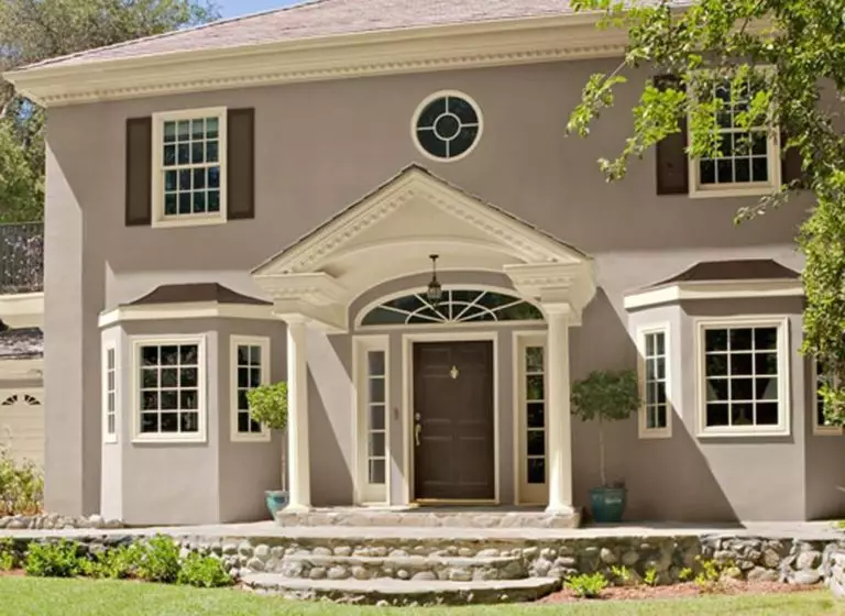
The use of Almond Wisp in interior and exterior
The color Almond Wisp is so delightful in its neutral and noble tranquility that it is challenging to resist its possibility in the interior or exterior of a house. It integrates perfectly into both modern and retro designs and can be an excellent partner for other shades and a wonderful backdrop for various shapes and textures. However, let’s not speak in riddles and consider several successful solutions using the PPU5-12 tone from Behr.
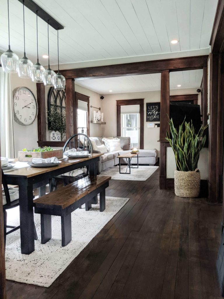
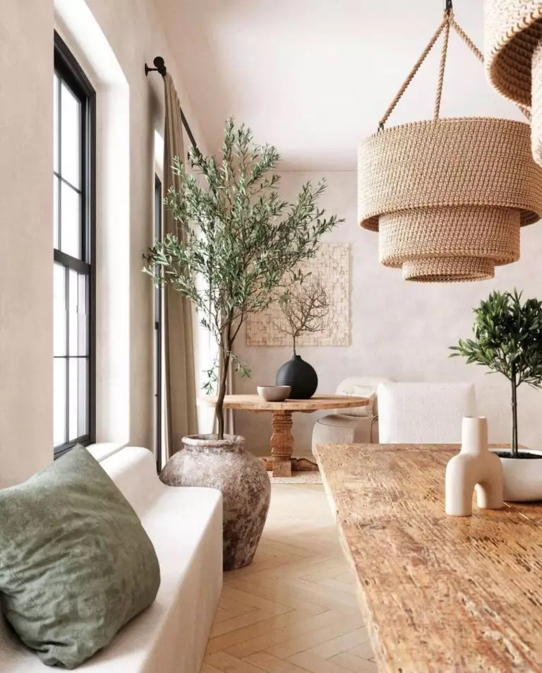
This amazing farmhouse
Open and welcoming spaces, a huge amount of light and air, maximum use of natural materials, unique decor – Almond Wisp will be a welcome guest in a farmhouse-style interior, where wooden furniture combined with beamed ceilings, green plants, and colorful textiles with traditional ornaments reign. Gray-beige walls in this shade become the perfect backdrop that provides coziness, naturalness, warmth, and coolness at the same time.
Japandi
One of the newest styles, offering a harmonious combination of the characteristic features of Japanese and Scandinavian design, has already managed to gain a foothold in the list of current trends that combine fashionable tranquility, serenity, and connection with nature. Almond Wisp fully meets all these criteria and becomes one of the essential shades for decorating a room for a japandi-style interior. The background of this color is in perfect harmony with the most straightforward furniture made of unpainted wood, light fabrics, tiled or stone floors, green plants, and ceramic décor.
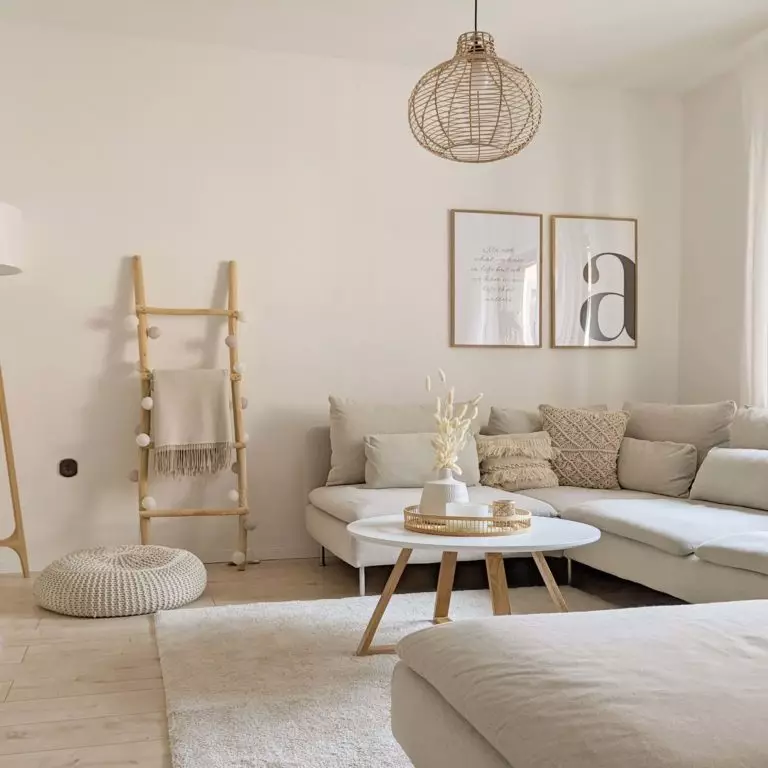
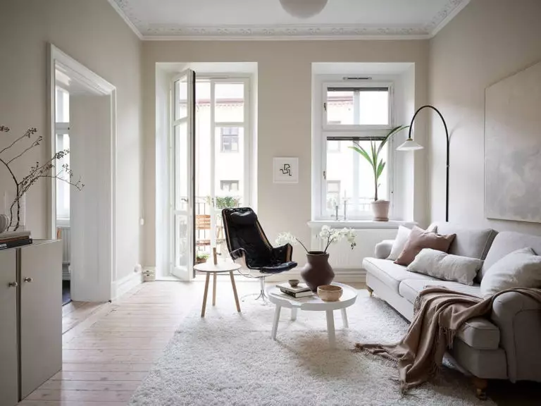
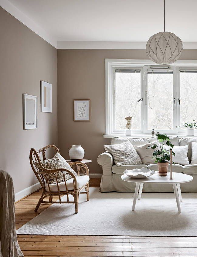
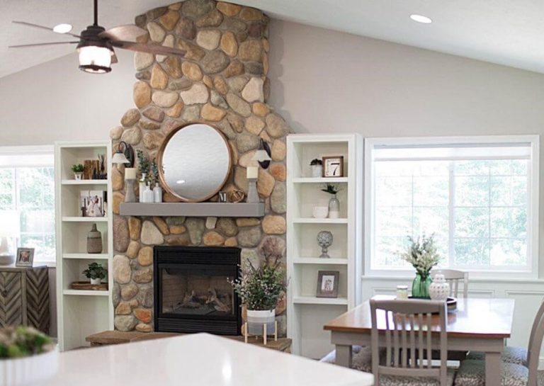
Living room
According to the same Erika Woelfel, Almond Wisp can be the perfect solution for the living room. The fact is that it is the living room that is the most visited area in the apartment, and therefore should correspond to the tastes of all family members and at the same time serve as a hallmark of the house in cases when you receive guests. The warmth and coolness in Almond Wisp, combined with the play of undertones, help create a visually pleasing picture for everyone. In addition, this color easily adapts to different styles, and therefore you can easily change furniture and accessories as you wish without the need for significant renovations.
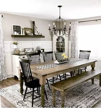
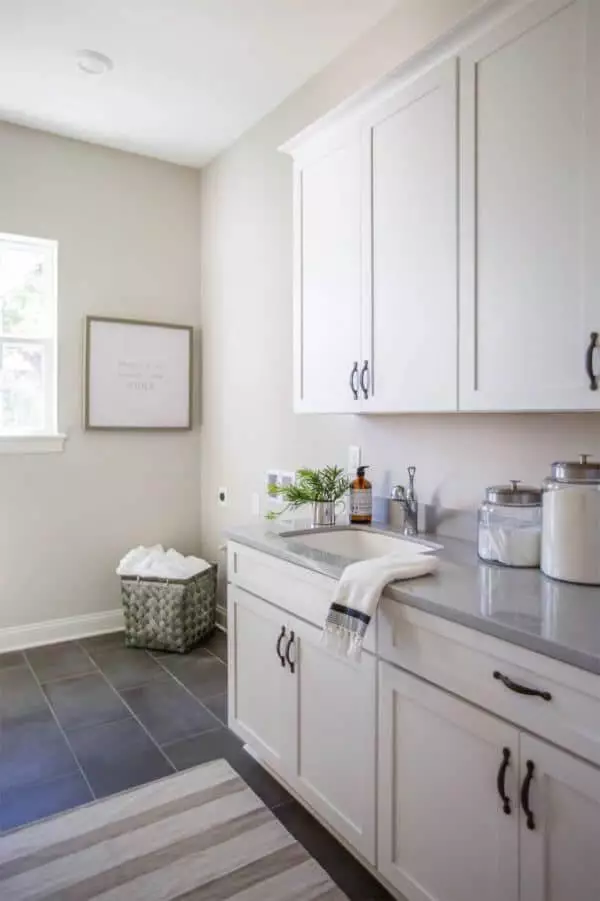
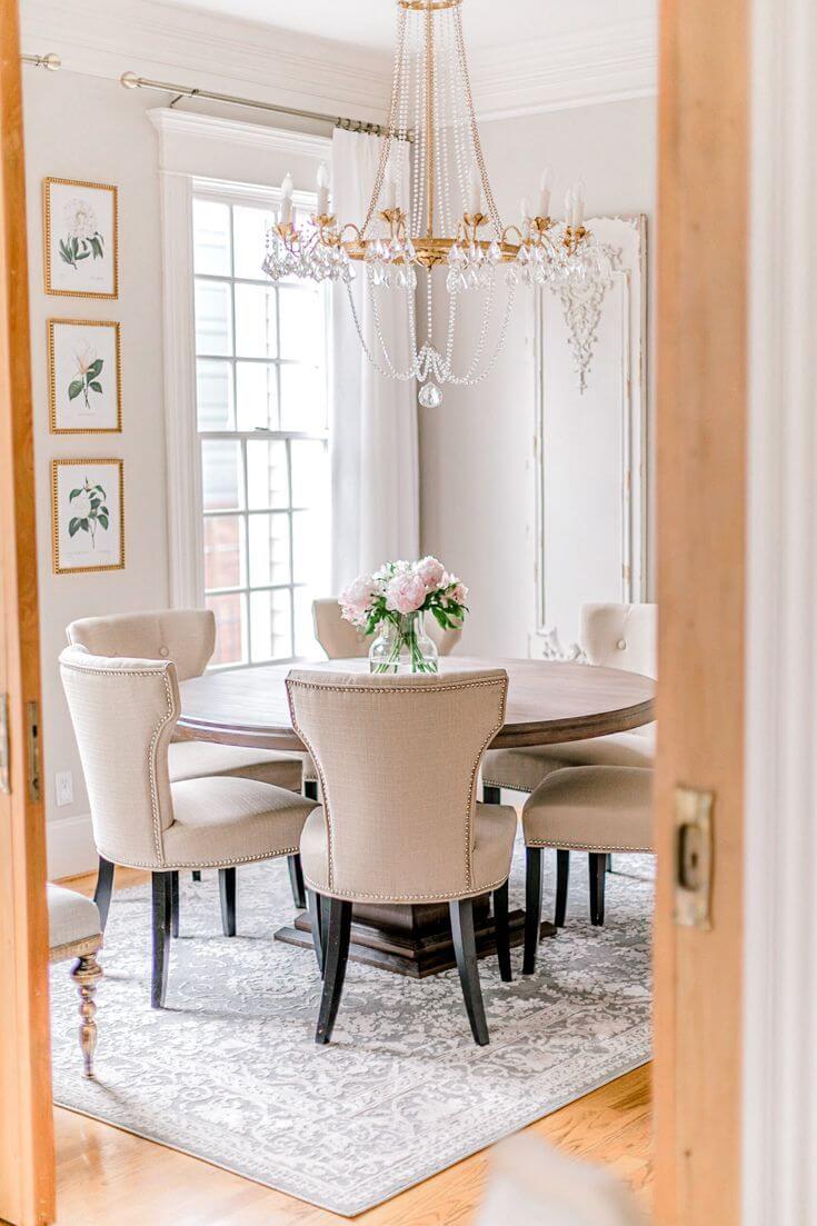
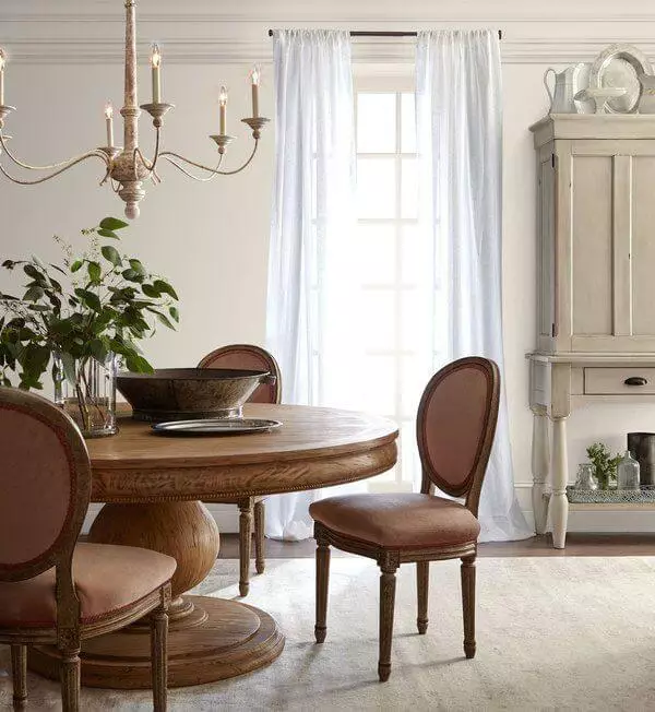
Kitchen and dining room
Much has been said about Almond Wisp’s role in relaxing, soothing, and traditional interiors, but why not try it with a bolder and more contemporary design? An excellent opportunity to discover Almond Wisp from this side would be a minimalist kitchen or dining room. The walls and ceiling in this restrained natural color, a laconic kitchen set with blind doors and built-in appliances to match the background of the same walls, a massive wooden table, and black metal chairs with the same lamps will create an incredibly effective and impeccably balanced atmosphere.
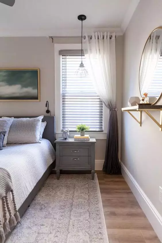
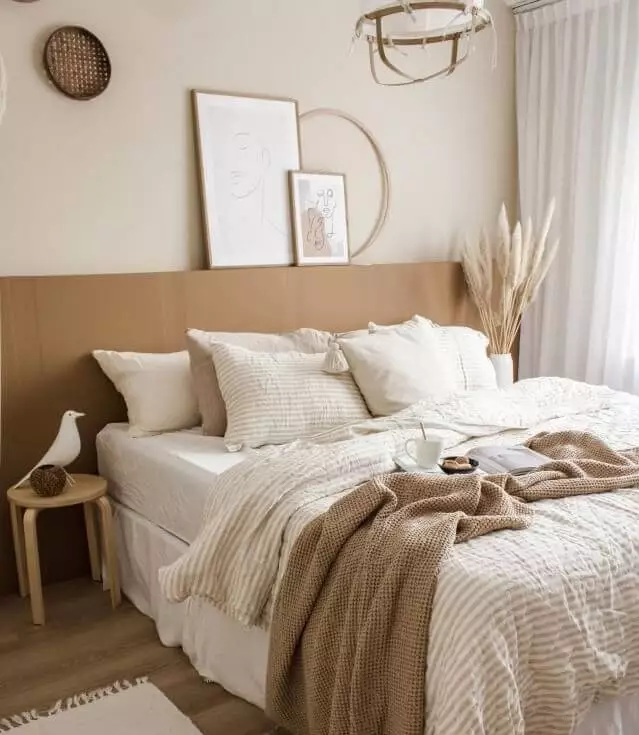
Bedroom
Like almost any gray-beige shade, Almond Wisp is the perfect solution for the bedroom. Its undoubted advantage lies in its versatility: you can use it for any style and in combination with a wide variety of furniture and textiles. If the background obtained with this color seems too calm and even for you, the designers recommend painting one wall in an accent color. So, for example, the P160-6 Intrigue from Behr can be an excellent solution – a deep and rich, but at the same time soft and warm shade of red.
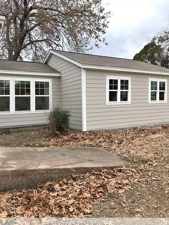
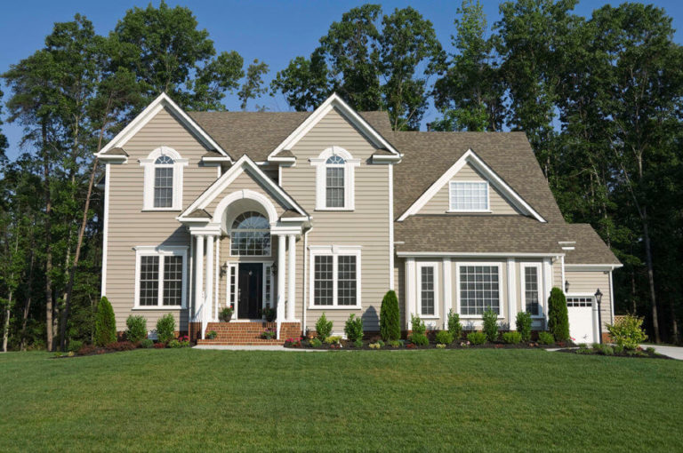
The exterior of the house
Neutral and ambiguous, Almond Wisp is ideal for a home’s exterior in any style – from the traditional and Mediterranean to the spectacular and daring modern and high-tech. It is in perfect harmony with wood and tiles, metal and glass, tiles and decorative stones. You can paint the walls entirely in this beautiful shade of taupe, leave the trim, roof, doors, and porch for contrast, or combine it with other finishes. In any of these cases, you can appreciate his character – calm, friendly, and discreet.
Almond Wisp by Behr is an outstanding representative of the gray-beige palette, offering warmth and coolness, coziness, and a modern look in equal measure. Feel free to use it in your design project and enjoy unlimited possibilities for experimenting with colors, textures, and shades on this excellent gray-beige background.
