Balanced Beige SW 7037
Sherwin-WilliamsA rather dark beige shade with a noticeable gray-brown tint.
Balanced Beige (SW 7037): what color is, review, and use
The times when beige colors seemed too straightforward, flat, and, let’s not beat around the bush, frankly boring, are gradually becoming a thing of the past. Over the past few years, designers and color experts have worked hard to create sophisticated beige tones that surprise with their ambiguity and unusual undertones.
Today, in the period when calm and restrained interior solutions are relevant more than ever, complex beige, including gray-beige and dark-beige shades, come to the fore. And if you are looking for a moderately light neutral paint, we suggest you study such a palette in more detail. Now that you know where to start from, we invite you to meet one of the representatives of this wonderful group – SW 7037 Balanced Beige from Sherwin-Williams, included in such brand collections as Top 50 Colors, Pottery Barn and Living Well.
Balanced Beige paint color features
Experts at Sherwin-Williams are renowned for their outstanding craftsmanship in modern neutrals. However, they have a special relationship with beige: in their opinion, not a single shade of this kind can be too simple. This is exactly what we see at Balanced Beige, a rather dark beige shade with a noticeable gray-brown tint. It is because of the latter that some experts attribute this color to the group of gray-beige shades, although we would rather call it neutral.
Many people compare this shade with its “neighbor” in the palette – SW 7036 Accessible Beige. Since they are on the same color bar, this comparison is really fair. Both are considered relatively light beige shades. However, a close comparison of the samples will make it impossible not to notice at least a few differences. So, Balanced Beige is much darker and has a gray-brown tone, which is not peculiar to SW 7036 at all. Nevertheless, it is most often referred to as a darker version of Accessible Beige.
Balanced Beige: is it warm or cold?
We know for sure that Balanced Beige refers specifically to warm tones. While it lacks the strong yellow undertones of the classic beige, it does not have enough warming power (visually, of course). This is especially noticeable in combination with light gray shades.
How does lighting affect Balanced Beige?
Balanced Beige needs as much light as possible to fully express itself. Designers consider rooms facing south and southwest as one of the best options for its use – it is here that it becomes warmer and brighter, giving the interior a sense of ease and coziness. A similar effect can be seen in the combination of this color with pink.
When there is a lack of light, typical of north-faced rooms, SW 7037 will appear darker, and its gray and brown notes will become deeper and more noticeable. If you decide to use it in such a place, be sure to compensate with enough artificial light.
Balanced Beige LRV
An important feature of Balanced Beige is its rather low LRV. If for the same Accessible Beige, this indicator is 58, which transfers it to the group of light tones, then SW 7037 with its LRV equal to 47 remains among the medium-light ones. This means that it is quite capable of reflecting a particular amount of light, but in order to fully reveal itself, it needs as much lighting as possible – both natural and artificial. At the same time, such a value of light reflection allows it to maintain its individuality and not look too faded even in bright light.
Balanced Beige undertones
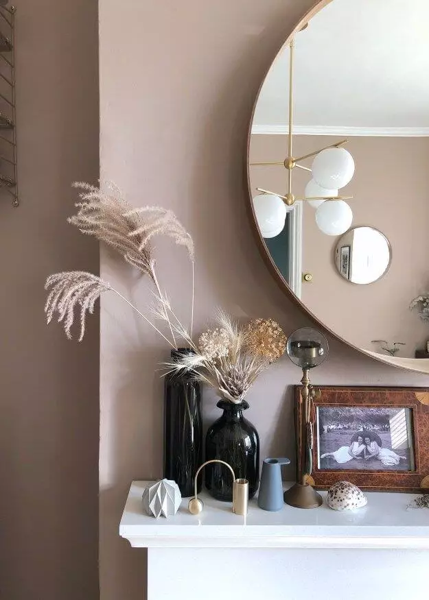
The presence of not too flashy but still noticeable yellow undertones is also characteristic of Balanced Beige as a representative of the beige family, albeit rather complex ones. At the same time, designers suggest paying attention to the presence of a more hidden green undertone, which can manifest itself in combinations of this shade with terracotta and emerald tones. If there is enough greenery outside the window, it is likely that it will be reflected in the color of the walls.
Similar colors
In the Sherwin-Williams palette, there are at least a few more dark beige tones with a gray tint, in addition to the aforementioned Accessible Beige, not to mention the color schemes of paints from other manufacturers. We are sure that you will be interested in learning a little more about them, and we promise that you will find many interesting discoveries:
Coordinating colors
Balanced Beige by Sherwin Williams can be safely called one of the most adaptable and versatile neutral tones, as it combines with a variety of colors – from deep and rich to cool and pastel shades. The brand’s designers have compiled more than one palette with it – and we invite you to evaluate the most successful partners from our point of view for SW 7037:
Use of Balanced Beige in interior
Many designers have repeatedly confessed their love for this amazing neutral color, unanimously proclaiming it a worthy candidate for both modern and classic palettes.
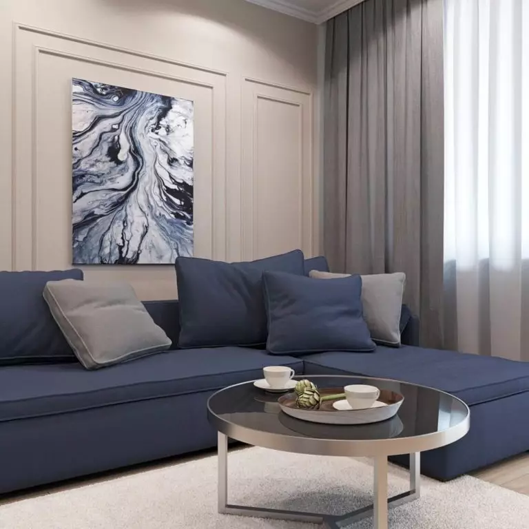
One of the qualities of Balanced Beige, which experts especially appreciate, is its versatility. The hue works equally well in warm and cool color schemes. In the latter case, it adds a pleasant warmth to the overall atmosphere. In addition, it is SW 7037 that helps coordinate spaces in which warm and cold tones are present at the same time – for example, in a kitchen with a warming honey-colored floor and cool sage-colored walls. However, we will not dwell on one example but consider an array of options for using this excellent beige tone.
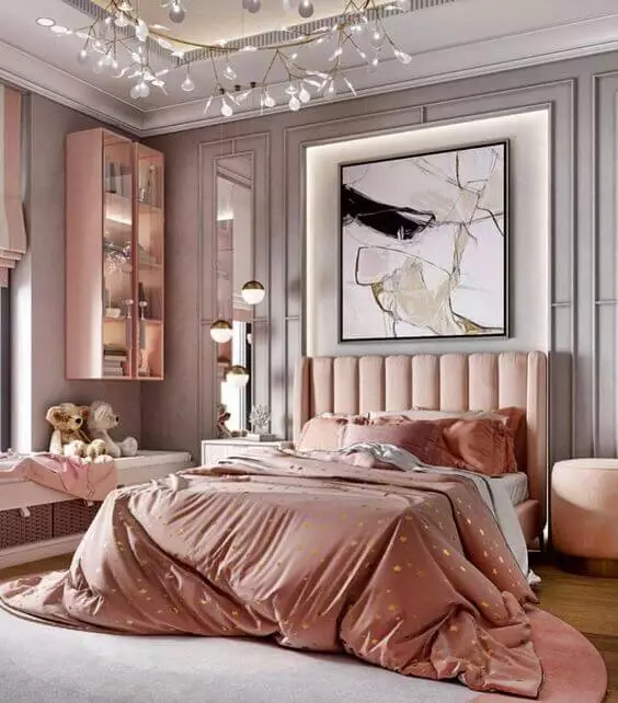
A bit of Vintage
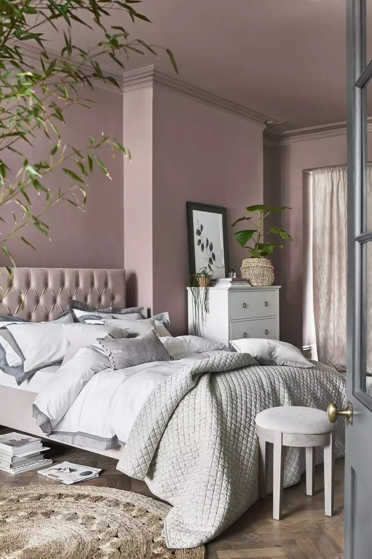
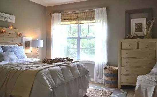
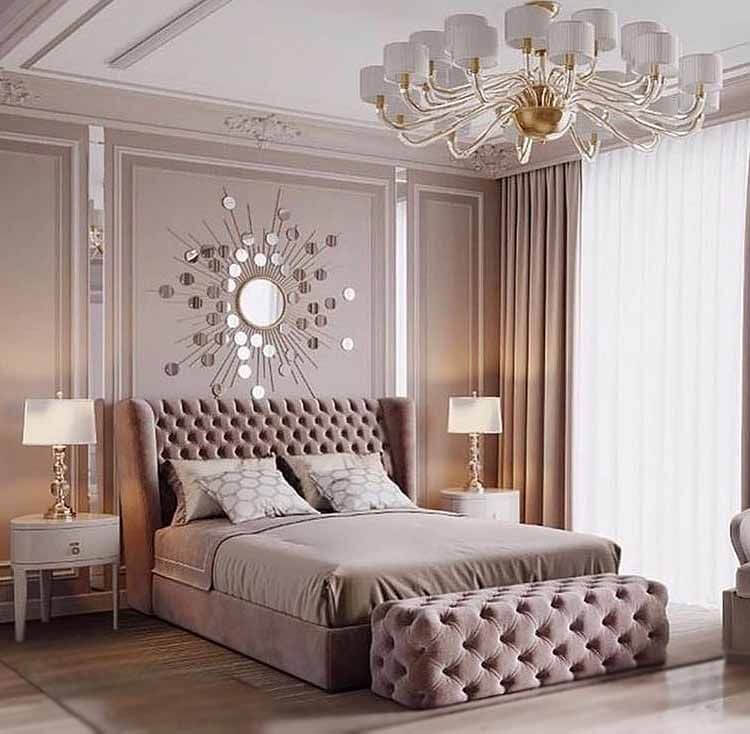
If you want to create an interior filled with the unobtrusive influence of antiquity, feel free to turn to Balanced Beige. This idea works especially well in the bedroom, where this shade seems warm and promises peace and safety. Walls painted in this beige make a wonderful backdrop for a cast iron bed, simple cream curtains, solid wood furniture, and a charming bedspread with an abundance of pillows.
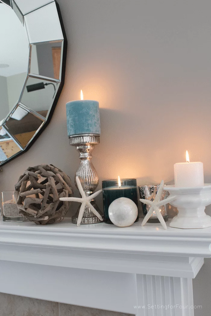
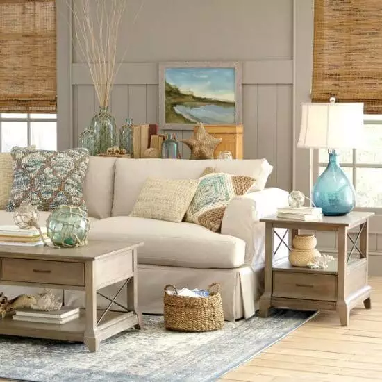
The softness of the Coastal
The style of a seaside home can be achieved with Balanced Beige. Quite discreet, soft, and calm, it will create that very serene and relaxing atmosphere for useful reflection. The huge windows, linen-upholstered furniture, and accents in airy blue tones will certainly add freshness.
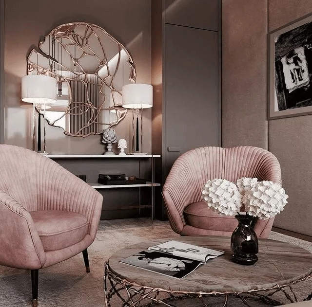
Art Deco style
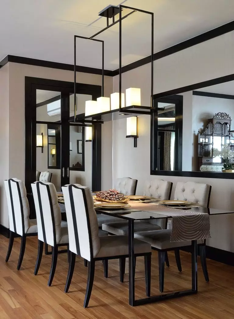
Do not think that the neutral Balanced Beige is solely associated with laconic modern aesthetics. In more sophisticated traditional interiors, it is no less surprising. If you want proof, try using it in the decoration of the room (best, of course, the living room) in the Art Deco style. The ambiguous beige walls will give a special sound to the elegant furnishings, the abundance of mirrors and glass, and luxurious metal decor and set the right tone for both the dark and light palettes of such a design.
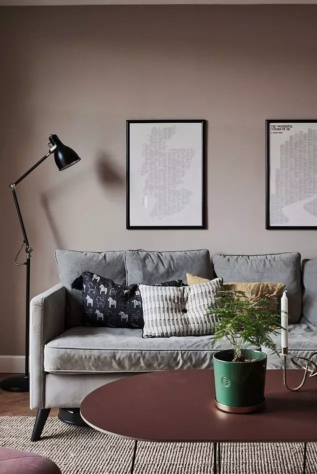
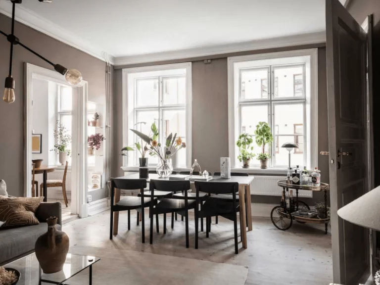
With cool colors
As we said above, SW 7037 works great with cool palettes, providing the necessary warmth and balance. Personally, we like its combination as a background with light blue, dark brown, snowy white, and cool natural grays. Our shade of beige looks calm, noble, and light with such neighbors, expanding the room boundaries.
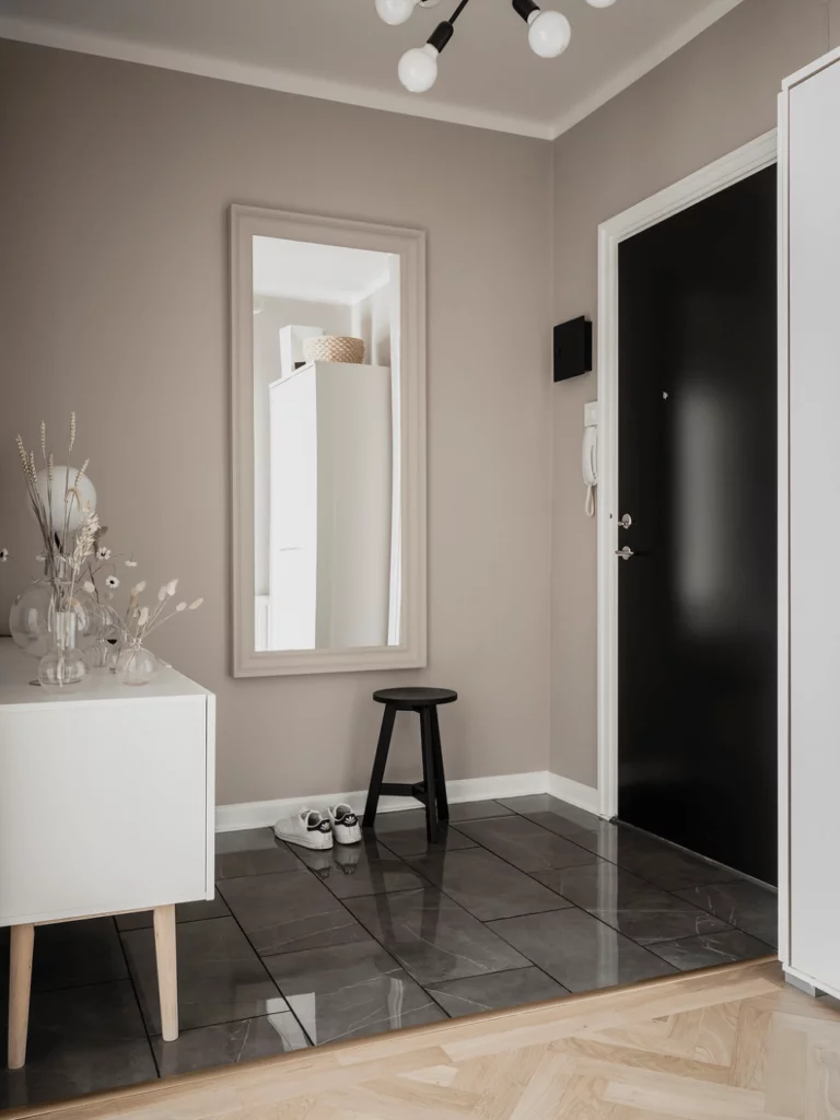
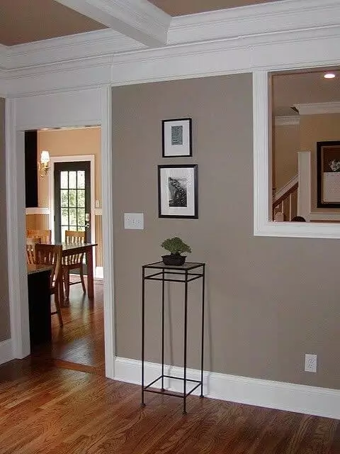
Hallway
Entering the hall, the walls of which are painted in Balanced Beige, it is easy to guess that people who live here are directed towards elegance and traditional interior solutions. To make the entrance look more fresh and modern, use snow-white door trims, canvases, and baseboards, and complement the furnishings with a chest of drawers, a coat rack, or a dark wood console.
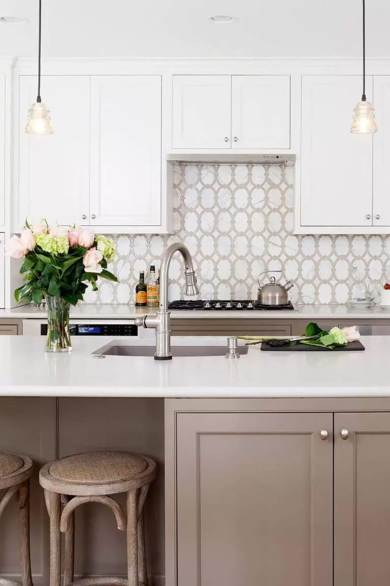
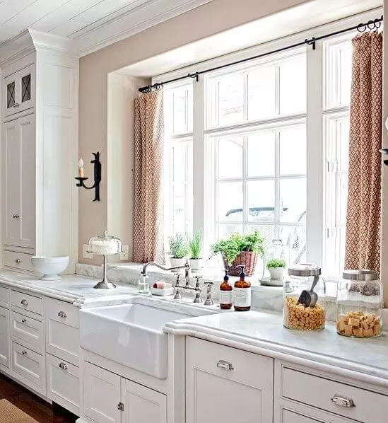
Kitchen and dining room
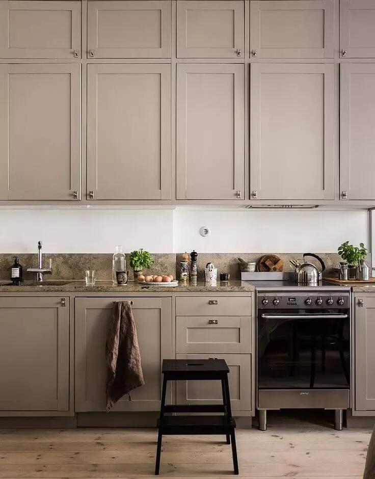
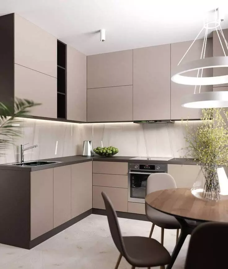
You can use SW 7037 to the fullest in the kitchen or dining room. Here you have tons of options for using it, and one of them is, of course, painting your kitchen cabinets in this warm and fairly dark beige shade. Do not be afraid that they will look too undemanding: expensive brass fittings, light walls, and a tiled backsplash in cool colors will create the necessary balance. And do not forget to paint the kitchen island the same color: it will look charming in combination with a gray granite countertop.
Another obvious use for Balanced Beige is as a background. In this case, you can play with the shade of the cabinets (from milky white to dark) and the texture and color of the floor (wood or tiled). In addition, we recommend adding black accents and contrasting white trim for greater clarity of lines and impeccable interior rhythm.
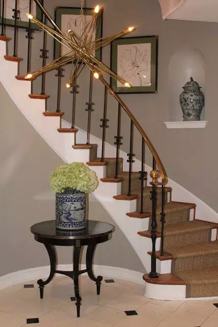
Space under the stairs
If you want every corner of your home to be cozy, do not ignore the space under the stairs. Thanks to Balanced Beige, it will not appear cold and empty but will contribute to a welcoming and cozy interior. If you feel the need for details, a dark wood console with a couple of beautiful knick-knacks will come in handy. You can also put a warm-colored lamp on it that can bring out equally warm undertones in this wonderful beige shade.
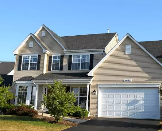
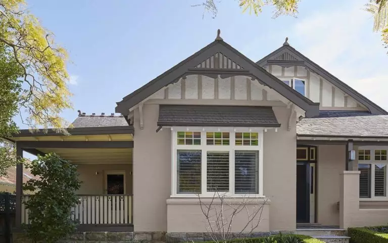
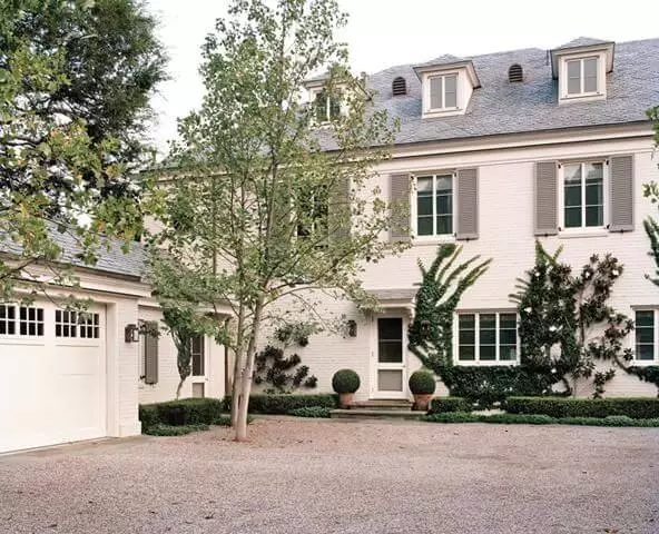
Use of Balanced Beige for house exterior
It’s no secret that some designers are very skeptical about the idea of painting a house beige. Its dependence on lighting, in which it can be both light and elegant or somewhat dull and outdated, can play a truly cruel joke on the owners. However, if you’re willing to take the risk, consider Balanced Beige for siding or stucco brick with dark or bright white finishes to create crisper, more modern facade lines.
Another option is Balanced Beige (preferably shutters) against white walls. If you balance everything with a dark roof and a similar door, you can get a very interesting and, at the same time, balanced picture.
Despite the prevailing stereotypes, SW 7037 from Sherwin-Williams is another attempt to present beige as an interesting color. It is worth noting that such an attempt is more than successful, considering that designers and house owners add to the army of its fans from year to year. Give it a try!
