Drift of Mist SW 9166
Sherwin-WilliamsA calm and pastel shade in which cream is dominant. Deep gray tones are felt in its depth, which, when combined with yellow and greenish, make Drift of Mist so complex and ambiguous.
Drift of Mist (Sherwin-Williams): what color is, review, and use
Drift of Mist SW 9166 is a paint color from Sherwin-Williams that brings together all the charm of pastels and creams. Even though it has already been featured in the manufacturer’s collections such as Creative, Living Well – Renew, Cool White, and even the recent Pottery Barn Fall / Winter 2021, it can hardly be called hot. Designers tend to attribute it not to super trendy shades but to timeless interior classics – it’s not for nothing that Drift of Mist was included in the Sherwin-Williams Top 50 colors list.
Drift of Mist paint color features
Since its introduction, Drift of Mist has positioned itself as a calm and pastel shade in which cream is dominant. This is what makes this paint color so unusual: deep gray tones are felt in its depth, which, when combined with yellow and greenish, make Drift of Mist so complex and ambiguous. That is why it is essential to pay attention to the special role of lighting when painting walls and other surfaces with such paint: the final perception of color will depend on it. However, more on that later.
Drift of Mist: is it warm or cold?
Even if you are not a sophisticated user and do not understand shades too profoundly, then at first glance, it will become apparent to you that Drift of Mist refers to warm colors. A similar effect is achieved due to the sufficient presence of green and yellow undertones, which, even with an apparent lightness of the shade, create the feeling of a cozy warming veil.
How does lighting affect Drift of Mist?
On the one hand, the complexity of this shade of paint is a kind of trump card for interiors, since a room whose walls are painted in Drift of Mist, as well as furniture, will never look monochrome and uninteresting. However, the flip side of this medal is that in some cases, lighting can present this color in the most unexpected way.
So, in even and sufficient daylight, Drift of Mist will show itself with noticeable creamy notes. In bright sunlight, it seems almost white, and if there is not enough light, you will see that very gray haze. That is why, when choosing this paint, be sure to take into account the illumination of the room. Of course, this color is beautiful anyway, but it may not be exactly what you planned.
Drift of Mist LRV
The LRV (Light Reflectance Value) for Drift of Mist is relatively high at 69. This allows the color to be included in the very light group, but it still falls short of almost white and white. You can use it to create an airy, light atmosphere and visually expand the space in well-lit rooms, where, depending on the intensity of the light, it can go into a very delicate cream or almost white. Conversely, in low light, Drift of Mist will appear light and mysterious pale gray.
Drift of Mist undertones
As stated earlier, the Drift of Mist paint color has a very interesting range of undertones. With a clear presence of soft grays, which are considered key, the shade includes a relatively strong chord of yellow and green undertones, thanks to which it acquires an unobtrusive creamy glow.
Similar colors
Shades similar to Drift of Mist include:
Coordinating colors
Use of Drift of Mist in interior and exterior
The Drift of Mist embodies the charm of versatility, which means you can safely use it in almost any interior. However, such trendy styles as modern, Scandinavian, classic, traditional, farmhouse and shabby chic are incredibly supportive of this shade. In the first case, the Drift of Mist will create that very laconic and eye-pleasing background; in the second, it will provide such a vital naturalness, and in all the others, it will make a delightful effect of the influence of time.
We bring to your attention the options for using the Drift of Mist in various home environments.
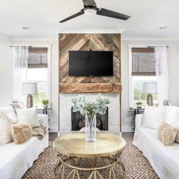
Living room or dining room
In these rooms, you can paint the walls entirely with this Sherwin-Williams paint or leave one for the accent in a matching shade of gray or brown. In such an atmosphere, furniture made of unpainted wood in warm colors and light-textured textiles looks incredibly harmonious. Want to give your interior a more modern and slightly daring look? Try adding glass and metal elements.
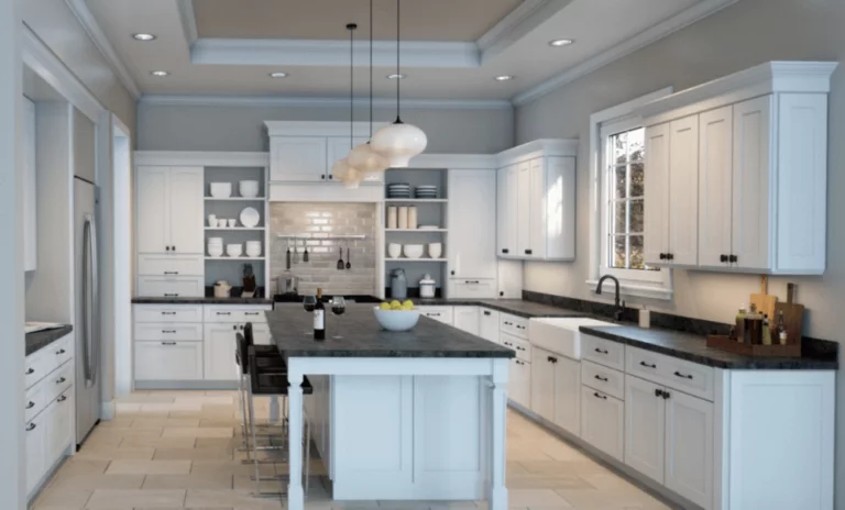
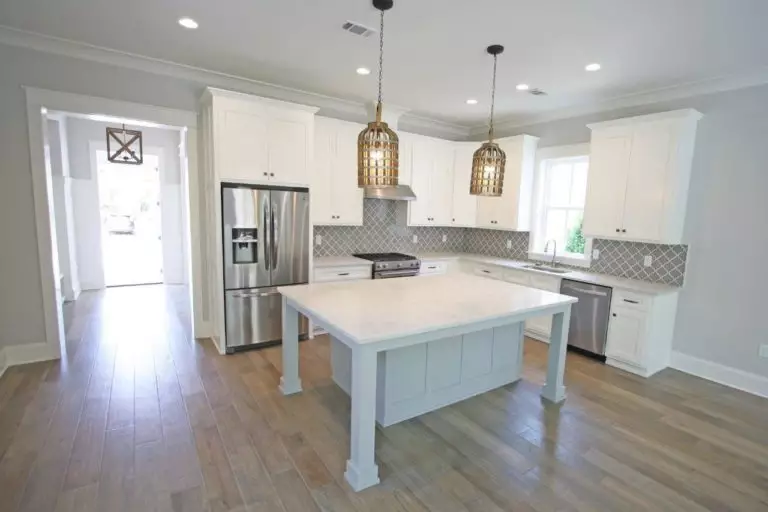
Kitchen
If you like Drift of Mist and are thinking about applying it in the kitchen, the background is the best solution. Such a delicate and discreet shade will favorably set off both unpainted wood furniture and kitchen cabinets in trendy dusty pastel colors, as well as create a harmonious union with wood and tiled floors or an expressive contrast with marble decorated with clear veins.
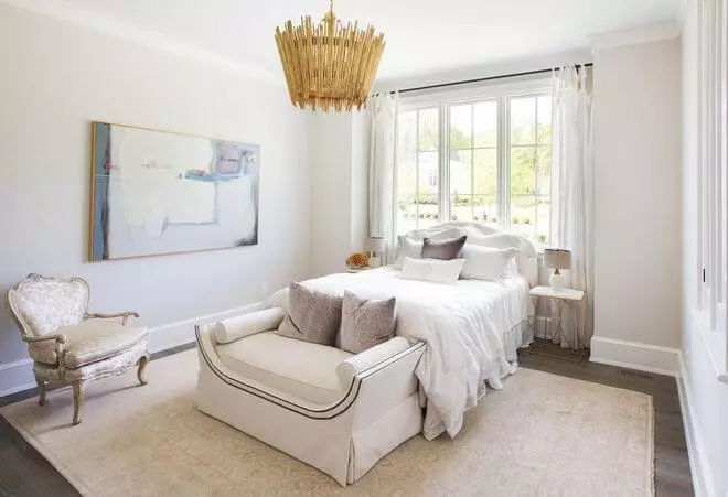
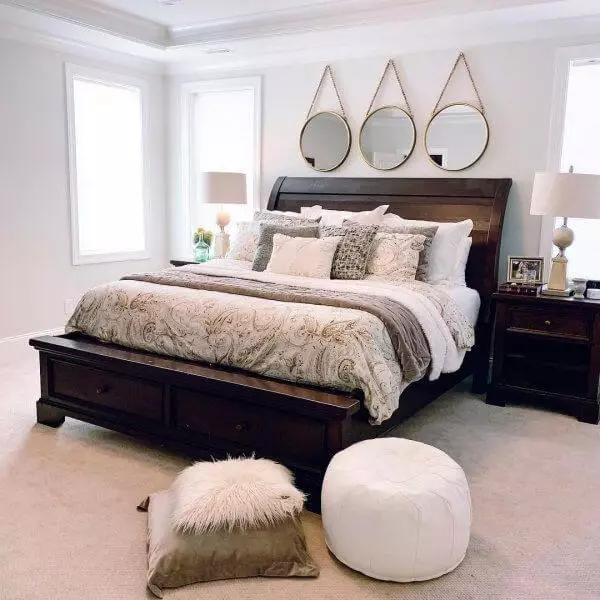
Bedroom
In terms of bedroom use, Drift of Mist is a unique shade. This color brings warmth and coolness, calmness and tranquility, a feeling of spaciousness, and the feeling that a soft, safe cocoon is enveloping you from all sides – and all this at the same time. In a bedroom with walls painted with this paint are equally good linen and cotton, matte black sconces and classic light-gilded lamps, fur bedspreads, and mirrors on stylish leather straps. In general, there is plenty of freedom for decoration.
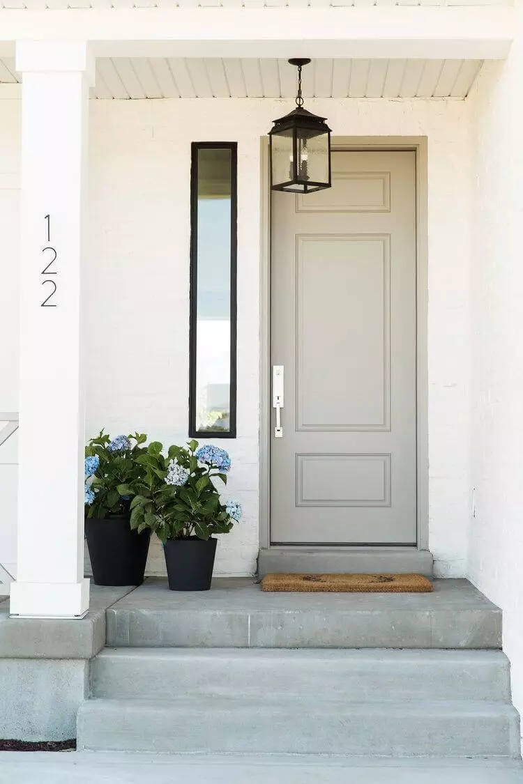
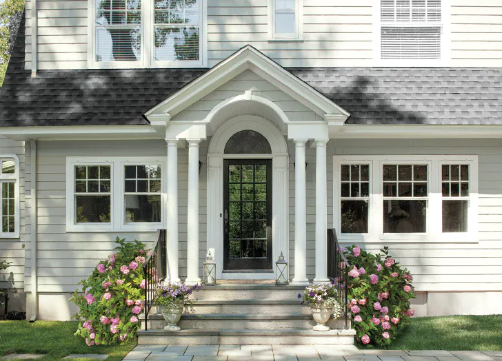
Front doors
Doors in the light cream Drift of Mist shade will become a harmonious element of the facade of the house, made in dark or complex soft colors, including the same sage, lilac and dusty blue. True, you will have to take care of painting the columns, porch, railings and even window frames in the same color – in this case, your house will look harmonious and stylish and at the same time unobtrusively differ from neighboring cottages or mansions.
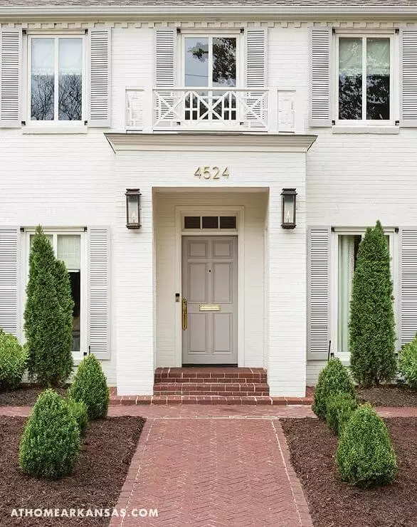
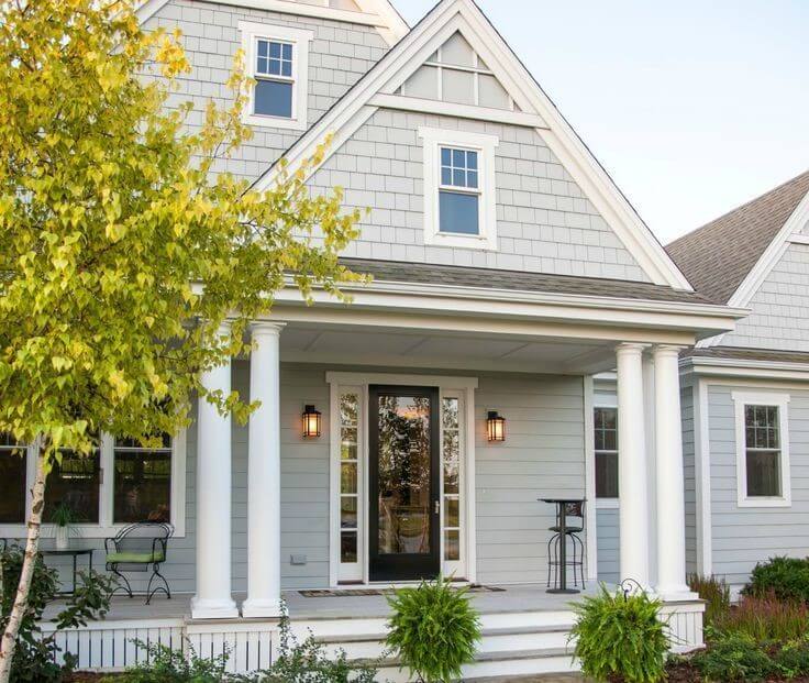
House exterior
Designers still have a lively debate over the use of Drift of Mist to paint the exterior of a house. Indeed, it may seem that it does not pose any danger and complexity at first glance – what can be wrong with a light grayish-cream shade?! However, as a detailed study of color properties and practical experience of application shows, everything is not so simple.
The fact is that in bright sunlight, your home will look well and welcoming. However, in rainy and cloudy weather, you risk getting a somewhat aged and sloppy look and the effect of worn paint. If you live in a region with few clear days, but there is plenty of precipitation and dust, then be prepared for the same experience, only even more intense.
Of course, no one will forbid you to use Drift of Mist to paint a house, but you should carefully weigh the pros and cons, and if possible, evaluate its appearance on at least one wall or a small part of it. In addition, some designers hail the shade as an option for painting a traditional country cottage or Spanish-style home and suggest balancing it with brown trims, doors and frames, dark tiles, and stonework.
The Drift of Mist by Sherwin-Williams is another light shade of paint that seems extraordinarily attractive for all its complexity. If you gravitate towards modern interior solutions but are not devoid of sentimentality, it will be an excellent compromise for you.
