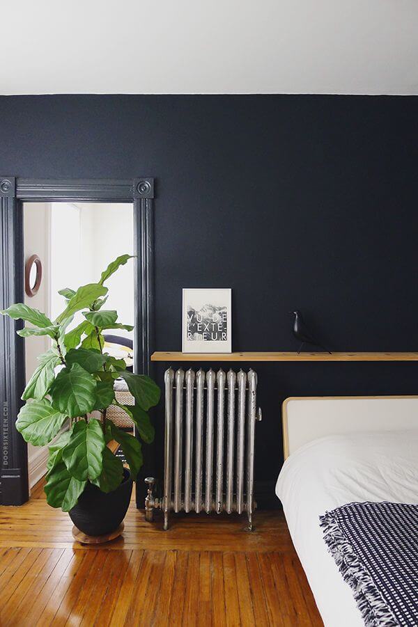
Autumn 2021 is in full swing, which means that it’s time to start thinking about new trends – including in the interior. If you are planning to renovate or update the interior of your house or apartment, it’s time to learn more about what will be relevant in the coming year – and start, as usual, with color. What is the best way to make the walls? What shade to paint the ceiling? What tones are best for accents? All these questions are of concern to those who want to equip their home following current trends. And we will try our best to give you complete answers.
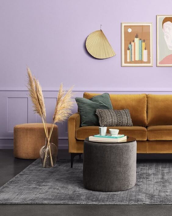
The palettes that promise to be trendy in interiors in 2022 are significantly different from the colors offered for this year. If the trends of 2021 were dominated by soft and light tones, slightly diluted with solid and pure, one might even say rectilinear colors. Everything will turn out entirely differently for the next season. The current palettes are ruled by complex and multifaceted shades and warm, perhaps scorching tones, which create an amazing, mesmerizing combination with a few cold, even crystal nuances. However, let’s not intrigue anymore – let’s turn to trends as such.
We bring to your attention the predictions for trending colors for 2022 from three of the most influential trendsetters – Behr, Pantone, and the bureau of trend forecasting in collaboration with color experts WGSN & Coloro. We do not doubt that you will have plenty to choose from!
Interior Colors 2022: What WGSN & Coloro Offer
WGSN (Worth Global Style Network) is a company that is considered a leader in forecasting current trends and on a global scale. Not so long ago, WGSN launched its own Coloro color system, which is now considered a serious competitor to the legendary Pantone. Close collaboration with major brands has allowed the company to create an impressive library of colors, each with a unique seven-digit numeric code.
Already in 2020, WGSN & Coloro presented their forecasts for trending colors for the coming year. Now is the time to get acquainted with what is proposed to us for the year 2022.
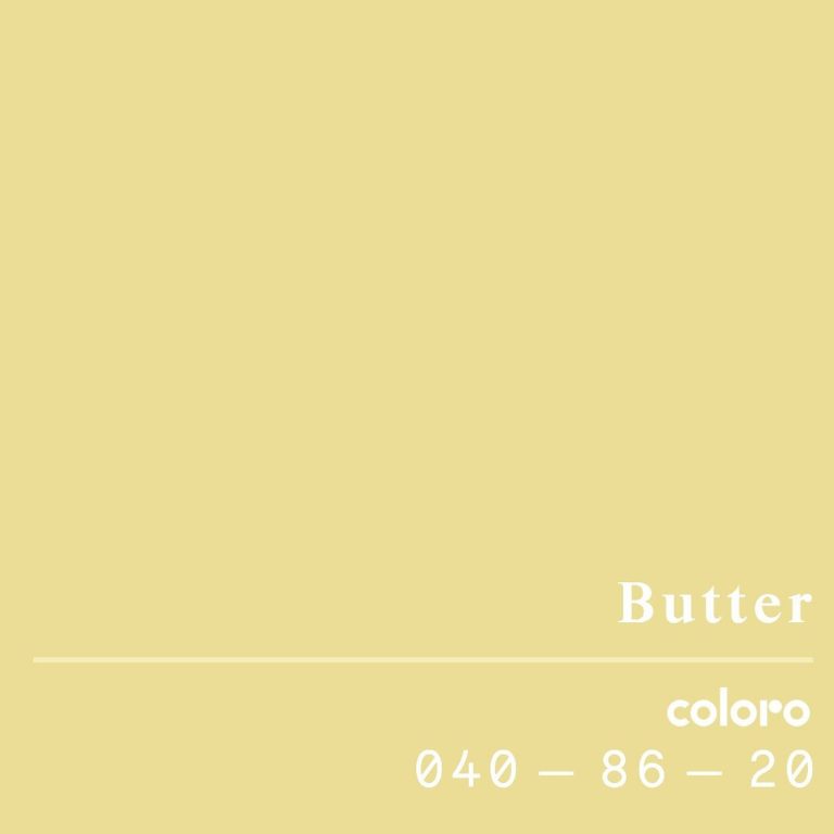
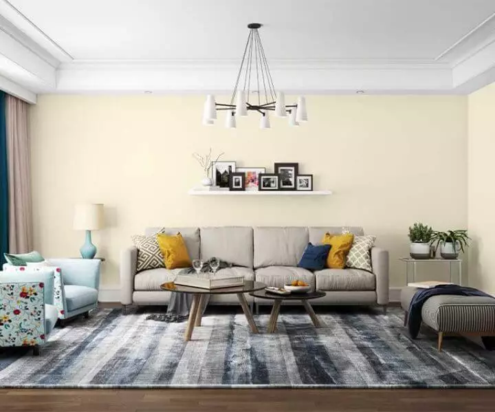
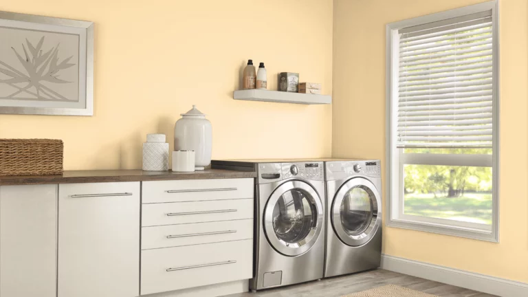
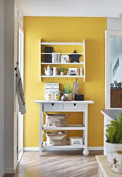
Butter
A charming and delicate cream shade with noticeable sunny yellow notes literally made designers fall in love with it. Its undoubted plus is the fact that it goes well with both warm and cold trendy tones.
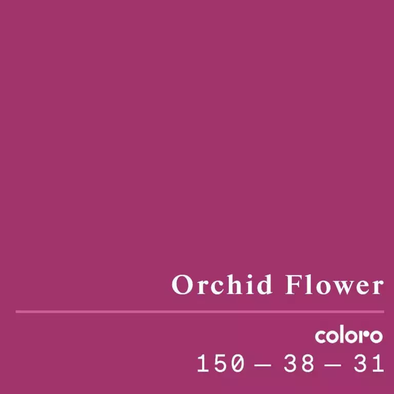
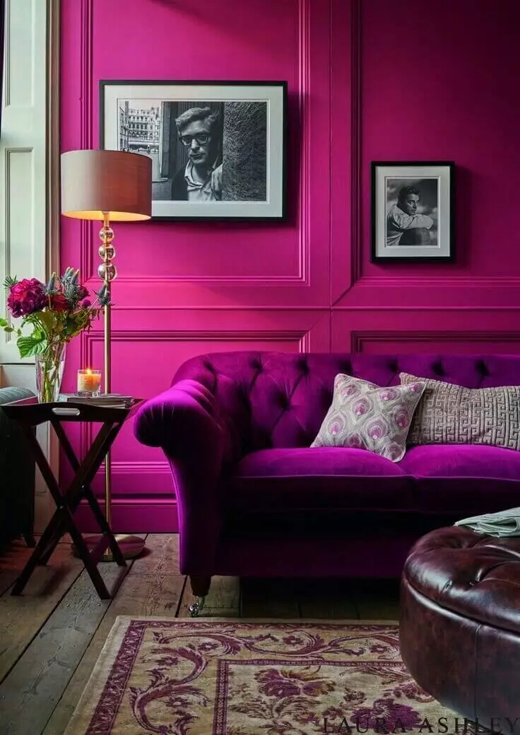
Orchid Flower
A similar purple tone was already present in the Behr palette for 2021 called “Fuchsia” – however, this time, it is much more pronounced with glimpses of pink tenderness. According to the experts at WGSN & Coloro, this shade has impressive energy, sensuality, and richness, and it is gorgeous and positive on any texture. Are you ready for fashionable brightness?
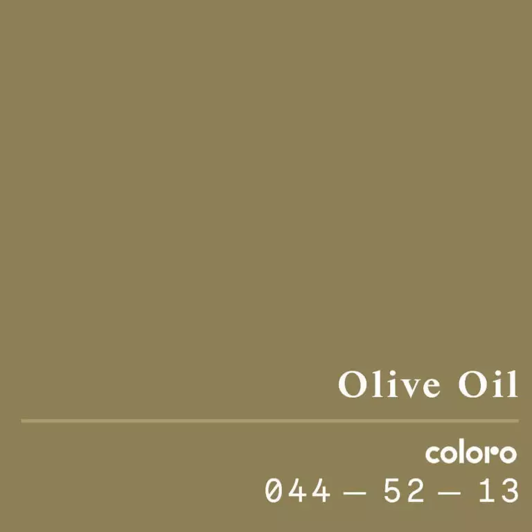
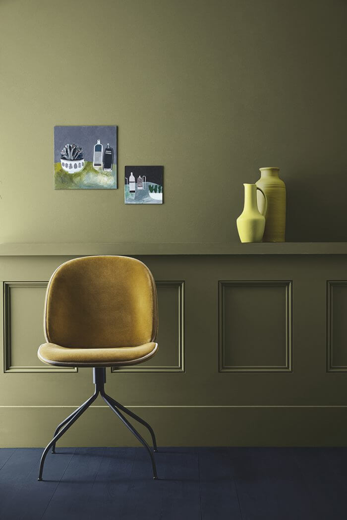
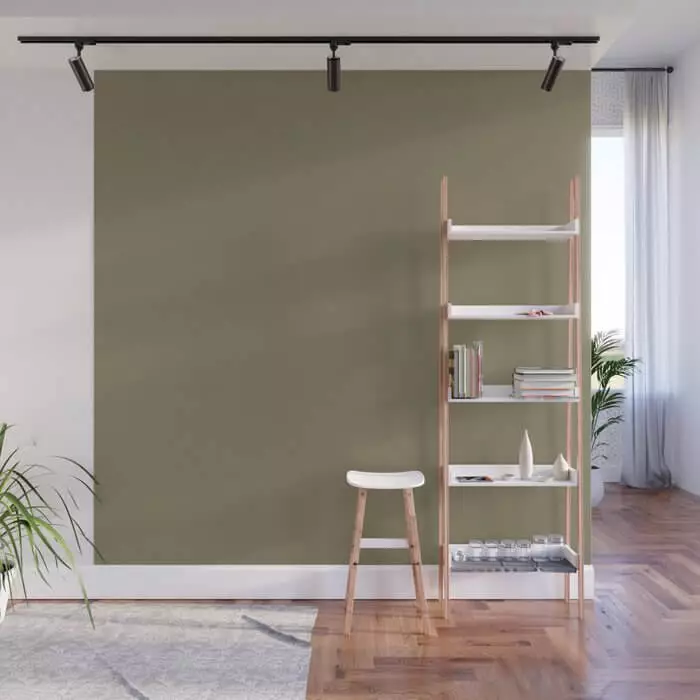
Olive Oil
This pale green tone with a silvery-yellowish undertone has also attracted the attention of designers for its relaxing and soothing properties. If you’re looking for a peaceful atmosphere, you’ve probably already figured out what color to paint the walls in!
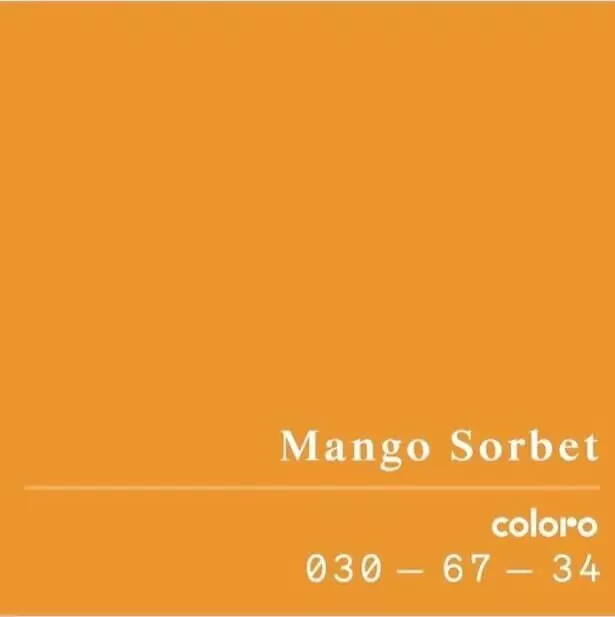
Mango Sorbet
Juicy, warming, yellow-orange is a unique shade, the brightness of which does not cause visual irritation at all. Color experts recommend using it next year if you have a difficult time ahead of you, a lot of projects and hard work awaiting you, and you definitely need a place of power and a source of energy.
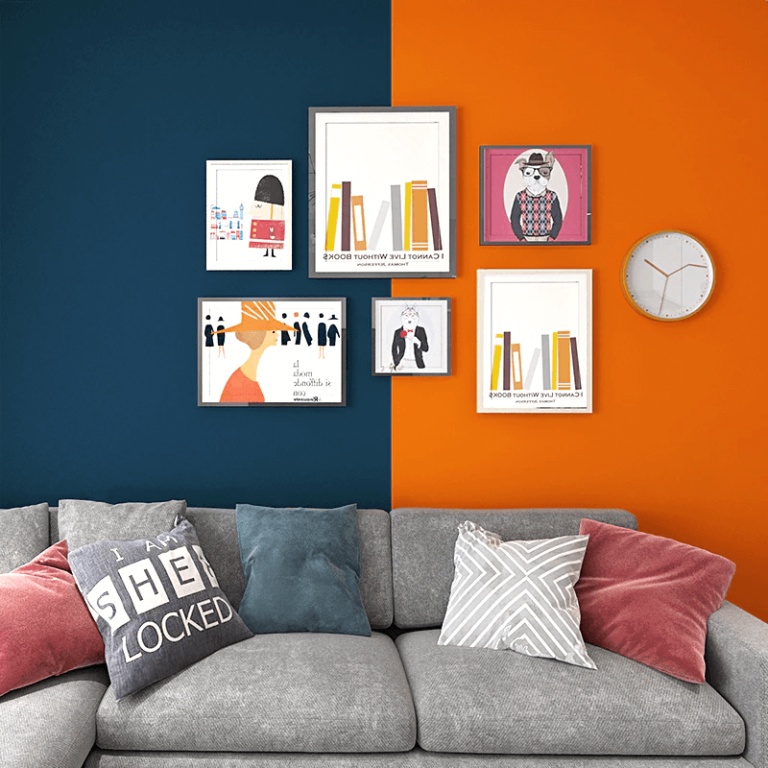
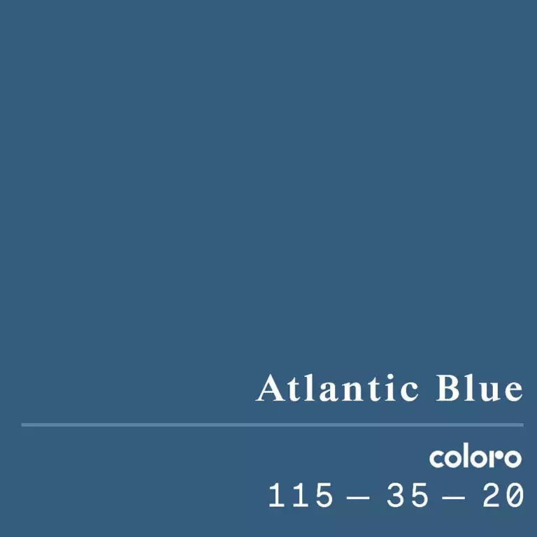
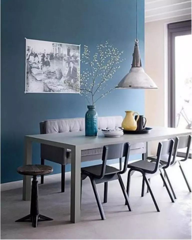
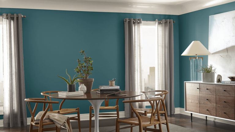
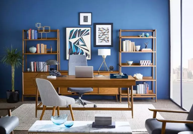
Atlantic Blue
Deep, watery, serene, it represents the perfect balance between light and dark blue. Designers are already considering it with interest not only for modern decoration but also as a way to update interiors in the spirit of neoclassicism.
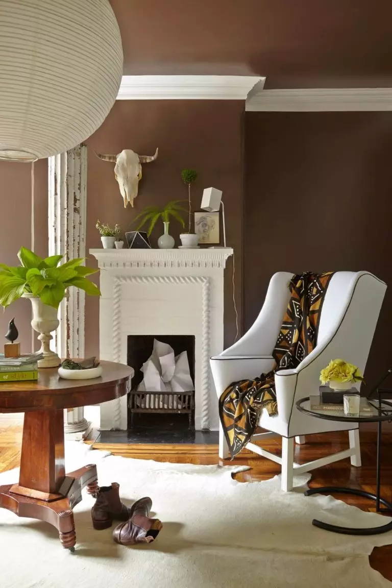
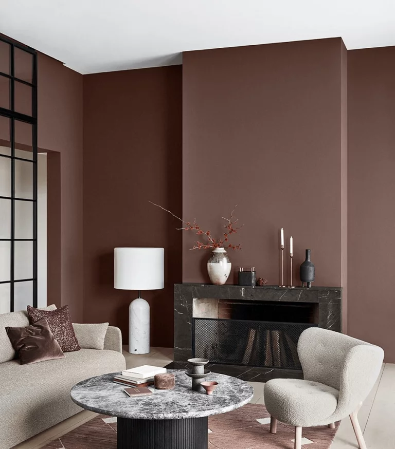
Nature Brown
The natural dark brown tone most surprisingly combines the earthy coolness and warmth of the bark with the confident notes of dark chocolate. Excellent as a color for flooring, and as a shade for accessories and textiles, and as a shade for furniture. A great partner for Butter, Olive Oil, and Atlantic Blue.
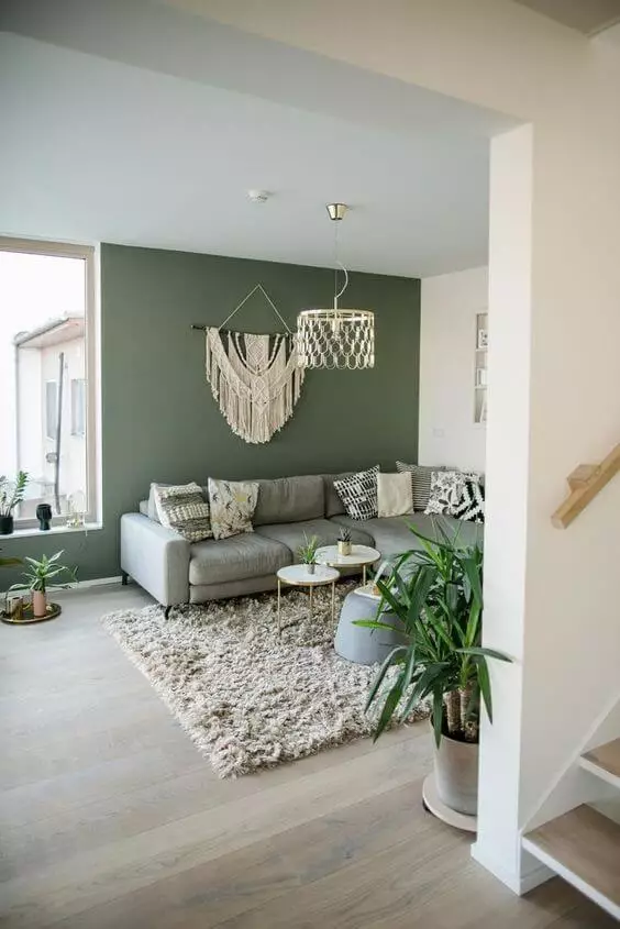
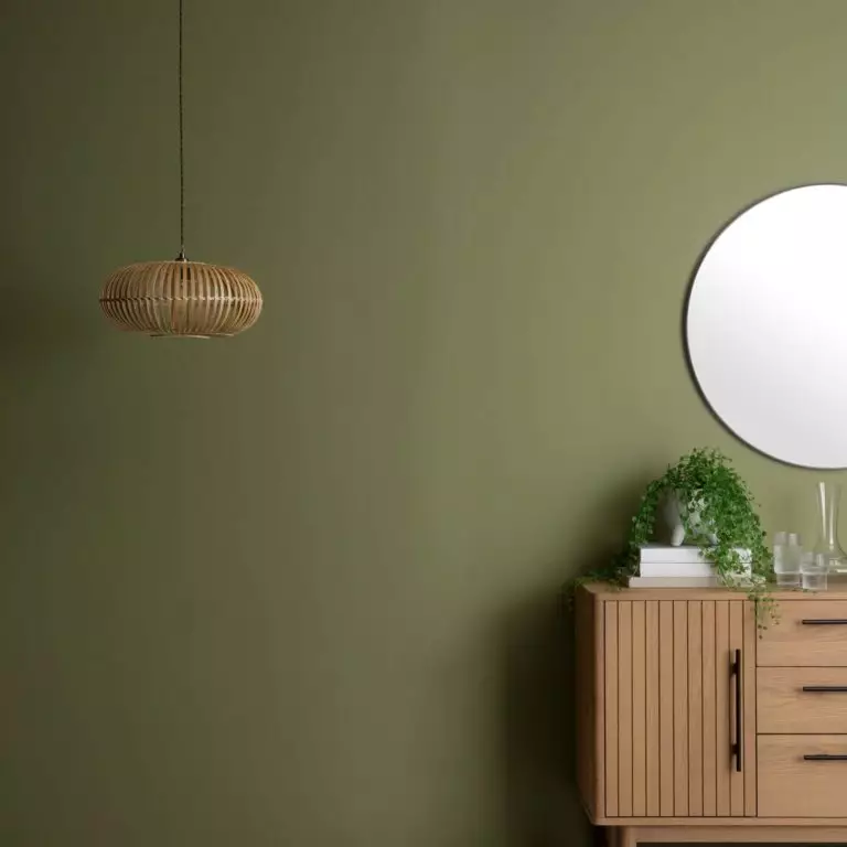
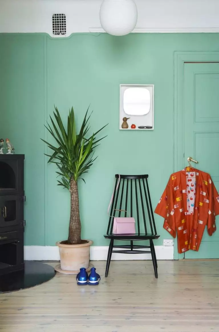
Green Quartz
Do you like eco and crave coolness? In 2022, you will get it all! A cool, dark green iridescent shade is recommended to be used as a background shade, complementing the interior with elements from natural materials and neutral accents.
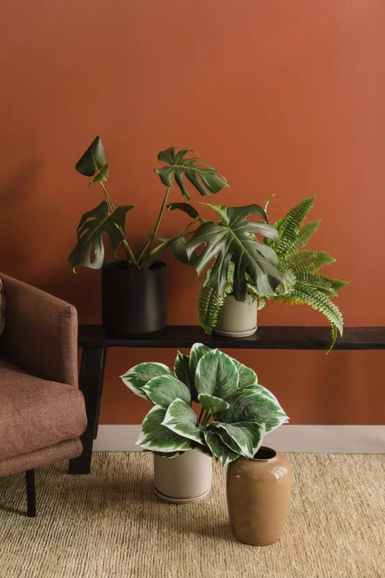
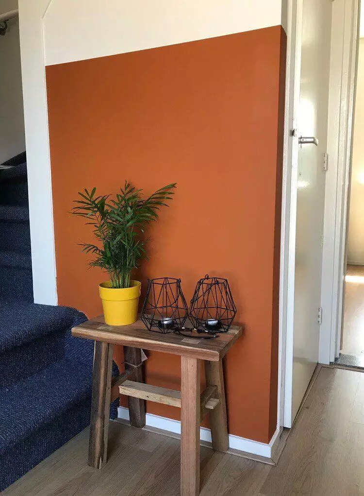
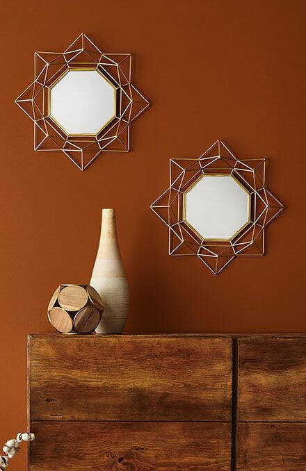
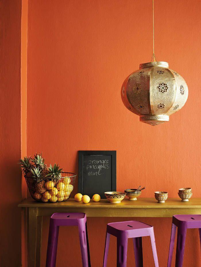
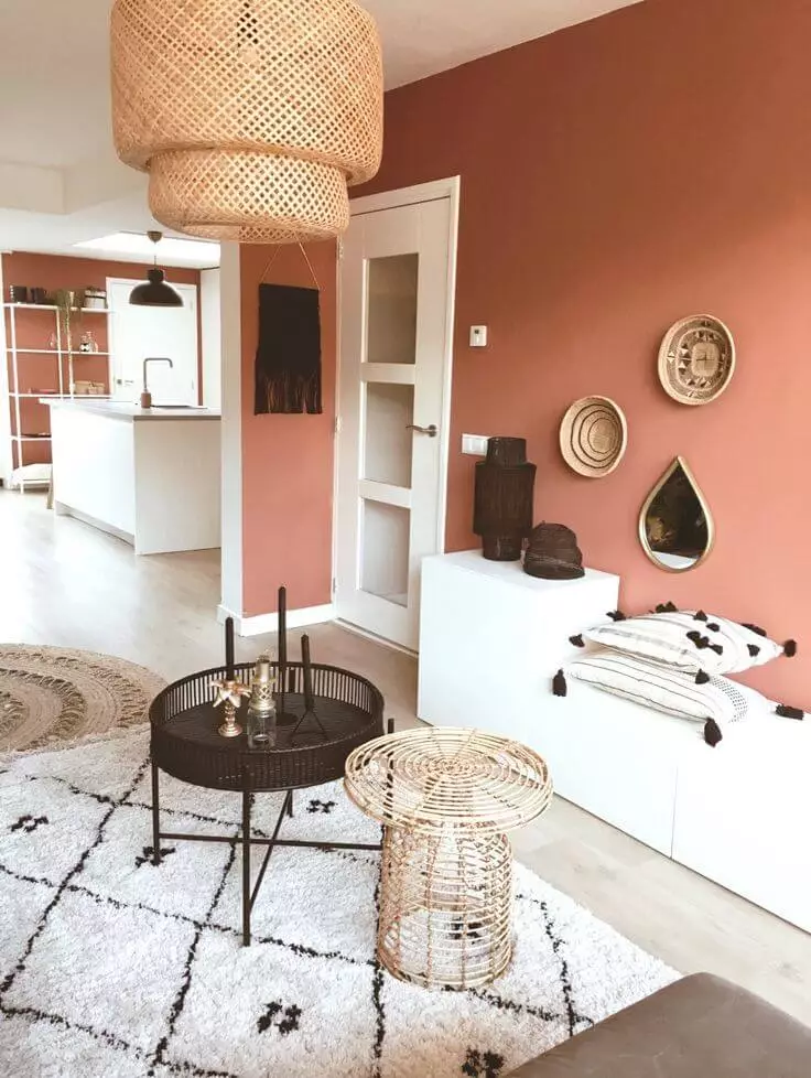
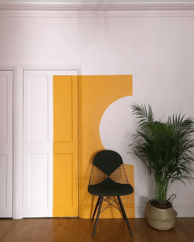
Dahlia Orange
If the luscious feast of Mango Sorbet isn’t too close to you, take a look at this ambiguous and sensual tone. The flashes of fire and the splendor of the August sunset are clearly felt in it, represented by the softest notes. In any case, this is a sure-fire way to add more positivity to the interior.
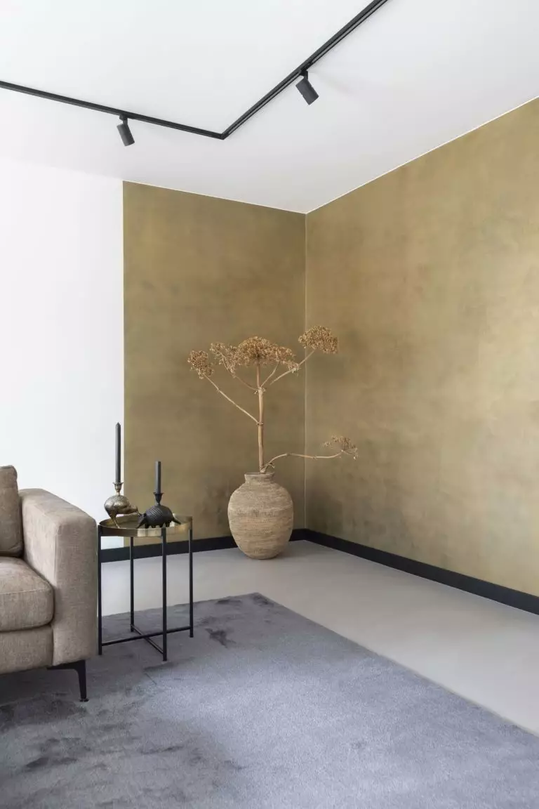
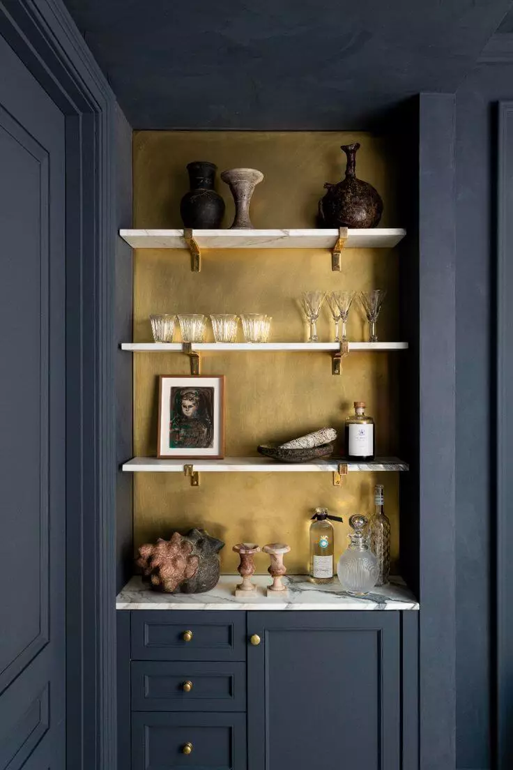
Military Gold
Oh, how long have we been waiting for this color of darkened precious metal, in which the notes of khaki sound distinctly! If ordering the whole house in gold is not your plan, be sure to use this color for accessories – in combination with Olive Oil, Natural Brown, or Atlantic Blue, the effect promises to be stunning!
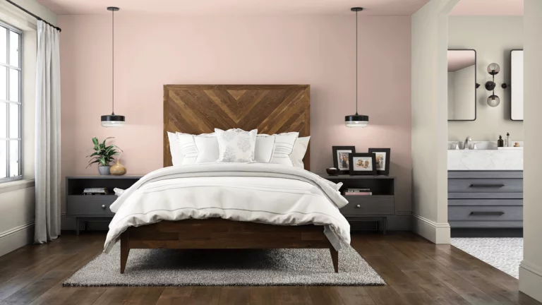
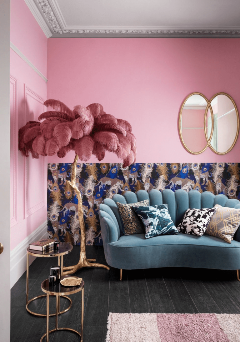
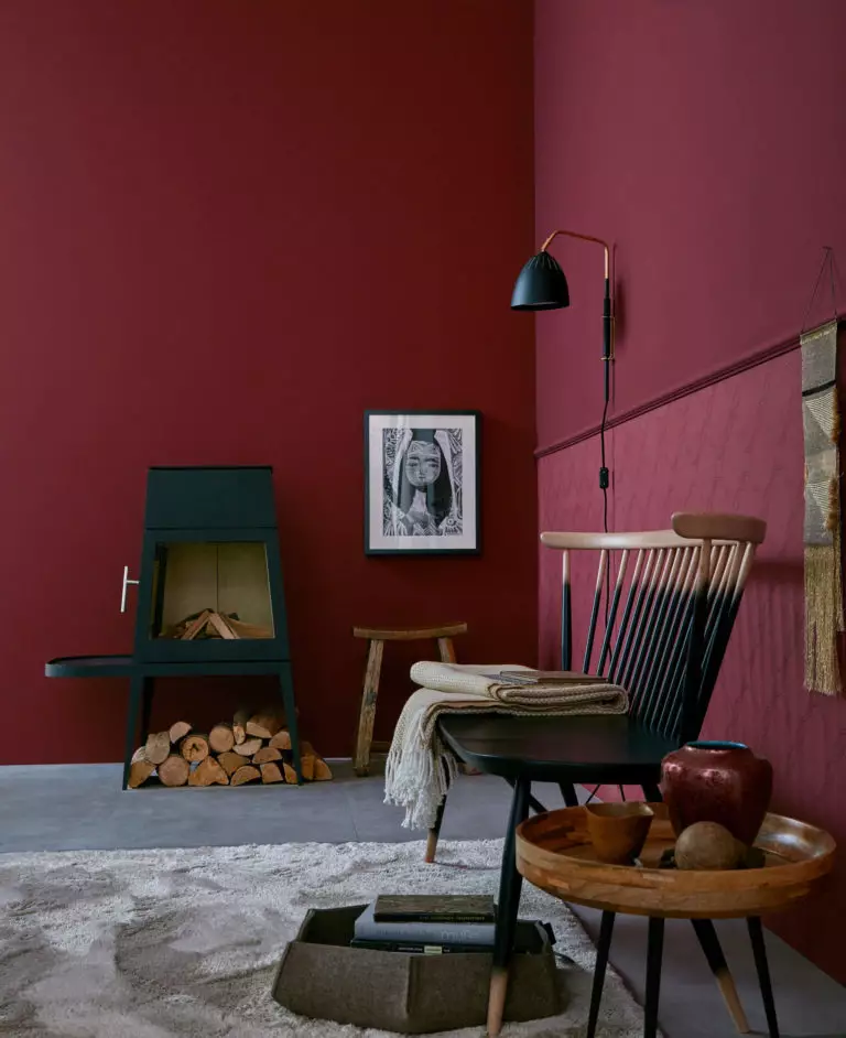
Pink Charlotte
Saturated and coldish pink, in some places, turning into crimson, no longer scares those who previously considered it frankly childish. This shade successfully overcame any prejudices and became one of the most beloved among designers, mainly if used on expressive textures.
By the way, a significant difference between the Coloro palette and Pantone is that it is the same for everything that surrounds us – from furniture and wall paint to clothes and accessories. So if you are planning to update your wardrobe using this system along with the remodel, you will not have any problems!
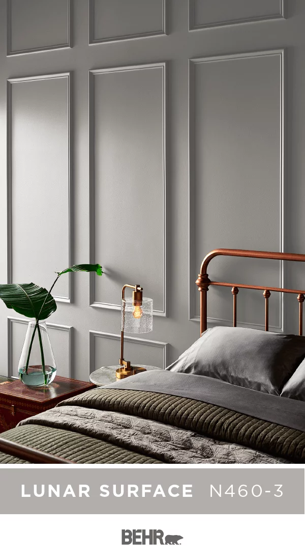
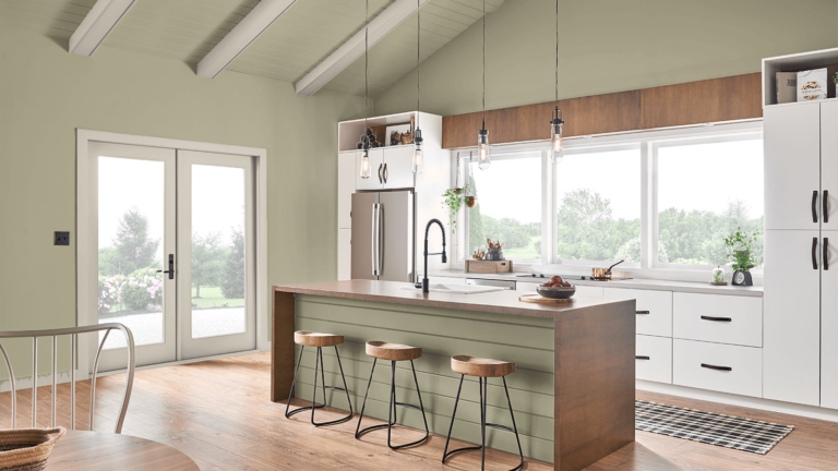
Color Trends 2022: the palette by Behr
We have previously written about Behr, an American company that has been supplying paints for indoor and outdoor use for over 70 years. The brand’s authority is so high that today it sets its own color trends, and forecasts for 2022 also receive special attention from designers.
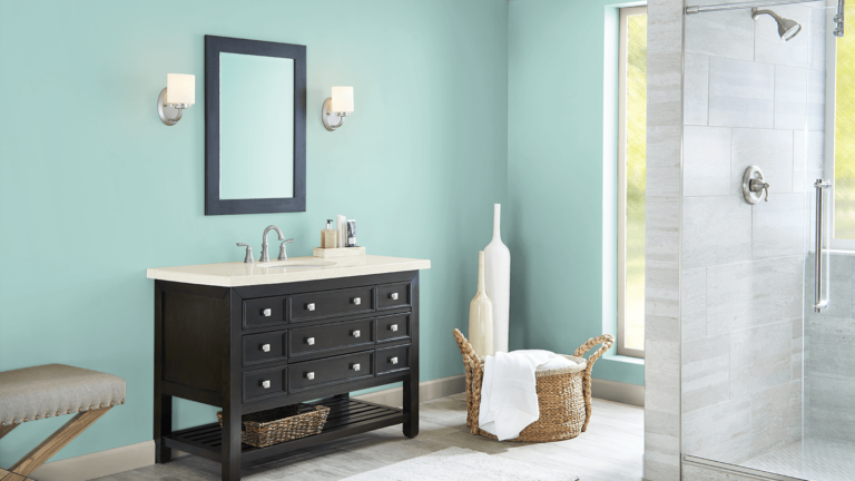
According to Behr, the shade with the mysterious name Breezeway (“transition”) became the color of the year, an ashen, watercolor blue-green color with ringing crystal notes – no wonder its second name sounds like Sea Glass Green. This unique color is like a breath of fresh air, a constant and discreet breeze, a symbol of spirituality and the transition from the physical to something higher. Although the field is still open to experimentation, the brand’s experts recommend pairing it with grays, whites, and natural woods.
As for other shades relevant for 2022, this time, in addition to Breezeway, 19 more shades are waiting for you, which can be conditionally divided into several groups.
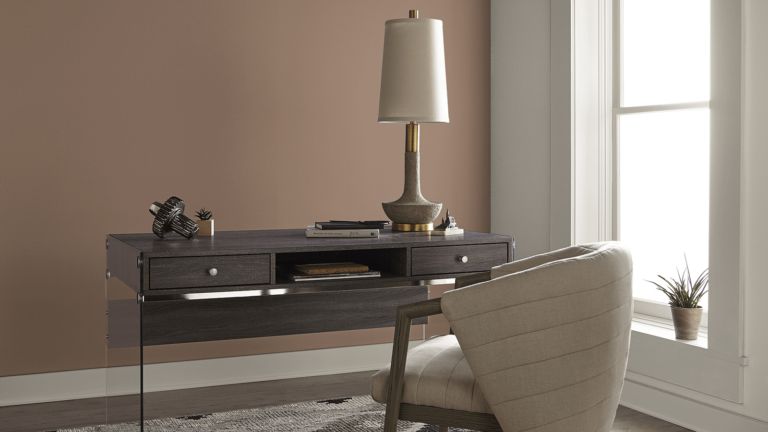
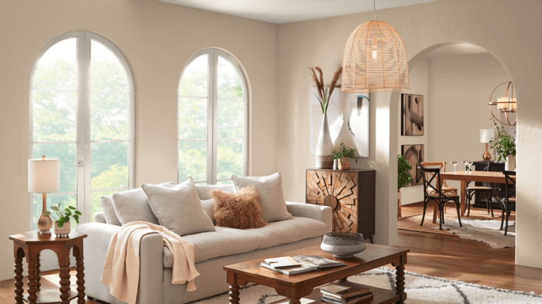
Neutral
The brand’s trendy palette includes the following neutral tones:
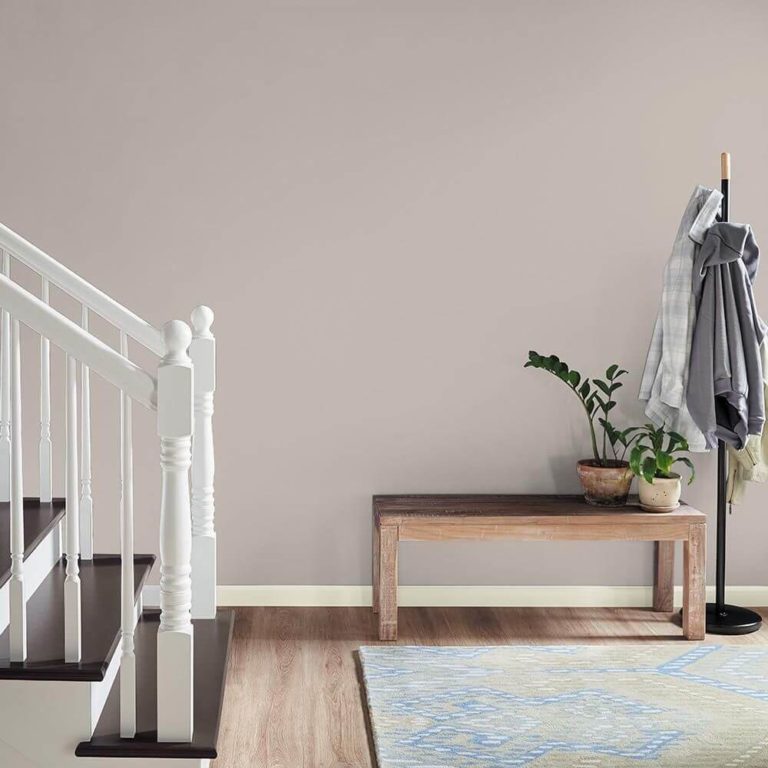
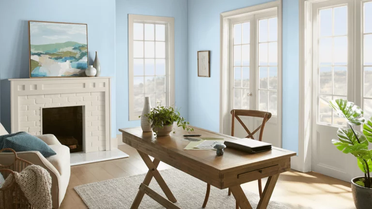
Light
As the current light shades for 2022, Behr offers:
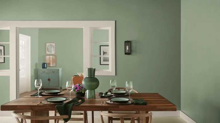
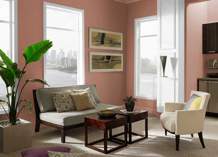
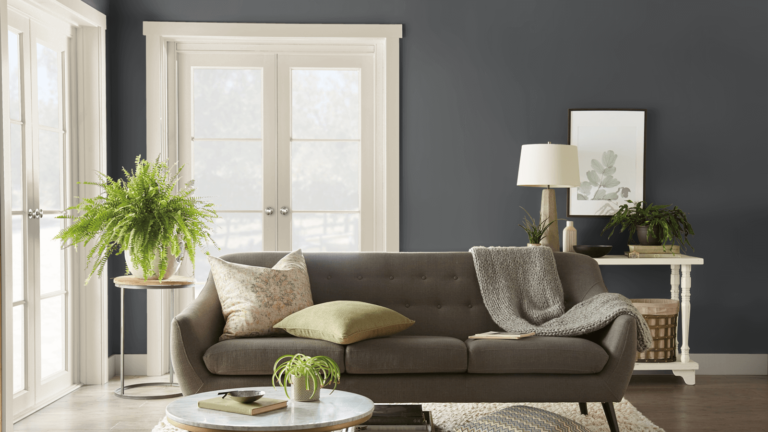
Saturated
Saturated and deep tones also found a place in the Behr palette – pay attention to the following shades:
In general, the Behr trendy palette for 2022 is subordinated to the idea of creating a space as a cozy and safe haven, a place where you can relax, calm down, not think about problems outside, and immerse yourself in serenity, generously seasoned with natural accents. Sounds tempting? So it’s time to order paints!
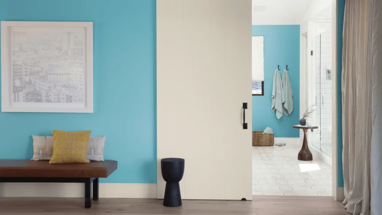
Pantone color trends 2022
And, of course, the cherry on the cake for color interiors of 2022 can be safely called our beloved Pantone. Every year we expect new discoveries from this American color system, and it never disappoints us.
This time, Pantone presented a range of 19 shades, from which the designers immediately compiled magnificent interior palettes. So, we bring to your attention the most balanced of them.
Nostalgic Memories
This palette was inspired by the aesthetics of the late 60s and 70s, with its rebellious spirit, playfulness, and optimism. The priority of warm earthy tones, characteristic of that time, was reborn through the use of shades such as beige, natural green, soft white, and burnt orange, generously seasoned with ethnic patterns and flowing lines.
The following Pantone shades are used for this palette:
Y2K
In general, this abbreviation hides the well-known problem of the year 2000. Still, today it has been transferred to a new meaning – the generations of the mid-1990s-early 2000s, an era when the popularity of the Internet began to grow at an unprecedented pace.
Y2K’s aesthetics are a blend of millennial technical advances and current pop culture trends, as reflected in the Pantone colors for 2022 chosen for the palette:
Zen Silence
This palette is inspired by the principles characteristic of the design of the Far East – it is a philosophy of simplicity and relevance, the dominance of natural materials, and precise geometry. And all this is diluted with subtle touches of imperfection typical of handicrafts.
Unsurprisingly, this palette uses Pantone’s most natural and neutral colors:
Southwestern Desert
A palette inspired by the magic of orange (which, by the way, is actually present in all the palettes offered by trendsetters for 2022) calls for the use of optimistic, hearty, and warm hues that encourage us to create and enjoy life.
Combining this craving with the magic of natural landscapes and hot deserts, which are also reminiscent of ethnic patterns, leather and wood, heavy fabrics and white accents, semicircles, and arches, we get the following trendy palette from Pantone:
Mediterranean Vacation
We have all been looking forward to the transition from cool Scandinavian minimalism to a warmer, southern atmosphere for several seasons. Now the Mediterranean style, reminiscent of summer vacation by the gentle sea, is embodied in an abundance of light and air, natural fabrics, traditional ornaments and tiles, handmade tiles, and, of course, a refreshing and at the same time cozy palette, reflected in the colors from Pantone:
Cocooning
The concept of life in a cocoon arose back in the 80s of the last century when the need for comfort, stability, and security became really urgent. Today, in the pandemic era, they remembered about it again – and developed these ideas in an even more comfortable and positive way.
Today “cocoon” is a house in which all systems provide comfort, tranquility, and safety. This is reflected in interiors, characterized by curved lines, flowing shapes, and tactile materials that are pleasant to the touch. The colors of Pantone for this concept are matched with the appropriate – light, soft, warm, and in some ways even feminine:
So now you know what colors to look for when designing your home in 2022. We sincerely hope that these palettes contain your favorite shades – or tones that you are ready to fall in love with and create a color scheme that is perfect for you in every way.