Every paint manufacturer has its own top of paint colors that it can firmly show off. The renowned brand Sherwin-Williams comes with a no less impressive collection of shades that are real finds for various design solutions. Furthermore, designers and homeowners cannot help but fall in love with these variations again and again. Therefore, some of these paint colors prevail over the trends year after year and promise to stay the same for a long time.
Considering the top 50 colors at Sherwin-Williams and the current trends, we came up with a list of 15 timeless hues that are especially popular this year and do not seem to get out of date for years to come. Not to our surprise, most of them are neutrals, although vibrant shades are also part of the list. Get ready for irreplaceable classics, modern sparkles, and even a few unexpected splashes!
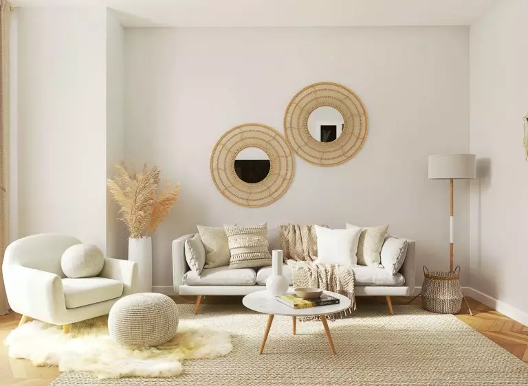
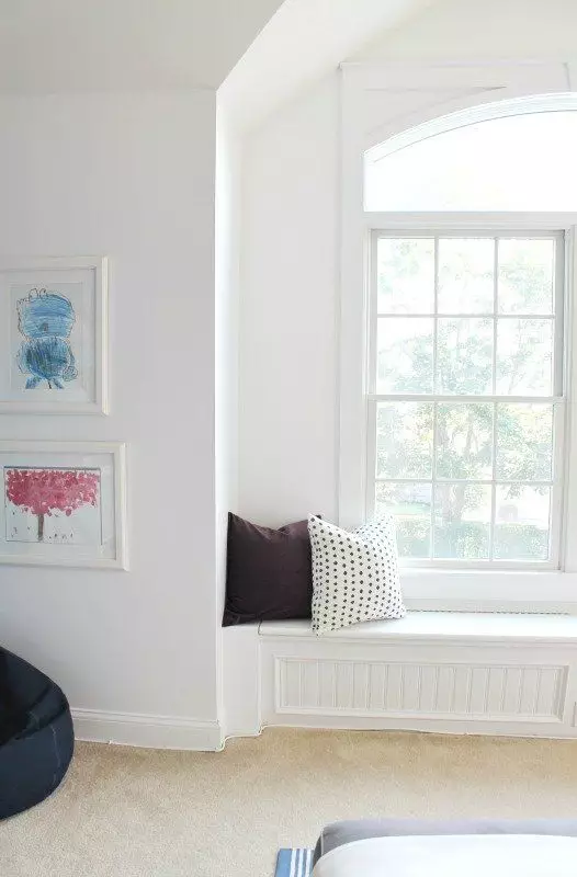
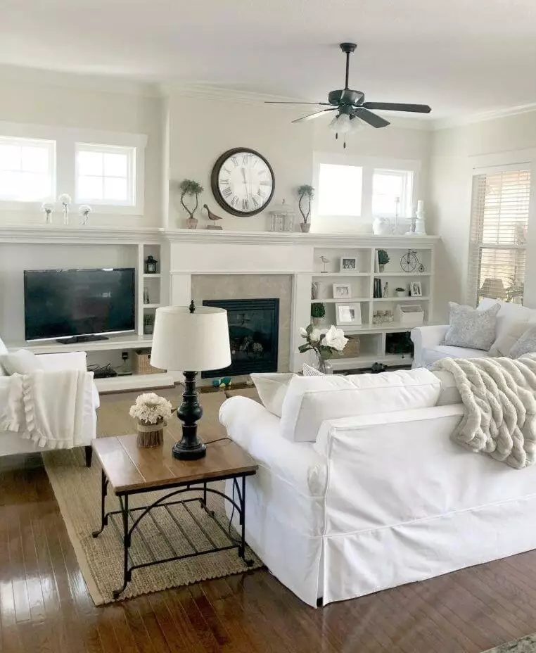
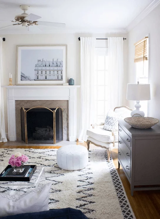
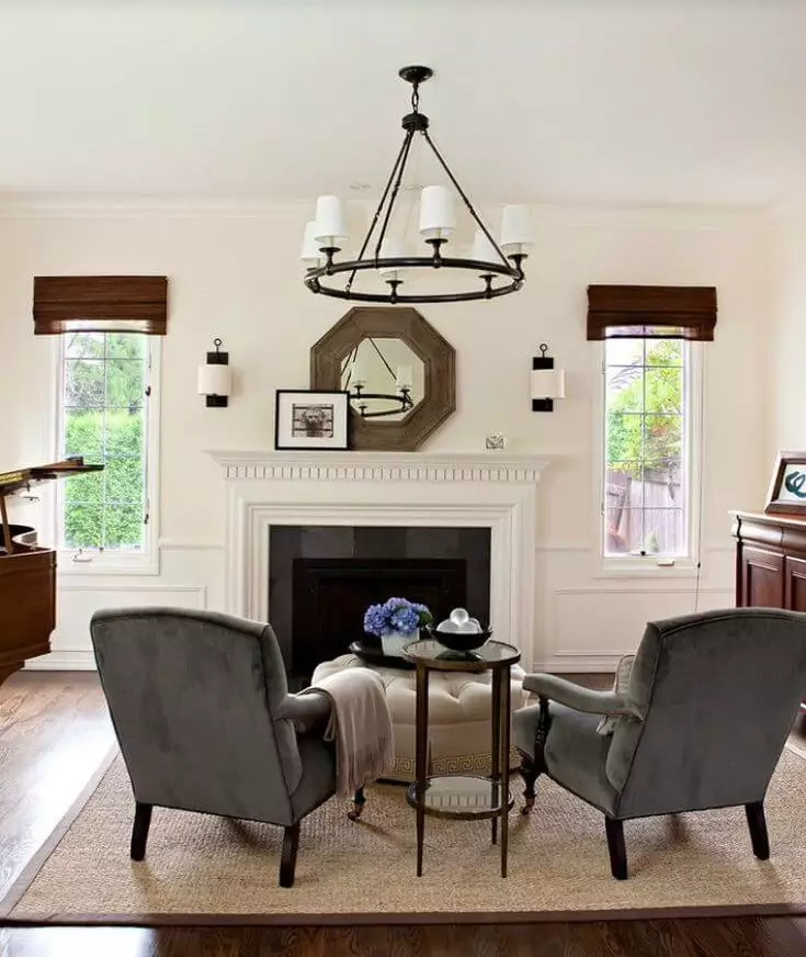
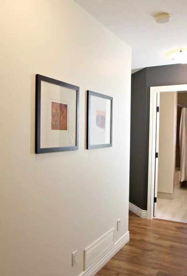
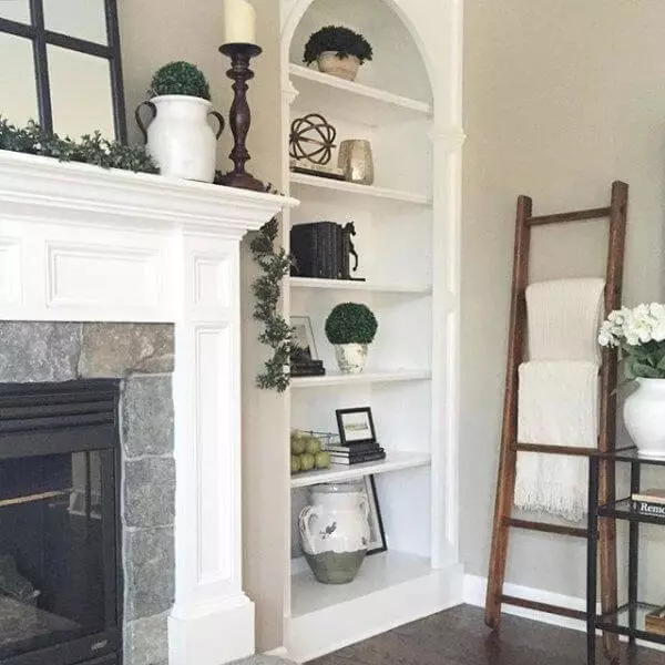
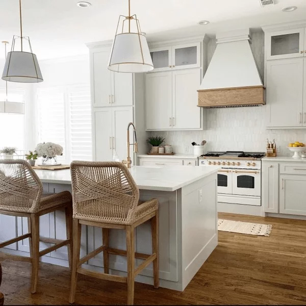
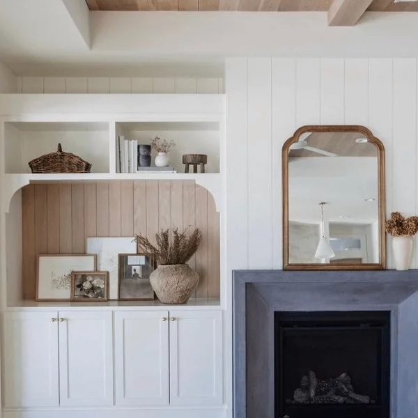
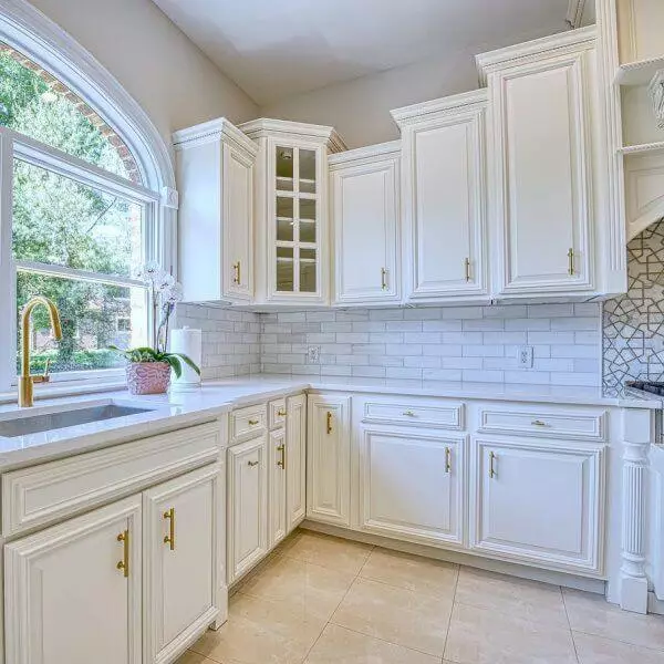
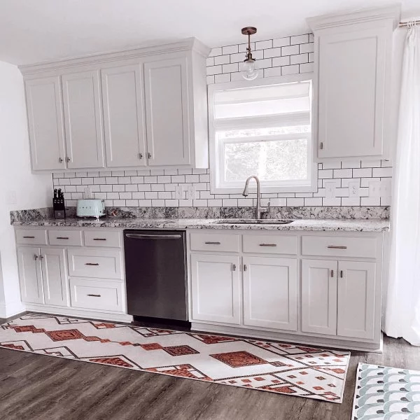
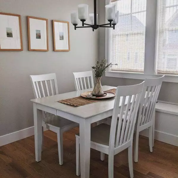
Pure White SW 7005
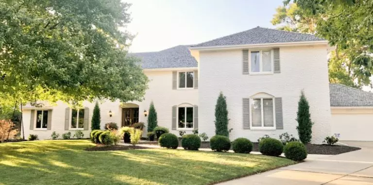
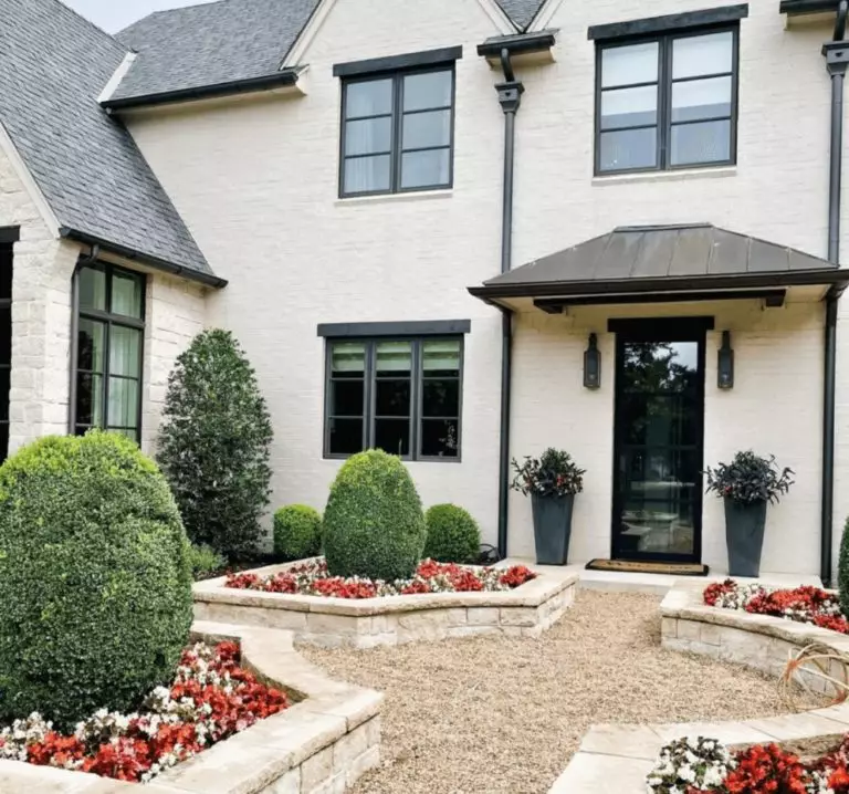
One of the most renowned shades of white at Sherwin-Williams, Pure White features a true shade of this kind devoid of striking undertones that impresses with its pure base. Therefore, this shade replicates a perfect mix of crispiness and softness, making it a real find for any design approach.
This paint color stays true to its nature, neither cold nor warm, although a slight play with lighting undertones can instantly change the scenario. Pure White is a go-to color for the walls, trim, cabinetry, and ceiling, with no less impressive effect on the exterior, particularly considering that this shade is friendly towards any other splash of color.
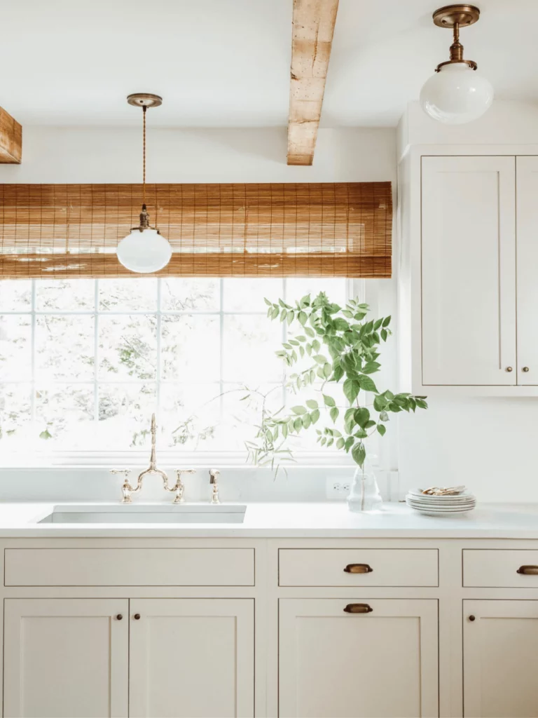
Shoji White SW 7042
Inspired by Japanese architecture, Shoji White reflects a warm and natural shade of white, replicating an astonishing balance between white, gray, and beige. We can safely state that this variation is neutral and easily integrates into any interior.
Considering that this shade is still warm, designers suggest using it in spaces with northern exposure or poorly lit rooms to provide appropriate amounts of light and warmth. Shoji White is the go-to option in south-facing rooms if an emphasized sense of comfort is required. This paint color is light, warm, and no less neutral – a perfect choice for modern interiors and exteriors.
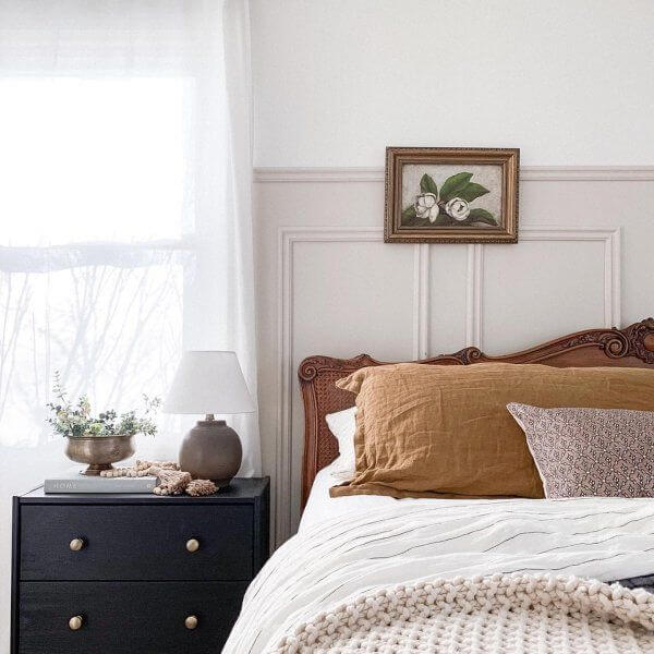
Navajo White SW 6126
This charming shade of light beige with standout yellow notes feels exceptionally comforting and mesmerizing. In a space painted this way, you feel surrounded by the softest particles of coziness. Although light enough to gravitate towards the medium and light color groups, Navajo White impresses first of all with its lovely peachy base.
One should note that this overly warm shade is a real find for north-facing spaces yet works no less appropriately for rooms with southern exposure if the matching colors slightly cool down this paint color. It is worth mentioning that this paint color may appear rather yellow within particular interiors. Since the current trends imply the use of warm shades to bring in as much comfort as possible, Navajo White is definitely a prominent representative of this kind.
Creamy SW 7012
This light creamy shade diluted with a few particles of gray replicates a well-balanced combination of notes. It does not feel too imposing nor too neutral, yet being able to soften the environment in the most exquisite way.
Due to its relatively neutral base, Creamy serves as a perfect background for bold accents, although its integration into a monochromatic interior is a no less appropriate option. The soft creamy base offers the right amount of warmth for a modern interior that does not lack comfort or a sleek contemporary look.
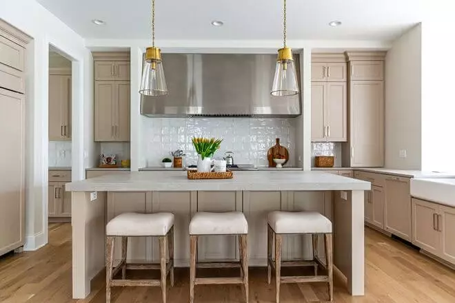
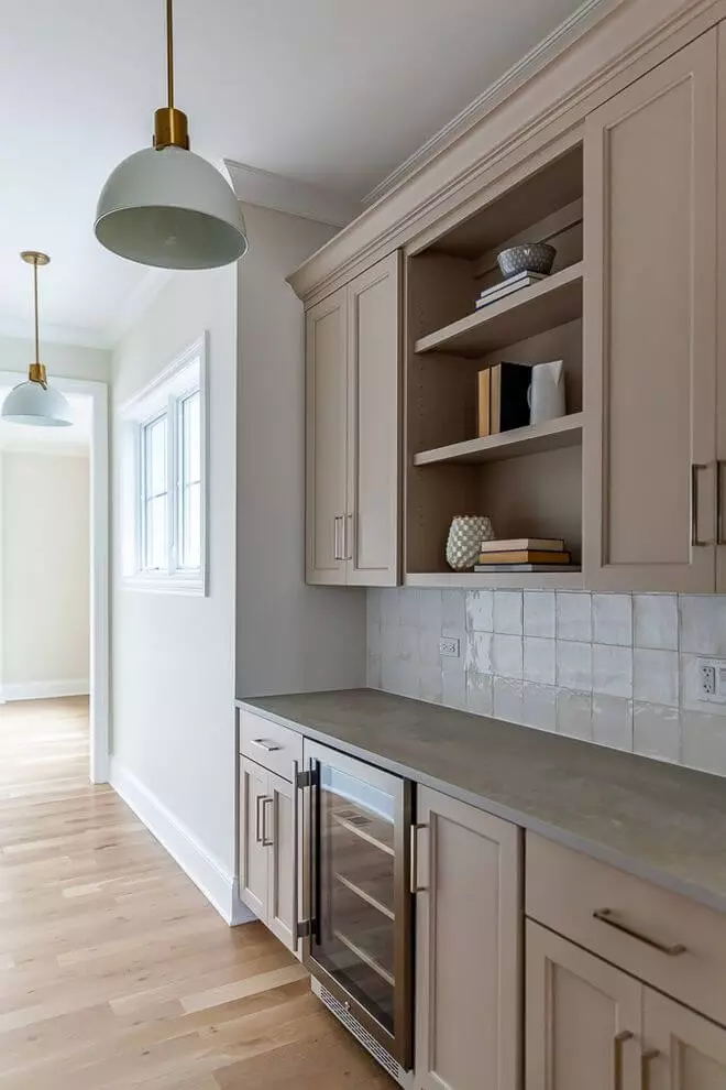
Accessible Beige SW 7036
The popular shade of beige is a medium color yet gravitates toward the light side, not devoid of a few gray particles. One may get confused about what category this paint color belongs to: is it the gray-beige or neutral one? Experts say it is rather a matter of taste.
Accessible Beige is a warm shade with a balanced base, featuring an impartial behavior. The thing is that it looks organic within almost any style and space, which makes it a go-to paint color one should not hesitate to give a try.

Balanced Beige SW 7037
Not that far from the inner beauty of the previous shade, this beige variation features more of a brownish base. We can firmly state that Balanced Beige is a rather dark beige shade with a gray-brown hint. Still, it is neutral and behaves like one.
This variation has a soft sense of warmth, which is not too striking because of the lack of yellowish particles. Furthermore, Balanced Beige requires an appropriate amount of light to fully reveal its beauty. Like its neighbor – Accessible Beige, this paint color perfectly suits almost any design solution.
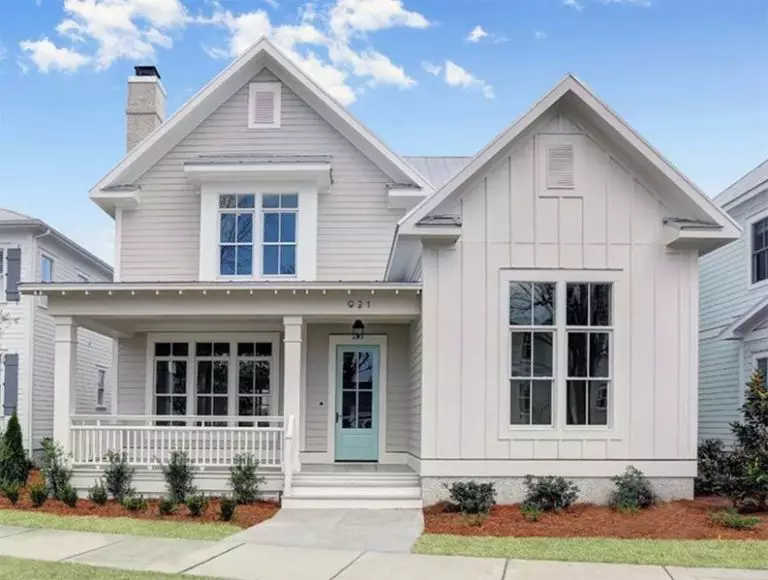
Alabaster SW 7008
According to designers, this is the perfect creamy shade of white. This soft white variation almost enters the off-white category, still staying true to its nature. Unlike most shades of white that tend to be tricky, Alabaster has a clear white base penetrated by an irreplaceable sense of softness.
This popular white variation is about simpler days and well-being without any eye-catching undertones, relying on new beginnings. This shade would perfectly set a new appearance to the interior and exterior as a source of revival.
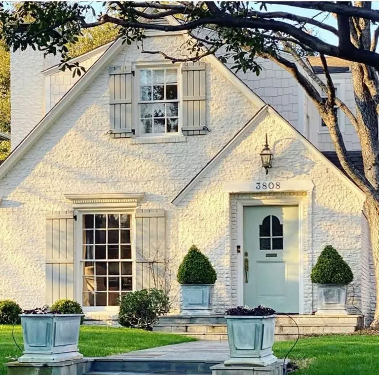
Greek Villa SW 7551
There are a few perfect shades of white developed particularly for white lovers, and Greek Villa is exactly what we mean. Although not a true shade of white, this paint color outstandingly replicates the beauty of a pure off-white variation.
One should note that Greek Villa is a brighter alternative to the beloved Alabaster, perfectly resembling the Mediterranean lifestyle from the perspective of a light shade. This paint color’s delightful appearance complements contemporary interiors and exteriors that require a bit of balanced softness.
Softer Tan SW 6141
The medium paint color that gravitates towards the light side with a pleasing combination of brown and gray penetrated by the softest notes is what we indeed call a softer tan shade. This paint color seems slightly warmer when applied to a surface, replicating a natural sense of calmness.
Due to the yellowish scents that slightly penetrate the surface when the color is put into practice, Softer Tan can easily be mistaken for a beige shade, which makes it even more relevant within contemporary interiors and exteriors.
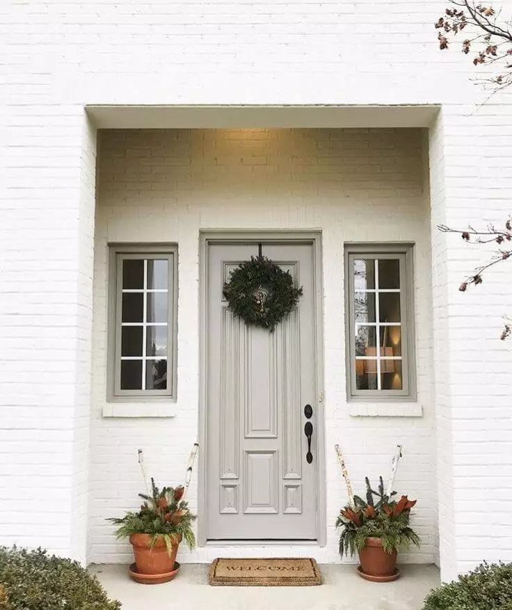
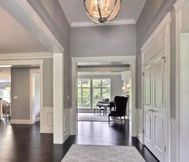
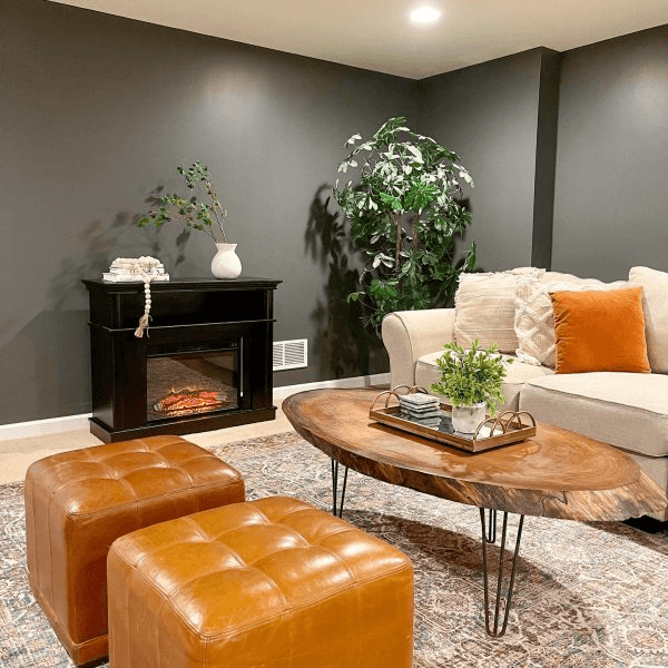
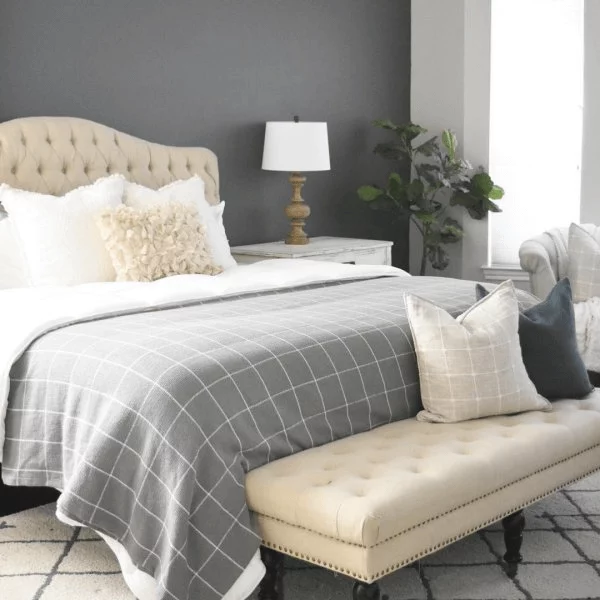
Repose Gray SW 7015
As the name implies, Repose Gray radiates nothing else but a gray paint color that induces an exceptional sense of relaxation. Gravitating between the true-gray and beige-gray color groups, this paint color is a light shade with a complex mix of undertones. To be precise, Repose Gray is rather warm than diluted with beige yet hides a sophisticated composition despite the relatively neutral base.
Undoubtedly, Repose Gray finds its way in any space and within any conditions, setting the desired calming effect: the perfect neutral shades for connoisseurs of true neutrals with a bit of magic – the slight warm notes.
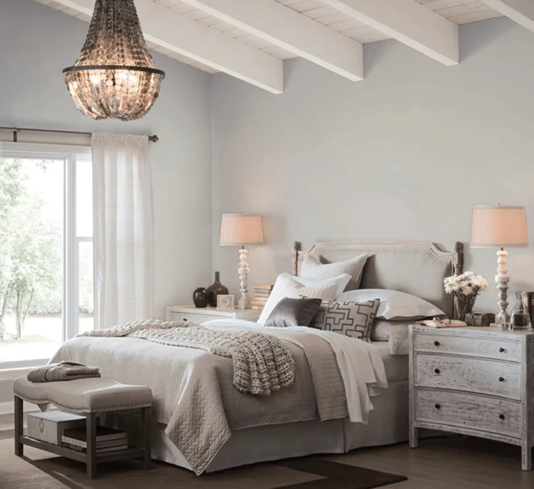
Light French Gray SW 0055
Since it comes right after Repose Gray, it should be noted that Light French Gray is the same gray variation devoid of the subtle beige undertone, which makes it indeed a true shade of gray. To be honest, LFG is relatively cool, just like a fresh summer breeze stuck in a can with paint.
In particular conditions, this paint color may reveal a slight purple note that impressively refreshes this shade. Generally speaking, this is the perfect neutral for contemporary interiors and exteriors, whether a minimalist layout or an eclectic setting.
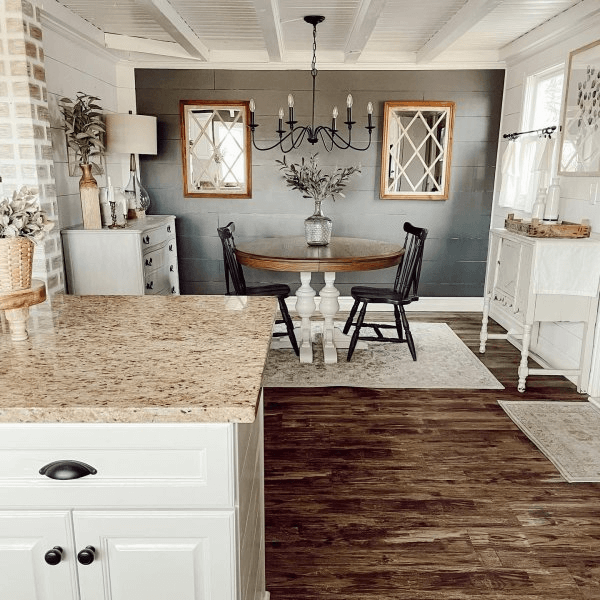
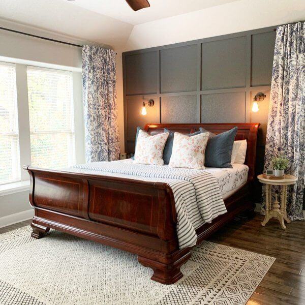
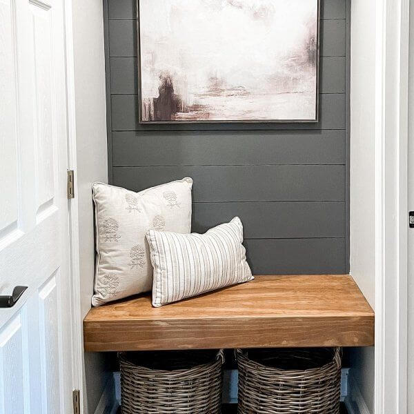
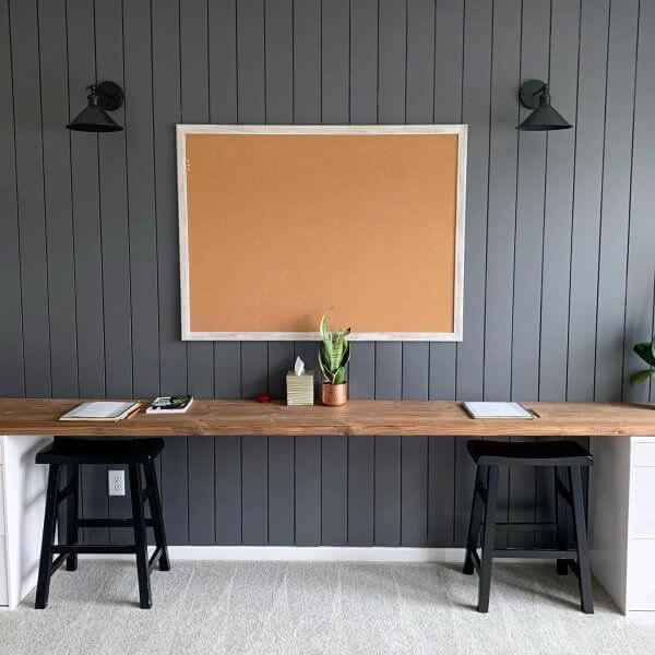
Drift of Mist SW 9166
Despite its standout place within the current trends, Drift of Mist is already a classic. This timeless splash of neutrality offers a new perspective on the beloved pastels. This shade entered the trends as a creamy gray that prevails over the calm shades even from the start.
The deep gray base is diluted with yellowish and greenish particles that bring a complex appearance and make this shade stand out. Still, the final result depends on the lighting and neighboring colors. Regardless of its complex composition, Drift of Mist also replicates the charming notes of versatility, and one can safely go for it, considering any style. Nevertheless, designers suggest paying attention to such approaches as Scandi, Modern, Classic, Traditional, Farmhouse, and Shabby Chic.
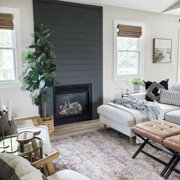
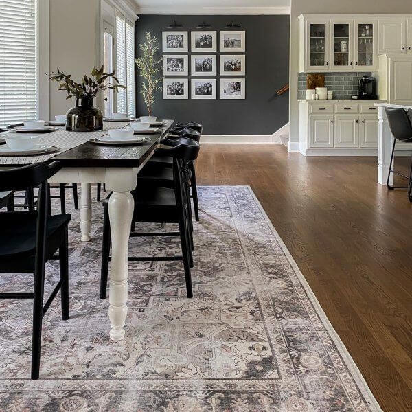
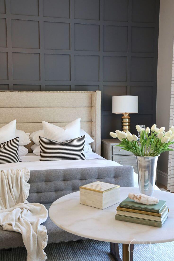
Peppercorn SW 7674
The fabulous combination of sophistication and depth that colorists from Sherwin-Williams came up with is a standout accent that takes the interior and exterior to the next level. Despite its dark base, Peppercorn is almost a true shade of gray. Furthermore, we speak of a chameleon here. This paint color may reveal various faces under different conditions.
Peppercorn may seem lighter depending on lighting, gravitating towards the medium grays or darker, being mistaken for a charcoal variation. When applied to the interior or exterior, this shade brings either drama, depth, sophistication, elegance, formality, or contemporaneity.
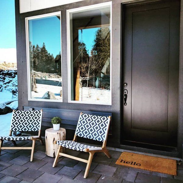
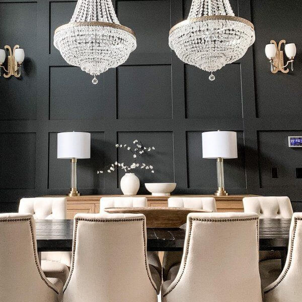
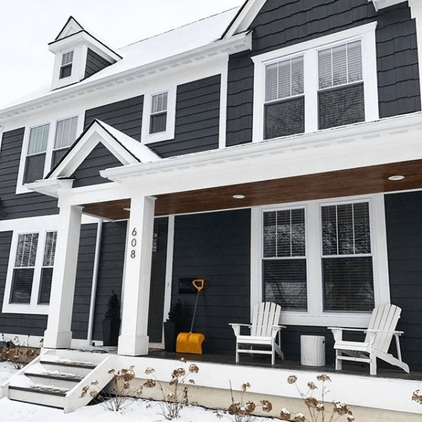
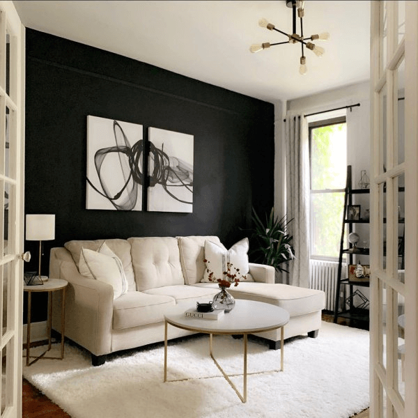
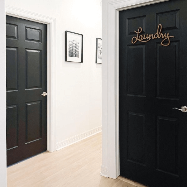
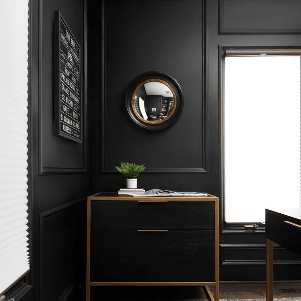
Tricorn Black SW 6258
The irreplaceable shade of true black that quickly entered the trends and does not plan now on giving up on this position impresses with its pure base devoid of undertones. A classic of its kind, Tricorn Black is the go-to option for an unforgettable accent.
Despite its relevance within modern interiors, this shade can be as successfully integrated into traditional settings. It brings a fabulous effect no other shade could replicate, all due to its impressive impartiality.
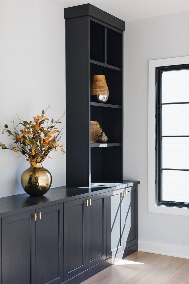
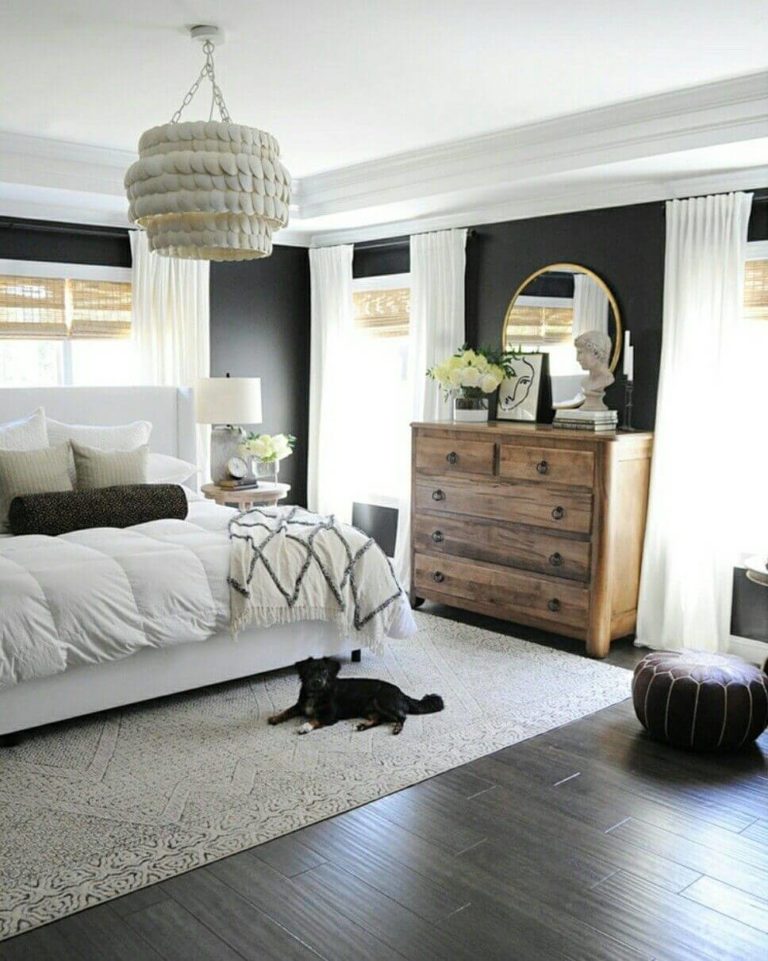
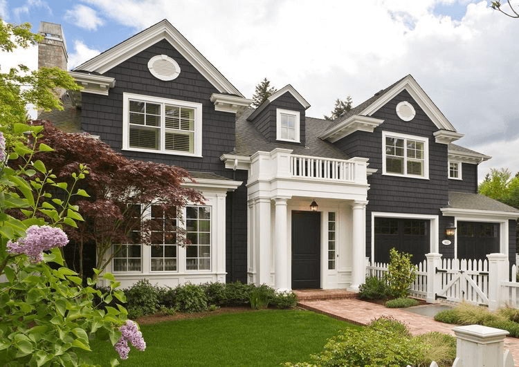
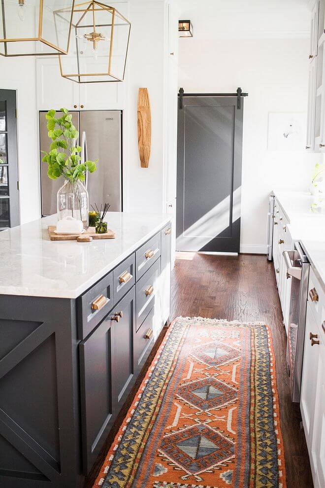
Iron Ore SW 7069
Another drama-inducing shade – Iron Ore, which may seem black. Still, it is a dark gray paint color. One can easily compare it to graphite, yet with a very soft surface. As strange as it may sound, tranquility is associated with this shade, making it a go-to option.
Iron Ore does not seem depressing by any means. The unusual sense of softness it radiates is enough to set a calm environment yet full of individuality. It is no surprise a seemingly black shade that covers so many impressive features is a popular choice within contemporary interiors and exteriors.