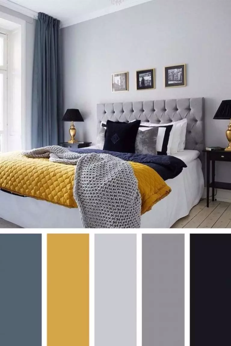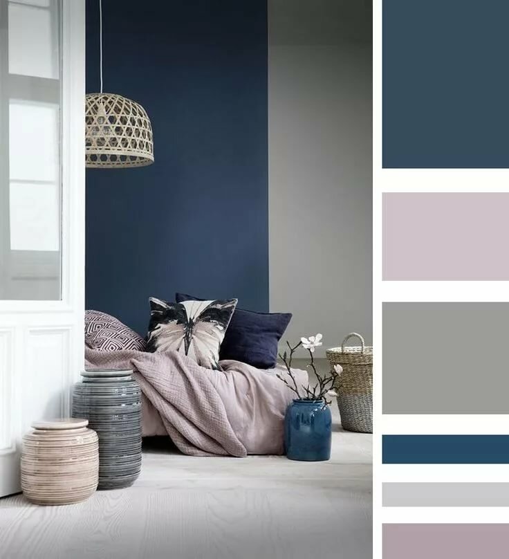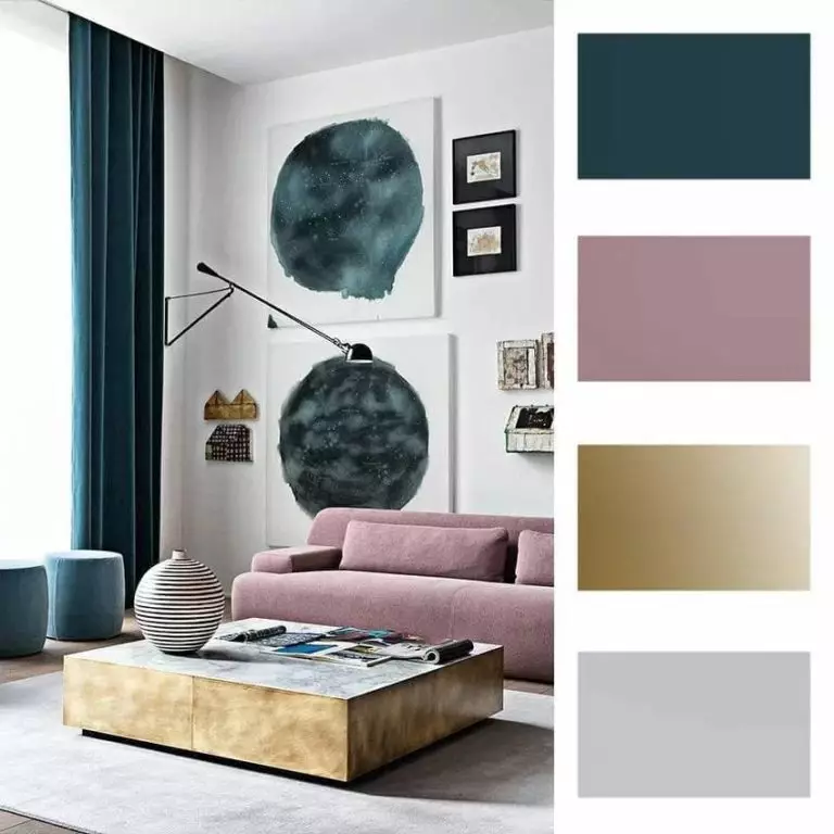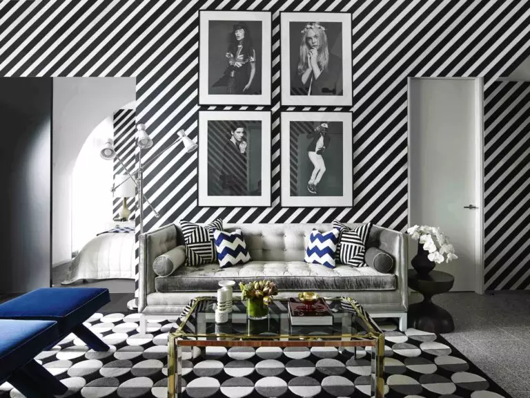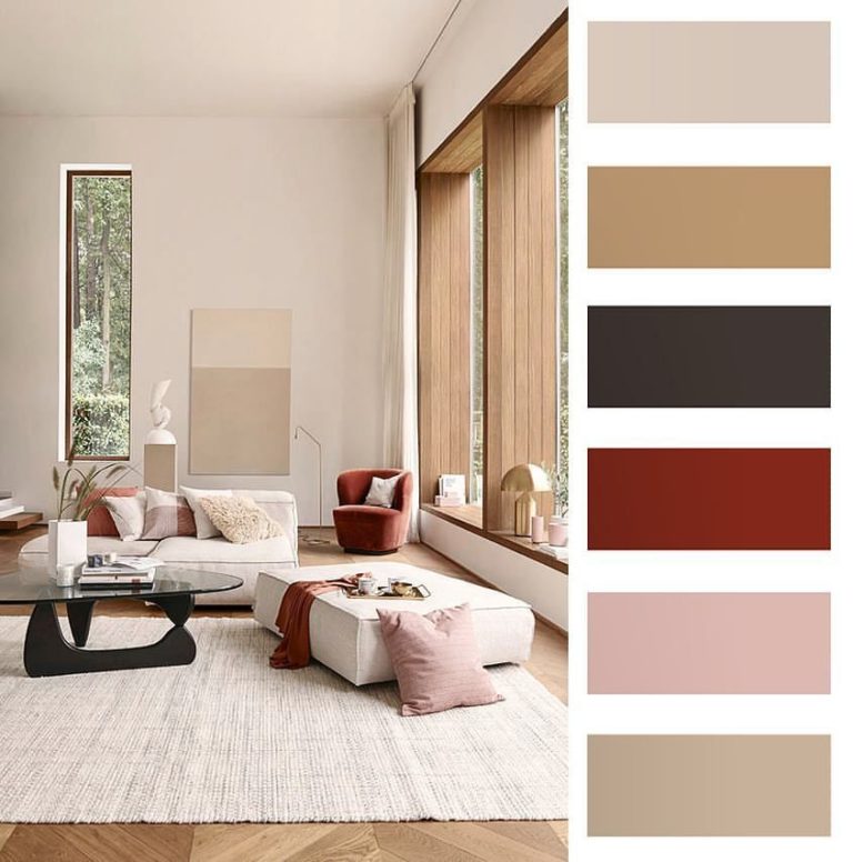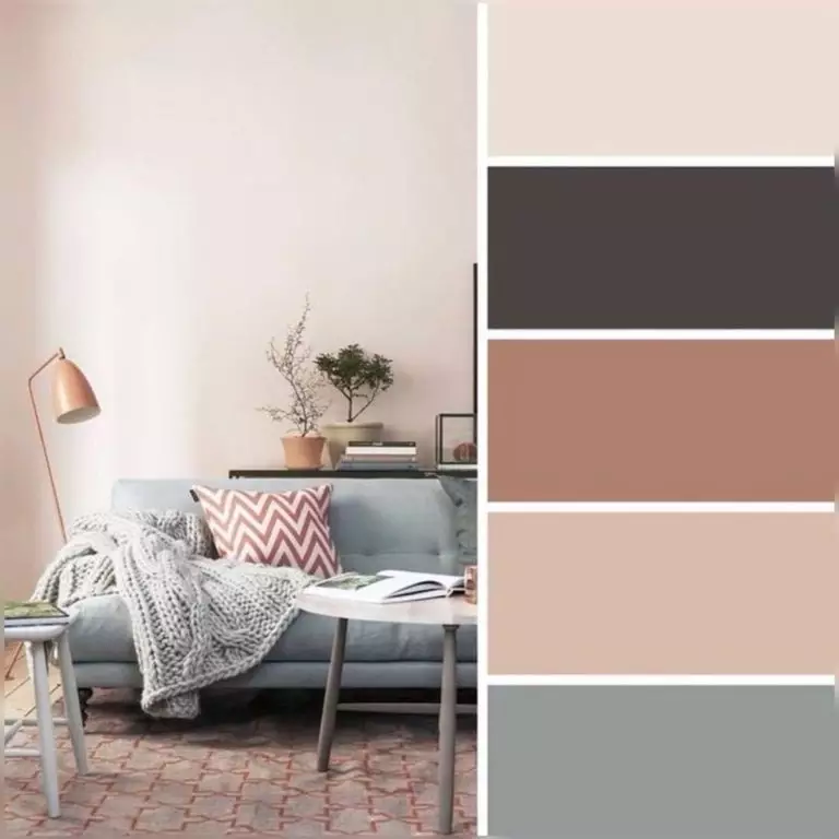
Color is an indispensable component of any interior. However, even more broadly, this is an integral part of our life. This is the mood, emotions, and attitude to the world around us. That is why selecting an interior palette is often decisive in designing and decorating a house or apartment.
Today we are surrounded by a considerable number of colors and shades. It is challenging to choose those suitable for your interior and harmoniously combined with each other – if you act “by eye”. However, designers for a very long time and do not work so energy-intensive. In fact, finding the perfect color combinations is extremely easy if you are guided by the color wheel, which has been helping interior designers for at least half a century. Let’s find out what the color wheel is, how it is built and how to use it to find shades that can make up the perfect palette for your interior.
Color wheel concept
Over the centuries, people have been working on the possibility of systematizing color… No, not only designers and architects, as you might think, but specialists in other fields – artists, physicists, and even mystics. The first attempts were made by Isaac Newton, who decomposed the white color of the solar spectrum into seven colors, and later identified three main ones – yellow, blue, and red. The rest were obtained by mixing these colors and therefore were called secondary.
Later this experience was deepened by the Swiss artist Johannes Itten. In search of a mystical meaning in the interaction of color and form, he wrote the book The Art of Color, where he described in detail the properties of each color and identified seven color contrasts. His theory formed the basis of the circle that was named after him – Itten’s color wheel.
You have probably seen the color wheel at least once with your own eyes since it is used not only by interior specialists but also by fashion designers and web designers, and even colorists in beauty salons. You may even be surprised, but it is effortless to understand the principle of its construction. So let’s try together.
Color wheel principle
As you already understood, three colors become the basis of the circle – yellow, blue, and red. These colors are considered pure because you can’t obtain them by mixing any other colors. That is why these colors are also called primary. Now let’s find out what happens if you mix them:
So, we got three colors, which are called secondary. Now let’s try to blend the primary colors with the secondary ones located side by side. As a result, we get the following colors:
In addition to the three primary and three secondary colors, we have six tertiary colors that form a circle of twelve sectors. Does this mean that there are actually only twelve colors? Of course not – and now we will explain why.
How do we get more colors?
According to the studies of the same Itten, the features of color are influenced not only by the wavelength of the spectrum to which it belongs but also by several other factors – first of all:
Based on this, many shades and tonal transitions are born, which we perceive to a greater or lesser extent. Proceeding from this, colorists and paint manufacturers often make the color wheel more fractional, dividing it into smaller sections and inscribing the shades’ names in each of them – you can do this indefinitely.
We hope you understand how the color wheel works. Now let’s find out how we can use it when choosing shades for our interior.
Color wheel: interactions and basic combinations
So, as you already understood, the colors on Itten’s circle are arranged in a specific sequence with an entirely logical justification. However, how do you choose colors from this circle that will interact with each other?
In fact, it all depends on what goals you want to achieve – to create an expressive and rich contrast or a peaceful and calm atmosphere. In any case, the work on the color wheel is based on opposition and proximity principles. Based on this, five key color combinations are distinguished.
Monochrome (analog) palette
This type includes palettes based on a combination of three adjacent shades in a color wheel. In this case, the neighborhood can mean both a step in the circle’s azimuth and a step along the radius. Let’s look at the example of yellow.
So, next to yellow on the color wheel are yellow-green and yellow-orange. If we go along the sector from the center to the edge of the circle, then in this way, we can collect a palette of lighter (closer to the center) and darker (closer to the edge) tones. As a result, we get two possible combinations – three shades of yellow, one with green and the other with an orange undertone, or a triad of darker, lighter, and medium yellow tones.
Monochrome palettes are considered the calmest and restrained. These are the ones recommended for use in rooms with a soothing and relaxing atmosphere – primarily in children’s rooms and bedrooms.
Complementary colors
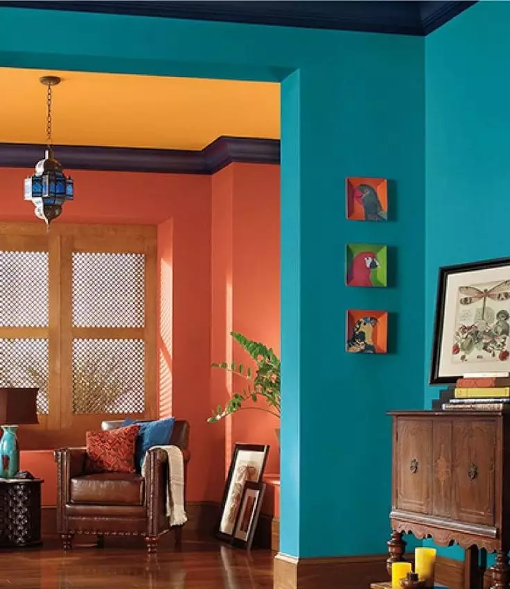
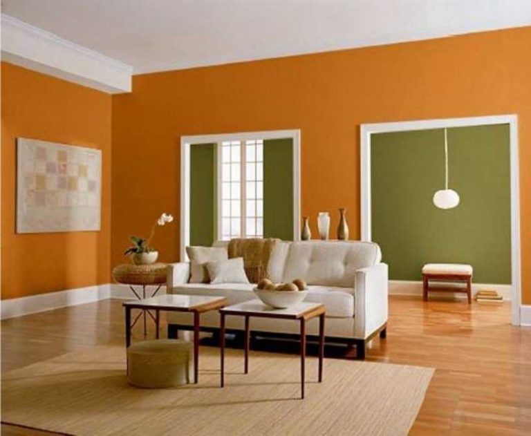
These are the colors located on the color wheel precisely opposite each other. Finding them is very simple: just draw a line from the color sector of interest to you exactly through the circle’s center. For example, green is complementary to red, red-orange to blue-green, and yellow to blue-violet.
You will need such combinations if you want to create a spectacular and expressive interior. However, it is undesirable to use complementary colors in equal proportions: the colors will suppress each other and create an unnecessary visual disturbance. The ideal solution would be to choose one color as the base color and the second one as an accent color or on the interior’s individual elements.
Color triad
If you do not need sharp contrasts, but there is a desire to use expressive color combinations, the so-called triad will help you to do this correctly – this is the name for three colors with sufficient contrast.
It is pretty simple to find shades that will be in harmony with each other – for this, it is enough to superimpose an equilateral triangle on the color wheel, and the vertices of this triangle will be on the sectors in which there are shades for the formation of that same triad.
For example, we want to create an interior palette based on blue and light blue tones. To do this, we impose an equilateral triangle with its apex on the blue sector – and we see that the triad with these tones is formed by red and yellow. Using their shades, you get a reasonably saturated and at the same time balanced color range.
If you would like to soften the contrast, then use an isosceles triangle with an acute angle – it will indicate the primary color, while the other two will be secondary or accent. So, for example, in the case of red, these will be blue-green and yellow-green shades.
Color tetrad (polychrome palette)
If you feel the strength to use more than three tones, the so-called color tetrad will come to the rescue. The color tetrad will indicate four shades or colors, one of which should be made the main, two additional, and one more for accent.
In this case, proceed in the same way as with the triad – only on the color wheel we already impose a square, the vertices of the corners of which will be in the matching sectors. For example, in the case of red, the tetrad will be blue-violet, orange-yellow, and green. This will make the two pairs of colors complementary, creating a more expressive color scheme.
If you need a softer but no less effective combination, then try to inscribe not a square but a rectangle in the color wheel. This way, you will find complementary pairs that are much closer to each other in the color spectrum, and this will create a varied and, at the same time, calmer palette.
Speaking of all these combinations, we do not mean exceptionally bright and clean tones at all. You can choose both lighter and pastel shades, as well as deeper and darker shades, moving within one color sector. So, when choosing a blue tone, light blue, dark blue, and classic denim are available to you. However, keep in mind: the contrasting shades combined with them must be equidistant from the center of the circle. Otherwise, there will be dissonance.
Neutral and achromatic colors
You might have noticed that there are no popular tones like black, white, gray, brown, and beige on the color wheel. Do these colors not participate in the selection of the palette for the interior? Quite the opposite – their role is crucial. However, due to some peculiarities, these colors are placed in two separate groups – achromatic and neutral. Let’s talk about them in more detail.
Achromatic colors
All the colors of Itten’s circle that we have listed belong to the so-called chromatic palette – that is, the colors of the rainbow spectrum we perceive. However, some do not have the so-called chromaticity and shades and can only be assessed by lightness. These colors are called achromatic or, roughly translated from Greek, “colorless.” You have probably already guessed what belongs to this category – these are black, white, and gray.
Achromatic colors cannot exist apart from chromatic colors. Firstly, these colors also create very relevant combinations with them, and secondly, achromatic colors directly participate in the formation of various shades within the color wheel.
So, achromatic gray, white, and black affect such important color parameters as lightness, saturation, and brightness. So, gray can make a color more or less saturated – the more we add it, the smoother the shade will turn out (if the ratio with gray approaches 50%, then our eye will perceive any color as a shade of gray). The addition of black can make the color darker or brighter, but white can change its lightness up to getting pastel shades.
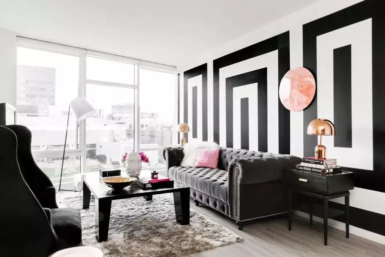
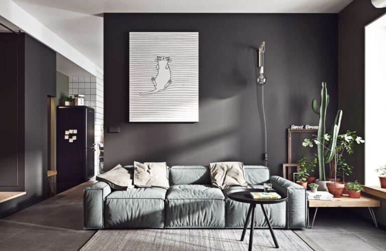
All three achromatic colors are actively used in interior palettes and can act as the main ones. In this case, complementary colors to them are selected according to the principle of complementarity or from an analog palette.
Neutral shades
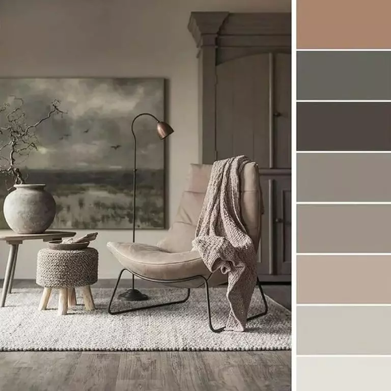
In interior design, achromatic colors fall into the so-called neutral palette, as black, gray, and white become an excellent backdrop for chromatic accents, as well as various types of textures and decor. However, if we are talking about neutrality, then we cannot mention the more expressive colors – namely those related to the brown-beige range. Among them:
All of them are formed from yellow and red colors, more-less diluted with white, gray, or black. However, these colors are endowed with such characteristics as saturation and lightness. Despite this, all of them have a calm, pacifying mood and can become both the basis for any interior and act as an accent.
In modern interiors (as, indeed, in classic ones), neutral and achromatic colors usually act as base colors. In this case, the color wheel will help you choose accent and complementary colors. We will talk about this now.
Selection of the palette by the color wheel: algorithm
To create an interior that is balanced in color and pleasing to the eye, designers recommend proceeding in the following sequence:
Of course, you can try experimenting and creating your interior based mainly on the color wheel. This option is quite acceptable, the most important thing – do not forget that you have to maintain the proportions of colors, and there can’t be two dominants in this case.
Selection of a palette for the interior: possible mistakes
Even experienced designers are not immune from errors in the selection of colors. We will save you from the most severe mistakes – be sure to keep them in mind when looking for the perfect color solutions for your apartment:
