What curtains go well with yellow walls?
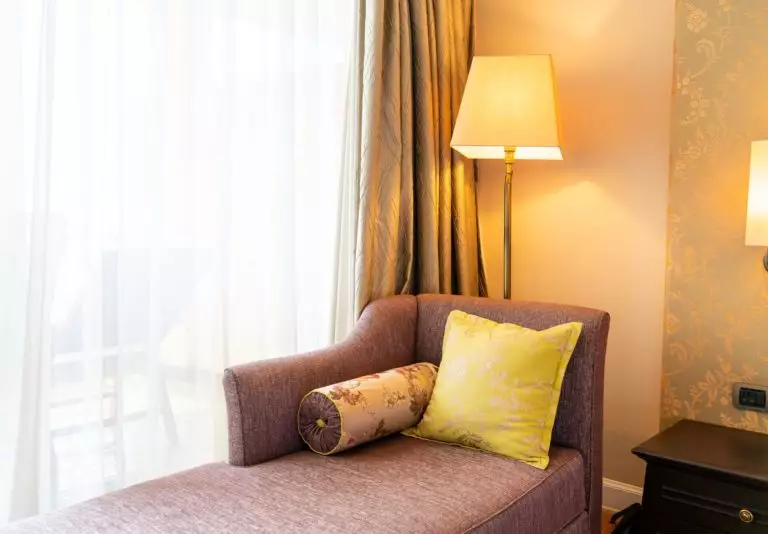
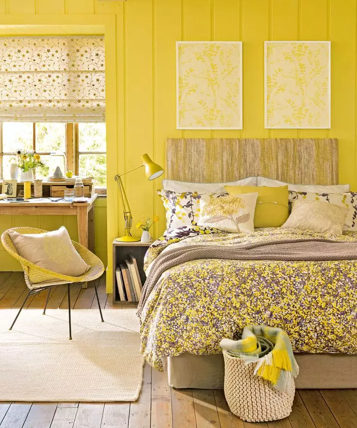
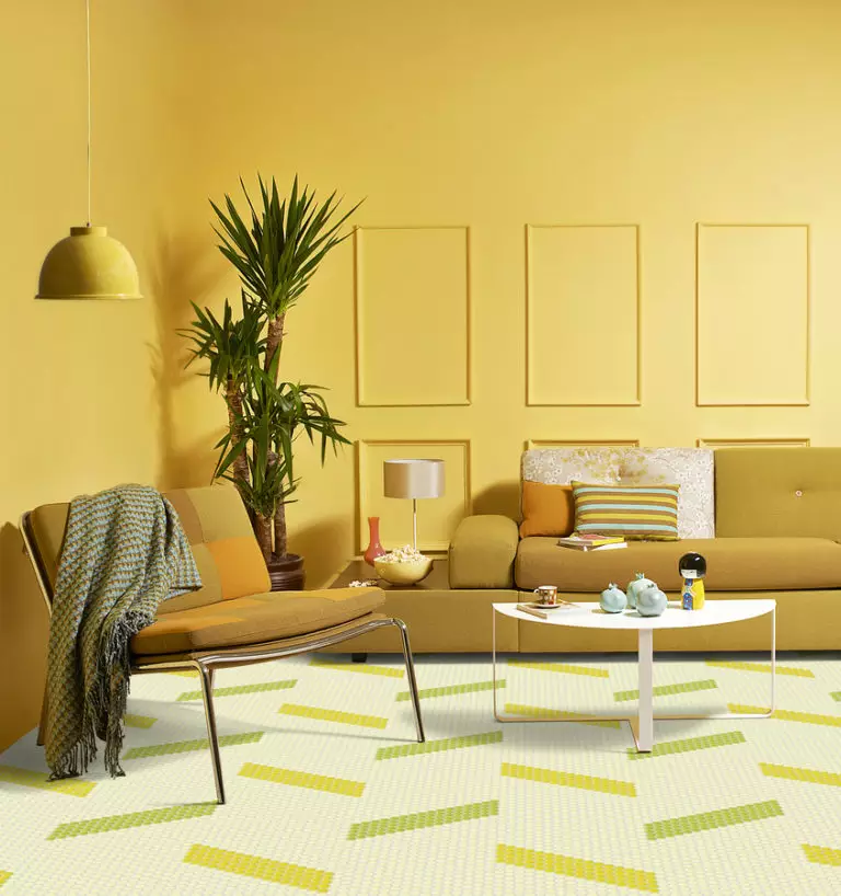
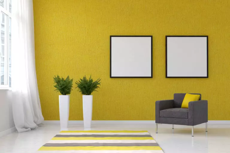
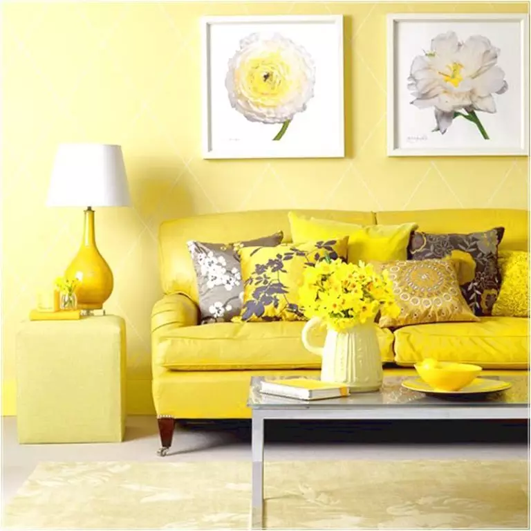
If you settled on yellow in the process of choosing a color for the walls, it is safe to say that you made a perfect choice. According to psychologists, yellow has an extremely positive effect on mood, relieves fatigue and stress, and has a pronounced visually warming impact. A room with such walls seems to be continuously bathed in the sun, and therefore bright and warm.
Another undoubted advantage of yellow walls is their ability to create a friendly background for almost any color accents. That is why you can constantly experiment and transform the room with textiles’ help – both consonant and contrasting shades. And if you want your ideas to be successfully implemented, it is worth talking in more detail about the selection of curtains for rooms in which just such sunny tones have become primary.
Best curtains for yellow walls: designer tips
Despite all its democracy, yellow is by no means “omnivorous.” It really goes well with most current shades. However, when choosing them, you still need to focus on the color intensity; otherwise, there is a risk that it will simply “eat” too pale curtains or, on the contrary, will fade under the influence of overly bright textiles. It is enough to be guided by several rules, which in the case of yellow are relatively simple, to prevent this from happening:
Yellow walls: choosing the suitable color for curtains
Choosing a shade of curtains for yellow walls is fascinating because depending on the color temperature, spectrum, and intensity of the tone you choose, the room can look different. Let’s talk about the compatibility of various textile colors with yellow walls of various gradations in more detail.
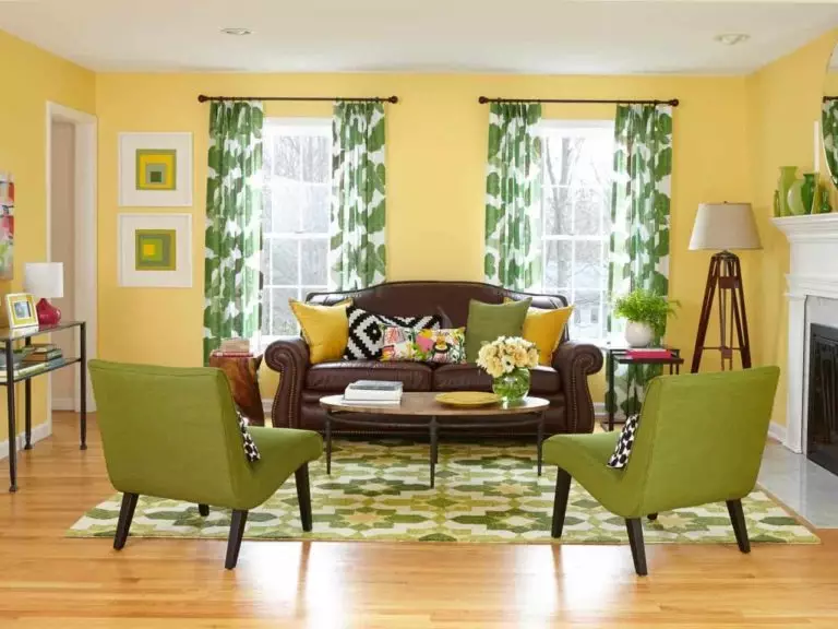
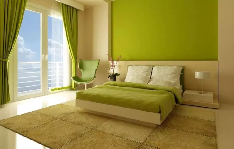
Green
Green shades are similar to yellow in the color wheel, and therefore you can safely use any of them in combination with walls of similar tones. A win-win solution, in any case, will be light green, herbaceous or pale cucumber curtains, the sophistication of soft yellow tones will emphasize the shades of foliage, marsh duckweed, pistachios and pine needles, and emerald textiles will make a magnificent composition with walls of lemon shades.
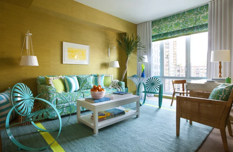
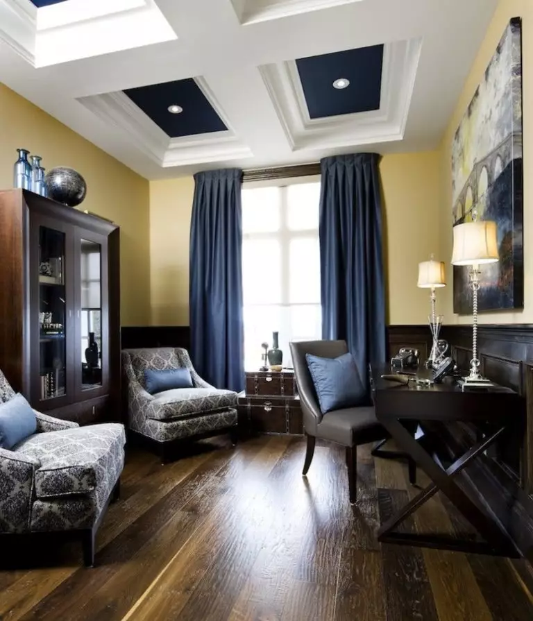
Blue
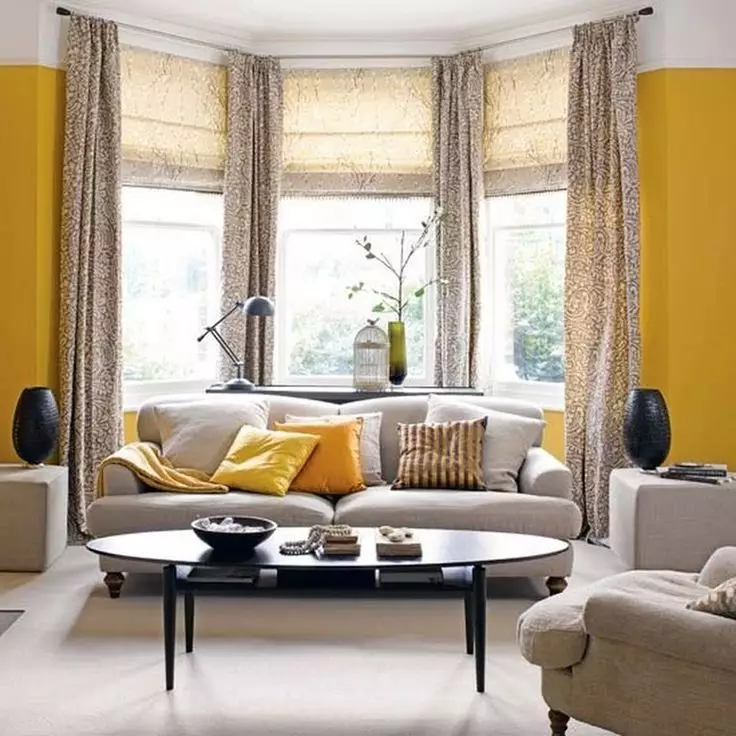
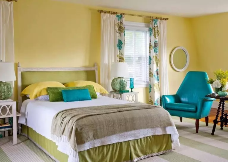
Yellow is exceptionally welcoming to blue, so the choice of shade of curtains is limited only by your imagination and personal wishes. The only thing designers insist on is the intensity ratio. So, bright tones of walls like golden or saffron can perfectly complement curtains of dark blue or sea blue shades, azure and turquoise will look organic with mustard and honey, and light yellow tones will successfully emphasize pale blue and heavenly.
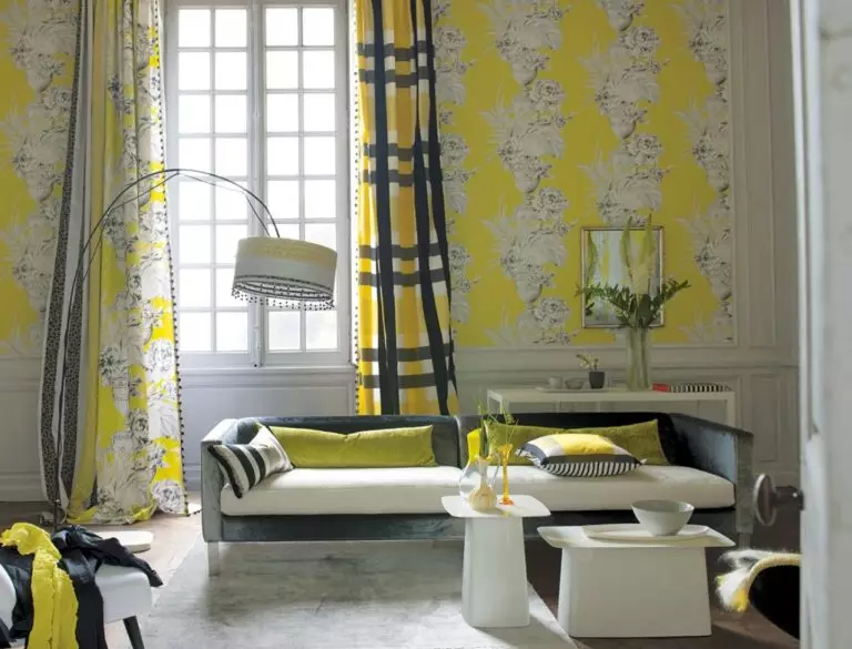
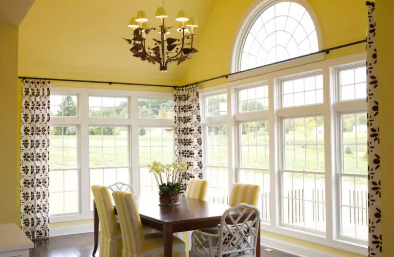
Blue curtains with a pattern look no less elegant in a room with yellow walls, especially if it is made based on beige, cream, brown, and orange tones or matches the base surfaces’ color, which ensures absolute harmony. However, this technique is not recommended for yellow wallpaper with a pattern – in this case, you should choose plain curtains.
Orange
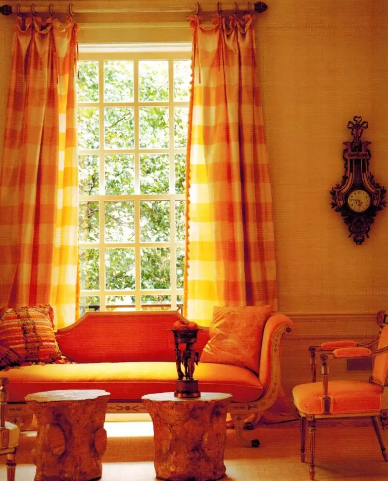
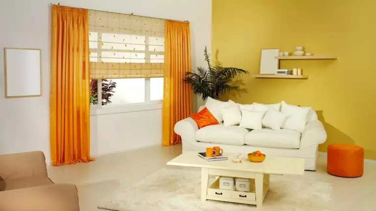
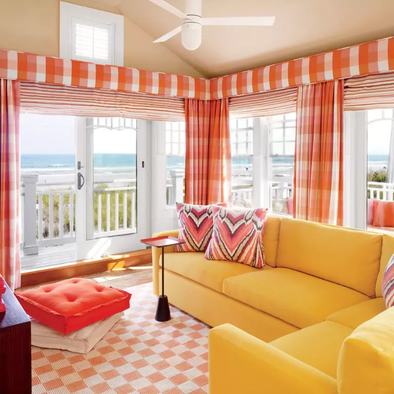
In a room with yellow walls and orange curtains, you will always be warm and joyful; therefore, this decision will be correct in any case. You are practically unlimited in the choice of shades, and the whole palette is at your service – from delicate salmon to juicy orange and temperamental carmine.
In this case, playing with the density of the fabric for curtains will be very interesting. So, if the windows of the room face the sunny side, a transparent organza or a veil will create a magical atmosphere and at the same time save you from stuffiness. But, thick cotton, linen, or jacquard will delight you with a visual warming effect in winter – or in a too cool room.
Brown
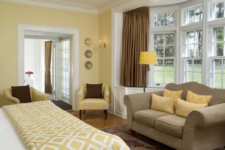
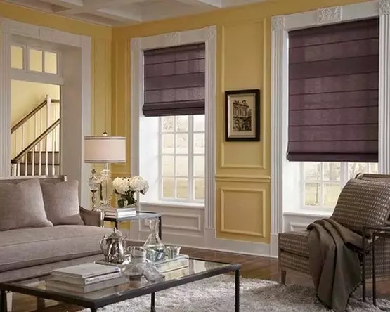
Yellows and browns create a classic combination that nevertheless works well in modern interiors. In terms of shades, you again have no limits: you can prefer deep and cool chocolate and nutty tones, as well as warm caramel or lighter coffee and linen tones.
It is also noteworthy that you absolutely do not need to focus on the intensity of the walls’ color. Deep and dark brown tones look great on both bright and light backgrounds – as well as softer and more pastel colors.
Red
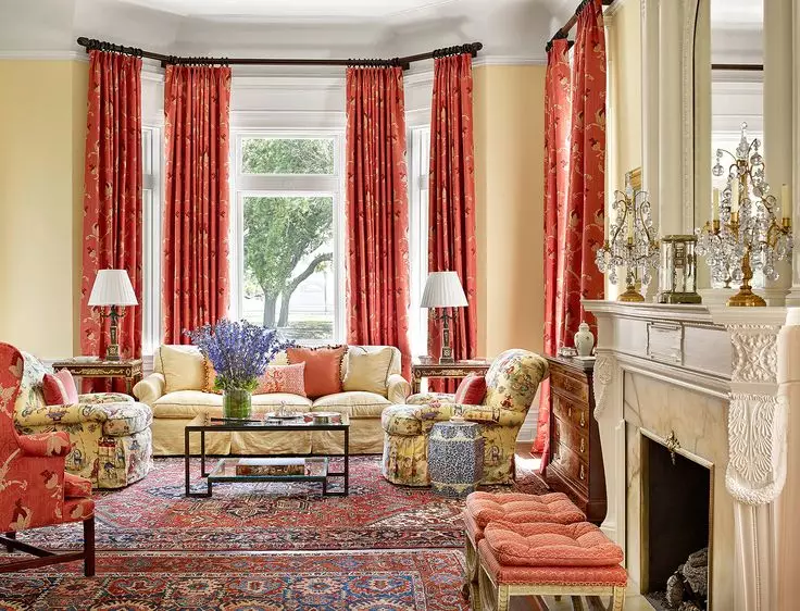
The combination of red curtains and yellow walls is a rather dangerous solution and requires from the owners not only impeccable taste but also a color flair. Although both colors are in the warm spectrum, excessive brightness can play a cruel joke on you, so regardless of the base color’s intensity, you will have to turn to quieter reds.
So, carrot, madder, marsala, and burgundy will make up with any yellow shades a moderately luxurious and at the same time harmonious combination. But scarlet, solferino, signal red, and ruby will have to be abandoned: their pronounced cold ebb and high intensity will provide them with a visually uncomfortable dominance.
Pink
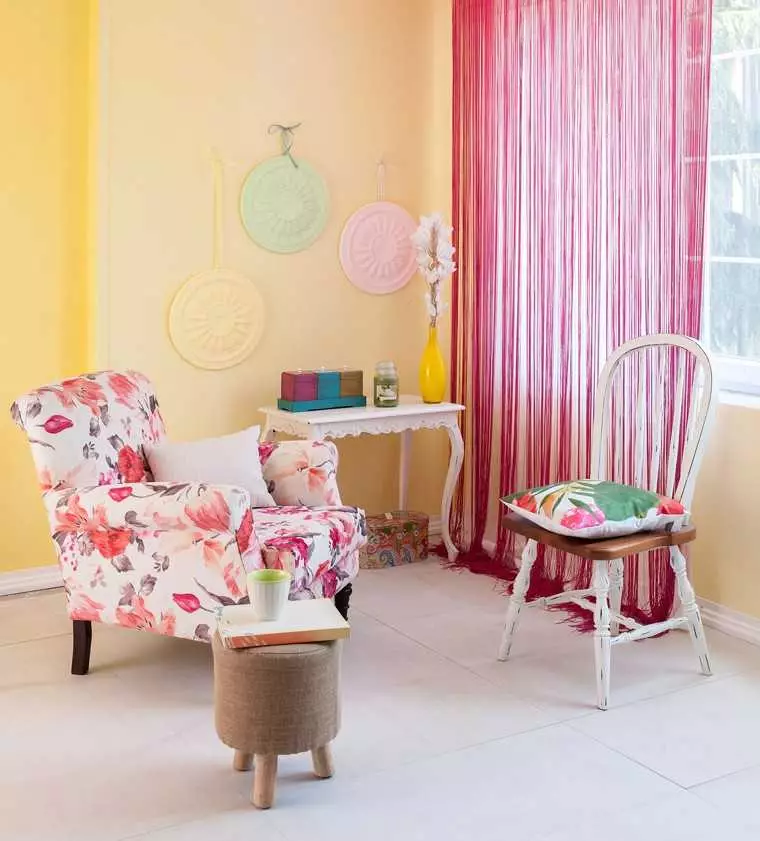
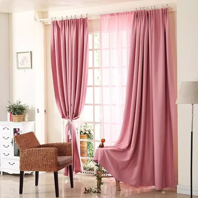
Pink curtains look quite attractive against the yellow walls’ background, but only when you prefer warm and calm shades to anxious and chilly ones. A lovely combination of dense and translucent canvases with a base is provided by salmon, dark salmon, begonia, peach, and tomato. But light cherry, raspberry, and amaranth, unfortunately, can discolor not only the brightest yellow shade but these tones by themselves will look uncomfortable – and at the same time create the impression of unkempt textiles.
Purple
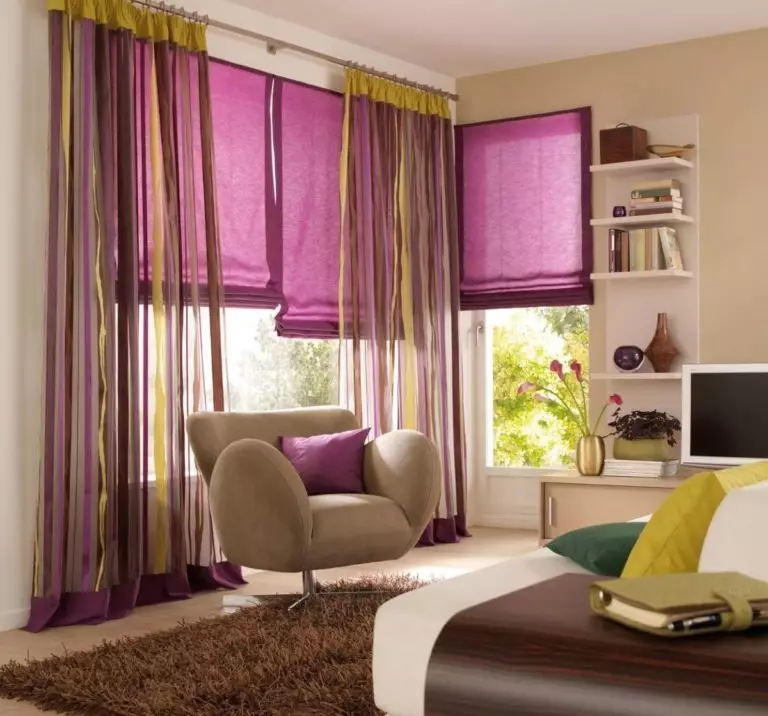
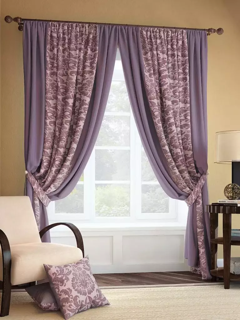
The purple range is complementary to the yellow range – and their combinations have incredible energy, so you can safely use such combinations. Although designers do not insist on matching according to color intensity, you can still resort to a similar classic technique – and give preference to plum and eggplant curtains for mustard walls, or complement the straw-yellow shade with textiles in lavender and heather tones.
However, if you are looking for textured panels, you need to be more careful with them. So, velvet’s textures look more advantageous in dark shades of purple, but satin and organza require calmer pastel solutions. As for linen and cotton, their natural texture is good in any color.
Yellow
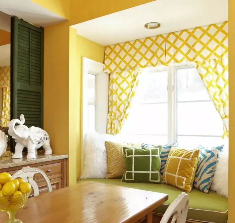
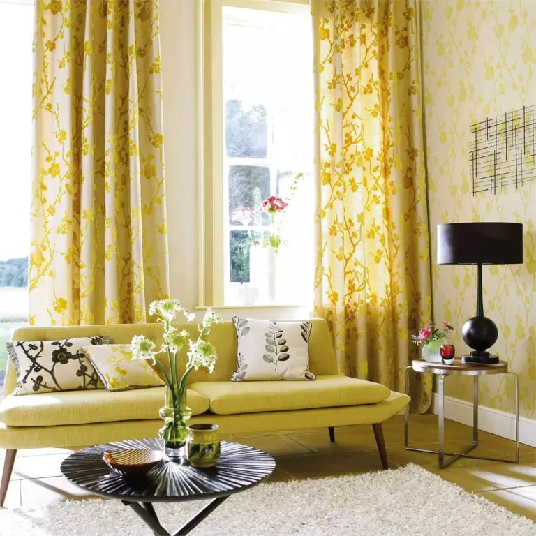
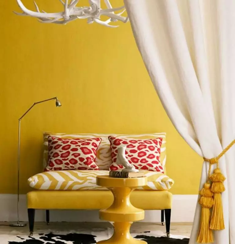
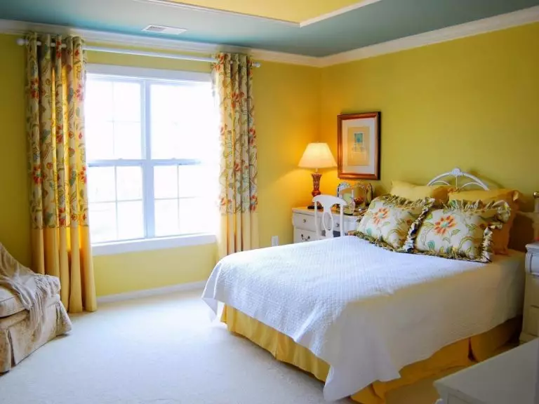
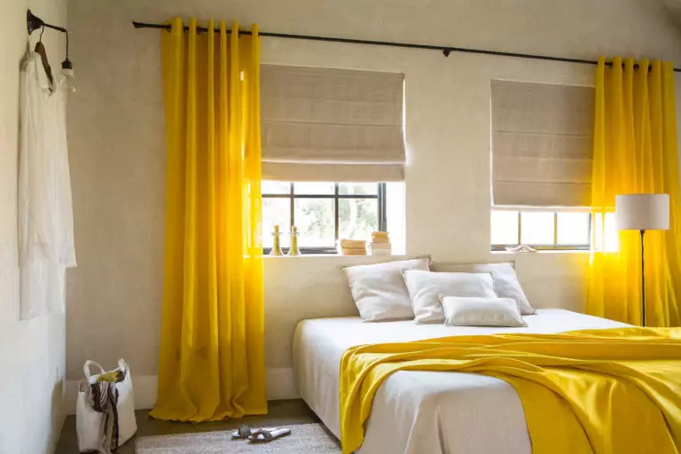
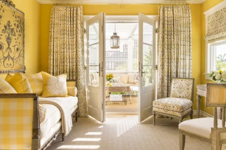
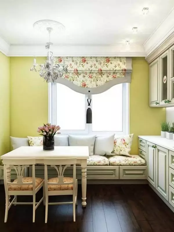
Yellow curtains look boring if you choose precisely to match the walls. Therefore, you can play with tonality. Curtains two or even several tones darker or lighter than the background will provide the necessary harmony and help to protect the interior from monotony.
Creamy, beige, and milky
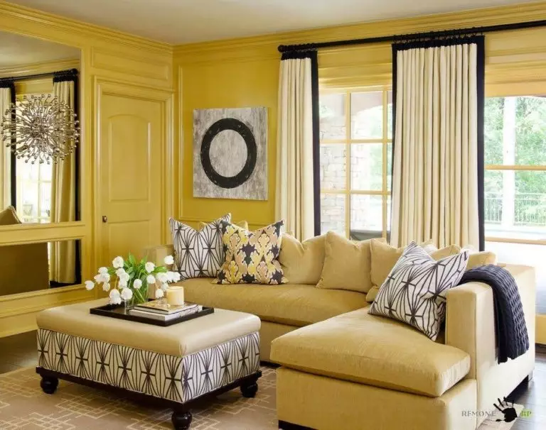
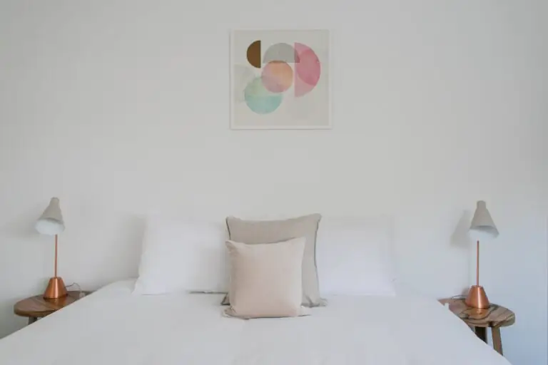
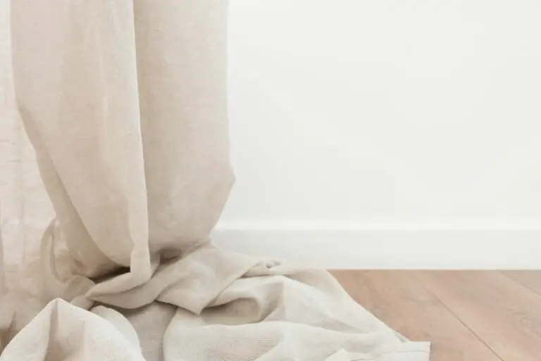
These noble shades are an excellent alternative to white, which can sometimes be overly bright. You can also use the technique with two colors of curtains, one of which is cream or milky, and the other is more colorful.
Yellow shades for walls: popular solutions
The yellow walls are more classic than extravagant. It’s not often that a trendy color palette from color influencers like Behr and Pantone doesn’t include yellow tones. If you have just stopped at yellow and are now in the process of choosing the right tone, we suggest you take a closer look at the most relevant solutions:
Curtains for yellow walls: Conclusions + Photo Gallery
The yellow color of the walls is a beautiful basis not only for a positive atmosphere but also for experimenting with design. Do not be afraid to try curtains in various shades and textures and even sometimes change them to your liking – with such a base, most experiments are doomed to success.
