Decorator’s White CC-20
Benjamin MooreA soft white with a cool base. According to the brand’s experts, DW has a sleek and stylish appeal, all due to the slight touch of gray.
Decorator’s White CC-20 (Benjamin Moore): what color is, review, and use
You have probably heard about Decorator’s White, a popular paint color from Benjamin Moore. While some regard it as a true white, we hasten to convince you that this shade is far from what a true white is. Nevertheless, its versatility and contemporary look are responsible for the integration of this paint color into new collections again and again. By the way, this is the reason why Decorator’s White CC-20 is also known under the numbers I-04, OC-149, and PM-3.
This seemingly simple yet quite sophisticated shade from BM is a cool white with a hint of gray that prevents it from being too bright and adds the right amount of softness. It seems Decorator’s White is no longer a simple shade. Wait and see what comes next since this paint color has even more secrets!
Decorator’s White paint color features
It is clear this far that the go-to neutral from BM is a soft white with a cool base. According to the brand’s experts, DW has a sleek and stylish appeal, all due to the slight touch of gray. We cannot help but agree. There is something special about the tricky gray note that balances the color, keeps it within borders, adds versatility, and even enriches it with a trendy appearance. This is probably the paint color most designers and homeowners usually look for since it is a well-balanced neutral that does not seem too bright nor too cool and even softens the space to which it is applied.
Decorator’s White: is it warm or cold?
This paint color cannot be called warm by any means, yet the cold extremity also does not suit it. No, it is not a balance between the two. The slight soft notes radiated by the gray undertones influence the seemingly cold base and offer this paint color a cool appearance. One should note that this effect intensifies in spaces with north exposure, meaning that an appropriate play with lighting undertones and neighboring colors is required to preserve this shade cool as it is.
How does lighting affect Decorator’s White?
As usual, we refer to both sides of the coin. Therefore, in rooms with north exposure, DW seems particularly cool; one may say even cold – crispiness in its full bloom. At the same time, in south-facing spaces, the same shade reveals a slight creamy surface, which replicates a very light and soft purple variation. Why purple? On this later. As for artificial lighting, depending on the undertones, you can achieve the color variation you want.
Decorator’s White LRV
Quick reminder: Light Reflectance Value determines what category each shade is part of based on how it reflects the light. On a scale from 0 to 100, where the latter stands for true shades of white, DW reaches an LRV of 82.68. Thus, we can surely state that this variation is not pure white, although very close to this group of shades. Still, DW is very skilled when it comes to reflecting the light throughout the room, expanding its borders.
Decorator’s White undertones
To our surprise, this shade of white still has things to impress us with. Besides its clear gray hint, DW may reveal slight purple, blue, and green notes, considering particular conditions. The neighboring colors also play a great deal in the way this paint color looks. Therefore, we suggest experimenting with a sample, paying attention to what appearance this shade takes, then deciding if it suits your preference.
Similar colors
It would be wrong to suppose that there are no white shades with gray notes similar to this one when the range of paint colors alike is very wide. The difference usually consists of how intense and cool or warm the gray hint is. Still, we can state that a few impressively identical shades of white perfectly resemble the essence of Decorator’s White. Let’s take a look!
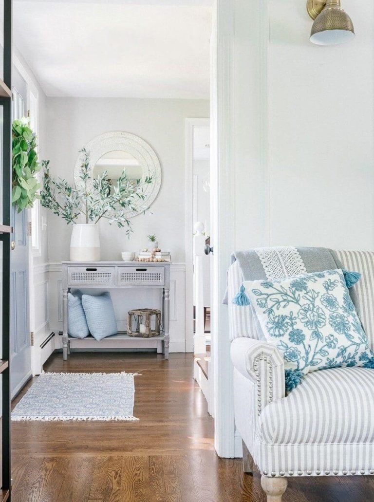
Coordinating colors
Decorator’s White is quite picky when it comes to choosing partners. Despite its neutral base that would seemingly work with a wide variety of paint colors, this crispy shade wants to play with blues and grays so that they would harmonize with its undertones. Don’t forget the slightly softer or crispier shades of white to contrast with DW within a monochromatic interior. There are also soothing purple and green variations among its favorites, which is no surprise considering its notes of this kind that sometimes come to the surface. One can also consider greige shades to contrast coolish and warm feelings. The list of possibilities is still large. Let’s get even more specific!
Use of Decorator’s White in interior
Designers suggest not using DW for kitchen cabinets since the unpredictable green, blue, or purple undertone may play quite the trick on you. This less flexible shade is also not perfect for the trim since it will not adapt to any background color. As for the rest, you can safely go with DW for the walls, considering the matching colors appropriately – the previous section offers you a full range of possibilities. Since we started with where you should not apply this crispy shade of white, the following sections are all about the successful integration of this paint color into the interior.
A new approach to Scandi
The irreplaceable cool-colored walls within Scandinavian interiors are simply a rule you should stick to since they perfectly resemble the Nordic weather. Although designers have been integrating softer shades lately to bring more comfort, it is still not enough to fully replicate the Scandi environment. At the same time, Decorator’s White is an impressive balance between the two extremities. Paint the walls without hesitation in this shade so that it can preserve the cool vibe yet add a refined sense of coziness. Furthermore, the crispy and soft shade of white will offer your Scandi interior an even more modern appearance than it already has.
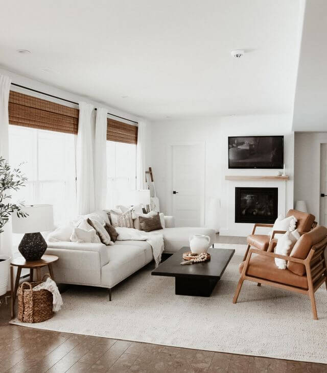
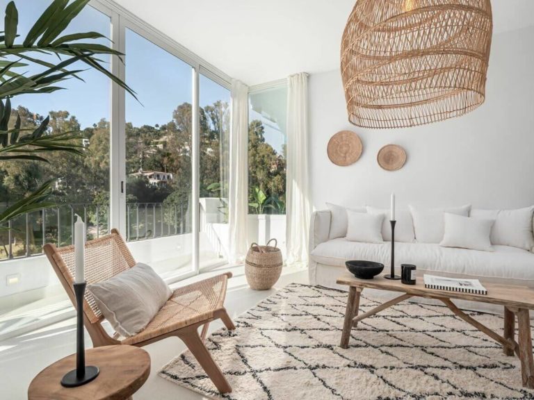
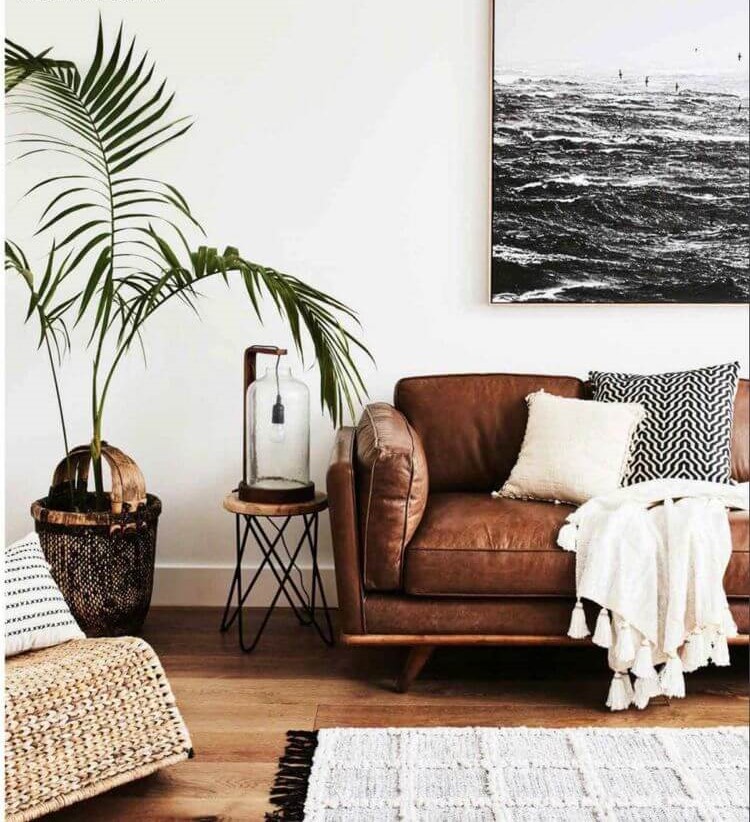
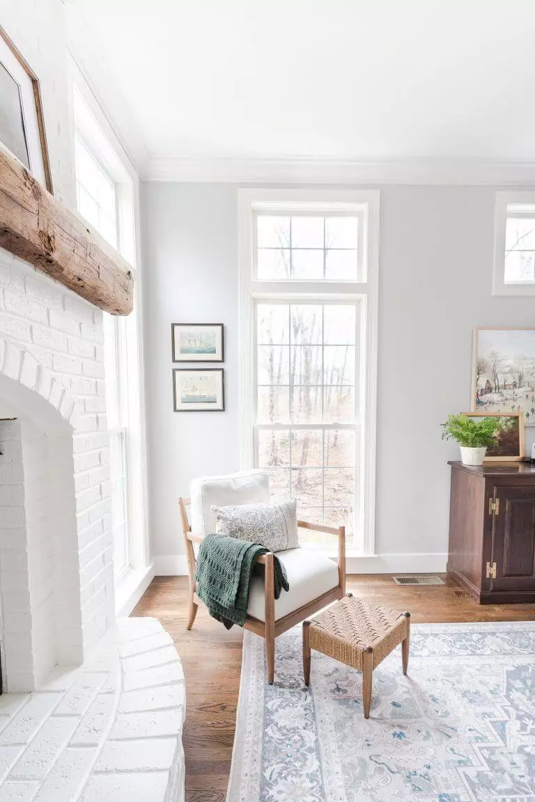
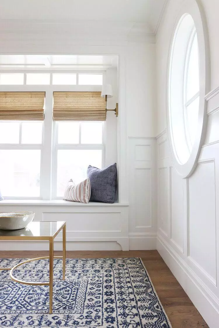
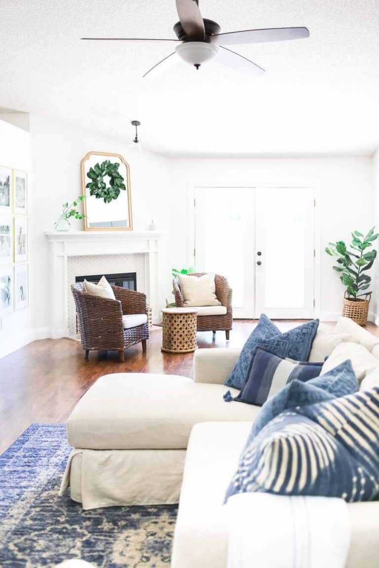
Living room
Decorator’s White definitely goes for the walls. Designers emphasize that one should not overload the walls with too many decorative pieces. Let them breathe and spread their unique shade. There is a special connection between this crispy source of softness and wood. Therefore, integrating the latter in terms of flooring, furniture, or decorative beans is not an option but rather a must. As for the rest, keep it functional, comfy, and inviting. Well, if the first aspect you can surely ensure all by yourself, DW will take care of the last two.
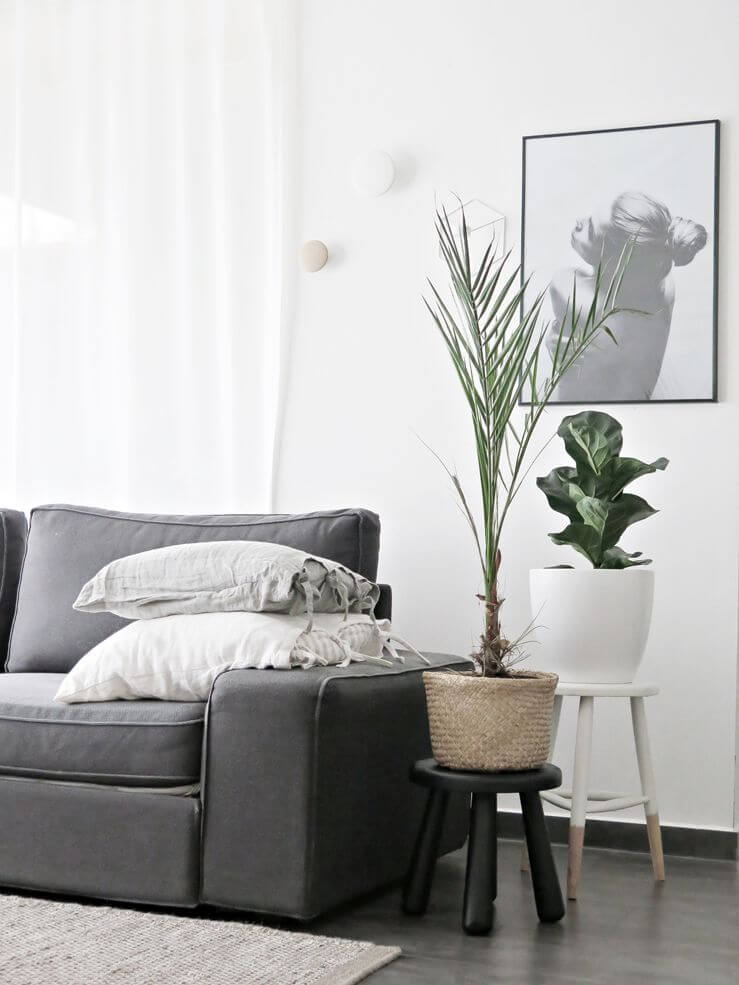
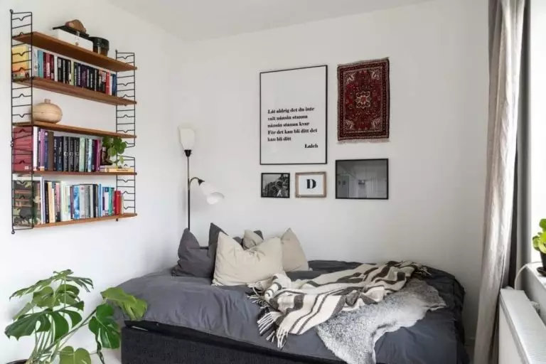
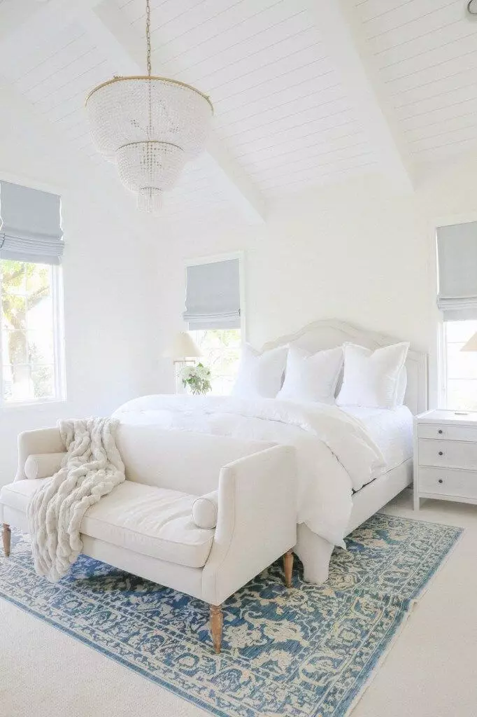
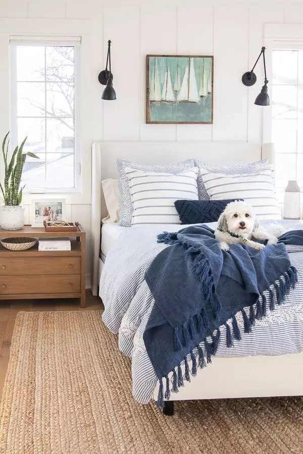
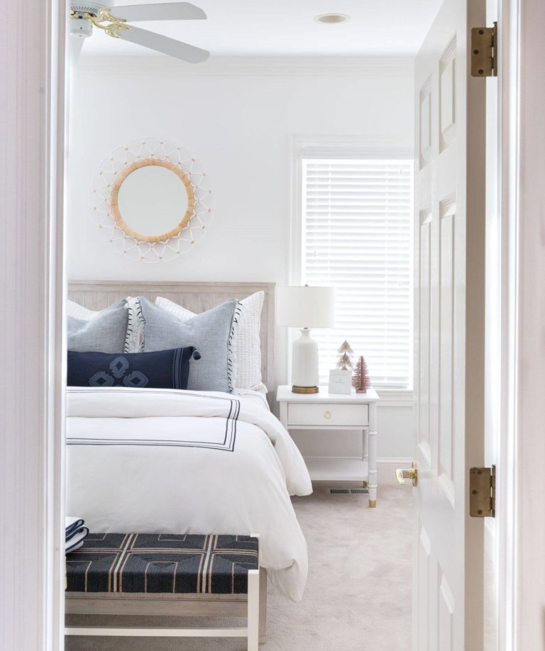
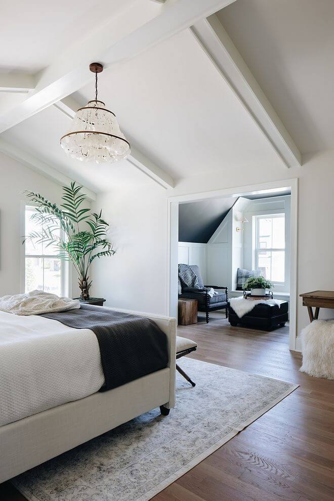
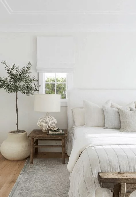
Bedroom
Start with a monochromatic approach by going with an all-white bedroom. See how it feels to you. The clean environment will be slightly diluted by the hidden undertones of walls painted in DW so that the interior will not feel boring at all. Add a few accents little by little if you see it appropriate, such as blue or gray textiles. Are you not satisfied yet? Enrich the space with the beloved wood texture that the beautiful shade from BM will happily complement with its soft notes. Do not overdo the decor. Keep it simple, clean, and aesthetic as the Decorator’s White is.
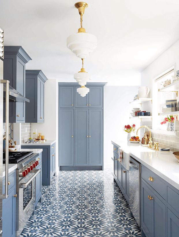
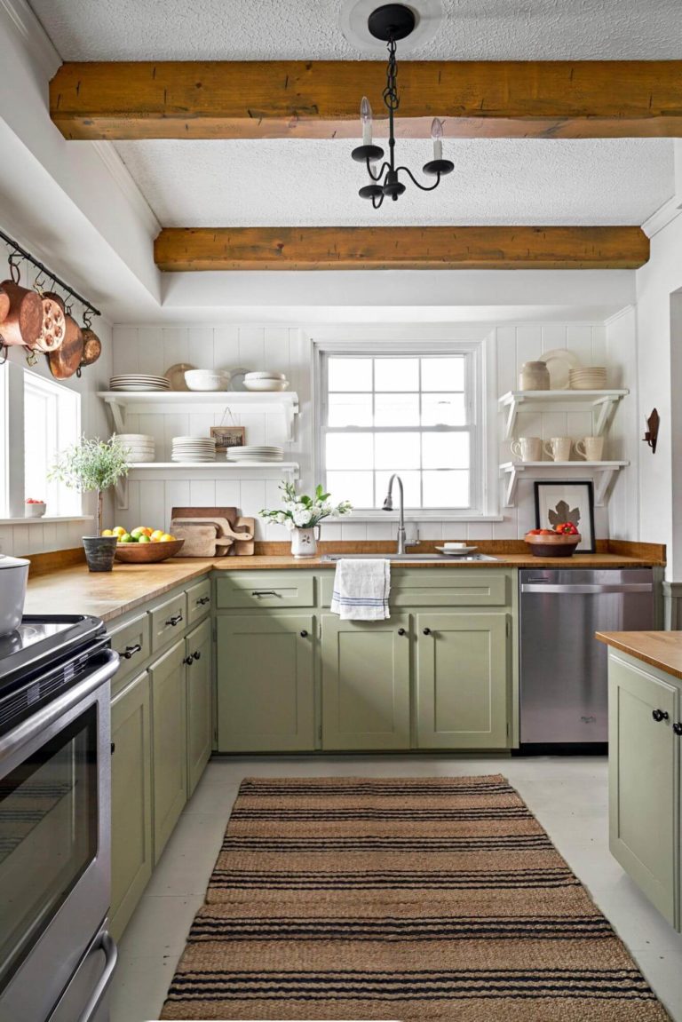
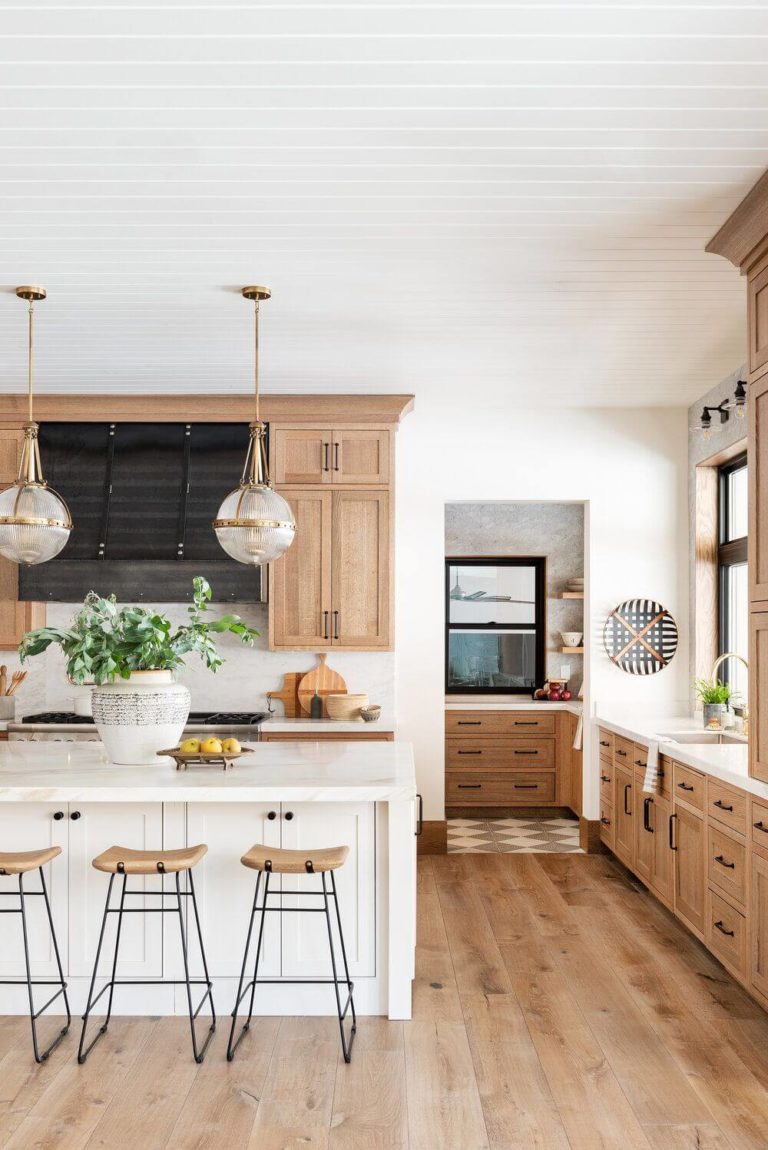
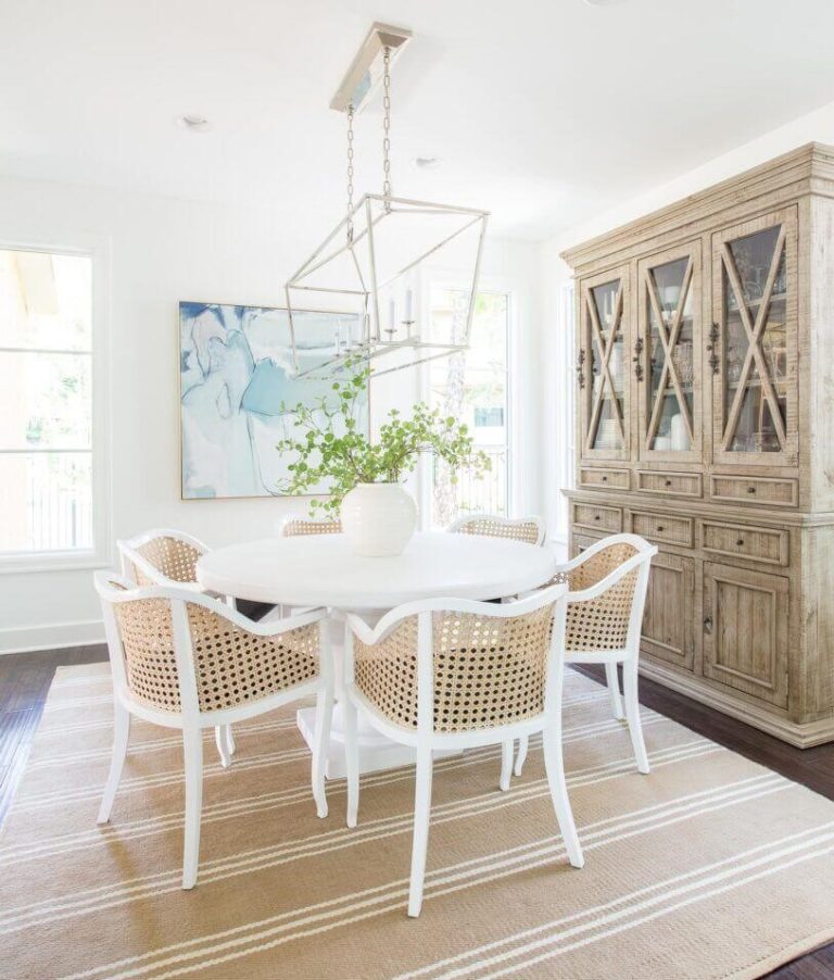
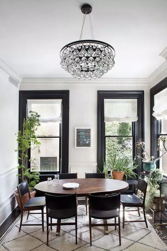
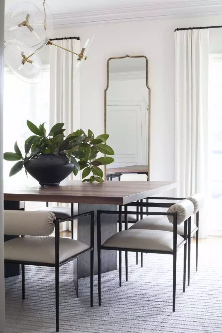
Kitchen and dining room
Since it is tricky to go with DW for the cabinets, we suggest not risking the result and opting for walls painted this way. Interestingly, this picky shade takes on the notes of the neighboring colors, particularly if these are its favorite blues, greens, and wood, leading to a harmonious effect.
A similar scenario can be noticed in the dining area, although DW accepts accents as partners. The no-fail option is wood, which can be chosen for the furniture, or black paint colors for the trim and furniture to set a classic contrast. You can also go as simple as opting for a functional layout with sleek furniture units on a crispy background to enhance the contemporary effect.
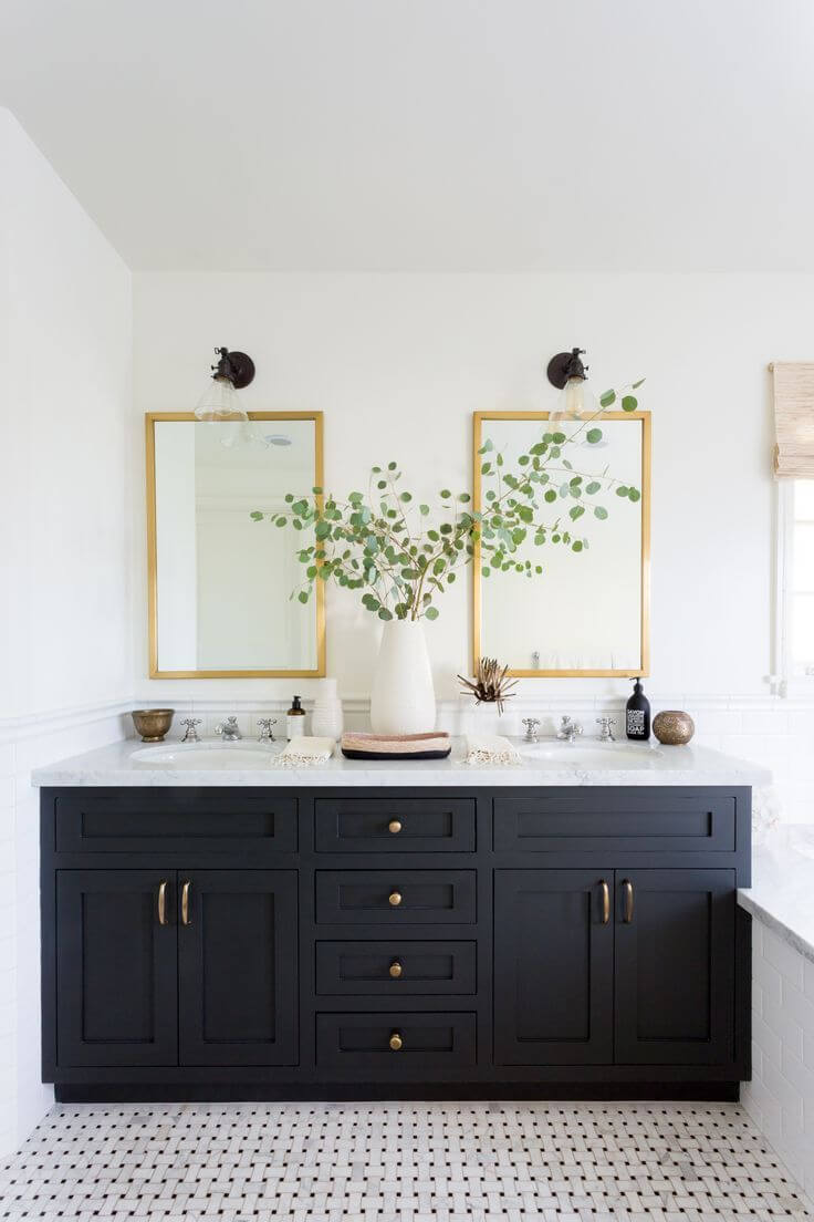
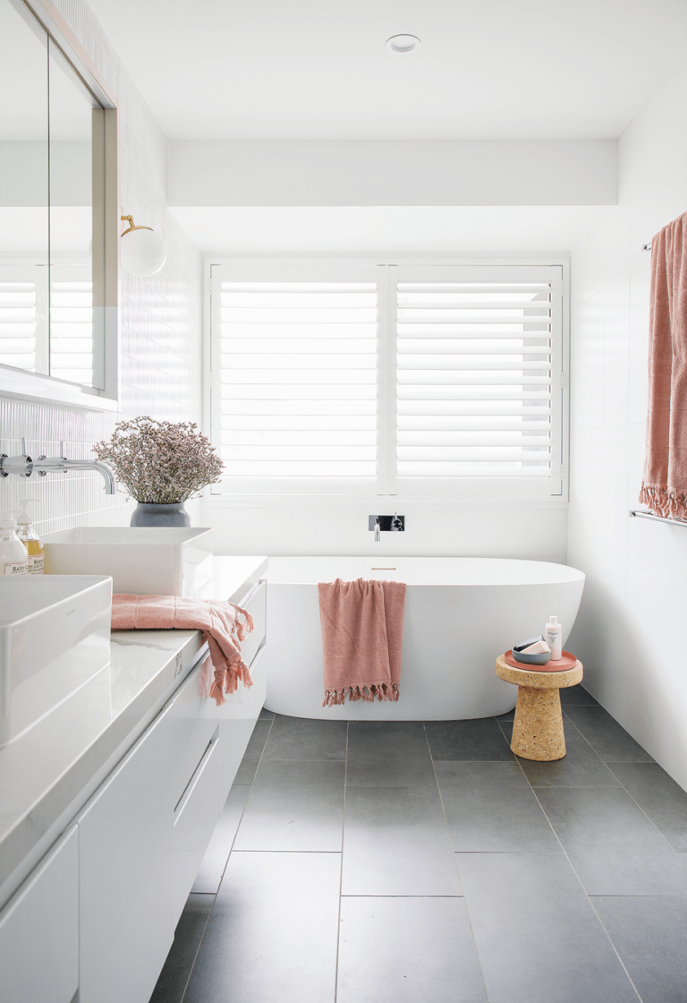
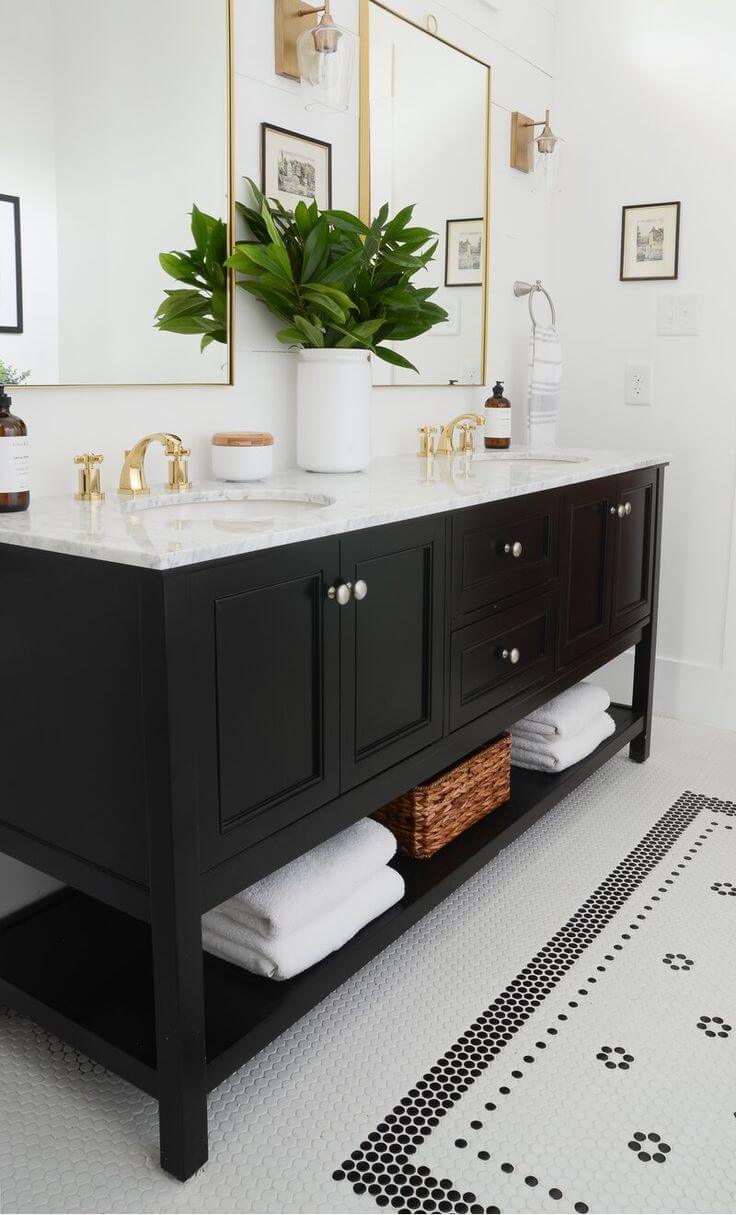
Bathroom
Our picky shade of sleek contemporaneity is open to compromise. Why this space particularly? Well, the bathroom elements are usually white, and the walls painted in DW will make this space even whiter, not that an all-white option is a bad idea. Still, the usually small spaces, which are also usually devoid of an appropriate amount of natural light, would benefit from additional splashes, such as a few black accents or brass hardware. The result will be as elegant and modern as a contemporary interior requires.
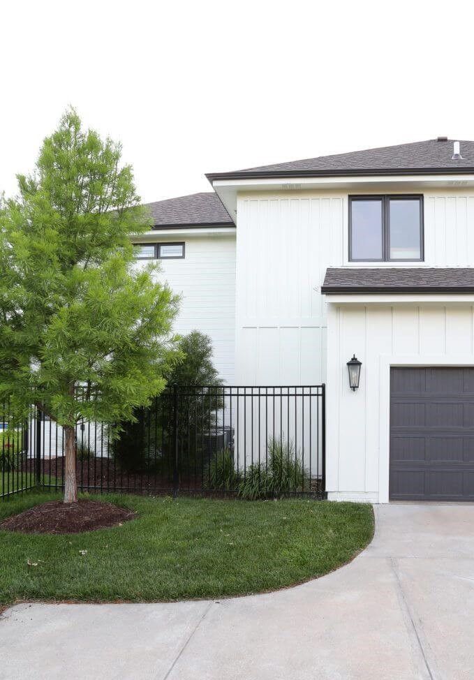
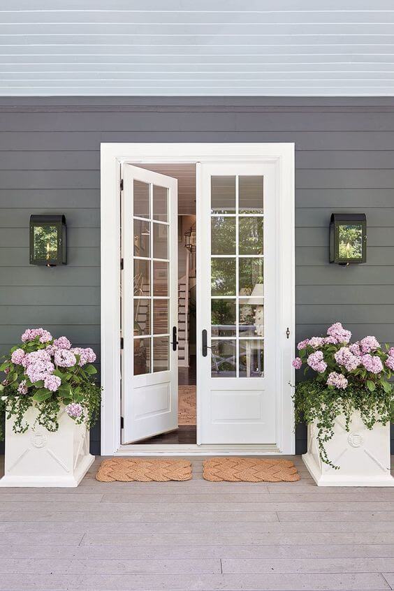
Use of Decorator’s White for house exterior
Since Decorator’s White is the color of softness, freshness, and style, it requires a contemporary approach when applied to the exterior. Although much lighter under natural light, DW does not lose its balance of crispiness and calmness. It simply requires a black matching color for a fully modern look or a softer accent to emphasize the inviting feel.
If you want to preserve the inner beauty of this shade entirely, don’t hesitate to opt for it the next time you decide to repaint your front door, which should necessarily be displayed on a dark background.
The Decorator’s White CC-20 paint color from Benjamin Moore is quite a popular paint color, although many avoid it due to its tricky features. Still, an appropriate play with its matching partners is a strong tool even in the hands of a homeowner without any background in design. Dare take a bold step, follow the rules of using this shade, most of which were exposed in this article, and get ready for a neutral you never knew you needed both for your interior and exterior.
