Bright, light, cool, and at the same time discreet, Goose Down from Dulux fits perfectly into the concept of a home as a refuge
Goose Down (Dulux): what color is, review, and use
We’ve already told you quite a lot about grays in the Dulux palette. And we can say with confidence that this topic truly has no end. The number of shades of gray in the manufacturer’s catalog is numbered in dozens. The brand’s designers regularly offer new tones and readings with various undertones – from the usual yellowish and bluish to surprisingly complex and ambiguous. And, which is very interesting, all gray shades from time to time breakthrough into the season’s favorites and become trendy. This is exactly what happened at one time with such a color as Goose Down, which fell into the fashionable palette of 2020.
Bright, light, cool, and at the same time discreet, Goose Down from Dulux fits perfectly into the concept of a home as a refuge – serene, visually and psychologically comfortable, relaxing, and allowing one to get away from everyday problems. However, this color is not so simple and offers very unusual interpretations of modern interior solutions despite all its neutrality. If you are intrigued, now is the time to learn more about him!
Goose Down paint color features
Dulux color experts routinely identify four key groups of grays in their palette. All gradations are divided into light, dark, warm and cold. From this point of view, Goose Down falls into two groups at once – light and cold. However, even if you don’t dig so deep, you can catch the charm of this airy hue with a light and subtle bluish undertone, as if reminding a light morning haze over a serene lake or the surprisingly soft plumage of young and strong waterfowl.
Goose Down: is it warm or cold?
Based on what we talked about earlier, it is pretty evident that Goose Down refers specifically to cold shades. However, the same situation is repeated here as with the overwhelming majority of light grays, which we wrote about earlier. Due to its high lightness and noticeably washed-out undertones, it does not give the impression of an icy and uncomfortable color. Moreover, this lightness and airiness make it rather pleasantly refreshing, which becomes an additional bonus for rooms facing the sunny side.
How does lighting affect Goose Down?
If you’ve chosen Goose Down to paint the walls in your room, you can fully enjoy the metamorphosis that this beautiful shade takes, depending on the lighting.
So, in bright sunlight or sufficient daylight, it may well seem very close to white – albeit with more confidently expressed coldish gray tones. If the light is moderate, it will demonstrate the same calmness of a noble and light gray shade that you can see on a paint sample. Well, with the onset of dusk, the walls in the room will acquire a very soft bluish tint that can create a somewhat mysterious and, at the same time, very cozy atmosphere.
It is equally interesting to observe the behavior of Goose Down under various types of artificial lighting. So, for example, bright and cold light will turn it into a very pale gray, and warmer and more muted light will make the bluish undertone more pronounced and the color itself in general – more complex and intriguing.
Goose Down LRV
Another eye-catching feature of Goose Down is the very high LRV of about 61. This allows you to successfully use this shade of gray to visually expand the space and brighten the room – especially if you take care of sufficient lighting. However, tragedy will not happen if it is not enough: this gray shade is so airy that it hardly seems gloomy.
Goose Down undertones
It was already mentioned above that bluish tones are pretty noticeable in the light gray Goose Down, which gives it this remarkable watercolor coolness. At the same time, under the influence of warm light, in some cases, a slight presence of greenish undertones can be caught, which gives this beautiful shade from Dulux the maximum naturalness.
Similar colors
Cool light gray tones are by no means rare in Dulux palettes and catalogs from other manufacturers. The list of colors similar to Goose Down is quite extensive, but we propose to shorten it slightly and give an example of the most popular tones:
Coordinating colors
What colors can be harmonious partners for Goose Down in the interior? In fact, there are many more of them than you might think. With an apparent cool character, it is quite friendly and goes well not only with light cold shades, but also some rich ones, as well as warm and pastel ones. Dulux designers suggest trying this trendy light gray shade in the following combinations:
Goose Down use in interior
Needless to say, how wide are the possibilities of using Goose Down in the interior? This delightful light gray shade can make even the smallest and cramped room cozy and modern. However, in this case, you will probably be more interested in the particulars than the general plan – and therefore, we are pleased to invite you to evaluate several harmonious design options, in which Goose Down from Dulux plays an important role.
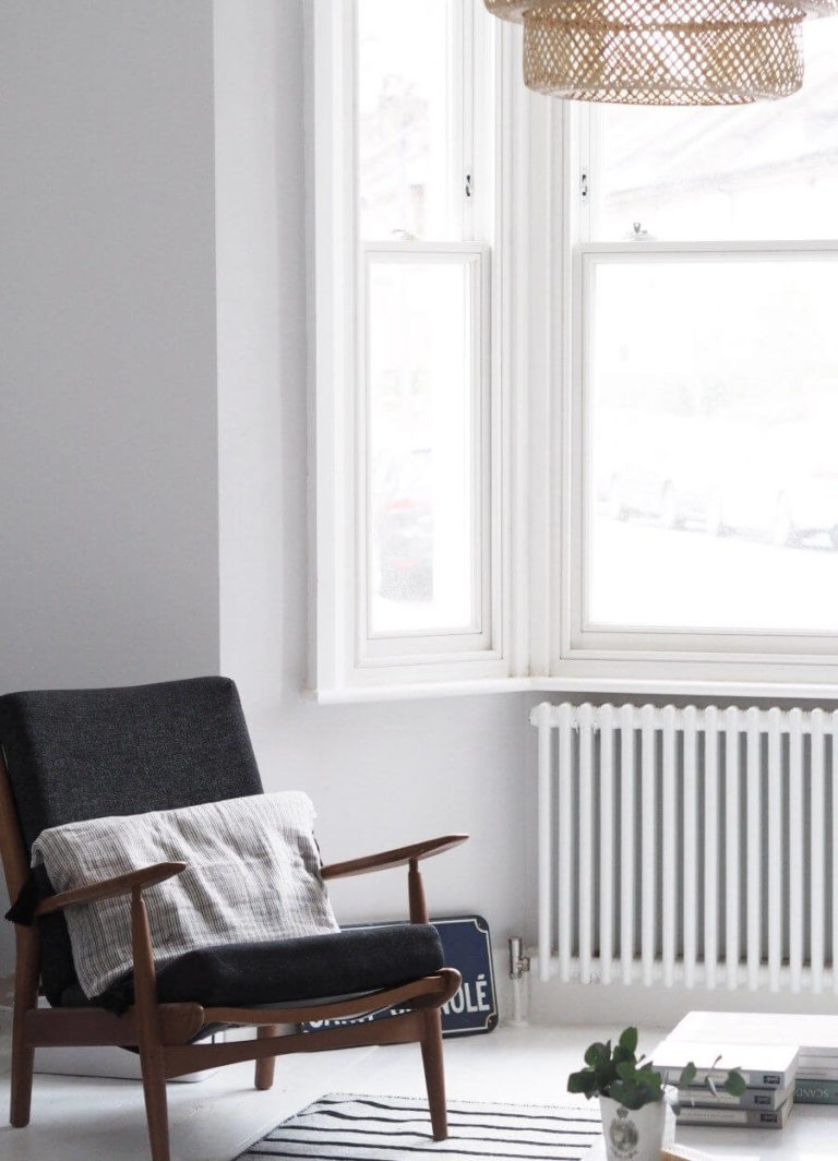
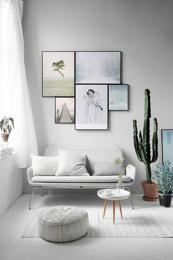
This serene Scandi
The Scandinavian style in the interior initially assumes light colors and, if possible, a white background – this is how the inhabitants of Northern Europe struggle with lack of sun and seasonal depressions. However, if the idea with white walls seems boring to you, try using an airy light gray Goose Down. Next to that base, you will feel the wood floors even warmer, the upholstered furniture even more stylish, and a few black metallic accents will take on a new personality.
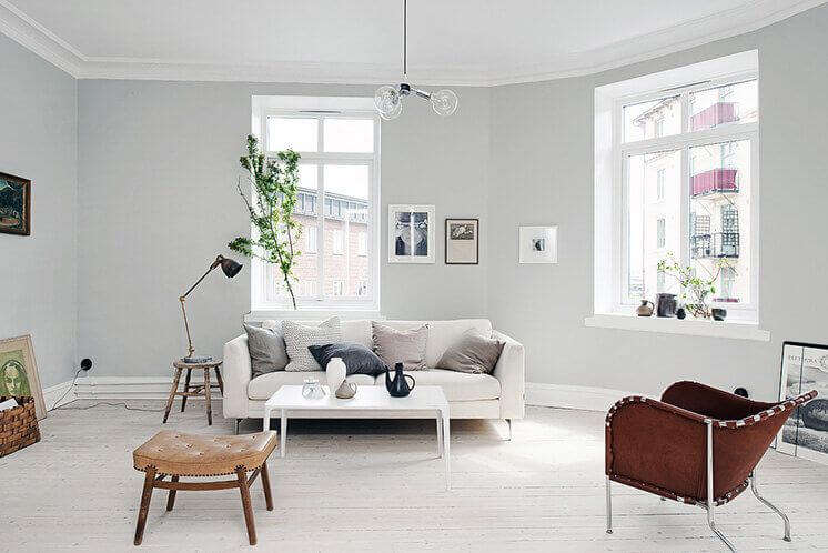
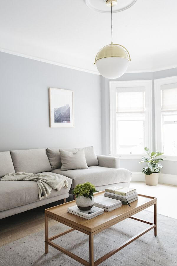
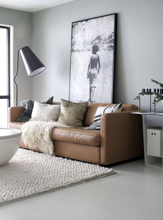
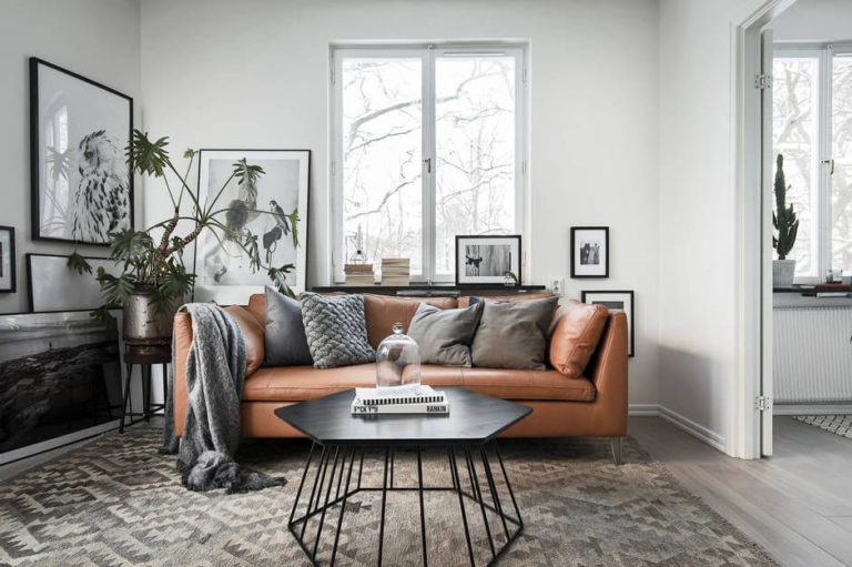
The harmony of minimalism
Minimalism and light gray – isn’t that too austere? If you act straightforwardly, then it is so, but the devil, as usual, is in the details. Try combining Goose Down painted walls with natural wood floors or asymmetrical matte porcelain stoneware. Place a brown leather sofa in your living room. Choose laconic and expensive lamps – floor lamps or ceiling hangers. Pair a jute rug with white dry herb floor vases. Combined with this shade from Dulux, each of our proposed details promises true harmony and incredibly comfortable and inspiring restraint.
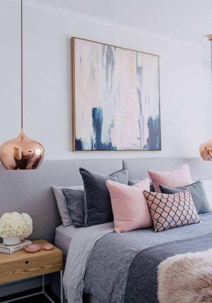
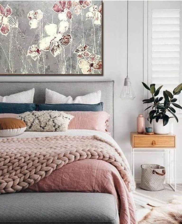
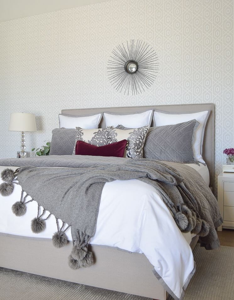
Romantic bedroom
The possibility of using gray in the bedroom is probably already well known to you. And yet, if you are not a supporter of unclouded and uncompromising minimalism, try adding softness and tenderness inherent in light pink shades to the interior. Whether it will be a dusty rose or the aforementioned “Sorbet,” – it’s up to you.
There are many options for combining gray with pink, so you have a fascinating process of finding a good idea. You can paint an accent wall in pink, match pink textiles to an utterly gray room, or simply arrange bouquets of delicate roses around the room or decorate it with paintings in pink tones. Falling asleep and sleeping in the bedroom, the atmosphere in which resembles the embrace of the dawn – is not it a pleasure?
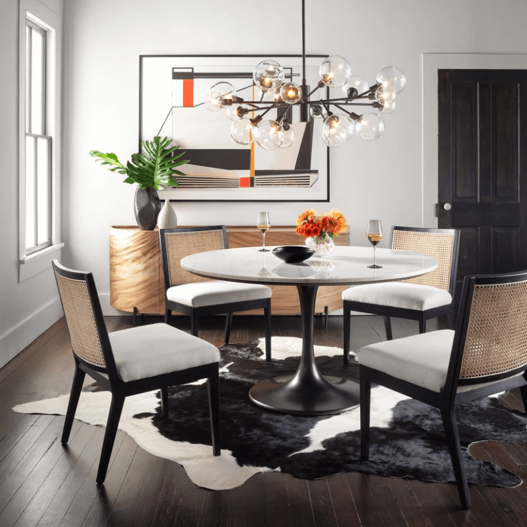
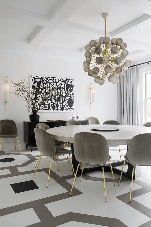
Dining room
If you think that gray is too unappetizing for a dining room, then Goose Down will help you change your attitude towards this particular palette. Combine a light gray base with soft white tones, tile floors with colorful patterns, and arrange blue and terracotta wooden chairs around a crisp white table. Expansive panoramic windows and bronze ceiling lights complete the picture of a modern dining room with a touch of vintage.
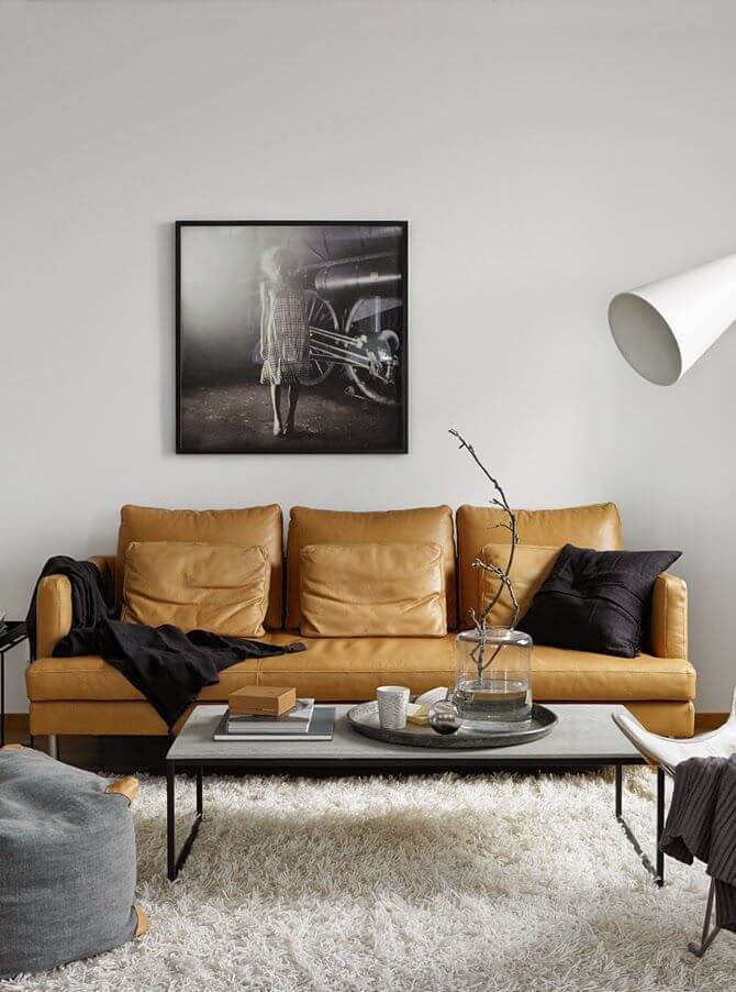
Refined contrast
It is entirely optional to use Goose Down as the primary color: it is equally successful as a complementary color in modern and classic palettes. So, for example, light gray wood panels look great against the background of bright walls, and textiles of this color favorably emphasize the luxury of such shades as emerald, dark blue, teal, wine, and burgundy.
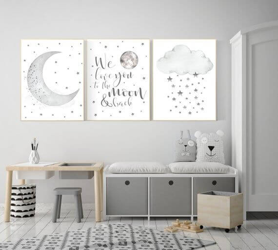
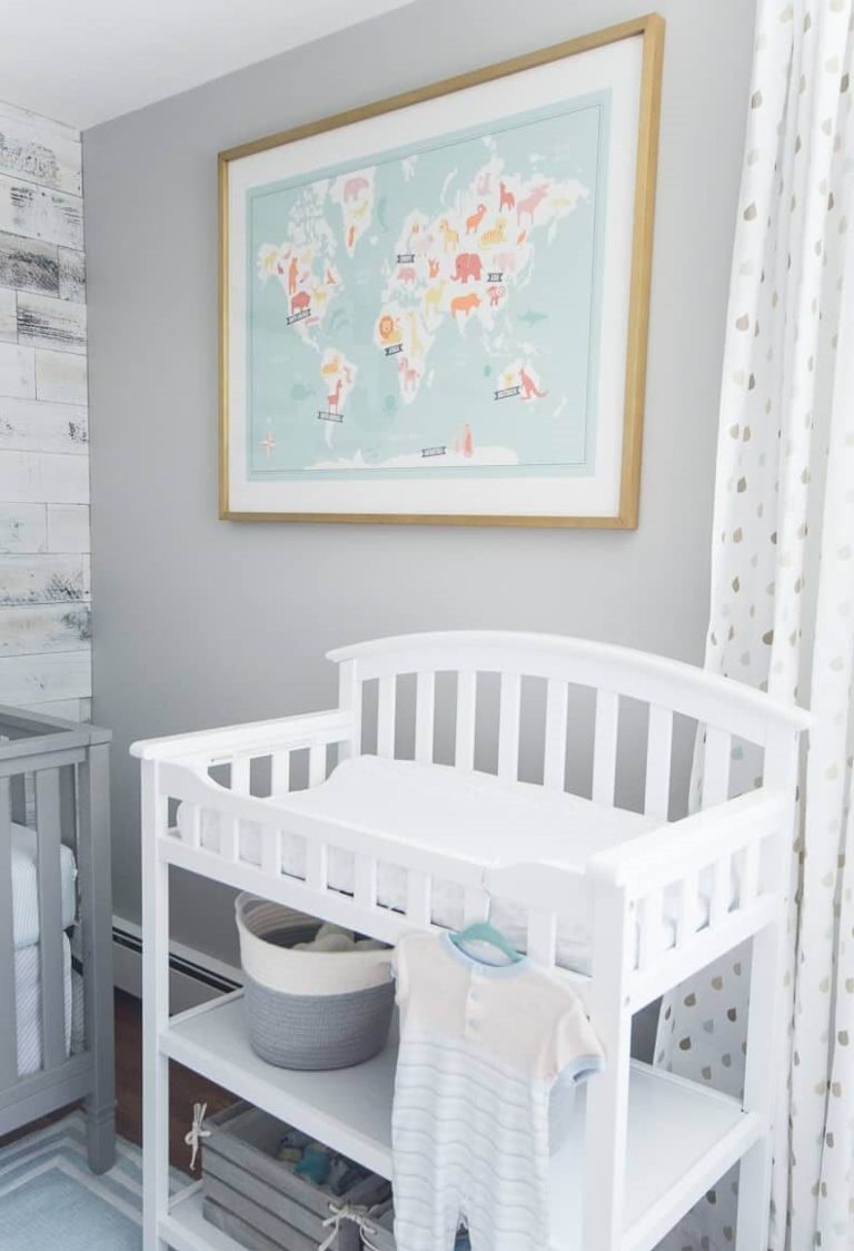
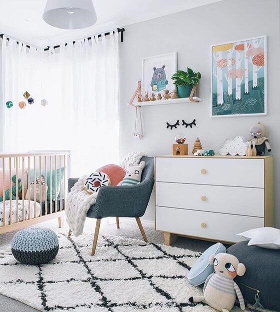
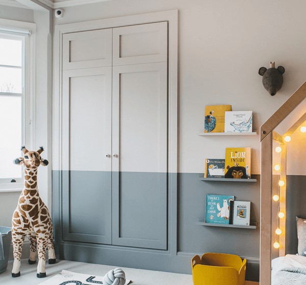
Nursery and kids’ room
Goose Down is so pleasant and refreshing in itself that many designers sincerely consider it to be a perfect color for a kid’s room of any age. An essential benefit of this cool light gray is that it can be used with different colors. So, in the baby’s room, he will set calmness and serenity in combination with white, beige, pale pink, and olive, and bright accents and details will create an individual interior for a teenager.
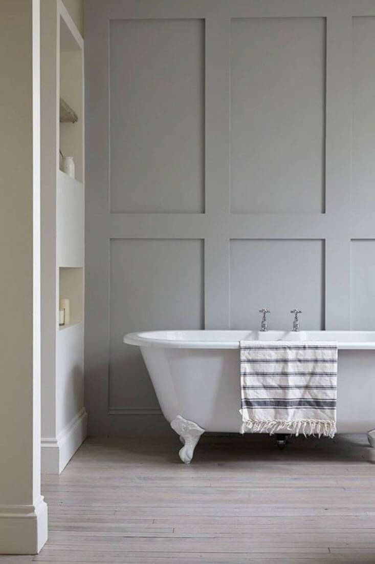
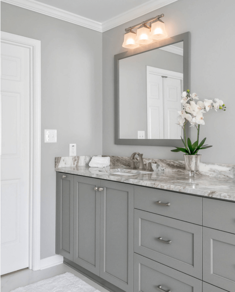
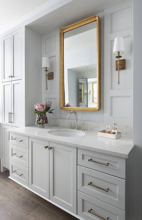
Bathroom
The bathroom is considered the ideal place to apply the Dulux color in the total gray concept. You don’t even need to invent anything: just do everything in a light gray shade to provide lightness and maximum relaxation. If you’re still worried about monotony, luscious green plants, a pair of willow vine baskets, or a set of accessories with brass details, add variety without distorting the overall design.
Goose down use for house exterior
Despite their sincere love for light gray, designers are extremely skeptical about the idea of painting a house in this color. The fact is that it is so delicate and crumbly that in conditions of external lighting and a tendency to fade, over time, it will not only lose its unique undertone but also make the proportions of the house more blurry visually. For this reason, it is not suitable for painting parts, including the front door. Choose darker, more intense, and complex tones for the exterior – and leave Goose Down for an interior in which it is unsurpassed.
Dulux Goose Down is a great way to explore the possibilities of light and cool grays. Be confident when choosing it for modern and vintage interiors – this is the design that allows you to maximize the potential of this popular shade.
