A very dark and eye-catching gray, although in a soothing way that makes you enjoy the environment to the fullest.
Graphic Charcoal (Behr N500-6): what color is, review, and use
We have written a lot about light shades, warm and appealing or cool and invigorating. At the same time, our list of reviews does not include that many dark colors, but believe us, when we refer to one of them, there is no chance you will not fall in love with it. The main character of this article is Behr’s dark shade of deep gray Graphic Charcoal. It was named the color of the month September in 2019. It seems like a long time ago, but this color does not cease to prevail when it comes to design solutions.
Indeed, gray has dominated interior design for years, and every new variation is welcome. Although dark shades are not that applied, particularly on a large scale, Graphic Charcoal still holds a leading role. Inspired by the cool yet impressively appealing outdoor nights in September, this color interprets perfectly the post-sunset weather. As strange as it may sound, it radiates a sense of ease, relaxation, at some point, calmness. Nevertheless, this is not all it has to tell us. Let’s take a narrow look at this fascinating hue!
Graphic Charcoal paint color features
The outstanding shade Behr came up with a few years ago gets more popular. No wonder why! Besides being part of the neutrals, which have been much appreciated lately, it bears particles of serenity, bringing in a moody feeling and enriching any space with depth. Undoubtedly, such a color is very dark and eye-catching, although in a soothing way that makes you enjoy the environment to the fullest. It feels like a cover that separates you from the rest of the world and offers you space for diving into your deepest thoughts. Even if you have never tried using a dark color in your interior, Graphic Charcoal is perfect to start with. Yes, it is bold. No, it will not work with all colors, but the effect it promises will redefine your style and set a unique environment, at some point, personal and undisturbed.
Graphic Charcoal: is it warm or cold?
Behr’s shade of gray is indeed a cold color. A touch of this shade within your interior will significantly darken the space. However, such factors as lighting, colors that find themselves in the neighborhood, and other elements will influence the way this shade appears to be. To be more clear, they are responsible for what Graphic Charcoal reflects.
Here is a hint: use paint samples in different rooms of your house and pay attention to the way the undertones behave. It will probably meet your expectations or turn out to be better than you thought. Either way, you have nothing to lose but succeed with this magnificent color.
How does lighting affect Graphic Charcoal?
Of course, such a dark shade is not that vulnerable when it comes to lighting. It stays true to its features. Nevertheless, an appropriate amount of light will make you look at this shade from another perspective. The sparkles of light hidden behind the dark basis will penetrate the surface and radiate a sense of balance. At some level, a great amount of light can reveal some blue undertones that change the scene entirely. Graphic Charcoal is sophisticated, coming up with new variations for every case in part.
Graphic Charcoal LRV
It is no surprise that the LRV of this color is low, reaching a value of 11. To make it clear for you, a value of 100 stands for pure white, while 0 for pure black. You can probably imagine how dark Graphic Charcoal really is. Nevertheless, its LRV points out that this color is still able to reflect a small amount of light, although we cannot tell the same about any expanding feature.
Graphic Charcoal undertones
It seems that such a dark color cannot simply reflect any noticeable undertones, but not this shade. Experts have worked hard to achieve such a result. At first glance, a dark shade of gray. The more you look, the more secrets this color is revealing to you. Particularly under a large amount of daylight, but not excluding a neutral environment, the blue undertones spread all over the surface and offer this color a pleasant look.
Similar colors
If you are impressed with what Graphic Charcoal offers, you probably want to discover other shades alike. Luckily, both Behr and other paint manufacturers have options in this sense. One should note that the differences are slight but certainly noticeable since each of these shades is unique. Let’s take a closer look!
Coordinating colors
Although it is a neutral color, this shade does not require bolder accents to reveal its full beauty. It accepts as companions other neutrals, particularly variations of gray or darker colors. At the same time, its blue undertones are responsible for its friendliness towards pastels, which do not go further than the balance established by Graphic Charcoal, although bringing a splash of new color. It sounds amazing how the same shade can have such different perspectives on design. Furthermore, experts from Behr analyzed it at all levels and came up with a list of coordinating colors that complete this color to the fullest.
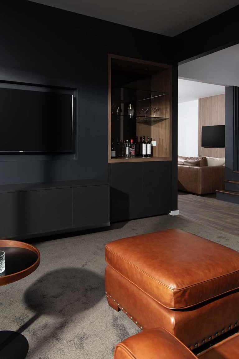
The use of Graphic Charcoal in interior
It seems like this color was created particularly for contemporary designs. Be it a whole makeover or a small adjustment, Graphic Charcoal works perfectly for the interior. Nevertheless, it is a real find for specific styles, adding this feel of depth and sophistication that most modern settings lack. From the entrance hall to the most personal spaces, this astonishing gray plays its magic and fills the space with a strong sense of style. Are you intrigued? Let’s reveal this color by going through the following list of design solutions!
Studio style
Speaking about contemporary settings, we cannot skip the studio-style apartments or open-floor plan houses. Such modern arrangements cannot simply go without an equally modern shade. This is when Graphic Charcoal enters the play. Consider painting the walls or the ceiling entirely in this color, additionally opting for a lighter color for particular areas to divide the space. The result should look like a monochromatic environment with a few splashes of light colors for a balanced and exquisite effect.
Industrial style
This dark shade reflects a particular industrial texture, which means that it resonates perfectly with materials of a similar style. Integrate as many raw surfaces as possible, offering your interior a refined industrial touch that radiates contemporary values. In this sense, the most important element is the standout shade of gray from Behr that, in combination with lighter splashes of color, will bring your interior to the next level.
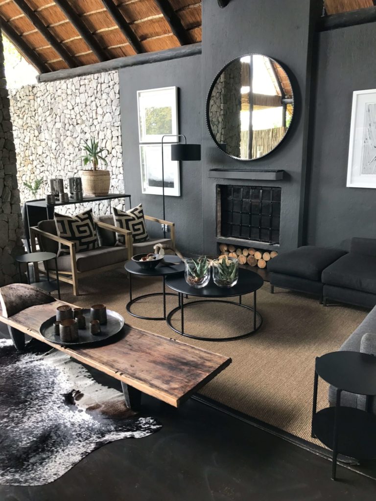
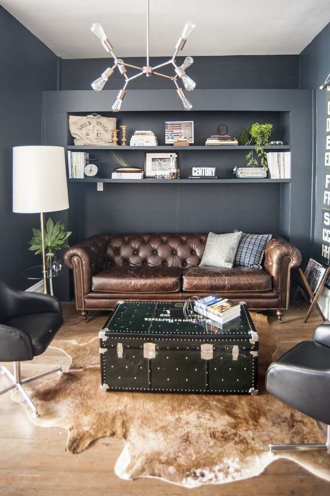
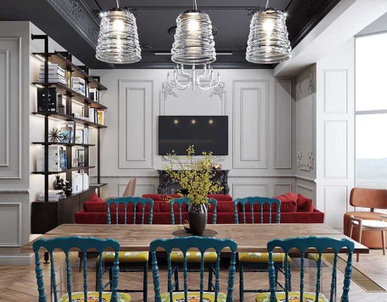
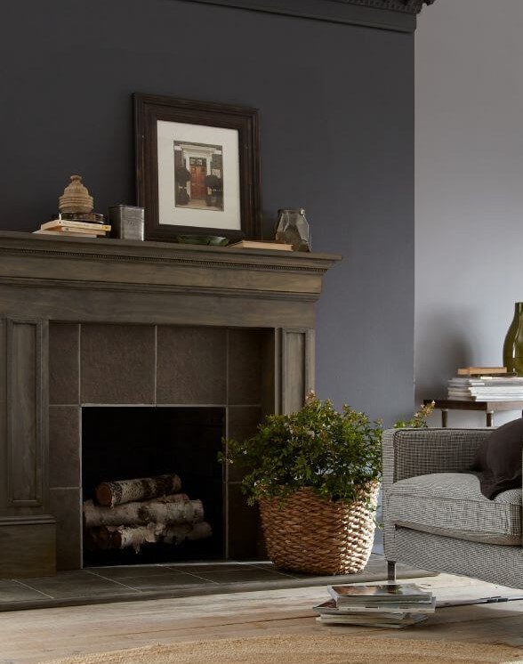
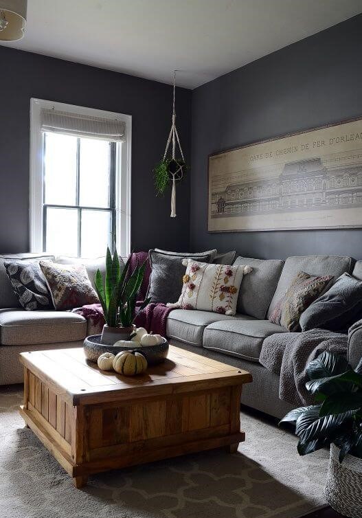
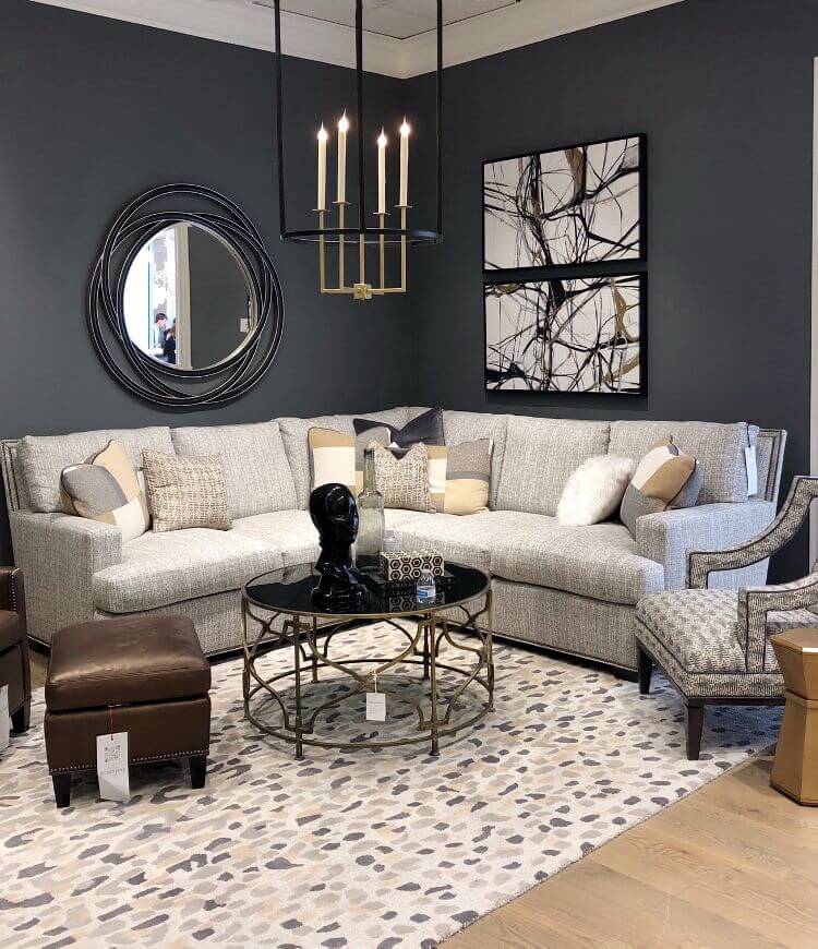
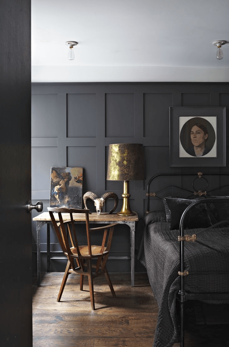
Living room
They say a bold decision is halfway to success. Why not make one bold step and ensure a successful result? Of course, by bold, we mean opting for a whole makeover of the living, painting the walls entirely with this deep shade of gray. If it seems too bold, there are always variations that adapt to any preferences. What would you say about an accent wall? Designers suggest painting this way the space surrounding the fireplace while opting for a lighter shade for the other walls. The latter will serve as a perfect background to play with patterns and textures to add visual interest.
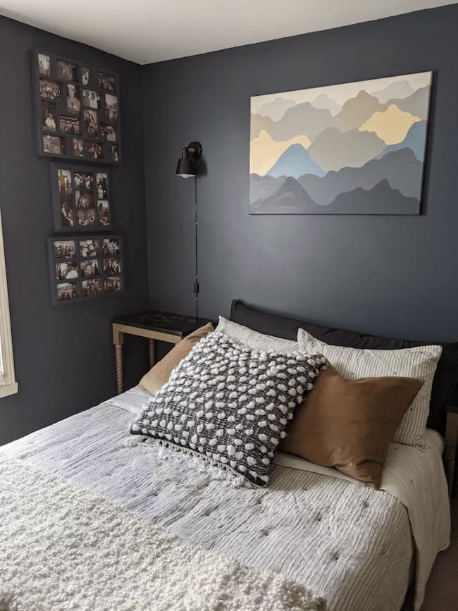
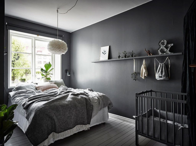
Bedroom
Do you fancy a sense of serenity with scents of sophistication that add both individuality and relaxation to your bedroom? Don’t hesitate to use Graphic Charcoal at the maximum. Full integration of this color in your interior means painting the walls entirely in this shade. A dark wood floor, lots of texture sources, such as nature-inspired units of furniture or textiles, and a few pots with indoor plants are the last ingredients you should add to this recipe for a sophisticated yet calming bedroom.
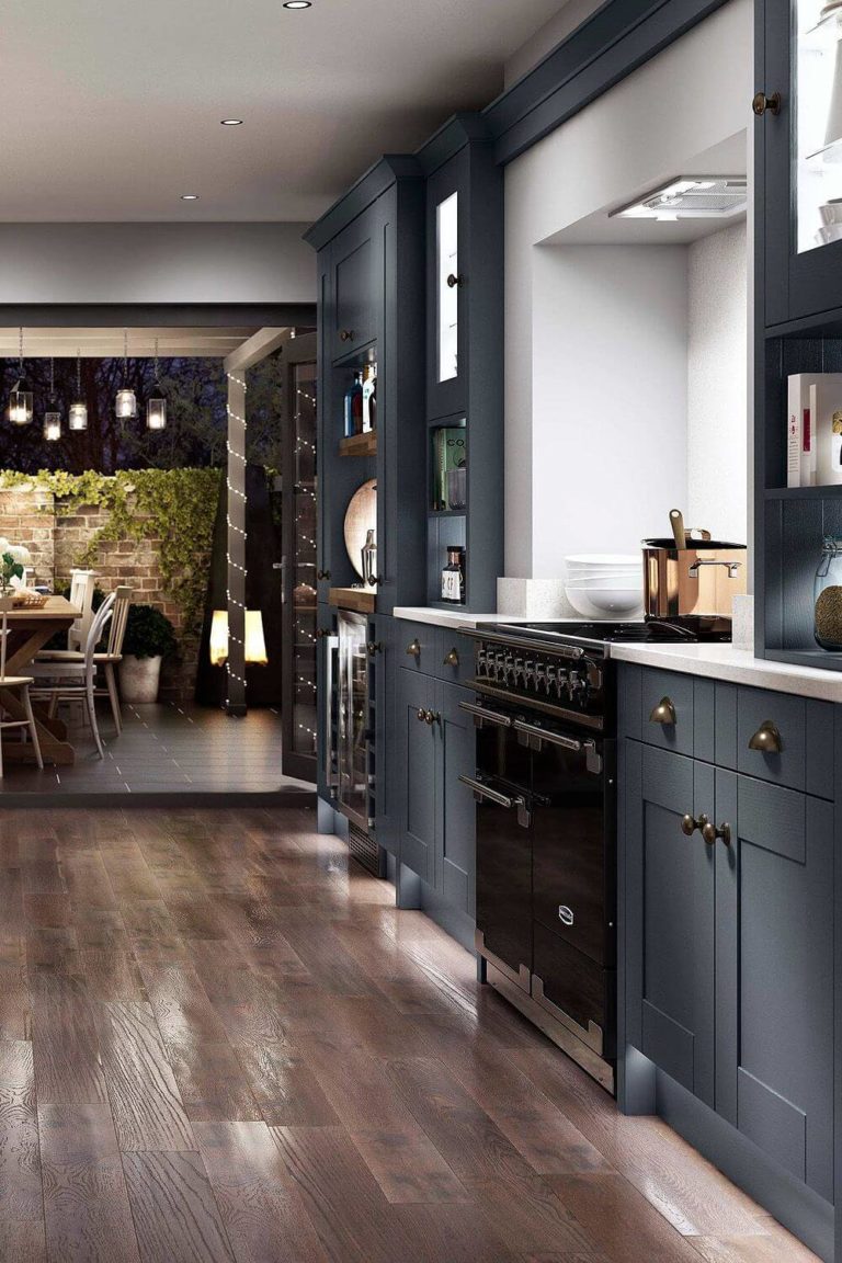
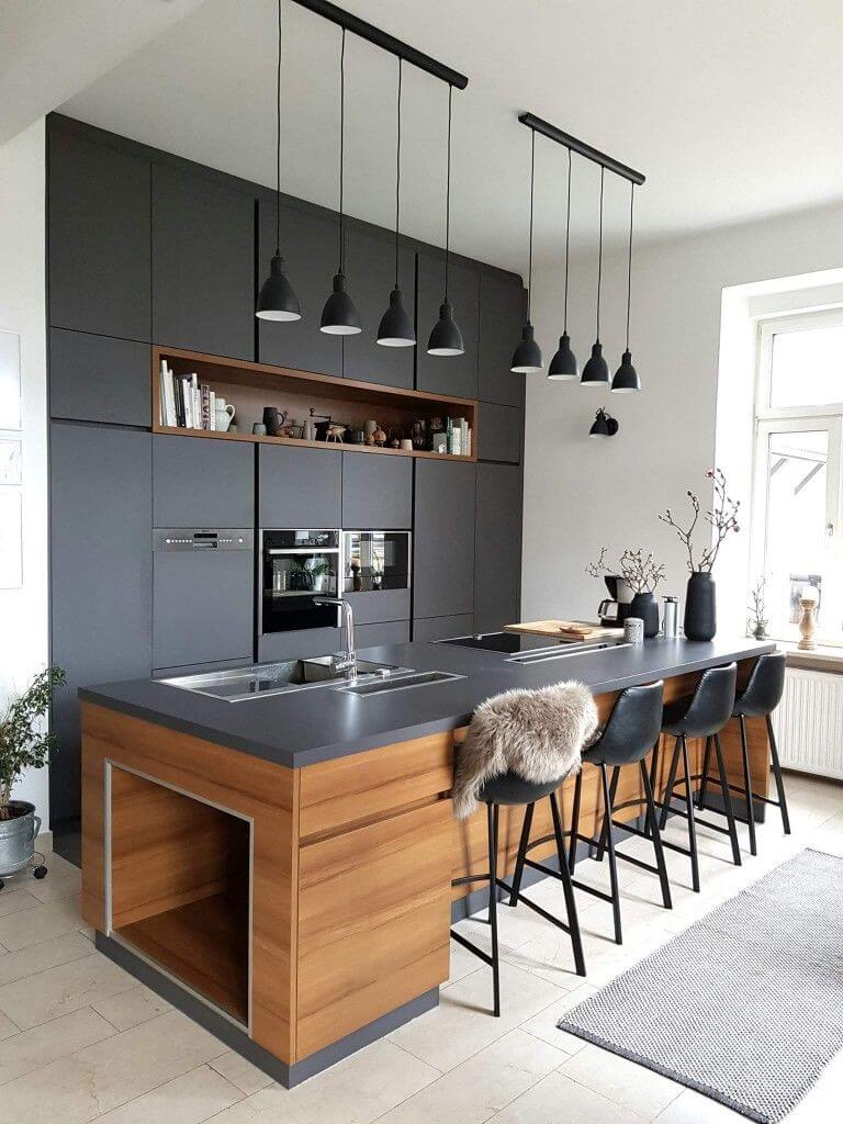
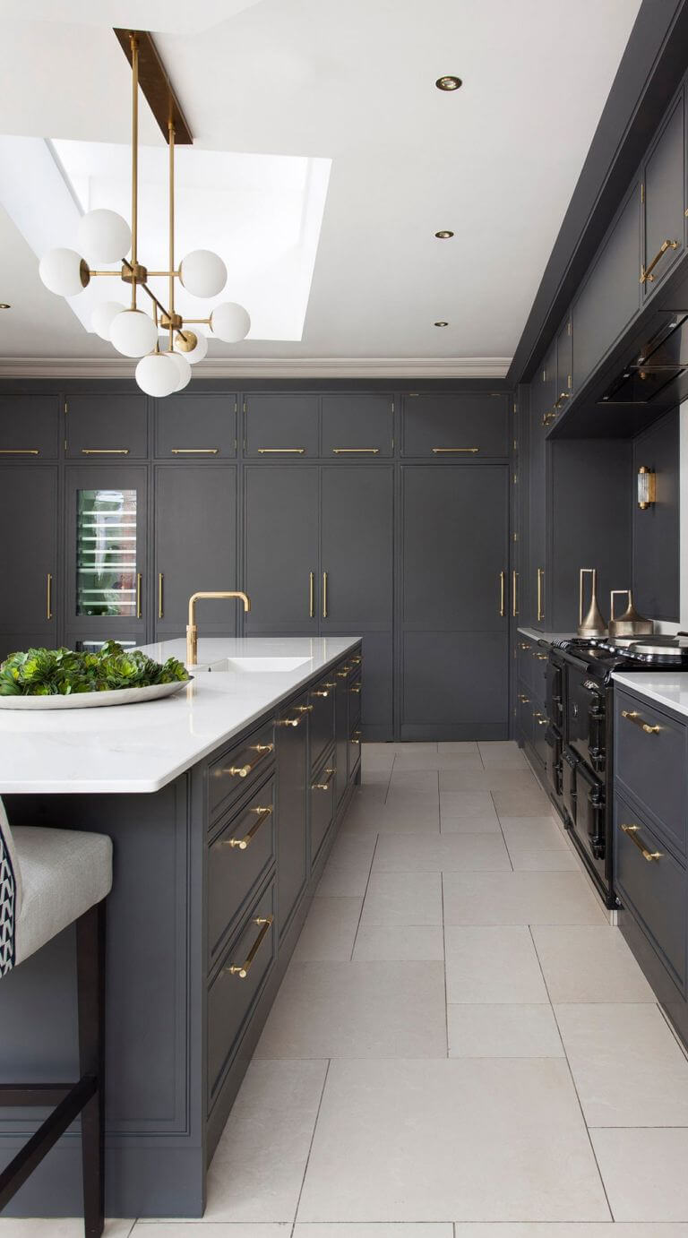
Kitchen
Keep pace with the latest trends and make this dark shade of gray part of your kitchen style. Be it a modern or traditional one, a touch of Graphic Charcoal will add a contemporary sense. In contrast with other spaces, this one will benefit particularly from cabinets painted in this shade. A lighter color for the walls, a splash of wood texture, a few white plates disposed on open shelves, and your redefined kitchen is ready to impress you every time you enter this space.
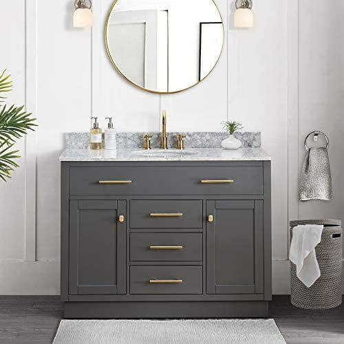
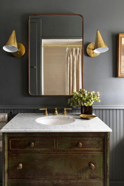
Bathroom
For a start, one should note that this color works for the bathroom only if an appropriate amount of light is ensured. Here, you are free to decide what particular element of the room will benefit from such an impressive shade. Paint the walls and leave the cabinets for a light shade or choose Graphic Charcoal for the cabinets on a light background. Do you think that more gray will spoil the result? Definitely not with such a perfect shade of gray and a few steel elements to reflect its beauty.
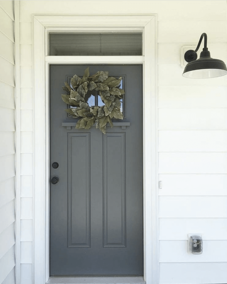
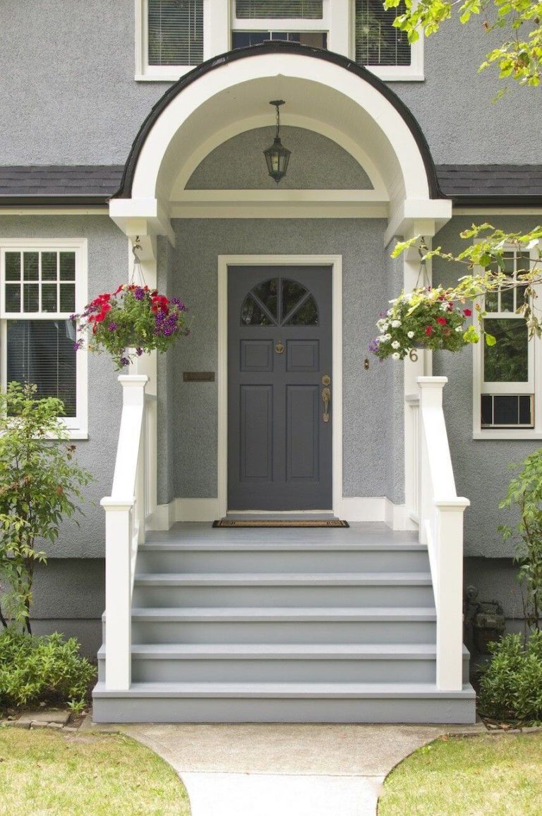
The use of Graphic Charcoal for house exterior
Regardless of how fascinating this color works in the interior when applied to the fullest, a similar approach is not suitable for the exterior. Of course, particular contemporary exteriors would benefit from such a paint, but the traditional wood, brick, or stone houses would rather accept a door painted in this color. This is when we fully encourage you to opt for a front door painted in Graphic Charcoal. Furthermore, you can consider any background color as long as it is light. An indeed stunning accent that also keeps the overall picture balanced.
The Graphic Charcoal paint color from Behr is a real find for those who want a bit of contemporaneity to their interior. Perfect as background and accent, enriching the space with a dramatic effect while keeping it balanced, this mysterious gray is an opportunity to add individuality and set an environment that suits your standards of relaxation.
