Hale Navy HC-154
Benjamin MooreThe HC-154 paint color from BM is a dark shade of blue and an accurate replication of what a perfect naval blue looks like.
Hale Navy HC-154 (Benjamin Moore): what color is, review, and use
Color trends in interior and exterior designs come and go, and only a few shades stay the same without getting out of style. This is true about the go-to naval blue from Benjamin Moore – Hale Navy HC-154. This beloved shade is devoid of any fuss and, like other hues of this kind, entered the heart of designers and homeowners and cannot simply get out. Who would give up on a perfect naval blue? It is to be noted that this particular variation of blue has been trendy lately, and Hale Navy is an outstanding representative.
Standing at the top of the designers’ list of favorites, the remarkable shade of blue from Benjamin Moore is already a classic, or, let’s put it this way: a timeless paint color. This impeccable splash of depth and serenity is part of the Historical Collection, which comprises true paint colors used in American architecture from the 1700s to 1800s; one more reason to think that Hale Navy is a pearl among shades alike. Let’s dive into the science of such a perfect naval blue!
Hale Navy paint color features
The HC-154 paint color from BM is a dark shade of blue and an accurate replication of what a perfect naval blue looks like. It is all about balance: not too warm nor too cold, not too bright nor too dark, which makes it a versatile shade that adapts to any situation in part and even contributes to the transition from one design direction to another. What does it feel like? It is deep, serene, inducing contemplation, although it is no less bold, inspiring, and encouraging for change. A tiny warning: once you use Hale Navy at least one within your interior or exterior, you cannot help but fall in love with it.
Hale Navy: is it warm or cold?
We have already stated about its balance of warm and cold notes. Still, Hale Navy gravitates towards the cold side with a slightly coolish scent. South-facing rooms bathed in warm sun rays will bring a subtle hint of warmth on the surface. Still, we cannot overlook its cool appearance, particularly in north-facing spaces.
How does lighting affect Hale Navy?
The more light it receives, particularly daylight, the lighter the color appears, preserving its cool scents penetrated by a few warm particles. It looks impressively refreshing in rooms with north-facing windows without risking its true naval blue nature, although a cloudy day can certainly make this shade seem like a charcoal variation in poorly lit spaces. On the other hand, Hale Navy fills with energy and sophistication in the west, east, and south-facing rooms, leaning brighter than usual and serving as a unique accent. Such a dark color requires an appropriate amount of light during the day, particularly at night, when artificial lighting comes to the rescue. However, cooler or warmer undertones will bring these particular features to the surface.
Hale Navy LRV
It is not that often that we deal with such dark paint colors, and the LRV of Hale Navy is there to prove it. First things first, for those unfamiliar with the term: LRV stands for Light Reflectance Value, determining how dark or light a color is on a scale from 0 to 100. The LRV of this shade from BM is about 6 (according to the official website – 6.3). Without too much explanation, we would like to refer to a fact that would clarify everything: 0 stands for a true black. Now you know what we mean by saying that Hale Navy is dark. It is not that skilled when reflecting light, and any expanding effect in terms of space cannot simply stick to this color. Yet, these are tiny nuances besides the exceptional beauty of this classic shade.
Hale Navy undertones
We cannot doubt the belonging of Hale Navy to authentic shades, by which we mean true naval blues. Still, it has a slight hint of gray responsible for the velvety scents. It is the smallest details that stand behind significant effects. In this case, these gray undertones are the ones that lead to the deep sense of tranquility hidden behind the surface of this shade. Again a perfect combination – blue and gray that go hand in hand and offer the beloved accent look.
Similar colors
The popularity of naval blues could not lead to any other result than a wide range of variations in this sense. Both Benjamin Moore and other paint manufacturers are ready to share their perspectives on naval blue. We have compiled a list of the most prominent shades that are exceptionally similar to Hale Navy. Let’s take a look!
Coordinating colors
In this sense, Hale Navy is regarded as a neutral color, which is hard to believe. Still, its versatility towards almost any shade is there to back our statement. It looks very well on light backgrounds, serving as an accent but no less impressive with pastel shades of brighter colors for more sophisticated pairings. This paint color also accepts warm wood tones with pleasure, although shades with blue and gray undertones are favorites. The spectacular hue from BM works even with black, which even looks similar in spaces with dim light. The list of possibilities can go on and on. Let’s stick to specific examples of shades that go with Hale Navy!
Use of Hale Navy in interior
Considering that Hale Navy is so versatile, there is no doubt that it works well with any style, from Traditional to Modern Farmhouse, the irreplaceable Nautical, and no less appropriate – Transitional. Do you fancy an original accent wall? Would a bold-painted piece of furniture bring sophistication to your monochromatic palette? Is an all-naval blue interior your dream design solution? Hale Navy is at your disposal. Let’s go through some design approaches of this shade and see how it works in practice!
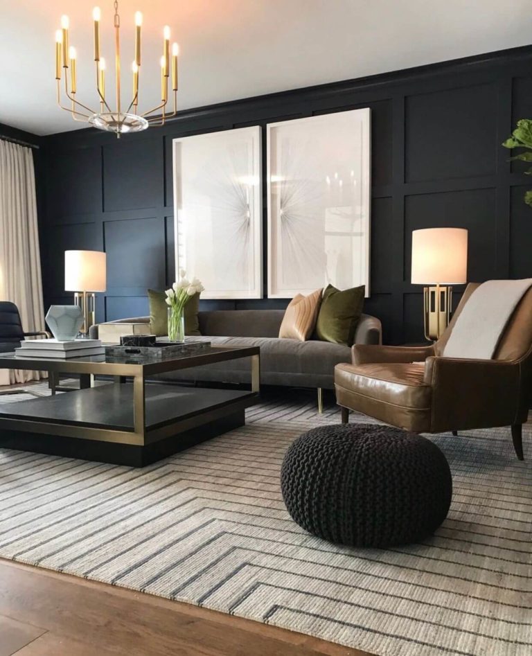
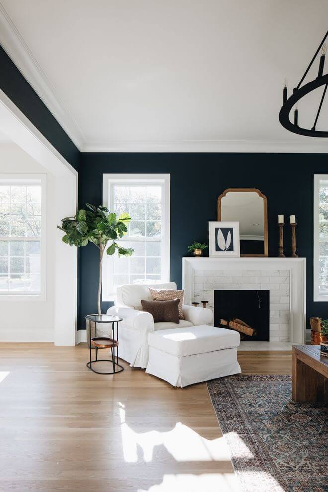
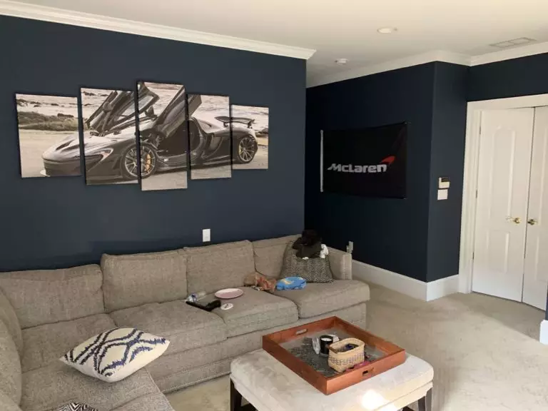
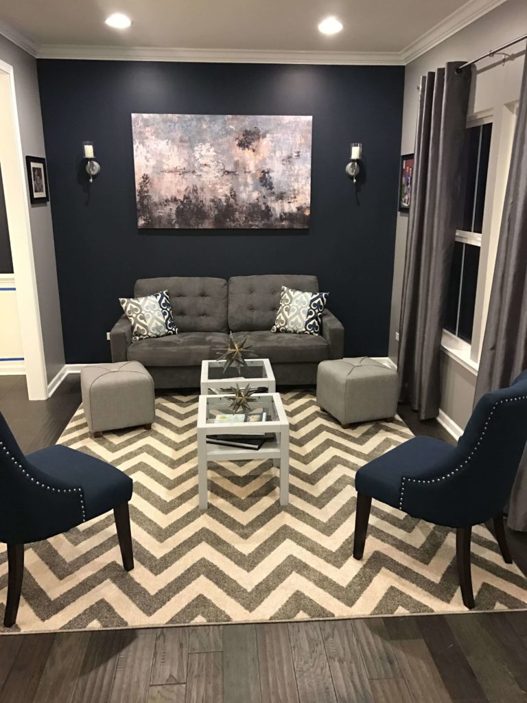
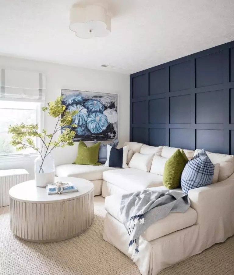
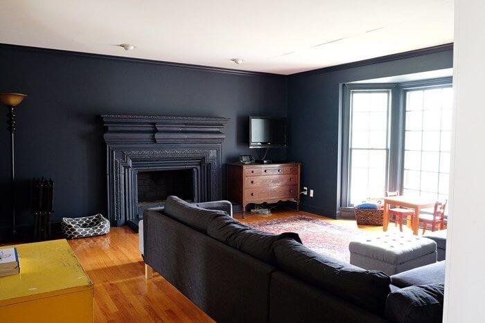
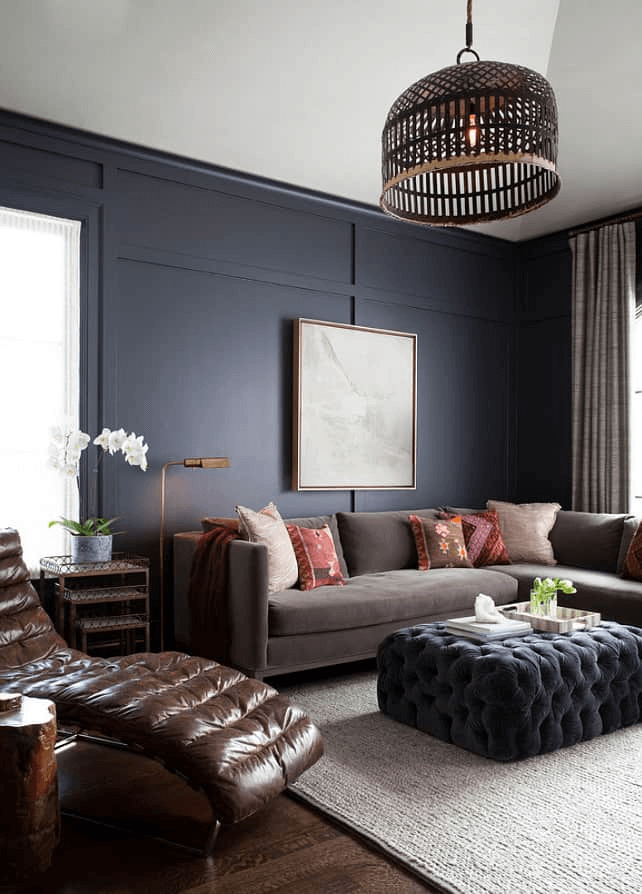
Living room
This is the space you can endlessly experiment with this beautiful shade. For a contemporary contrast, consider Hale Navy as a background and white accents, such as the trim, sofa, or textiles. Opt for a pot with greenery that will soften the environment for a splash of energy within such a contrastive interior. Additionally, you can consider a green shade for particular textile pieces to ensure a harmonious connection. On the other hand, you can opt for an all-naval blue living room with dark wood for the flooring and antique pieces of furniture of wood for a modern approach to Farmhouse. Still, don’t forget about a few light accents to balance the overly dark setting.
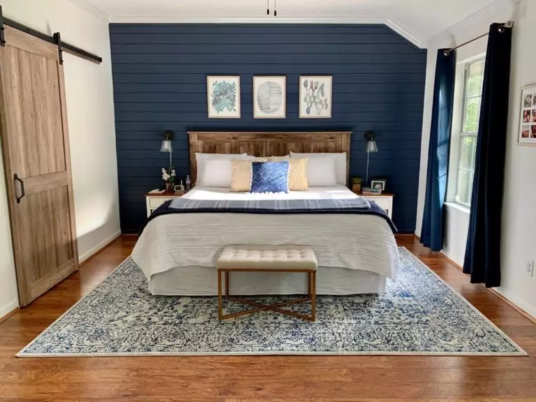
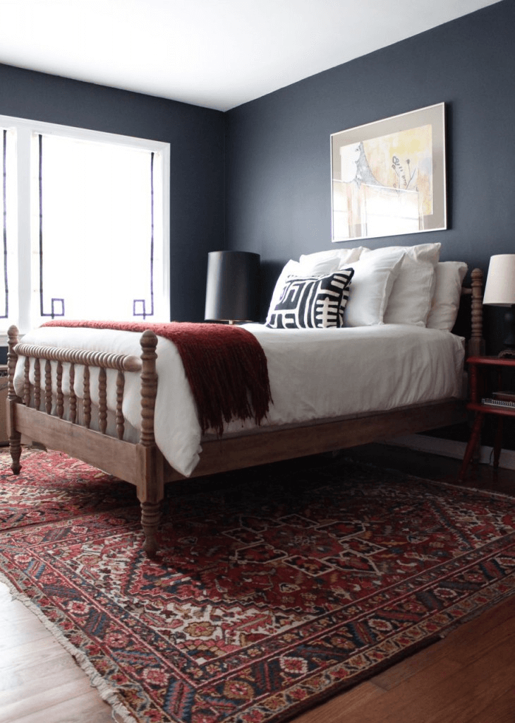
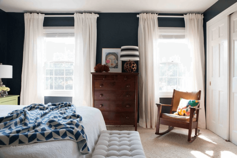
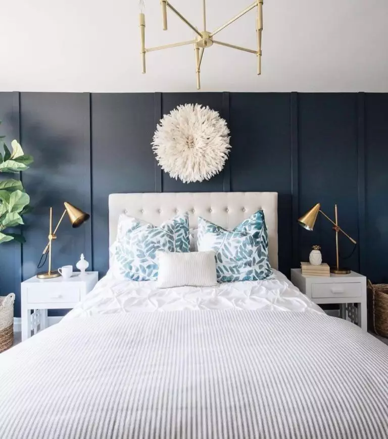
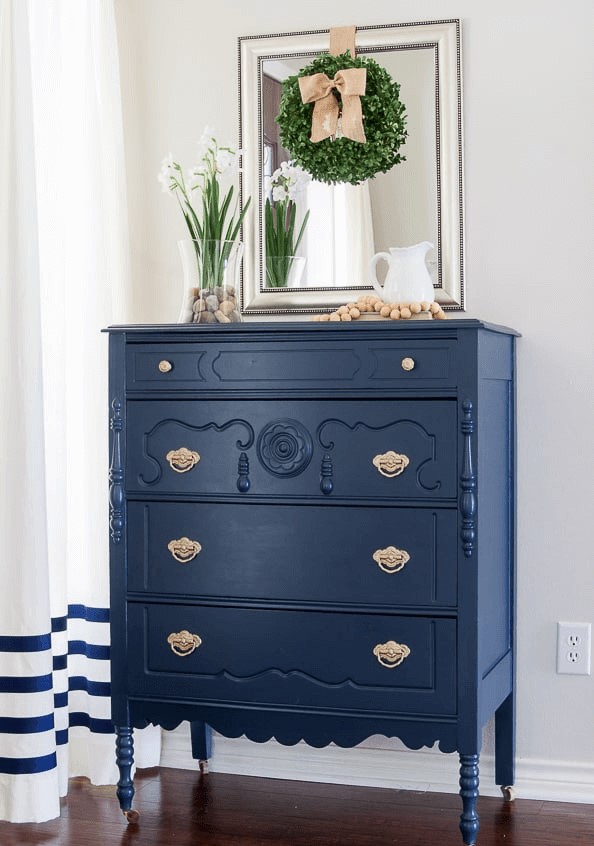
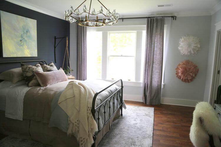
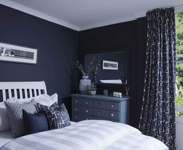
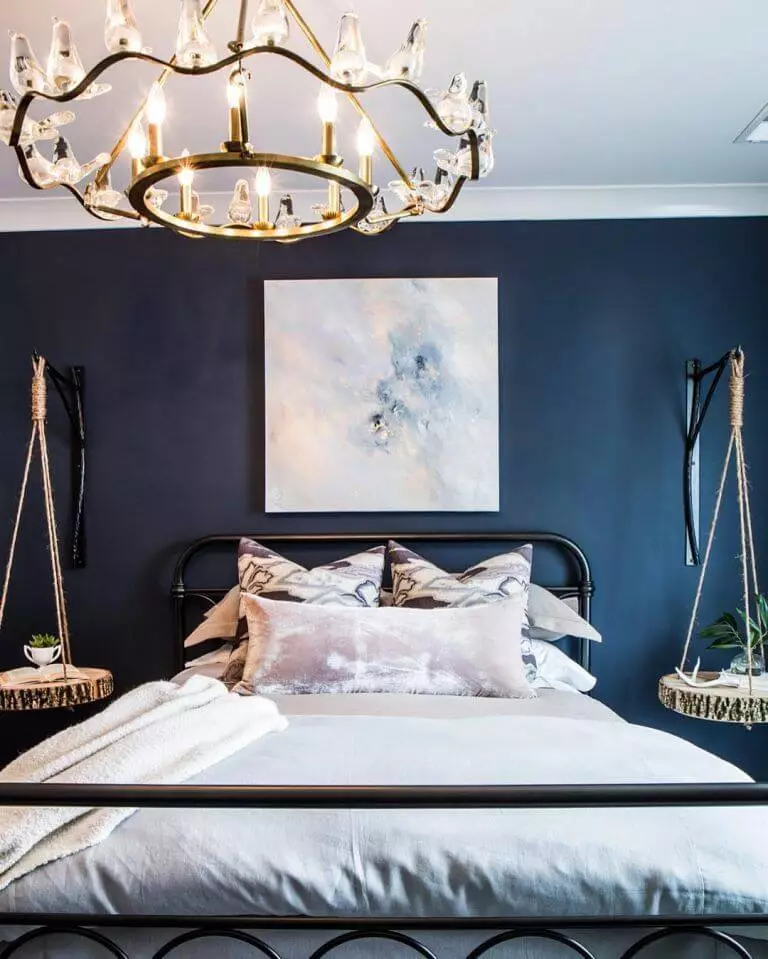
Bedroom
If you decide on painting the walls entirely with Hale Navy, consider mandatorily white bedding and curtains, although other light shades are also acceptable. Such contrast will keep everything balanced and offer your bedroom an indeed contemporary look. Add a single dark wood piece of furniture, and this space will also slightly embrace tradition. At the same time, you could consider this fantastic blue for an accent wall and accompany it with a light background and curtains in the same naval blue – sleek, balanced, and no less modern. In the same context, you could opt for a vintage unit painted in Hale Navy on the light background to add a bit of sophisticated elegance to an overly contemporary setting.
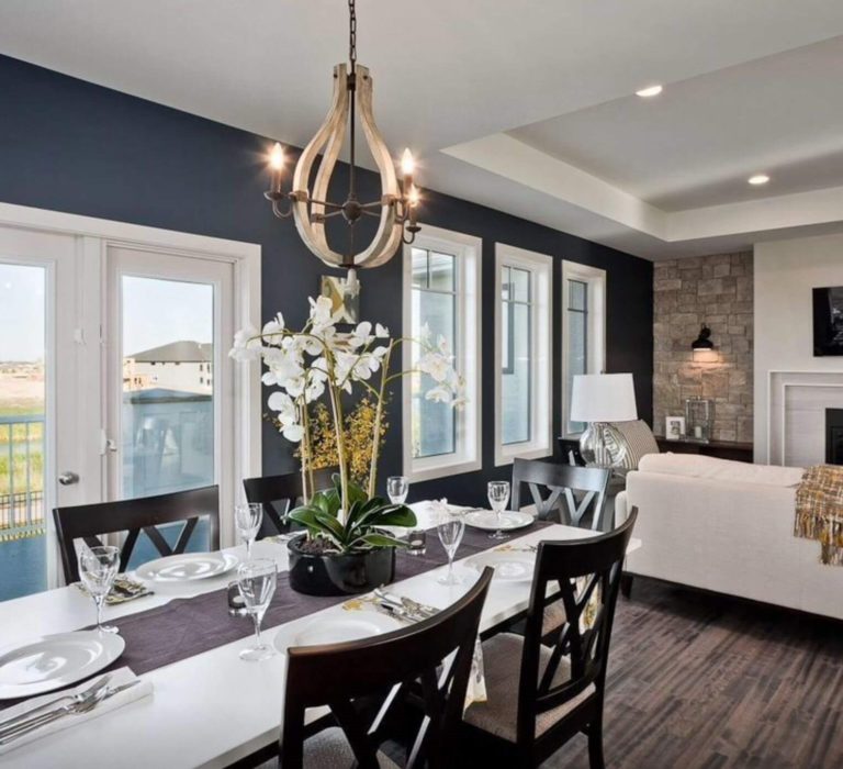
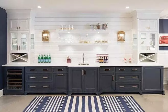
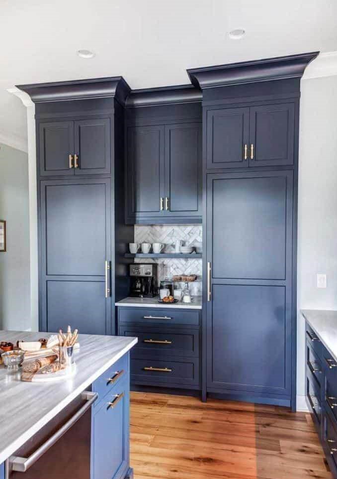
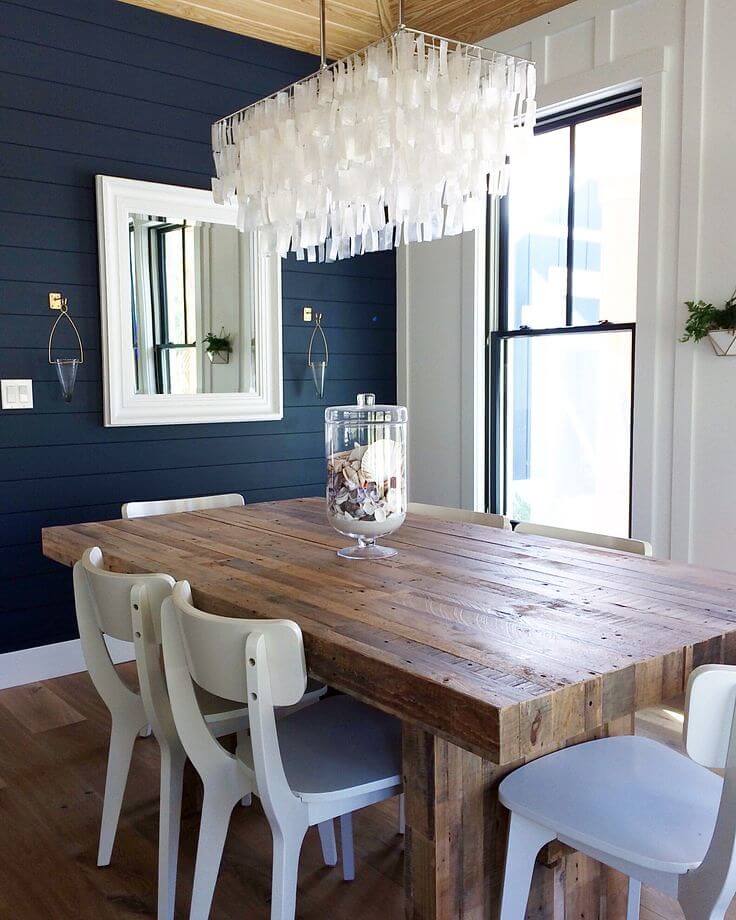
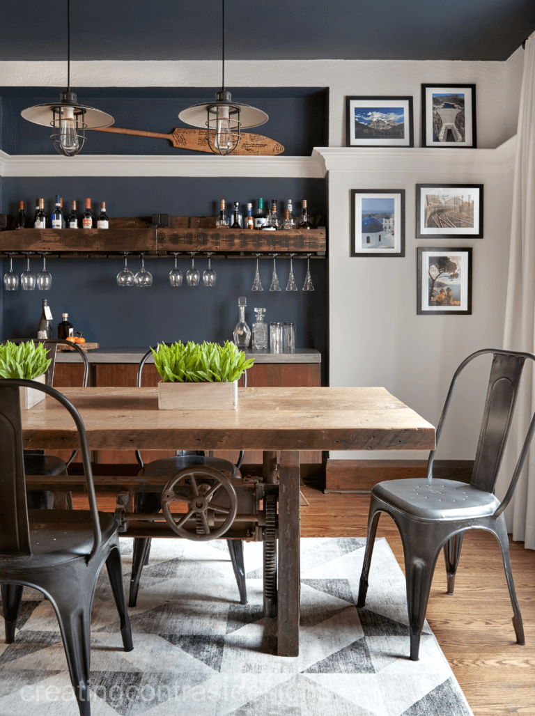
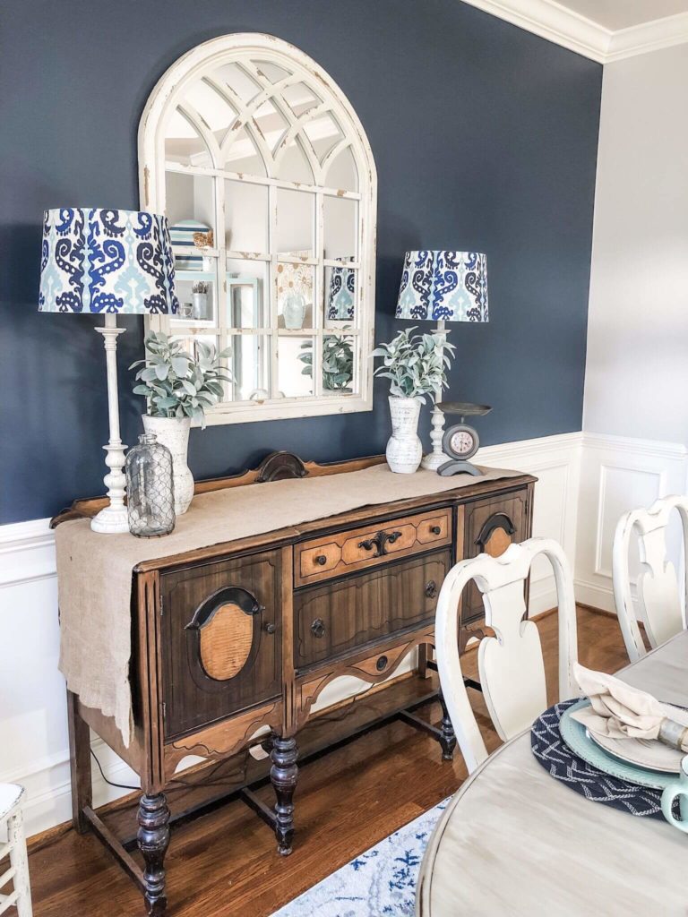
Kitchen and dining room
For both these spaces, the true companions of Hale Navy are a white paint color and wood. In the kitchen, you can go with cabinets painted this way and open shelving with a white shiplap background for a Farmhouse style. Still, a white backdrop with naval blue cabinetry and marble details accompanied by brass is the replication of a sleek contemporary kitchen. Consider naval cabinetry or a naval blue island on a white background accompanied by wood elements to embrace traditional values.
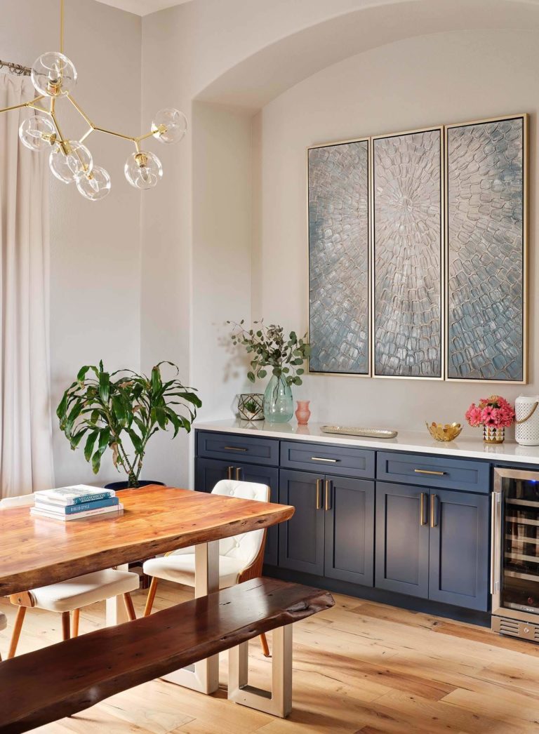
Once we reach the dining area, we notice a similar combination of colors and texture; Hale Navy as an accent wall, white paint for the background, and wood pieces of furniture. Go with raw textures such as wooden surfaces in their natural beauty and iron details for a more modern approach. No less impressive is the Modern Farmhouse design solution with naval blue for the upper part of the walls and white wood paneling for the other half accompanied by vintage wood units and irreplaceable wood pieces of furniture.
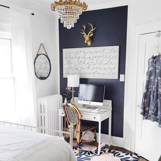
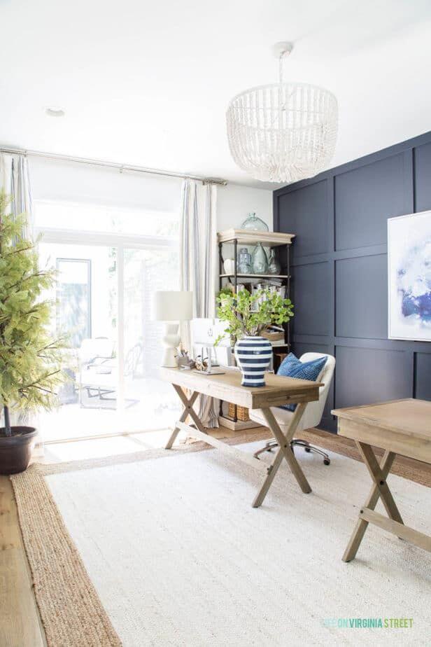
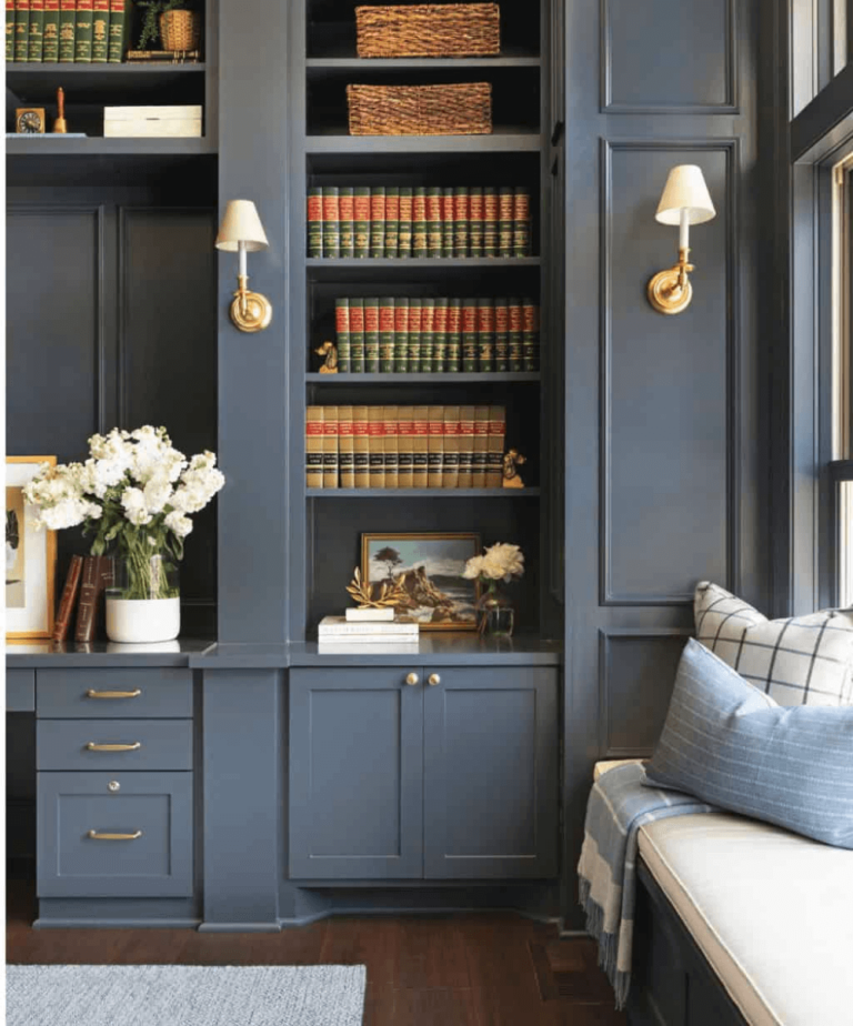
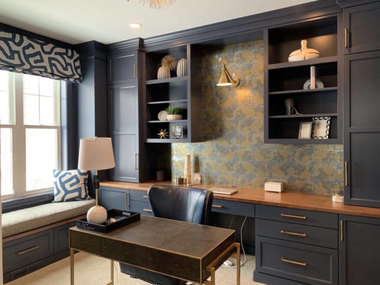
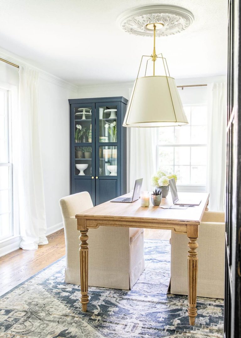
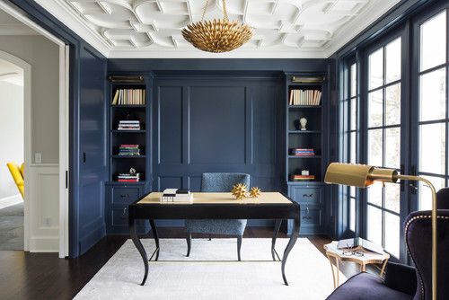
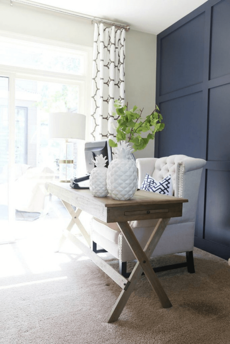
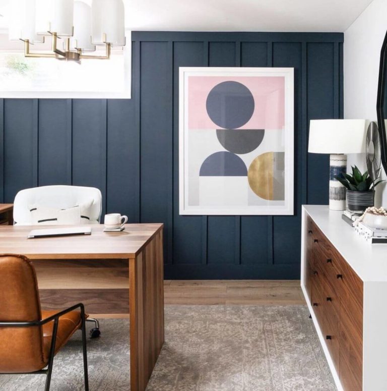
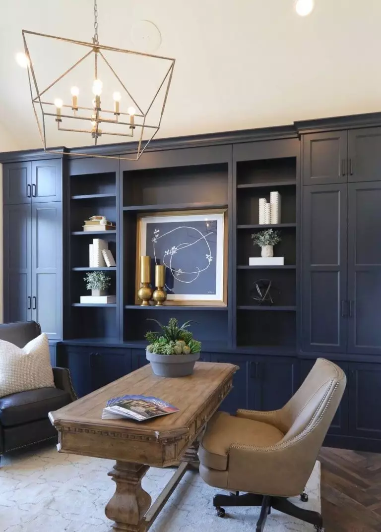
Home office
The deep naval blue is a perfect source of inspiration and calmness for a balanced and productive environment. Its favorites – white paint color and wood can be successfully paired with green and brass details. No less appropriate are leather upholstered chairs. Whether it is an all-navy blue interior, an accent wall in this shade, or an accent unit on a white background, the other details will play their magic and make the most of this fantastic blue.
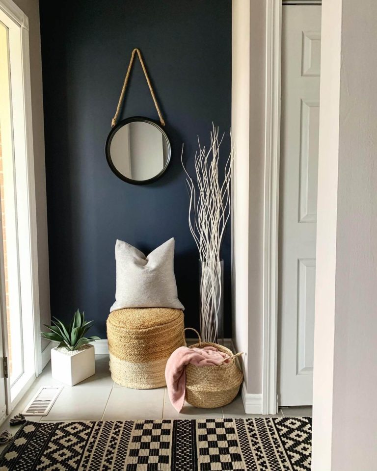
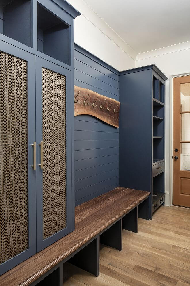
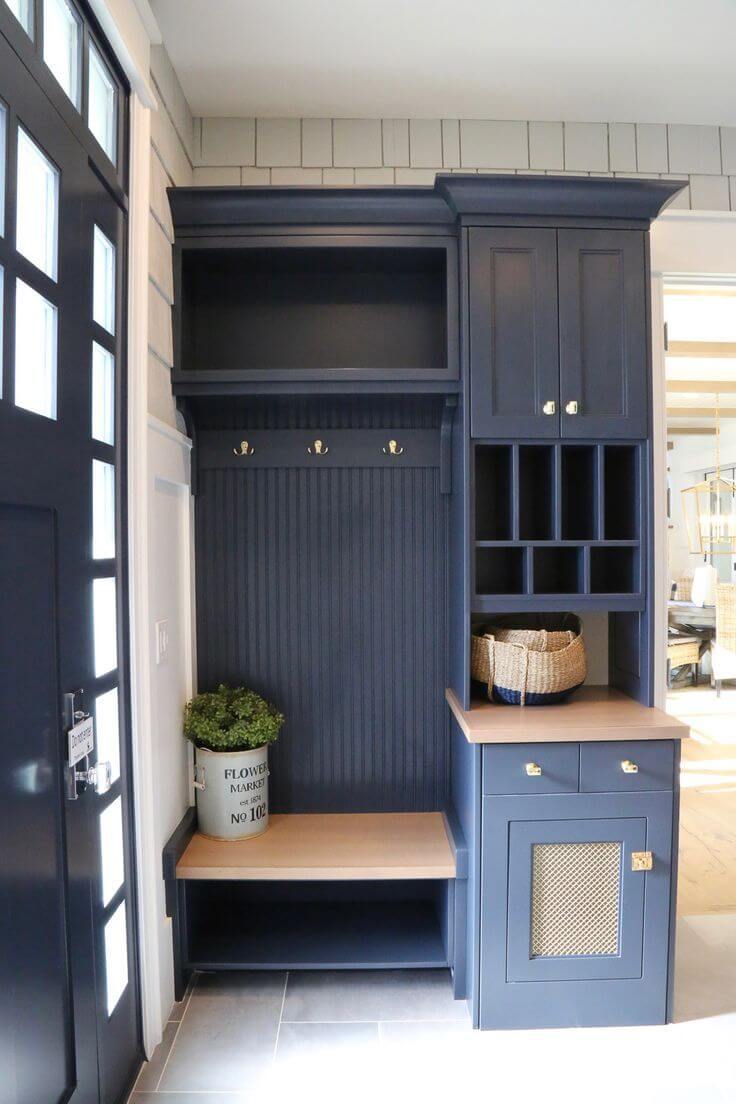
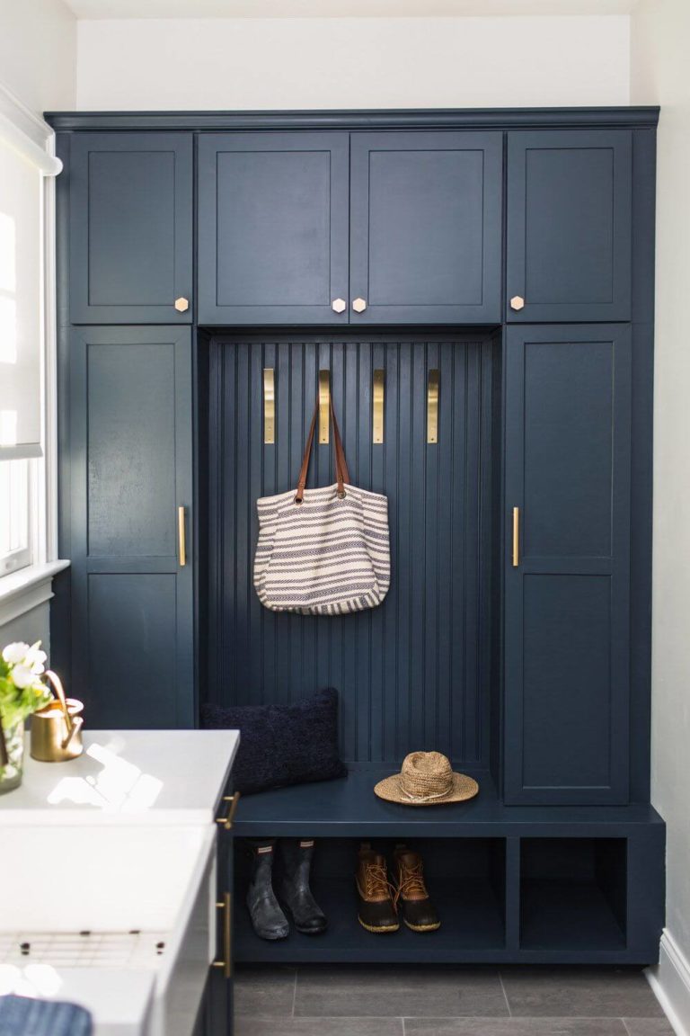
Hallway
This space can benefit from a tiny touch of depth and intrigue with Hale Navy. Be it an accent wall or a piece of furniture at the entryway. Don’t forget about the brass and wood details to complete the aristocratic look of your hallway. In all cases, a white background is a perfect canvas for displaying such decor pieces – nothing more, nothing less; just a contemporary contrast that can adapt to any style.
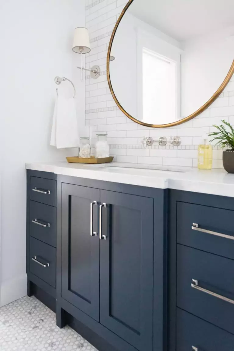
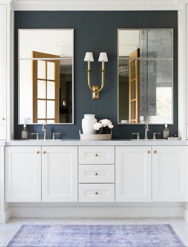
Bathroom
Although Hale Navy is very flexible, designers do not get tired of the gorgeous combination between naval blue, white, and wood. Be it separately or all together. One of the most popular approaches is painting the cabinets in this fantastic shade that brings in drama on a white backdrop or the opposite. Wood cabinets work as well on a naval blue background. One thing that brings all these options together is brass for tiny elements.

Use of Hale Navy for house exterior
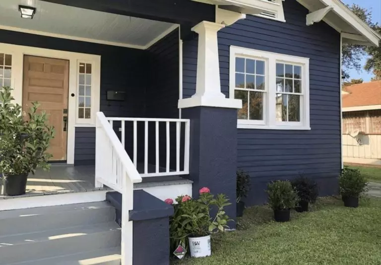
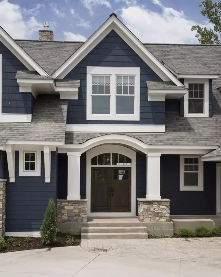
Although a very bold color, Hale Navy does not cease to impress even when it comes to the house exterior. The appropriate combination of contrasts will redefine the style of your house. Guess what! White and wood come again to the rescue. Naval blue for the walls, white for the trim, and dark wood for the front door. Experts suggest completing the picture with a gray roof. At some point – traditional, at another level – modern, even a hint of transition can be felt.
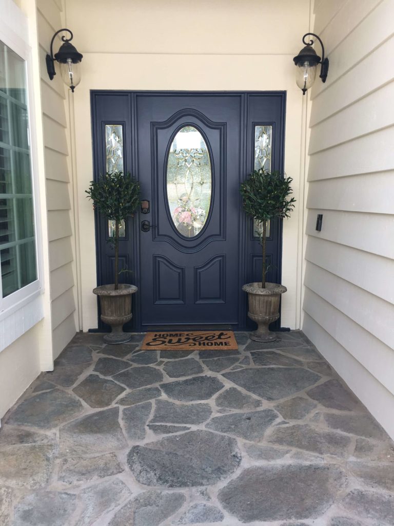
The smallest splash of Hale Navy will ensure the trendy look of your house. Furthermore, this naval blue is timeless, and a front door painted this way will go with any accompanying shades and keep your exterior up to date for a long time. Always on the safe side and extremely stylish.
The Hale Navy HC-154 paint color from Benjamin Moore is the beloved shade of many designers and homeowners due to its versatility, adaptability, and classic appearance. The perfect naval blue that always stays true to its nature, adjusting to your preferences, that simply does not get out of trend under any conditions.
