Modern Gray SW 7632
Sherwin-WilliamsA calm and neutral and, at the same time, surprisingly friendly, clearly light gray, but with some subtle undertones.
Modern Gray (SW 7632): what color is, review, and use
If you are looking for the right gray color to update your interior, we can even sympathize with you in some ways. The choice of shades in the palettes of the most famous manufacturers today is truly huge – and each of them has its own strengths. We told you earlier about the actual gray tones that you should pay special attention to. Now we are pleased to introduce you to another very interesting representative of this extensive family – SW 7632 Modern Gray from Sherwin-Williams.
Modern Gray paint color features
Designers have repeatedly confessed their love for Modern Gray, and they have lots of reasons to do so. Indeed, this shade has a special character – it is calm and neutral and, at the same time, surprisingly friendly, clearly light gray, but with some subtle undertones, which we will talk about a little later.
The peak of popularity of SW 7632 Modern Gray was reached in 2021 when it appeared in two current color palettes at once – Pottery Barn and 2021 Sanctuary. Also, this shade is included in other collections of the brand – Top 50 Colors, Timeless Color Wall, and Living Well – Renew.
Modern Gray: is it warm or cold?
Just look at a surface painted in Modern Gray to make everything clear without further ado: well, of course, this color belongs to warm gray shades! The warming effect that this wonderful tone has is felt even with a lack of lighting.
Experts attribute this feature to the significant presence of soft brownish undertones. Even with significant warmth and the presence of other tonal nuances, it stubbornly retains warmth and friendliness, for which it is especially appreciated by fans of modern minimalism and Scandi.
How does lighting affect Modern Gray?
SW 7632 is very sensitive to light, so be prepared for the fact that its perception under the influence of various light sources will be significantly different from the sample in neutral conditions. For example, in a south-facing room bathed by the afternoon rays of warm sunlight, beige-brownish undertones come to the fore in this color – and they come out so effectively that the gray base becomes almost invisible. However, in coldish light or lack of it, you will definitely see it as a very even and at the same time as neutral as possible light gray, since it will not look either warm or cold.
It is worth noting another extremely interesting point – the ability to adapt the tones of surrounding objects. Modern Gray is so light and neutral that it can successfully reflect the tones of furniture, textiles, and accessories that are nearby. This phenomenon is especially peculiar to objects in pink, red, and green tones.
Modern Gray LRV
The light reflectance coefficient for Modern Gray is 62, and this allows us to attribute it to the golden middle of the group of light shades. Even studying photos of interiors using this actual shade, it should be noted that, in principle, it can make any room lighter and more spacious, but only with the condition that it is sufficiently lit. In this case, SW 7632 will provide such an amazing combination of warmth and light that you simply won’t want to leave the room.
If there is not enough light, you are still on the safe side. In this situation, Modern Gray will look completely neutral (of course, if there are no colorful furniture and accessories nearby, as we talked about above), and at dusk, it will seem much darker and perhaps even show its deep brown undertone.
Modern Gray undertones
As we said earlier, SW 7632 is neutral, and the only undertone that is quite noticeable is brown-beige. However, sometimes it may seem that it exhibits pinkish or green notes. Nevertheless, it is nothing more than an illusion. The thing is that it reflects the neighboring colors. That is why you should carefully choose a palette in which Modern Gray reigns, as it will depend on how you and your guests will see it all the time.
Similar colors
Modern Gray is charming in its warmth and neutrality. At the same time, it can hardly be considered a unique and eye-catching color. In fact, you can find similar shades from both Sherwin-Williams and other manufacturers we already know. We invite you to find out what shades of gray the SW 7632 can be compared with.
Coordinating colors
Designers have already compiled their list of colors that ideally combine with Modern Gray. Pure and chilly whites, such as SW 7005 Pure White and SW 7757 High Reflective White, were the first to appear in it. Also, look out for blue-gray, gray-beige with greenish undertones, and cool tones with less LRV. However, we offer you the color options that seemed to us the most interesting:
The use of Modern Gray in interior
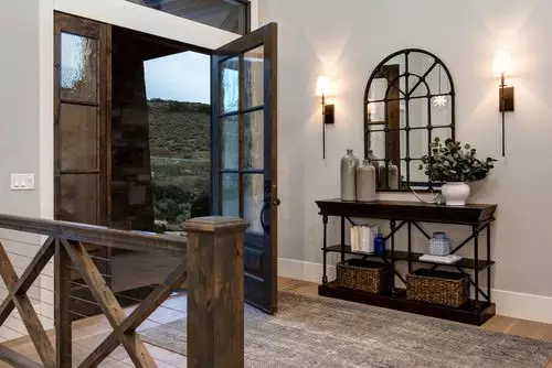
Once again: Modern Gray is appropriate in any premises the same way those neutral gray and gray-beige tones that we talked about earlier. Of course, you will have to consider the environment carefully to achieve the desired effect, but it is not as hard as it appears to be. So, let’s talk about how you can transform the environment in your home with the help of Sherwin Williams shade.
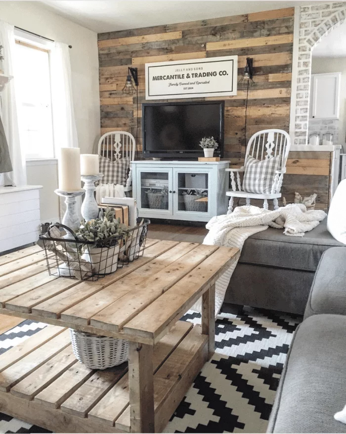
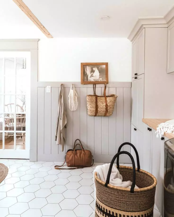
This cute Farmhouse
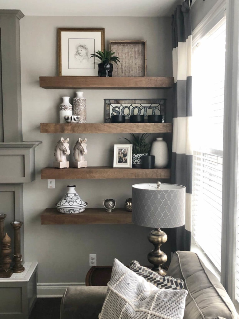
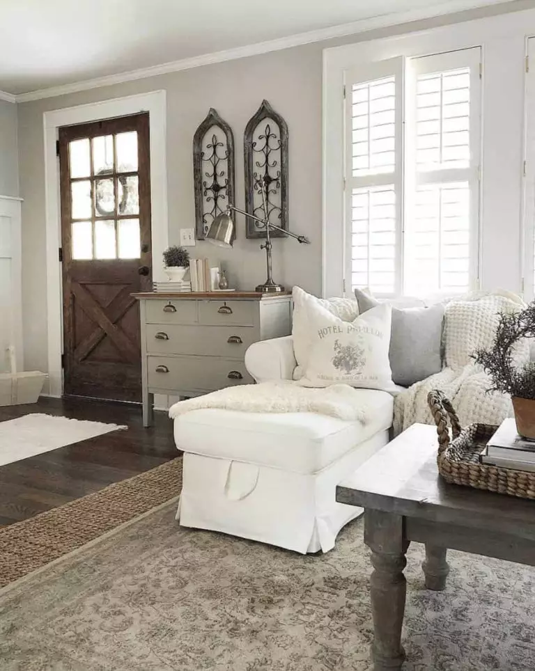
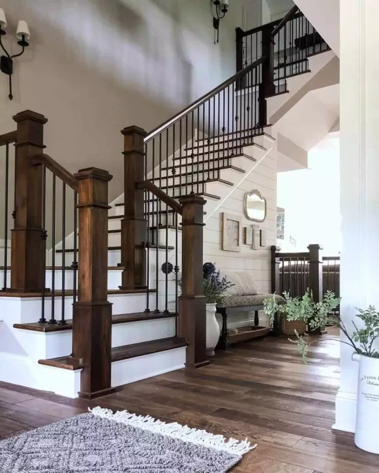
Modern Gray seems to us a very logical and surprisingly pleasant solution for conveying a cozy and relaxing atmosphere of a farmhouse. Yes, it is really gray, but light and warm enough to look slightly meditative, calm, and at the same time with slight notes of the past. In addition, the typical farmhouse setting, which is dominated by simple wooden furniture, natural textiles, and a gray-white-brown palette in balance with green plants, perfectly reveals the friendly character of Modern Gray.
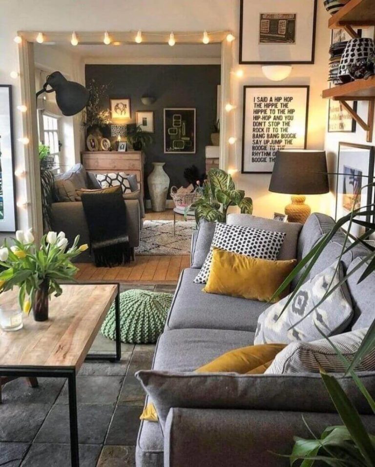
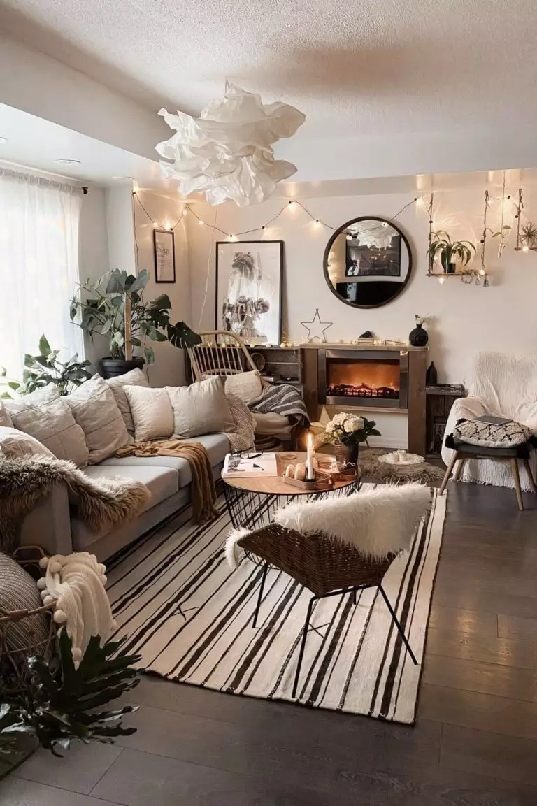
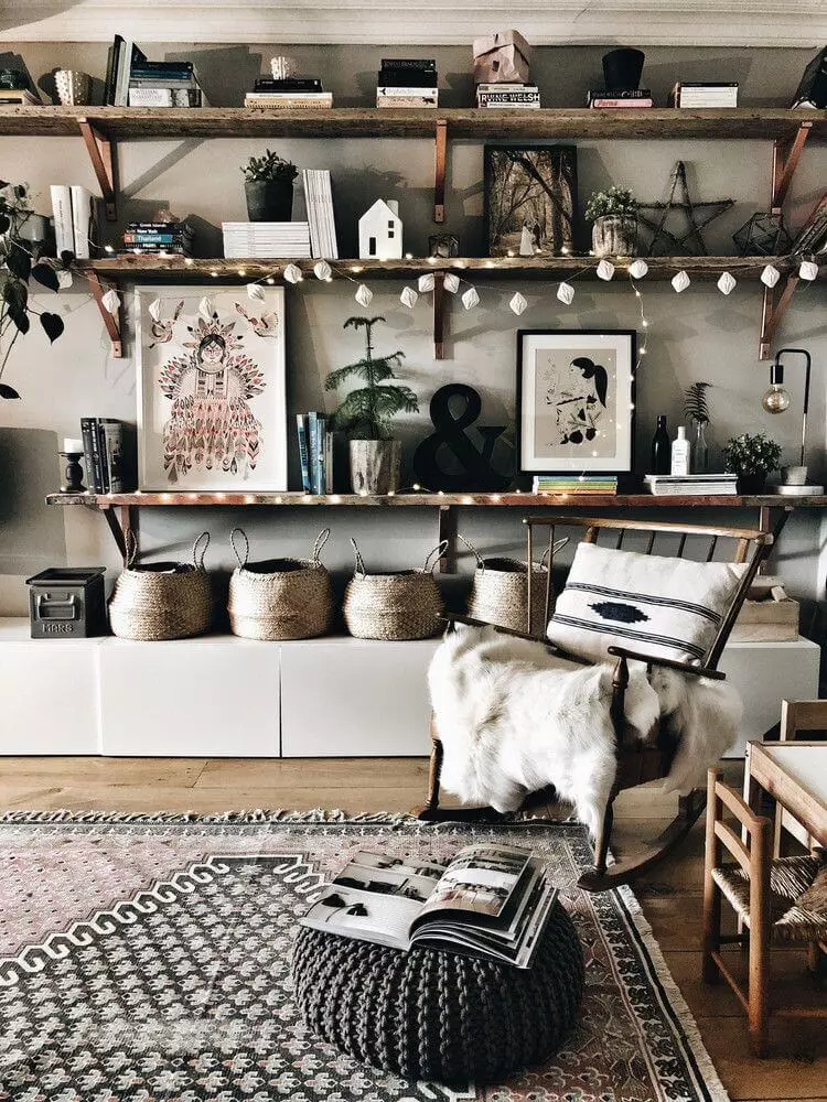
The magic of Hygge
We confidently include SW 7632 in a palette that can perfectly emphasize the charm and warmth of hygge, one of the most delightful trends in Scandinavian interior design. The abundance of textiles, cozy furniture, numerous accessories, and lovely little things – against the backdrop of Modern Gray, all this turns the room into a kind of oasis, a small corner where you feel safe and experience only positive emotions.
As noted by those who chose this color for such an interior, it becomes especially magical at Christmas, when luminous garlands and compositions of spruce branches and red accents become especially expressive against this background.
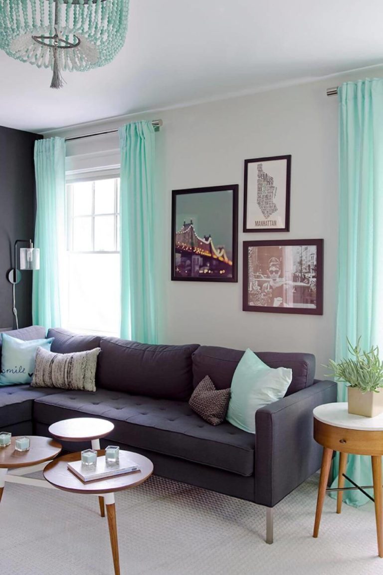
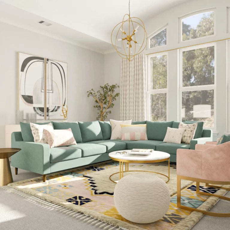
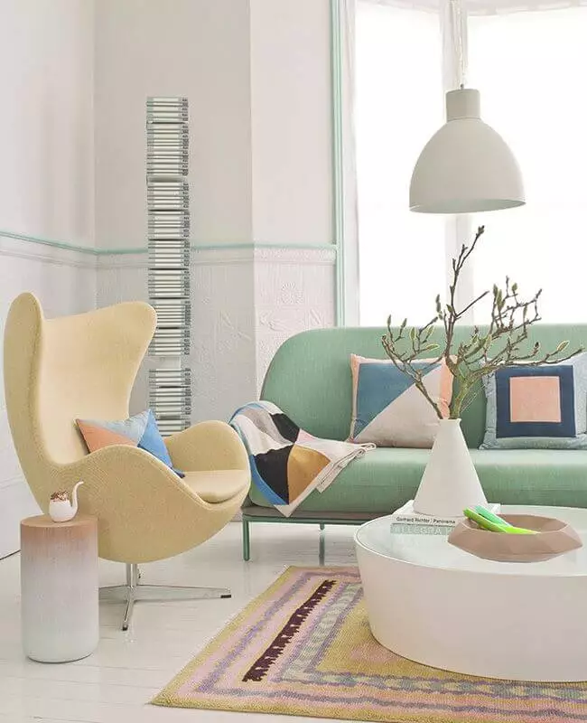
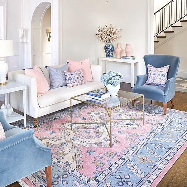
Try pastels
Above, we already wrote about shades that go well with Modern Gray. However, there are very few axioms in interior design, and therefore it is completely optional to choose them – especially if you are in love with pastel shades. Pale yellow, soft brown, light pink, mint, and very light blue (by the way, you can use them all at the same time) help create a light, watercolor, and somewhat feminine atmosphere in which you are sure to feel uplifted. If you want contrast, add white details to the trim – you can find out what this white color should be like above.
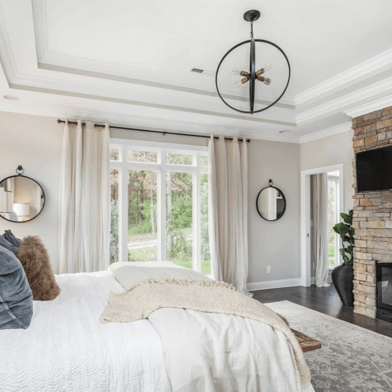
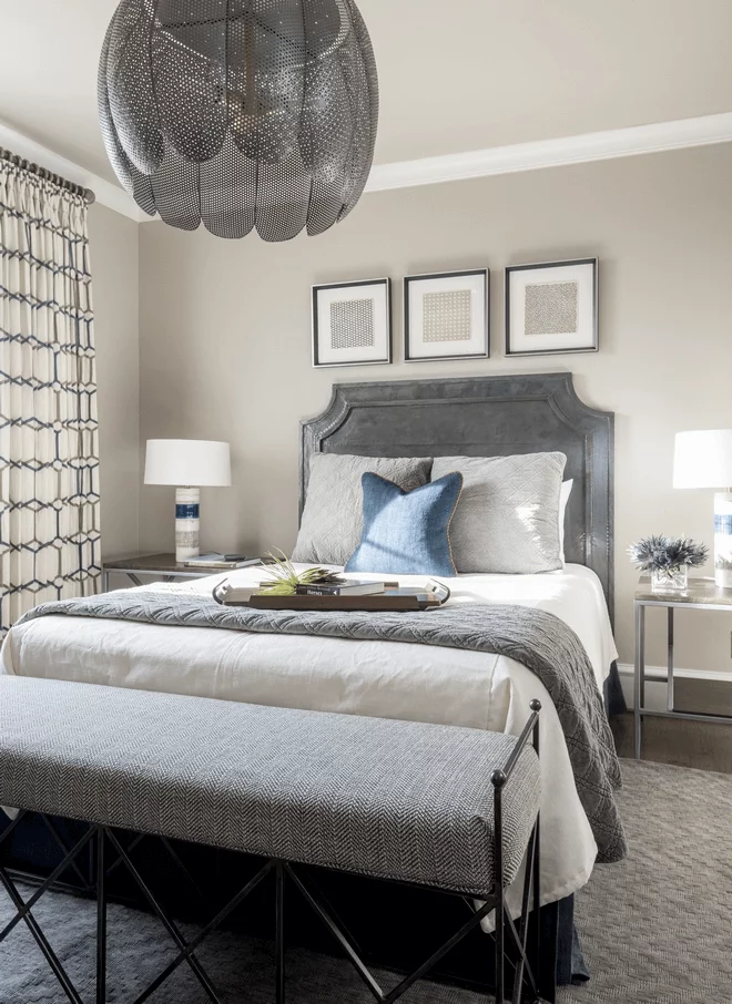
Bedroom
If you are dreaming of a vacation spot where no detail irritates the eyes, Modern Gray will be a real lifesaver for you. Having painted the walls with such paint, you will ensure a comfortable falling asleep in a cozy atmosphere and an easy awakening in a bright and warming one. In addition, this gray shade is suitable for almost any style of interior – except maybe for the classical, for which it may seem too gray and too washed out.
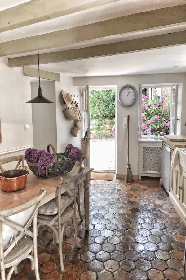
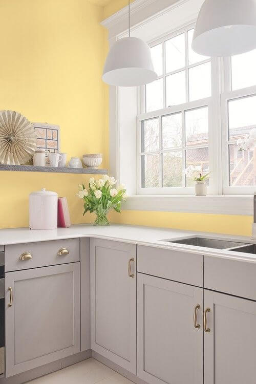
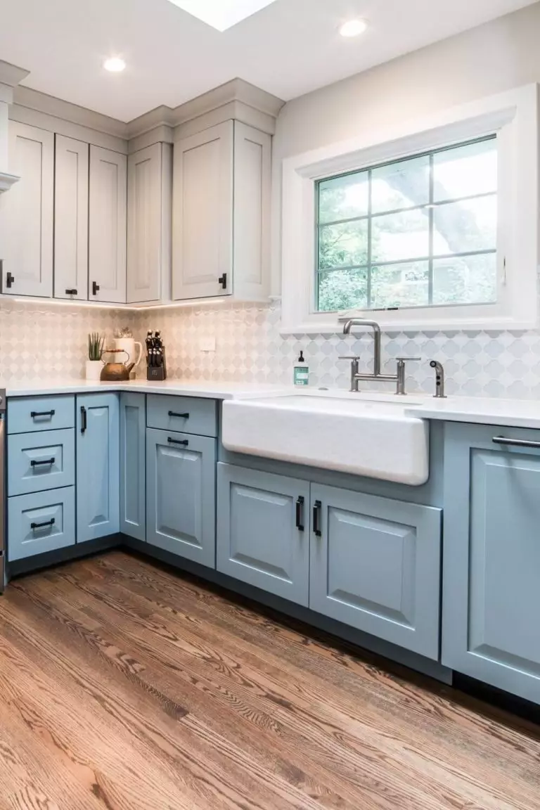
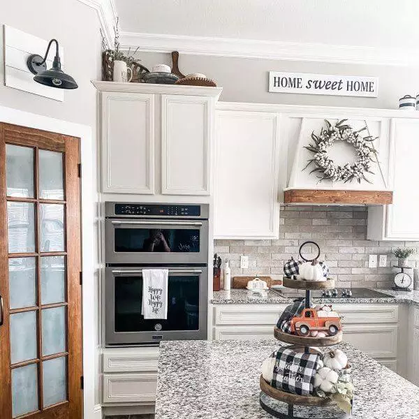
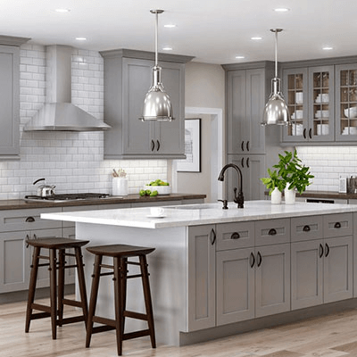
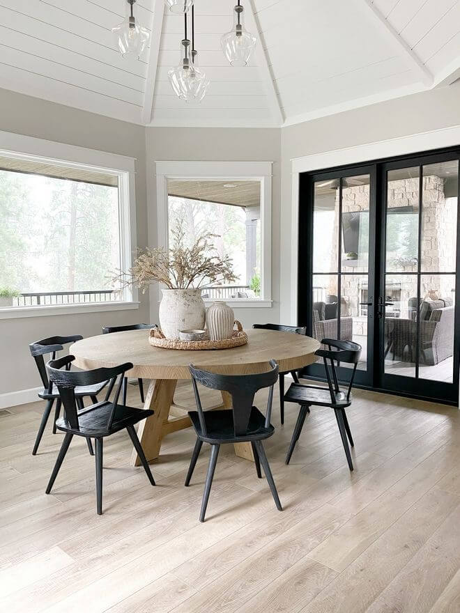
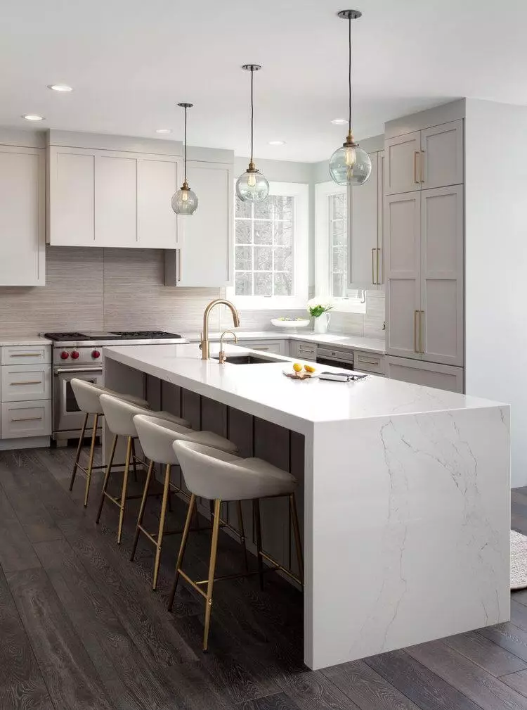
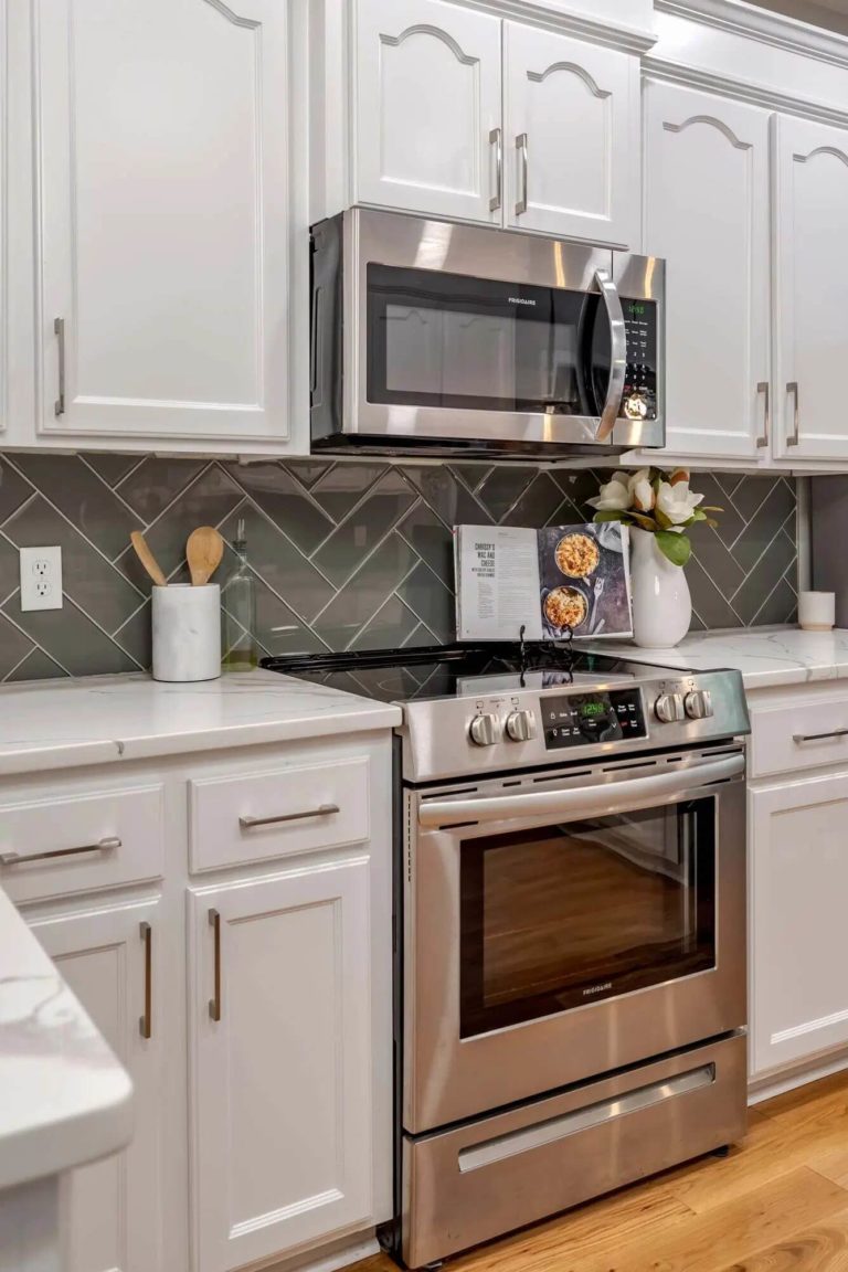
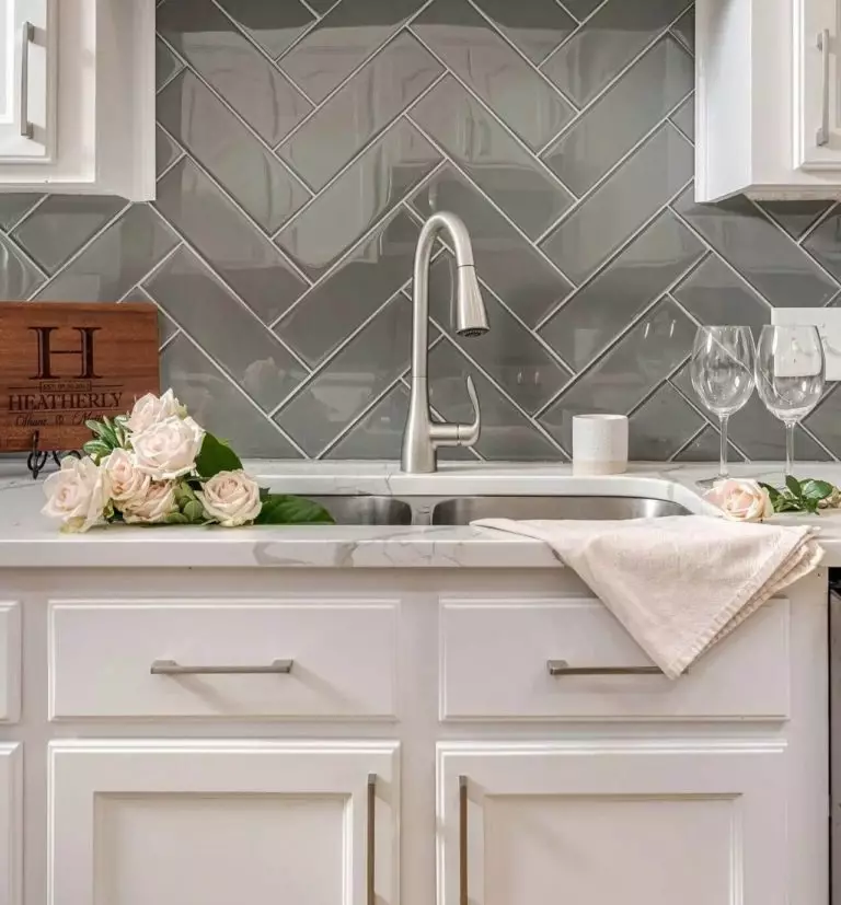
Kitchen and dining room
In a kitchen where cabinets or walls are painted in Modern Gray, the eyes can surely rest. Whether you use built-in steel appliances and chrome fittings or prefer copper and brass handles paired with a wood top, this gray color will favor any of your decisions.
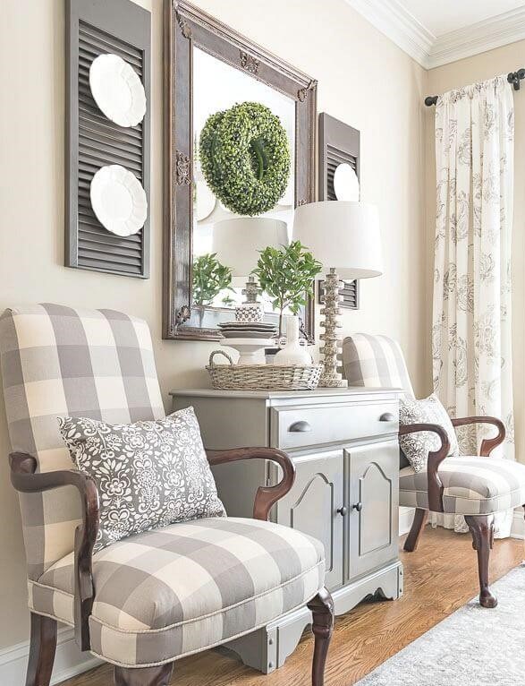
As for the dining room, you can apply any ideas in terms of furniture and decor if you use SW 7632. However, we find the option of using dark forged details on furniture and decor (for example, frames for a mirror) especially interesting – thanks to them, Modern Gray will seem more refined than ever.
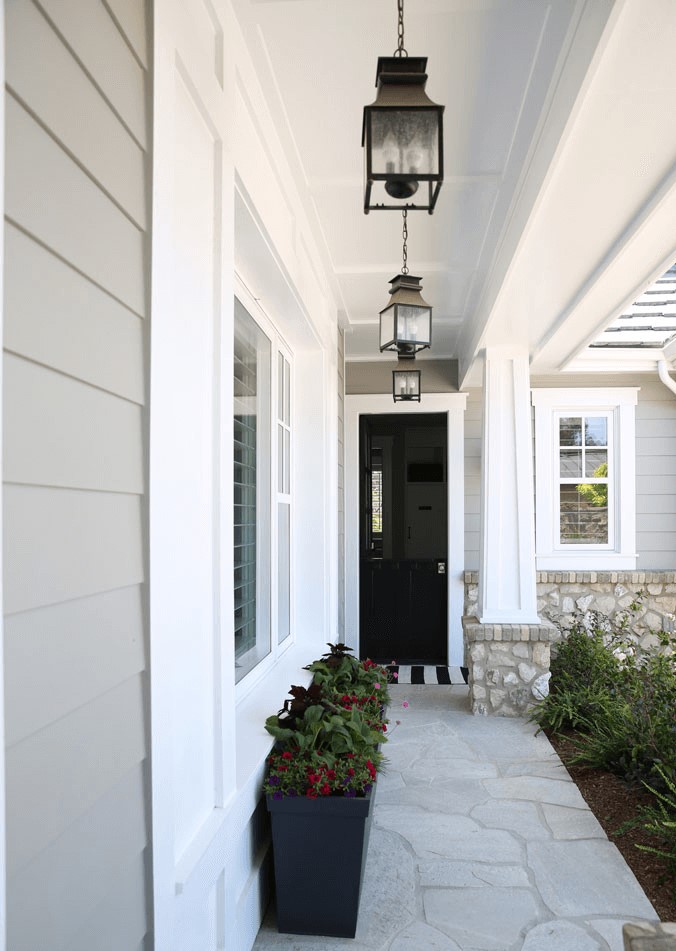
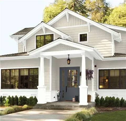
The use of Modern Gray for house exterior
The light gray tone by Sherwin-Williams may be the choice for your house exterior. However, in this case, you will definitely need a contrasting finish that will emphasize the building lines and add expressiveness. Otherwise, there is a risk that the facade will seem faded.
Coolish snow-white color for windows, roof peaks, and columns can be an excellent option. Dark brown, dark gray, and black look just as good against the background of light gray walls with warm undertones. In addition, think about covering the lower part of the house with stone: such a combination will add a certain aristocracy.
The Sherwin-Williams Modern Gray hue has been popular for the second year and is actively used in fashionable interiors, where comfort and peace are especially valuable. If you fancy tranquility and perceive your home as a refuge and an island of calmness in our crazy world, this color will provide you with exactly the experience you are looking for.
