Naval SW 6244
Sherwin-WilliamsNaval from SW is a dark blue color with rich notes that hypnotize and inspire. A replication of the night sky and the sea, a source of confidence and rejuvenation, a symbol of change.
Naval (SW 6244): what color is, review, and use
To your attention: the color of the year 2020, a replication of the night sky and the sea, a source of confidence and rejuvenation, a symbol of change – Naval SW 6244 from Sherwin-Williams. It is clear as day that naval shades are trendy. What is so outstanding about this one? First of all, it has not got out of date yet but has become even more popular. Next comes its unique connection with nature, which one can firmly put alongside the natural properties of green. Not least, its impressive versatility, from background for a serene environment to an accent for a stunning statement. This is just the beginning. Let’s embrace this paint color to the fullest!
Naval paint color features
Naval from SW is a dark blue color with rich notes that hypnotize and inspire. According to Sue Wadden, the manufacturer’s director of color marketing, this shade reflects both scents of luxury and versatility. Furthermore, it is regarded as the “new neutral” and throws a new perspective on the usual shades alike, encouraging us to look outside the borders of white, black, gray, and beige. There is indeed something special about this shade that makes you endeavor, thrive, and be in a continuous search of yourself. Naval is considered to be the color of feelings. What does it feel like? The refreshing coastal breeze, the fabulous night sky, or the inspiring ocean depth? All of them together for a paint color developed once in a lifetime.
Naval: is it warm or cold?
The naval blue from SW is undoubtedly a cool color, although we cannot call it cold since its deep notes of sophistication offer it an intense blue base with scents of sparkle and boldness. Even a touch of warm artificial lighting cannot make this paint color lose its refreshing coolness, which induces confidence, inspiration, and limitless contemplation.
How does lighting affect Naval?
Even a true naval shade cannot stand the lighting. This shade reveals its coolest version in spaces that face the north side. While other naval shades may seem gray, this one doesn’t. What about the south-facing rooms? Naval seems bright, revealing its inner beauty. In spaces with west and east-facing windows, this paint color replicates a balance between the earlier mentioned variations.
Naval LRV
It is time to back our statements with figures. On a scale from 0 to 100, where the former stands for a true black, Naval has an LRV (Light Reflectance Value) of 4. Now, you know how dark this naval shade is. With such a value, this paint color hardly reflects any light. Therefore, a room painted this way, particularly if you consider covering the walls entirely, requires an enormous amount of light to ensure that the space doesn’t feel too dark. Still, it will not feel suppressing, in any case, since its bright blue base cannot be simply hidden, which is surprising for such a dark shade.
Naval undertones
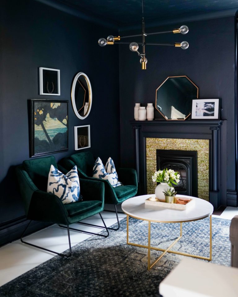
The SW 6244 is a true naval shade with a blue base devoid of undertones. Unlike other shades of the kind, it doesn’t show any scents of green. Still, a tiny hint of gray seems to penetrate it in particular conditions, although it is in place to mute the bright blue notes a bit, which means that one cannot call this paint color gray at all. Some may say it has a tiny splash of teal, which rarely reveals itself, and they would not be wrong. Still, these are just consequences of certain factors, such as lighting and neighboring colors, which doesn’t change the nature of this true naval blue.
Similar colors
Naval shades are so many that finding out this paint color from SW has many brothers at the same manufacturer and even more cousins at other color brands was not a surprise. Darker or lighter, warmer or cooler, they still have something in common with SW 6244 yet offer a new perspective on the famous naval blue, although there are a few impressively identical shades. Let’s discover the alternatives!
Coordinating colors
Naval shines at its finest when paired with nature-inspired shades of white, off-white, beige, cream, and brown as a replication of the midnight sky and ocean depth. Such combinations work in perfect harmony, while the more neutral shades emphasize the richness of SW 6244 paint color. Consider the following paint colors as partners for the trendy naval blue:
Use of Naval in interior
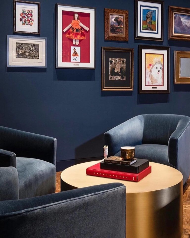
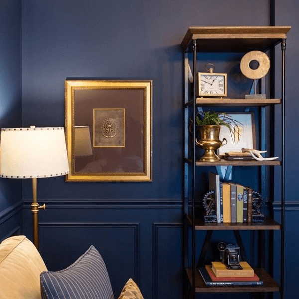
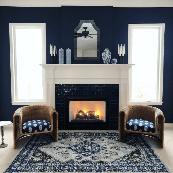
According to experts from Sherwin-William, this true naval shade is a no-fail option both as an accent and background. From traditional and less so interiors, this paint color reads your mind and takes any direction you want. One thing should be considered in particular: SW 6244 loves nature-inspired surfaces, such as wood and marble, while its versatility makes it a go-to paint color for the most luxurious settings with Art Deco scents to the most modern ones. A touch of depth, inspiring a change, and offering a new perspective both on the interior and life brings all design solutions implying this color together. Let’s scroll through some of the most prominent approaches to this paint color!
Art Deco chic
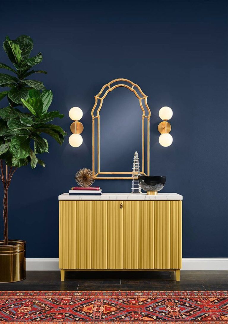
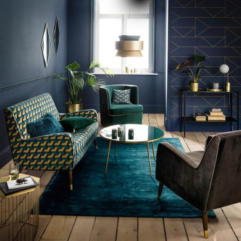
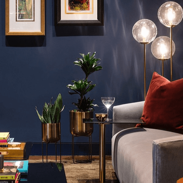
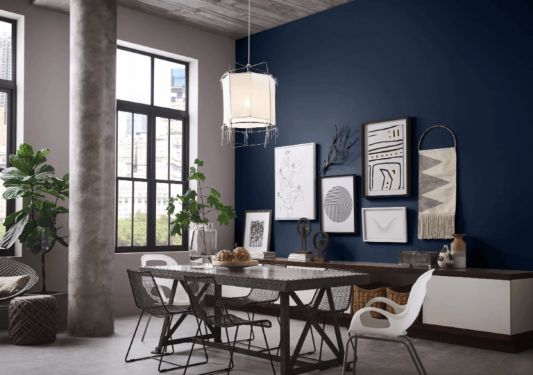
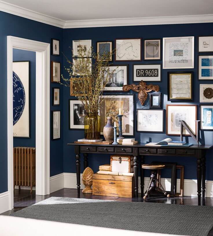
The dark blue resembling the inner beauty of Art Deco interiors is fully interpreted through Naval from SW that throws a new perspective on the popular style. The rich blue notes resonate with the magic of the Great Gatsby era while the slightly muted effect adapts to the contemporary design rules. Consider this shade to paint the walls entirely for a dramatic environment and enrich it with splashes of bold colors and gold elements. Don’t forget the extravagant shell-shaped sofa or chairs and flamboyant decor units to fully embrace the luxury of the Art Deco interior from the last century.
Living room
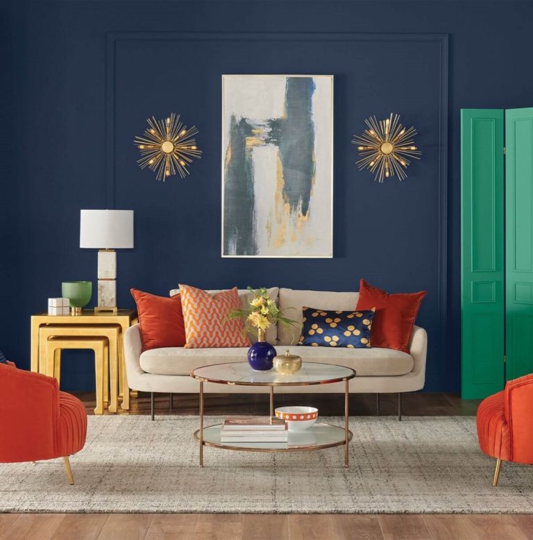
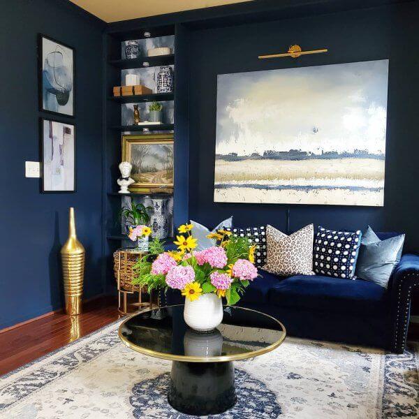
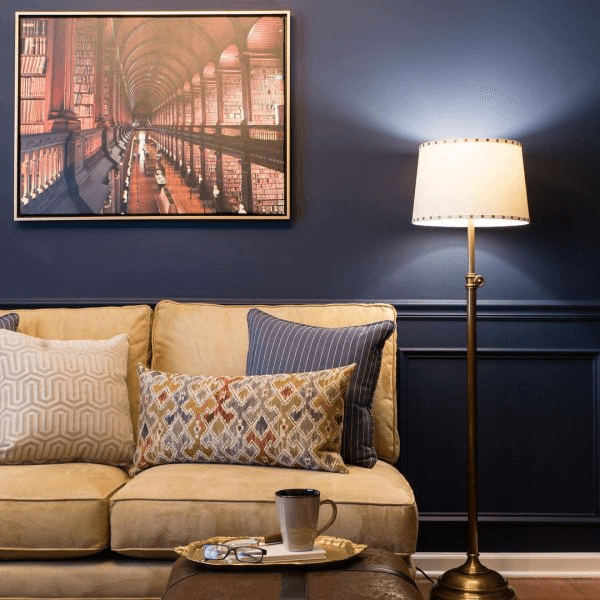
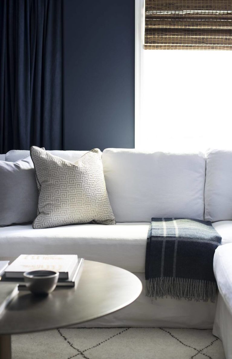
Designers suggest a few options in this sense. Since Naval is obsessed with natural surfaces, consider a traditional interior with wood furniture and a fabulous pairing between SW 6244 and various shades of brown. Opt for a leather sofa on the naval background and the timeless combination of dark blue and wood for a classic approach. At the same time, a modern living room would benefit from a mix of naval blue and white or beige shades. You can even go as extra as considering naval blue and white only for the whole interior for an indeed contemporary look. In all these cases, Naval plays a leading role and should be used to paint the walls entirely. A splash of colorful live plants, such as yellow tulips, will add even more naturalness to such an interior.
Bedroom
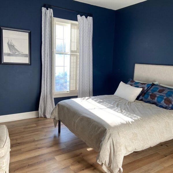
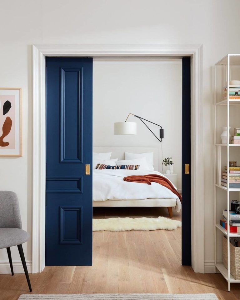
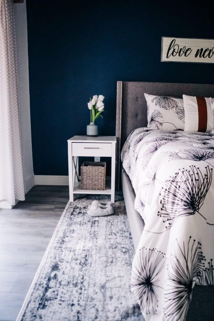
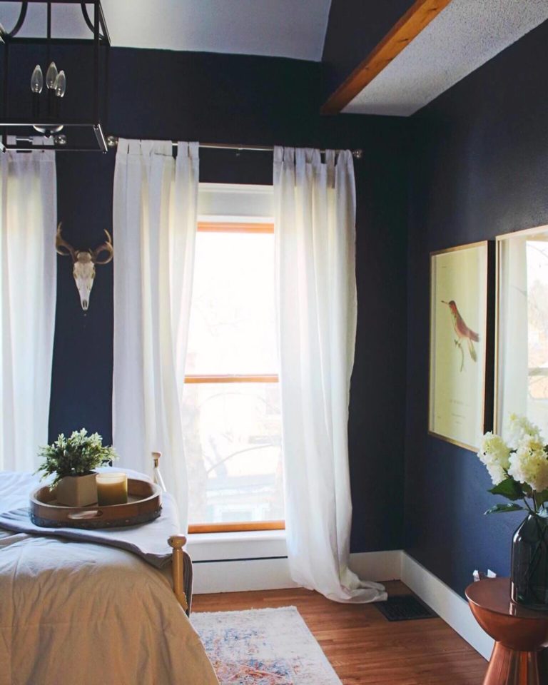
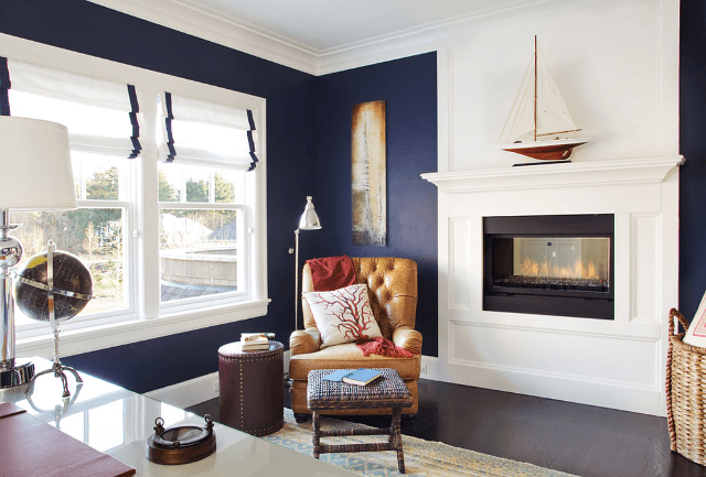
Such a dark shade may seem too imposing for a space that requires relaxing paint colors. Still, Naval is more than a dark color. It is a unique shade whose dark notes are a source of sophistication that induces calmness. Furthermore, nobody says you have to paint the walls entirely in this shade, although such an approach is outstanding. You can use Naval to paint an accent wall. The no-fail partner is a crispy white or beige. You can go as far as considering white for the entire space with a splash of naval blue. Be it an accent wall, an interior door, or a separated area within the bedroom. An additional sparkle, such as a bold colored carpet, would not spoil the picture.
Kids room
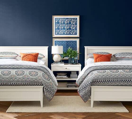
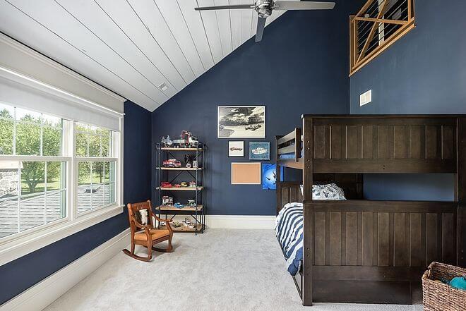
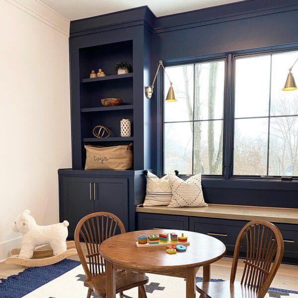
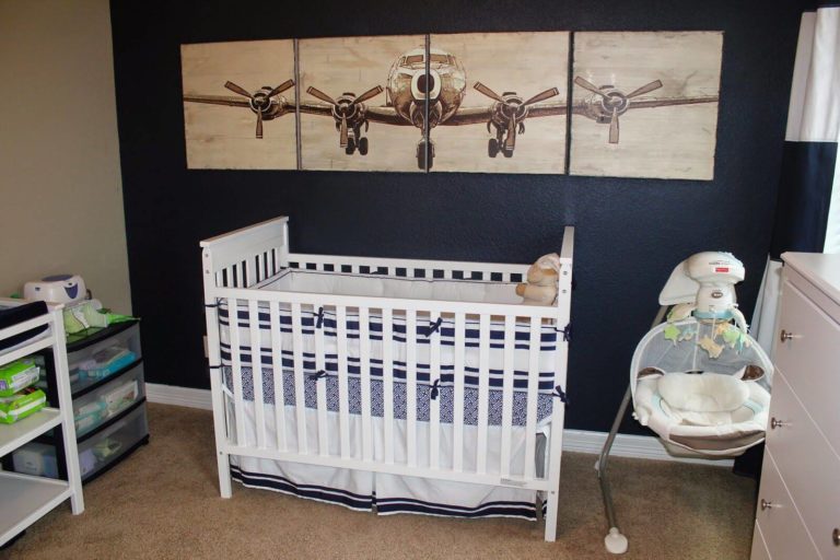
Naval is so versatile that it fits such spaces as the kids’ room and even the nursery, which means this paint color is first of all about serenity and harmony. In a grown-up kid’s room, pair this shade with dark wood or bold accents for a vibrant environment that inspires and plays with your child’s imagination. Combine it with white for a calmer interior that connects with nature in the nursery. Not least, Naval from SW will offer this space personality and make it stand out as a stylish part of your interior.
Kitchen and dining room
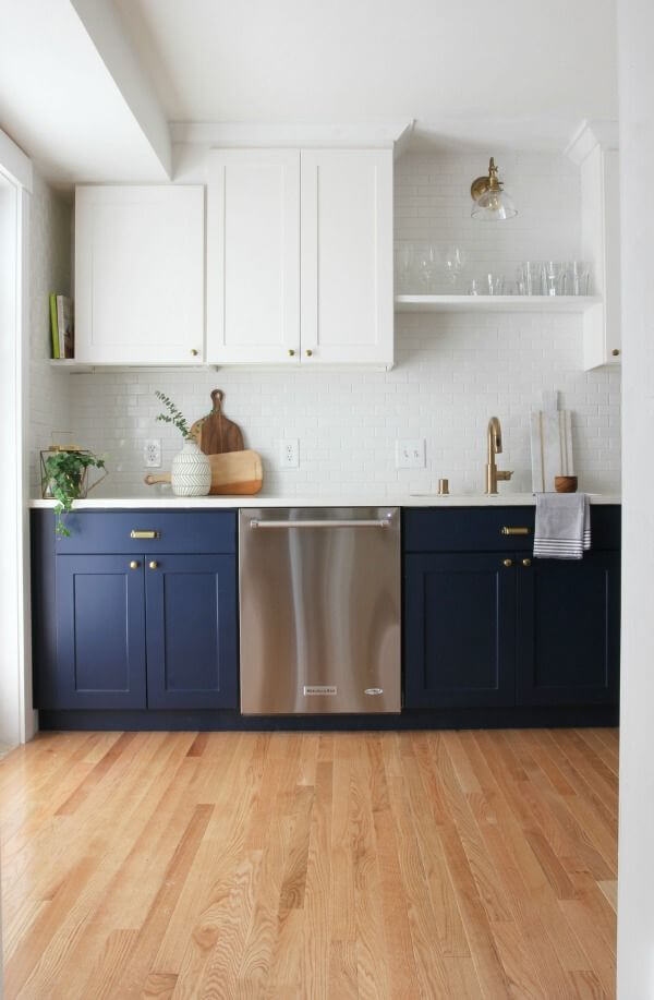
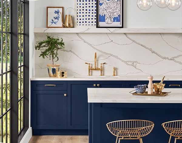
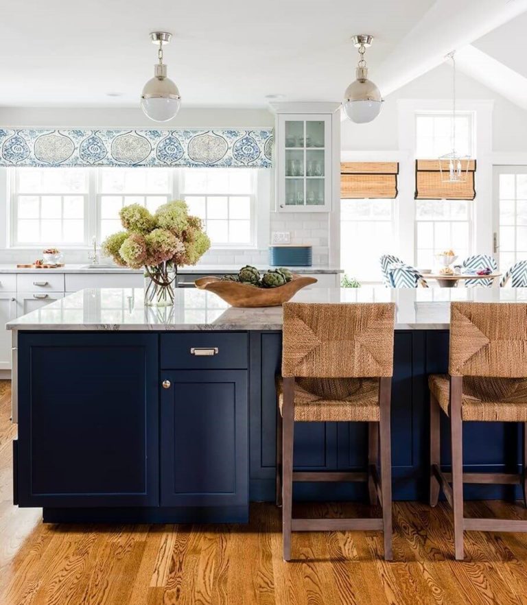
The SW 6244 paint color opens a sea of possibilities in the kitchen. The presence of a white splash is mandatory. The rest is up to you. Consider painting the cabinets entirely in Naval on a light background or pairing dark blue lower cabinets with white upper units of this kind. Steel or brass for the hardware, marble or wood as accompanying materials, and lots of light sources.
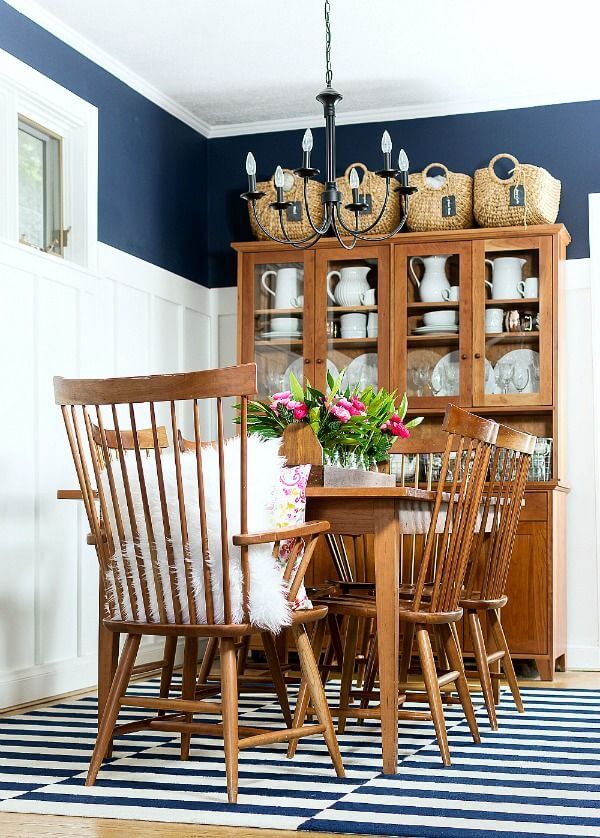
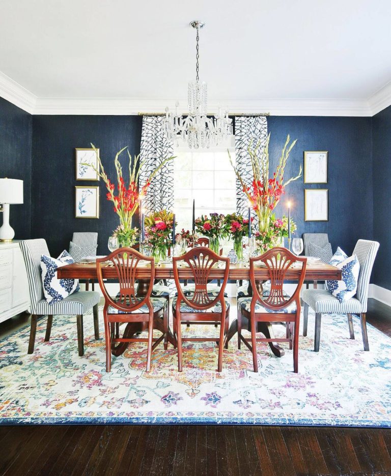
The flexible Naval is a bit pretentious in the dining area, wanting to play with wood only for a rather traditional, even classic, interior, but believe us, the result will simply leave you without words. Combine naval blue walls with dark classic wood furniture. Still, a similar combination with a functional approach to the layout can integrate the dining into a contemporary interior.
Home office
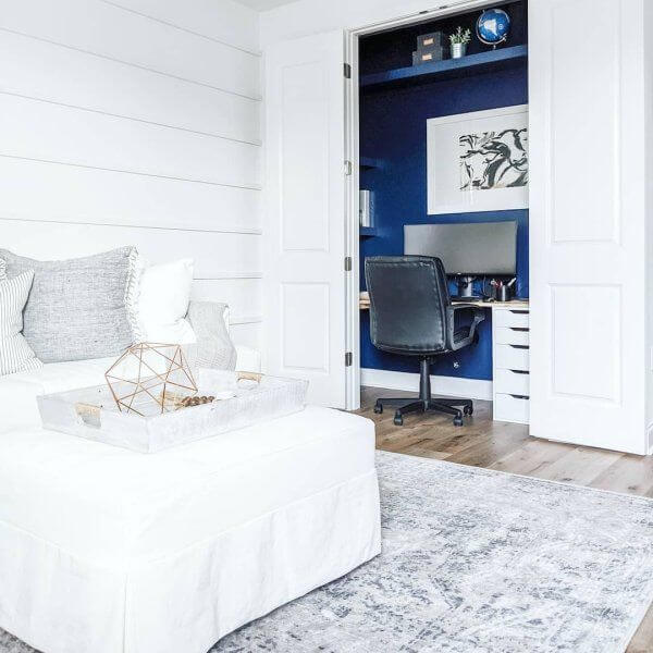
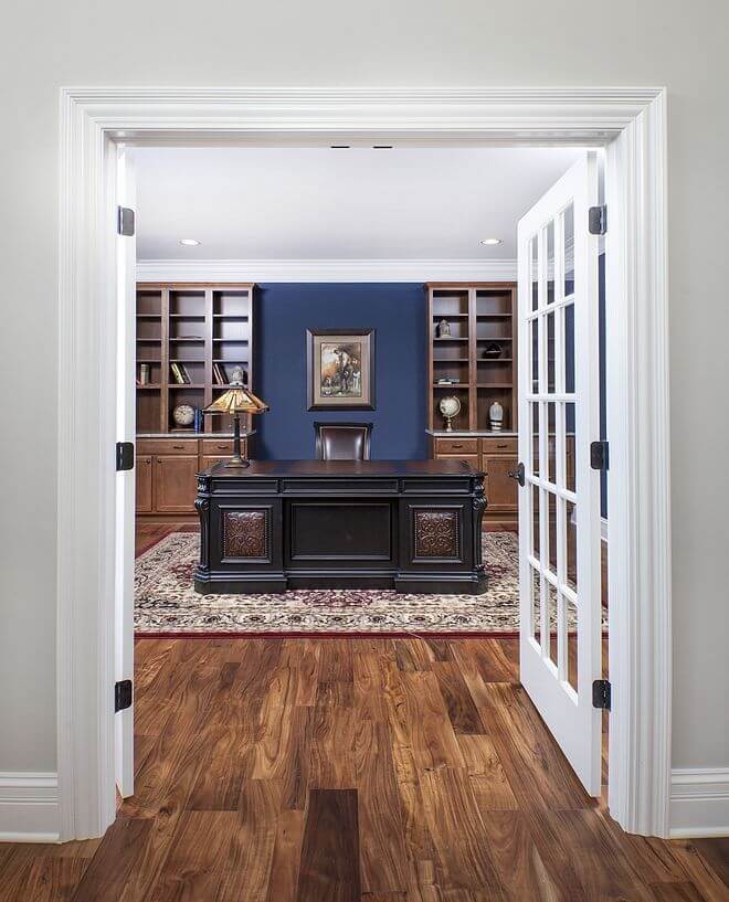
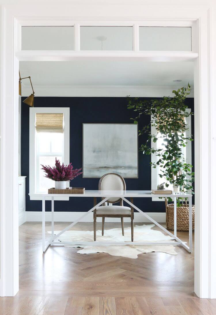
Naval is perfect for spaces that require impartiality, serenity, inspiration, and partial isolation from the outside world. These features should mandatorily be part of your home office if you own one and the shade of naval blue that is all about contemplation is ready to offer you this. Naval blue and white for a contemporary home office devoid of any disturbing splashes of color or naval blue and wood for an aristocratic space of the kind that will make you feel confident about your decisions – it is up to you. One thing you cannot control in this sense is the stylish effect of Naval that will reveal itself either way.
Bathroom
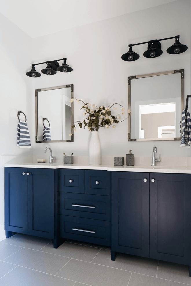
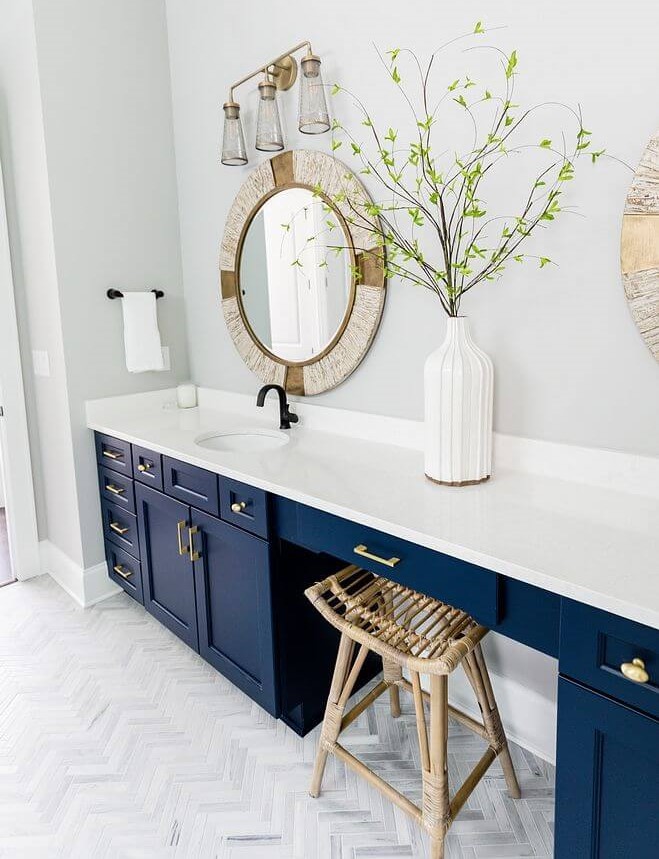
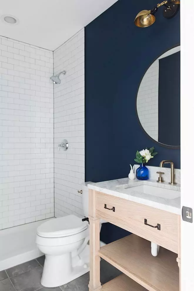
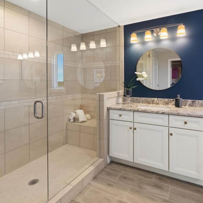
The already mentioned combinations go here, but they acquire a new appearance. Naval cabinets and white walls with black sconces for a timeless mix of contrasts. Naval cabinets and white walls with steel or brass hardware for an emphasized feel of luxury. Naval walls paired with crispy white or beige tiles. Walls painted entirely in this naval shade and a large white bathtub, perfectly replicating when modern meets traditional. The list of possibilities is impressive, but the main shade to consider in this sense is no less fabulous.
Use of Naval for house exterior
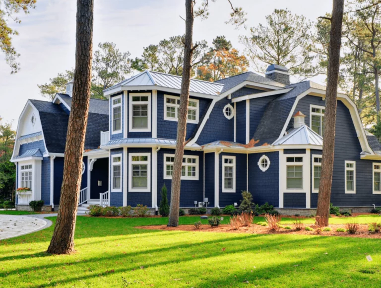
Naval appears much lighter due to a large amount of daylight when applied to the house exterior. Still, depending on which side your house faces, this paint color leans brighter or more muted. Its all-time white companion doesn’t change the fact that your house shines like a pearl when bathed in sun rays without losing the formal appearance, while a cloudy day brings the most delicate cool notes to the surface, offering your house an indeed aristocratic look. When applied in small quantities, SW 6244 shines in a whole new way, looking like a pearl that draws your attention to how harmoniously it connects with nature.
The Naval SW 6244 paint color from Sherwin-Williams is a timeless shade that comes out of the comfort zone with its bright yet balanced notes and encourages you to do the same by integrating a dark blue color within your interior for a limitless feel of confidence, change, inspiration, and naturalness.

