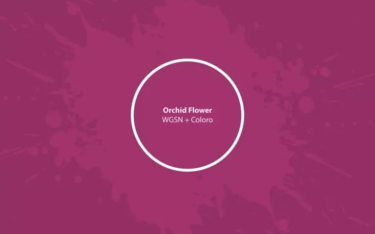
By examining the colors that have become favorites of paint manufacturers and trendsetters and announced as key for 2022, it is impossible not to notice the dominance of blues, gray-greens, and complex whites. At the same time, among those dictating fashion for colors, some would prefer to see in the relevant trends for the next year something more expressive, bright, and life-affirming. Among them are WGSN & Coloro. So far, this brand is the youngest in this segment, but their proposed Orchid Flower (150-38-31) as the color of the year 2022 has become a very, very strong statement of identity.
According to Joanne Thomas, head of content at WGSN & Coloro, this vibrant yet deep and eye-friendly pink shade with expressive purple notes captivates with its energy, awakens imagination, and becomes a great way to express your individuality in a variety of areas. According to the colorists of the brand, Orchid Flower makes it possible to get away from everything boring, mundane, and depressive and feel the joy of being.
Orchid Flower: color features
When choosing a shade that would be the perfect color for 2022, WGSN & Coloro went through many tones and palettes. Moreover, it is essential to note that they were guided not only by the perception or emotions that a particular color evoked but also its potential demand from the audience.
In Orchid Flower, experts immediately saw a very pleasant duality – strong, bright pink tones that appeal to most of the fair sex and noticeable deep purple-purples, which are very much to men’s liking. All this prompted us to evaluate this color as universal and attractive at the same time. According to Gemma Riberti, head of interiors at WGSN, this color is softer and more pleasing than last season’s electric magenta. It can also excel in small and noticeable accents, prints, and details. In addition, it looks imposing on shiny materials, including metallic textures.
Orchid Flower: is it warm or cold?
It is quite natural that the color of Orchid Flower is dominated by red shades, which, in principle, allows it to be attributed to pink. However, the significant presence of blue and purple tones and the very minimal – green – ensures it unconditionally falls into the group of cold shades. That is why to be extremely careful when choosing a palette for an interior with the participation of purple-pink from WGSN & Coloro, especially in terms of warm shades: this color can steal their tones or even distort their perception. Therefore, the best partners for Orchid Flower will still be equally cold tones.
How does lighting affect Orchid Flower?
Orchid Flower by WGSN & Coloro is quite dark and complex, and due to this, it is necessary to pay enough attention to its behavior depending on the lighting. This color is rich in shades and gradations, and depending on which one appeals to you the most, you can unmistakably choose the best zone to use this color.
Thus, Orchid Flower appears as a gorgeous pink with coquettish, subtle purple notes in a well-lit room and creates a very cheerful and colorful atmosphere. That is why you can use it in combination with contrasting and light neutral tones.
However, if you introduce Orchid Flower in a room with insufficient lighting, it is significantly transformed. Purple and blue tones come to the fore, and the color becomes more saturated, dark, noble, and sensual. That is why it is important to consider the behavior of color in such a situation and, possibly, choose interior solutions that can present it in the most winning and attractive way.
Orchid Flower LRV
The Orchid Flower has a light reflectance of approximately 17-18, which means it belongs to the medium-dark shades. Tones from this group have an especially acute need for sufficient lighting since it is under its influence that they can fully reveal and demonstrate all their color nuances. That is why, when choosing this color, be sure to take into account both the degree of illumination of the room in general and the most illuminated areas in the room in particular – if, of course, you want the magnificent Orchid Flower to appear before you in all its individuality.
Orchid Flower undertones
As mentioned above, the key for Orchid Flower is red tones of a reasonably high lightness – it is about 52%. Blues and magenta remain the second most dominant colors, giving it depth, saturation, and complexity. Orchid Flower has minimal green undertones. There are practically no yellow tones, which is vital to pay attention to when using color in the interior and matching other shades.
Similar colors
Orchid Flower really looks distinctive and unique. However, if you want to study in more detail the palette of luxurious purple-pink shades, you can find similar ones both in the WGSN & Coloro palette and in the lines of other paint manufacturers:
Coordinating colors
Solid and resonant, Orchid Flower looks especially impressive and expressive when combined with lighter and slightly warmer green tones – perhaps with a touch of gray or yellowish. Among them:
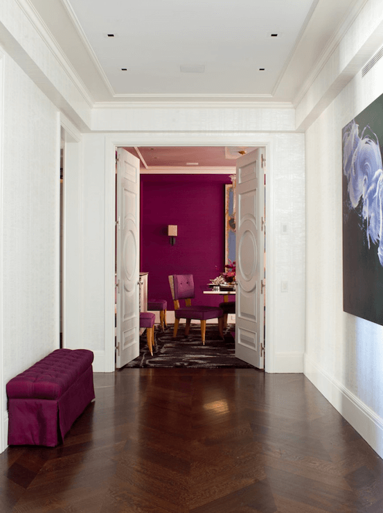
The use of Orchid Flower in the interior
Color 2022 from WGSN & Coloro can transform any interior into something completely unique. Not everyone can withstand the intense energy of this delightful purple-pink hue. Still, if you feel the hottest affection for it, then you can be sure that you have taken another step towards a luxurious and mysterious setting.
Many designers associate Orchid Flower with glamor and urge to consider it primarily for interiors that imply chic and sophistication. However, this is just one of the many solutions: let’s look at other ways to integrate this charismatic shade into the atmosphere of a house or apartment. We deliberately do not mention the options for using it for the exterior since this is a choice of extravagant natures and should be considered individually in each case.
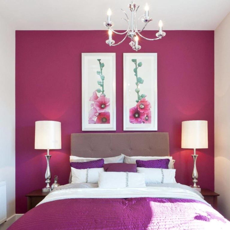
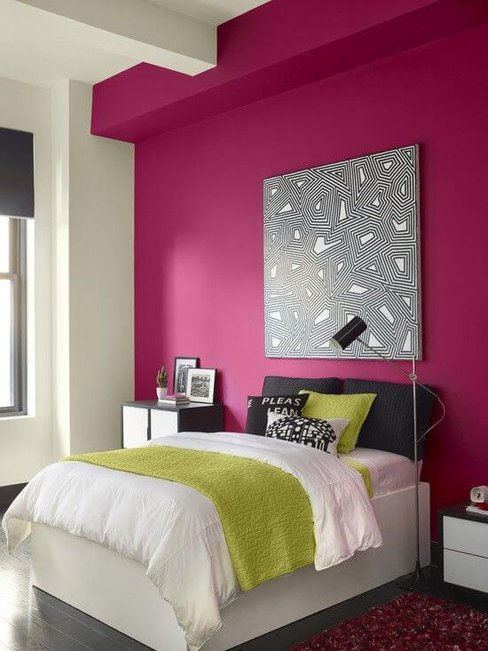
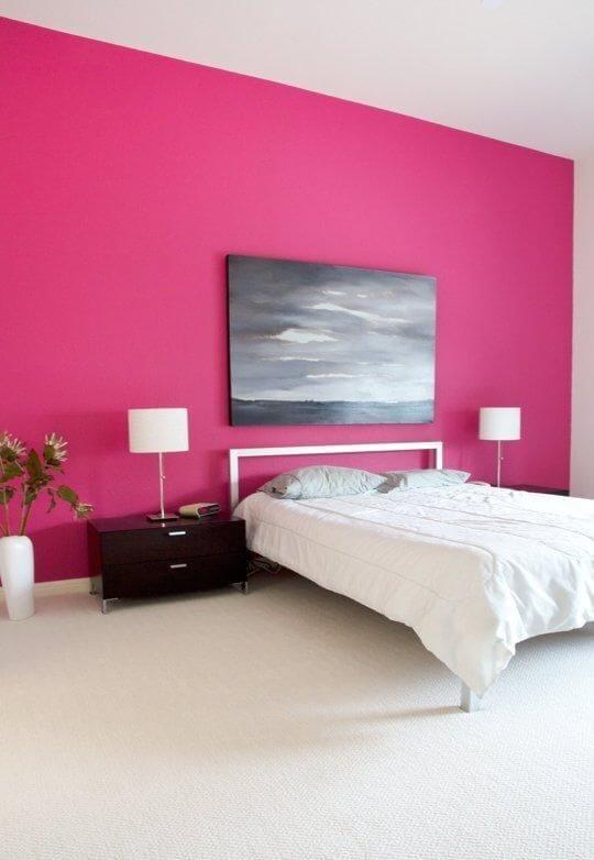
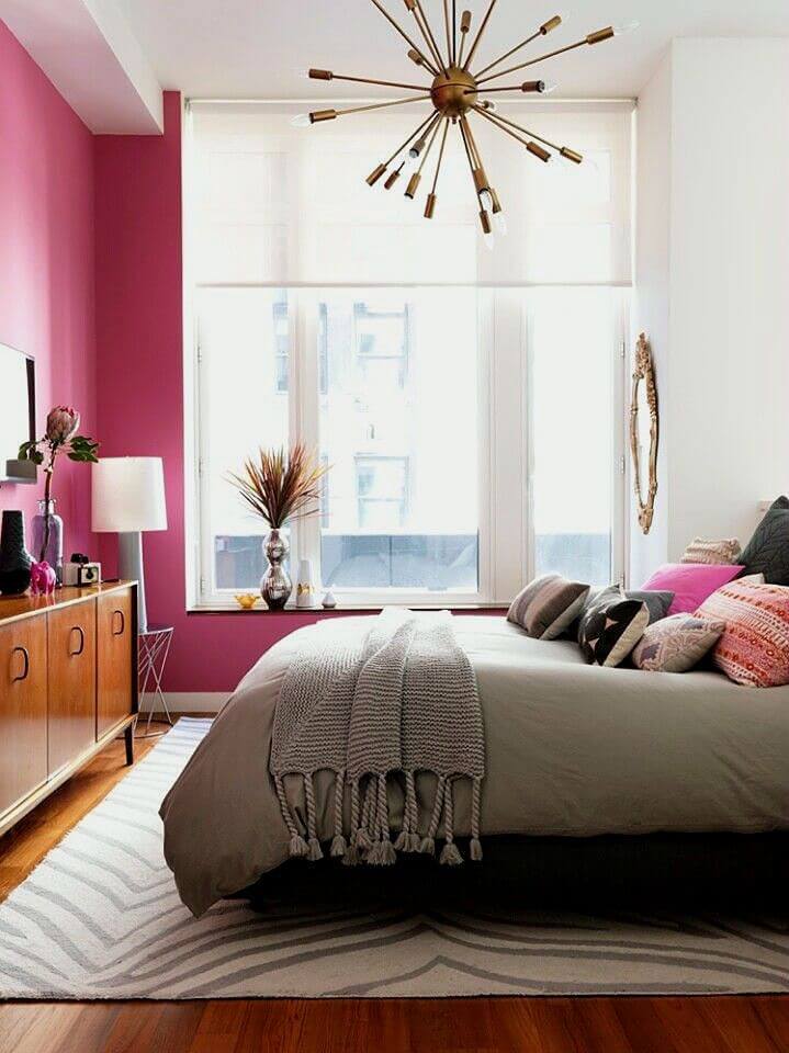
In the bedroom
If your ideal bedroom is to be sophisticated and mysterious, using Orchid Flower as a base can be a great solution. Use wallpaper with a classic pattern or evenly painted walls, match textiles precisely to the tone, and don’t forget the luxurious metal-framed mirror and matte black hardware. The use of candlesticks and candelabra will not be excessive, which will help create an alluring and sensual atmosphere. One small note: make sure your other half also likes Orchid Flower as it is a very strong and personal shade that strongly impacts emotions and mood.
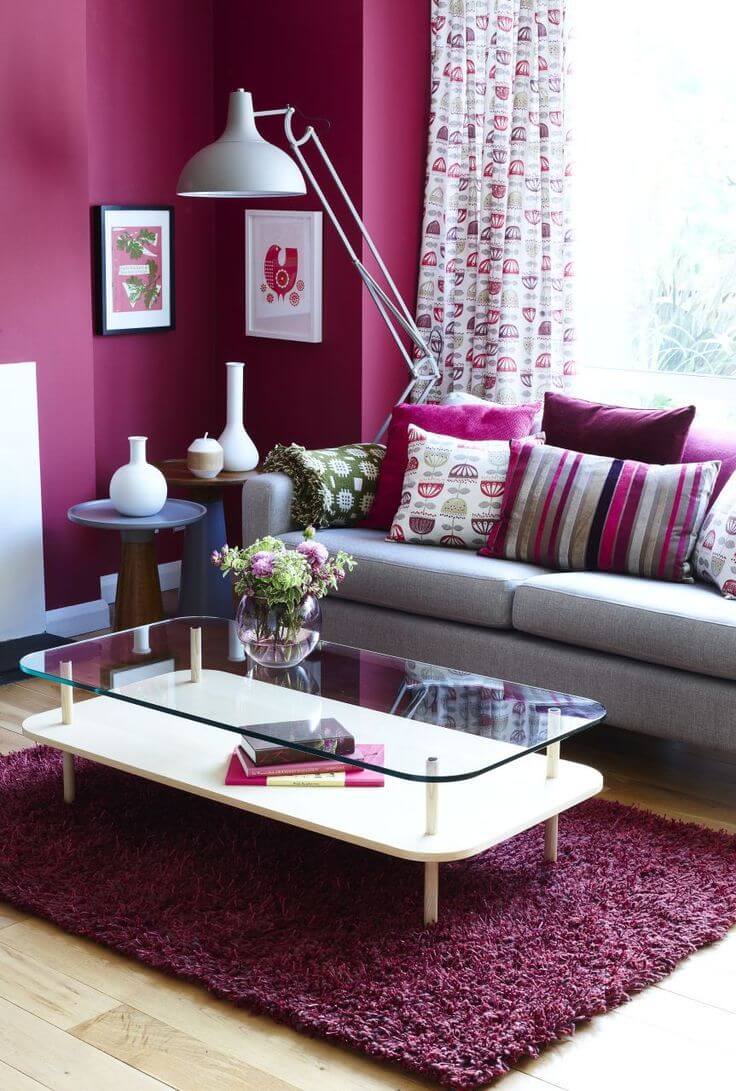
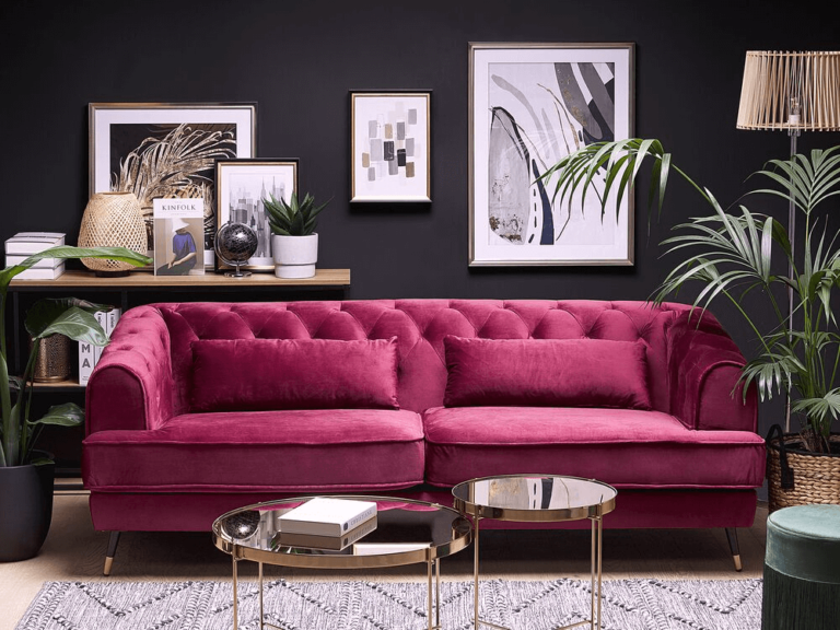
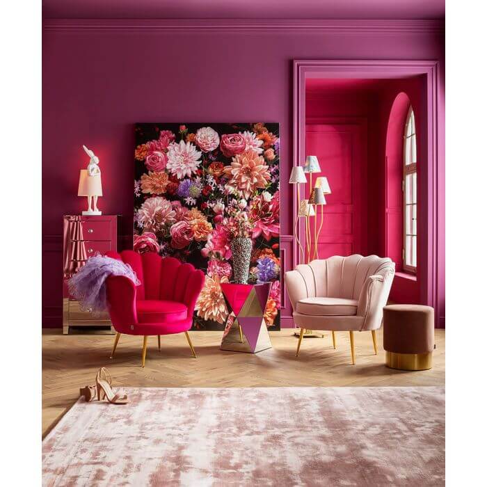
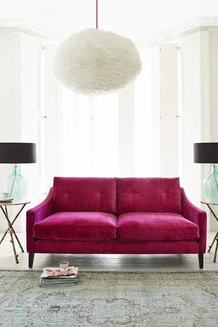
In the living room
If laconic and light minimalism is much closer to luxurious art deco, this is not at all a reason to abandon the expressive purple-pink offered by WGSN & Coloro. If it seems too dominant to you, use it as an accent – and quite noticeable. Orchid Flower upholstered furniture complemented by lightweight roller blinds in the same shade and mauve wall art and posters can be a welcome touch. Very pale lilac and cool white, as well as gray and dark brown, are perfect as a base. If you want to add more glass and metal, that would be wonderful.
Accent wall
If your heart is still devoted to light, calm and neutral tones, and you just want to add a colorful note to the interior, paint one of the walls in Orchid Flower. This deep and catchy tone will make a great pairing with cool whites, grays, or dark brown base palettes. If you want more contrast, use it in an environment dominated by emerald, blue-green, or aqua. This contrast looks luxurious but not at all sharp and also creates an amazing feeling of bliss and comfort.
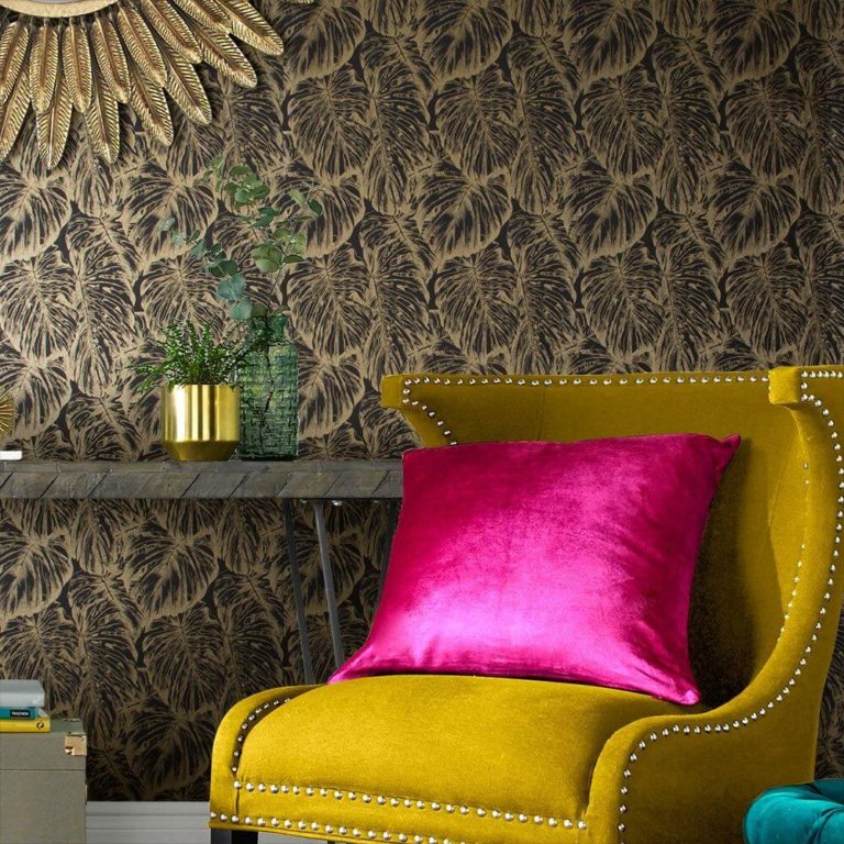
More metal
The creators of Orchid Flower urge us to use it in combination with sonorous metal accents, and we think they are worth listening to. Depending on the type of metal selected, this pink-purple will sound differently.
So, in combination with chrome, it will create a daring and stylish or laconic and balanced atmosphere, with matte black – elegant and sophisticated, and under the influence of brass or gold, it will acquire an incredibly luxurious sound.
Orchid Flower by WGSN & Coloro is like a bright splash against the more subdued shades of green that other paint manufacturers and trendsetters proclaimed the color of the year. It still stands out for its sonority, unique energy, depth, and love of life without belittling their merits. Therefore, it can add life, juiciness, and new meaning to your interior.