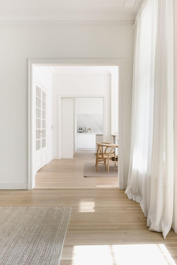
2023 Paint Color Trends: Colorful Collections from Renowned Trendsetters
As the new season is preparing to unfold its interior design trends, renowned paint color brands reveal their color forecast for the upcoming year. More or less, design projects start with color particularly, and considering the trendy shades for 2023 will surely come in handy, whether you plan a makeover or research on the subject.
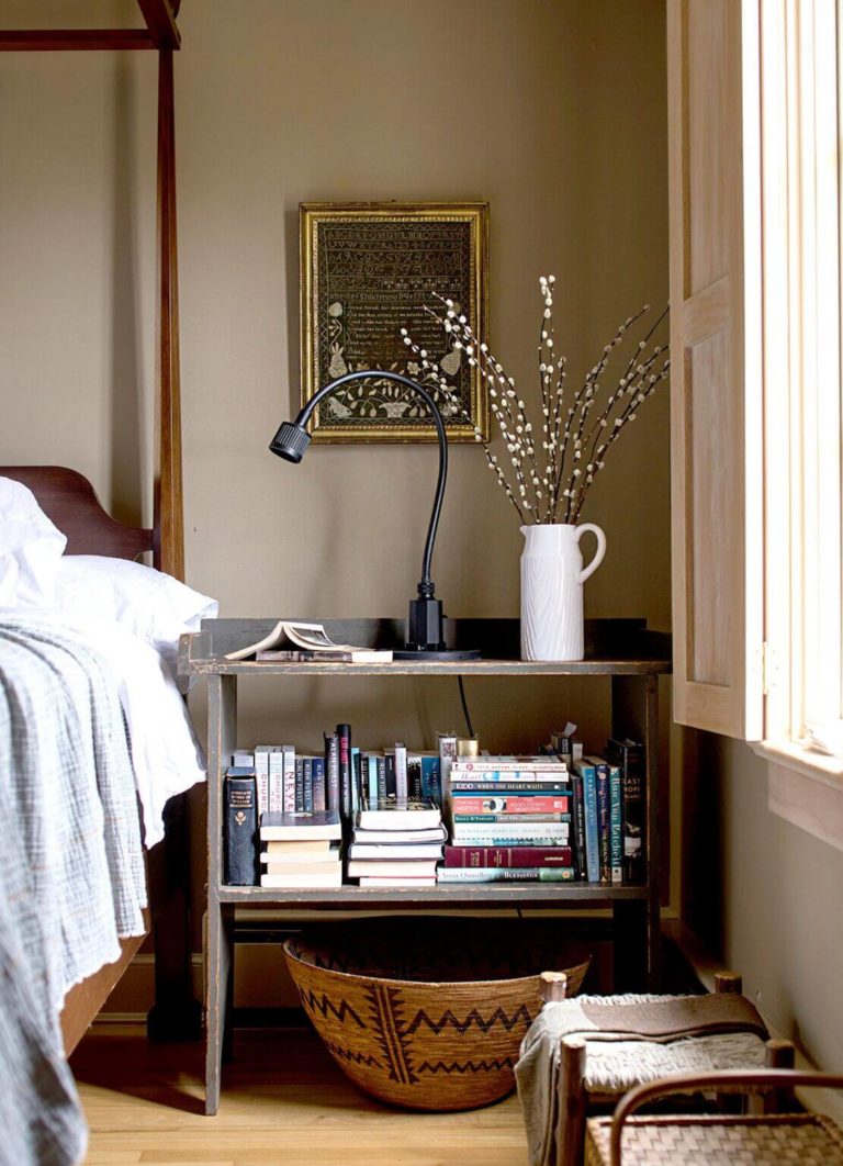
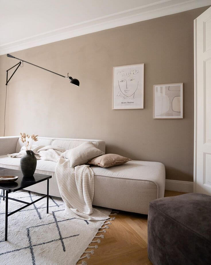
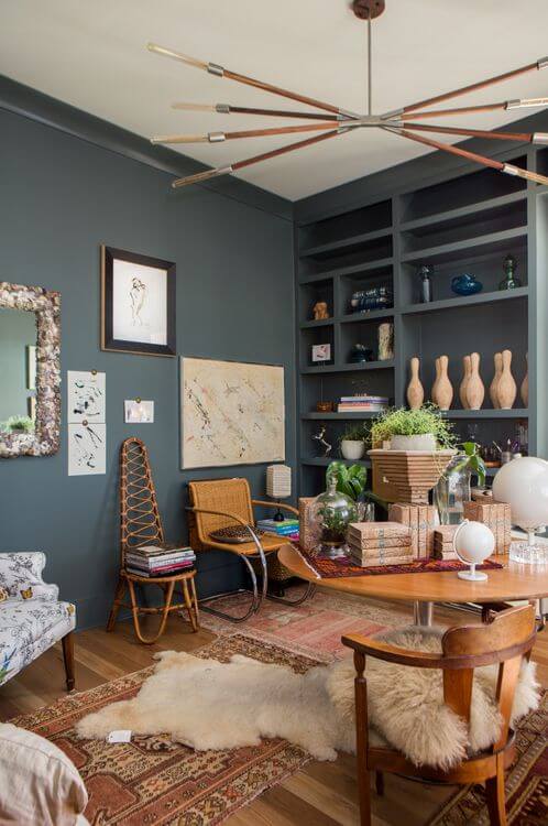
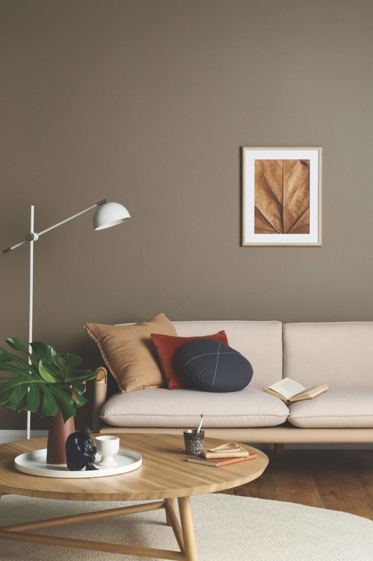
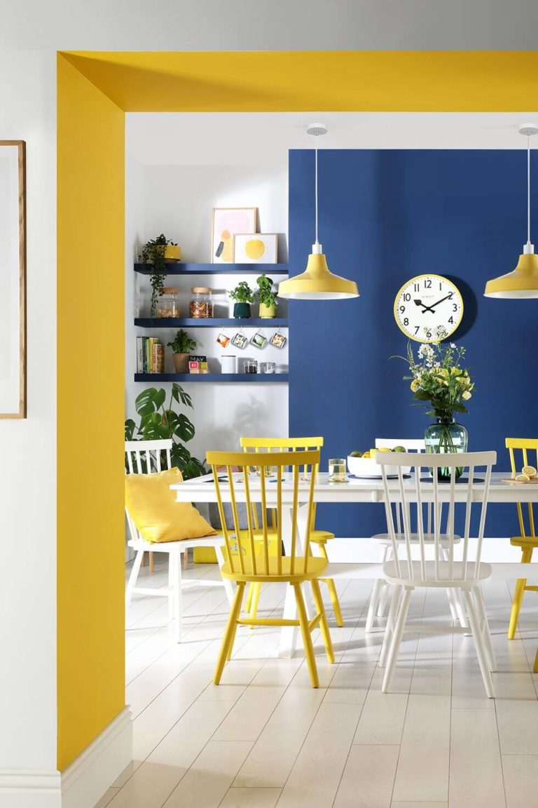
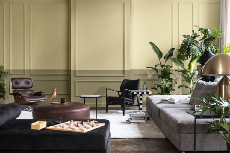
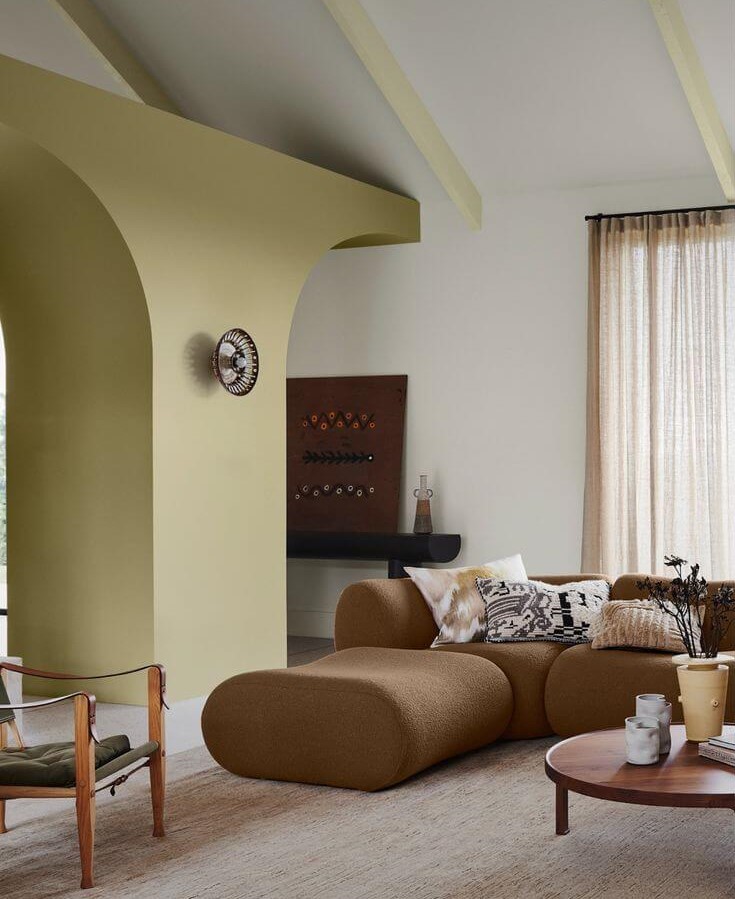
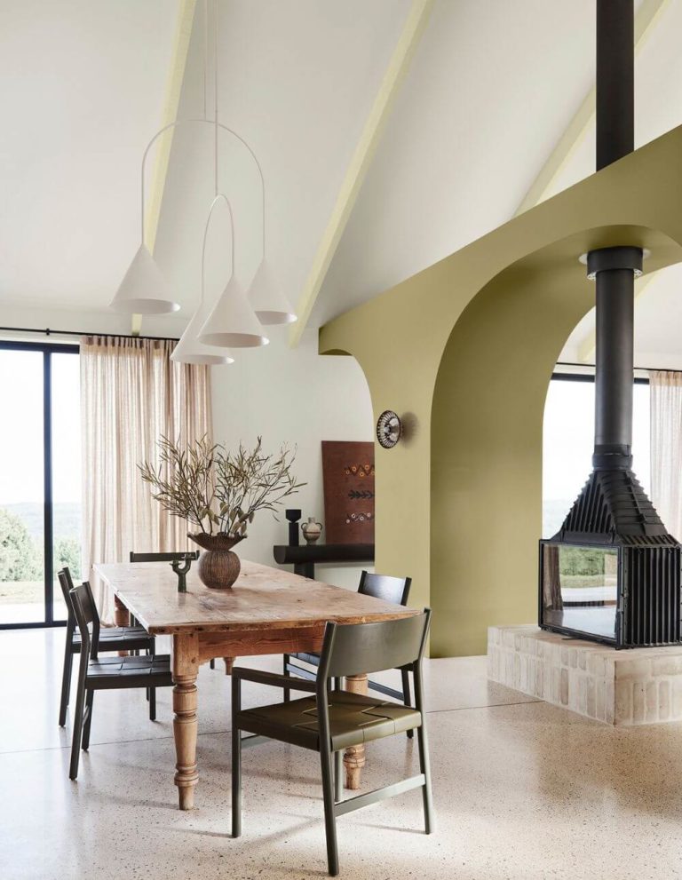
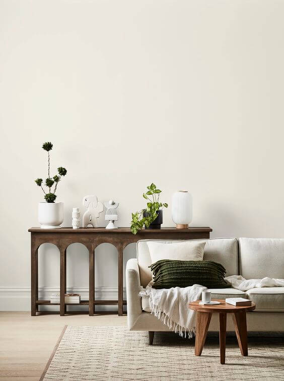
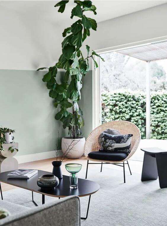
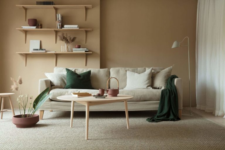
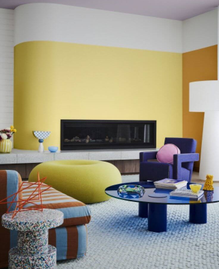
The paint color trends for 2023 substantially differ from what 2022 stores under its veil. Preserving a bit of neutrality and the same love for natural hues, the colorists bet on self-expression with the richest and brightest colors seen so far in the new year. Professionals say we are finally free to leave our comfort zone taken over by neutral and calm shades only and set off the adventure that the latest color trends offer with much more space to explore, express, and discover. Following the interior design tendencies that switch from simple to sophisticated, partially influenced by the audacious maximalist features, the new colors are about the desire to make statements, stand out from the crowd, and show your true colors through color. Enough with the intrigue. Let’s unpack the box carefully prepared by the main trendsetters for 2023!
Color Trends 2023: WGSN + Coloro
We would like to start this article by referring to the forecast of the global authorities on color and design trends in 2023. In a few words, a general introduction to the color world in the new season.
After a thorough survey of lifestyle, fashion, interior, and beauty worldwide, the experts came up with a global color collection that resonates with what people hope to see in the new color trends. The results are undoubtedly on a new level since the identified colors go beyond one’s expectations.
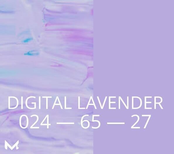
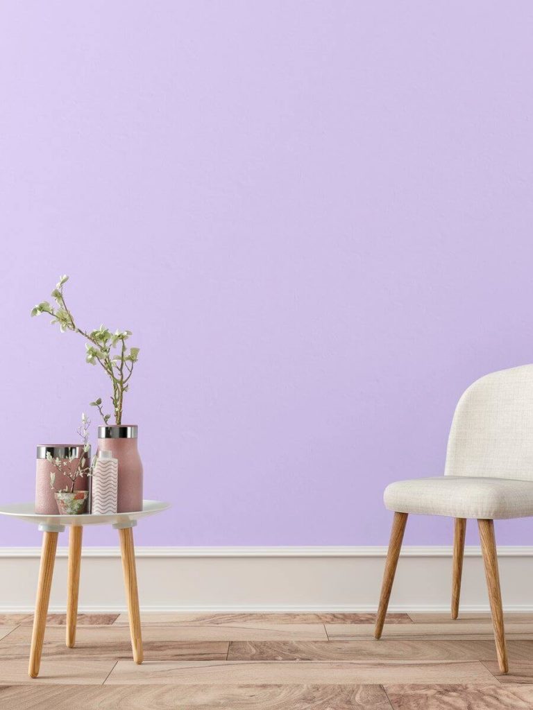
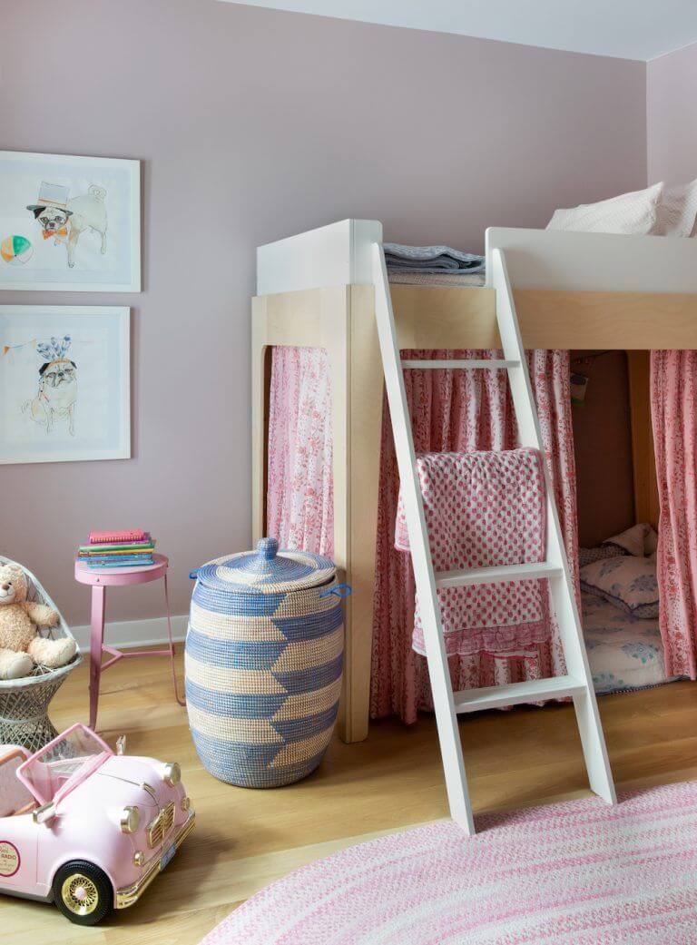
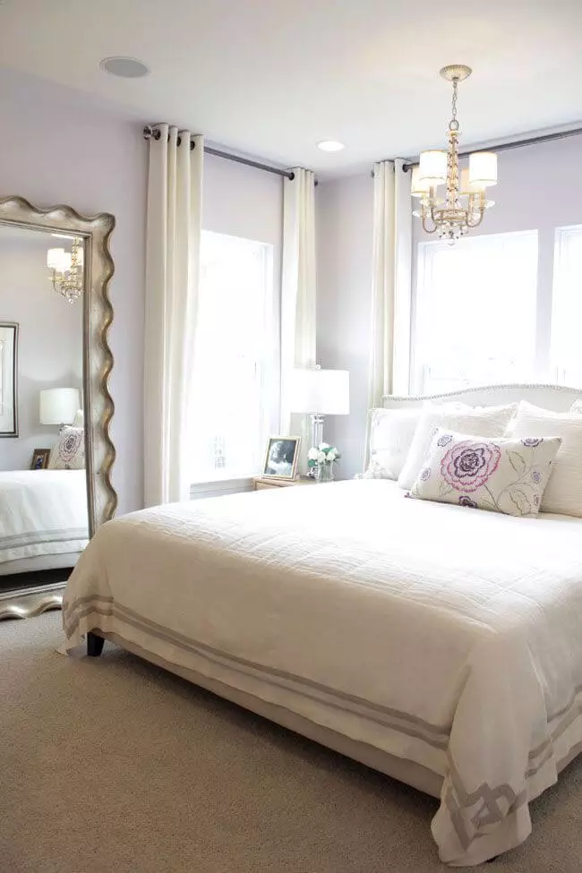
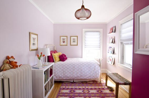
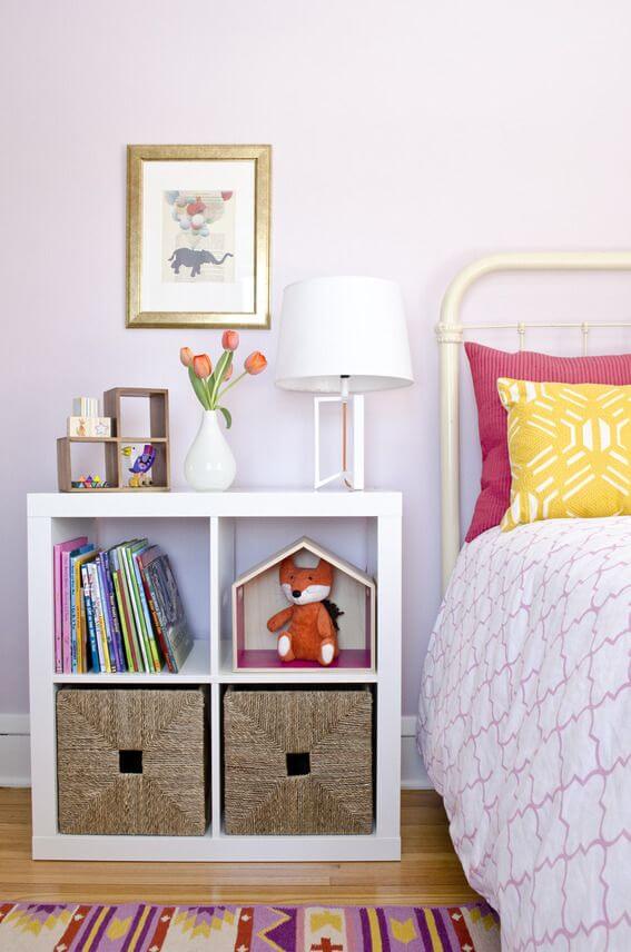
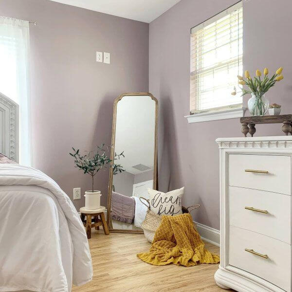
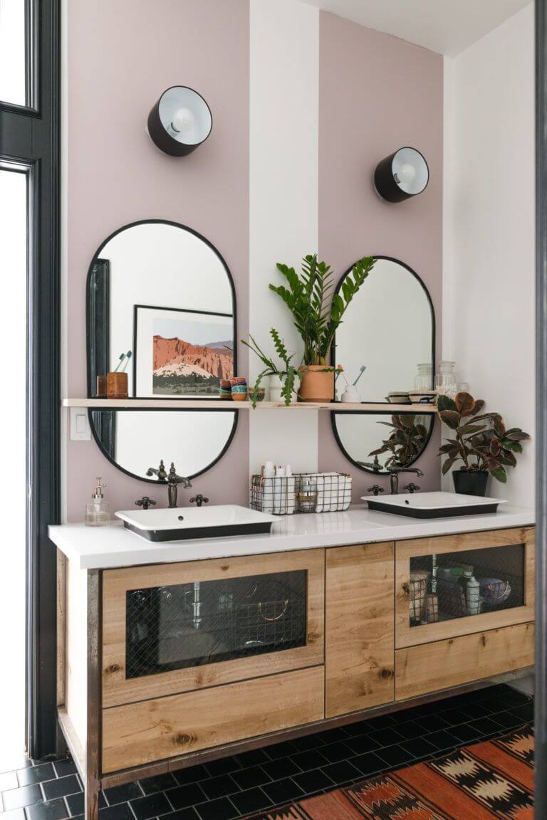
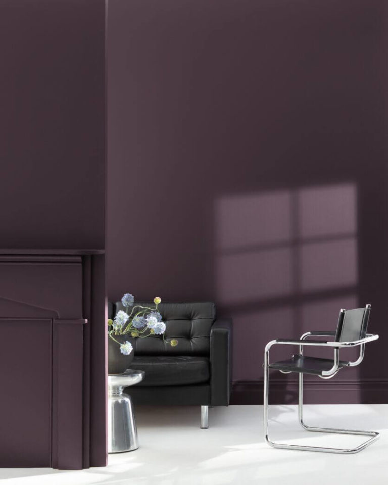
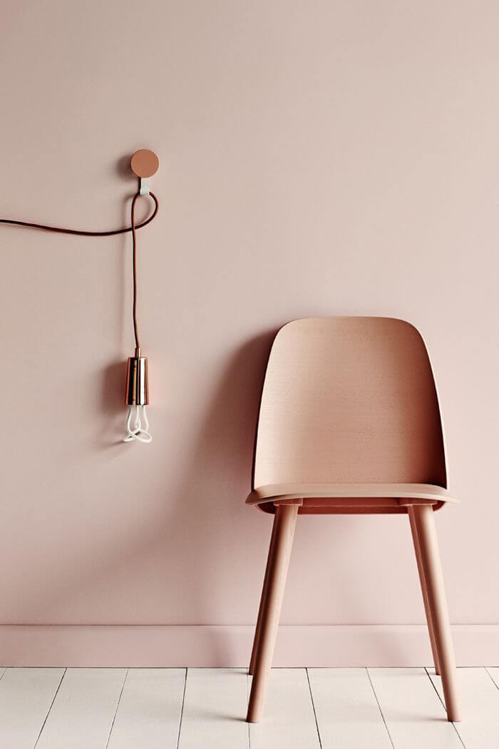
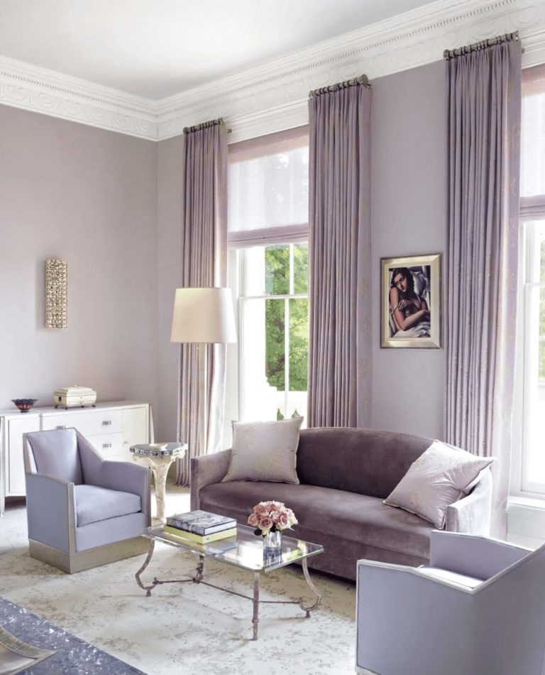
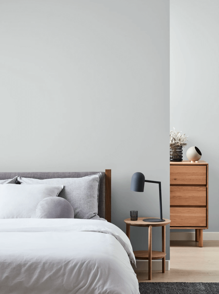
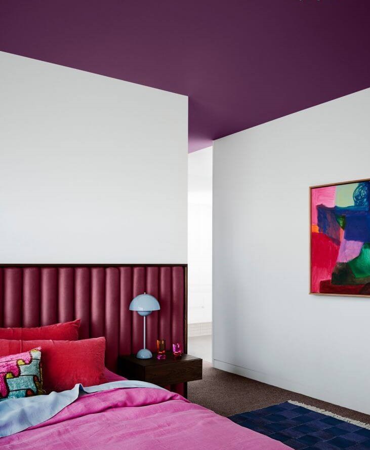
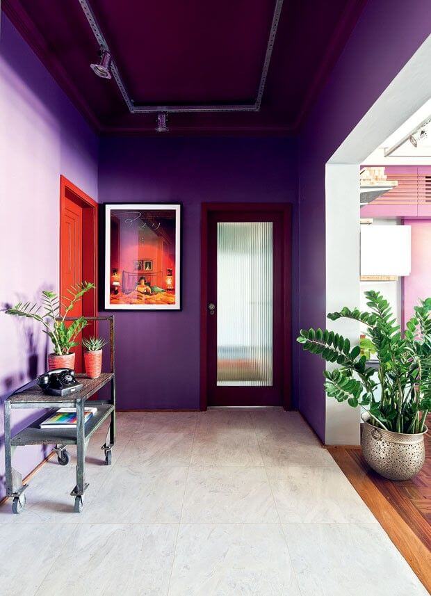
Color of the Year 2023: Digital Lavender
The world slowly adjusts to a new era, where bolder colors have they say. Digital Lavender perfectly underlines the transition from fully calm to totally mind-blowing. With optimistic traces, a balanced base, and explorative characteristics, the purple shade embodies serenity and courageous desire for a change simultaneously, bearing a strong conceptual value of well-being, which doesn’t exclude the virtual world.
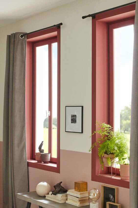
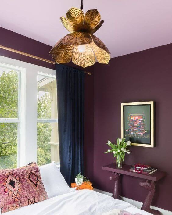
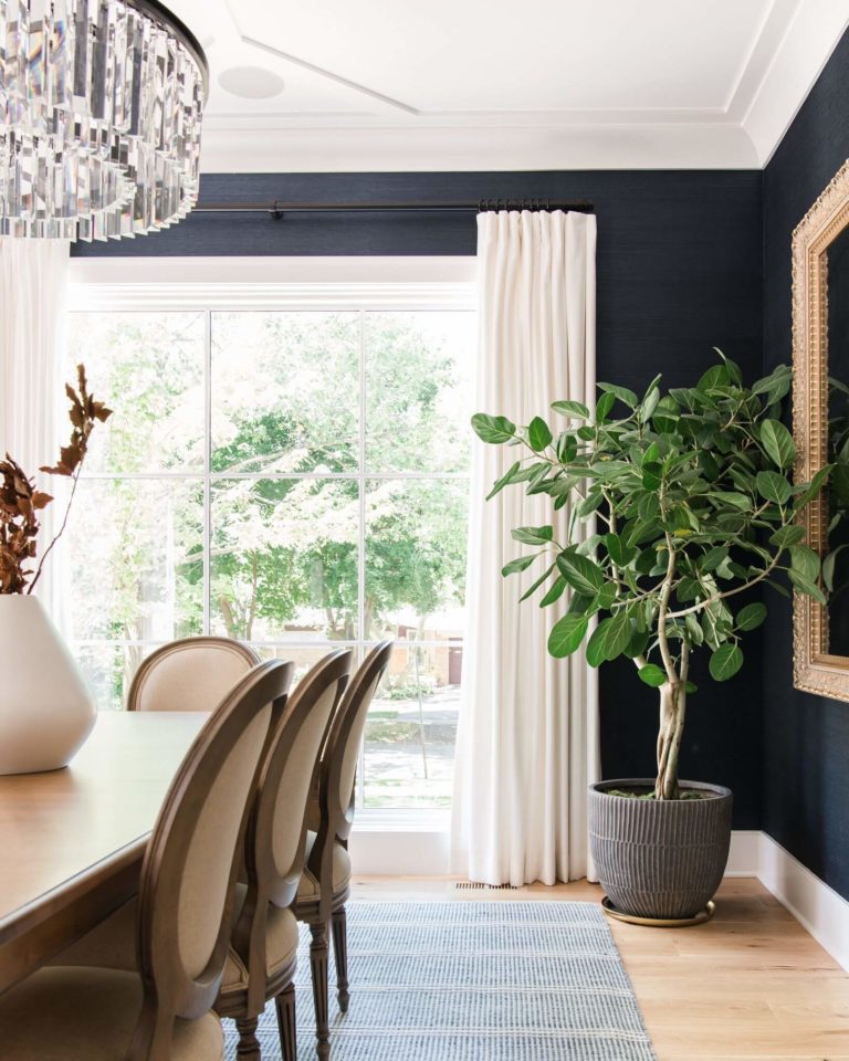
It is worth mentioning the return of purples as the leading color group in interior design, which are about balance, stability, and well-being on the one hand and endeavor, hope, and change on the other hand, perfectly reflecting the switch the fashion, design, and beauty world is experiencing.
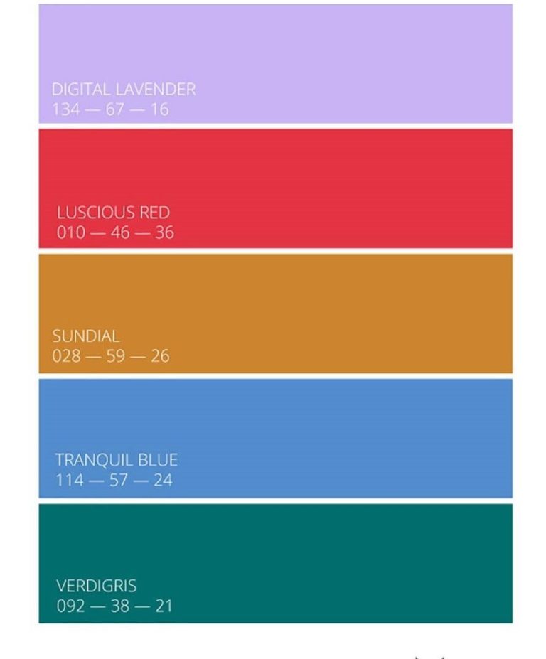
Key Colors Spring/Summer 23
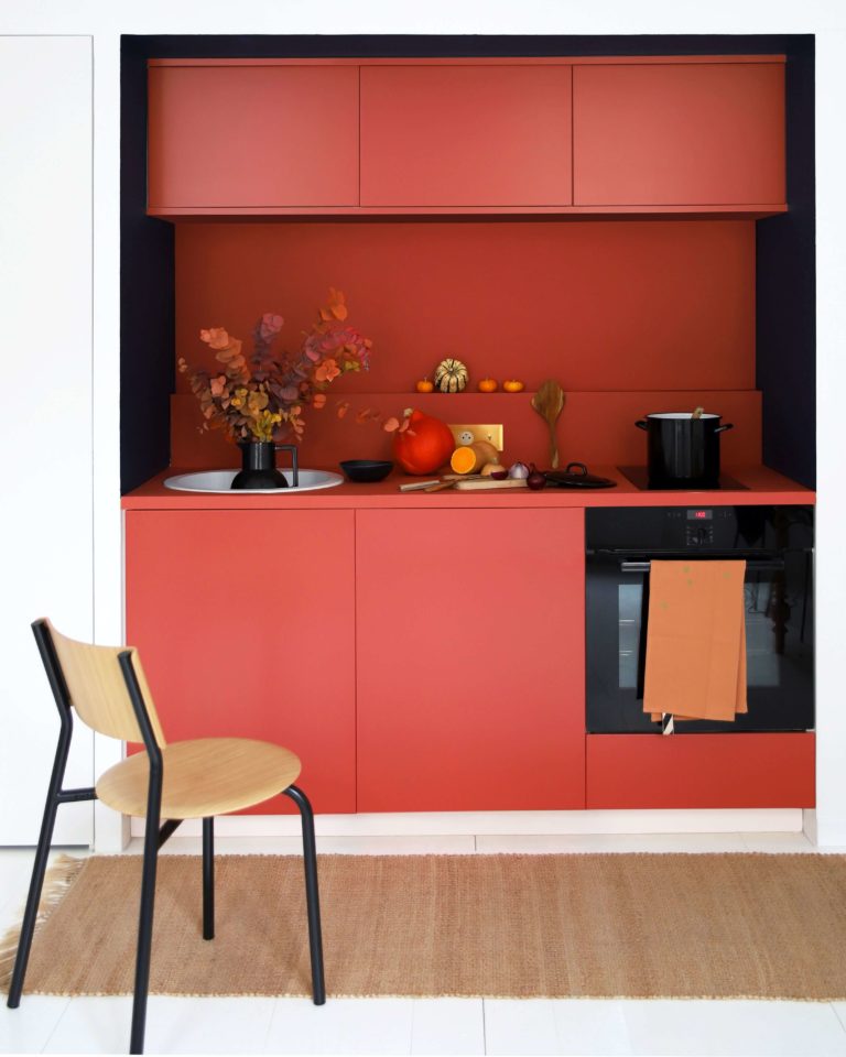
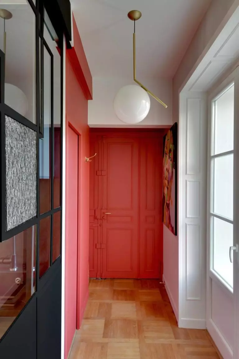
Luscious Red
A bright red color variation slightly diluted with water, incorporating Emotion, Appeal, and Illusion.
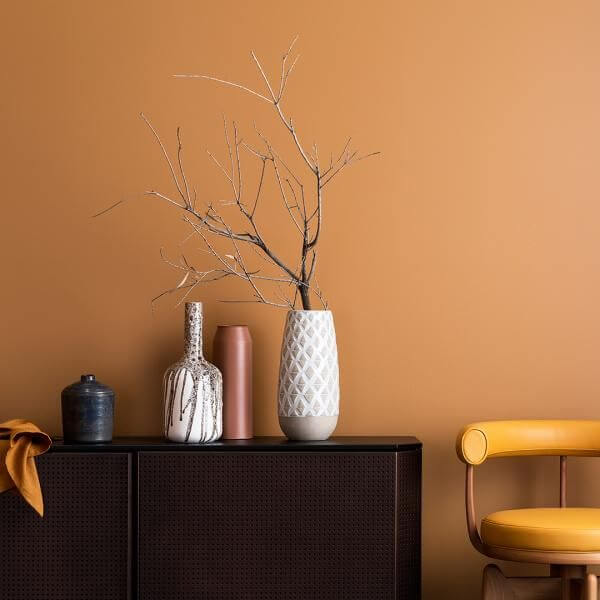
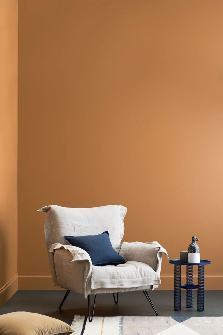
Sundial
An earthy orange color that connects with nature through such characteristics as Organic, Secure, and Modest.
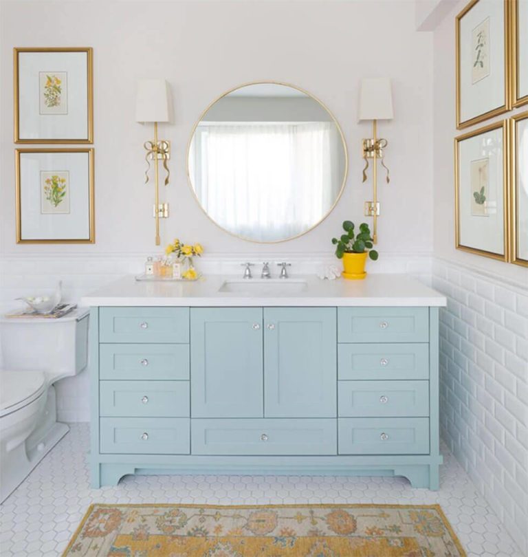
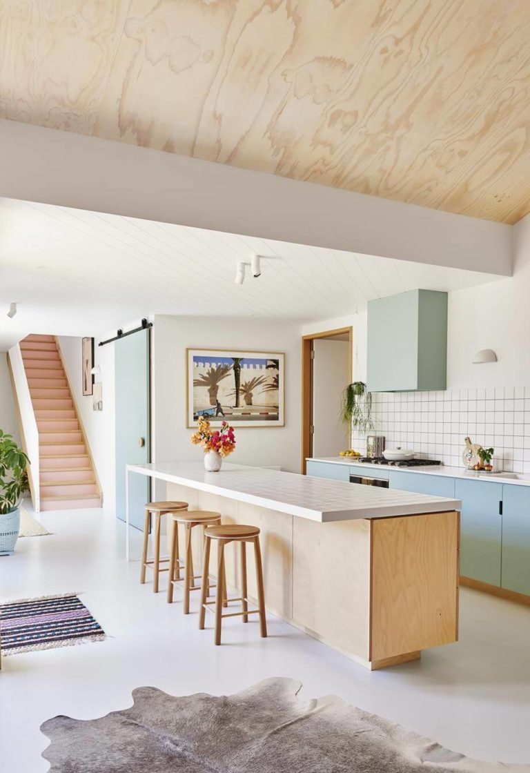
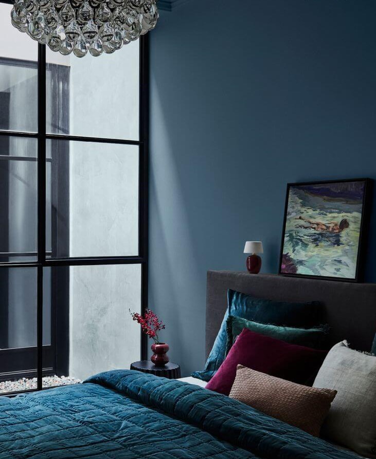
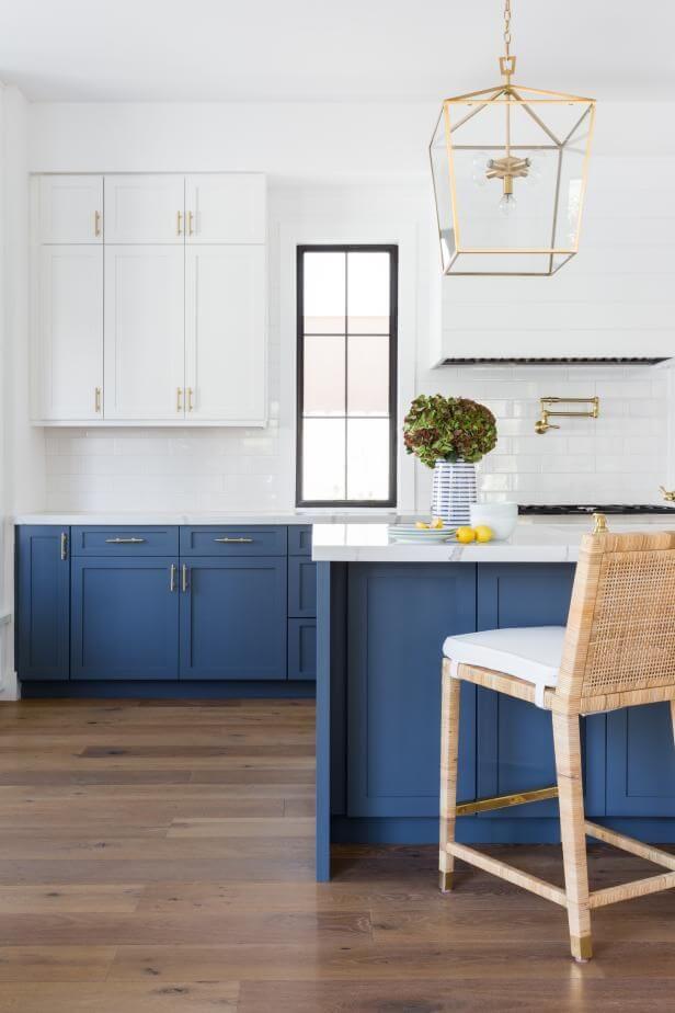
Tranquil Blue
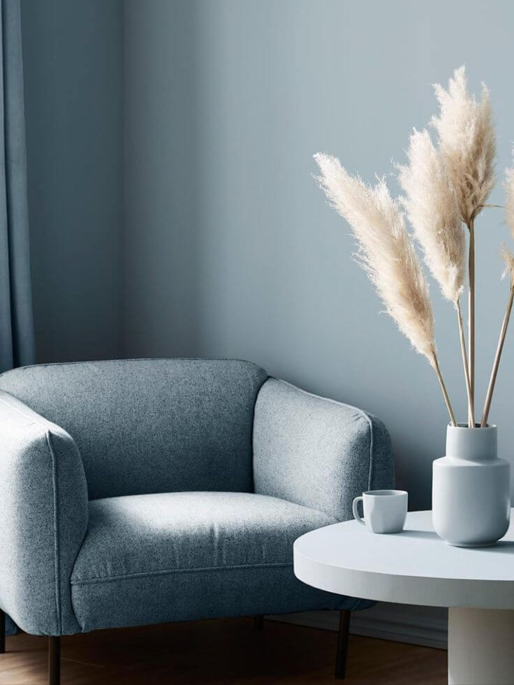
A saturated blue shade that operates with features like Serenity, Balance, and Clearness.
Verdigris
A blue-green color with deep roots reflecting such concepts as Invigoration, Taste of the Past, and Virtual.
Key Colors Autumn/Winter 23/24
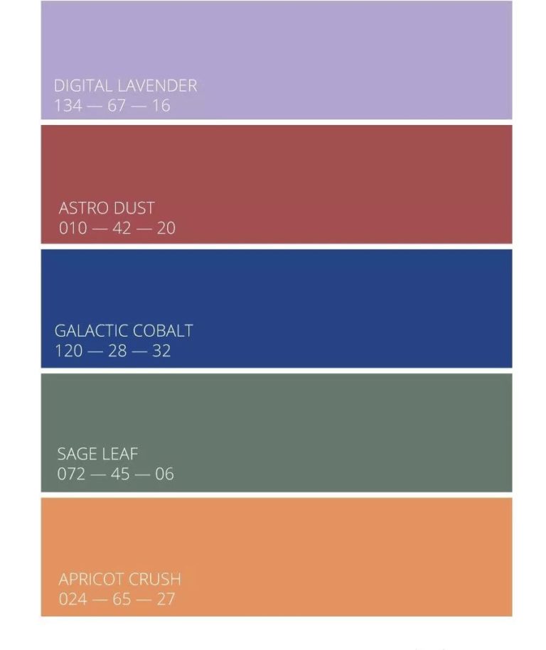
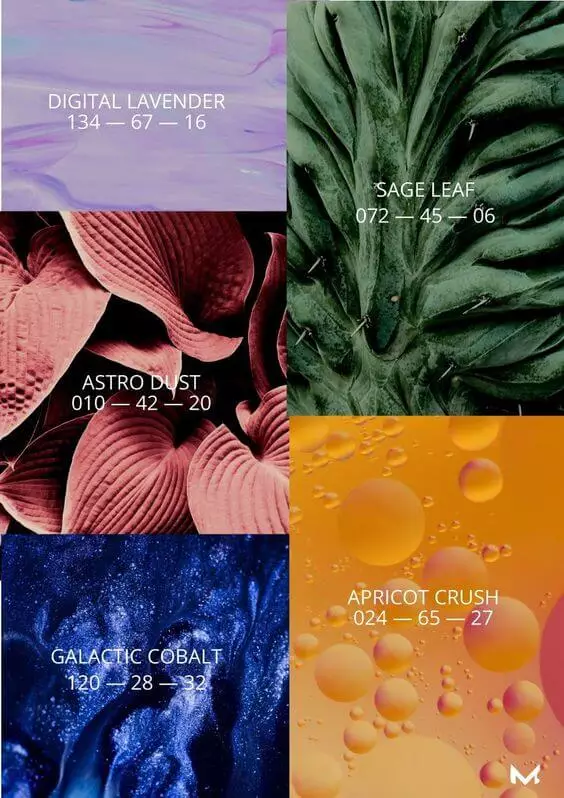
Astro Dust
A mineral red tone with a dusty base, inspiring Exploration, Inclusivity, and Intrigue.
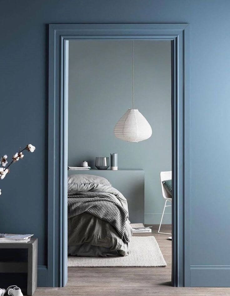
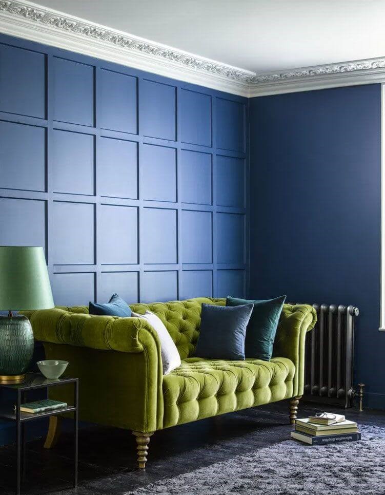
Galactic Cobalt
A dynamic shade of blue meant to collaborate with Escapism, Virtual reality, and Technology.
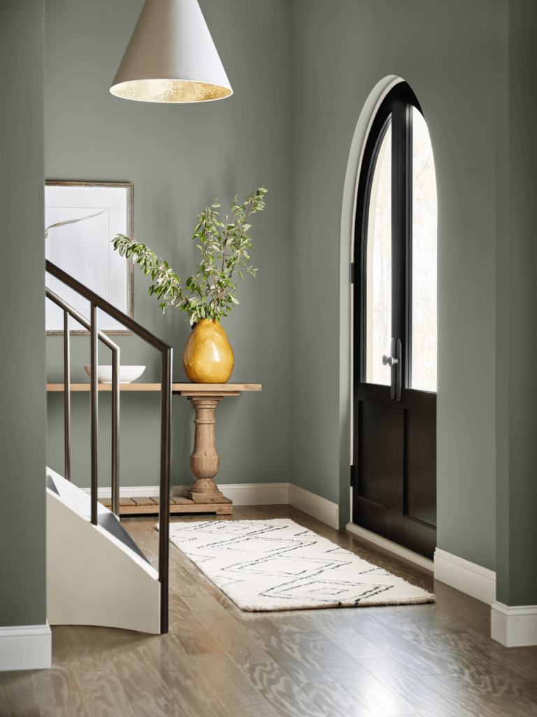
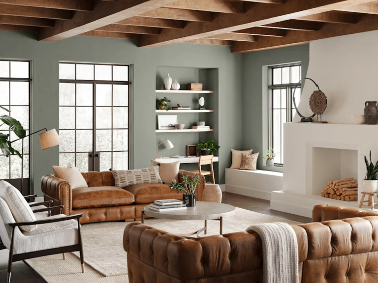
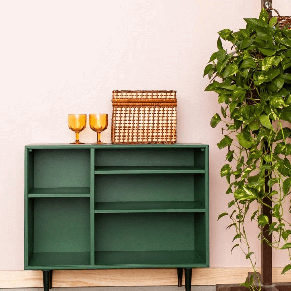
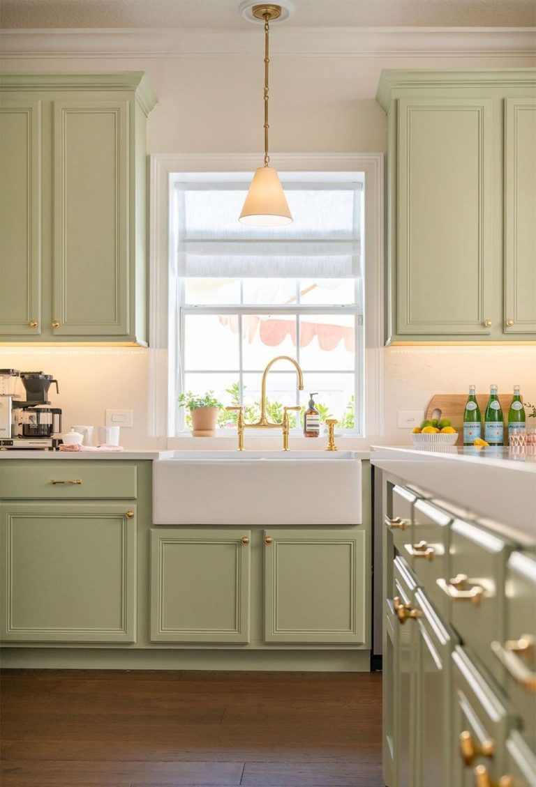
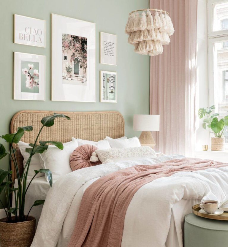
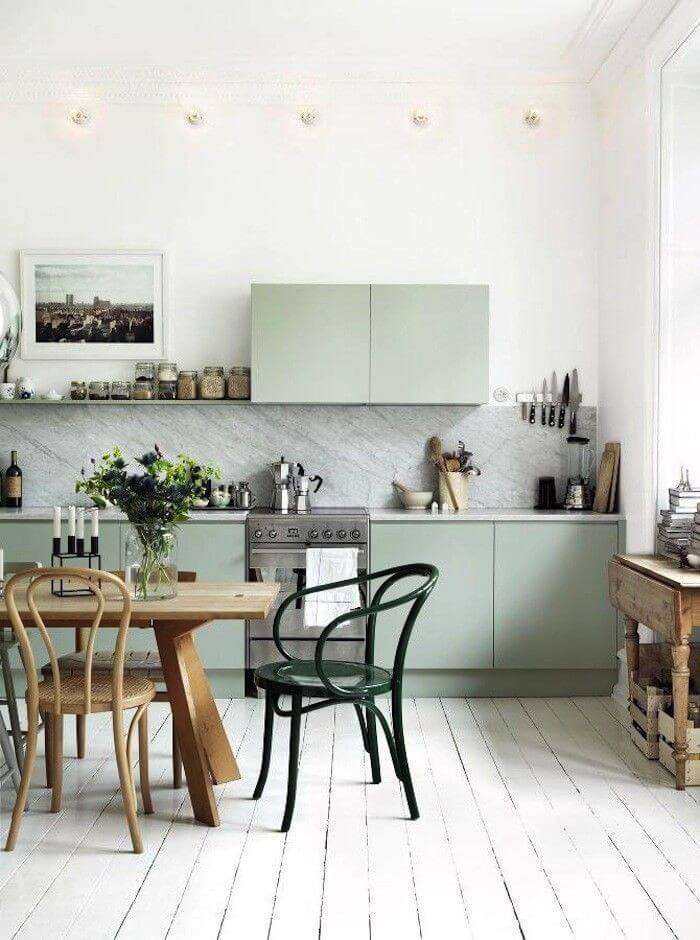
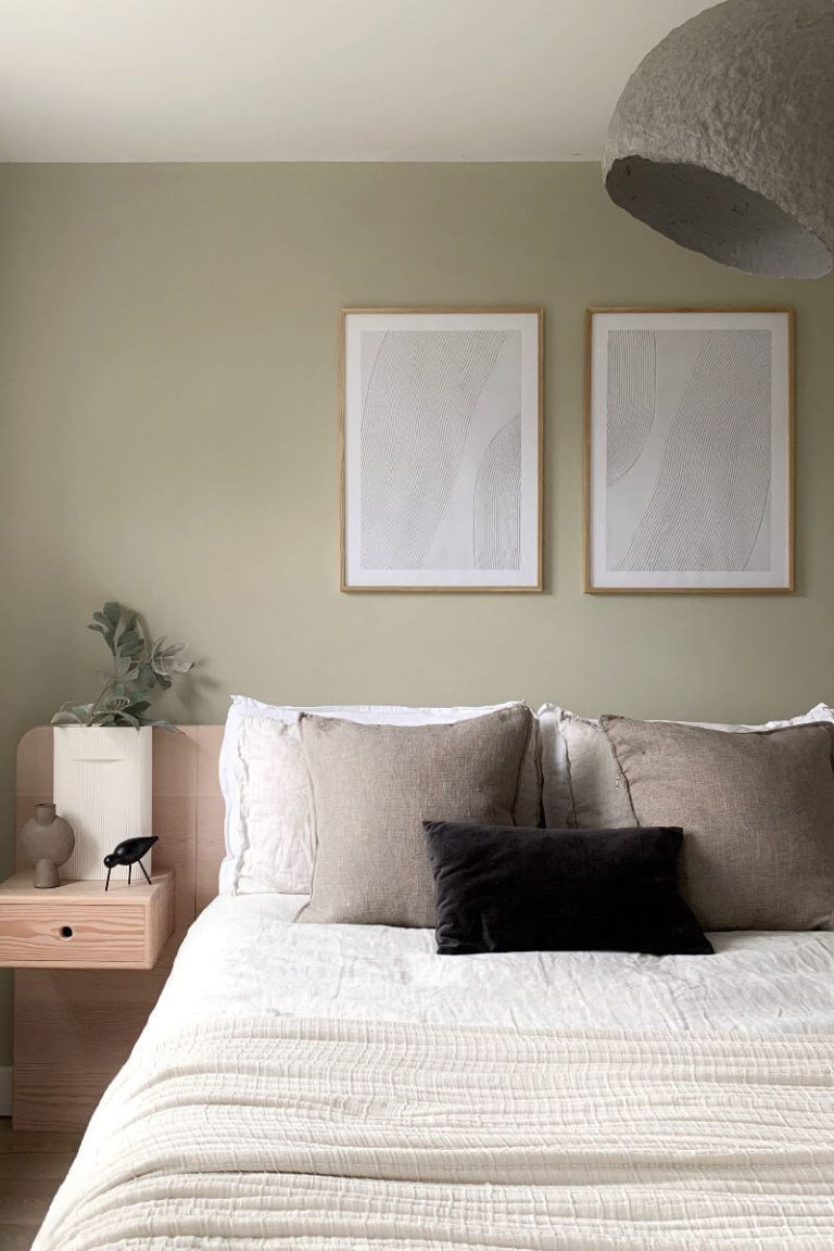
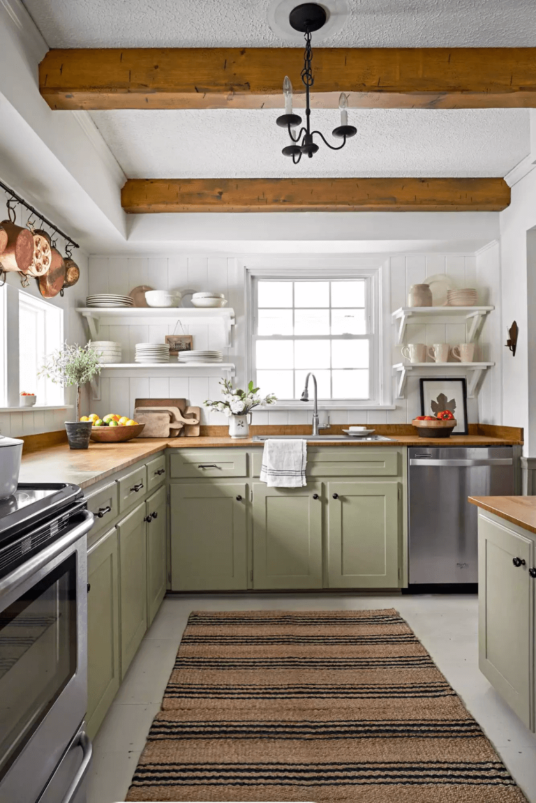
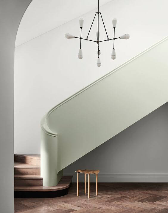
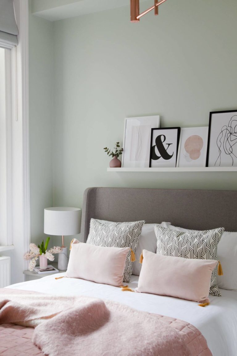
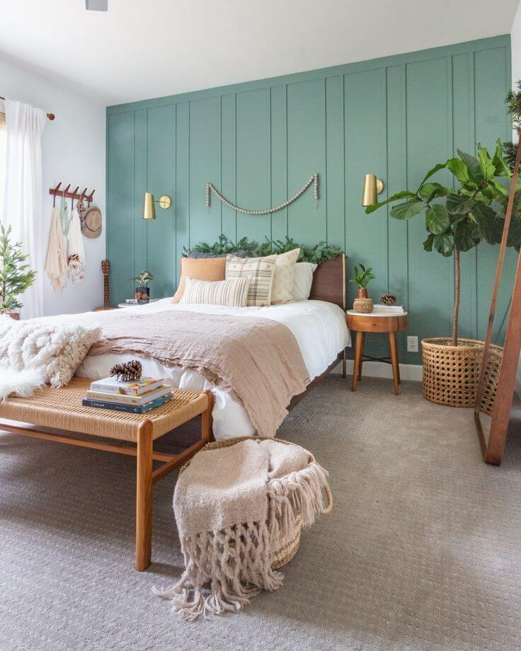
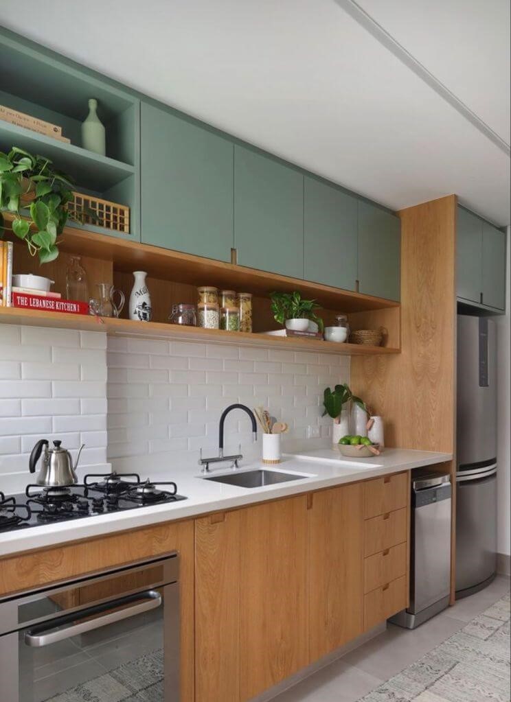
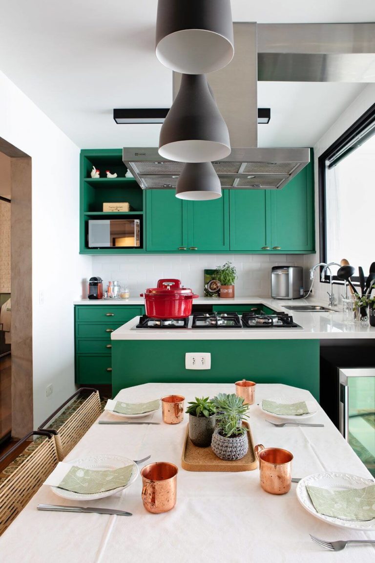
Sage Leaf
A quiet green variation that opposes the trendy bright colors through Tranquility, Reflection, and Relaxation.
Apricot Crush
An invigorating orange shade that stands out with its vibrant notes and cultivates Nourishment, Balance, and Restoration.
Paint Color Trends 2023: Benjamin Moore
The giant paint color brand has recently unfolded its perspective on the shades that will determine the colorful world in the new season. As the colorists at Benjamin Moore state, their new collection is like a push beyond traditional, which means exploring new shades and gathering the courage to express your true feelings. According to the manufacturer, the trendy colors in 2023 are vivid shades that clearly sought inspiration from nature, modern art, and creativity. What makes their selection stand out is the playlists attached to every shade in part so that you can really experience what the new pops of color sound like.
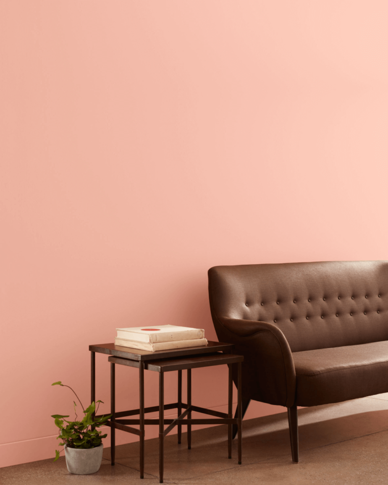
Benjamin Moore selected a true representative of its 2023 collection of trendy colors as color of the year. Raspberry Blush, as the name implies, is a lively coral variation with the softest pink tinge. So vibrant and, at the same time, natural, the new paint color that tops the color trends in the new year renders dynamic and optimistic feelings, right like a favorite song that keeps you positive and inspired.
Trending Paint Colors
Unlike most brands, which separated their paint colors into distinctive categories, Benjamin Moore unveiled its collection through a wide common group of shades that share the same values – new challenges, courage to reveal one’s true colors, optimism, and individuality. Inspired by the music rhythm, the new 2023 colors show vibrance and personality. They are statement paint colors meant to transform and underline.
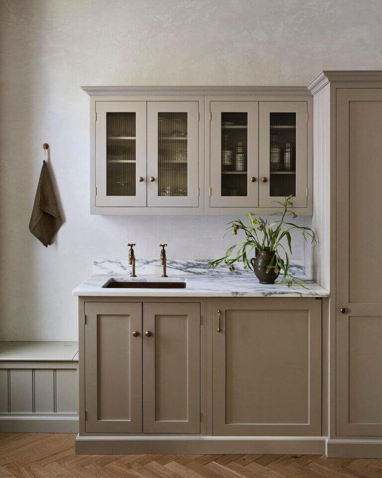
- New Age 1444 – light purple with a tinge of gray; this is one of the softest shades on the palette that seems both gray and lavender, created to unwind and relax without risking its hidden feel of sensible self-expression;
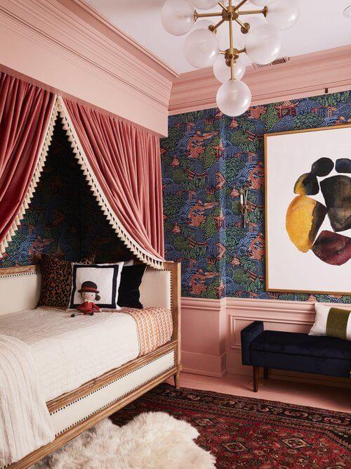
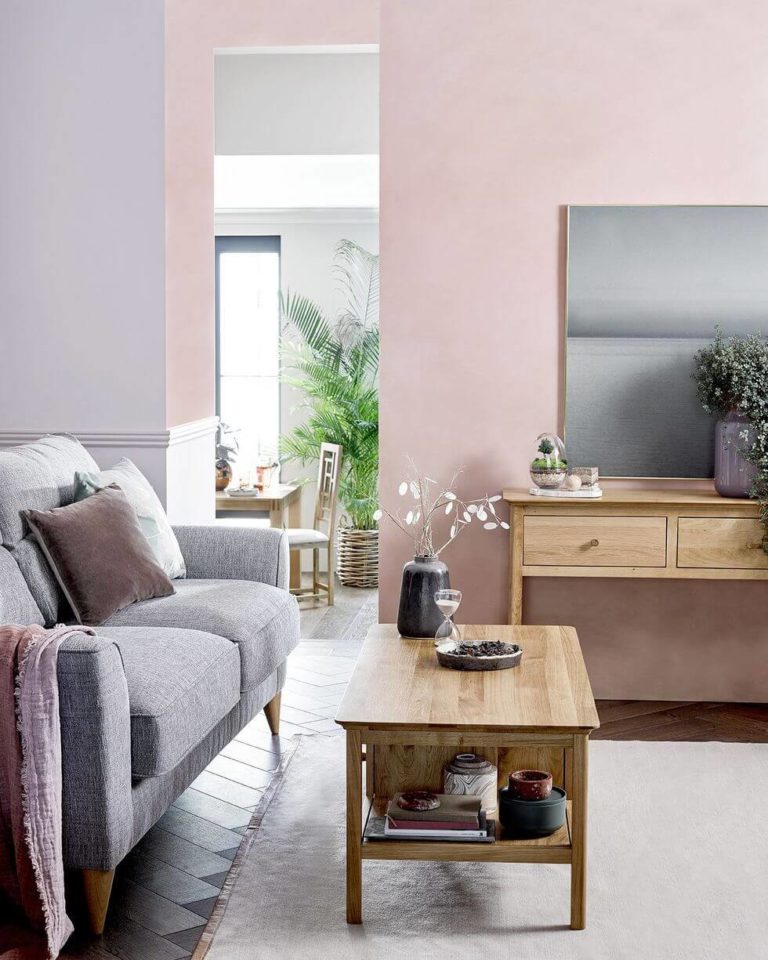
- Conch Shell 052 – dusty pink resembling a nostalgic sunset; another soft shade in contrast with the following bright colors, balancing the collection;
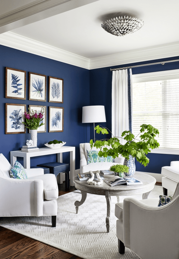
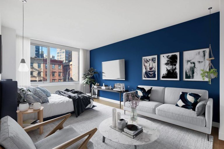
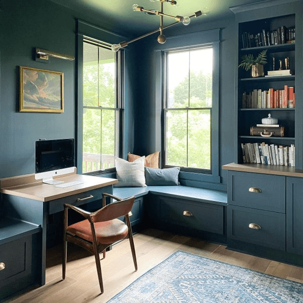
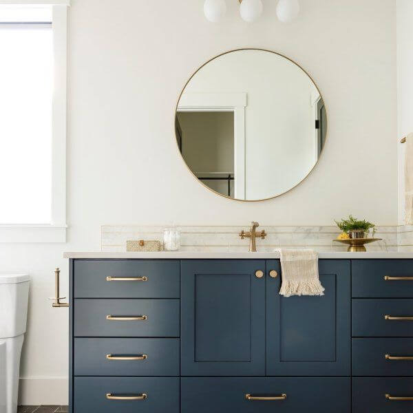
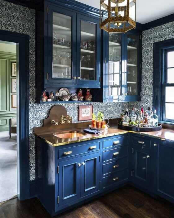
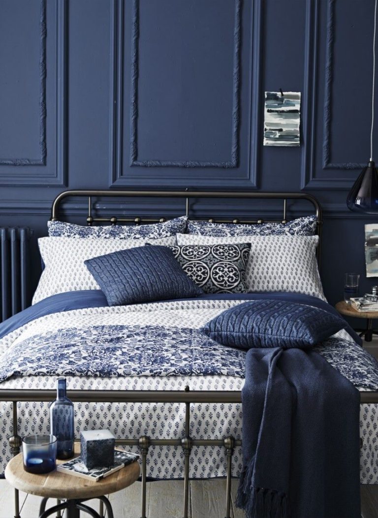
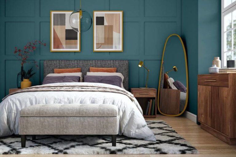
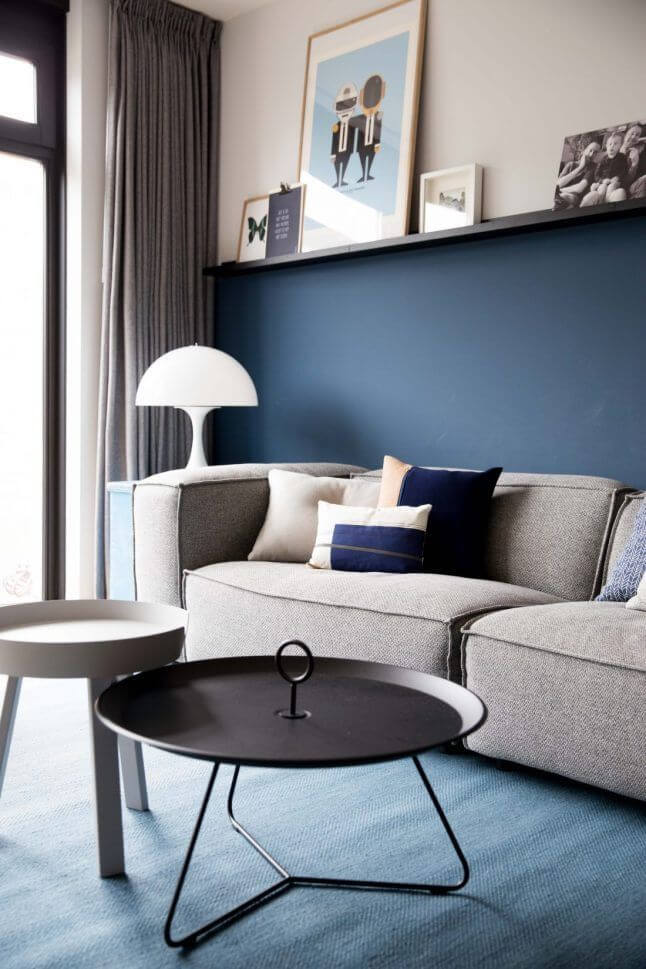
- Starry Night Blue 2067-20 – a deep blue between navy and indigo with airy purple scents that resonate with the romantic ambiance at dusk; a true representative of the bright side of the color selection;
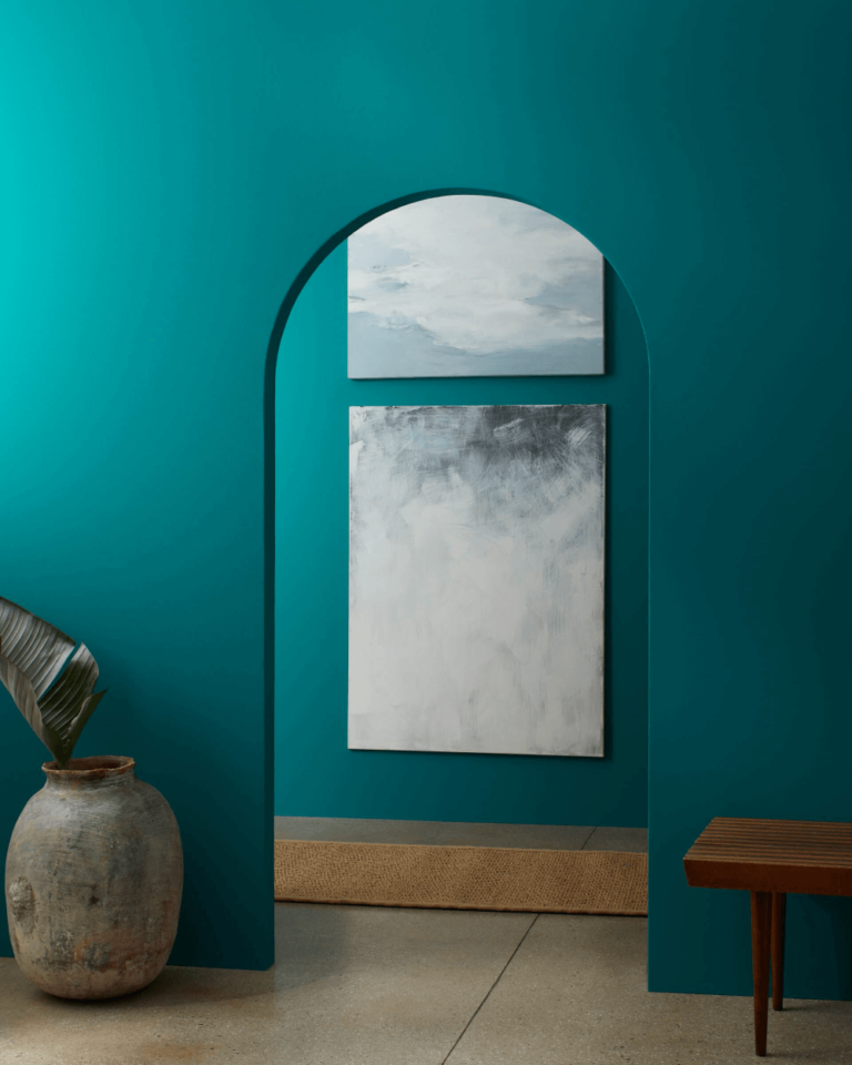
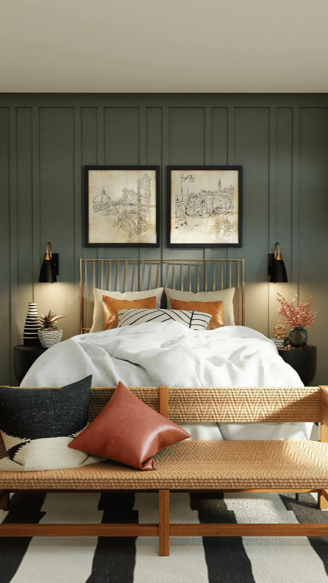
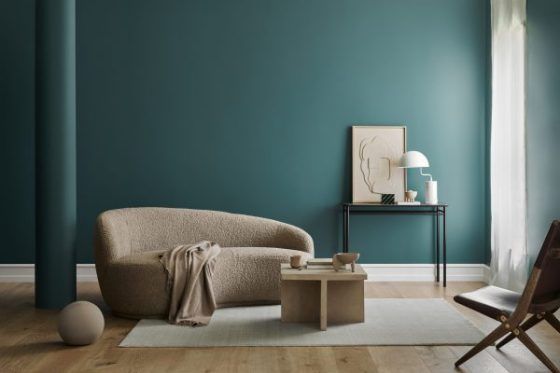
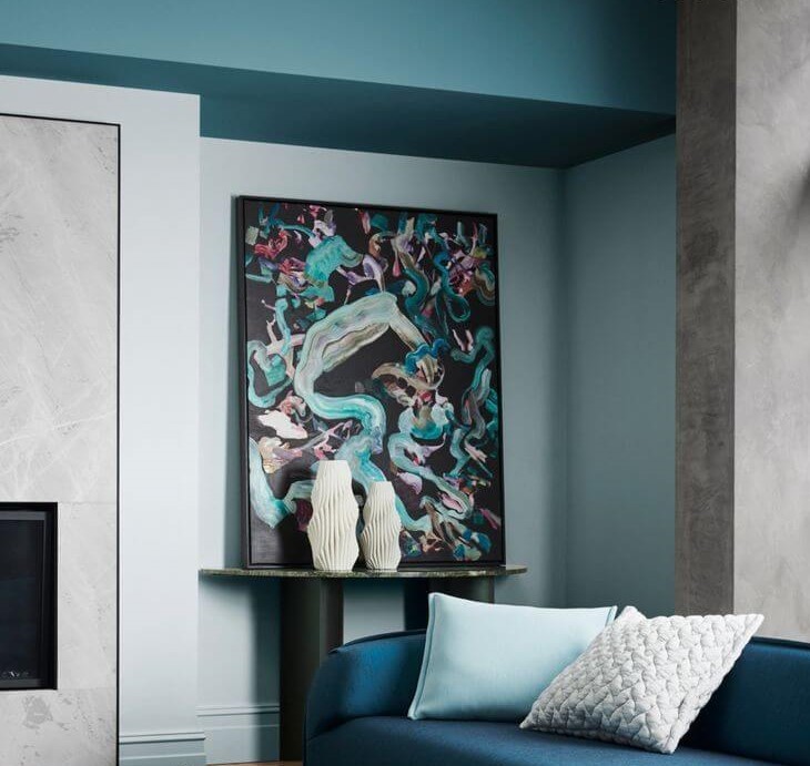
- North Sea Green 2053-30 – moody teal with green-blue notes of saturated depth that almost fades into the gray-blue background; an intriguing paint color that hides true pearls of the marine world waiting to be explored;
- Savannah Green 2150-30 – unmatchable ochre shade with rich green and yellow undertones with a relatively balanced amalgam of color traces; it brilliantly replicates a worn gold surface, bringing shine and sumptuous charm;
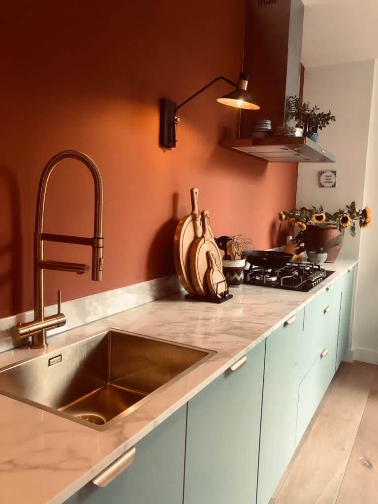
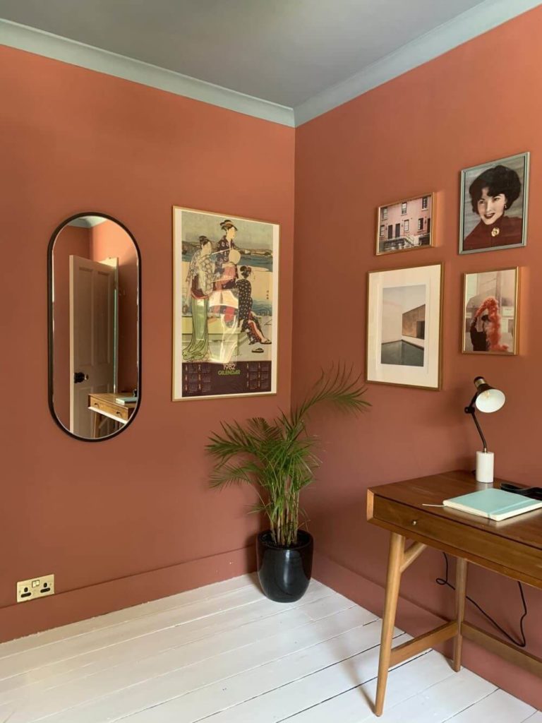
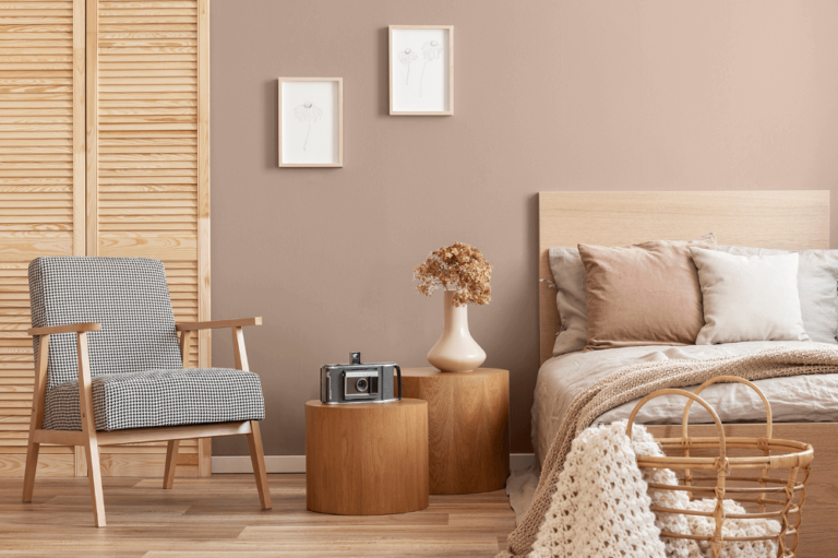
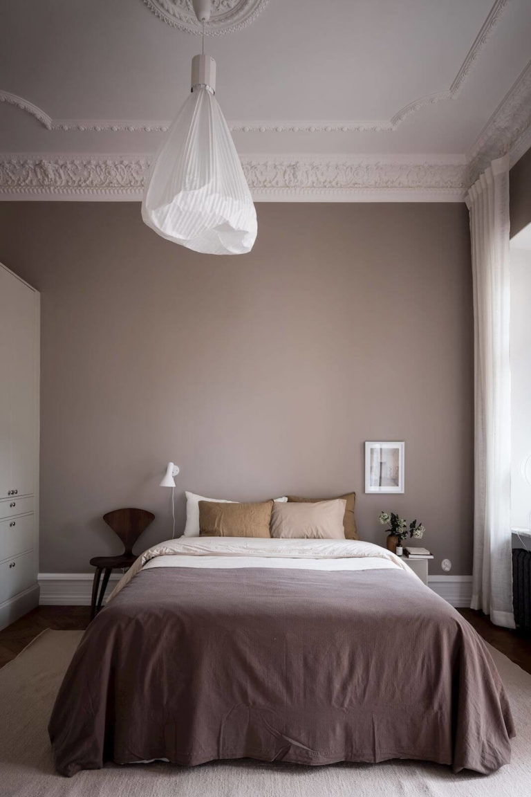
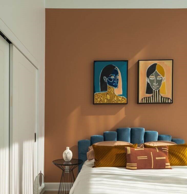
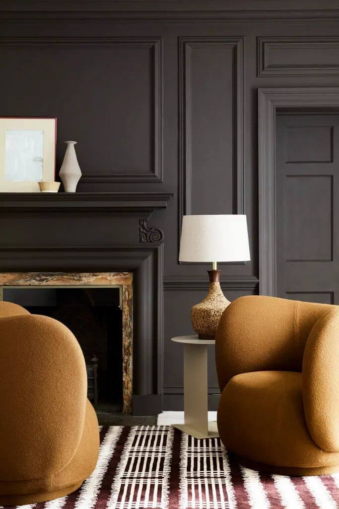
- Cinnamon 2174-20 – warm brown with light burgundy hints that gravitates between earthy orange and intense terracotta; this paint color is the definition of a perfect pastel shade that doesn’t overwhelm yet leaves space for expressing emotions;
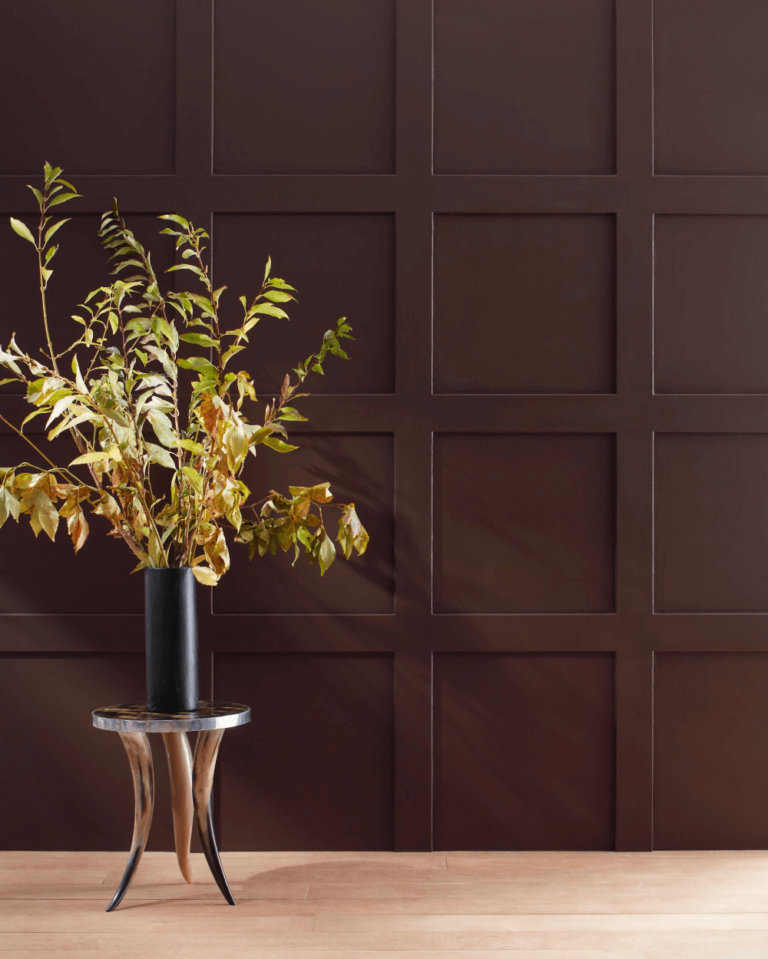
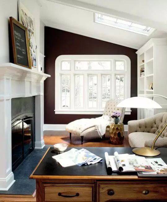
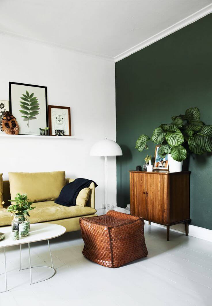
- Wenge AF-180 – dramatic shade of chocolate with a deep gray and brown base, featuring a few purple traces that preserve the enigmatic personality untouched; the darkest and surely most dynamic shade capable of balancing the most colorful interiors and bringing dimension to monochromatic spaces.
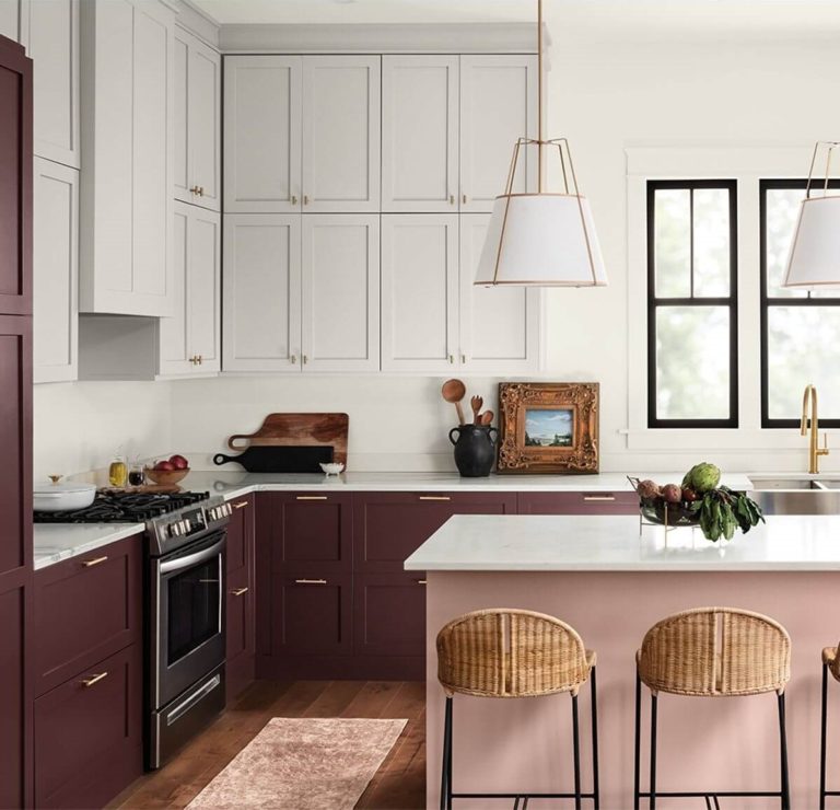
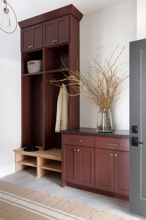
Paint Color Trends 2023: Sherwin-Williams
The renowned paint manufacturer has recently revealed its annual forecast for the new season. Sherwin-Williams decided to put the emphasis on earthy shades in particular; even the color collection itself appears under the symbolic concept of TERRA. It comprises 40 carefully selected hues grouped by the values they share. Besides the warming earthy notes, you can find such features as hopefulness, harmony, and restoration behind the colors that are trending in the new season.
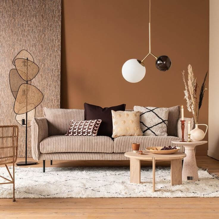
Of course, the leading paint color this year is inspired by the warm earthy colors noticed in nature. With a subtle clay tinge, this impressive pastel gravitates between dusty brown and foggy burgundy in search of a perfect balance. The new trendy color encourages connection with our surroundings by staying intriguing, comfort-preserving, and inviting. As the colorists at Sherwin-Williams state, this is a perfect background color for daily moments that matter due to its minimal yet cozy collection of undertones.
Trendy Shades by Color Schemes
Sherwin-Williams separated its trendy shades into color palettes that pay tribute to particular concepts. The color boards themselves are relatively large, comprising a wide range of hues. Still, you will taste each through the following prominent representatives.
Biome
A collection of colors that refer to biophilic, organic, and balanced, celebrating the love for nature and everything it supplies us with. You will find hues that inspire peace and serenity, besides their simple combination of notes that hide an intriguing sophistication waiting to be discovered.
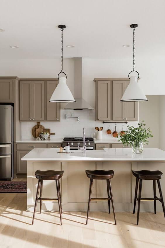
- Threshold Taupe SW 7501 – a mid-tone balance between brown and gray, giving out a subtle violet vibe; used as an alternative to usual neutrals;
- Homburg Gray SW 7622 – a very dark and intense gray with a cool cast that renders rather organic than classic neutrality;
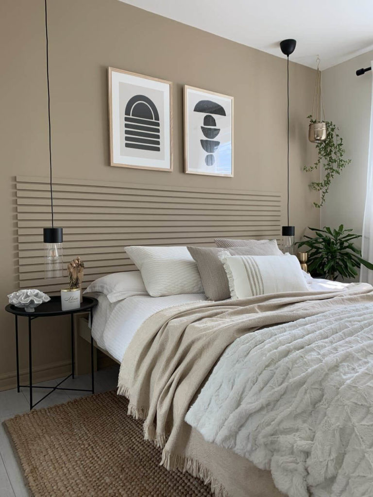
- Antler Velvet SW 9111 – a nurturing middle-tone brown, almost taupe, with warm undertones that sound like a favorite melody and combine with most natural hues;
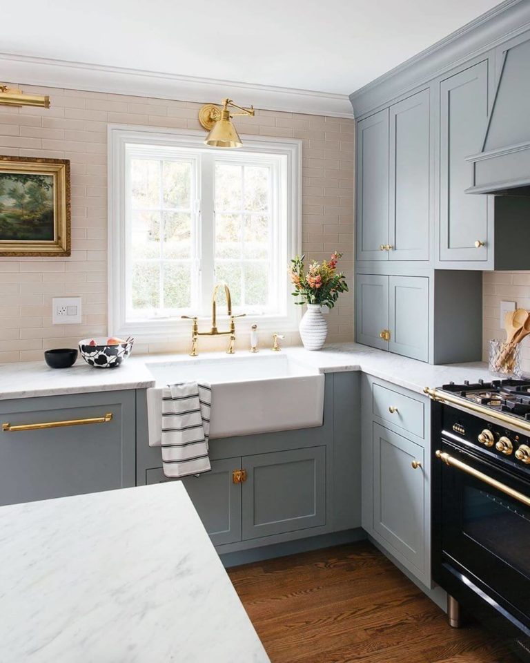
- Shiitake SW 9173 – a mid-tone naturalist greige with a warm appeal that provides harmony for increased well-being;
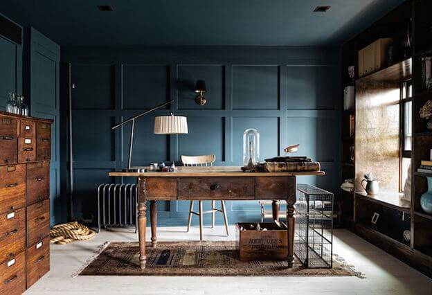
- Mount Etna SW 7625 – a dark blue, almost entering the category of black colors, yet revealing a free-spirited and rejuvenating shade;
- White Raisin SW 7685 – a delicate fruit yellow with a sweet peach veil that harmoniously pairs with classy whites and its favorite – a soothing shade of navy blue;
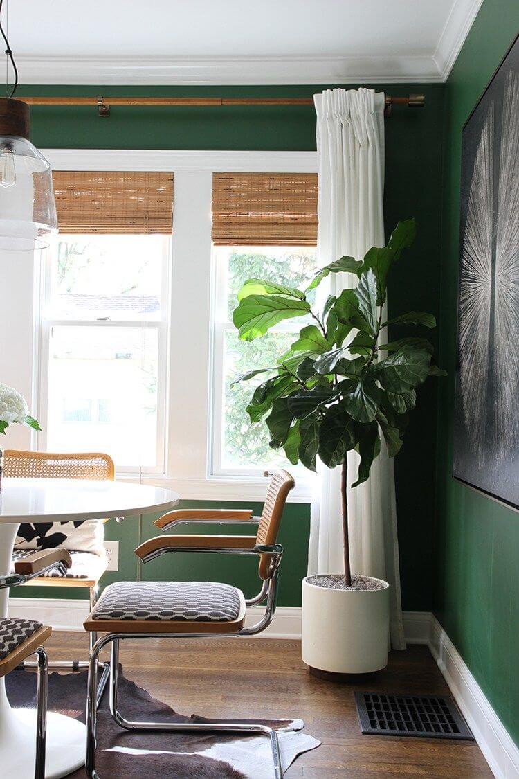
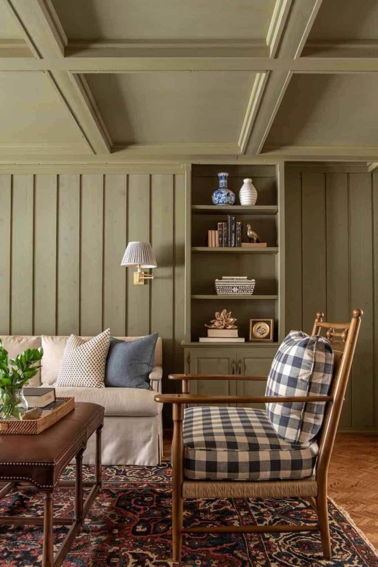
- Evergreen Fog SW 9130 – cool green with a stunning foggy effect; a much-beloved paint color for modern and traditional designs;
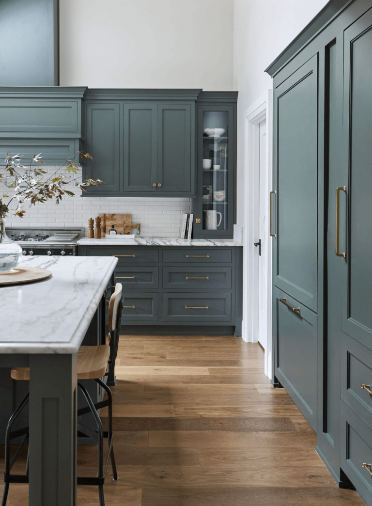
- Urbane Bronze SW 7048 – dark and imposing shade of gray rooted in nature with a fascinating organic appeal;
- Silvermist SW 7621 – a mix of gray and blue resembling the cool morning mist, except this one shows a few drops of silver shine;
- Rookwood Medium Brown SW 2807 – a dark brown with warm earthy particles of color that make you feel one with nature while indoors.
Lore
A romantic and culture-inspired color palette traced to history and traditions from all around the world. The combination of shades acts like a burst of loud colors, brave pastels, and antique tones. It perfectly reflects the celebration of the past.
- Toile Red SW 0006 – a dusty and romantic crimson shade, pretty dark yet worthily bright; peculiar of historic styles, including the flowerful Victorian age-inspired design;
- Nugget SW 6697 – a mustard yellow shade, stately, bold, and filled with shape; a perfect organic accent for creative projects;
- Wallflower SW 6281 – endeavoring light lavender that feels warmer than expected, like a late summer day;
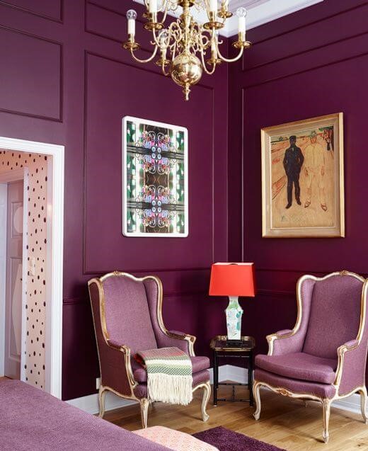
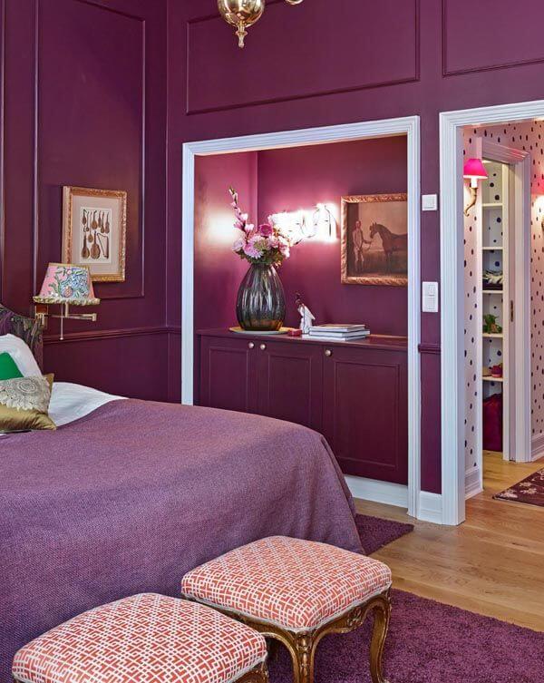
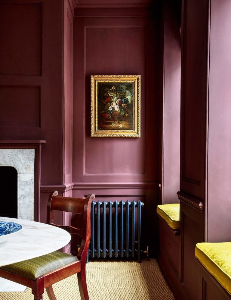
- Carnelian SW 7580 – a revolutionary dark aubergine with warm scents covered by a foggy veil;
- Blue Peacock SW 0064 – a deep and bold teal resembling a bright shade you can only witness in wild nature;
- Pediment SW 7634 – a pale greige color with a lavender charm and a soft restorative effect;
- Studio Mauve SW 0062 – a mid-tone grayish purple penetrated by soft greige notes that offer it a warm and familiar look;
- Serape SW 6656 – an earthy orange that doesn’t give up on its modern boldness yet pays tribute to color variations that respect tradition;
- Dhurrie Beige SW 7524 – a warm gray and beige in-between shade that doesn’t hide a pretty intense base for a neutral color like this;
- Mineral Gray SW 2740 – dusty navy blue, almost fading into the gray fog of soothing color particles that bring a familiar look for modern and traditional design concepts.
Nexus
This mix of paint colors is associated with what the morning sun rays feel like – restorative, appealingly disturbing, and peaceful. You can find relaxing clays, stately browns, and warm neutrals, among which the color of the year – Redend Point. To give you a small insight:
- Reddened Earth SW 6053 – a dark clay diluted with a drop of red and resulting in the warmest accent color that stands out when paired with white particularly;
- Malted Milk SW 6057 – a light pearl-pink with warm undertones that makes any interior feel like home;
- Kestrel White SW 7516 – a rejuvenating light beige with the tiniest trace of gray for a neutral that feels fresh and soft simultaneously;
- Cool Beige SW 9086 – an earthy light beige that doesn’t seem warm or cold;
- Chatura Gray SW 9169 – a middle-to-dark gray with a brown cast that lends comfort and security;
- Likeable Sand SW 6058 – middle-tone clay with perceived pinkish notes and calming coolish effect;
- Foothills SW 7514 – slightly intense brown with a noticeable warm trace yet balanced enough to seem cool;
- Lei Flower SW 6613 – saturated and striking coral with an undercover earthy orange trace;
- Emerging Taupe SW 6045 – mid-tone taupe with pronounced violet undertones that update the known gray and brown combination of tones up to a new version.
Origin
The alluring name of this color selection hides a gathering of the boldest and standout hues, reminding us of pleasant memories and inducing hope for the future with optimistic shades and positive undertones.
- Fabulous Grape SW 6293 – an imposing violet shade, as wild as you can see it in nature only, with the brightest fruity scent;
- Chartreuse SW 0073 – a mid-tone lemon yellow diluted with a lot of water that borrowed suburban appeal from Mid-Century Modern and gentle notes of classy allure for a transitional expression of emotions through color;
- Skyline Steel SW 1015 – a balanced gray shade, neither warm nor cold, yet full of character and enthusiasm for timeless color palettes with bolder accents;
- Pure White SW 7005 – a bright and pure white devoid of daring undertones to pair with the visibly bold accents of this paint color collection;
- Homestead Brown SW 7515 – a dark yet pleasant shade of dusty brown that pairs well with white and its favorite companion – light blue;
- Black Magic SW 6991 – classy black color with a trace of gray so that the shade would not seem without borders; the perfect pairing for light and warm paint colors for a personalized accent;
- Goldfinch SW 6905 – a very, very bright shade of yellow that instantly stands out in any surroundings;
- Kale Green SW 6460 – dark and intense shade with a true green base and a lively combination of bright nature-inspired scents;
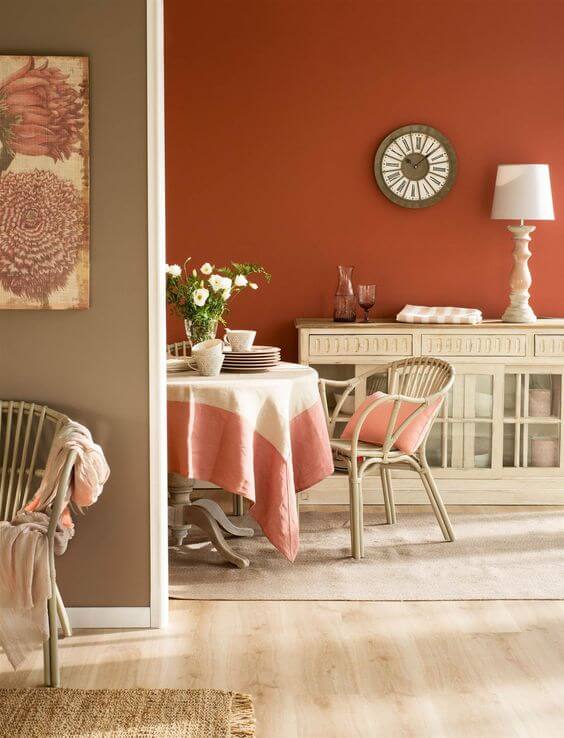
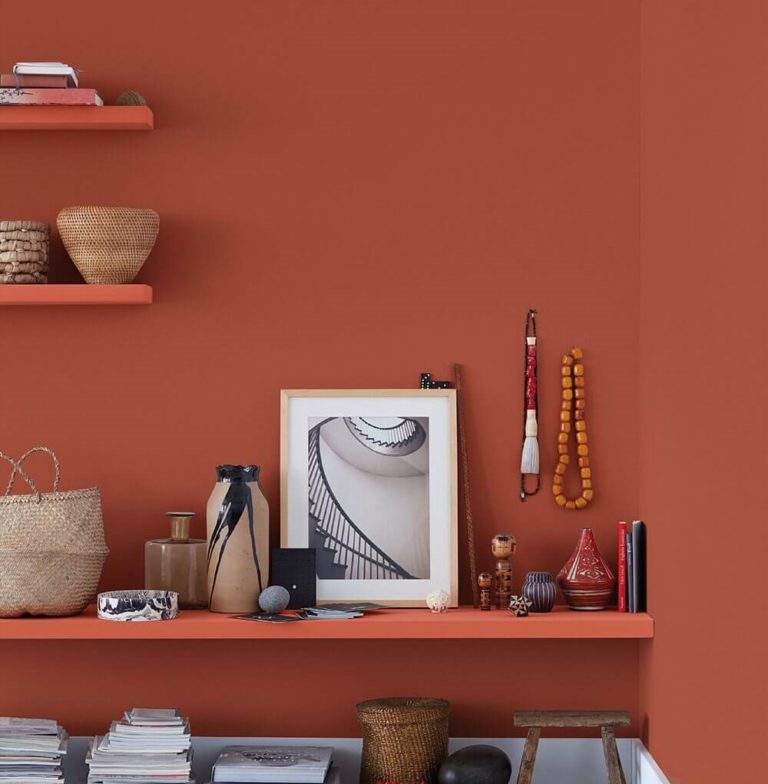
- Peppery SW 6615 – sunburnt terracotta with noticeable orange and reddish undertones, perfect for accents;
- Indigo SW 6531 – dark blue shade with eye-catching bright splashes that invite you to taste the magical sense of style from under the bold color.
Paint Color Trends 2023: Behr
Behr decided to go with one large color palette that includes all trendy colors for the new season. It has them of any kind – neutrals, pastels, natural, and bold. The main feature that makes this manufacturer stand out with its color forecast for 2023 is that most paint colors are muted and adapted for a more serene and calm ambiance. Still, the variety of shades is so wide and attractive that no one can probably overlook such pearls.
The rebellious color brand didn’t follow suit and chose a natural, say either earthy or neutral shade. It went with a true representative of minimalism – an alluring white with welcoming notes that invite you to express your emotions and thoughts on its clean canvas. That’s probably for the best since we surely require a neutral background like this for the amalgam of rich colors trending in 2023.
Trending Paint Colors
- Half Sea Fog N470-3 – a gray-blue splash of soothing composure with a stately sense of stability and self-control;
- Perfect Taupe PPU18-13 – indeed a perfect combination of brown and gray for a timeless shade that has equal parts from both colors;
- Spanish Sand OR-W07 – versatile white with sandy pink undertones, whose neutral traces of modesty work with any accent;
- Smokey Pink N150-2 – a soothing dusty pink resembling the foggy mountain peaks bathed in the morning sun rays;
- Pure Earth PPU7-05 – soft earthy shade bringing to the surface a gorgeous taupe that seems warm and organic;
- Hybrid S340-3 – a light yellowish green with nurturing properties that makes you one with nature;
- Spiced Mustard S300-5 – impressive muted shade enriched with a stark earthy drop of security and comfort;
- Vermilion S150-5 – pastel purple-red that preserves its rich and juicy undertones yet unfolds an engaging and calming effect;
- Aubergine N100-7 – a dark and dramatic aubergine purple whose organic and warm look renders natural vibrance and luxury elegance;
- Conifer Green PPU10-19 – a profound and cool grayish green resonating with the color one can witness in the depths of a pine forest;
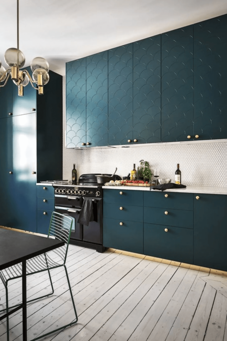
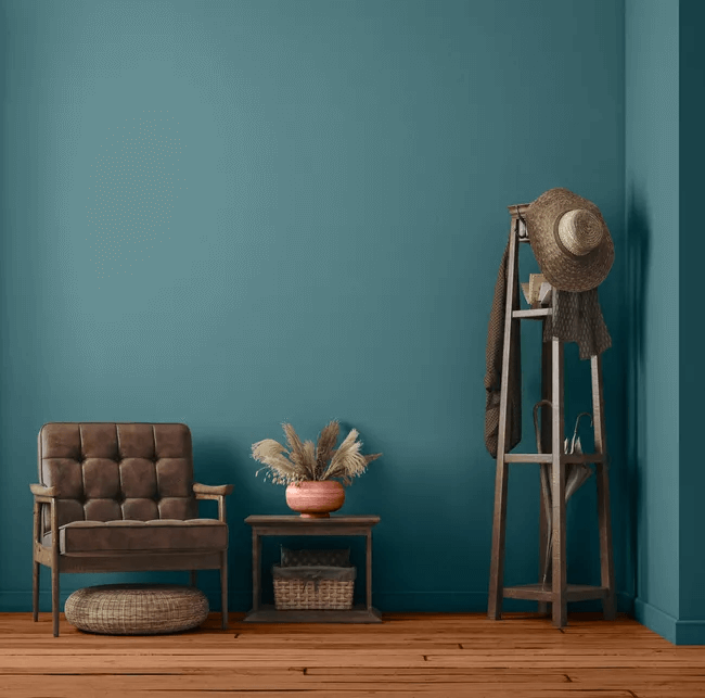
- Sophisticated Teal HDC-CL-22 – dark green-blue, almost fading into a naval blue color, preserving the same sense of marine depth.
Paint Color Trends 2023: PPG Paints
One of the largest coating companies has announced its list of trendy paint colors for the coming year based on the idea that colors are a reflection of our interaction with the surroundings and other people. Long story short, colors are a means of telling your story, which can be seen through different colored glasses, and this is why PPG Paints divided its trending paint colors into thematic groups, and we would like to show the most prominent examples from each.
Color of the Year 2023: Vining Ivy PPG 1148-6
The deep and sensitive teal shade that gravitates between blue and green has a quite dark base, although the delicate sense of starkness and unmatchable sobriety offer the clearest feel of the ocean depth.
Color Theme: Origin
The color palette blooms with natural shades that inspire exploring new worlds while at peace with what you already know. With a few bold attempts that don’t pass the border and relatively calm shades, it connects with nature, operating mostly with earthy variations and plenty of other organic shades – as rich-colored as nature itself is. These are the leading hues:
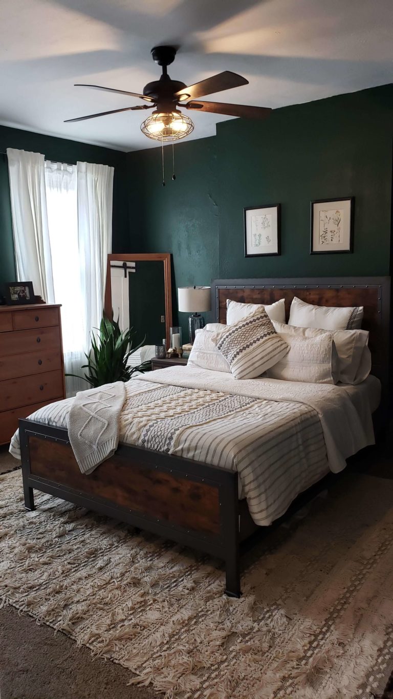
- Pine Forest PPG 1134-7 – dark green inspired by the forest depth that offers the sought-after sense of organic delicacy;
- Oceania PPG 10-01 – beloved shade of naval blue in its true marine variation that enchants and makes you one with the ocean;
- Dark Granite PPG 1005-7 – very dark brown resembling the forest soil after rain;
- Cool Clay PPG 1071-5 – seemingly neutralized yet organically bold clay shade that works as a perfect alternative for brown;
- Foxfire Brown PPG 1069-6 – lively brown with orange scents possessing irreplaceable appealing and charming notes;
- Gooseberry PPG 1048-7 – berry-like shade of intense purple with warm roots that knows how to balance vibrancy and comfort;
- Spicy Mustard PPG 1108-5 – dusty mustard color with a slight tinge of yellow cheerfulness.
Color Theme: Serenity
This color board offers more tranquil shades, including neutrals with warm undertones, beloved pastels, and slightly bright shades diluted with a lot of water. These color variations are meant to remind you of what you hold dear in life and help you find peace with yourself and everything surrounding you.
- Gypsum PPG 1006-1 – cool white with a bluish rather than grayish trace of color, which is slightly noticeable, for a clean and unobtrusive paint color;
- Synchronicity PPG 1021-2 – a mid-tone gray with the tiniest beige trace meant to sync with the surrounding colors and textures;
- Beach Vibes PPG 1070-3 – pastel peach shade resonating with an intense and dusty pink color, although having a bold yet balanced personality on its own;
- Earth Rose PPG 1056-5 – earthy color with a charming dusty rose base that stands out, calms, and impresses;
- Whispering Pine PPG 1125-3 – light pastel shade of green that reveals a very soft, whisper-like breath of natural freshness;
- Summer Breeze PPG 1139-1 – watery blue with a very light base that reminds us of the cool coastal breeze during summer.
Color Theme: Duality
This color scheme is about telling your own story as written exclusively by you. Self-expression and courageous attempts are the core features standing as pillars for the contrastive palette consisting of daring contrasts between stately neutrals, juicy shades, and transition-oriented pastels. You are already acquainted with neutrals and pastels. We would like to give you an insight into the bright side.
- Kimono PPG 1166-5 – exceptionally bright shade of blue with a vibrant and enchanting collection of purple-bluish notes;
- Laurel Wreath PPG 1228-5 – saturated and soft green resembling the pastel variation of a true natural drop of color;
- Briquette PPG 1188-6 – astonishing red, slightly mixed with water, yet preserving the statement base that cannot help but attempt to burst into a splash of bold color;
- Lilac Breeze PPG 1248-4 – a very subtle resemblance to lavender hides behind the dazzling lilac shade that unfolds hope and optimism.
Paint Color Trends 2023: Pantone
The giant trendsetter that inspires fashion, interior design, and lifestyles forecasts a beautiful collection of brand-new classics and unexpected bright shades as the definition of color in 2023. Pantone feels that people are ready to reveal their true self and encourage them to do so through color inspiration. Pantone’s color of the year has been recently announced, yet everybody talks about it. Let’s discover it!
As the Pantone’s colorists claim, the powerful mauvish-crimson color with an audacious sparkle takes its inspiration from a tiny and brave insect – cochineal with a red-blue-purple crust that passed the test of time and survived through the years. Viva Magenta promotes embracing the unconventional, as Pantone’s color experts affirm. The last few years made us isolate ourselves from the world, and now it is time to express ourselves and reveal our true colors, as bold as they are. Fearless, courageous, optimistic, hopeful, and full of bravery, the new Pantone’s color of the year brings the joy we have all secretly craved the past few years.
Trending Colors: Magentaverse
Following the reveal of the defining color of the year, Pantone came up with a comprehensive collection of colors that broadcast the interchange of power between the real and virtual worlds with bright and timeless shades that were inspired by the gorgeously defined – bright side of the natural world – Viva Magenta. Explore the stars of the Magentaverse colors!
- Pale Dogwood 13-1404 – a light-tone pink that hides under a subtle, neutral veil yet shares with the world the most pleasant pastel shade of a joyous summertime pink;
- Gray Sand 13-1010 – a muted beige shade diluted with light gray undertones for a timeless neutral that manages to stay audacious through subtle notes of vivacious warmth;
- Gray Lilac 13-3804 – an exhilarating lavender color with fulfilling features that inspire change, hope, and a redefinition of the familiar;
- Pale Khaki 15-1216 – a classy neutral shade that keeps pace with the 2023 color forecast and reveals a unique personality due to the perfect balance between tan and slight yellowish notes;
- Fields of Rye 15-1115 – an aesthetic greige color with a balanced mix of gray and beige for a perfectly idyllic ambiance;
- Agate Gray 15-6307 – chill greenish gray with a light personality and natural drops of color that, once penetrating a space, reveal a peaceful identity;
- Plein Air 13-4111 – fresh, airy, and winter cool blue, denoting a stark and vibrant character that roars modern, reviving, and new.
For an expanded paint color inspiration in the new season, you can safely look into the spring/summer 2023 and fall/winter 2023/2024 forecast suggested by Pantone colorists, available online.
Paint Color Trends 2023: Dulux
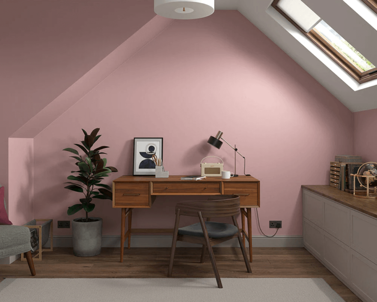
Considering the contemporary lifestyle, Dulux came up with a collaboration of colors that satisfy our need to connect with nature, reach the necessary level of harmony with oneself, and rediscover the love for joy. This is how the 2023 color forecast takes three different directions for three different types of emotions. But first things first. What is the main representative?
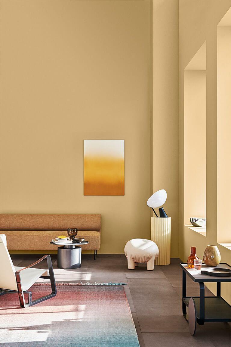
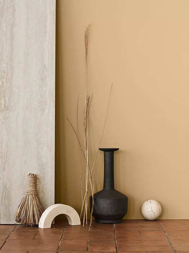
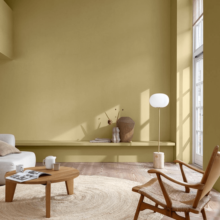
Color of the Year 2023: Wild Wonder
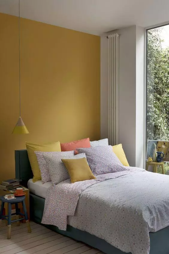
Since nature is at its peak in terms of influencing the way we perceive the world through color, Dulux made it the leading concept for its color forecast in the new year and proved it by announcing Wild Wonder as the color of the year. A pale yellow shade with a subtle green tinge, both color notes being inspired by guess what – nature. Colorists regard the trendy shade as glowing and magnifying due to its soft gold particles that combine perfectly with the slightly noticeable green. The warm neutral brings nature closer and shares the exquisite power of restoration and well-being with homeowners.
Color Scheme: Connect
Connect with nature, bring nature indoors, and rediscover yourself. The nature-inspired color code includes earthy shades, warm neutrals, muted greens, and, as you have noticed, yellows. The same scheme is completed with more accentuated colors, such as dark browns, deep grays, and true dark shades with warm undertones.
- Sandy Day – a mid-tone sandy gray with warm violet undertones that would work with raw Rustic design concepts;
- Wasabi – a middle tone of soothing olive green with warm yellow undertones that looks impressively organic besides natural texture;
- Hammer Gray – a relatively dark gray with a neutral base true to its nature, undisturbed by additional color notes;
- Namadji – an earthy black tone with subtle brown undertones; a perfect paint color for trim and all-black makeovers;
- Research – a dark yellow olive shade resembling a fully ripe olive color, rich-pigmented and Mediterranean-scented;
- Whisper White – at first glance, white; the more you look, the more you see it as an off-white with a mix of gray and beige at the base, offering it the finest sense of comfort;
- Beaten Track – seed greige that resonates with a very light brown shade with appealing warm echoes;
- Apparition – mid-tone gray, neither too warm nor too cool, yet with the slightest mark of beige that makes it seem inviting;
- Cinnamon Sand – earthy orange, almost entering the brown category, with the most pleasant notes of warmth that bring the magic of nature indoors;
- Stilted Stalks – middle-tone muted green with warm yellow scent, resonating with the timeless olive shade;
- Bongo Skin – pale yellow with a washed-out base yet still revealing a hidden earthy trace;
- Basset Brown – alluring brown paired with a tiny drop of burgundy for a warm and inviting dark shade.
Colors Scheme: Balance
The depth of bodies of water mostly inspires this color board. With refined pastels, watery blues and greens, and dark variations of color, the palette is meant to help you find harmony, unwind, relax, and deeply breathe in the tranquility and peace these shades bear.
- Casper White Quarter – a true white hue boosted by a subtle tinge of yellow-gray that slightly disturbs the clean white paint;
- Terrace White – a powdery white tone with watery blue-scented beige-gray undertones that slightly fade out when kissed by sun rays;
- Porcelain – an exceptionally light pink with dusty violet traces and a unique romantic origin;
- Green Alabaster Half – a very light mint green hue diluted with dusty gray, almost fading into the off-white group;
- Starfish – a reserved and timeless shade of dark blue of sea-depth beauty, perfect for sleeping spaces due to perceivable calming features;
- Kimberley Sea – a deeply vibrant teal shade radiating a perfect pairing of blue and green that underlines the modern feature of your design and refreshes the color palette;
- Domino – a dark charcoal shade with blue undertones, stately and formal when paired with white or wood;
- Pure Blue Half – light pastel shade of blue with a powdery surface that makes your dreams of the calmest environment come true;
- Mornington – powdery pink, soft and misty, working as an unbeatable source of escape and coziness;
- Sea Kelp – almost a true naval blue – beloved color variation, although slightly darker and one-step entering the black category;
- Deep Garnet – a bold and simultaneously calm shade of pastel burgundy for those who want an accent color that knows how to behave itself;
- Nephrite – pastel teal that shows an exceptional dance between blue and green, intense enough to stand out from the crowd and relaxing enough to become a favorite.
Color Scheme: Revive
In contrast with the previous schemes, this one invites to celebrate the bright colors and shortly – revives. The cheerful blues, greens, and yellows with softer and warmer representatives, besides juicy pinks and purples, accompanied by sparkling accents, show paint colors as never before – daring, mind-blowing, and contrasting any shade that has been mentioned this far.
- Princess Pink – a medium-to-light vivid pink tone that would consolidate any retro endeavor in interior design;
- Lexicon Quarter – a snowy white paint giving off an unnoticeable blue scent, perfect substitute for neutral white;
- Breezy Half – a breezy blue shade resembling the clear morning sky; irreplaceable bright paint for walls in eclectic design projects;
- Day Glow – mid-tone yellow devoid of undertones besides a fully bright yellow base;
- Diorite – a vivid mint green with a subtle powdery effect to pair with other representatives of the bright color selection;
- Purple Celebration – a strongly vivacious purple paint with a warm cast; perfect to pair with other vivid colors of crisp white;
- Pink Chi – bright pink with a strong and interesting personality that manages to inspire and warm up at the same time;
- Golden Sand – flashing yellow with sparkling gold scents that shimmer under the surface of this fluorescent paint color;
- Perplexed – soothing and vibrant at the same time shade of lavender purple;
- Integra – middle-to-dark shade of blue with a dazzling individuality that spreads energy, positivity, and uniqueness;
- Pharaoh’s Gem – a sophisticated color gravitating between bright green and mint with a beautiful mix of undertones like out of a fairytale;
- Paper Brown – pretty intense peach with an appealing creamy surface that reveals a few earthy hints; the rest is about softness.