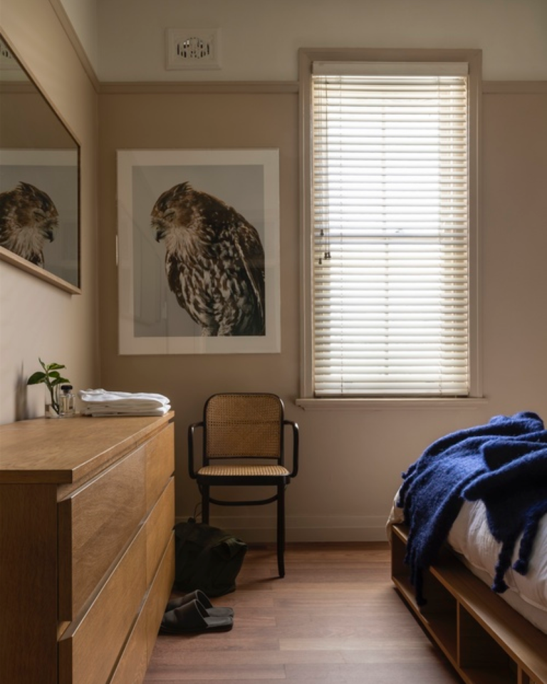
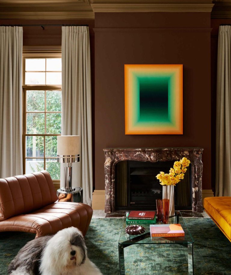
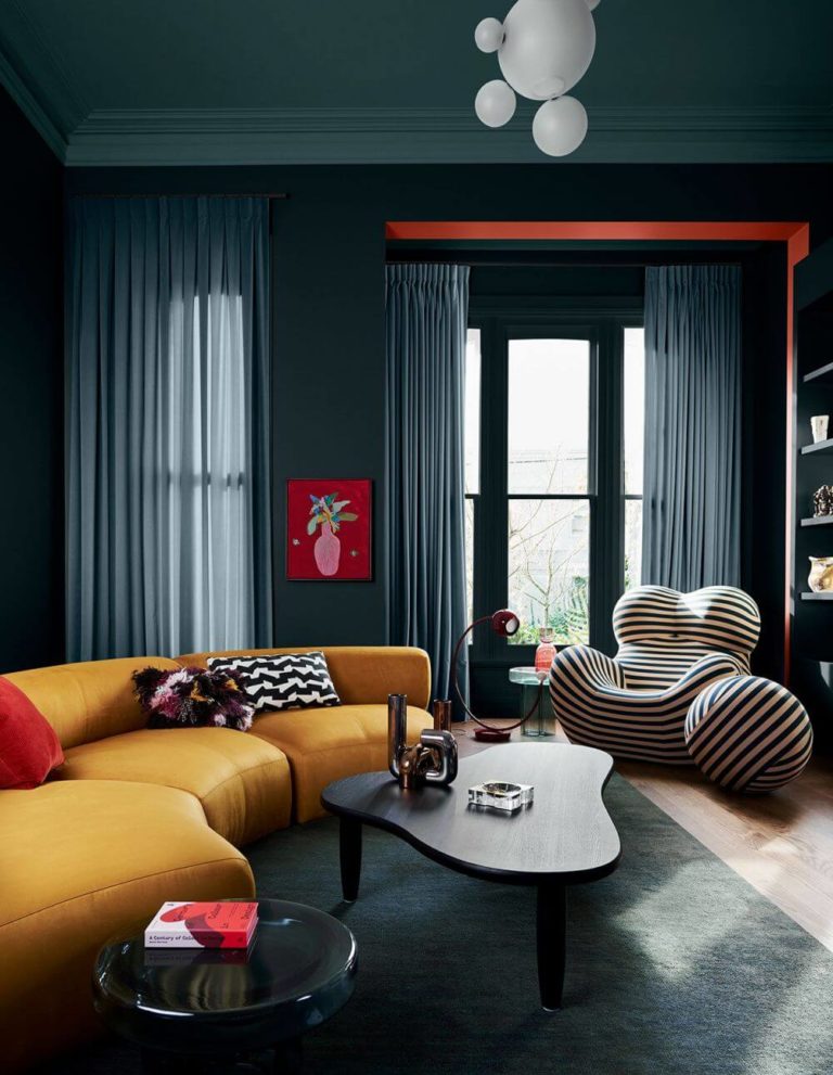
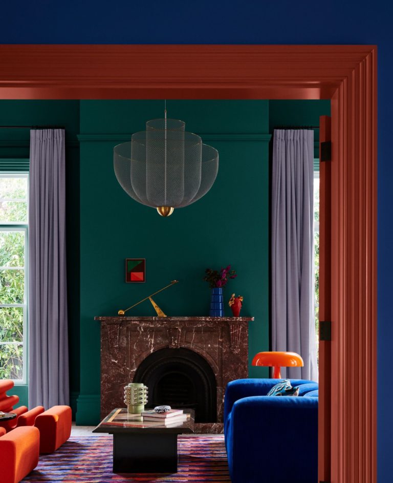
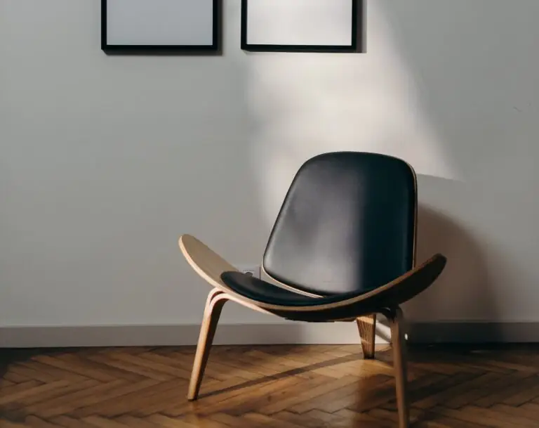
As much as colorists and interior designers love the 2023 paint color trends, they are ready to embrace what the new season brings. At some level, the latest forecast feels like the continuation of the 2023 trendy color palette. It upgrades the known color collections through brighter and more adventurous shades.
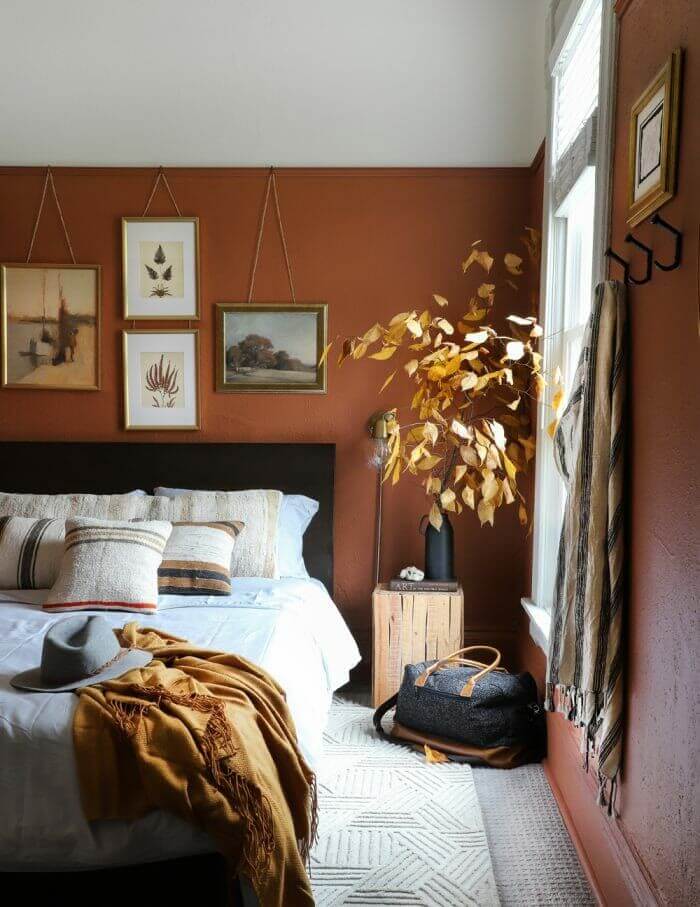
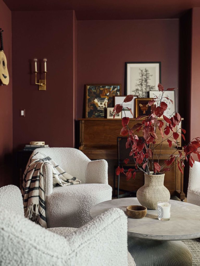
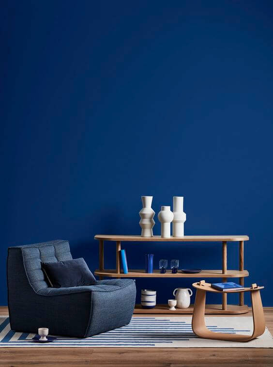
The leading color trendsetters have already revealed their 2024 forecast. Thus, we can underline the steady relevance of timeless neutrals, yet this season surprises us with warm and blush neutral shades. Greens and especially blues become trendier. Unexpectedly deep and surprisingly dark tones also join trends. Moreover, last season’s favorite, purple, still holds one of the leading positions. Bright reds, pinks, yellows, and oranges are also invited. Not least, we cannot help but admire the paint brands’ decision to preserve the warm and comfy earthy shades this season as well.
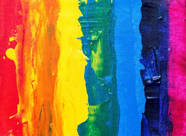
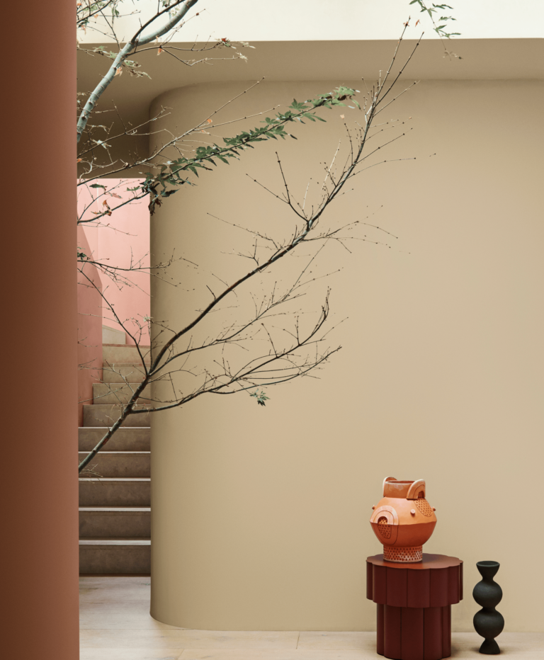
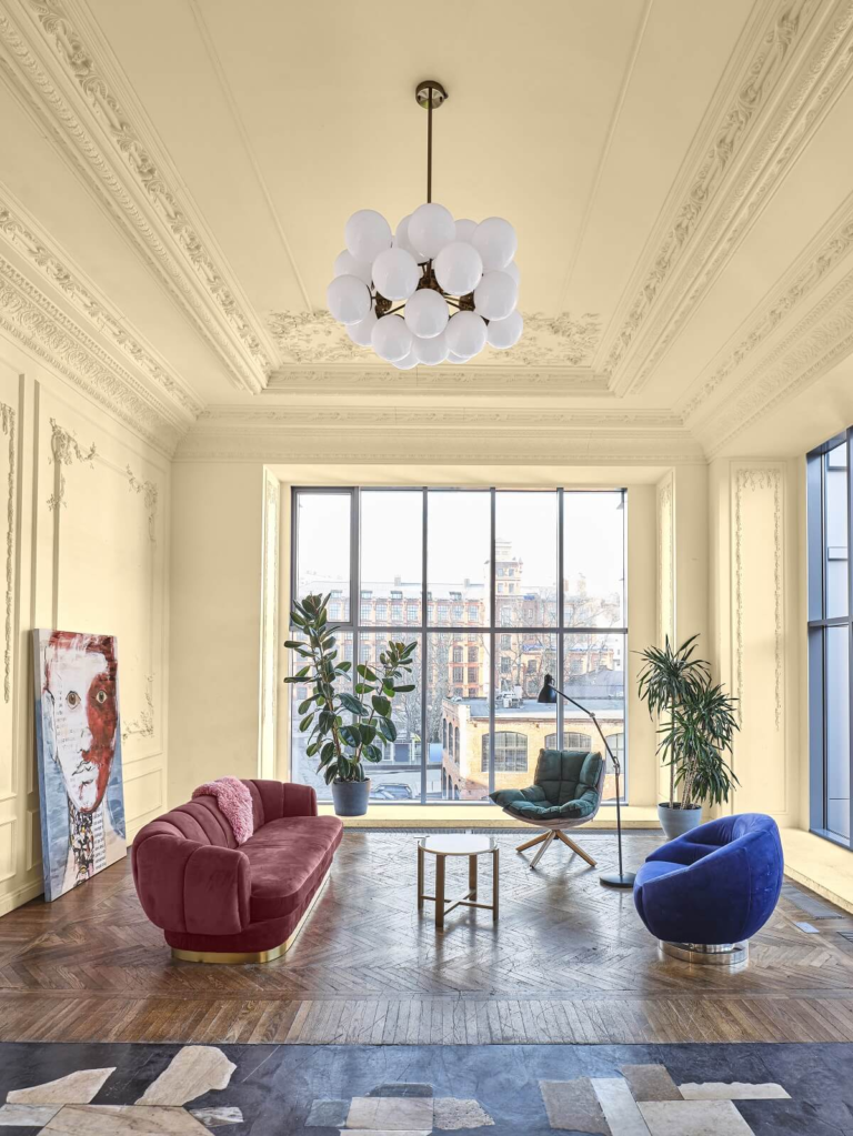
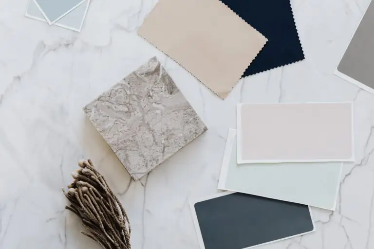
Unsurprisingly, the trending paint color palette is impressively wide. Homeowners and designers can choose any color to tell their story, from unconditionally lovely pastels to radiant pinks. “There are no rules. It is really about how one feels on any given day and what resonates at the moment,” states Laurie Pressman, Pantone Color Institute vice president.
Let’s find out what colors will dominate interior design in 2024. We included the colors of the year we know so far and trending paint colors from renowned manufacturers like Benjamin Moore, Sherwin-Williams, Behr, and Dulux. And the list doesn’t end here.
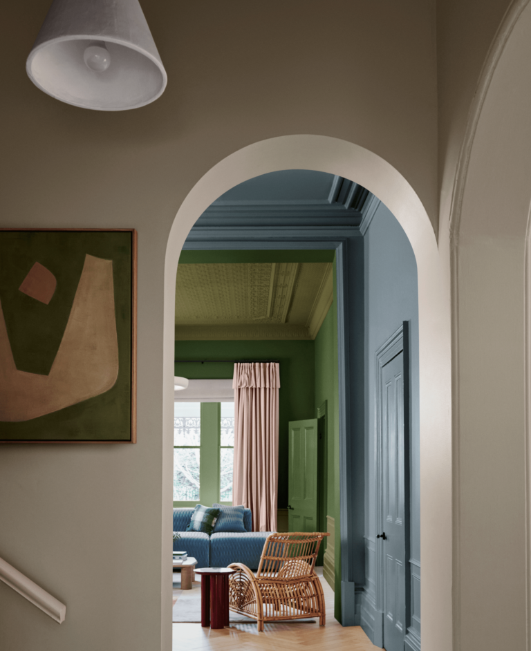
The brand’s trendy color palette encourages us to explore and discover. Open new horizons with color. Thus, a selection of deep blues, earthy greens, warm pastels, and cheerful summertime colors awakens our appetite for creativity. In addition, the trending color selection inspires us to add personality to our homes with these magically delightful shades of unconditional color.
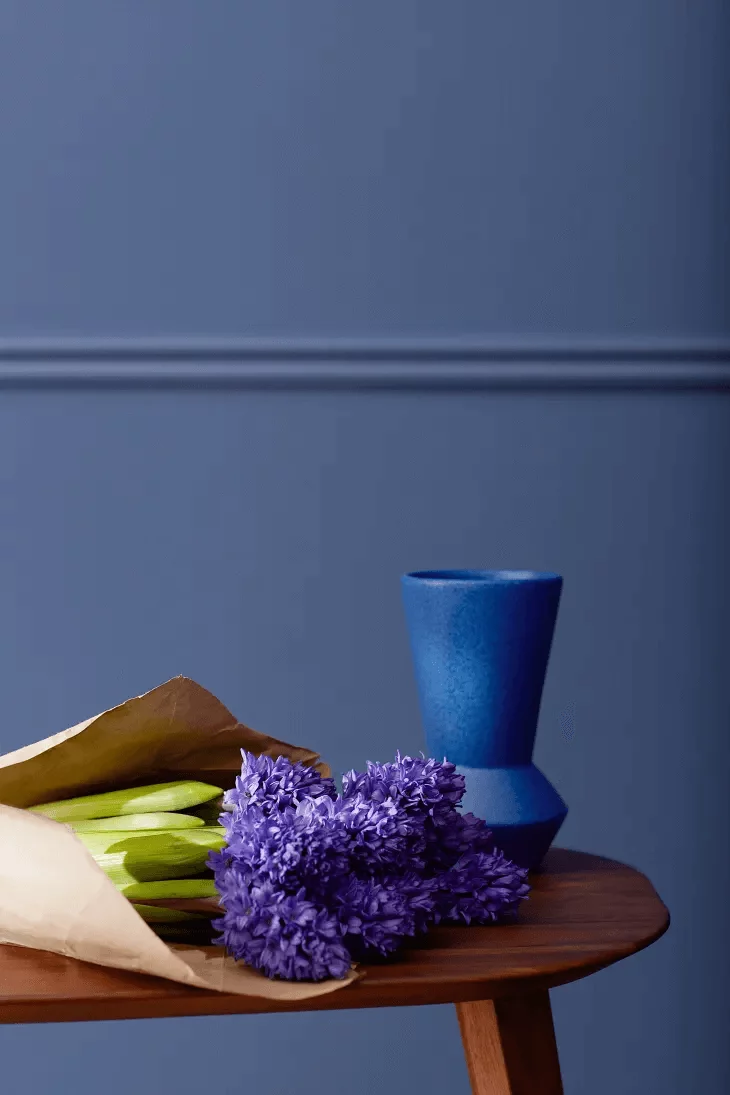
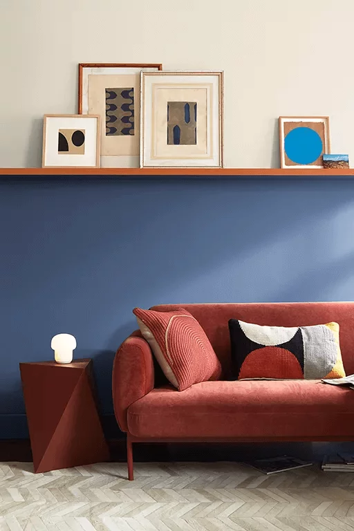
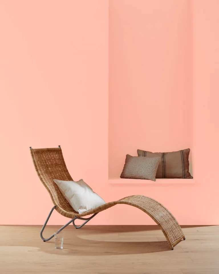
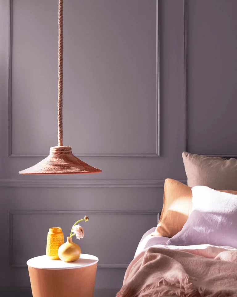
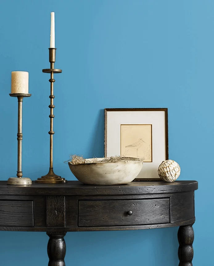
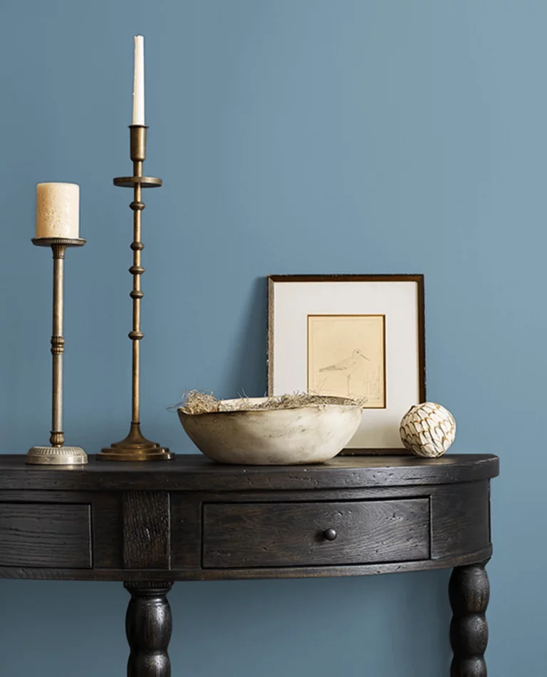
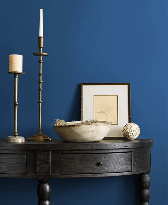
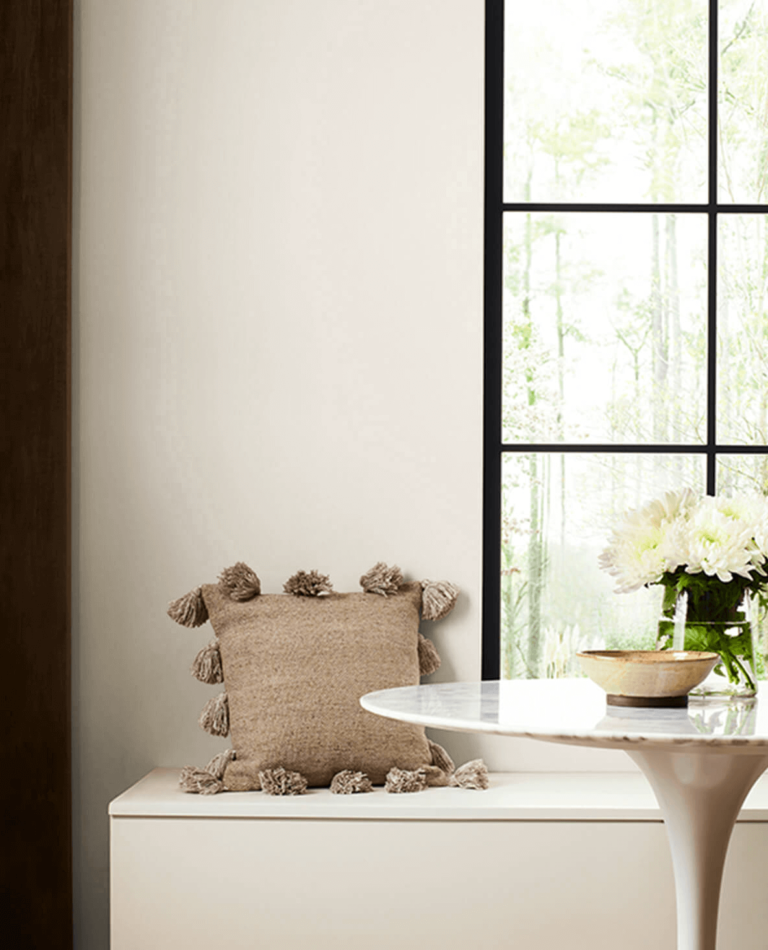
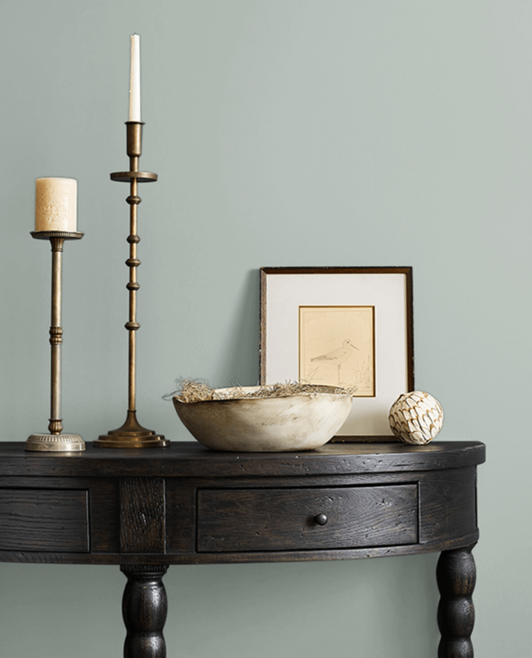
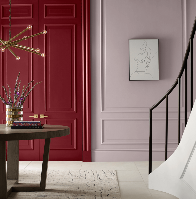
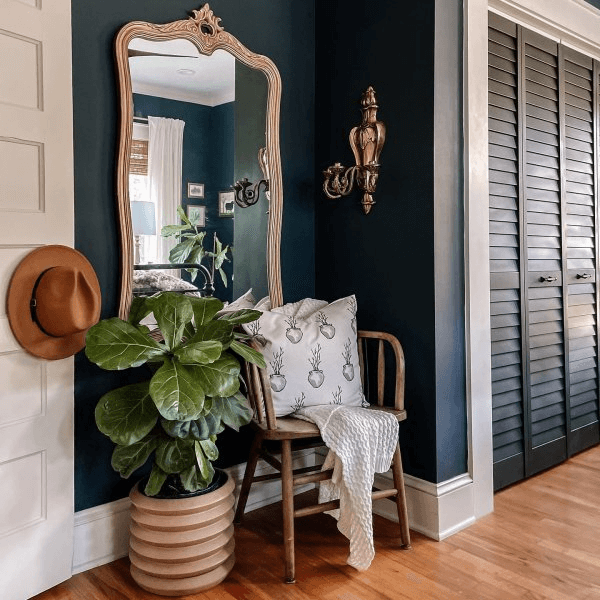
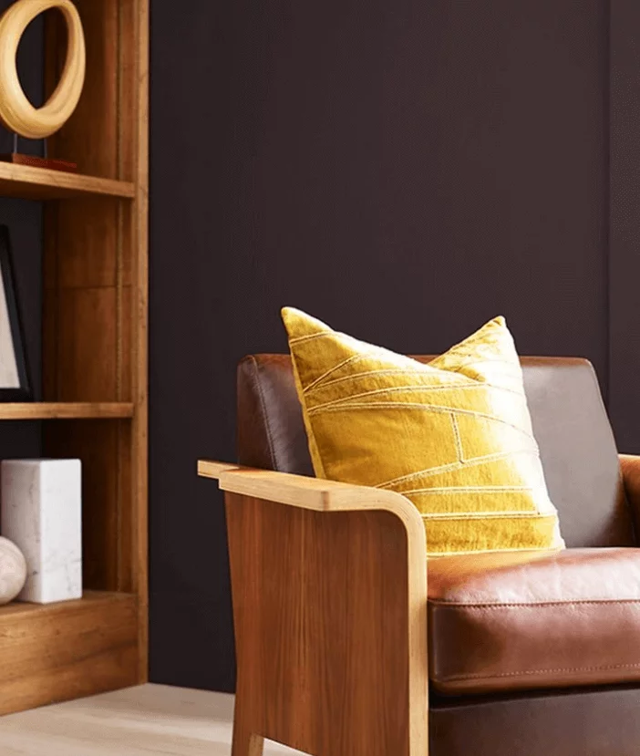
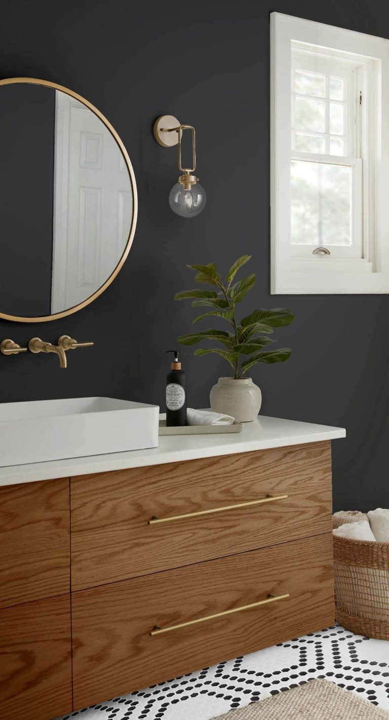
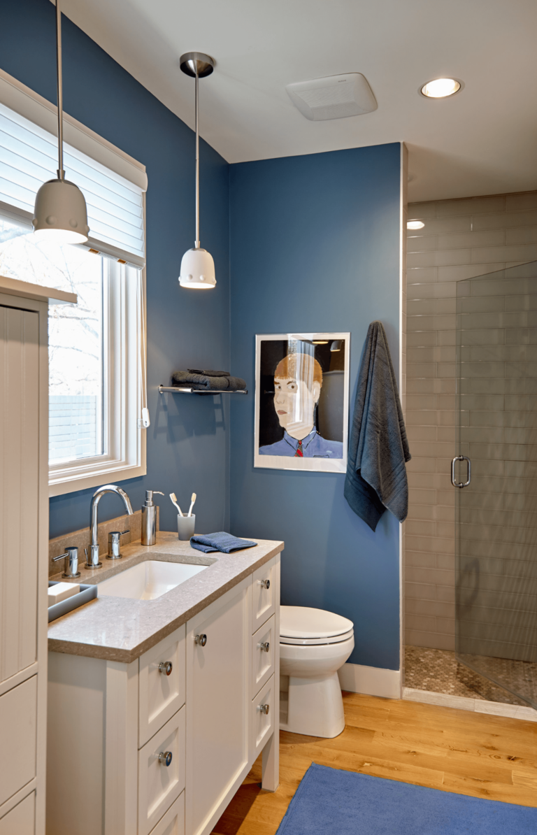
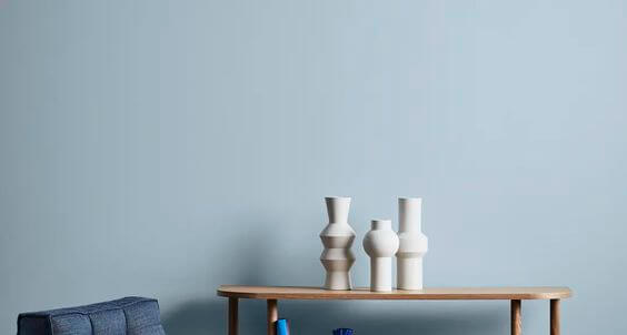
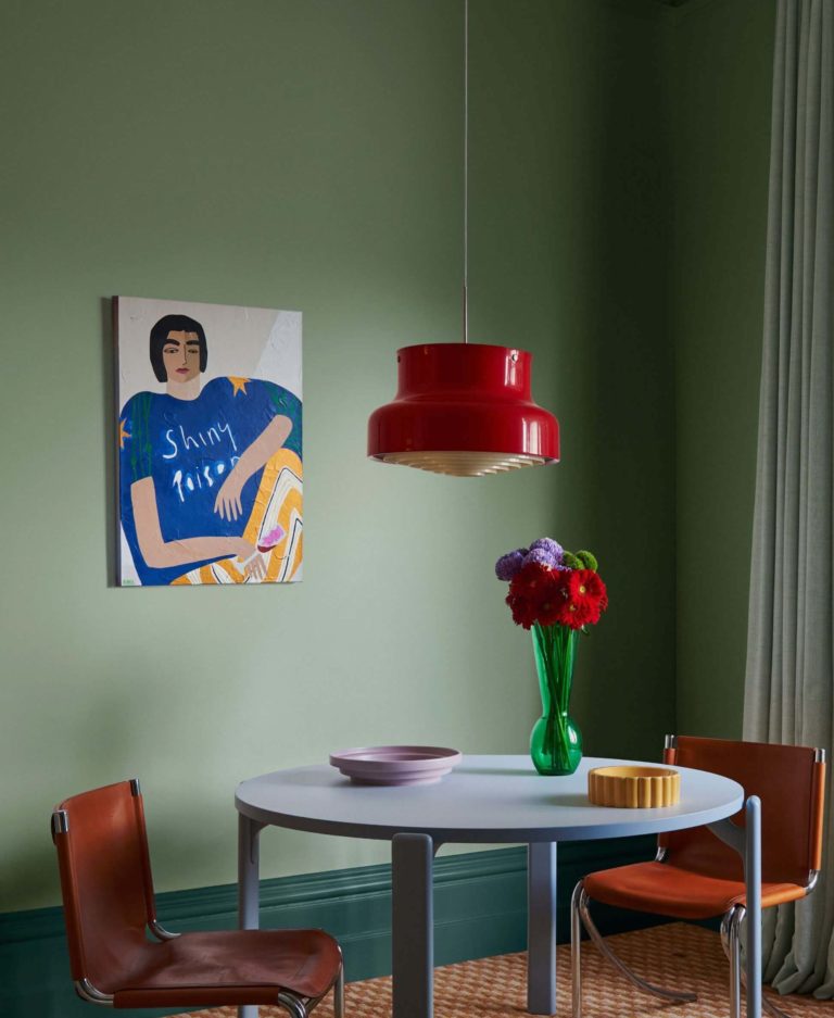
Part of the Classics collection, this enigmatic blue with soothing violet undertones invites us to discover the balance of intriguing and timeless. Think out of the box and get reassurance in your design endeavors with this experienced shade of explorative blue.
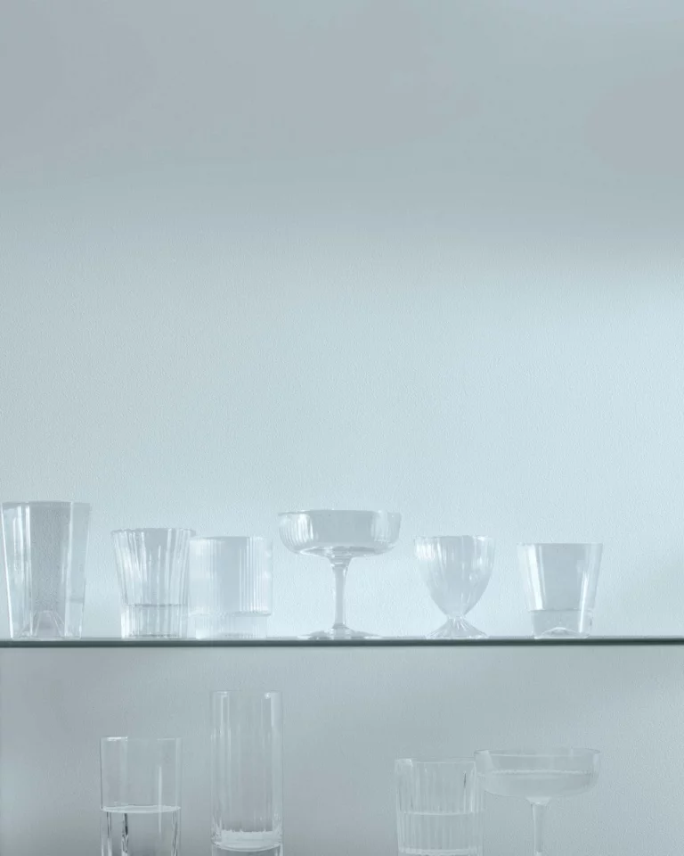
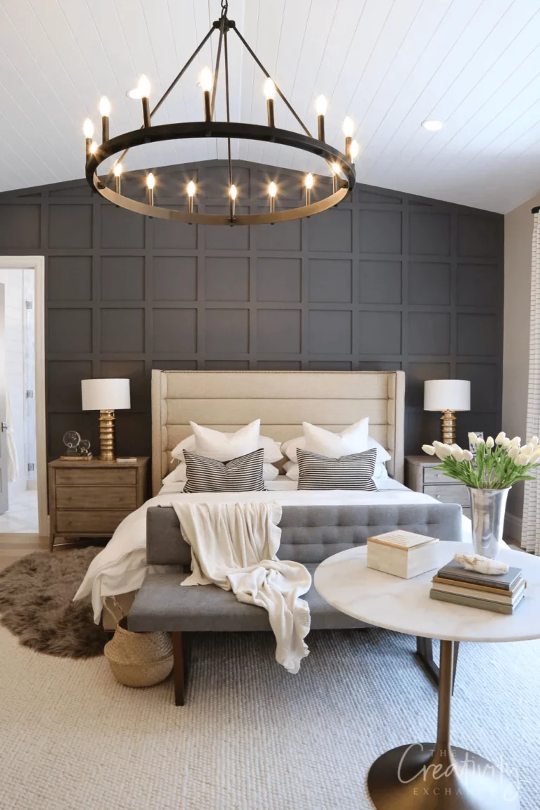
Trending Paint Colors
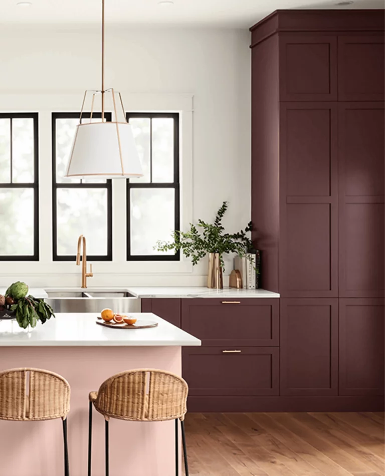
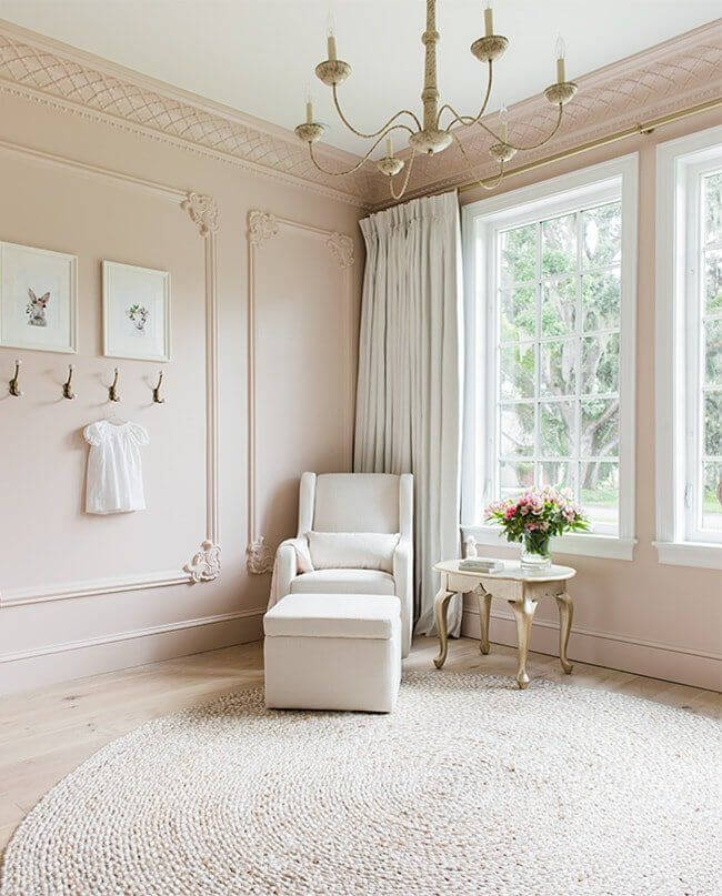
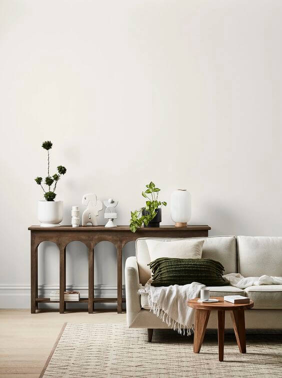
White Dove OC-17– versatile and inviting warm white with a creamy undertone, one of the best-selling white paint colors;
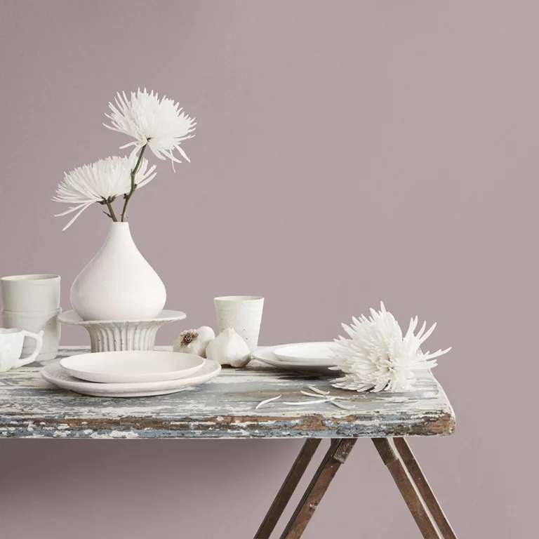
Pristine OC-75 – the most delightful dusty rose notes define this charming off-white tone;
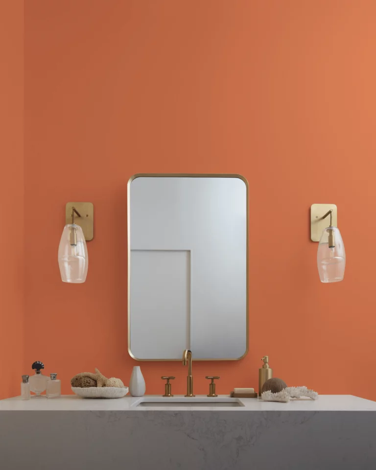
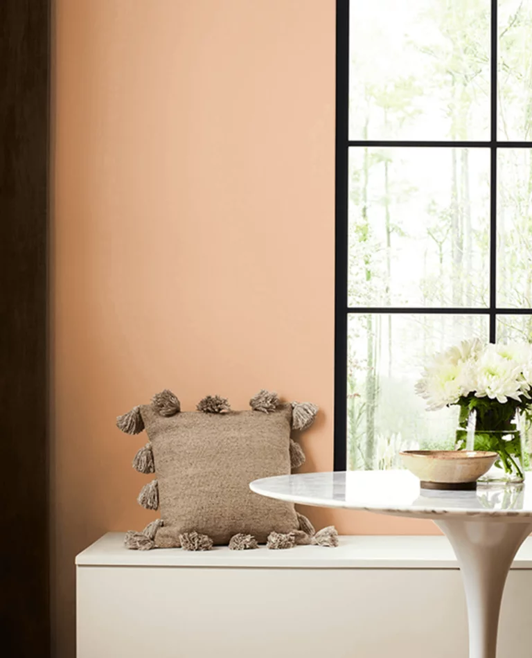
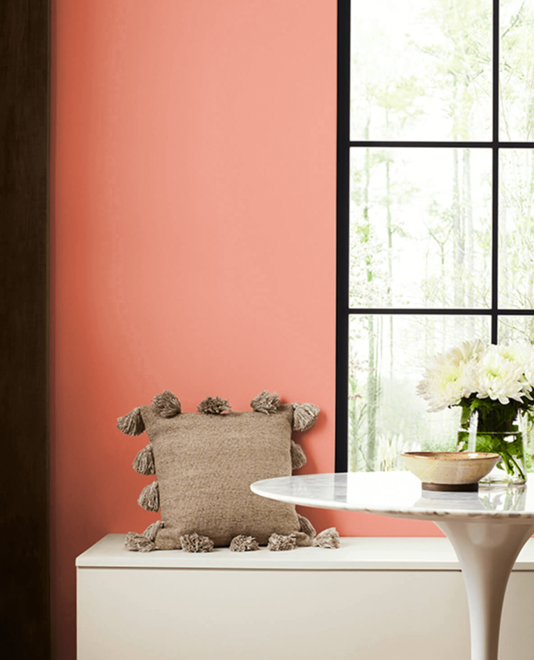
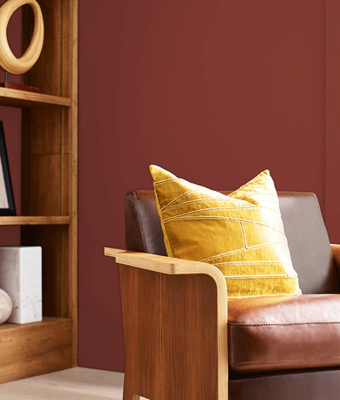
Topaz 070 – a hypnotizing orange shade with red-brownish undertones that will steal the spotlight;
Teacup Rose 2170-50 – a catchy tone of pastel pink-coral that will charm you at first sight;
Honeybee CSP-950 – this delicious yellow smells like honey despite its relatively soothing color base;
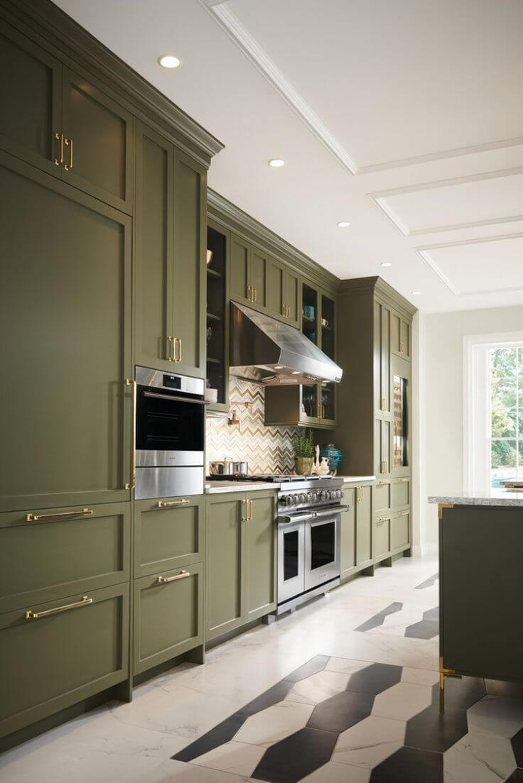
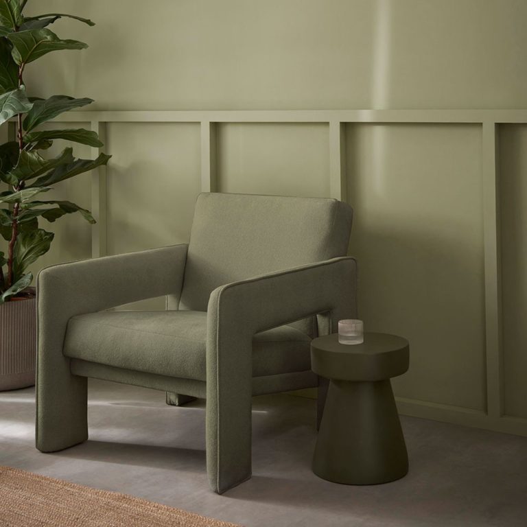
Regent Green 2136-20 – a surprisingly deep and dark pine green almost merging into black;
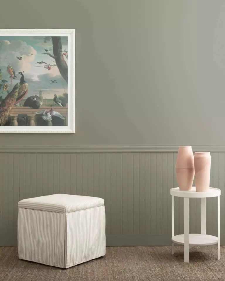
Antique Pewter 1560 – a classic shade of sepia green diluted with gray that resonates with the old-time sense of natural beauty;
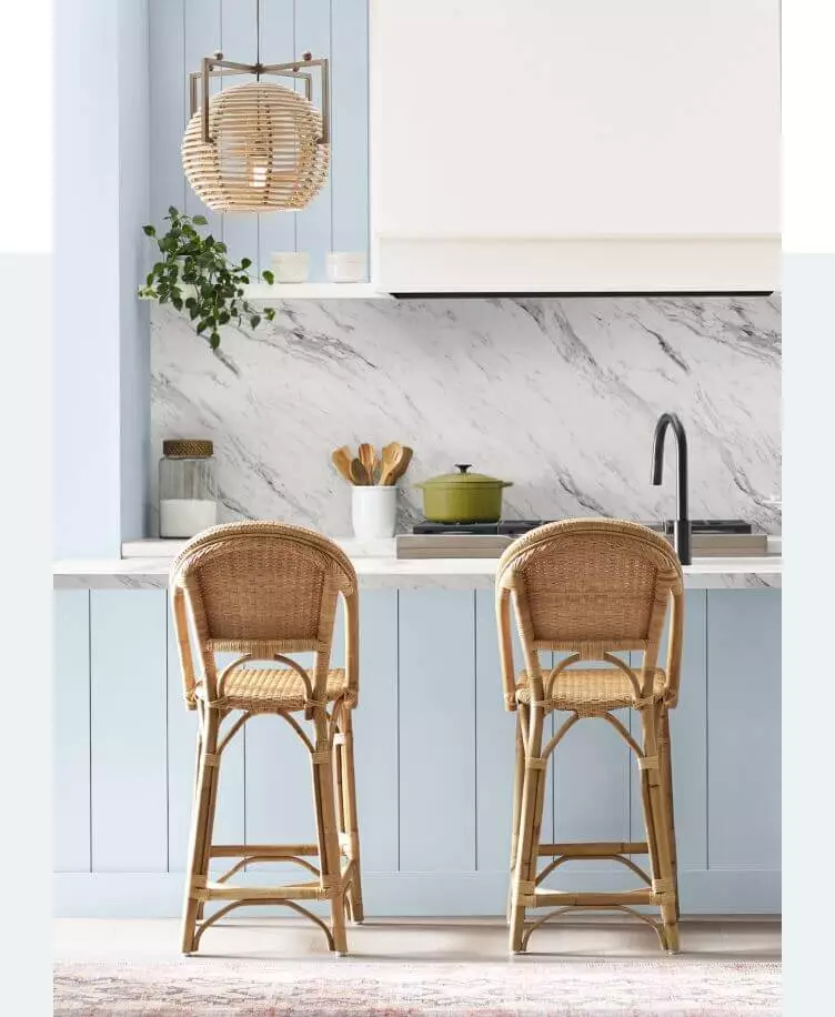
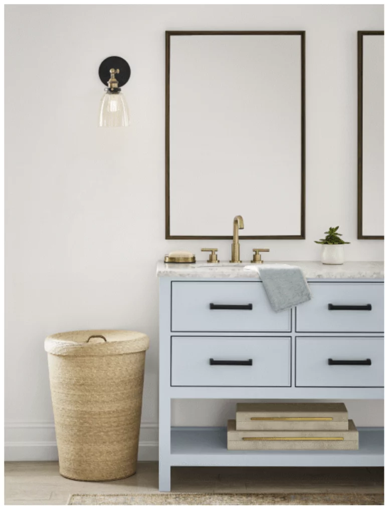
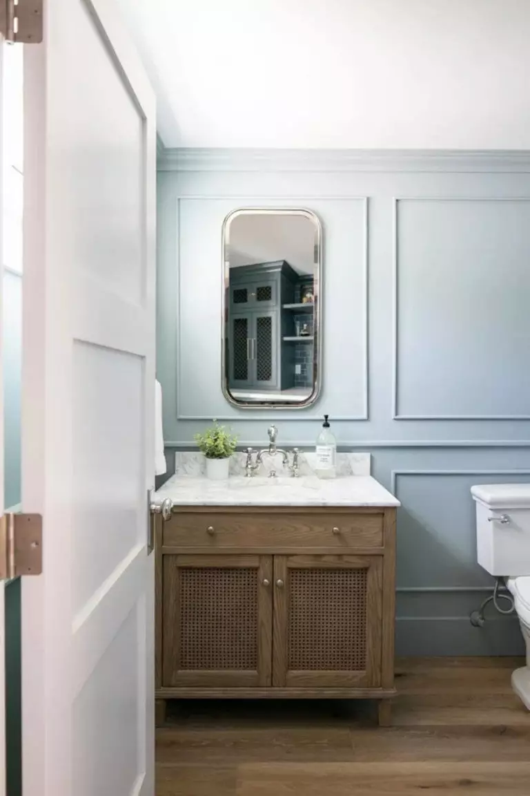
Polar Sky 1674 – in contrast with other shades in this selection, this pale blue is considerably brighter, resonating with the winter morning sky;
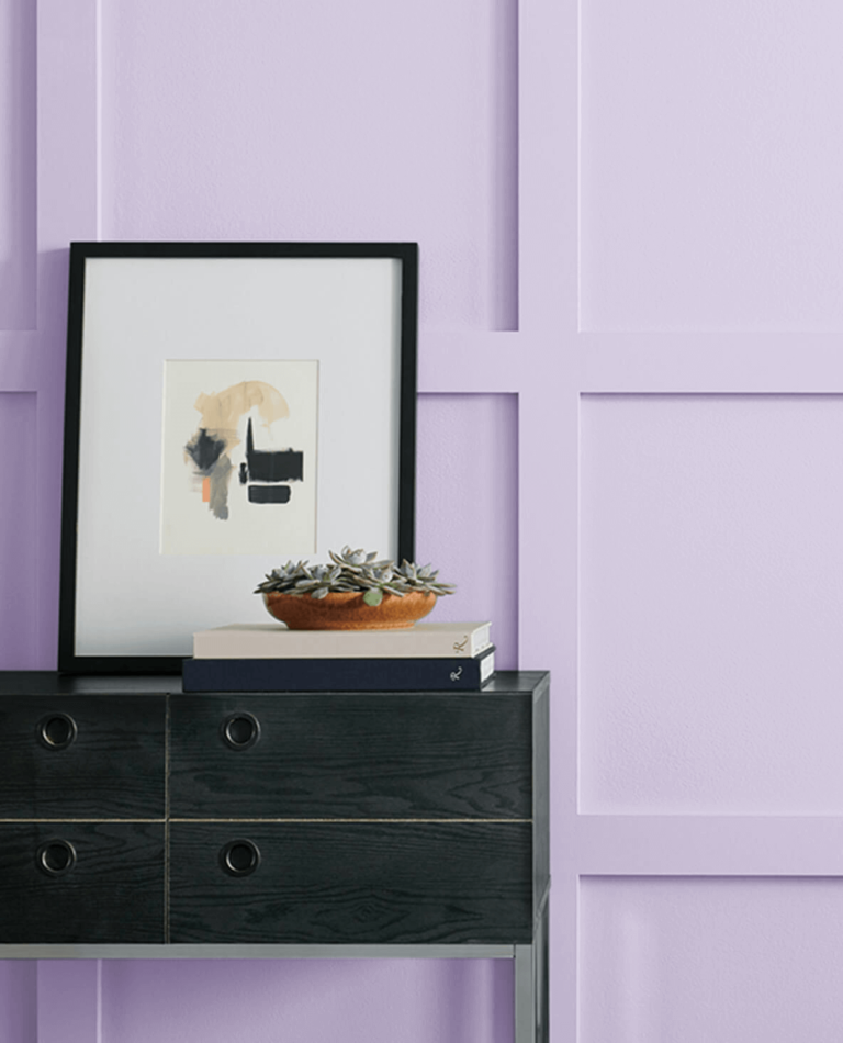
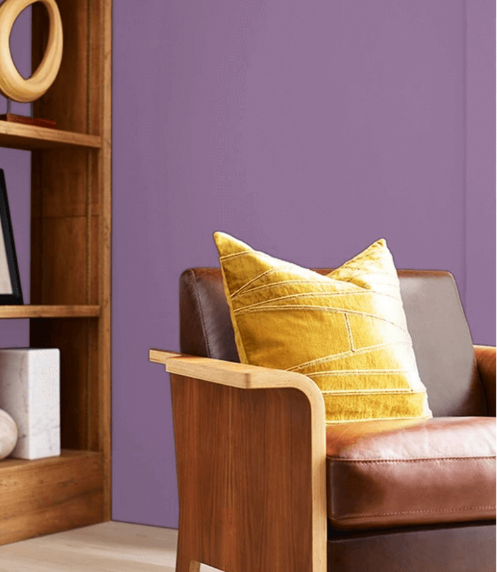
Hazy Lilac 2126-40 – a middle-tone purple with a foggy cover determined by the subtle trace of gray.
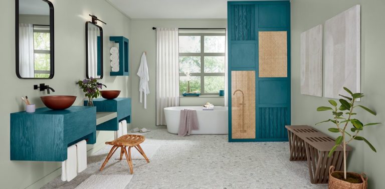
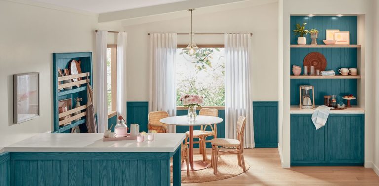
One of the leading color trendsetters reveals a vast selection of trending paint colors meant to emphasize the shift to a new era of colors and experiences. Colormix Forecast 2024 appears under the title Anthology: Volume One and puts a collection of 48 paint colors separated into four distinctive groups at our disposal.
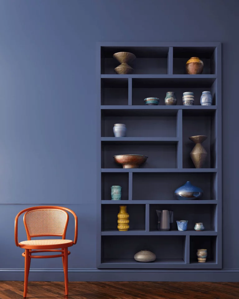
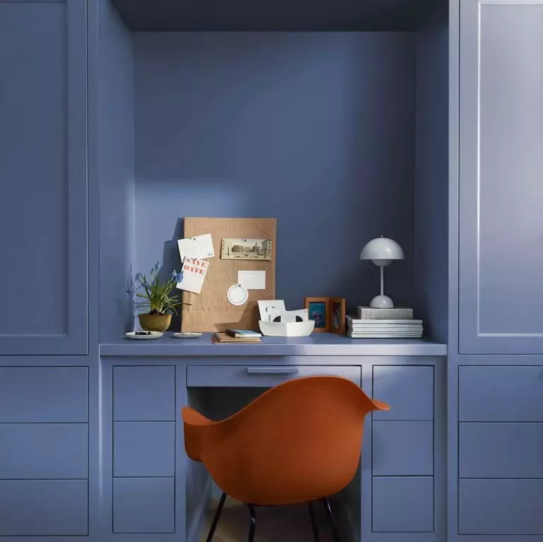
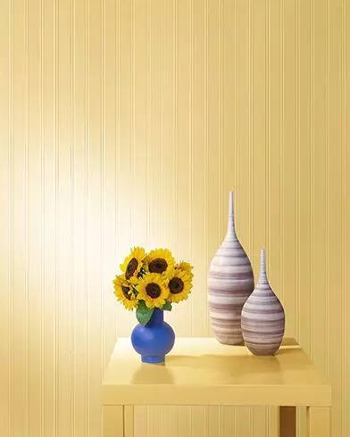
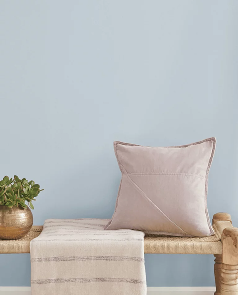
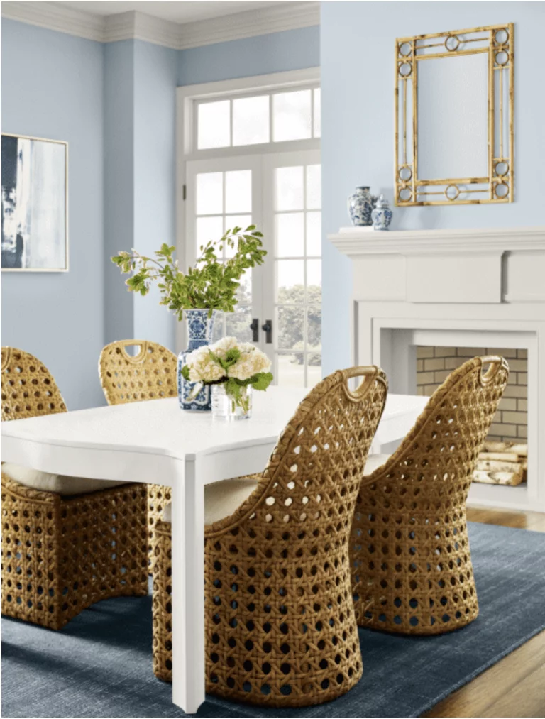
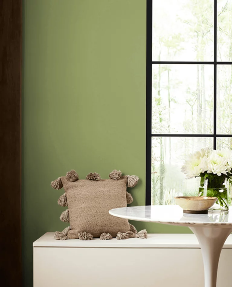
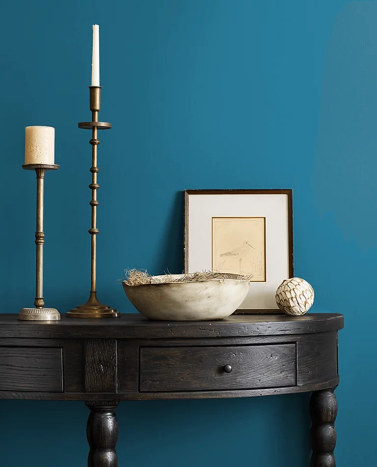
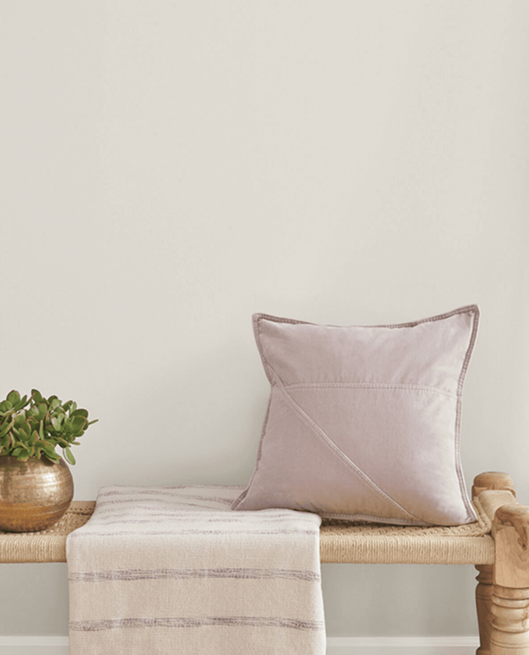
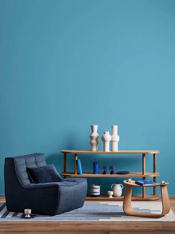
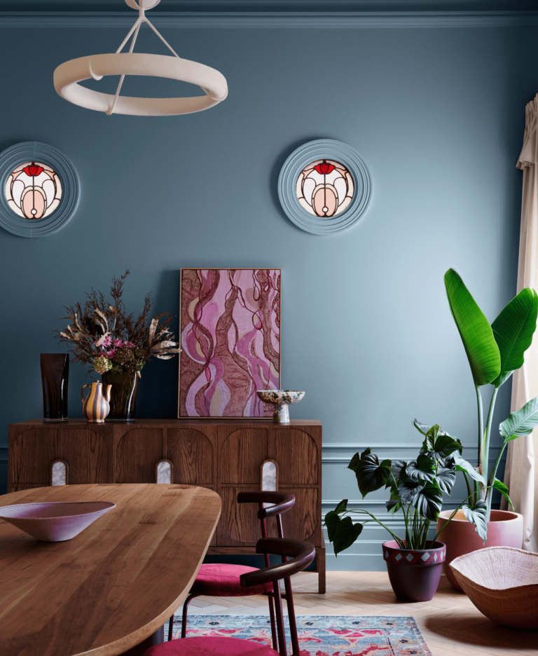
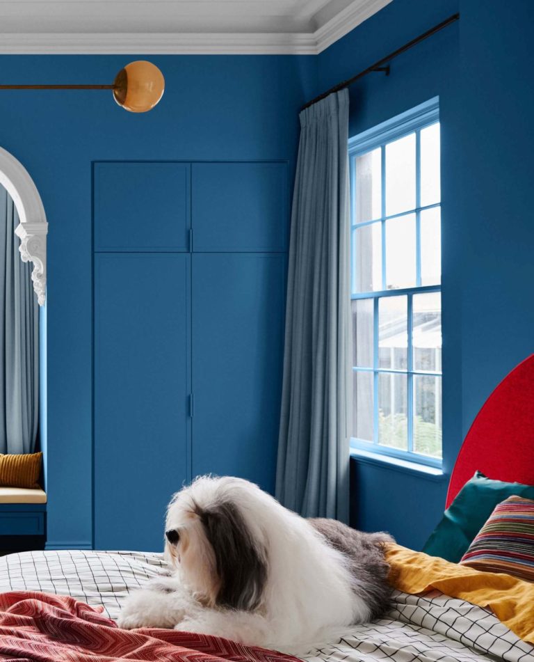
Allow your mind to restore peace and serenity by decorating your home with this trendy shade of blissful and airy blue. Worries stay at bay while a breezy feeling of calmness uplifts your mood when surrounded by this thoughtful blue.
Trending Paint Colors
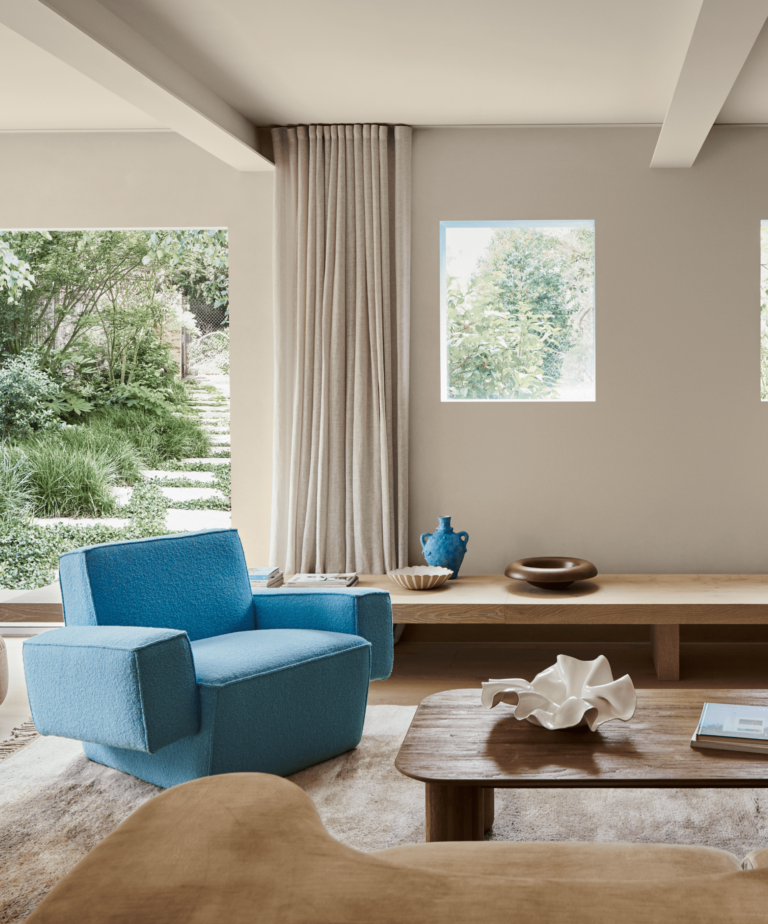
Blues and Greens
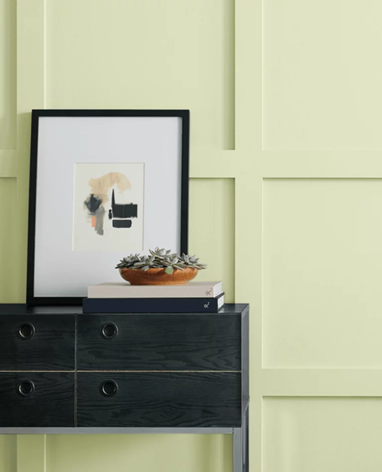
Honeydew SW 6428 – a newly introduced shade of lemon green diluted with the slightest tinge of yellow;
Aquastone SW 9043 – the merge between blue and green defines the name, while the color shade reveals a vivid mint green with blue undertones;
Stardew SW 9138 – recreate the perfect escape with this balanced green-blue stone color that reads dreamy and peaceful;
Evergreen Fog SW 9130 – this top interior paint replicates a perfect green shade, meeting a subtle veil of fog under blue compulsion;
Jacaranda SW 6802 – a vividly enchanting shade of blue with a delicate shadow of green, perfect for creative design projects that require bright colors;
Leapfrog SW 6431 – expert pick paint with a veggie green tint that looks exotic and creative;
Smoky Azurite SW 9148 – another new shade on the horizon; this washed-out denim blue with yellowish-gray undertones will add the right amount of comfy sophistication to any room;
Pewter Green SW 6208 – another expert pick paint color; this earthy green tone perfectly compliments wooden and metallic accents;
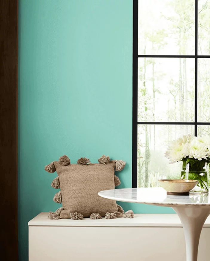
Georgian Bay SW 6509 – an unapologetically vivid teal color that brightly pairs blue with green, best used in well-lit spaces;
Billiard Green SW 0016 – a historic tone of deep green that bears the legacy of the past royalties;
Indigo SW 6531 – this deep and vibrant violet-blue, borrowed from last season’s collection, keeps prevailing over blue paint color trends this year as well.
Delicate Tints
Snowbound SW 7004 – this top white paint color mixed with yellowish-gray is one of the most beloved interior and exterior paints;
Heron Plume SW 6070 – this delicate and warm white gets its sophisticated attitude from a subtle violet tinge;
Fleur de Sel SW 7666 – a coastal off-white with pleasantly disturbing green traces that bring the outdoors closer;
Egret White SW 7570 – slate off-white with the coziest undertones that add delicate calmness to any interior space;
Drift of Mist SW 9166 – renowned neutral shade rendering a combination of gray and off-white under the spell of the comfiest notes;
Modern Gray SW 7632 – the unforgettable warmth of this light gray makes it a perfect backdrop for any design endeavor;
Silver Strand SW 7057 – another colorists’ favorite, this airy green-gray will uplift the mood in any room;
Sand Dollar SW 6099 – a creamy orange neutral that perfectly showcases the new-era neutrals with warmer and softer features;
Light French Gray SW 0055 – everything is perfect about this top gray paint that effortlessly balances cool and soft, versatile enough to be used in any space;
Skyline Steel SW 1015 – borrowed from last season’s trendy palette, this gorgeous stone gray with warm traces serves as a perfect canvas for any design idea;
Jogging Path SW 7638 – a muted gray shade with subdued green undertones that brings organic naturalness to your home;
Silvermist SW 7621 – find escape with this delicate green-gray that brings nature closer and keeps worries at bay.
Reds and Purples
Rhapsody Lilac SW 6828 – an updated version of one of the trendiest paint colors resembling lilac in full bloom;
Soft Apricot SW 6352 – a delicious apricot color diluted with water for a soft orange shade meant to inspire and make you think out of the box;
Sashay Sand SW 6051 – a pottery dusty rose, pretty bright and soft, that will charm you with its daring and unusual character;
Ravishing Coral SW 6612 – a middle-tone coral-orange with the most vivid yet uniform spread of magnetizing undertones that awaken the appetite for positivity;
Intuitive SW 6017 – unlike most paints in this collection, this muted violet with strong gray ties serves as a more neutral alternative to bright and catchy colors;
Redend Point SW 9081 – the color of the year 2023 proudly enters this vivid color palette, revealing one of the best earthy red tones with a pottery personality;
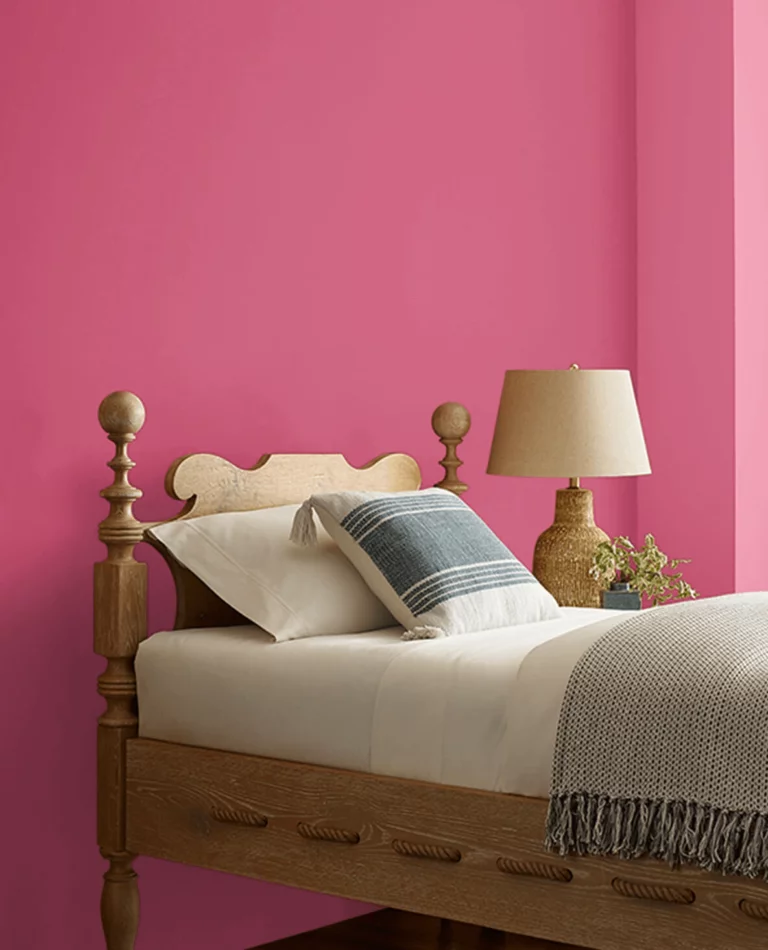
Dragon Fruit SW 6855 – one of the brightest pink shades you’ll ever see that firmly stands out on this color palette of the most radiant shades;
Veri Berri SW 9069 – a deep yet impressively roaring violet tone that almost smells and tastes like summer berries;
Chinchilla SW 6011 – a pretty dark purple-brown with a soft creamy cover that serves as a brighter substitute for classic brown paints;
Habanero Chille SW 7589 – one of the best representatives of the adventurously bright paint colors this season, a vivid orange-red that instantly steals the show;
Fireweed SW 6238 – this charming yet intensely dark red-brown will steal your attention with its bright notes;
Wild Currant SW 7583 – a timeless shade of fully ripe red currant that almost turns into a deep red-brown, perfect for those who want to replace traditional neutrals with evergreen bright shades.
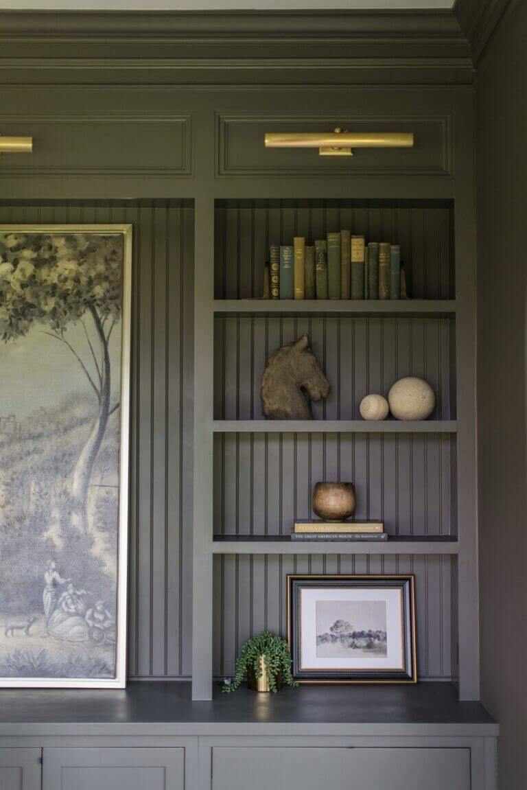
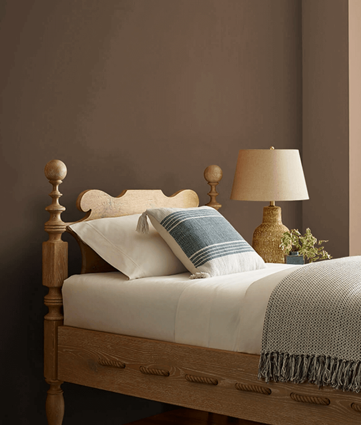
Deeps and Darks
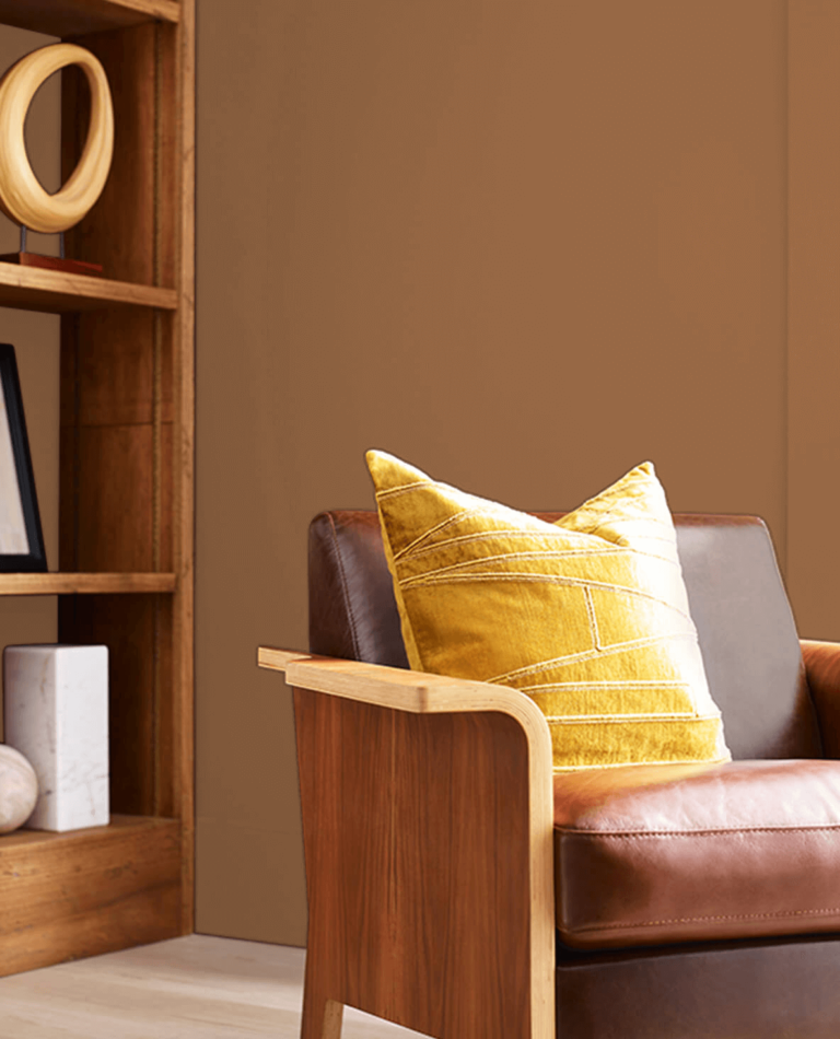
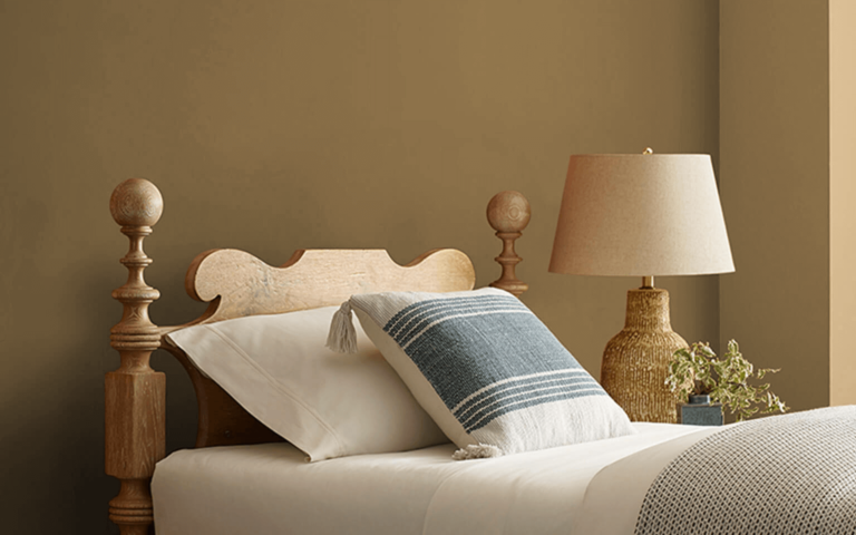
Antiquarian Brown SW 0045 – designers simply love this historic brown with a dark color base and the slightest yellow touch;
Mossy Gold SW 6139 – a pretty intense yellow tone mixed with a tremendous amount of moss green, resulting in an organic dark paint color;
Palm Leaf SW 7735 – make the best contrast in your home with this deep green filtered by a sepia effect that feels so natural and veggie;
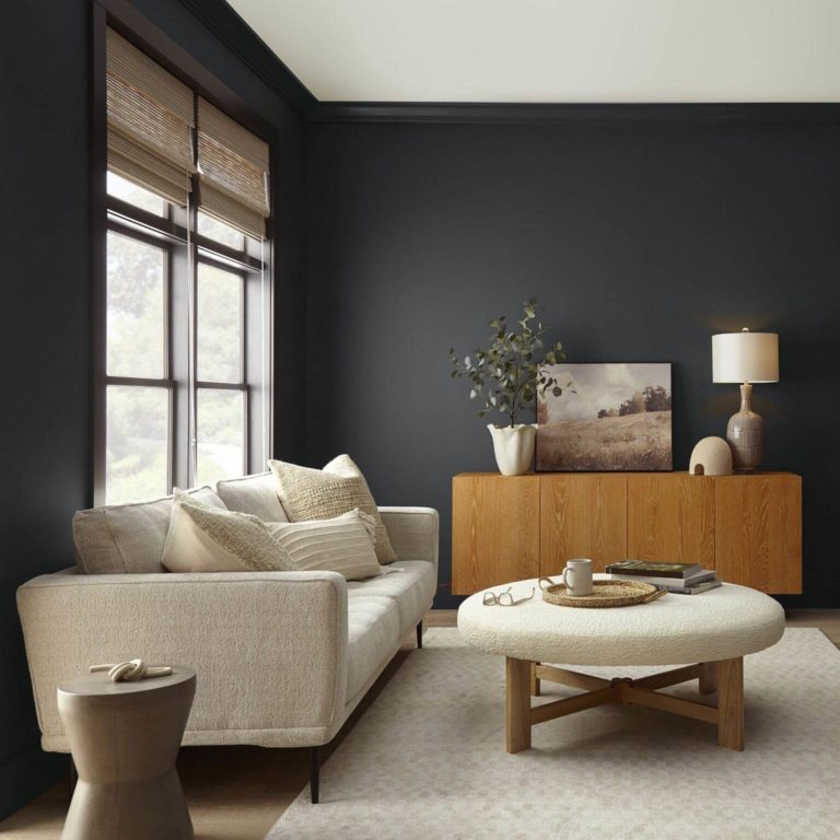
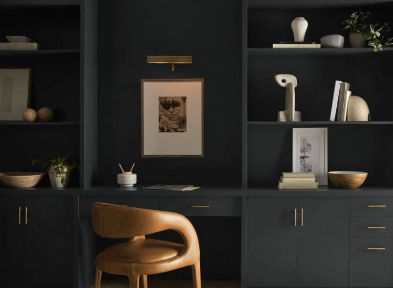
Peppercorn SW 7674 – an intriguing dark gray almost fading into black, a favorite among designers and homeowners who crave contrast;
Roycroft Bronze Green SW 2846 – the historic shade of earthy green will beautifully add mystery and timelessness to your modern interior design;
Half-Caff SW 9091 – this intensely earthy brown with cozy undertones will transform any room into a space full of personality and edge;
Rock Bottom SW 7062 – the slate green shade inspired by deep forests will nurture your craving for natural, deep, and intense;
Carnelian SW 7580 – heritage brown-purple that will share its legacy with your interior design; part of last year’s trendy paint colors;
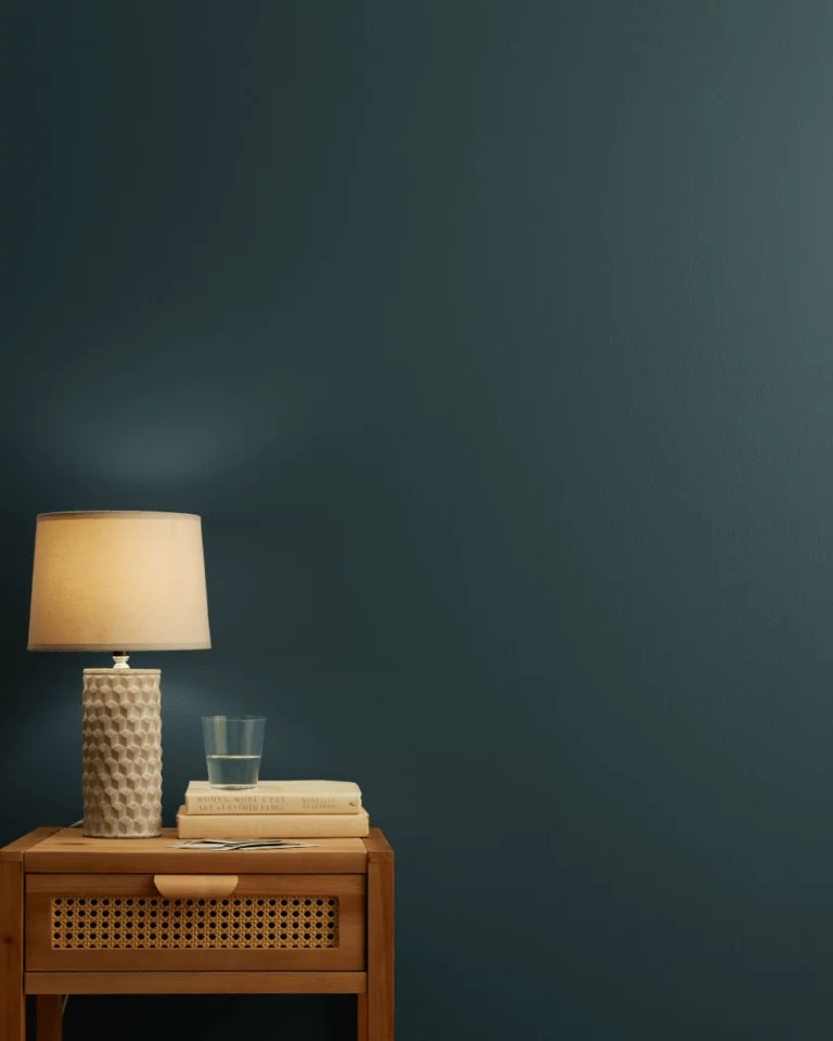
Gale Force SW 7605 – the further we go, the darker colors get; try this unconditionally deep blue tone with green undertones in well-lit spaces;
Sealskin SW 7675 – colorists favor this dark grayish-brown for its relatively neutral and unobtrusive contrast;
Tricorn Black SW 6258 – another expert pick shade, this time a mysterious black tone that quickly became designers’ favorite;
Raisin SW 7630 – a dried grape color that has the ability to invite drama while keeping any space comfy.
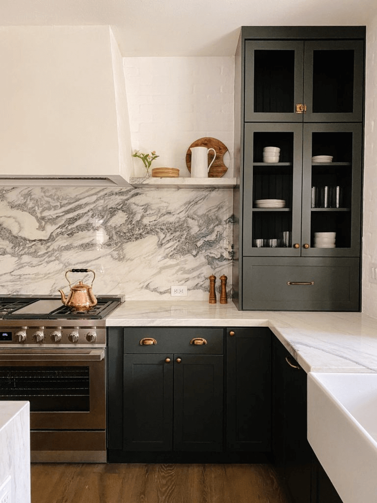
The giant paint manufacturer surprises us this year with a perfect collection of trendy paint colors of every type that smoothly flow one from another. Thus, the selection starts with illuminating neutrals, goes on with contrastive accents, and reaches the deepest shades ever. So, their palette meets anyone’s expectations. Pick a color and make it a trend.
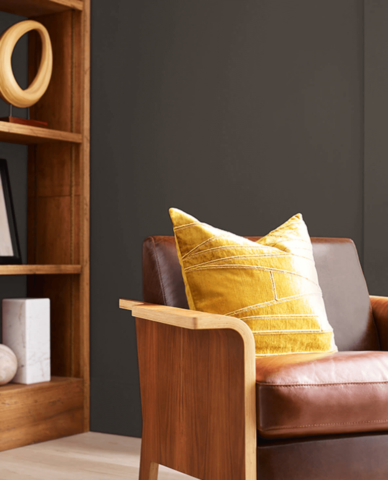
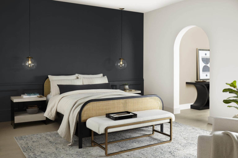
Surprisingly, one of the top trendsetters decided to give the title of the color of the year to an almost black shade of gray resembling the thin pepper dust with a spicy effect on interior design. History repeats itself, and similarly to last year, when Behr stood out with Blank Canvas, a bright white tone, as the head of its palette, this season, it proudly stands out again with the opposite, the most profound and contrastive gray meant to make your daily moments feel special.
Trending Paint Colors
Whipped Cream DC-001 – this light creamy hue gives off the slightest warm effect under the brightest off-white veil;
Weathered White HDC-NT-21 – as if a white-painted surface stood the test of time, this greenish-greige white will soothe any color palette;
Even Better Beige DC-010 – a classic beige shade with a past full of popularity due to its perfect look and instant state of calmness;
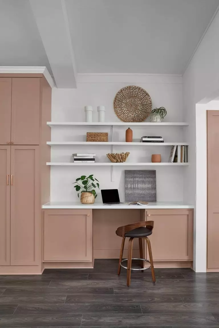
Malted N160-2 – a medium pinkish beige showing how charming and cozy perfectly chosen neutrals can be;
Tranquil Gray DC-007 – this beloved gray tone, revealing a subtle beige trace, knows its way around modern and traditional spaces;
Chic Taupe N230-4 – a perfectly balanced gray-brown by all means; let it become your new favorite this season;
Amber Brew MQ4-10 – an autumnal earthy yellow that induces a cozy state of calmness and retreat;
Riviera Beach PPU7-07 – the sandy beige shade that rushes to enter browns effortlessly brings the coastal vibe into your home;
Orange Flambe MQ1-28 – let yourself be surrounded by this cocoon orange with a vivid signature that will make your home embrace coziness;
Offshore Mist PPU13-16 – a dusty green-blue that will surely expand the borders of any room and make you feel outside while being inside;
Provence Blue HDC-AC-23 – this mysterious gray-blue with weathered green undertones and a delicate air will take you to the unsophisticated Provence lifestyle;
Rumors MQ1-15 – catch up on the latest gossip – this brownish-red paint with a subtle grape fragrance is all the rage now due to its deep and complex look;
Laguna Blue PPU14-18 – an ocean-deep blue diluted with balanced gray for the trendiest marine touch in your interior design, of course, not devoid of personality;
Mountain Olive N350-7A – a flawless pairing between green and earthy notes with the deepest undertones to share its love for organic beauty with your home design.
This trendsetter allows us this year to experience a vast range of trendy paint colors and use them to tell our story. Does your lifestyle resonate with yellow-pigmented colors, pinkish clays, earthy browns, deep blues, or organic greens? Dulux’s new paint color palette has representatives from each, separated into three distinctive groups.
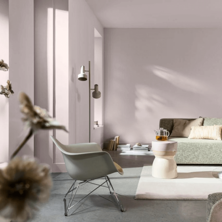
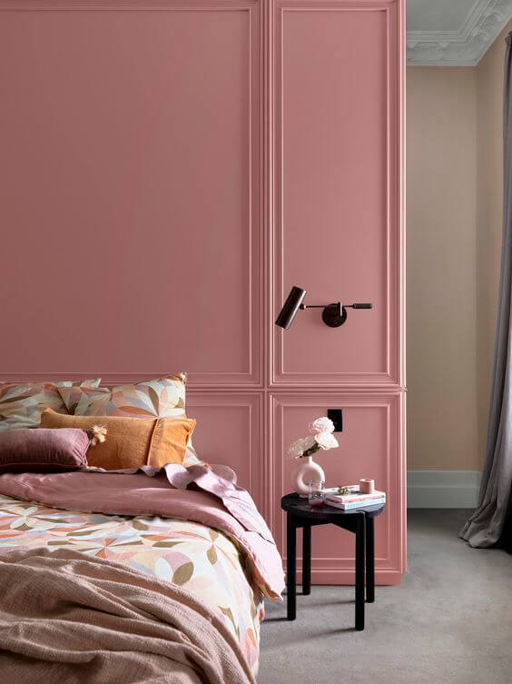
Dulux went with a no-fail option for the upcoming season. It feels like we all need a soft embrace in the inconsistent world we live in now. This affectionate pottery pink whispers words of calmness and keeps all worries at bay, ensuring a light and comfy place at home. Aside from being a great stand-alone paint color, Sweet Embrace perfectly pairs with a wide range of colors.
Trending Paint Colors
Solstice
Natural White– compared to true white, this one stands out as an organic white shade you can notice in nature, be it linen texture, cotton plant, or white stones in the Mediterranean;
Light Rice Half – the softest beige shade full of body and attitude that will effortlessly update the whole color palette in any room;
Handmade Linen Half – a crop yellow shade generously diluted with water and resulting in a pale neutral;
Potter’s Pink– a medium pottery brown that will embrace you like a cocoon and share the love for home;
Jodhpurs – another yellowish tone, a mix of gray and yellow full of character while slightly neutral;
Ripe Lemon – a delicious green-yellow resembling the natural lemon juice color, perfect for a design refresh;
Tan Wagon – wooden brown shade with subtle orange traces, again borrowed from a pottery palette;
Lama – a creamy peachy brownish-orange that you’ll enjoy to the fullest if you fancy a trendy summertime paint sparkle in your home;
Pure Blue – a coastal shade of marine blue that will reach the deepest chords of your soul with its calm and tranquil beauty;
Reddy Brown – get ready to stand out this season with the trendiest and comfiest brown paint color, deep and warm simultaneously;
Empty Stage – this dramatic brown with imaginary green undertones will leave you speechless due to surprisingly intense and natural scents;
Ocean Surf – start a new adventure with the oceanic green-blue that reveals the upper layers of the marine world.
Journey
Pollinate – a mid-tone pastel shade that will change your perspective on yellow tones and make them your new favorite;
Antique White U.S.A. – worn-out white that will add an edgy effect to any contemporary interior;
Lilac Light – the brightest lilac violet with a pinkish tinge you won’t get tired of;
Hay Wain – this stark yellow hue with unconditionally charming green undertones will steal your attention and enliven any design style;
Beige Artefacts – unlike other shades in this category, this sepia beige tone bears the legacy of the past and balances the bright palettes of the current season;
Evening Blush– discover the colorful world of the upcoming season with this trendy creamy pink that you can witness in nature at sunset;
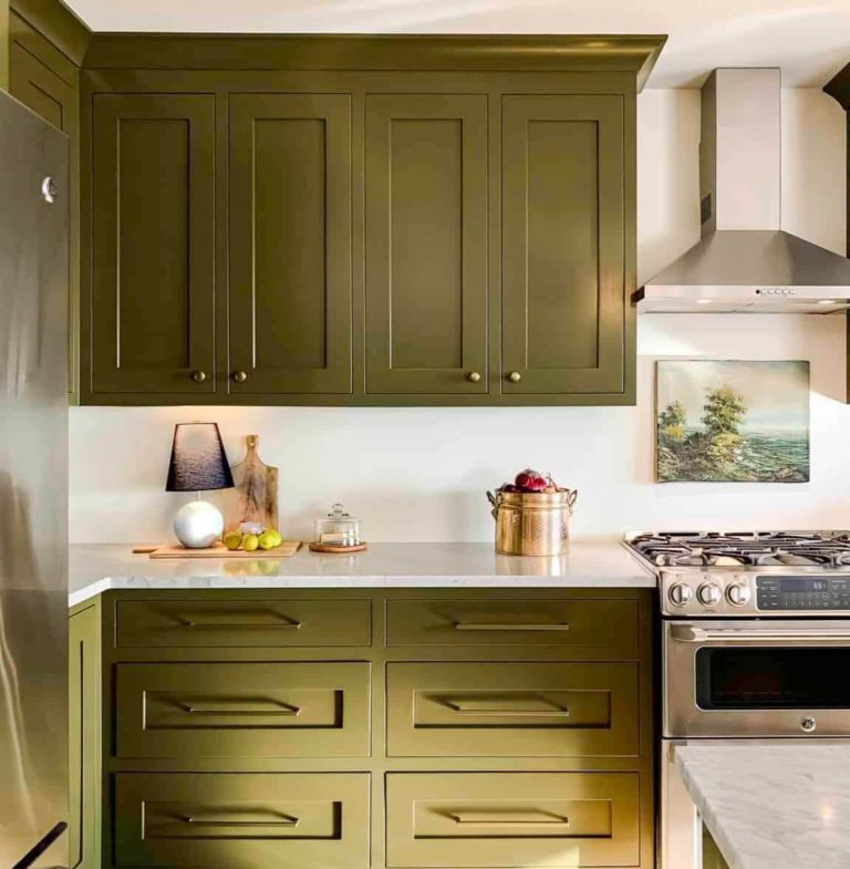
Xena – another voguish olive green that colorists love so much, a perfect match for neutrals and a well-balanced stand-alone paint color;
Clouded Sky – a cloudy gray-blue predicting the storm, which in this case is a creative storm of new design ideas;
Carmen – the name is as beautiful as the color behind, a rich and deep red that knows a thing or two about style, modern beauty, and limitless charm;
Bean Counter– of course, it doesn’t have anything to do with the profession, yet this paint definitely has links with the ripe green bean color, a rather exotic earthy green;
Swedish Blue – not much a blue but an aqua blue-green that you can witness in the wild only;
Bruised Burgundy – a rich and dark brownish-red that reads royal and expensive.
Muse
Lexicon Quarter – this trendy white paint color with refreshing snowy undertones holds the lead of the best neutrals to pair with the colorful pearls that follow;
Poached – a dash of nostalgic notes update this soft yellow shade and brings us back to the old-day comfort;
Tuscan Sunset– similar to the name, this passionate orange-brown with a calming combination of notes radiates warmth and a calm end of the day;
Canyon Cloud – the name reveals the stunning shade of subdued cloudy gray touched by violet, preferred in traditional interiors;
Bryophyte – as sophisticated as the name, this retro shade of green defined by a subtle sepia finish will help you recreate your favorite Retro design plans;
Fantan – create a space of unlimited creativity with this fantastic muted brown that effortlessly hosts any color accents on its backdrop;
Decoration Blue – an emerging modern color that will support your most creative design approach;
Surf Green – a deep mint green that reveals a tiny drop of blue and perfectly complements adventurous design options;
Guitar– this timeless shade of warm brown, slightly dark, follows contemporary rules and serves as a flawless background for brighter pops of color;
Passionate Blue – a striking pop of blue color, as if inspired by van Gogh’s art, hides an immaculate depth polished with late-night magic;
Hidden Depths – like the hidden forest depths, this tropical green with earthy traces impressively well pairs with other vivid shades to recreate the roaring and colorful design periods of the last century;
Fluorescent Fire – a radiant orange-red with a hypnotizing effect, used primarily as an accent color in retro or modern design concepts.
Top Colors of the Year 2024
We’ve covered so far the key paint color trends from top paint manufacturers. Now, let’s discover other trendsetters’ perspectives on color in 2024. To your attention: the prominent colors of the year 2024, as designated by renowned trendsetters from all over the world.
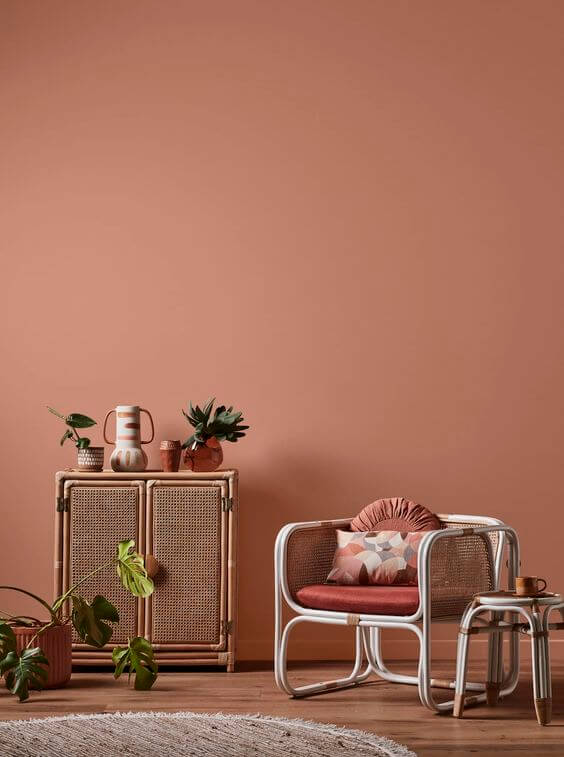
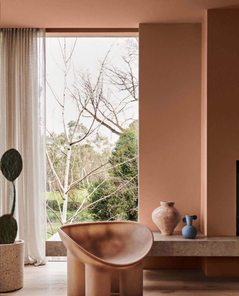
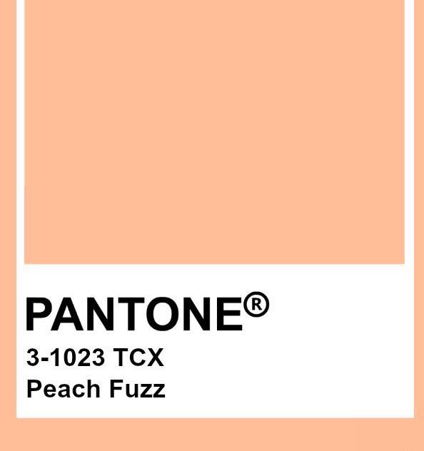
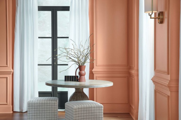
The world’s color authority marks its 25th anniversary with a somewhat classy yet contemporary peach tone. This soft apricot color brings everything we need today – peace, comfort, nurture, and wellbeing. In contrast with previous colors of the year announced by the Institute, peach has an entirely different energy. It brings people together and awakens compassion.
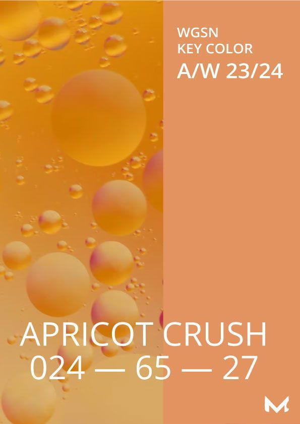
WGSN + Coloro: Apricot Crush
The collaboration between the two giant trendsetters in the world of design and color led this year to the reveal of the energetic and daring Apricot Crush, a vivid orange tone inspired by the rich color of apricots and oranges. Give your home a more optimistic look with this nourishing and charming pop of inspiration.
Glidden by PPG: Limitless
Limitless is anything but yellow, as colorists state. This refreshing and soothing color perfectly pairs the ability to act as a neutral and the power to hit like an accent. Pair it with both warm or cold matching colors and enjoy the creative side of Limitless, whose name indicates an endless range of options. Moreover, its sunny personality induces a warm feeling of energy and vitality.
Valspar: Renew Blue
According to Valspar’s colorists, this chalky green blue perfectly suits the current transition in the design world when we are looking for ways to refresh our homes and escape from the outside world. Besides, nothing compares with the undeniable creativity and consistency that perfectly co-exist in the same paint color.
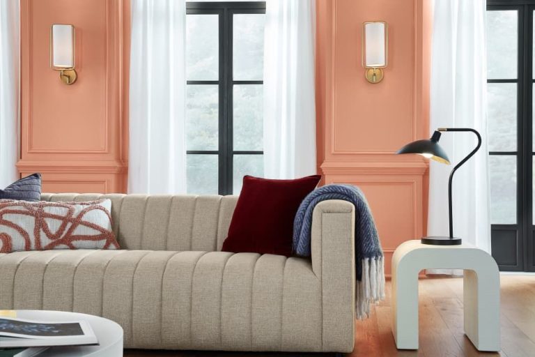
HGTV Home by Sherwin-Williams: Persimmon
Part of the Renewed Comfort collection, this peachy terracotta shade will win your love if you crave comfort and the feel of home. This unique, vivid tone perfectly integrates neutral notes, allowing you to apply it to living spaces. Even more, this color, better than others, knows how to entertain and encourage conversation.
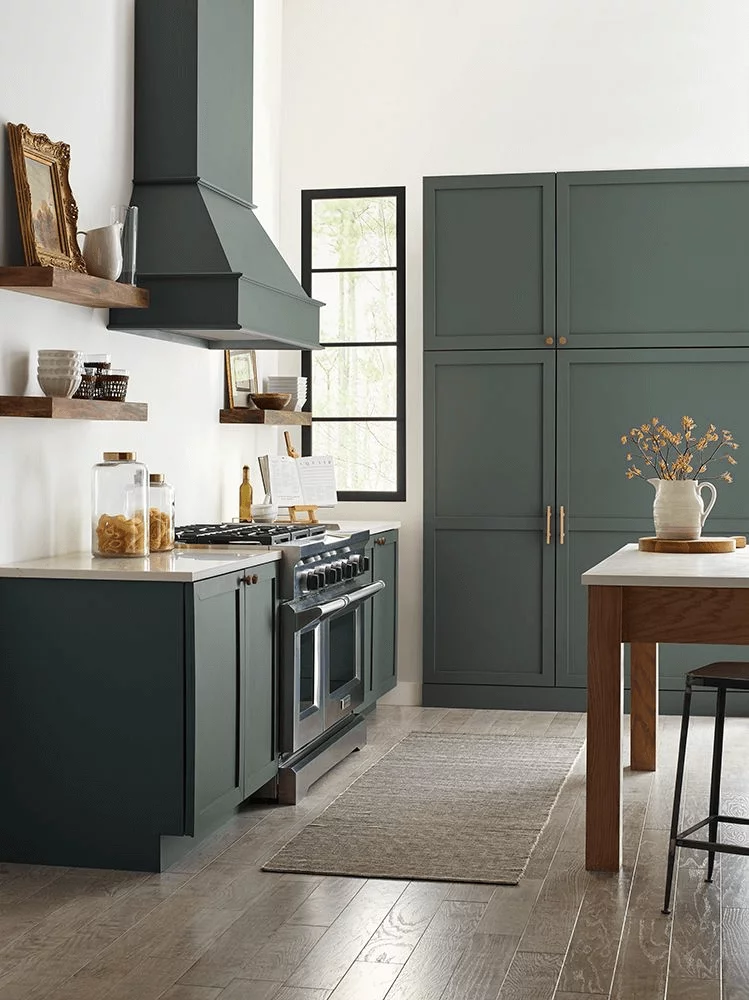
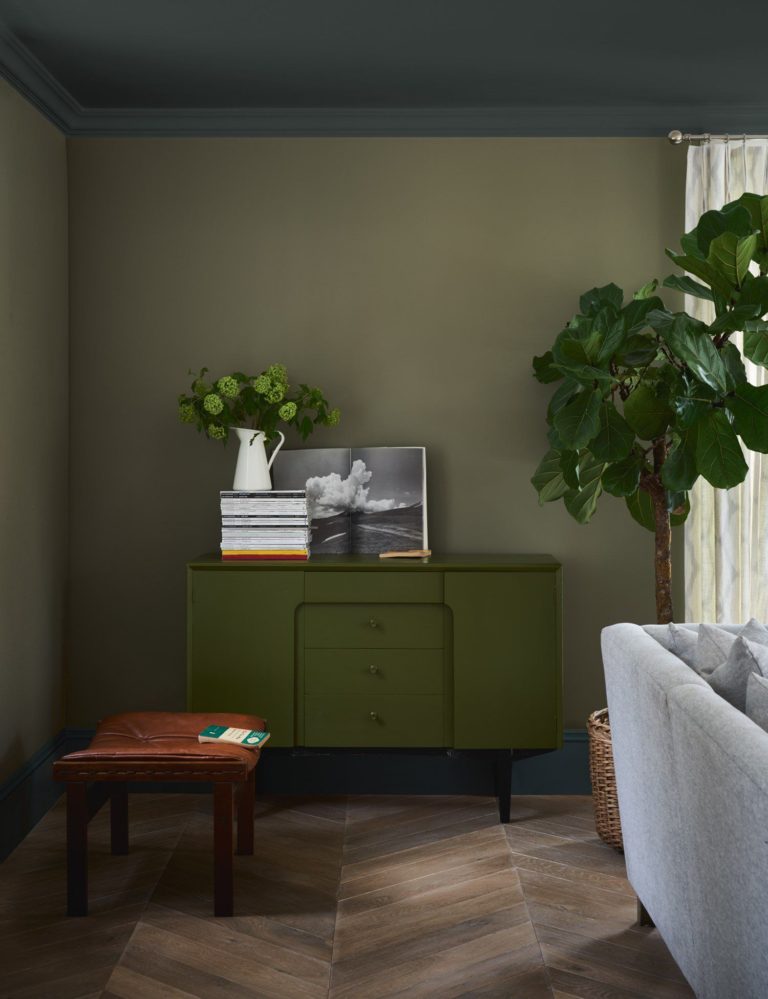
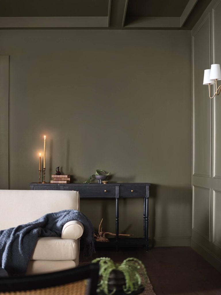
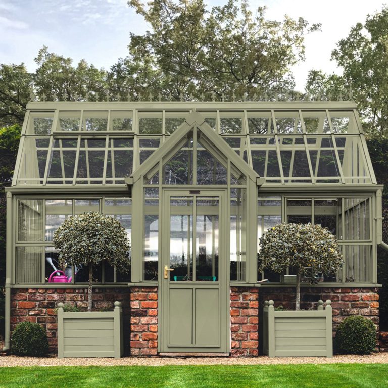
Dutch Boy Paints: Ironside
The deep olive shade with a distinctive earthy trace will suit those who seek security and comfort in colors. Inspired by nature, Ironside will nurture your need for a secure space to unwind and think about your well-being.
Minwax: Bay Blue
Mainly renowned for impressive wood stains, Minwax surprises us this year with an untraditionally creative shade of green-blue. It’s time for a design refresh, and this gorgeous teal tone will formidably underline the rich wood texture of your next makeover.
Graham & Brown: Viridis
Since green registers unprecedented popularity today, the brand didn’t hesitate to make it their defining color trend. Viridis, in particular, is the calmest, most nurturing green shade you’ll ever experience. Moreover, if you’re looking for ways to make an oasis for relaxation and quality family time out of your home, Viridis is your go-to option.
Color is the best way to express a feeling, show your perspective on the world, underline your lifestyle, or tell a story. Last year’s trendy paint colors gave a start to a transition in the world of color, and we can see the marathon goes on this season. Some brands offer color opportunities to enhance comfort at home, while others assist us in the endeavor to get more creative with the brightest shades ever. At the end of the day, current trends are much freer and more personal; we are encouraged to choose any paint color we like from the available palettes and make it a trend.