fbpx
Paint colors for small rooms: perfect hues from popular manufacturers

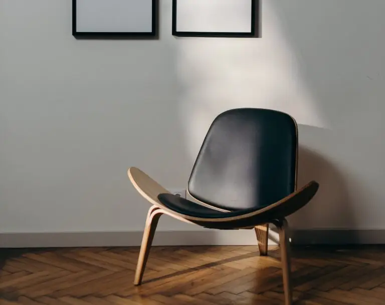
Is it the hallway, laundry room, or probably the bathroom that gives you headaches when it comes to a paint color that would match a small space? Or, do we go further to the living room, bedroom, or kitchen? Well, it is a common problem for homeowners to deal at least once with the drawbacks of small rooms. If such a problem is close to you, we are here to make your life easier.

Undoubtedly, the first color to think about is white, the lightest of all, which reflects enormous amounts of light and makes any room look spacious. Of course, we will not skip it. But… There are lots of possibilities in this sense when you use a particular color smartly. Today, we will provide you with an array of paint colors, extremely different from each other, that have the same purpose – to go beyond the borders of a particular space. One should note that it is not only about the expanding feature but also the integration of these hues into the interior, which makes the process a bit more complex, although the result will surely be successful from all perspectives. We are not here to give you a general insight into the subject but provide you with real examples of paint colors that can be applied in this respect. Let’s see what some of the most renowned paint manufacturers have in store!
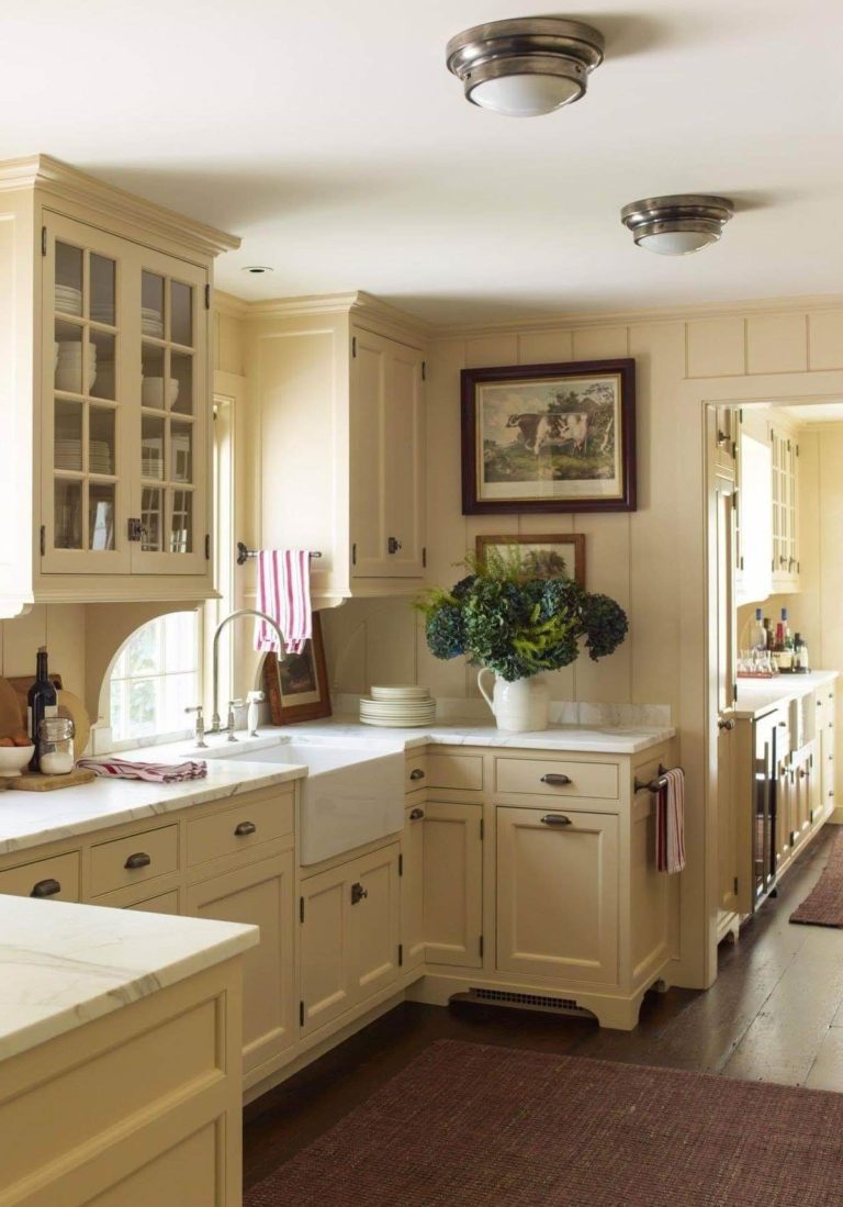
Classic White

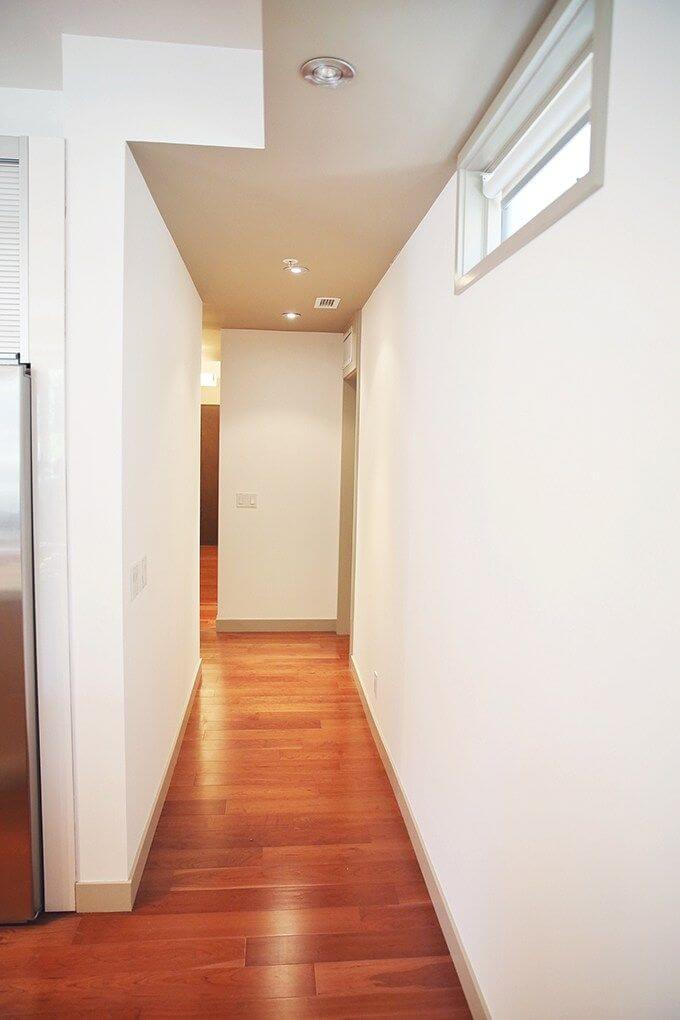
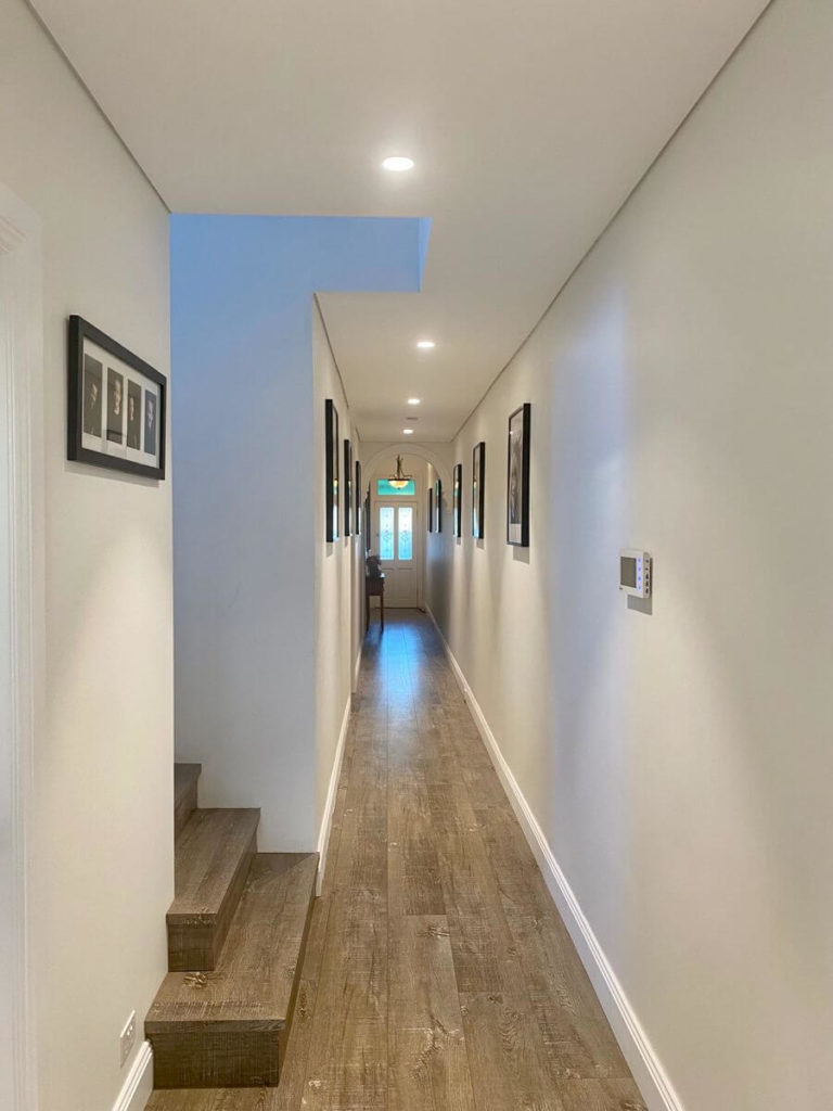
White is a favorite among homeowners who look for a suitable color within small spaces. Well, we cannot help but agree with them. This hue is indeed one of the best options that surely enriches the space with light and makes the room look way bigger than it is. Besides, it is a timeless choice that will always keep you up to date and integrates perfectly into any style. The question is: what shade of white in particular? Experts suggest you not go too far and stick to true shades of white or their crispy variation that feel exceptionally airy and light. Let’s see what the paint manufacturers have to offer!
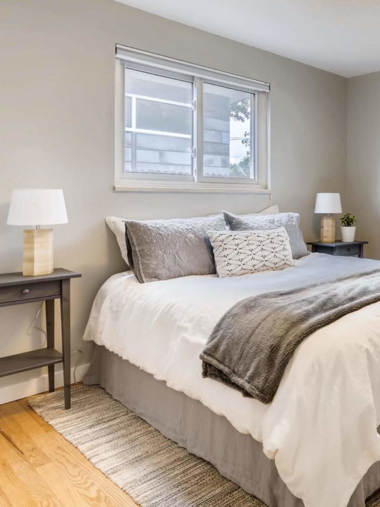
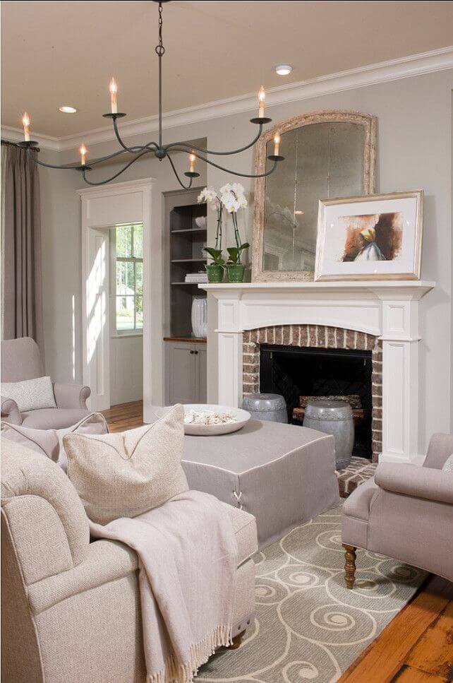
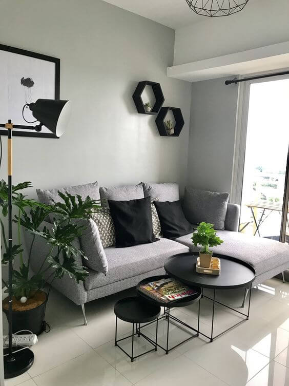
  • Drift of Mist SW 9166 by Sherwin-Williams – crispy white with tiny particles of gray that feels extremely fresh and invigorating;
  • Ultra Pure White 1850 by Behr – pure white devoid of undertones, regarded as one of the truest shades of white and gravitating slightly to the cool side;
  • Meadow Mist OC-134 by Benjamin Moore – a foggy yet calming white with a subtle green note that replicates natural freshness;
  • Vivid White by Dulux – pure white with with an exceptionally clean appearance, whose freshness will brighten up the space accompanied by a contemporary vibe.

Playful Gray

The next neutral to suit small spaces is gray, and not a simple one, which may seem rather draining but a shade of the kind full of luminosity. Besides expanding the room borders, it will play different notes at different times during the day, influenced by light. Therefore, your small room will be enriched with visual interest and acquire a whole new identity, even if the space is limited. Furthermore, gray is no less popular than white when it comes to contemporary settings.
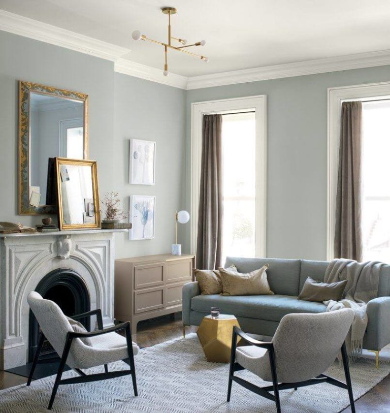
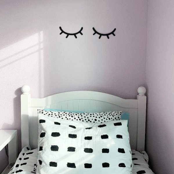
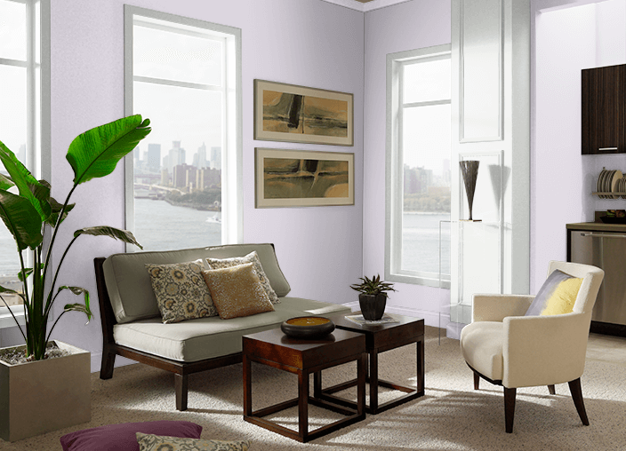
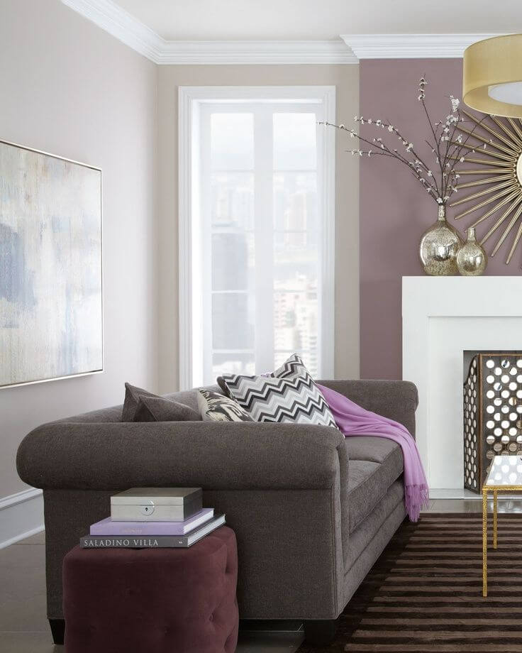
  • Requisite Gray SW 7023 by Sherwin-Williams – medium-tone gray with a complex mix of cool and warm notes that may seem either green or purple, ensuring a clean yet sophisticated environment;
  • Dolphin Fin 790C-3 by Behr – light gray with subtle warm notes, resembling greige that offers this shade an enchanting soft appearance;
  • Metropolitan AF-690 by Benjamin Moore – a light variation of gray with a barely noticeable warm base, penetrated by green undertones that brighten the space in a natural way;
  • Pebble Shore by Dulux – light-to-medium gray diluted with a few beige particles that enrich the space with a fresh yet calming environment.

Wild Purple

Quite a bold one for small spaces, isn’t it? Well, we cannot stick only to neutrals when the right approach to a bolder shade can make the most of your interior. In this sense, purple is a favorite. Actually, the smaller the space, the more outstanding this color looks. Of course, we don’t suggest going with a splash of bright purple. The best variation to suit small rooms is soothing shades yet not devoid of intensity, whether hiding tiny drops of bright purple or leaning towards a fresh lavender.
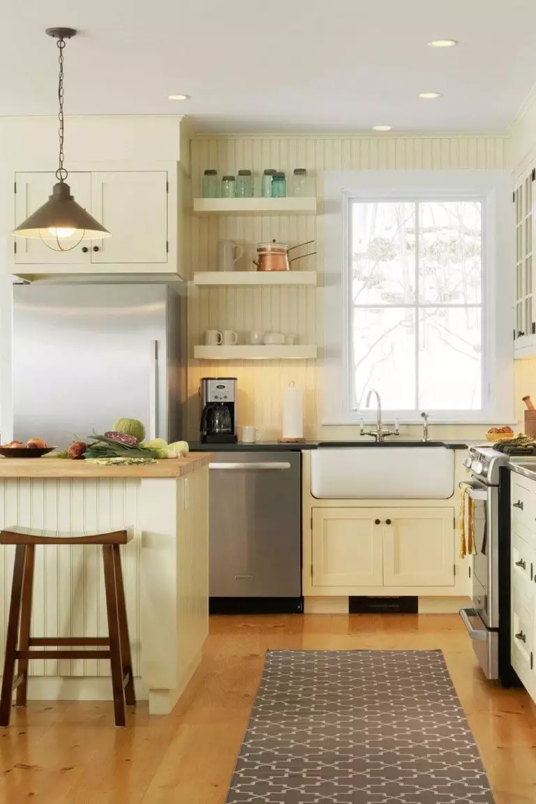
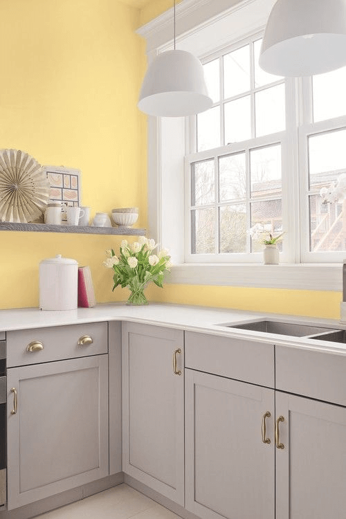
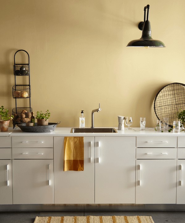
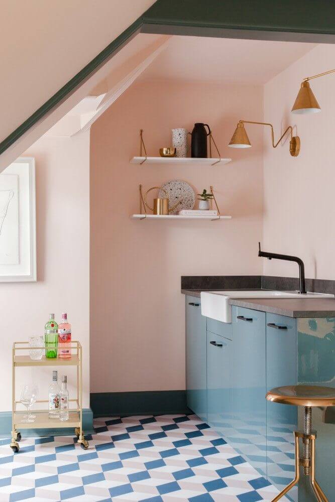
  • Potentially Purple SW 6821 by Sherwin Williams – light purple with soft, soothing notes reminiscent of a foggy lavender shade;
  • Spring Bouquet S100-1 by Behr – soothing shade of light lavender leaning towards the cool side, although not devoid of soft notes;
  • Sandlot Gray 2107-50 by Benjamin Moore – despite the name, a light shade of purple with impressive warm undertones that brightens and softens the room at the same time;
  • Elusive Mauve by Dulux – light to medium-tone purple, resembling a foggy lavender shade with soft undertones.

Soothing Yellow

You may probably think that yellow has nothing to do with small spaces. A bold one – probably not, while a soothing one is welcome. It surely doesn’t work like white. Nevertheless, besides expanding the room borders, it also brings a splash of positive flair. Experts suggest opting for pastel yellow, particularly for pieces of furniture to add visual interest. Let’s see how it works in the kitchen!
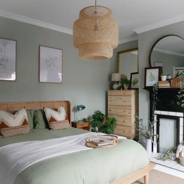
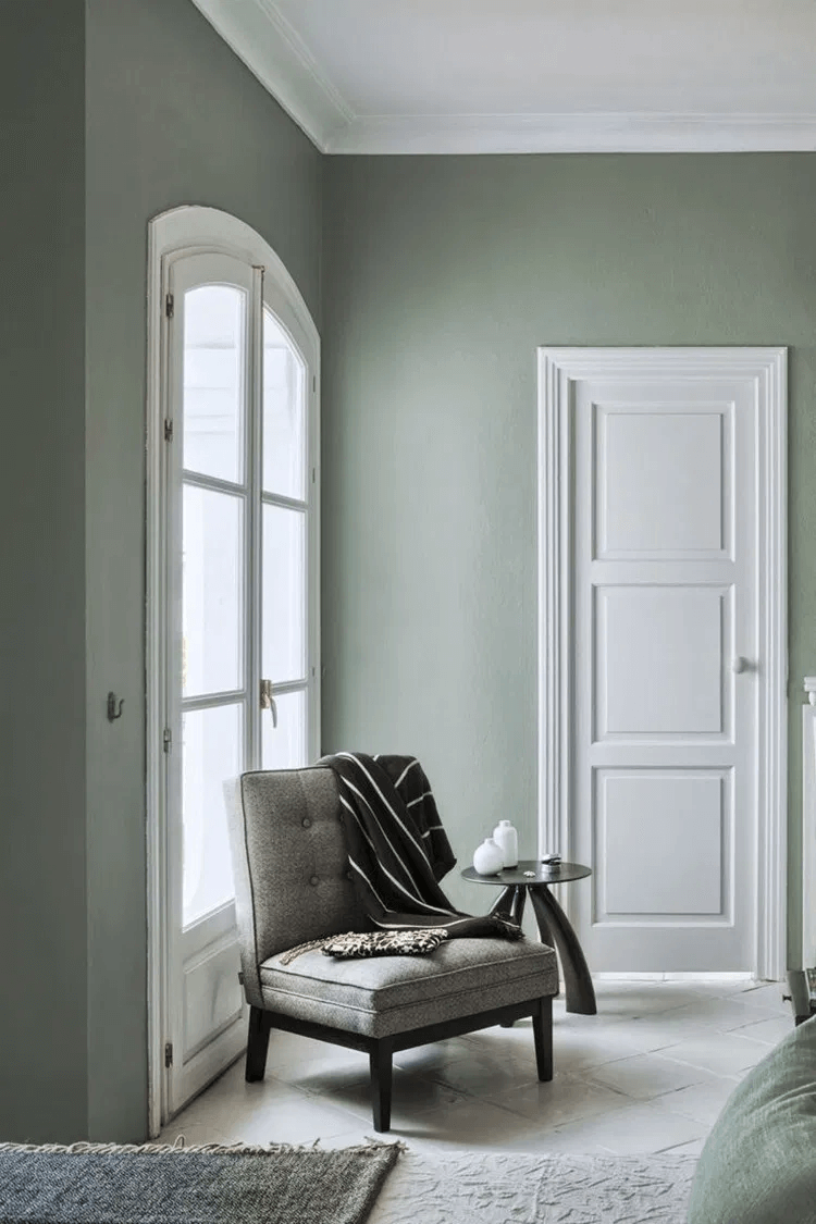
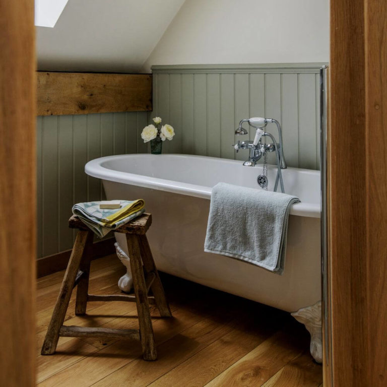
  • Pineapple Cream SW 1668 by Sherwin-Williams – pale shade of very light yellow with a creamy base and refreshing yet calming scents;
  • Lime Bright P330-2 by Behr – very soothing shade of yellow with a slightly muted base and subtle green undertones;
  • Pineapple Grove 333 by Benjamin Moore – creamy yellow with light notes and a soothing base penetrated by a few drops of orange;
  • Spring Breeze 5 by Dulux – pastel yellow with noticeable peachy notes and a light base penetrated by soft scents.

Neutral Sage

If gray sounds too simple to you, and you want to find a color that still makes the room look spacious and brings in something interesting, you should try a sage shade. The subtle greenish notes will make the space feel fresh and somehow connect the outdoors with the indoors. In this sense, consider light shades of the kind to avoid the draining effect and reach the main purpose – to expand the room borders.
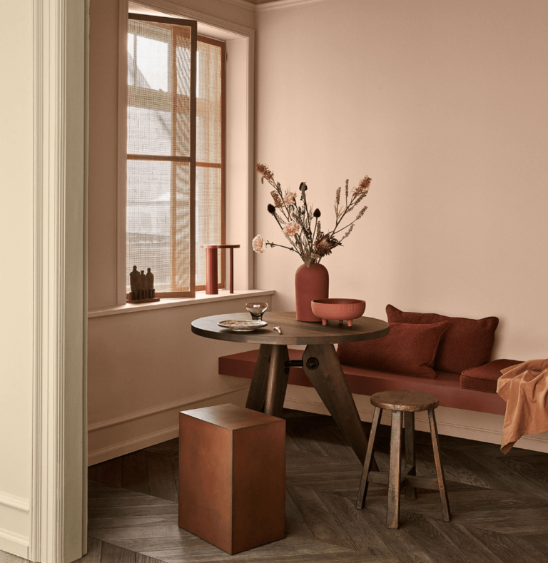
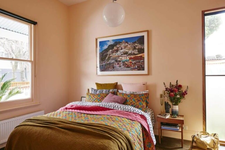
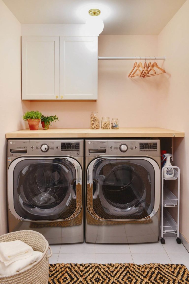
  • Filmy Green SW 6190 by Sherwin-Williams – very light green so that it can be easily mistaken with gray, although the soothing green base is there to preserve its nature-inspired appearance;
  • Cabbage Leaf M370-2 by Behr – light shade of soothing green penetrated by subtle gray notes with a very fresh and invigorating surface;
  • Pleasant Valley 696 by Benjamin Moore – a medium-tone to light sage with a cool green base and soothing gray scents;
  • Pale Sage by Dulux – pale shade of sage with a perfect combination of cool green and gray notes that impresses with its intensity and slightly refreshing features.

Soft Peach

A small space will surely benefit from a refreshing color, but what about warmth and softness? They are not to be skipped unless this is not what you are looking for. An appropriate shade that makes the room feel larger and adds a scent of appealing softness is more than a successful result; it is perfect. A standout choice in this sense is the light and soothing peach shades that refresh the space in an exceptional natural way.

  • Blushing SW 6617 by Sherwin-Williams – dusty variation of light peach, resembling a very light and soft pink;
  • Citrus Delight P210-2 by Behr – a delightful peachy shade with noticeable light pinkish notes that radiate very positive energy;
  • Sunset Hill 1212 by Benjamin Moore – impressively light peach with a pinkish base covered by a dusty veil;
  • Pastry Quarter by Dulux – extremely light peach reminiscent of the light pink blooming trees in the spring.

Paint colors to avoid in small rooms

In the same range of ideas, we want to draw your attention to an array of colors that should be avoided in small spaces. It is not necessarily the bold ones since particular neutral shades can also spoil the picture. Let’s get straight to the point! Don’t risk the result with any of the following categories of paint colors in a small room:

  • Muted neutrals. They lead to a draining effect that can make the room look smaller and dark since such colors cannot reflect large amounts of light;
  • Bright shades. There is no doubt that an extremely bold color will serve as a great splash of eye-catching features that will overload the space;
  • Neutrals with inappropriate undertones. The hidden notes of particular shades ensure harmony within the interior, and the wrong ones can risk the entire result. One should note that they are particularly perceived at neutrals and have to be chosen according to the overall design;
  • A color that doesn’t suit your preferences. Don’t think only about the suitability of the color within small spaces but also the way you feel about it. Consider a shade that seems close to you, and the success will be doubled up.
online interior design service
Give a new look to your room with our professional online interior design service
Best Floor Color for White Walls: Designers’ Top 6
ColorsFlooring
Best Floor Color for White Walls: Designers’ Top 6

As experts claim, you can have a perfect furniture layout paired with the most expensive accessories, yet if there is…

What Is the Best Color for Garage Walls: Trends and Tips
ColorsGarageWall paint
What Is the Best Color for Garage Walls: Trends and Tips

If your garage walls need a makeover, paint is the most affordable, practical, and suitable option. Color is a matter…

Top 10 Family Room Decorating Ideas for 2024 from Trendsetters
DecorationIdeasRooms
Top 10 Family Room Decorating Ideas for 2024 from Trendsetters

The family room, known as the living room or the space where you gather with your family on evenings or…