Paint colors that go with oak cabinets: perfect matching hues from popular manufacturers
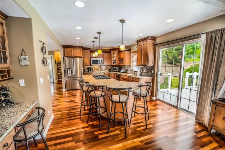
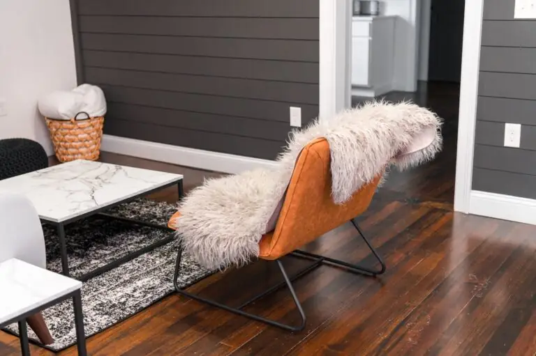
If you are a true fan of oak surfaces or are not willing to do a whole makeover of your oak kitchen cabinets, the result can always be updated with a new splash of paint. Although wood is a commonly used material in the interior, it is not that easy to work with. Every type of wood requires special attention, particularly when it comes to pairing colors. Furthermore, an accordingly chosen paint can offer your wood cabinetry a contemporary feel. The question is: what colors go perfectly with oak cabinets? A comprehensive answer can be found as follows, including examples of paint colors from some of the best paint manufacturers.
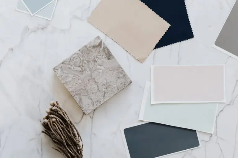
First things first, you probably wonder how you can pick the best color from a wide variety of options. For a start, it would be appropriate to think about the general look of your kitchen; what result are you willing to achieve? Is it a natural and warm environment filled with comfort? A darker palette with mysterious notes? A light and fresh atmosphere? Or a subtle and timeless effect? It is up to you which one suits you best. The following list of color suggestions embraces all these features. Let’s find out what these colors are!
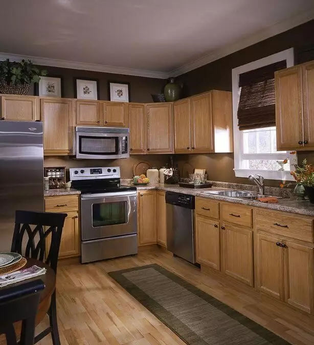
Earth paint colors
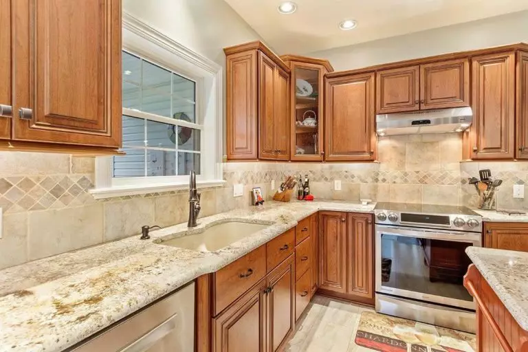
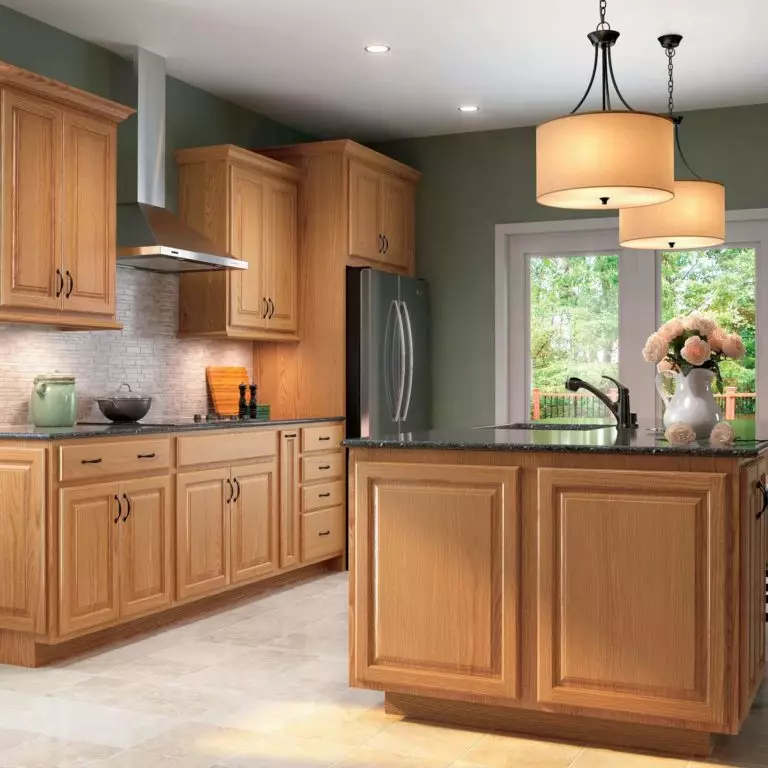
Inspired by nature, oak surfaces and earth tones go hand in hand. Such hues as greige (a combination of gray and beige) and brown will harmonize with the natural wood cabinets. While sophisticated shades of gray neutralize the wood saturation, offering it a slight feeling of warmth and comfort, the rich brown colors fit the wood intensity, leading to a balanced effect. Let’s see what paint manufacturers have in store for us!
- Useful Gray SW 7050 by Sherwin Williams – a light shade of gray with subtle beige notes and hardly noticeable green scents; a perfect fit for natural wood due to its fresh effect;
- Revere Pewter HC-172 by Benjamin Moore – one the most popular shades of warm gray with perceived beige undertones; it perfectly matches the warm wood undertones, ensuring cohesion within the overall environment;
- Pebble Shore by Dulux – crispy gray with calming beige notes; while the beige undertones resonate with the warm wood notes, gray is responsible for filling the space with an airy feel of freedom that is usually limited by the saturated wood scents;
- Dry Brown N230-5 by Behr – crispy shade of light brown with a haze effect; impressively suits the wood undertones, serving as a perfect background due to its foggy surface;
- Deep Taupe 18-1312 by Pantone – cool brown with gray undertones; a perfect source of freshness for wood, replicating the deepest scents of the latter.
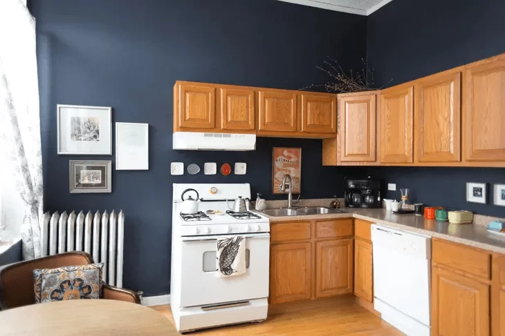
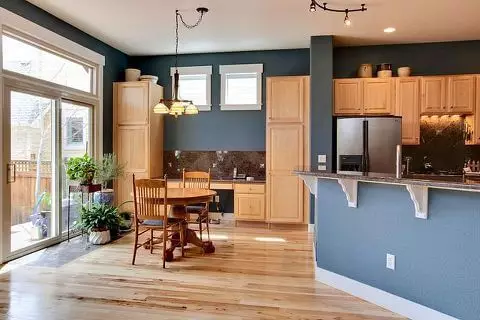
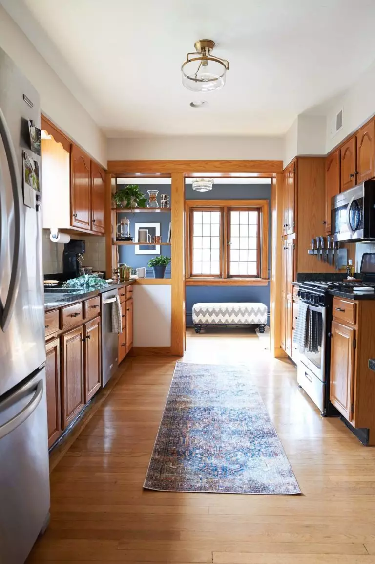
Cold paint colors
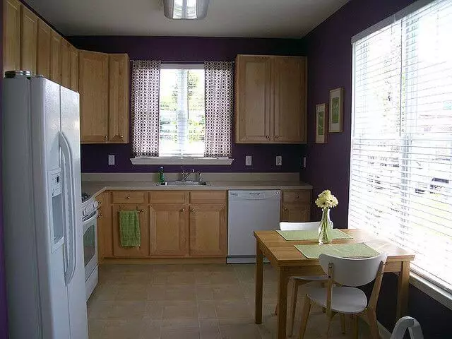
The oak cabinets are a reliable source of comfort due to their warm undertones. Sometimes, they may even seem too extra, overwhelming a bit the space. This is why cold undertones are invited to take part. Cool shades of gray and dark blue, green, purple are perfect solutions. They balance the rich wood undertones and add a feel of sophistication. A seemingly simple oak kitchen will achieve an intriguing effect. How do you reach such results? Simply, by opting for one of the following paint colors:
- Naval SW 6244 by Sherwin Williams – dark blue with deeply penetrated gray notes; it adds exquisite scents of sophistication to the light-toned kitchen cabinets;
- Gentleman’s Gray 2062-20 by Benjamin Moore – dark blue with a soothing surface; perfectly feels the space left by oak with notes of intrigue;
- Timeless Grey by Dulux – cool gray with mysterious cold notes; it offers the oak cabinets the possibility to reveal their beauty to the fullest due to its neutrality;
- Rainforest M440-7 by Behr – dark green with an airy effect; in combination with wood surfaces, it interprets with precision the fresh forest environment;
- Dark Purple 19-2524 by Pantone – cool shade of purple embraced by a subtle foggy effect; it adds accent to the commonly used wood surfaces, offering them an ultra-modern effect.
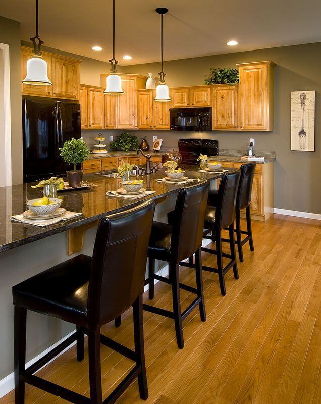
Light paint colors
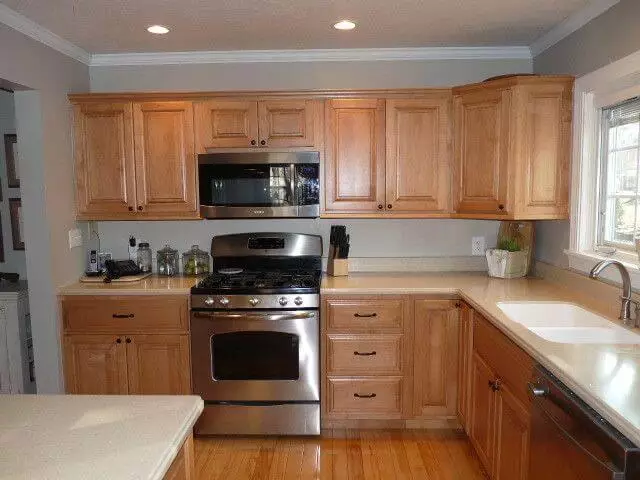
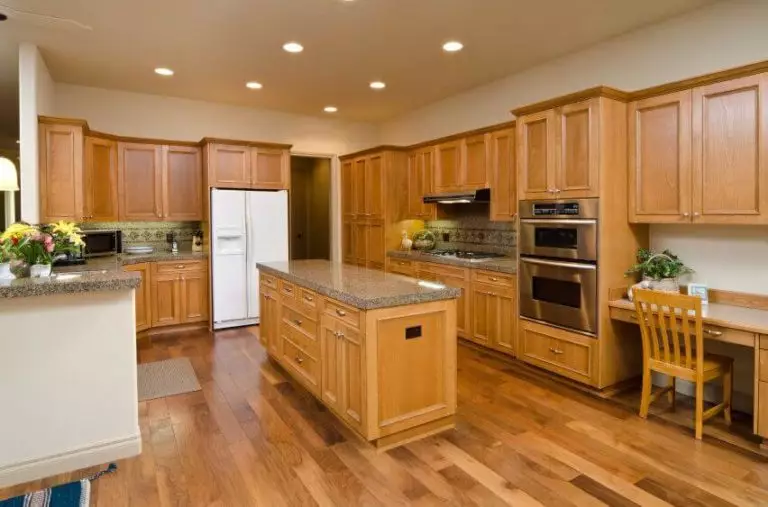
Most oak cabinets are light-toned, and a pairing color from the same category will complete the overall design. If you wonder whether the result will look faded or not, we hasten to assure you that an appropriate combination of colors, involving various undertones will lead to a harmonious effect. Therefore, such shades as off-white, beige, taupe, cream will keep the softness provided by the oak cabinets within limits. Enrich your kitchen with more comfort and an elegant effect with one of the following paint colors:
- Drift of Mist SW 9166 by Sherwin Williams – airy white with cool beige notes; its soft underlayer appealingly refreshes the warm wood undertones;
- Natural Wicker OC-1 by Benjamin Moore – soft white with a touch of beige; it impressively reveals the warm wood undertones and completes them with calmness;
- Sourdough 1084-3 by Dulux – light beige penetrated by soft creamy scents; it balances the intensely perceived wood undertones, enriching the space with visual comfort;
- Perfect Taupe PPU 18-13 by Behr – a light combination of brown and gray with an airy surface; although the gray undertones are well perceived, they do not fail to appear lighter in contrast with oak, offering the latter a feeling of ease;
- Cloud Cream 12-0804 by Pantone – an appealing shade of light beige with slightly noticeable gray notes; the perfect pairing of beige softness and gray coolness leads to an outstanding background against which oak reveals its hidden earthy tones.
Nature-inspired paint colors
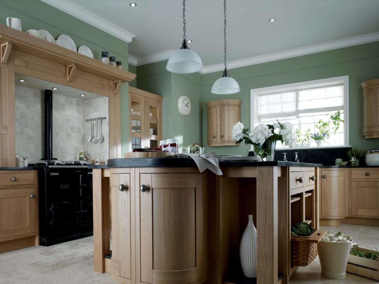
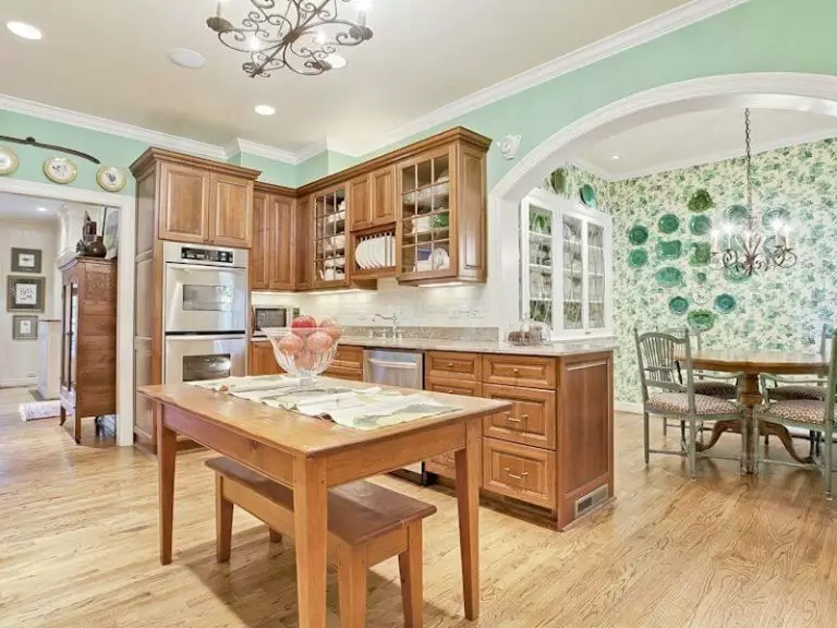
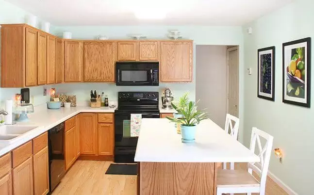
This category involves only one color – green, but its wide variety of variations offer lots of possibilities when it comes to a perfect pairing color for oak cabinets. Due to the fact that nothing refreshes an interior the way a nature-inspired shade can, particularly if this one works perfectly with wood, green holds a leading position on this list. From intriguing shades of olive to intense pistachio, irreplaceable pastels, and muted hues, green does not cease to impress with its richness of shades. Let’s discover them!
- Relentless Olive SW 6425 by Sherwin Williams – bright green with slight yellow undertones and an impressively attractive appearance; it replicates the rich wood undertones amazingly and leads to a pleasant and comfortable environment;
- Pistachio 561 by Benjamin Moore – light green with minty undertones; besides complementing the intensive wood notes, it serves as a perfect background for the rich oak texture;
- Pastel Mint A267 by Dulux – light mint with a relaxing foggy effect; perfectly refreshes the yellow undertones of oak cabinets;
- Pastel Green PPH-45 by Behr – a very light shade with slightly perceived green notes; it resembles white, although with a subtle touch of green that resonates perfectly with the brown notes of oak cabinets;
- Muted Lime 14-0636 by Pantone – appealing green with muted yellow notes; it works perfectly with dark oak cabinets, leading to a balanced combination and much welcome appetizing result.