Paint colors that go with wood paneling: best hues from renowned manufacturers
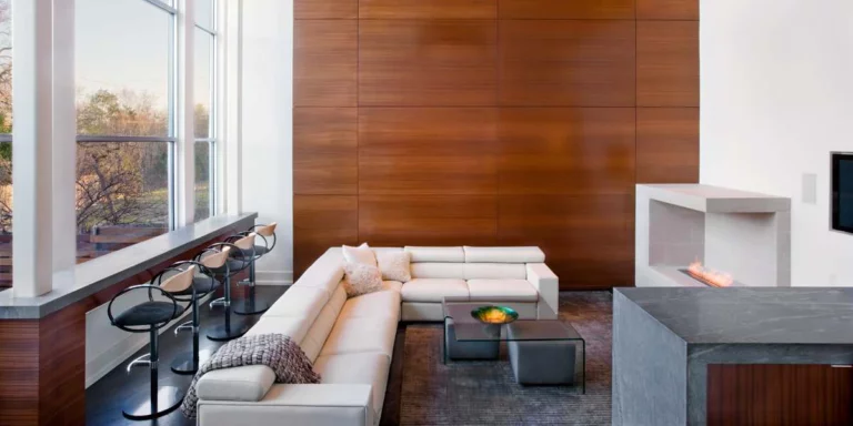
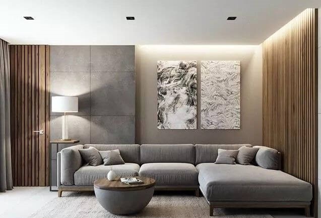
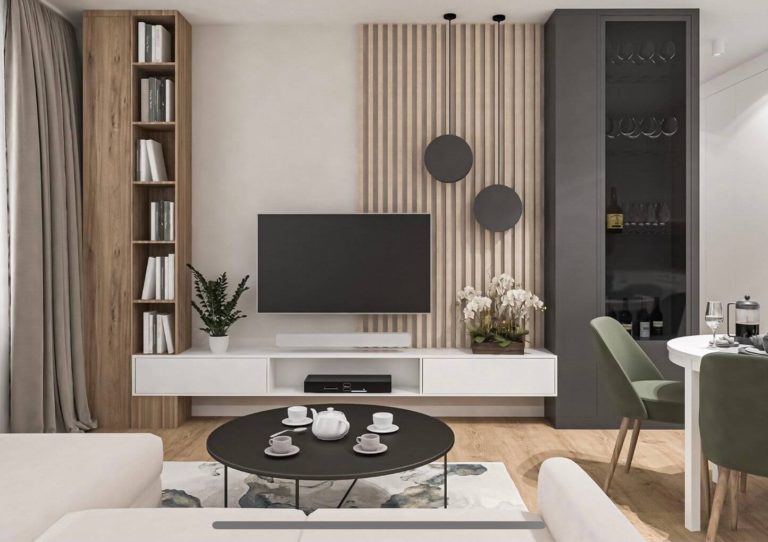
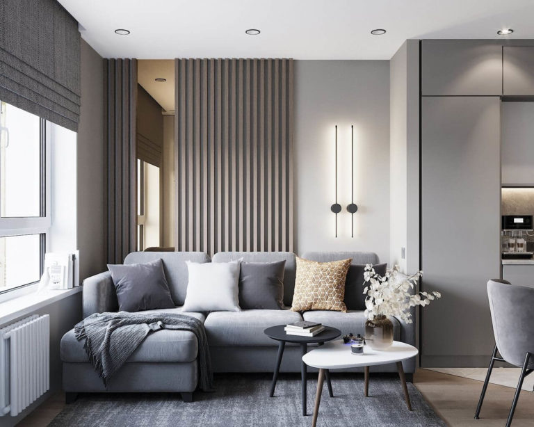
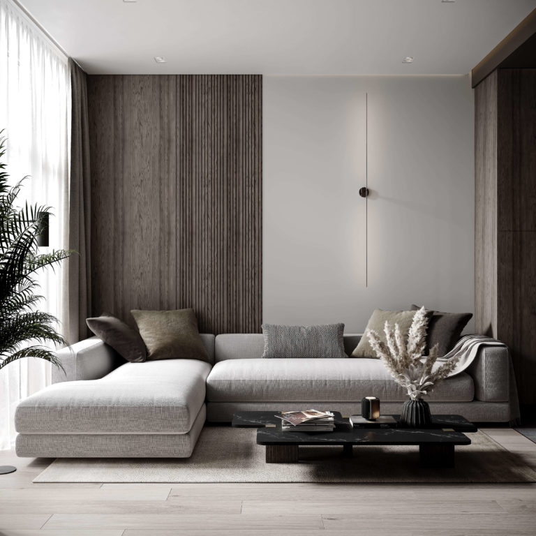
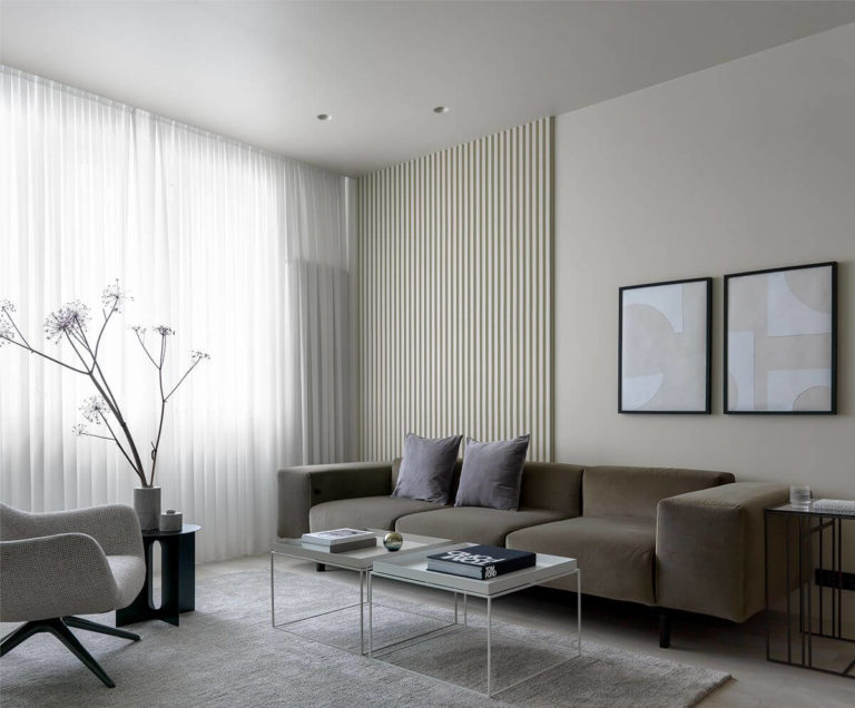
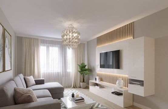
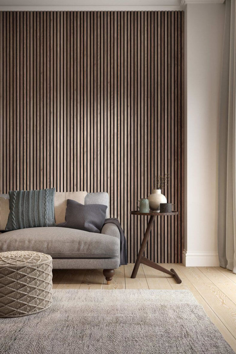
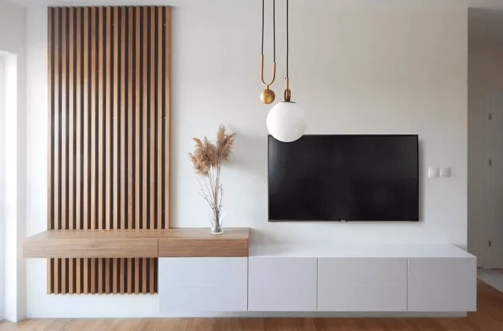
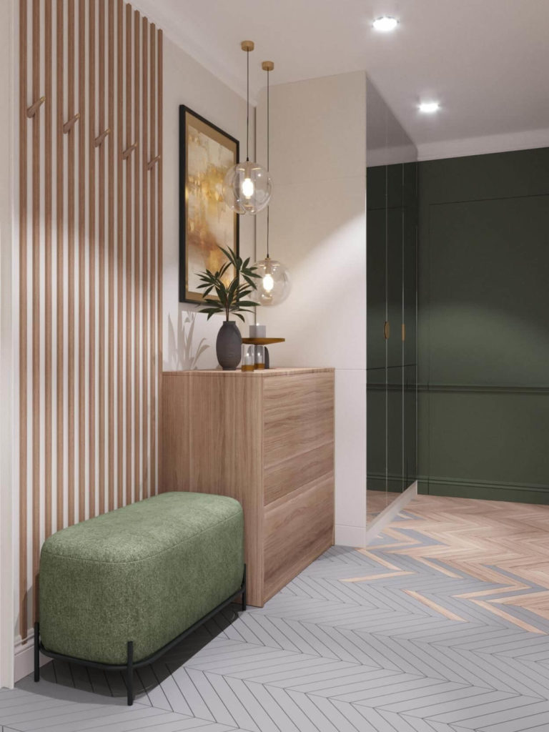
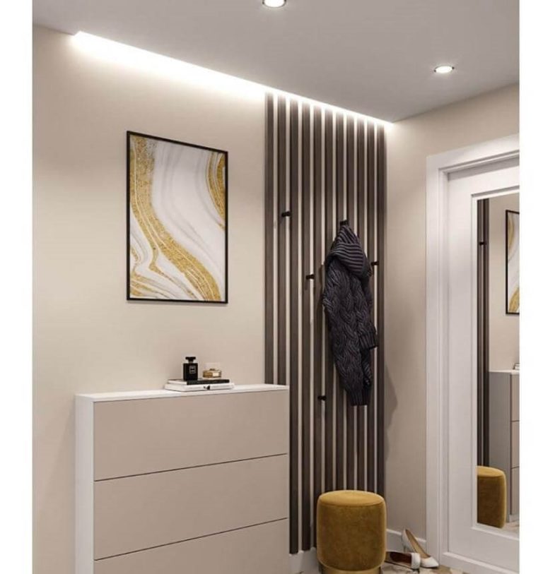
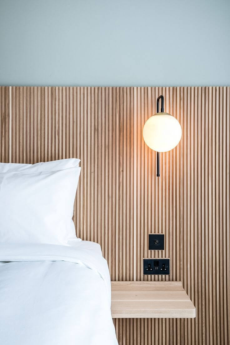
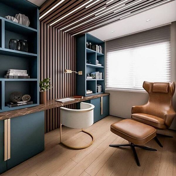
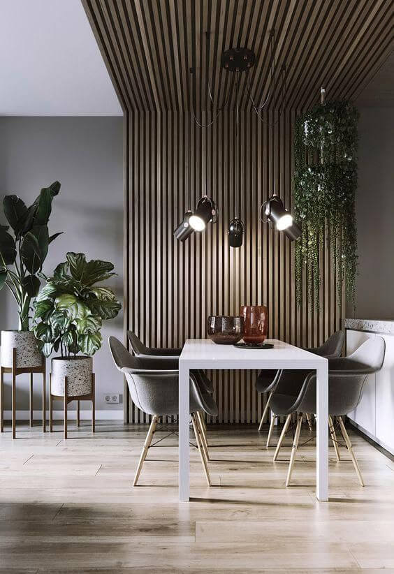
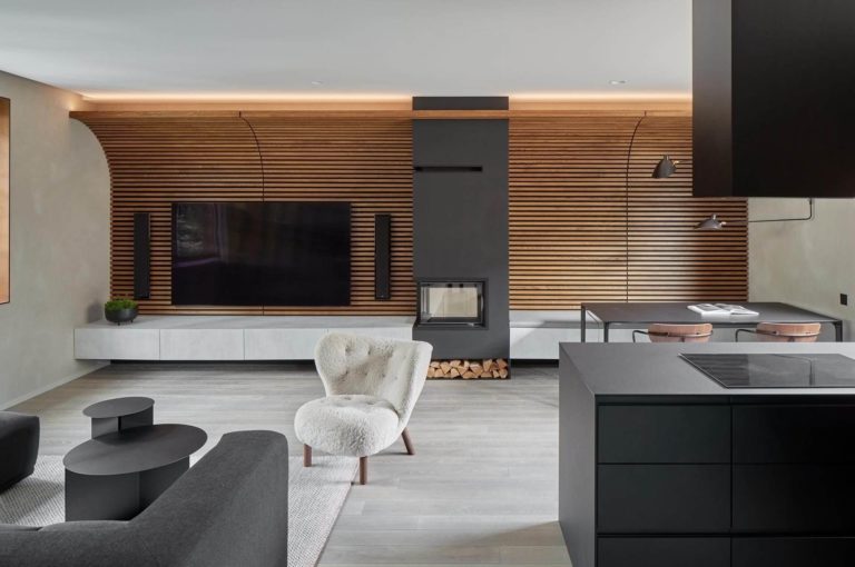
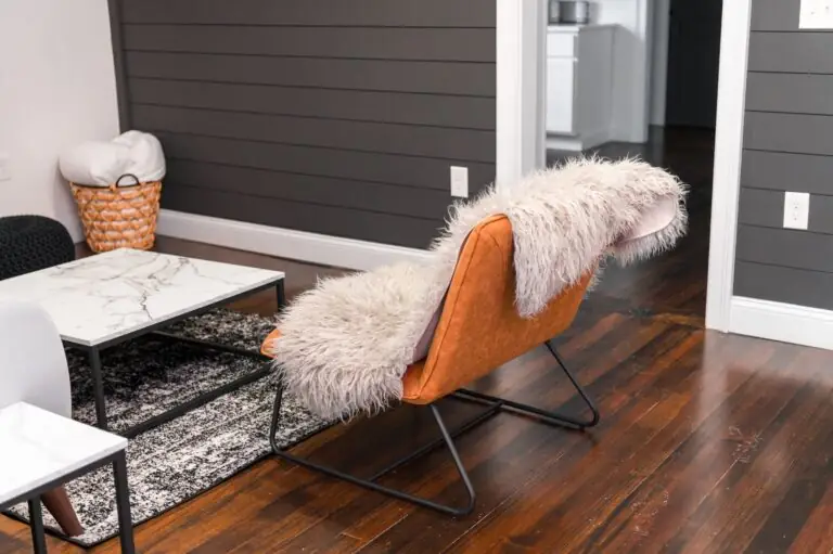
Back to nature and harmony with oneself – this is what the latest design trends try to integrate into interiors. Is there any better way to implement this idea than opting for elements inspired by nature? In this sense, you don’t have to go extra. Add a little bit of wood, and you will notice how your interior will experience a whole makeover. This is when wood paneling enters the play. Besides providing an impressive source of coziness, warmth, and safeness, it also enhances the interior design by adding texture.
Once you decide to go natural, keep it this way further on. There is no need to paint the wood paneling. Let it bloom in its natural way! Nevertheless, the surrounding will benefit from a splash of a new color to the fullest. Furthermore, an appropriate shade will help you adapt the wooden texture to your style. One should note that wood also has undertones and various surfaces, which influence the process of choosing a color. This is why we prepared an array of useful tips for an efficient start, followed by color suggestions with clear examples from renowned paint manufacturers for a successful result.
5 Starting points to consider
- Wood color and pattern. The particular undertones and surface will point out the right color that will either go in harmony with the wood notes or emphasize them;
- Light wood in the first place. Contemporary settings show an increased integration of light wood due to its fresh and calm appearance;
- Dark brown wood is the most used one. If you still wonder which wood type to choose, go for dark brown wood since it is a classic option and pairs with any color;
- The overall decor. Do not forget about other elements, such as furnishings and textiles, whose colors may as well direct towards an appropriate pairing color;
- Contrast is the key. The more contrastive the combination, the greater the possibility to add an accent. Dark wood stands out on neutral or light backgrounds, while light wood – on bold-colored ones.
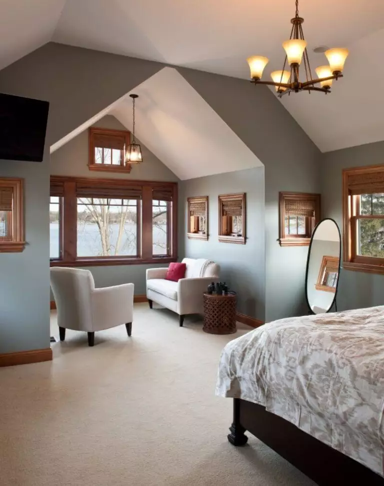
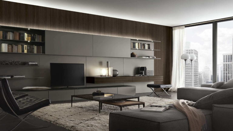
Gray
It is no surprise that gray holds a leading position on this list. One should note that not only its popularity was considered but also its surprising ability to combine with wood for a unique yet contemporary design. Experts suggest opting for warm undertones or mixtures between beige and gray to fit the warm wood undertones. Let’s take a look at the color palettes offered in this sense by paint manufacturers!
- Repose Gray SW 7015 (Sherwin Williams) – a light shade of gray with pronounced notes of cool and beige undertones; it will serve as a perfect background for the rich wooden texture and go in harmony with it due to its slightly visible warm scents.
- Agreeable Gray SW 7029 (Sherwin Williams) – soft gray with subtle brown notes that offer this color an appealing look; it matches the warm wood undertones and helps reach cohesion within the interior. Nevertheless, the fresh gray notes balance the environment and keep it relaxing.
- Revere Pewter HC-172 (Benjamin Moore) – light gray with soft scents on the horizon, enriched with warm undertones; its classy look will complement wood in the best possible way due to its versatile feature of adapting to the situation.
- Gray Owl OC-52 (Benjamin Moore) – airy gray that seems like a soft feather touch; its silver notes and subtle beige scents lead to a balanced combination of stimulation and calmness. Once it accompanies wood, the latter will not only acquire a valuable partner to go in harmony with but also a perfect contrastive background.
- Silver Drop 790C-2 (Behr) – warm gray enriched with beige notes, which acts like a chameleon, adapting to the existing colors. In combination with wood, it replicates impressively both its rich undertones and surface.
- Wheat Bread 720C-3 (Behr) – a combination of gray and beige, which is called “greige”. As this pairing is a definition of balance, it will work the same with wood by balancing its rich notes, although adapting to its warm undertones.
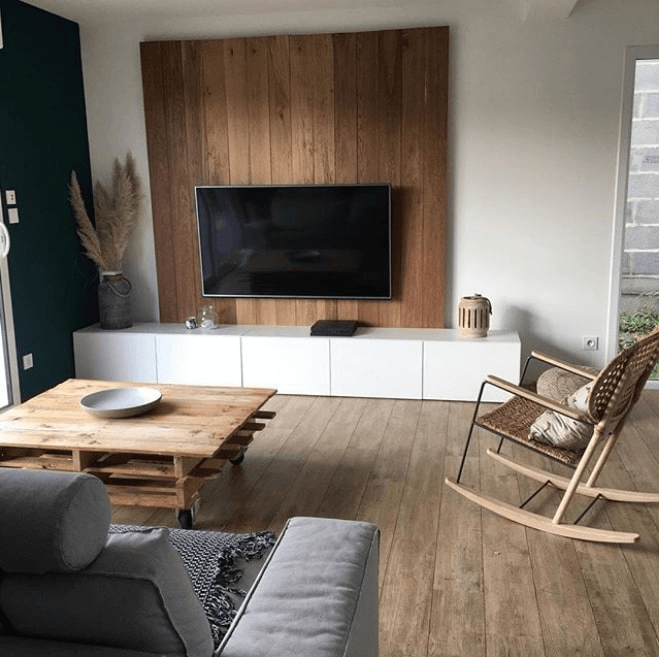
White
It is a classy color that fits any style and neighboring shades, even when it comes to various wood tones. Wood is known to overwhelm the space slightly if not combined with an appropriate shade. Therefore, white will brighten up the place. Furthermore, its neutral finesse will enrich any interior with notes of contemporary flair, while wood paneling will fill the space with comfort. Let’s see what paint experts have in store for us!
- Drift of Mist SW 9166 (Sherwin Williams) – cool white with subtle foggy notes; this is when wood benefits from a cool shade at its finest. The haze effect of this outstanding color combined with wood paneling will seem like an early morning scroll through the forest.
- Roman Column SW 7562 (Sherwin Williams) – a warm shade of white with visible yellow undertones; the aged-like effect of this shade will harmonize with the untouched wooden surface, leading to an unexpected cozy effect, benefitting both the interior and your comfort.
- Decorator’s White CC-20 (Benjamin Moore) – a truly cool shade of white; it seems that subtle gray notes try to penetrate the surface, but the overall soft scents cannot simply allow it. In combination with wood, this shade brings in an invigorating feel.
- Cloud White CC-40 (Benjamin Moore) – a true companion for those in love with soft light shades, the slightly pronounced beige scents will go hand in hand with any wood paneling, offering it a bit of freshness, unconditional ease, and stimulation.
- Swiss Coffee 12 (Behr) – a warm shade of white with a soft base; its perceived yellow undertones are responsible for the notes of comfort that this color radiates. When it seems that there is no room left for extra coziness, this shade will prove you wrong by enriching with an airy softness, even the warm wood undertones.
- Spun Cotton YL-W09 (Behr) – calm white with pronounced yellow undertones; it replicates the warm wood notes perfectly, making it seem like the latter flow from the wood paneling itself and merge with a cool shade of white.
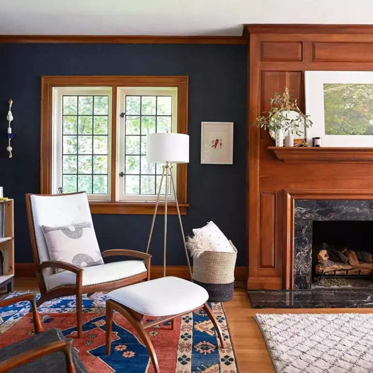
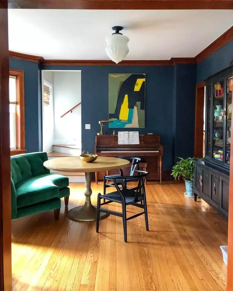
Blue
From azure to teal, this color is ready to impress you with its ability to fit wood paneling for a modern look. Although most shades of blue have cold undertones, the warmth provided by wood will not let the space lose its comfort. This shade promises to be as follows: a splash of new color, a great companion for wood paneling, and simply a standout accent. Let’s discover the paint color suggestions from our favorite paint manufacturers!
- Tradewind SW 6218 (Sherwin Williams) – light blue shade with gray undertones; this fantastic color brings in the coastal breeze and is ready to enrich any style with invigoration. A touch of this shade in the neighborhood of wood paneling seems like a breath of fresh air.
- Naval SW 6244 (Sherwin Williams) – the beloved naval blue with its deep undertones and impressive cold basis is irreplaceable in contemporary settings. A room decorated with wood paneling, which enriches it with comfort, will benefit from the dramatic accent of such a shade that adds individuality.
- Amsterdam AF-550 (Benjamin Moore) – soothing blue with subtle green notes; its soft underlayer will combine perfectly with wood, leading to a formal feel within the space that radiates stability, calmness, reflection, and safety.
- Symphony Blue 2060-10 (Benjamin Moore) – dark blue with deep notes that induce drama; no less impressive than Naval Blue, it will add even more accent to wood paneling due to its slightly brighter undertones. Charming, exquisite, and intriguing.
- Wind Speed S450-2 (Behr) – light blue with a soothing cover; airy as the wind and refreshing as an early morning by the sea, this color will make wood paneling bloom in the most unexpected way, adding a feel of ease, serenity, and harmony.
- Oarsman Blue S450-5 (Behr) – dark blue with saturated notes of gray; if you feel that your wood paneling needs a little balance, this color will manage this task at its finest. Furthermore, such a combination promises a little mystery and intrigue.
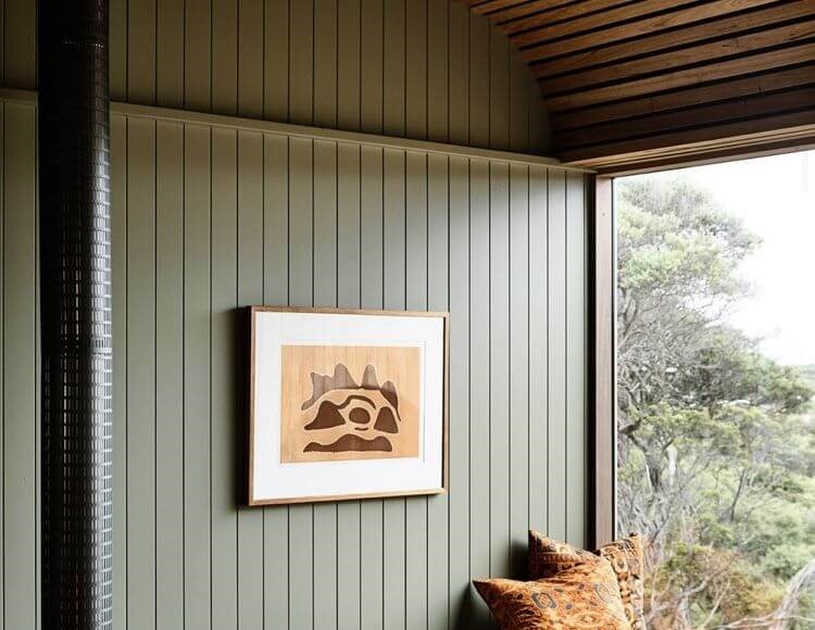
Green
No wonder why this color works perfectly for wood; they are both inspired by nature. Furthermore, any shade of green is a great option. Sticking to the ones that suit your preferences will add uniqueness to the result. Nevertheless, there are particular shades that stand out in this sense. Let’s find out which ones they are!
- Acacia Haze SW 9132 (Sherwin Williams) – soothing green with a foggy effect; refreshing, calming, and stimulating; all this within limits replicate what this fanatic shade feels like. It seems that wood cannot simply stand such features, and a prospective pairing promises to be fabulous.
- Ripe Olive SW 6209 (Sherwin Williams) – dark green with an appealing dramatic effect; it may seem too dark in combination with wood, although a lighter alternative for the latter will solve the problem. An interior like this is a real find for those who fancy a Mediterranean environment.
- Louisburg Green HC-113 (Benjamin Moore) – soothing green with noticeable gray undertones. Perfect for formal settings that require balanced shades to influence the same way the rich wood undertones. The slight foggy effect will let the wooden texture reveal its entire beauty.
- Hunter Green 2041-10 (Benjamin Moore) – dark green with bold accents and subtle gray scents; when paired with wood, it blooms surprisingly, embracing the forest environment to the fullest. It is a perfect background for the rich wooden surfaces and an astonishing accent for the interior.
- Minted Lemon PPU10-08 (Behr) – light green with minty notes, resembling a soothing lime shade; as with any other green shade, this works perfectly with wood, adding freshness and softness that wood paneling usually lacks.
- Pesto Paste S370-5 (Behr) – Are you familiar with the faded green shade of pesto? Then you surely know what this color looks like – pale green with gray undertones and a pleasant look that does nothing else than accompany wood the best it can.