Revere Pewter HC-172
Benjamin MooreThe HC-172 paint color from BM is a medium-to-light shade of gray with beige notes. Some may regard it as a greige, a mix of gray and beige, and they would not be wrong.
Revere Pewter HC-172 (Benjamin Moore): what color is, review, and use
Regardless of the wide variety of paint colors, we often return to gray hues. The range of gray shades cannot be beaten. Warm or light, soft or cool, there are grays to meet any expectations. Furthermore, gray has always been part of color trends within interior and exterior designs.
Today, we will refer to a prominent representative of the kind – Revere Pewter HC-172 by Benjamin Moore. You have probably heard of it since it was trendy a decade ago and the top-selling paint color at BM. It is still part of the designers’ favorite colors, which means that it passed the test of time and became a classic people return to every time they are looking for a light gray with warm undertones. What stands behind this timeless gray that makes homeowners fall in love with this shade again and again? Let’s dig deep into the science of this paint color!
Revere Pewter paint color features
The HC-172 paint color from BM is a medium-to-light shade of gray with beige notes. Exceptionally warm scents penetrate it with an appealing softening effect. Some may regard it as a greige, a mix of gray and beige, and they would not be wrong. The beige undertones are clearly felt. At some point, this paint color may seem rather muddy, and not in a negative way since Revere Pewter is a saturated shade with intense beige notes that offer it a natural and rustic appearance. Do you wonder what this hue feels like? It is not imposing nor draining but rather calming and restoring. This is just a general perspective on the color. Wait and see what it looks like under the influence of specific factors!
Revere Pewter: is it warm or cold?
Undoubtedly, Revere Pewter is a warm shade. We won’t tell you as usual about a balance of cool and warm notes, which we refer to when speaking about grays. This one is a true warm gray, and the intense beige notes, which even make this color a greige, prove it. You don’t have to wonder much. A single glance at this shade, and you instantly get charmed by its soft undertones.
How does lighting affect Revere Pewter?
Even the truest grays cannot stand the influence of lighting and start playing by its rules. The same can be said about the warm gray from BM. Revere Pewter appears to be a gray shade devoid of undertones in north-facing rooms, revealing even a few green notes. At the same time, it feels warmer in east, west, and south-facing spaces since the beige notes take the leading role. At some level, this color may even seem a taupe variation. Of course, a warm one. The same play with undertones in artificial lighting leads to similar gray or beige appearances. This is why you should never rely on pictures with this paint color from the internet only since this gray takes on different appearances according to particular conditions.
Revere Pewter LRV
The LRV (Light Reflectance Value) of Revere Pewter reaches 55.51 on a scale from 0 to 100, where 0 stands for true blacks and the latter – for true whites. Therefore, we can surely state that this fabulous gray enters the middle group. It has the impressive ability to reflect the light and even expand the space borders. In this context, we would like to mention how skilled this shade is at reflecting the neighboring colors, which change its appearance entirely. It seems that we deal with a chameleon.
Revere Pewter undertones
Besides the visible beige notes, Revere Pewter also shows other undertones, such as a hint of green. Still, it does not make the color feel cooler since we speak about a warm green, such as olive green. In particular conditions, this paint color may even reveal a few particles of blue, which are noticed with cream trim or cabinetry in the neighborhood. In any case, Revere Pewter stays true to its warm undertones and does not lose its gray base and beige notes.
Similar colors
We are not even surprised that many shades are similar to this fantastic gray from BM. Still, we will refer to some of the most prominent representatives that look almost identical to Revere Pewter, preserving the mix of gray and beige, revealing a unique scent of warmth. Let’s find out what Benjamin Moore offers and go beyond its borders!
Coordinating colors
This neutral color pairs with a bunch of various shades – other gray variations, white shades, and even bright hues, such as pink or coral, although soothing tones, such as green and teal, are no less impressive in combination. Experts also suggest using this gray in open spaces and accompanying it with scarlet, tangerine, or turquoise. Let’s get more specific!
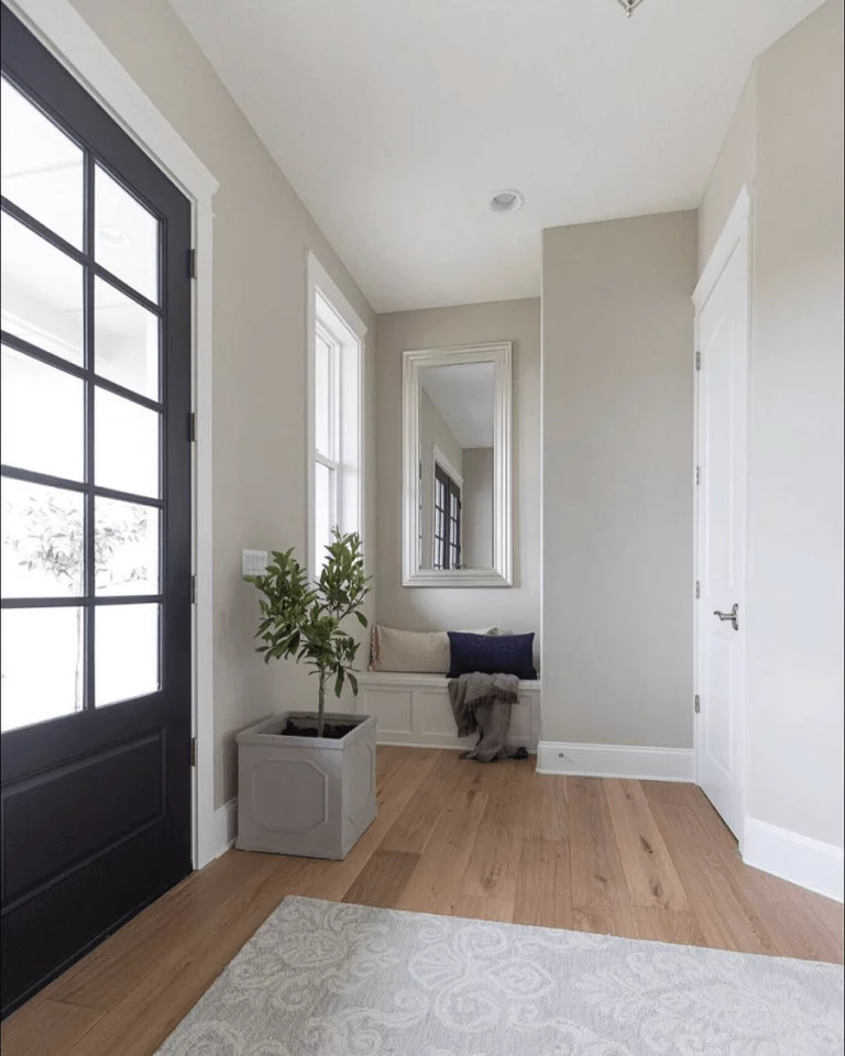
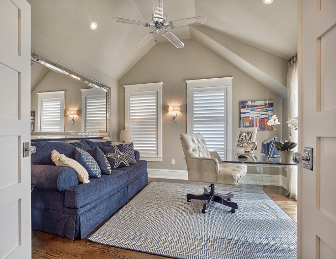
Use of Revere Pewter in interior
Revere Pewter is not a new paint color that has been experimented with in various spaces. Homeowners regard it as a natural shade that induces relaxation and organic naturalness. Versatility is its second name, meaning that the range of possibilities is enormous. Let’s take a look at the best design solutions involving this paint color that are still popular and promise to stay the same for a long time!
Traditional approach
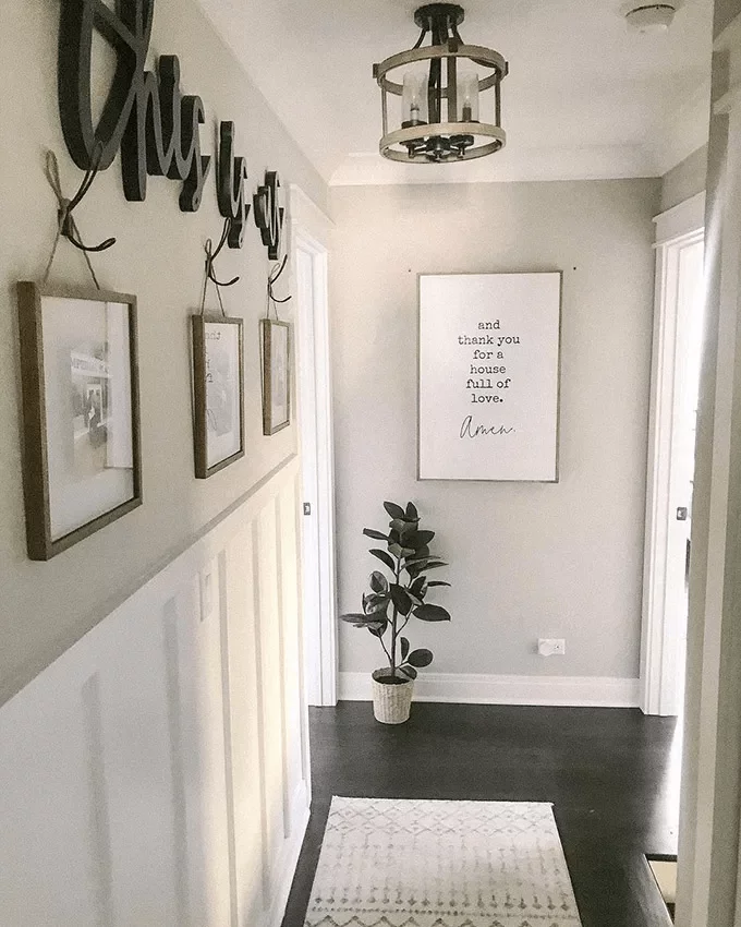
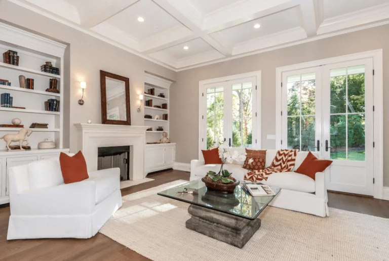
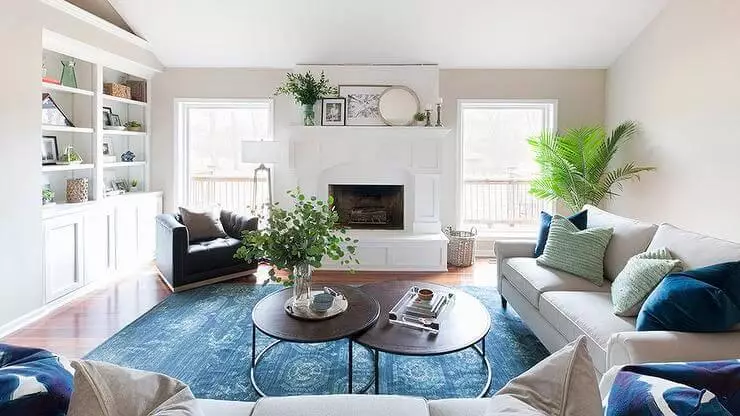
Revere Pewter has been seen as more appropriate in rather traditional settings. Its warm notes and saturated base complement the curved shapes and rich wood texture, which make this paint color perfect for Farmhouse. Whether traditional or modern Farmhouse, the soft gray from BM used to paint the walls will perfectly accompany the elements peculiar to this style. Furthermore, this color works for any space. Be it the living room, kitchen, bedroom, or hallway. This outstanding gray adds a fabulous sense of calmness and endless comfort.
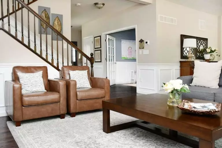
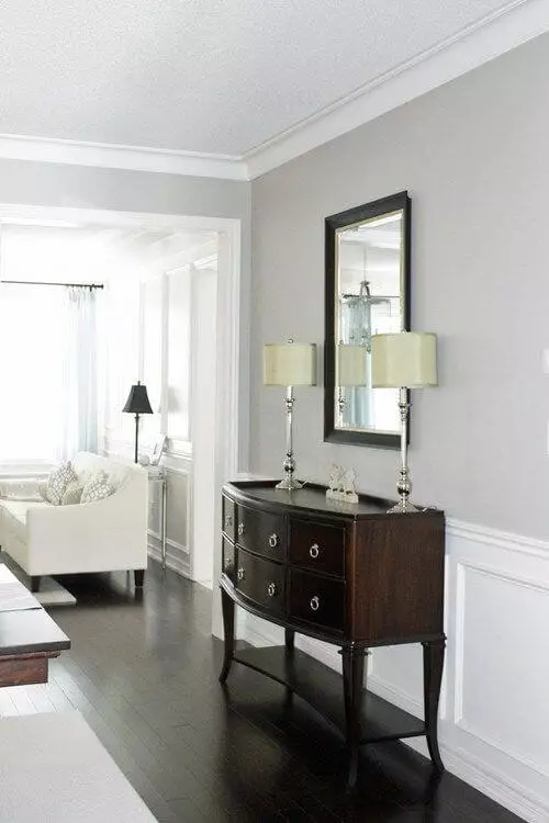
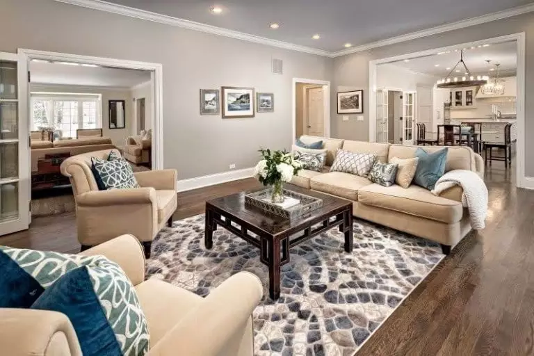
Living room
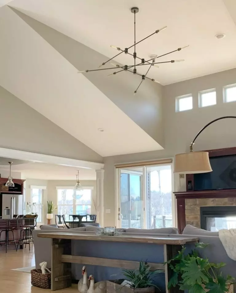
Although this paint color works best for traditional settings, an appropriate color combination can make the most of it within modern interiors. Consider a monochromatic palette with Revere Pewter for the walls, or use this gray shade as a canvas for displaying various accents. Its favorite companions are wood texture and blue accents, although other bold splashes that do not seem too imposing are no less appropriate.
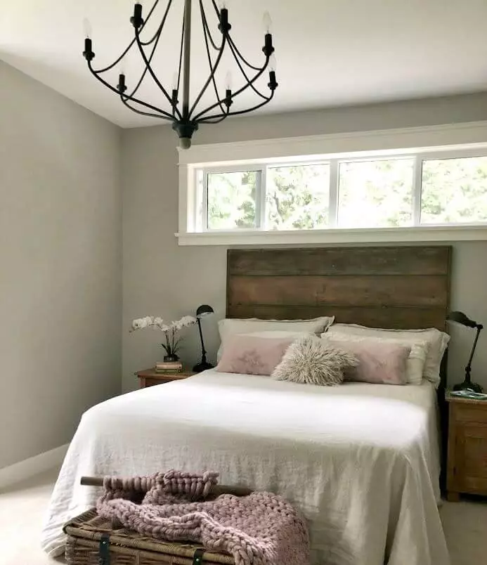
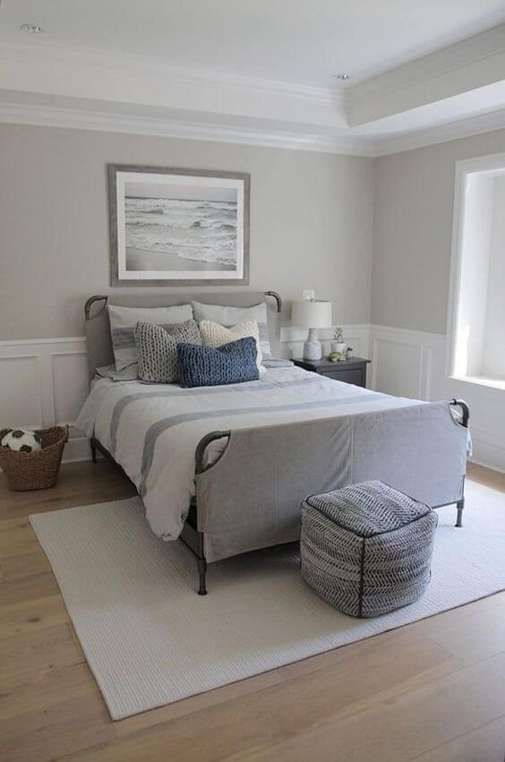
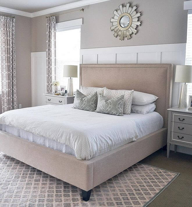
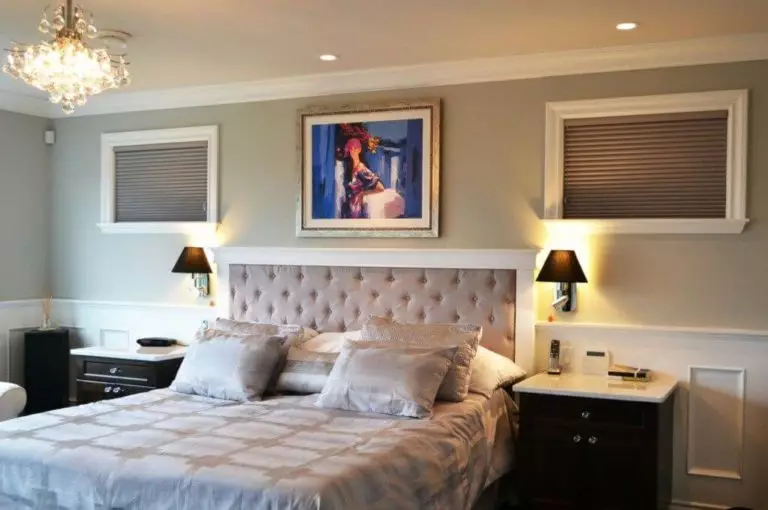
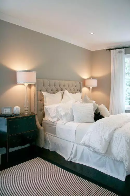
Bedroom
Such a pleasant color is the right fit for spaces that should be filled with relaxation. No other approach will ensure this better than applying this gray shade to the walls. The same as with the living room goes here: a palette based on beige notes or a combination of warm neutrality and soothing accents. Designers suggest not overwhelming the space with many units but leaving it free so that the warm gray can reveal its whole beauty.
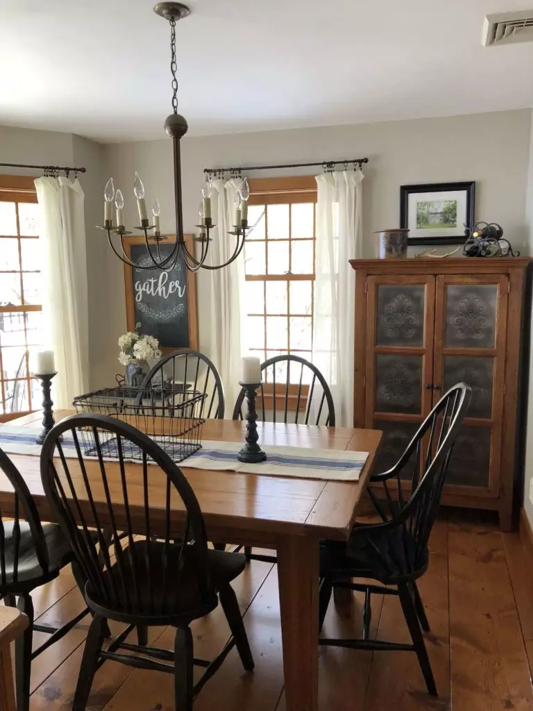
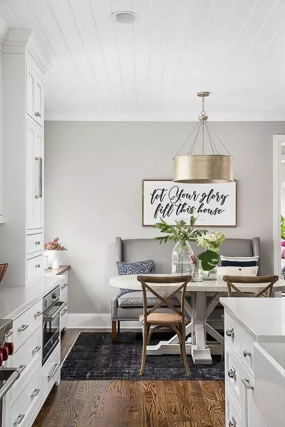
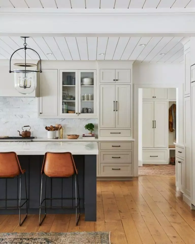
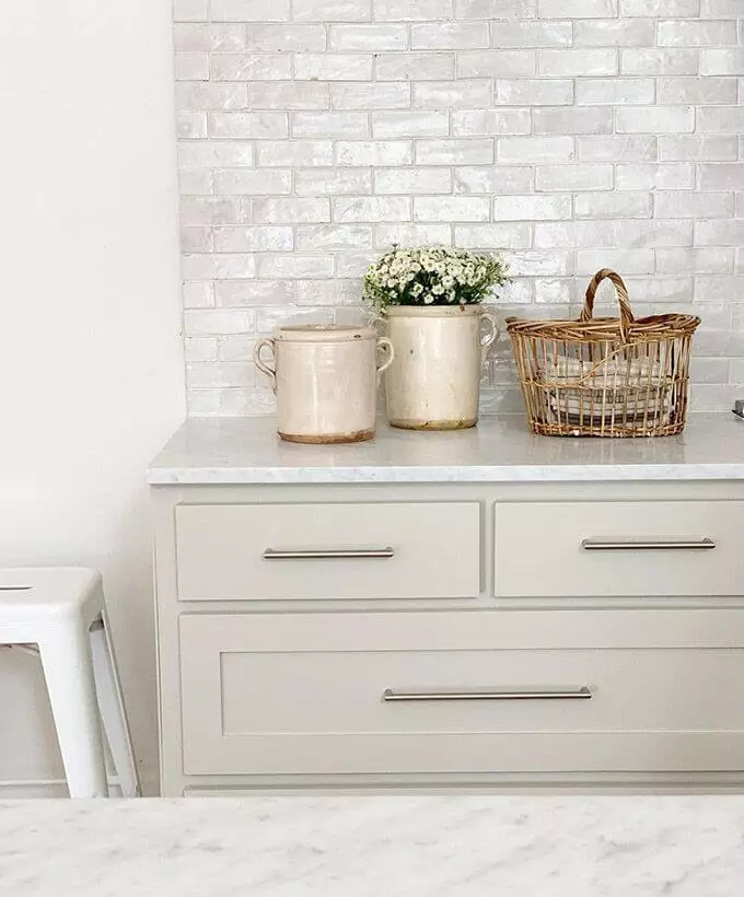
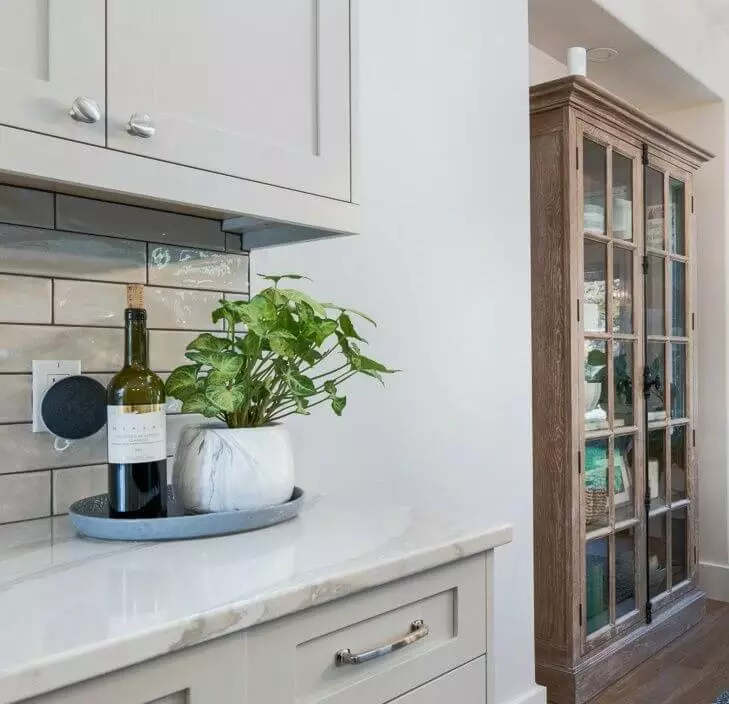
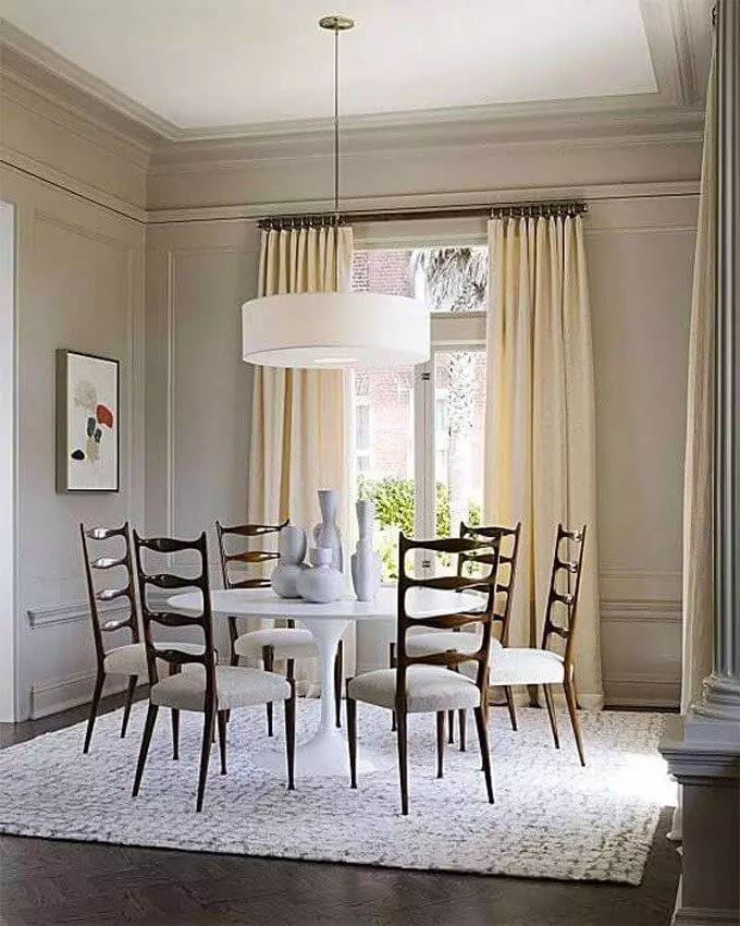
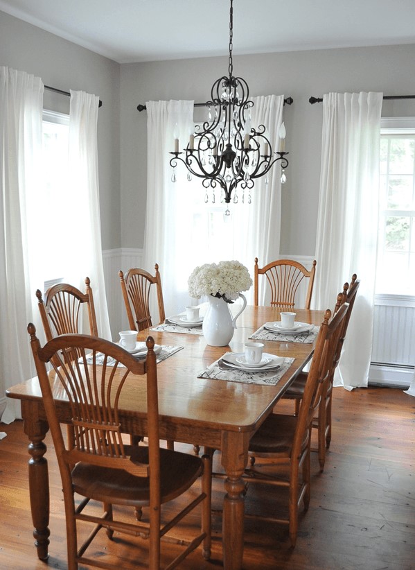
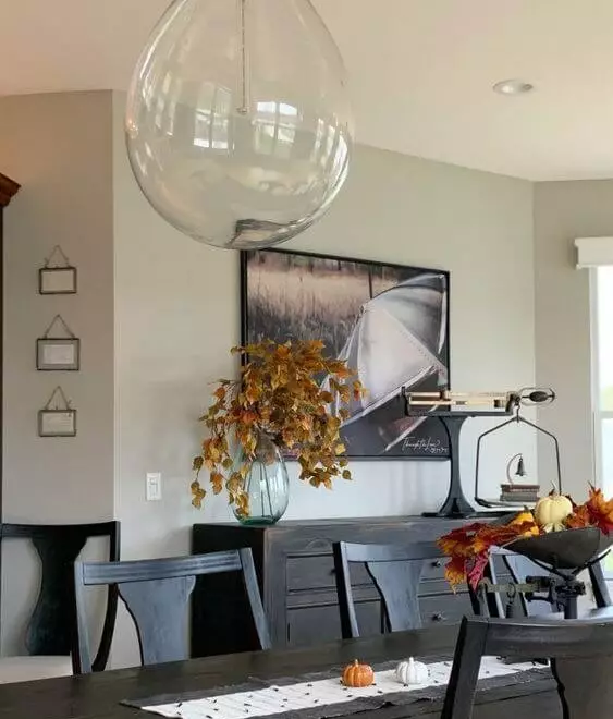
Kitchen and dining room
Revere Pewter works best for the cabinets with marble elements and brass details when we speak about the kitchen. Consider an accent island to add a contemporary air to the color considered as rather traditional. In the dining room, the best approach involving this shade is particularly the traditional one, which, by the way, would serve as a pearl within a contemporary interior. Paint the walls in this soft gray with soothing beige notes and emphasize the warm scents with wood pieces of furniture and a striking chandelier for a splash of elegance.
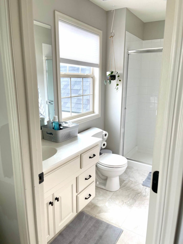
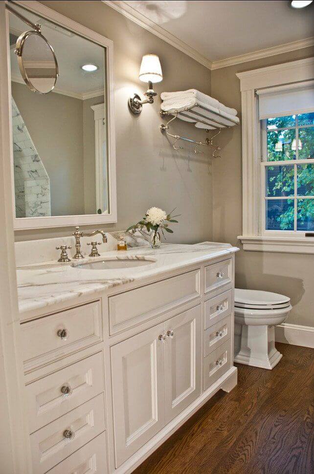
Bathroom
As well as Revere Pewter looks on cabinetry, it would work better for the walls in the bathroom with white trim and white pieces of furniture for a sleek contemporary feel. Once artificial lighting enters the play, this shade takes on a warmer and charming appearance so that it even seems that there is one space during the day and a whole different one at night. You can easily change the perspective by opting for dark wood cabinetry and a few vintage units for an individual approach that resonates with the earthy notes of gray.
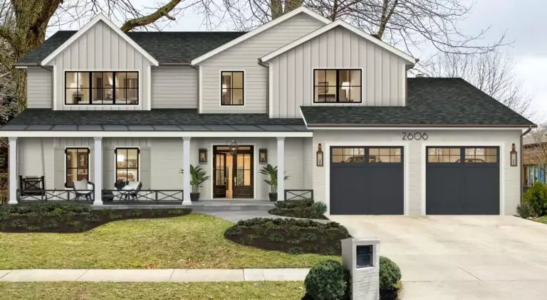
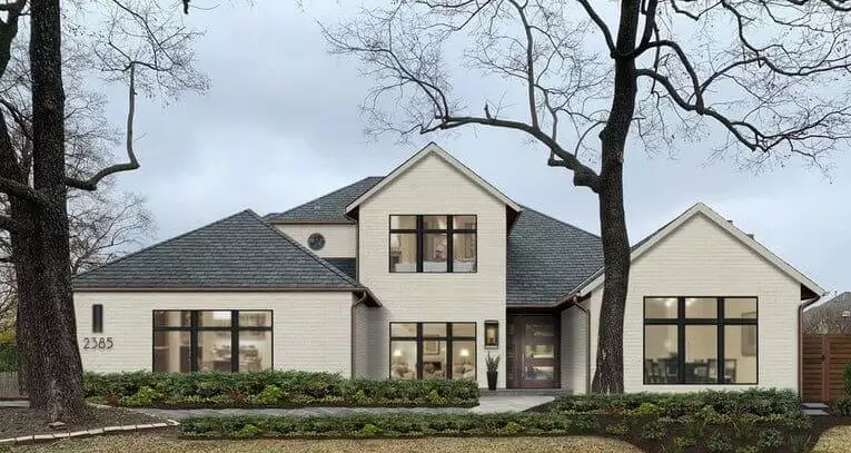
Use of Revere Pewter for house exterior
Are you still looking for the best greige to paint your house exterior? Stop your search and take a look at the timeless Revere Pewter that draws attention in an unobtrusive way that makes you fall in love with it again and again. One should note that this gray may seem a bit lighter and warmer than expected. Still, the combination of notes is balanced. Be it a traditional wood house or a modern brick one, the remarkable gray with warm scents will complement it to the fullest. A medium or dark gray devoid of undertones for the roof would serve as a perfect companion.
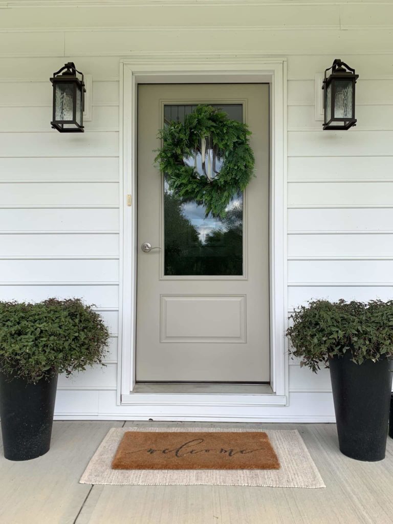
A no less refined approach is using Revere Pewter for the front door on a white background. A pot with greenery on both sides, and you will not get tired of admiring the magic this beautiful gray is playing on the result as a whole.
The Revere Pewter HC-172 paint color from Benjamin Moore is a classic greige whose versatility and stylish effect have already been proved. A great option for traditional, modern, and transitional interiors, this timeless shade is ready to meet any expectation of yours.
