Wall painting in the kitchen: the most popular colors, tips, and combinations
The color of the kitchen walls is an essential design element, on which the harmony of the entire interior will depend. A competent choice of shade will allow you to set the room a certain mood and create a favorable atmosphere.
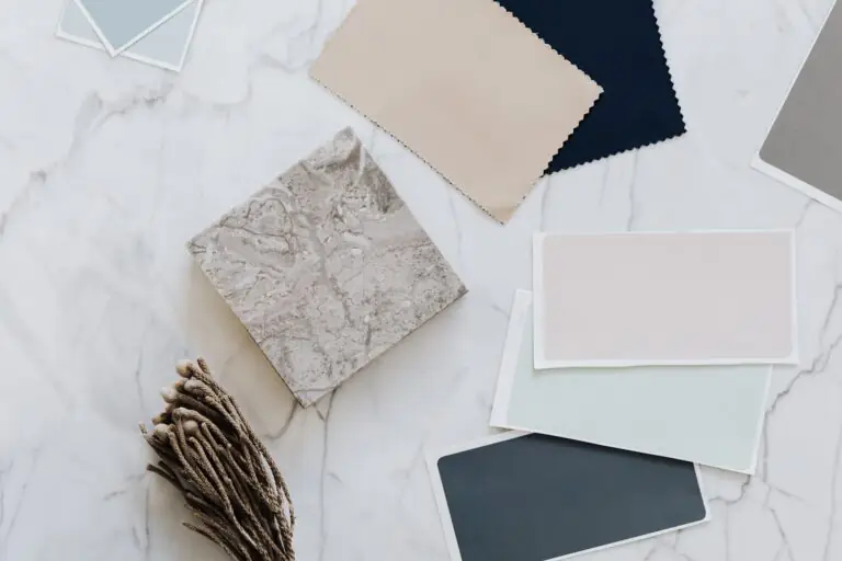
Color matching steps
The first thing you need to understand is the beginning of work, so before you start designing and choosing the color of the walls, it is vital to study the recommendations of designers, psychologists. Matching the colors should follow steps are carried out:
After all the steps completed, you can proceed to the design and painting of the kitchen.
Psychologists’ recommendations
Any color affects the psychological state of a person. Before choosing, you should familiarize yourself with the recommendations of psychologists.
Experts do not recommend the use of very colorful and bright colors since they activate the nervous system. Depending on the temperament, psychologists advise using the following colors for the kitchen:
Those who like bright colors should know that red strongly affects the psyche – not only activates the body to action but also enhances the appetite so that this decision may be required for people with anemia.
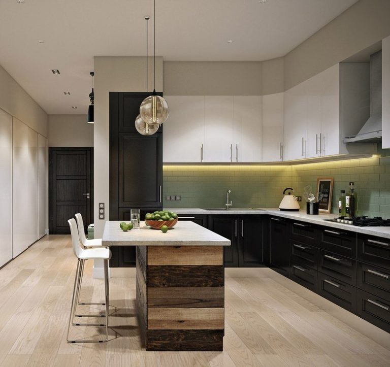
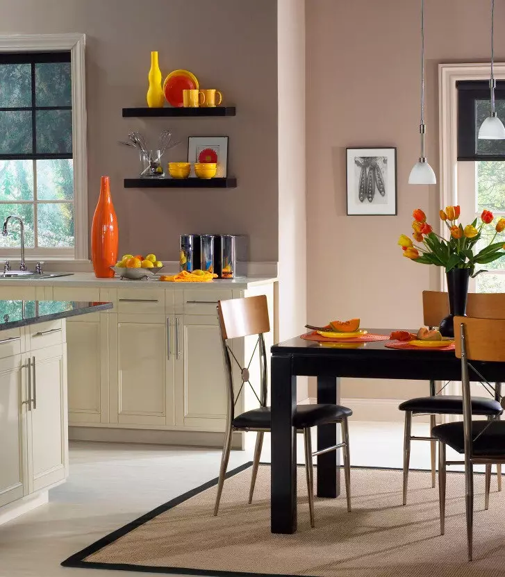
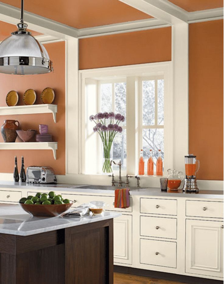
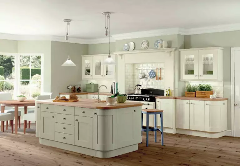
Orange has similar qualities as red, being disturbing, but the effect on the psyche is more moderate. From such walls, the mood rises, the digestive system improves. Green shades are good for digestion. Dark shades can negatively affect a person’s mood; they are also not used in a small area. If dark colors are present, then they will need to be diluted with softer, lighter ones.
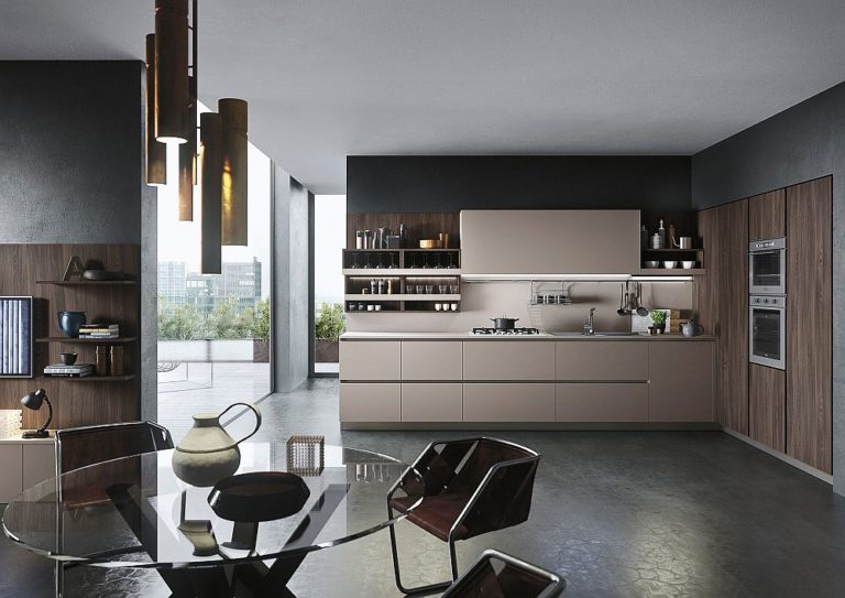
Black, brown paints are rarely used for the kitchen because they visually make it small. Such a decision can impair appetite, affect mood.
Boring colors are too tiring for anyone, warm colors give vigor, and cold colors can calm.
The choice in the direction of light color can revive the design; dark ones will keep the kitchen restrained and calm.
Choosing a palette according to style
It is imperative when choosing the color of kitchen walls to determine the style. For understanding, you can pick up several options at once and attach samples to the walls. Based on the style of the kitchen, the color selection is simplified:
Among the general rules are:
Psychologists and designers do not recommend using a pure green color for kitchen walls. It is better to choose several shades and combine them according to your preferences. A similar rule applies to yellow, pastel, or red copper.
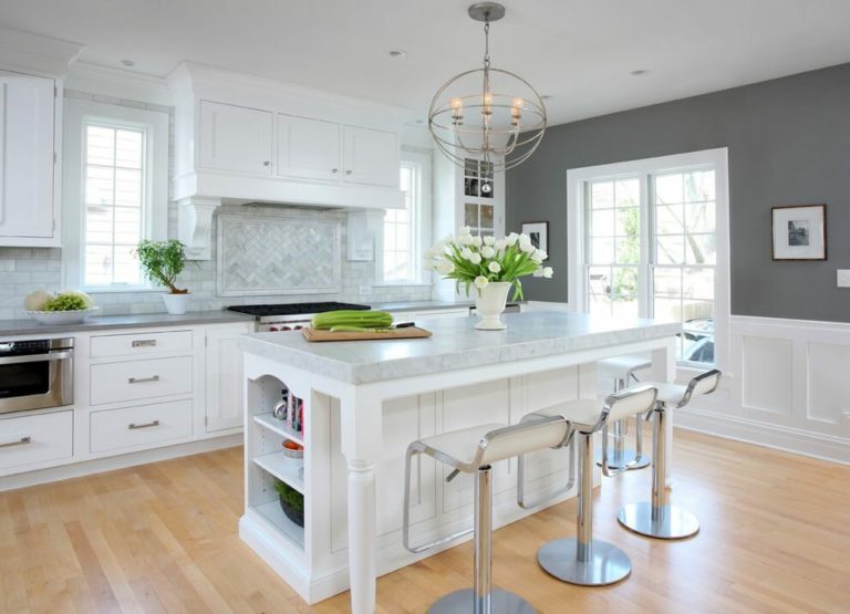
Universal and suitable is the white color, which, if combined correctly, will make the room beautiful and fit any style.
Nuances of color choice
Designers recommend that when choosing a color for kitchen walls, consider many different features, including layout, lighting, area, and other factors. Be sure to take into account furniture, appearance, and location.
Wall painting in a narrow kitchen
The color of the walls for a narrow kitchen should be light, furniture and paint are selected in different shades. Among the options are:
Choosing a bright color, you can paint only one wall located on the other side of the door. It is forbidden to use paints in a narrow kitchen at two levels.
Wall painting in a small kitchen and low ceilings
The combination of colors in such a room should be selected appropriately to make the kitchen cozy. To do this, you need:
Finished drawings, borders, or painting in two colors are excluded.
Wall painting in a big kitchen
In such rooms, you can not use very light and cold shades. Well suited orange, coral, cherry, or purple. It is crucial to consider the following rules:
Using purple, you need to choose it correctly and make the best combination. From such a decision, quickly get tired.
Wall painting in a studio kitchen
During the kitchen studio’s design, it is essential to maintain not only the general interior style but also the same gamut of colors with different shades. For decoration, it is better to use three colors:
Bright solutions to apply for one wall in the room, in the living room area, paint everything in one color.
If there is light brown furniture, you can make one wall light green and white, painted with a light green shade in the living room. In this case, only light furniture should be placed in the living room. The kitchen-studio in red and white color is combined in a modern and beautiful way.
If the walls in the living room are covered with wallpaper, then in the kitchen, you need to paint in a similar shade, and it is better to use wallpaper as well. The application of different shades of the same color is combined well, but applying light colors in the living room, dark in the kitchen.
Lighting and color
The selection of gamma depends on the lighting of the entire area. If the kitchen is located on the north side, there is little natural light; you need to give preference to soft yellow paint, golden, sand, or cream.
With a large area, red and orange can be used, and yellow will make the illusion of sunlight. Apply bright shades only on one wall, and it is better in the darkest part, making the room soft and pleasant.
If the side is sunny, then cold shades are suitable, the use of blue, green, sea color is allowed. They can be combined with soft colors or contrasted by adding yellow to green or blue, and gray to red.
In bright rooms, it is better to use glossy paint so that lighting appears overwhelming and bright.
Color change the size of the room
It is important not only to choose the correct color of the walls but also to take into account the range of additional details. Furniture occupies a lot of space, which is the main part of the kitchen. When choosing the color of the walls, the gamut of furniture is taken into account. Key requirements to follow:
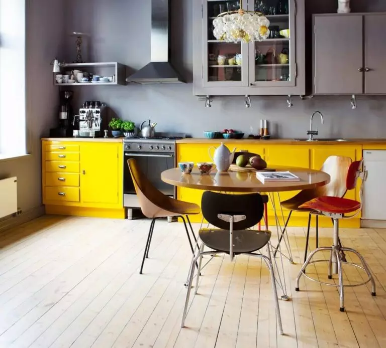
The most popular wall painting colors in the kitchen
The color palette of the walls is considered the most crucial element in the decoration of the kitchen. It is from the correct selected shade that the whole appearance of the interior will depend.
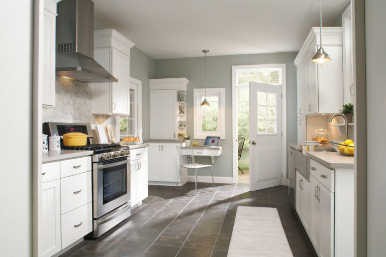
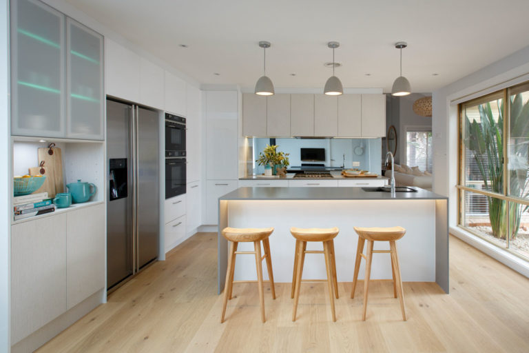
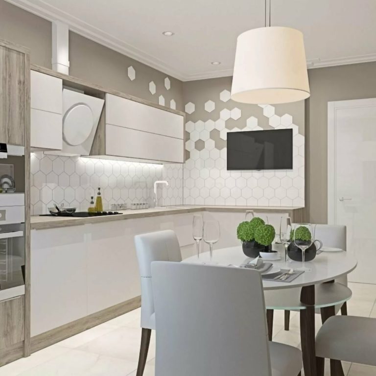
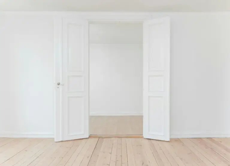
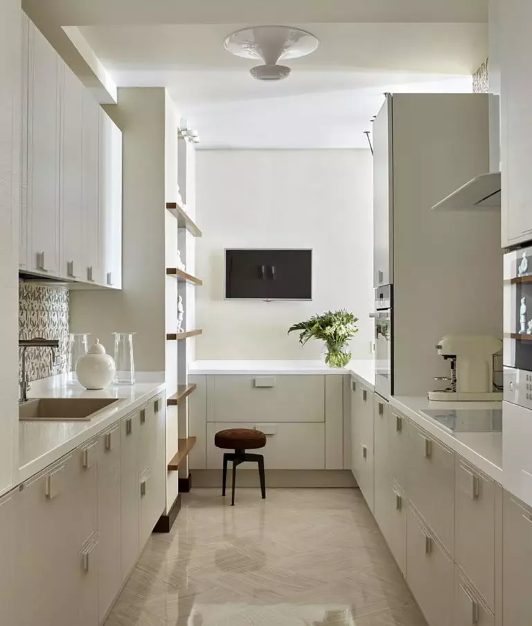
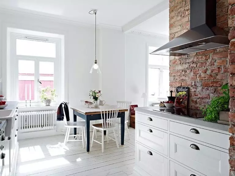
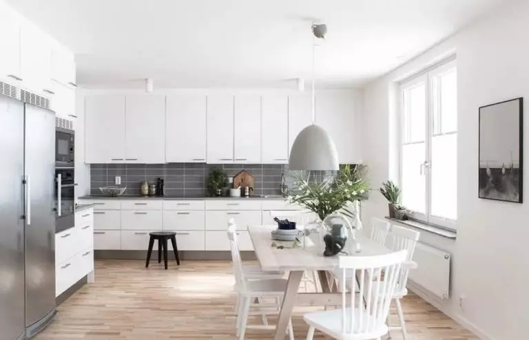
White walls in the kitchen
It will undoubtedly give the room additional volume, brightness, and snow-white purity. This color is rather ambiguous, as it has a wide variety of colors: chalky, milky, creamy, or opal.
White brings graphics and stylishness to the interior; it perfectly emphasizes the volume and texture of other decor elements while not drawing attention to itself.
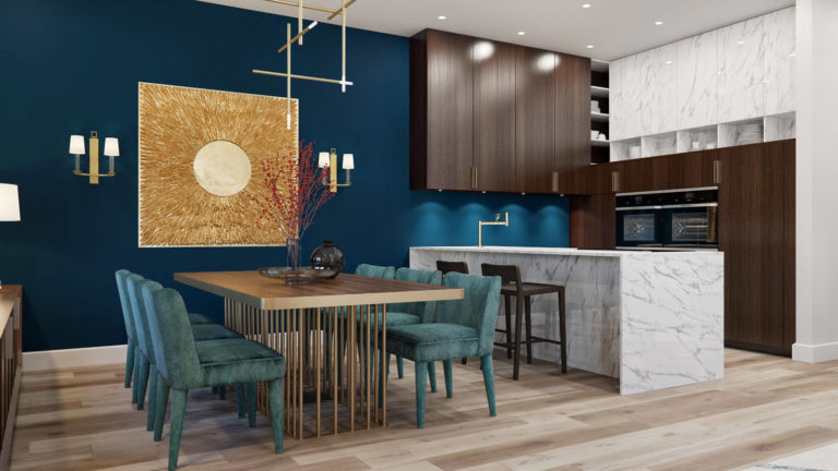
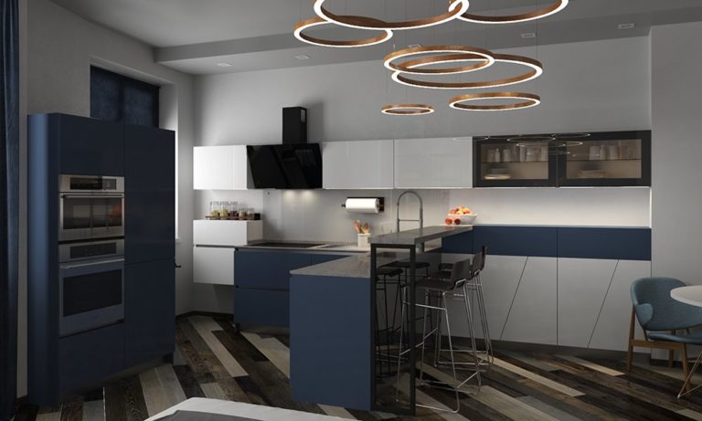
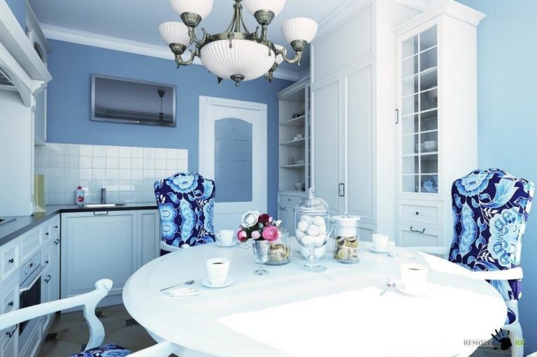
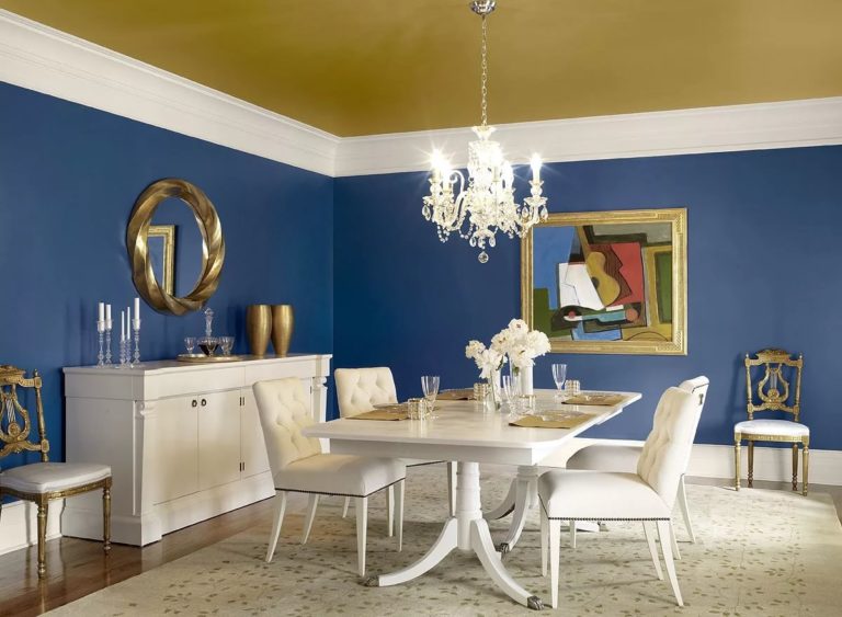
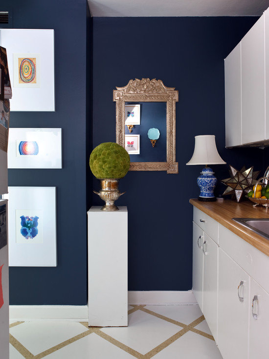
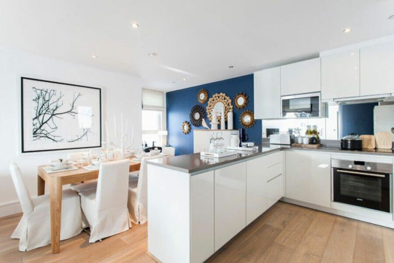
Navy blue walls in the kitchen
The extravagant, but at the same time, very harmonious blue hue, is very relevant in the design of walls in the kitchen. Such color of the sea wave always looks merely magnificent and forms a light, as if the air-filled design.
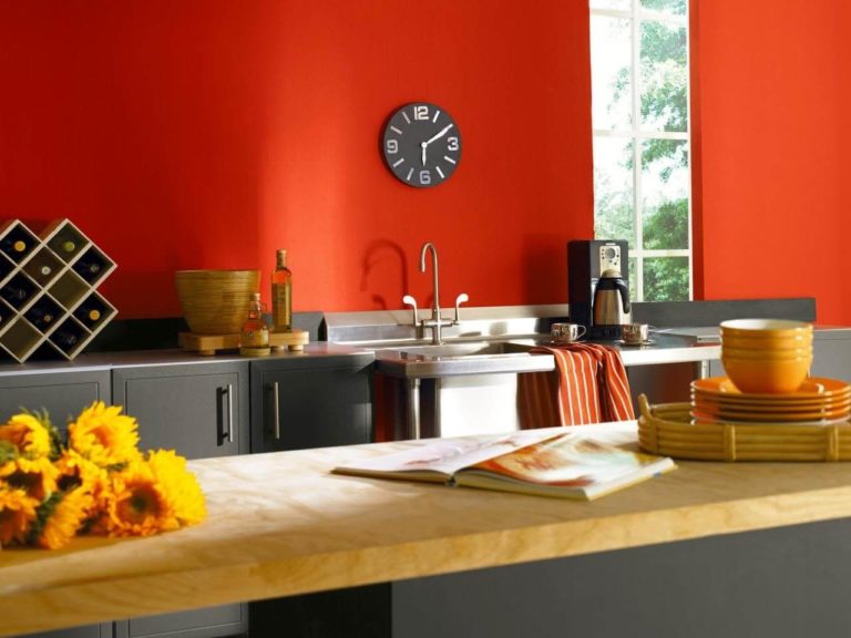
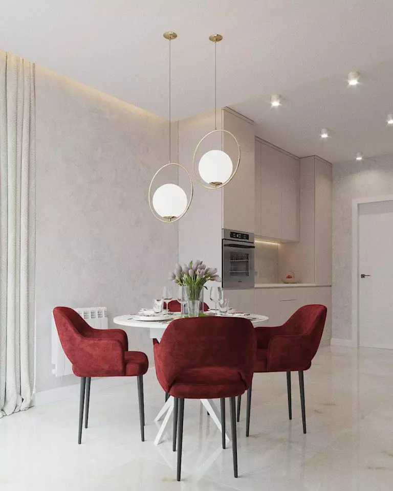
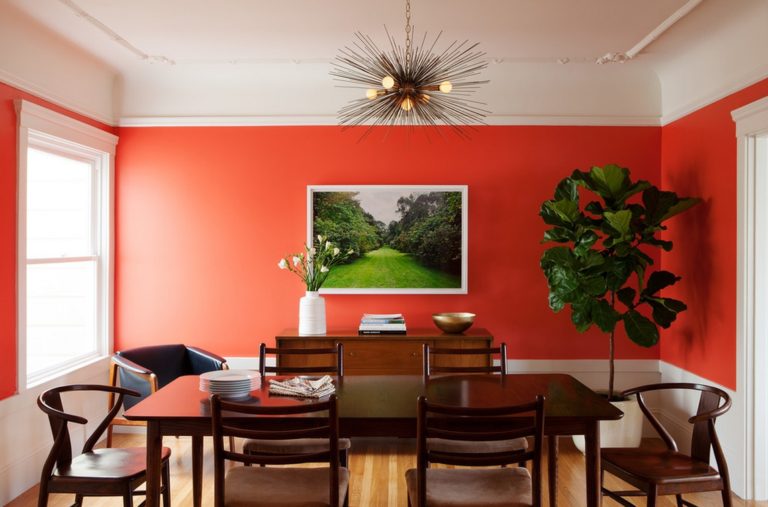
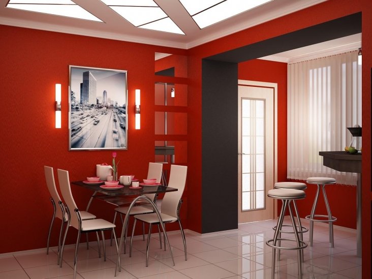
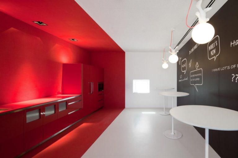
Red walls in the kitchen
Burgundy walls will add some piquancy to the room and make the interior more active and pronounced.
Complex, bright, and deep red tones in the kitchen look bold, extravagant, and attract all attention to themselves.
Such colors radically transform the room, making it genuinely stylish, fashionable, and attractive. This wall decoration is very bold and extraordinary and is perfect for creating exclusive and memorable interiors.

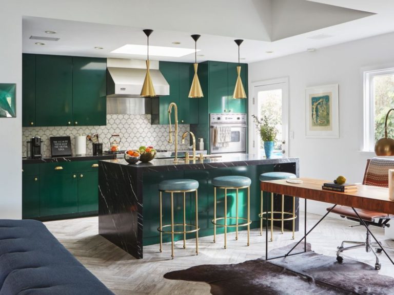
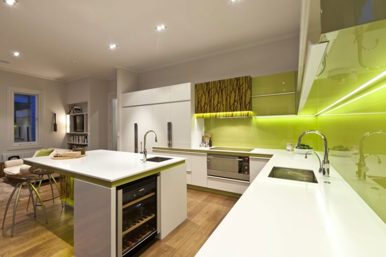
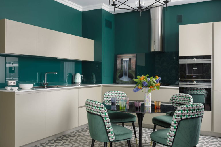
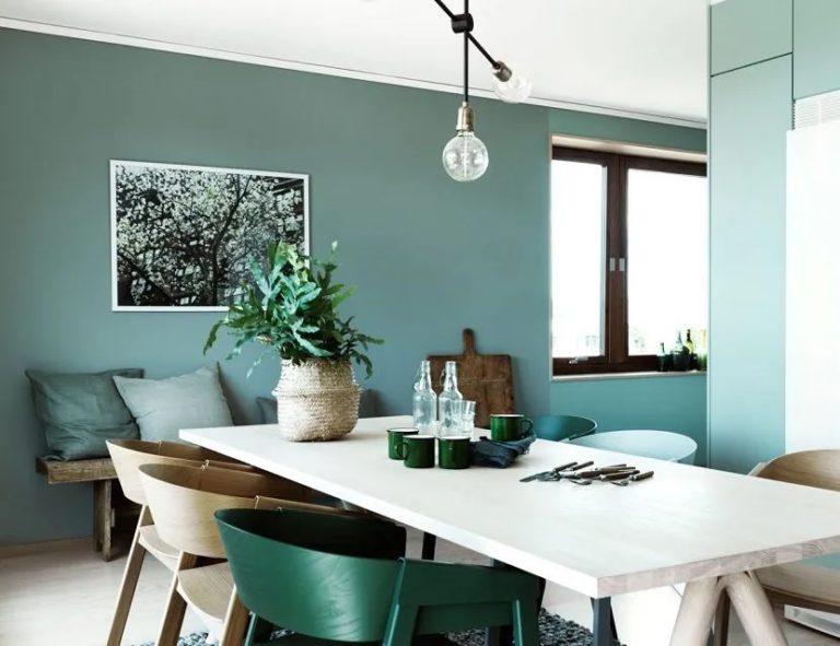
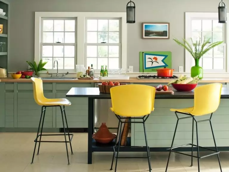
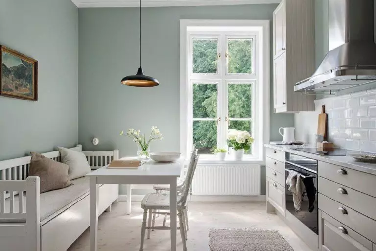
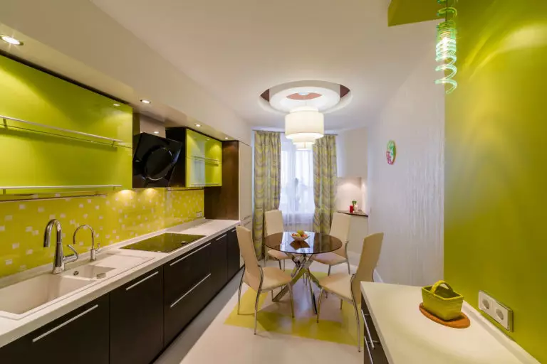
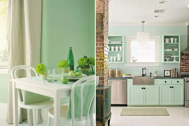
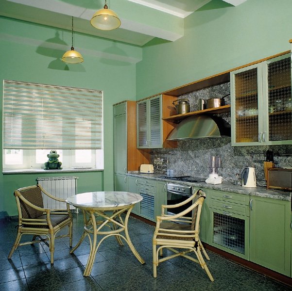
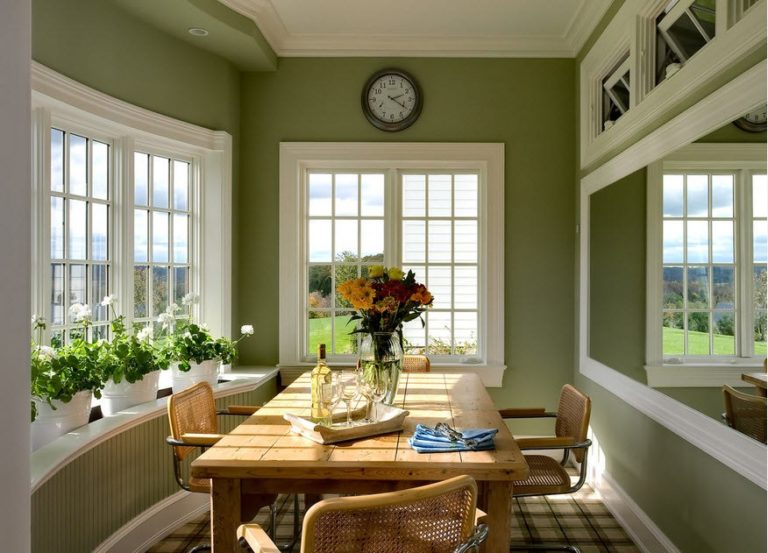
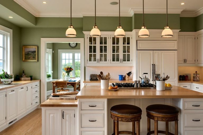
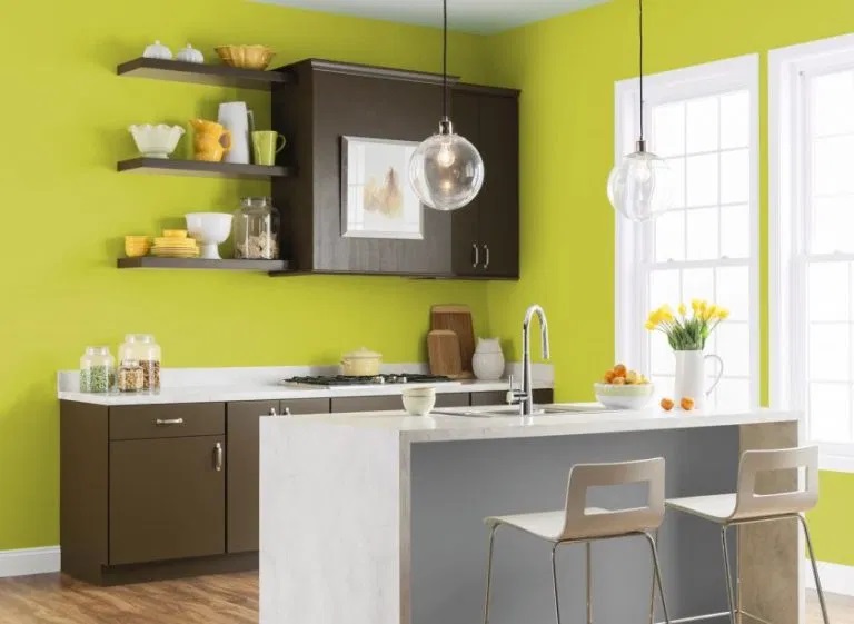
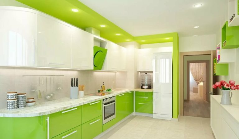
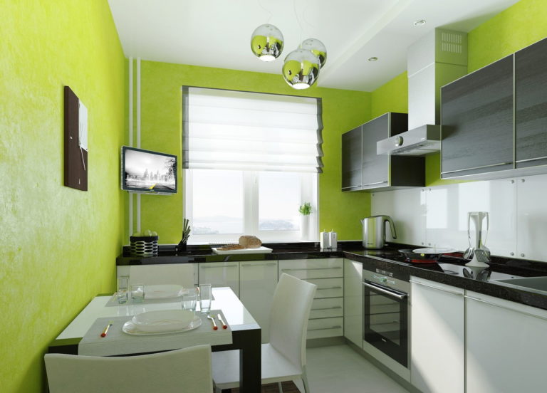
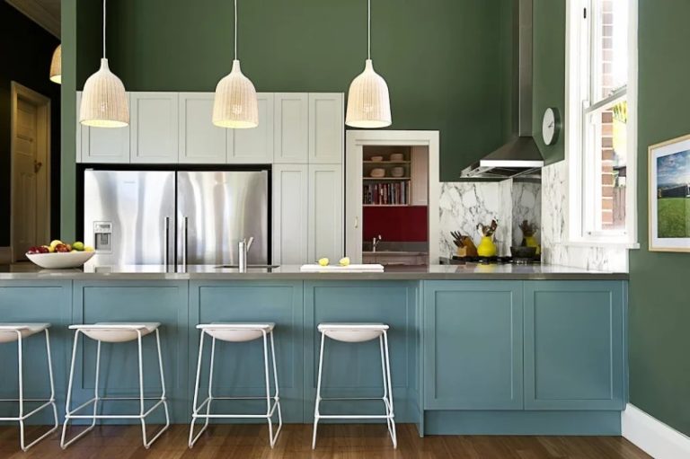
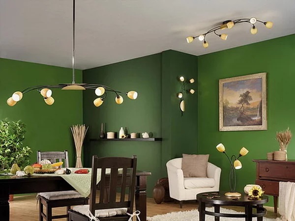
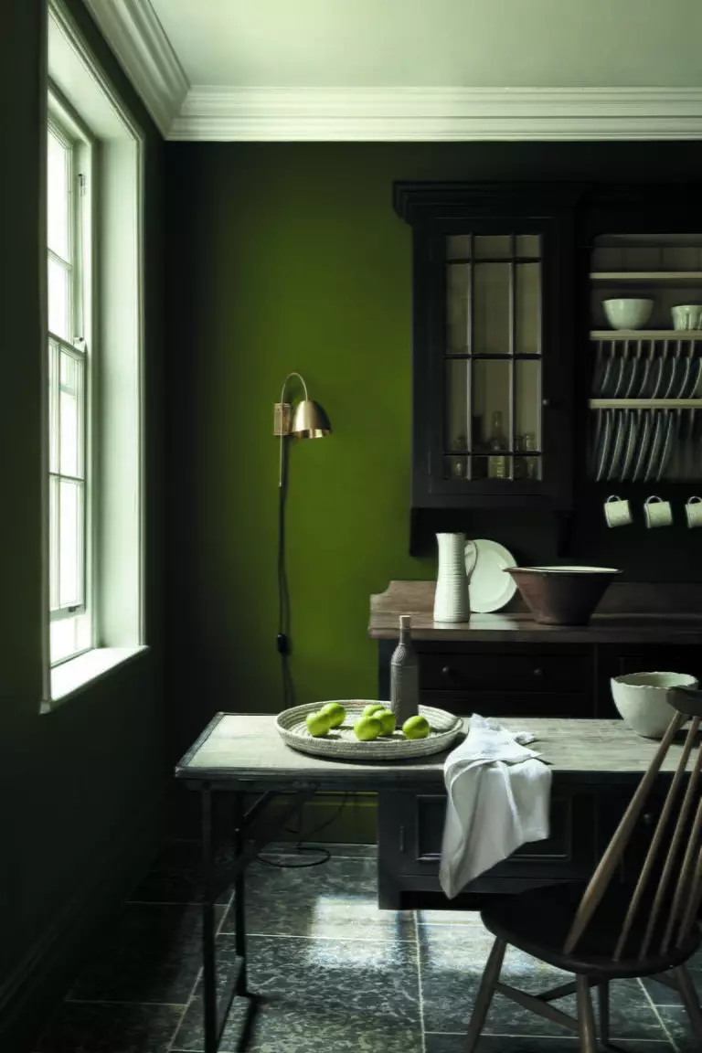
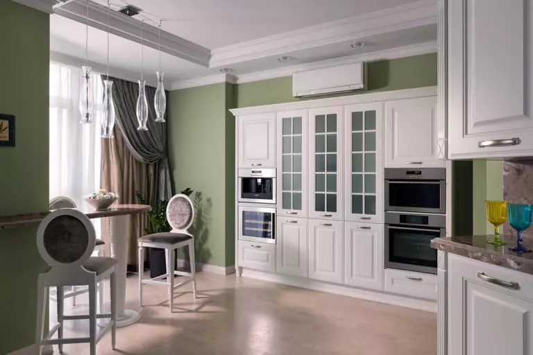
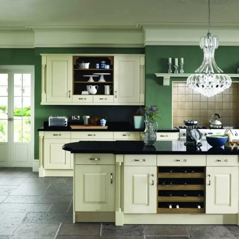
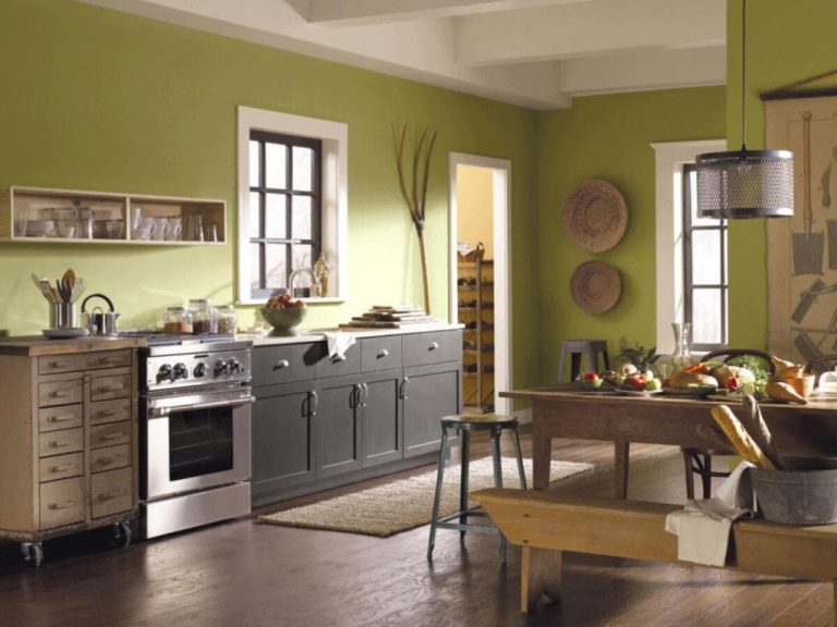
Green walls in the kitchen
Fill the atmosphere with the aroma of summer greenery and optimism. Green, pistachio, or lime will animate the space and add juiciness to it.
Shades of green
Natural green shades always have a very beneficial effect on the atmosphere in the room.
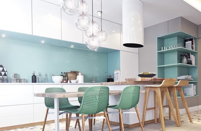
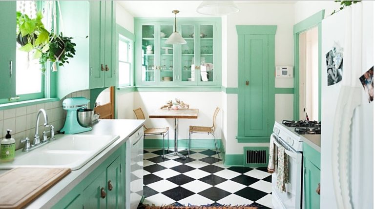
Mint color
It copes well with both the central and secondary role in the design of the kitchen. The menthol shade brings freshness into space, a feeling of languid coolness, and blends beautifully with almost all colors.
Mint due to its natural appearance, pleasing to the eye, does not cause fatigue and irritation and does not bother.
Olive color
Natural, and warm olive tone, allows you to create amazing, sophisticated, and attractive color combinations, due to which it turns out to change the design beyond recognition and make it truly extraordinary.
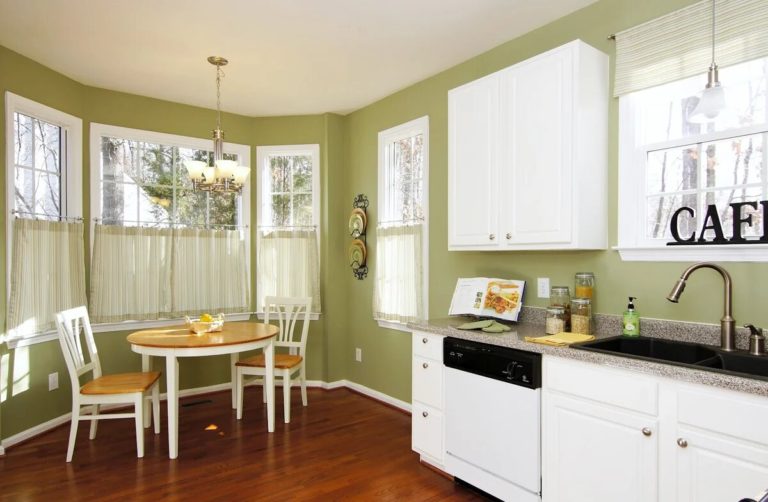
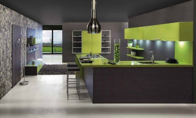
Light green color
It will fill the atmosphere with positive emotions and create a cheerful atmosphere. The light green background in the kitchen space emphasizes and highlights the rest, both dark and light interior elements.
Dark green color
Deep and noble dark green, give the room a particular mystery and give the interior a presentable appearance. However, this wall decoration should only be used in rooms with good lighting, so as not to get a gloomy and depressing atmosphere.
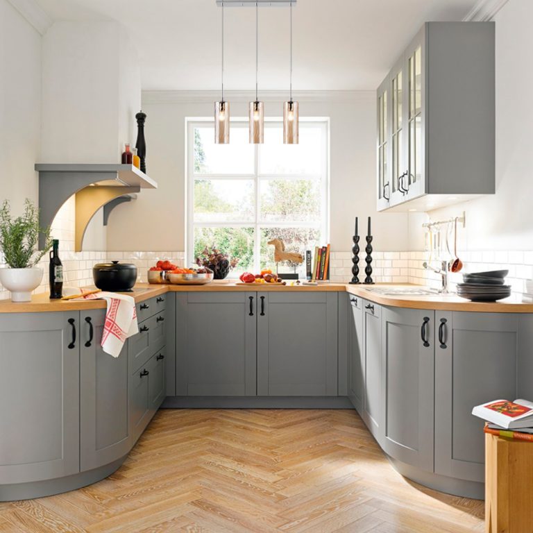
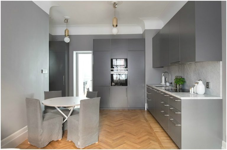
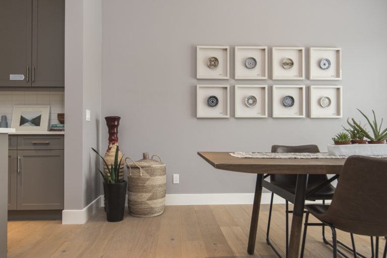
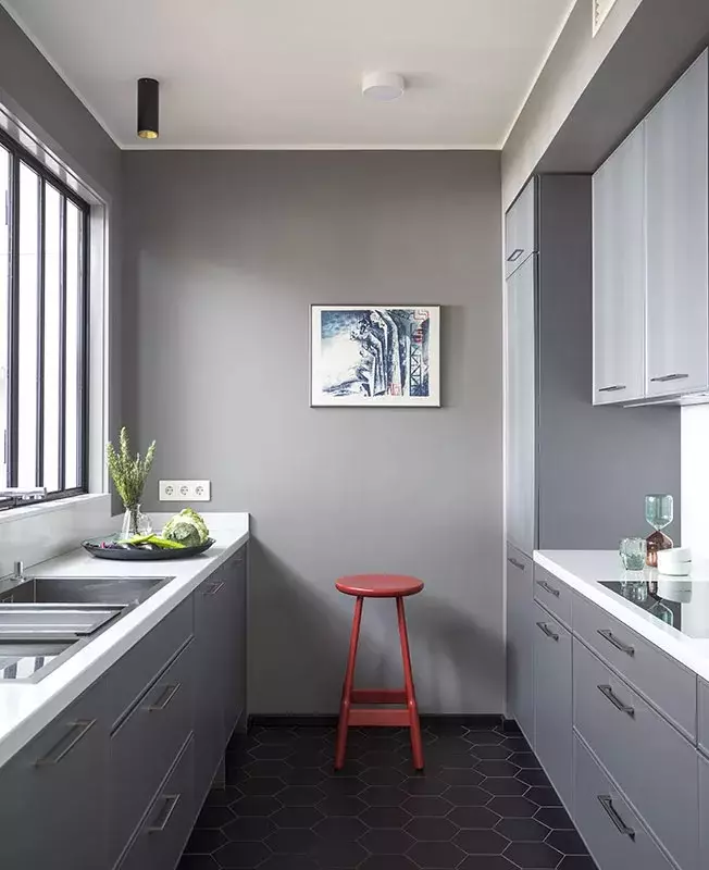
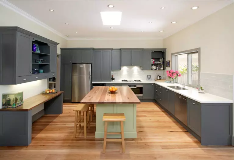
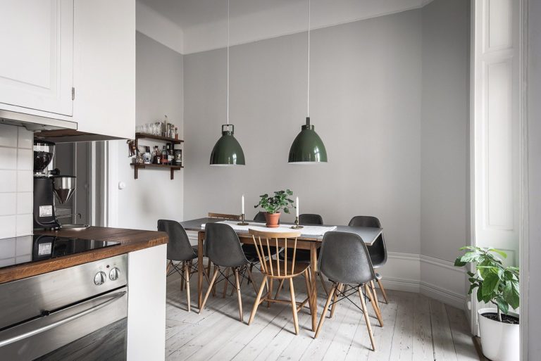
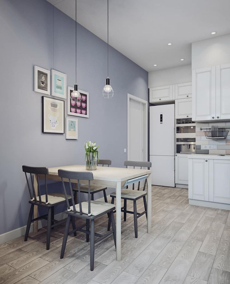
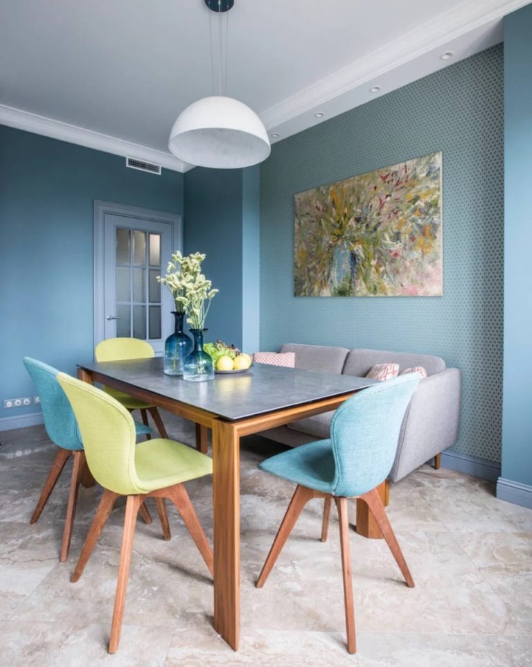
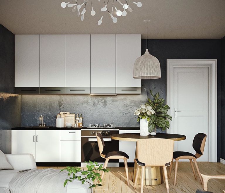
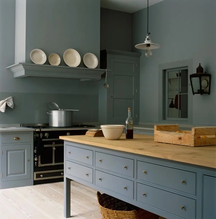
Gray color
Gray or light gray, combine striking elegance and simplicity. Owing to their restraint, they are a modern sign of good taste, create complete harmony, poise in the room, and fill it with a haze of mystery.
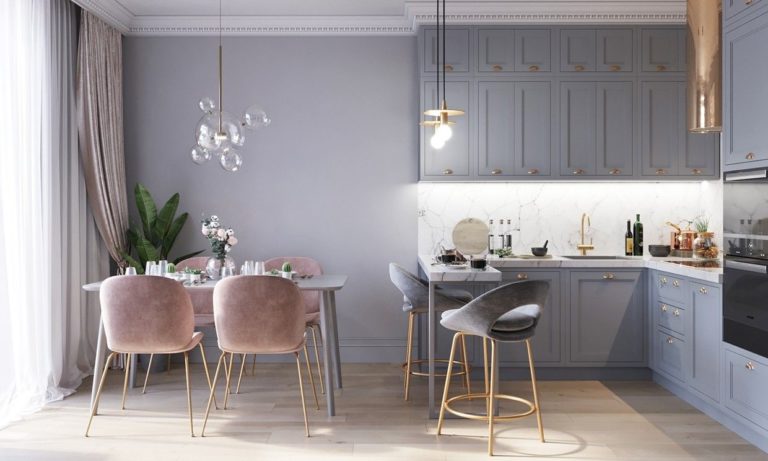
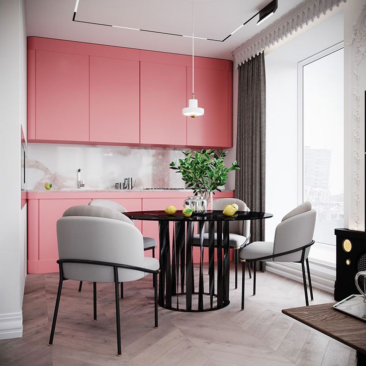
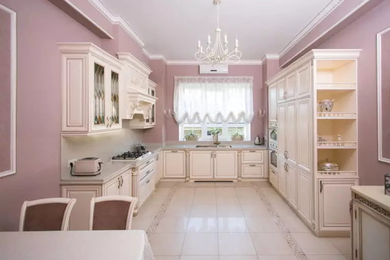
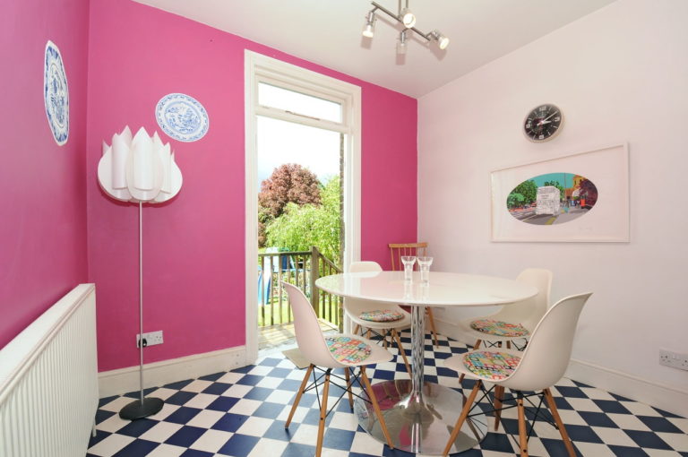
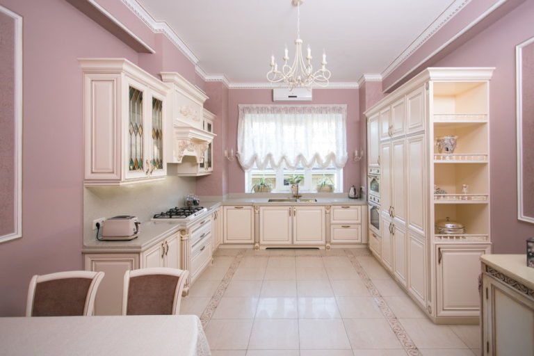
Pink color
Delicate pink always creates a warm and cozy comfortable atmosphere. Soft and sophisticated shades make the design more sensual.
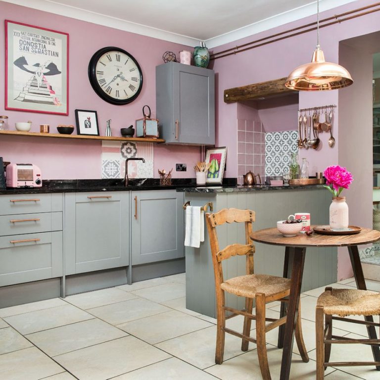
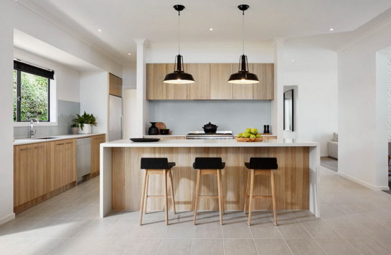
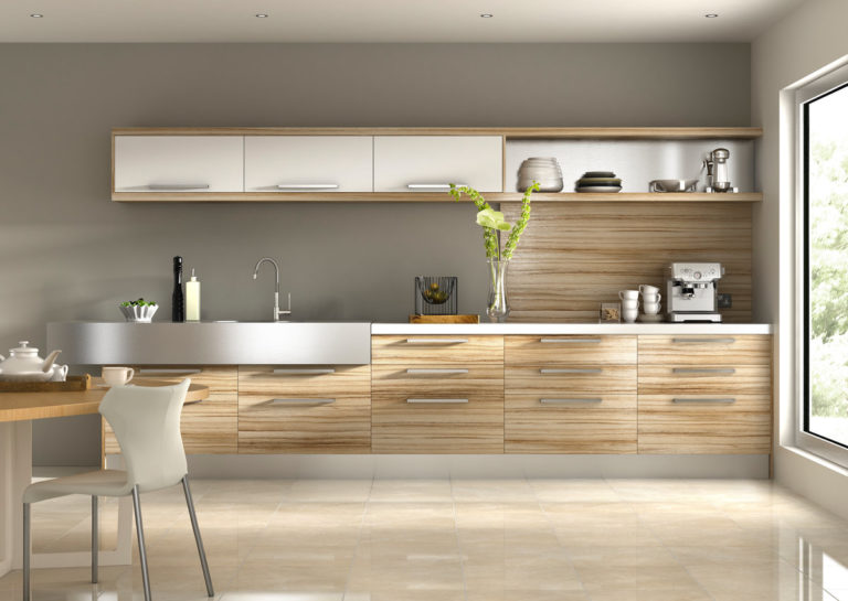
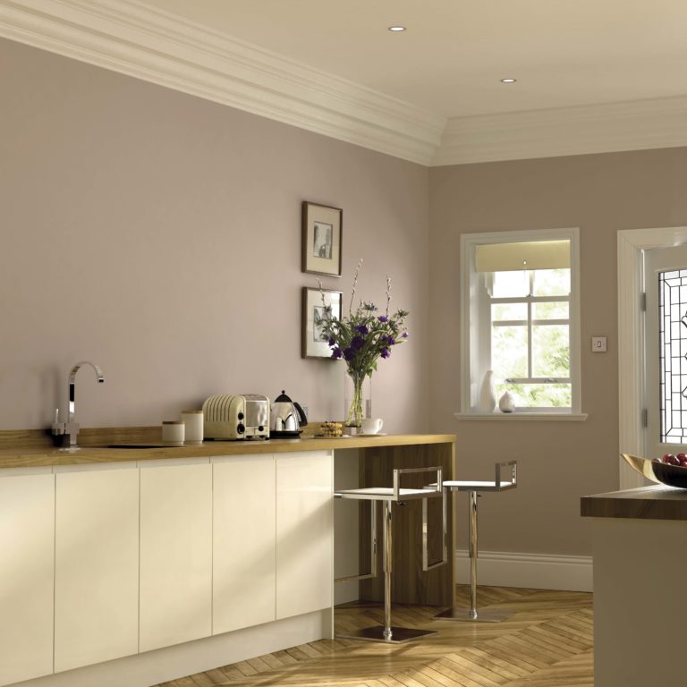
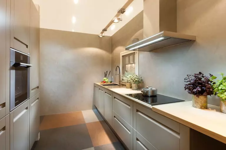
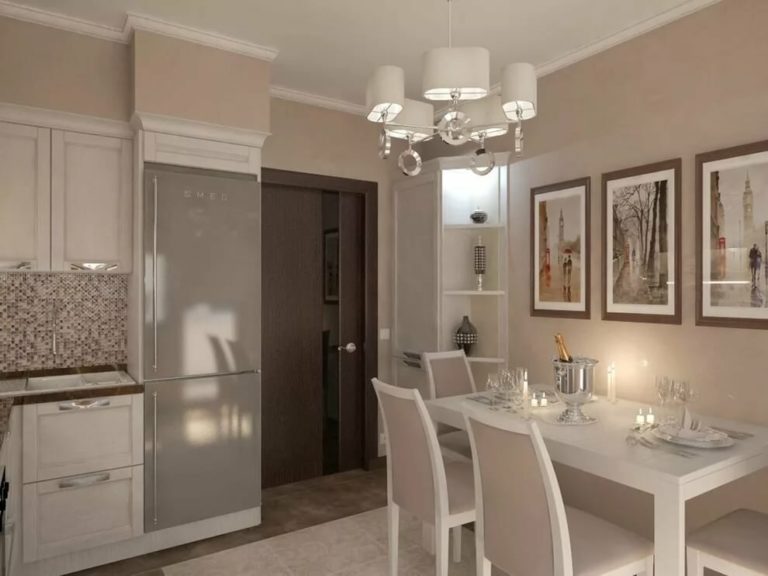
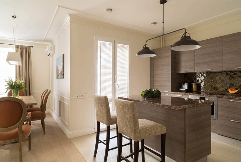
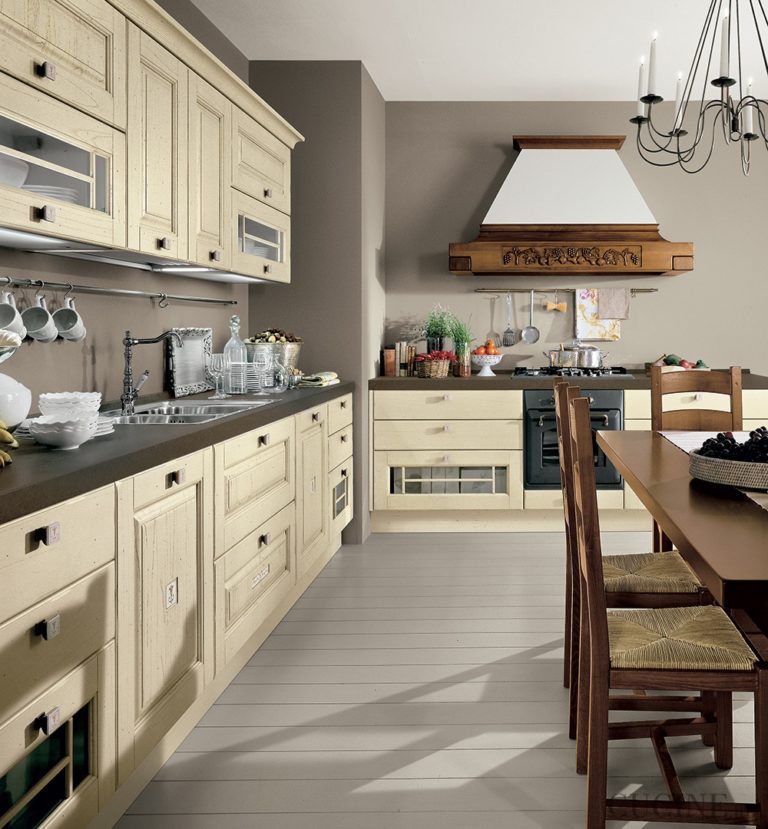
Beige color
Due to its versatility, beige is often used for kitchen decor with any style solution. This tone is considered neither warm nor cold and therefore allows you to create a stunning interior with the kind state and style.
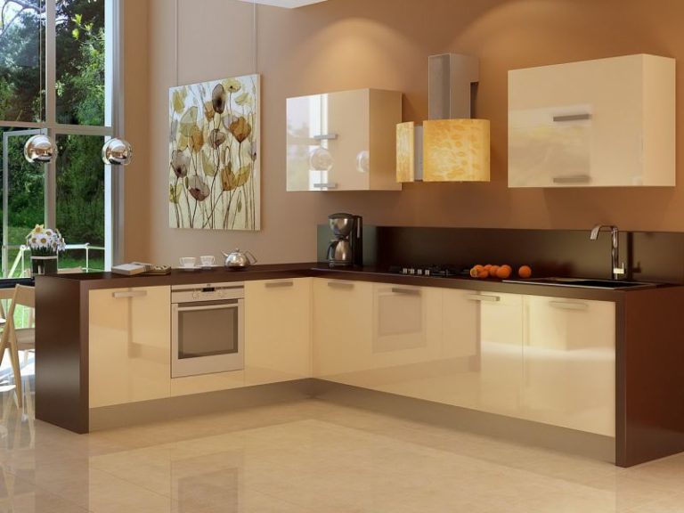
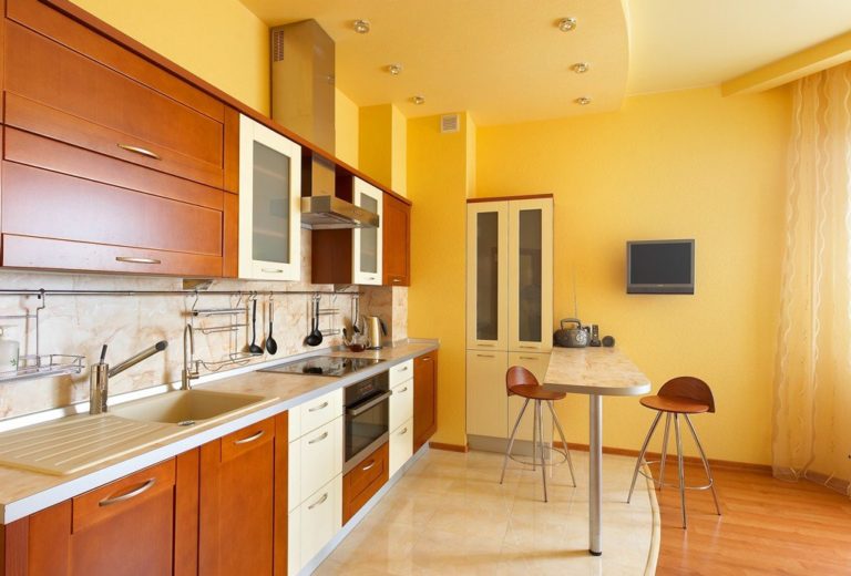
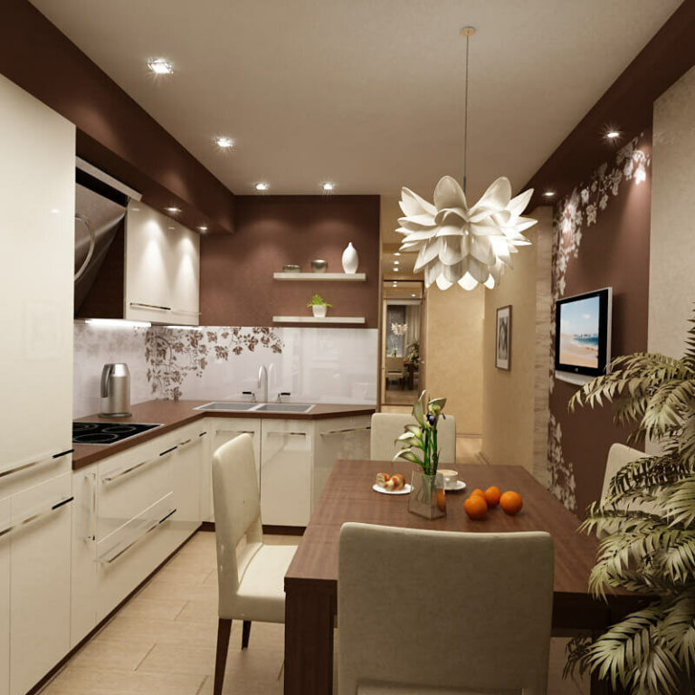
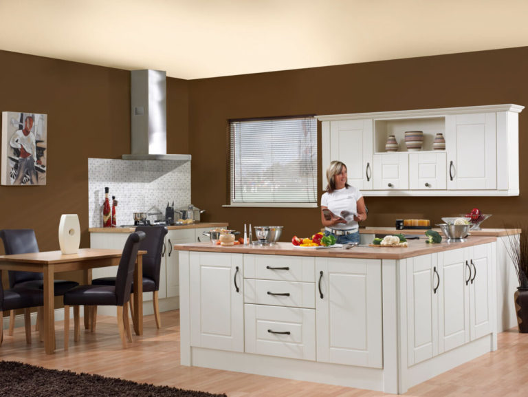
Brown color
Chocolate and coffee shades are a classic option for creating a cozy and comfortable atmosphere. Brown carries in itself the nobility and high cost and is universal.
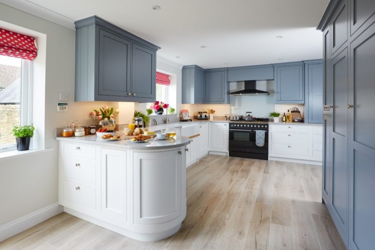
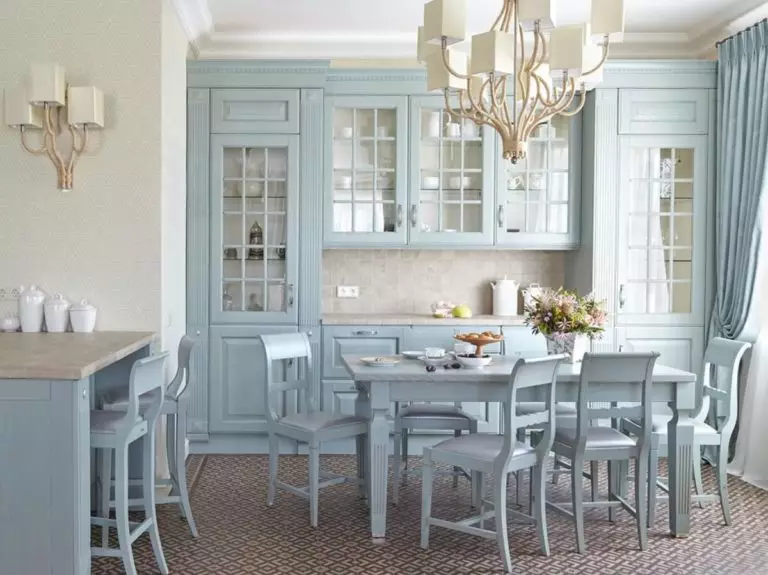
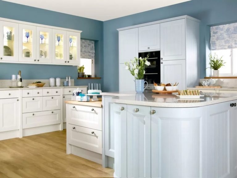
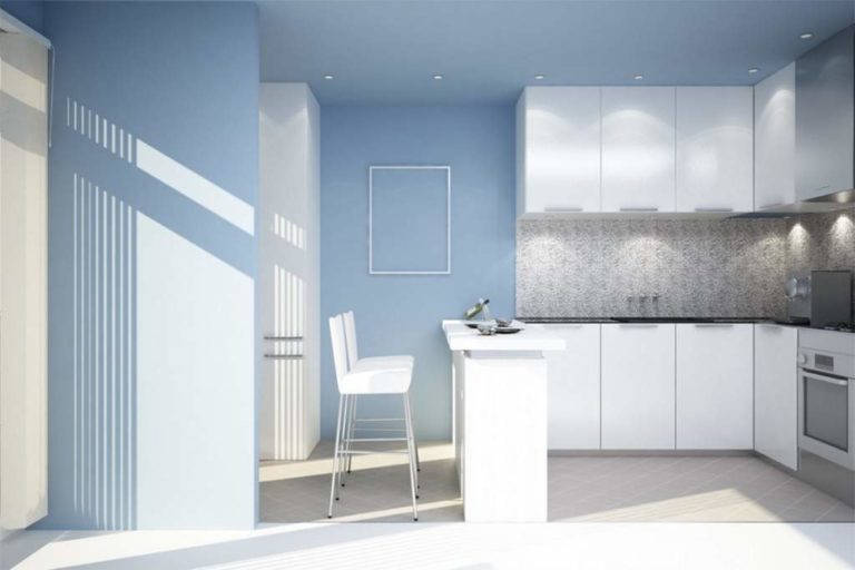
Blue color
Calm and deep blue gives the space color and creates accents in it. Due to its royal coldness and a certain severity, such a coloring is better suited for rooms located on the south side.

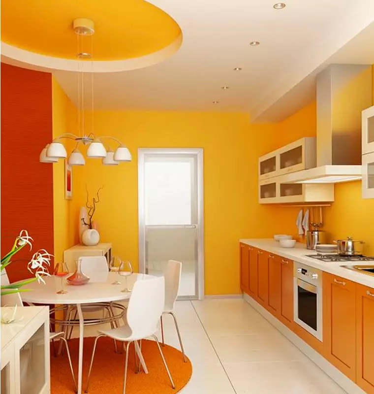
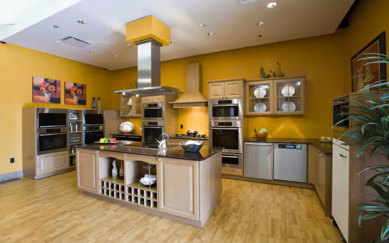
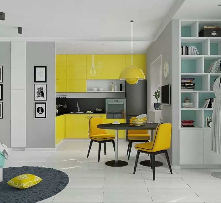
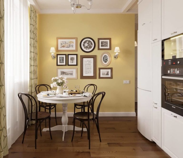
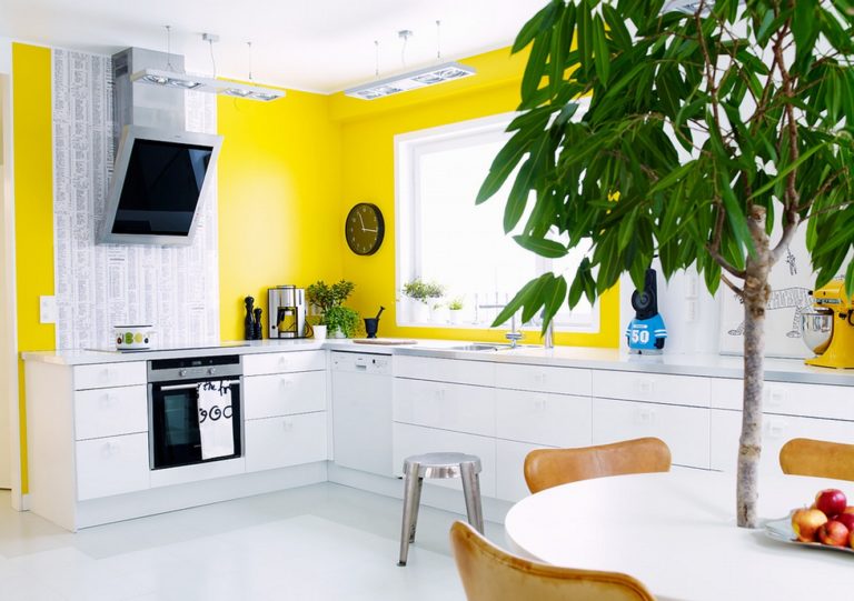
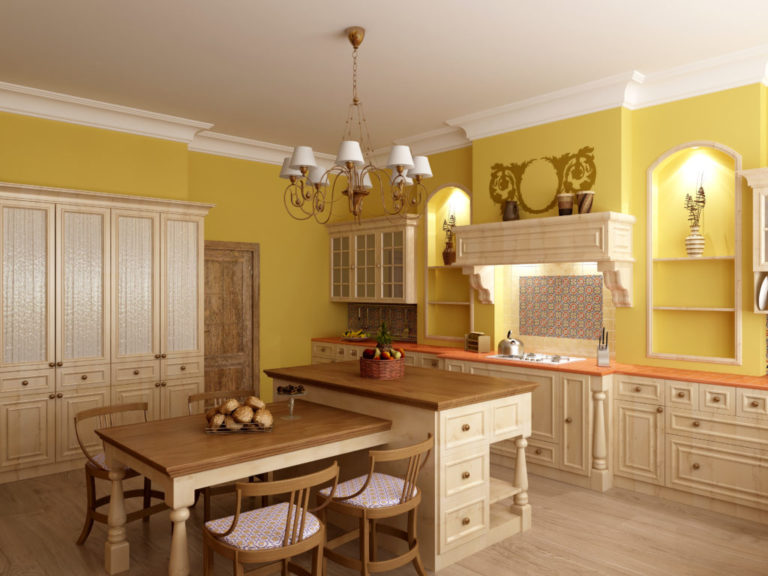
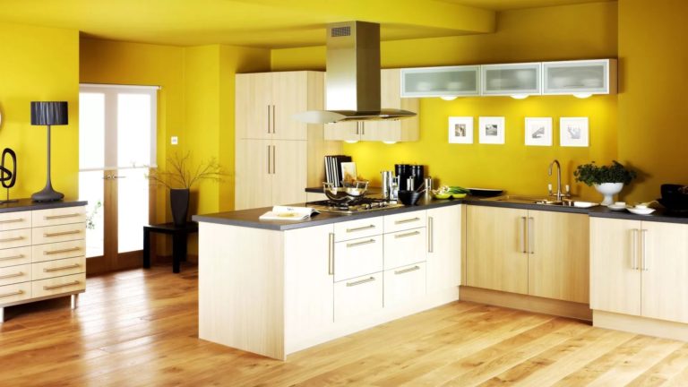
Yellow color
Associated with the bright sun and undoubtedly fills the room with vivacity and energy. Yellow, mustard, or lemon wall decor looks creative and generates a feeling of additional lighting in the room.
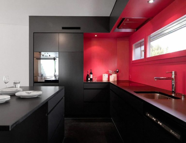
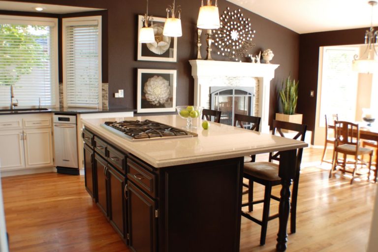
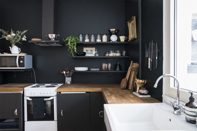
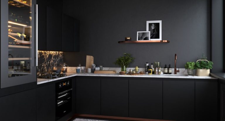
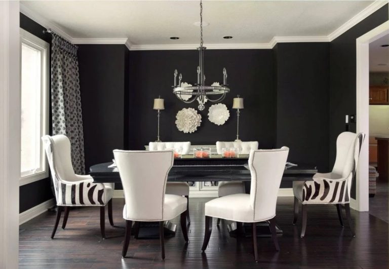
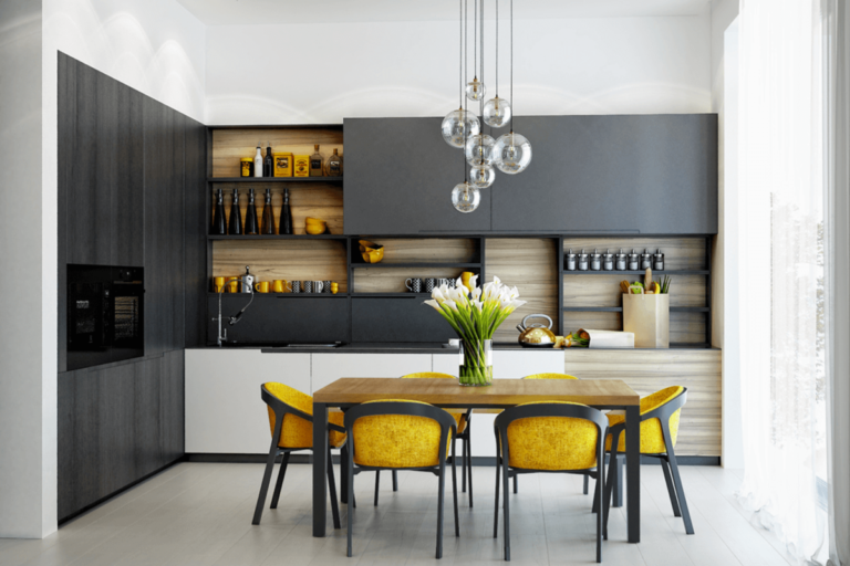
Black color
Such a captivating and provocative color will undoubtedly become one of the main accents of the kitchen. Black in the kitchen merely looks fantastic and is considered an indicator of chic, wealth, and exquisite taste.
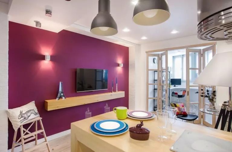
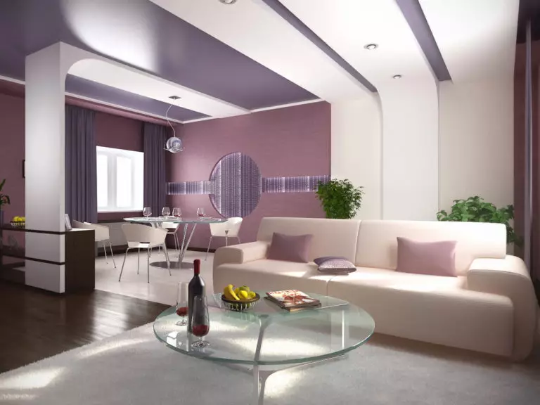
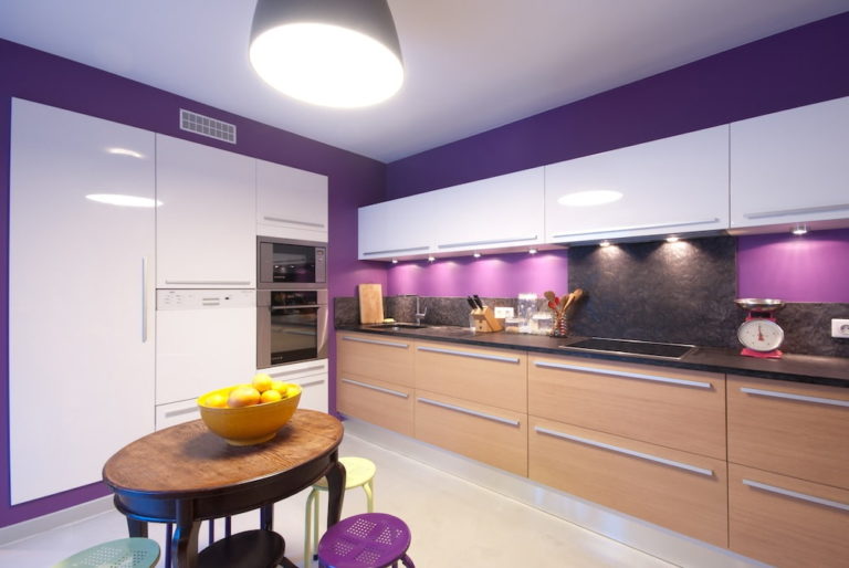
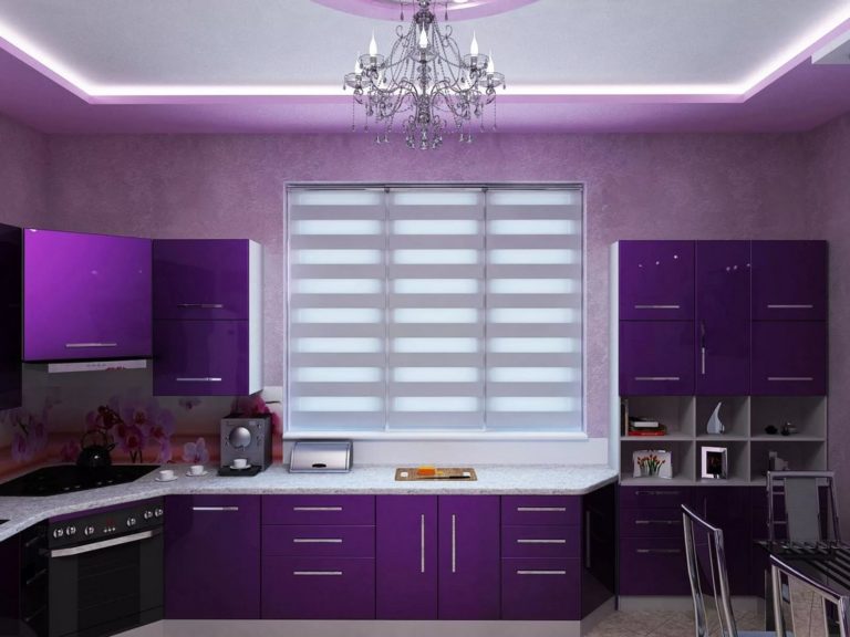
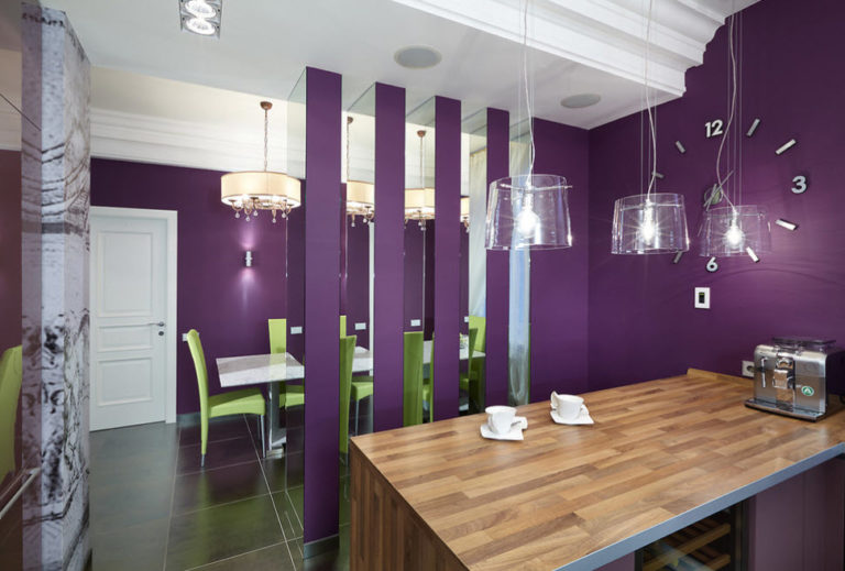
Violet color
Lavender or lilac tones will allow you to create a sophisticated and refined setting, filled with special romance and sensuality. Saturated violet colors will give the elegant design luxuriousness, vivid expressiveness, and extraordinary.
Best color combinations for kitchen walls
There is a monochromatic, neutral, or contrasting color combination. With their competent use in the interior, it will be possible to most accurately convey the main idea of the design of the room.
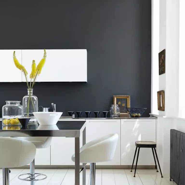
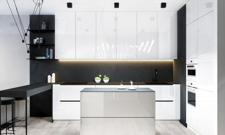
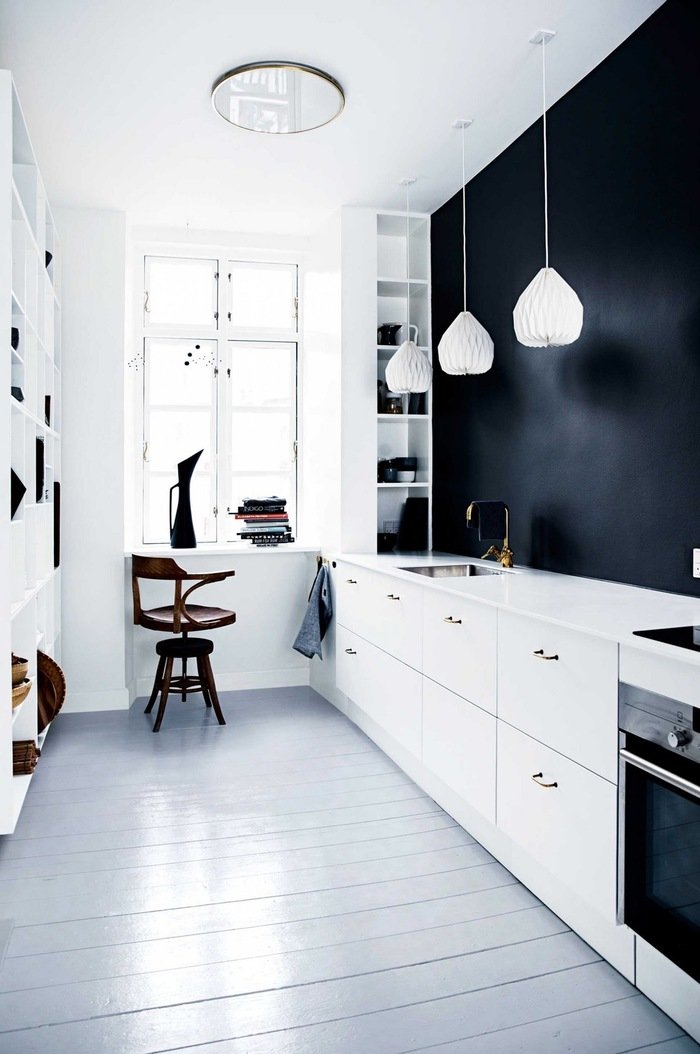
Black and white wall painting
This contrast dramatically corrects the appearance of the entire room and completely changes its mood and character. Black and white combined are a bright dominant, so a catchy and indisputably effective kitchen design is obtained.
Blue and white wall painting
The duo of blue and white gives the space a rugged look. With a well-proportioned application of these colors, you can achieve a genuinely excellent decoration result.
Red and black wall painting
The most successful and very stylish two-tone combination. The extravagant glowing red, combined with luxurious black, creates an incredible tandem that fills the space with solemnity, sensuality, and elegant drama.

Wall painting in various kitchen styles
Each style direction has a specific color character.
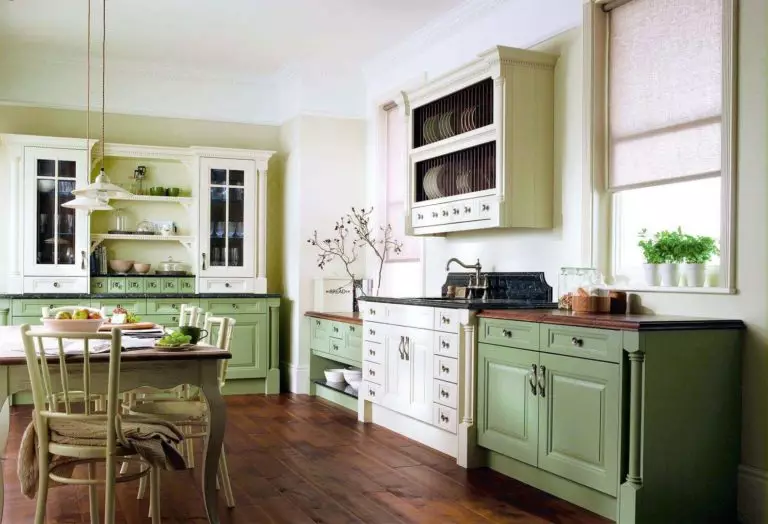
Classical
For a general background in the classics, restrained pastel, neutral, calm, or noble shades are used. For example, it can be pale pink, beige, sand, light blue, cream, fade yellow, or other colors diluted with large portions of white. Such a discreet and muted wall decoration will become an integral part of this style.
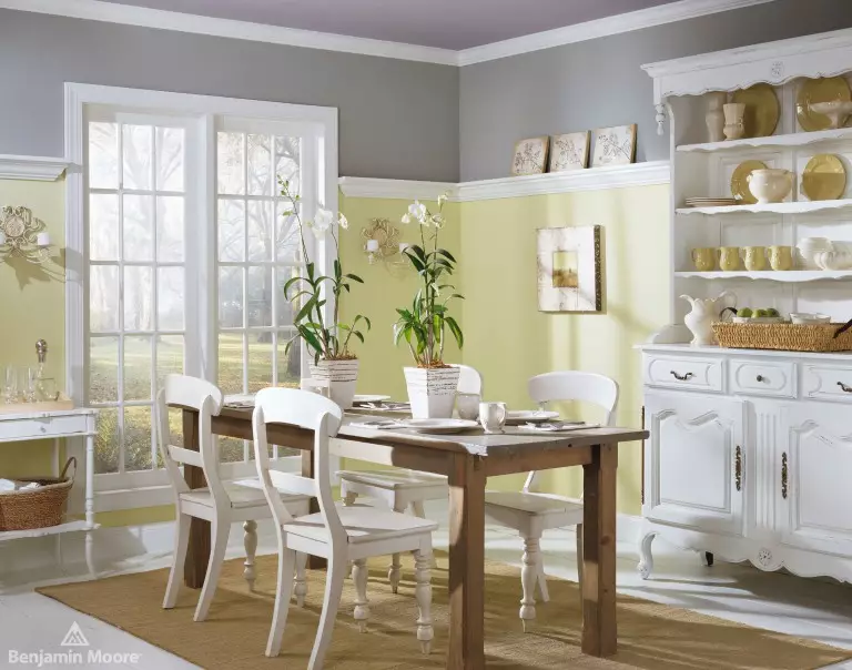
Provence
Calm, as if slightly faded halftones, such as light blue, lilac, olive, pink, beige with the addition of bright and rich accents in the form of cornflower blue, turquoise or amber yellow, will create an atmosphere as close as possible to French Provence.

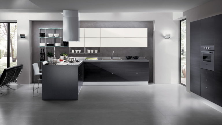
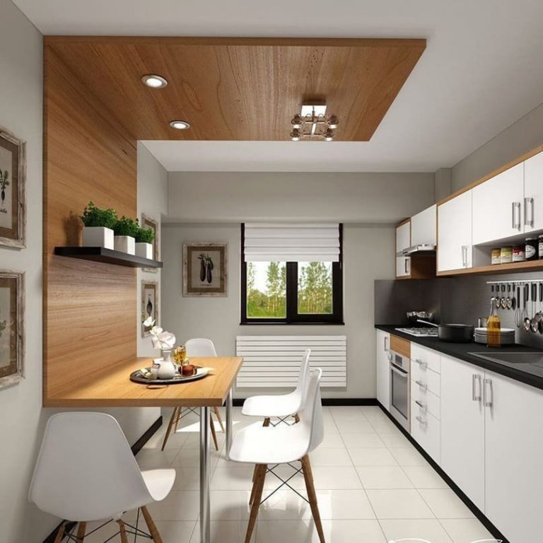
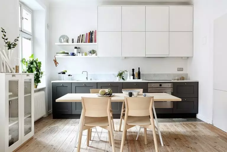
Modern
For this style, the color gamut is appropriate, which includes no more than two or three shades, which ideally should be combined. Quite often for modern design, use white, natural beige, gray, or milk. They are an excellent backdrop for creating any design ideas.
Wall painting in the kitchen+Photo gallery
The color of the walls allows you to create an atmosphere in the kitchen that will contribute to a good and positive pastime and a positive and welcoming mood.